《鸿蒙动画效果全解析:属性动画、帧动画与模态转场实现》
·
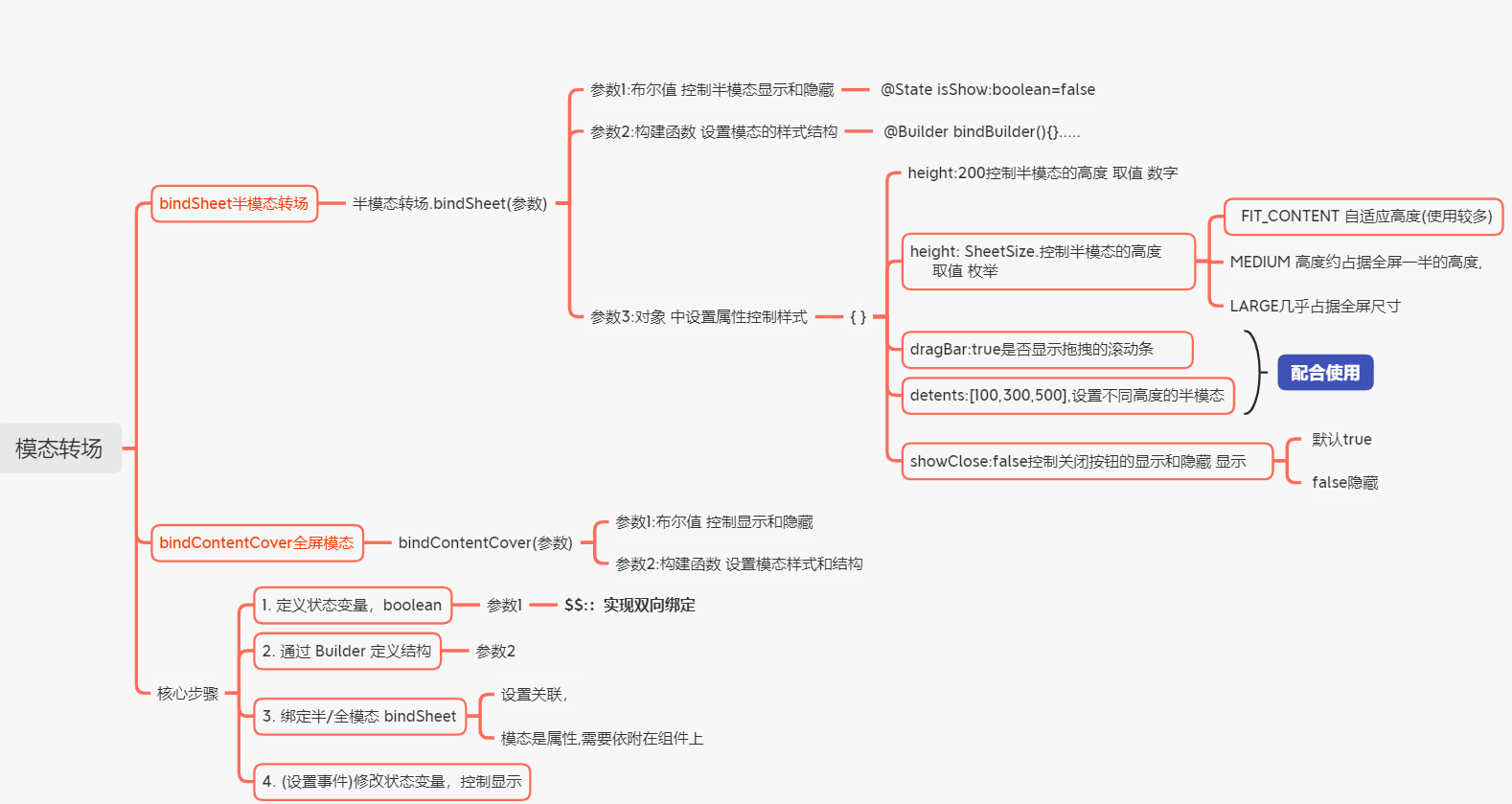
模态转场
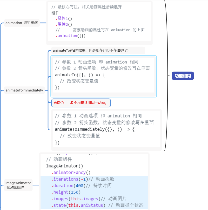
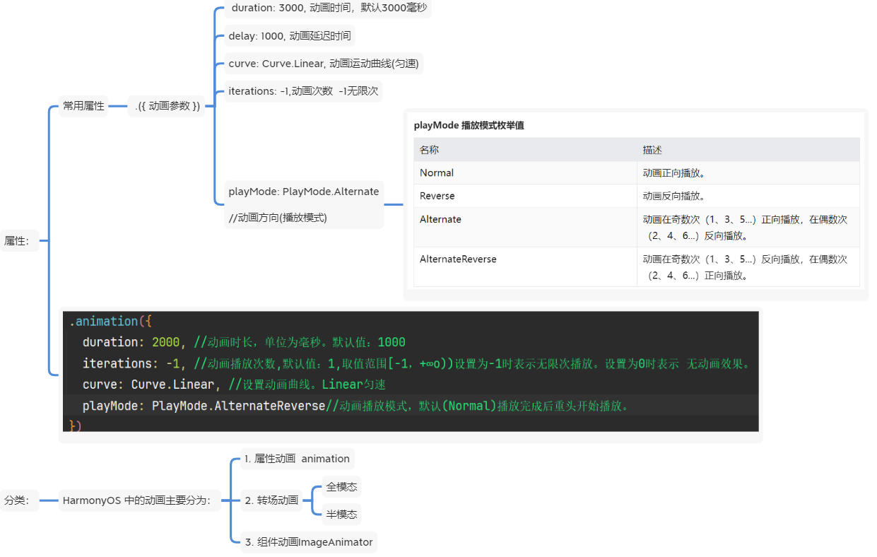
1、animation属性动画
2、animateToImmediately
控制多个动画的操作
基本代码示意:
@Entry
@Component
struct Page07_animateToDemo {
  // 1. 声明相关状态变量
  @State scaleX: number = 1
  @State scaleY: number = 1

  build() {
    Column({ space: 50 }) {
      Text('全场低至一分购')
        .fontSize(30)
        .fontWeight(900)
        .fontColor(Color.Red)
        .backgroundColor('#e8b66d')
        .padding(10)
        .borderRadius(20)// 2.将状态变量设置到相关可动画属性接口
        .scale({
          x: this.scaleX,
          y: this.scaleY
        })// 3. 通过属性动画接口开启属性动画
        // .animation({
        //   duration: 1000,
        //   curve: Curve.EaseInOut,
        //   playMode: PlayMode.Alternate,
        //   iterations: -1
        // })
        .onAppear(() => {
          // 4.通过状态变量改变UI界面
          // this.scaleX = 1.3
          // this.scaleY = 1.3
          animateToImmediately({
              duration: 1000,
              curve: Curve.EaseInOut,
              playMode: PlayMode.Alternate,
              iterations: -1
          },()=>{
            this.scaleX = 1.3
            this.scaleY = 1.3
          })
        })
    }
    .width('100%')
    .height('100%')
    .padding(20)

  }

  @Styles
  fullSize() {
    .width('100%')
    .height('100%')
  }
}
例demo:控制多个动画

@Entry
@Component
struct Page06_animateTo {
  // 1. 声明相关状态变量
  @State rotateAngle: number = 0

  // @State
  build() {
    Column() {
      // 4个齿轮
      Flex({ wrap: FlexWrap.Wrap }) {
        Image($r('app.media.ic_gear1'))
          .width(150)// 2. 将状态变量设置到相关可动画属性接口
          .rotate({ angle: this.rotateAngle })
        // .animation({})
        Image($r('app.media.ic_gear2'))
          .width(150)// 2. 将状态变量设置到相关可动画属性接口
          .rotate({ angle: this.rotateAngle })
        // .animation({})
        Image($r('app.media.ic_gear3'))
          .width(150)// 2. 将状态变量设置到相关可动画属性接口
          .rotate({ angle: this.rotateAngle })
        // .animation({})
        Image($r('app.media.ic_gear4'))
          .width(150)// 2. 将状态变量设置到相关可动画属性接口
          .rotate({ angle: this.rotateAngle })
        // .animation({})
      }

      Button('点击旋转齿轮')
        .onClick(() => {
          //两个参数,
          // 参数1:写相关属性,{}和animation一样的使用参数
          // 参数2:箭头函数,操作相关状态变量,引起UI更新
          animateToImmediately({
            duration: 2000,
            iterations: -1,
            curve: Curve.Linear
          }, () => {
            this.rotateAngle = 360
          })
        })
    }
    .width('100%')
    .height('100%')
    .backgroundColor(Color.Orange)
  }
}
3、ImageAnimator帧动画组件
4、bindSheet半模态
基本代码示意:
@Entry
@Component
struct  Index {
  @State isShow:boolean=false
  build() {
    Column(){
        Button('半模态的显示隐藏')
       .onClick(()=>{
        this.isShow=true
        })
          // 半模态 bindSheet(是属性,需要依附在组件上)
          // 参数1: 是否显示半模态(双向数据绑定)
          // 参数2: Builder构建函数,在里面写半模态的结构
          // 参数3: 设置半模态的结构样式,例如高度
          .bindSheet($$this.isShow,this.bindSheetBuilder(),{
            // height:600,//设置固定高度
           height: SheetSize.FIT_CONTENT,//枚举设置高度,(枚举)
            // MEDIUM高度yue占据全屏一半的高度,
            // FIT_CONTENT根据模态框里内容自适应尺寸,(一般用这个自适应)
            // LARGE几乎占据全屏尺寸

            dragBar:true,//是否显示拖拽的滚动条(配合detents使用)
            detents:[200,300,400],//设置区间的高度(配合dragBar使用),
            // 设置了detents,height也设置的话,height不生效

            showClose:false//是否显示关闭图标取值布尔值默认值truefalse隐藏
          })
    }
    .width('100%')
    .height('100%')
  }
//   半模态的结构
  @Builder bindSheetBuilder(){
    Column(){}
    .width('100%')

    .backgroundColor(Color.Orange)
  }
}
5、bindContentCover全模态
基本代码示意:
@Entry
@Component
struct BindContentCoverDemo {
  @State isShow: boolean = false;

  build() {
   Column(){
     Button('全模态')
       .bindContentCover($$this.isShow,this.bindContentCoverBuilder())
   }
    .height('100%')
    .width('100%')
  }
  @Builder bindContentCoverBuilder(){
    Column(){
      Button('关闭全模态')
       .onClick(()=>{
        this.isShow=false
        })
    }
    .backgroundColor('#f40')
  }
}

讨论HarmonyOS开发技术,专注于API与组件、DevEco Studio、测试、元服务和应用上架分发等。
更多推荐


 5
5 0
0- 0


 已为社区贡献8条内容

所有评论(0)