Qt for 鸿蒙PC GlobalStyles 全局样式表开源鸿蒙PC开发实践
📋 项目概述
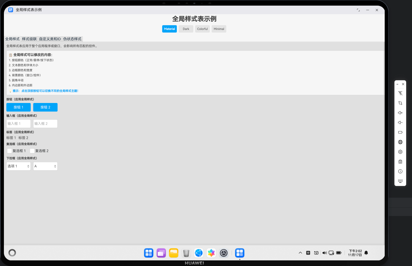
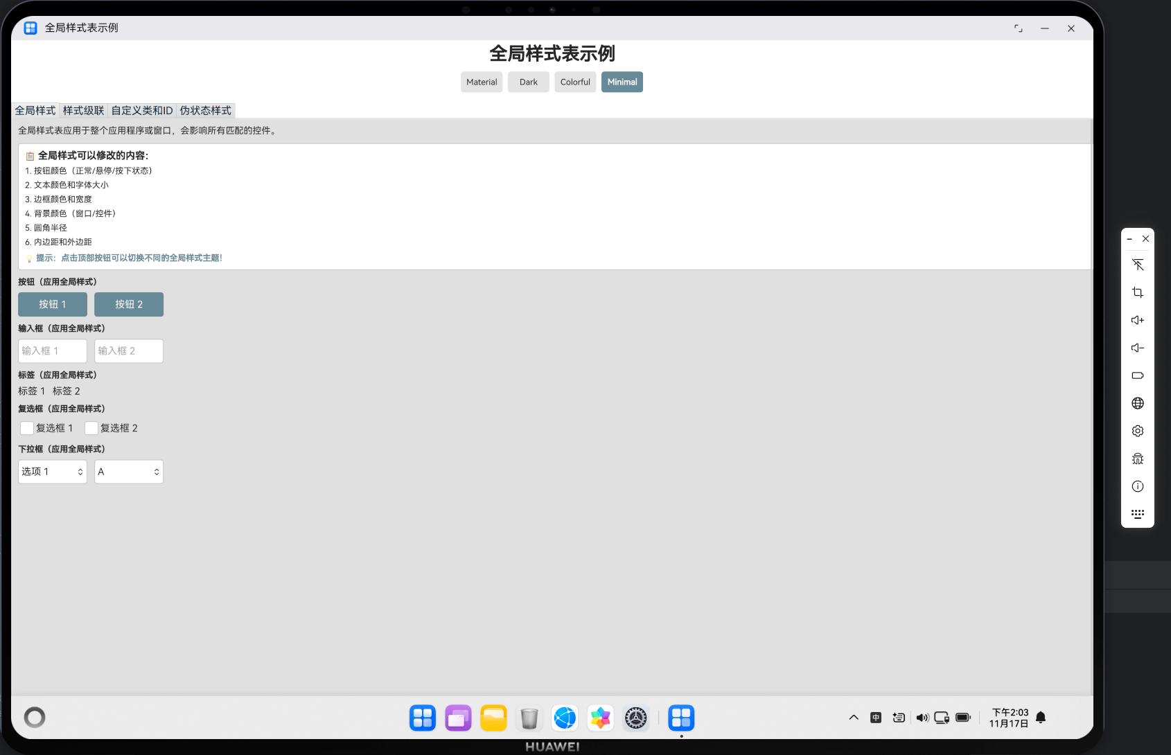
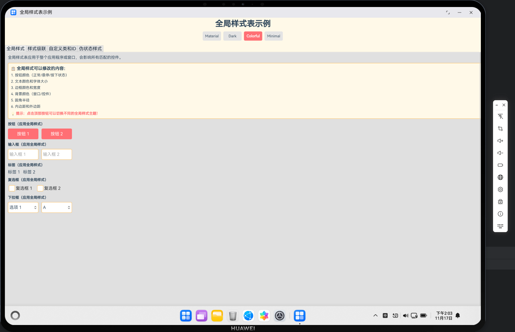
本文档基于一个完整的 GlobalStyles 项目,详细介绍了如何在 HarmonyOS 平台上使用 Qt 实现全局样式表功能。项目实现了4种主题样式(Material、Dark、Colorful、Minimal),展示了全局样式定义、样式级联、自定义类和ID选择器、伪状态样式等技术在 HarmonyOS 平台上的实际应用。
✨ 主要功能
- ✅ 4种主题样式:Material、Dark、Colorful、Minimal
- ✅ 全局样式定义:通过属性绑定实现全局样式系统
- ✅ 样式级联:演示全局、窗口、控件级别的样式级联效果
- ✅ 自定义类和ID:通过ID选择器和自定义类应用特定样式
- ✅ 伪状态样式:支持 hover、pressed、checked、disabled 等伪状态
- ✅ 主题切换:实时切换不同主题,所有控件自动应用新样式
- ✅ 多控件支持:按钮、输入框、复选框、下拉框、标签等控件样式统一管理
- ✅ TabView 展示:使用 TabView 分类展示不同样式功能
- ✅ 响应式布局:适配不同屏幕尺寸
- ✅ 完整的触摸交互支持
欢迎加入开源鸿蒙PC社区:https://harmonypc.csdn.net/
仓库地址:https://atomgit.com/szkygc/HarmonyOs_PC-PGC/tree/main/Qt/global_styles
环境搭建参考
Mac构建Qt鸿蒙项目:https://blog.csdn.net/qq_46169531/article/details/155111784
官方仓库:https://atomgit.com/openharmony-sig/qt
官方环境搭建参考:https://atomgit.com/openharmony-sig/qt/wiki/Home.md
🛠️ 技术栈
- 开发框架: Qt 5.15+ for HarmonyOS
- 编程语言: C++ / QML / JavaScript
- 界面框架: Qt Quick Controls 2
- 构建工具: CMake
- 目标平台: HarmonyOS (OpenHarmony) / PC
🏗️ 项目架构
目录结构
global_styles/
├── entry/src/main/
│   ├── cpp/
│   │   ├── main.cpp              # 应用入口(HarmonyOS适配)
│   │   ├── main.qml              # 主界面(全局样式系统)
│   │   ├── CMakeLists.txt        # 构建配置
│   │   └── qml.qrc               # QML资源文件
│   ├── module.json5              # 模块配置
│   └── resources/                # 资源文件
└── image/
    ├── 演示示例1.png            # 演示截图1
    ├── 演示示例2.png            # 演示截图2
    └── 演示示例3.png            # 演示截图3
组件层次结构
ApplicationWindow (main.qml)
├── Column (主布局)
│   ├── Rectangle (标题栏)
│   │   ├── Column
│   │   │   ├── Text (标题)
│   │   │   └── Row (主题切换按钮组)
│   │   │       ├── Button (Material)
│   │   │       ├── Button (Dark)
│   │   │       ├── Button (Colorful)
│   │   │       └── Button (Minimal)
│   └── TabView (标签页容器)
│       ├── Tab (全局样式)
│       │   └── Flickable
│       │       └── Column (内容列)
│       │           ├── Text (说明)
│       │           ├── Rectangle (信息框)
│       │           ├── Column (按钮组)
│       │           ├── Column (输入框组)
│       │           ├── Column (标签组)
│       │           ├── Column (复选框组)
│       │           └── Column (下拉框组)
│       ├── Tab (样式级联)
│       ├── Tab (自定义类和ID)
│       └── Tab (伪状态样式)
└── 全局样式属性
    ├── themeStyles (主题样式定义)
    ├── currentTheme (当前主题)
    ├── globalButtonColor (全局按钮颜色)
    ├── globalTextColor (全局文本颜色)
    └── ... (其他全局样式属性)
📝 核心功能实现
1. HarmonyOS 入口函数:qtmain()
⚠️ 关键要点:HarmonyOS 真机上必须使用 qtmain() 而不是 main()!
// ✅ 正确写法
extern "C" int qtmain(int argc, char **argv)
{
    // Qt 应用作为共享库加载,生命周期由 HarmonyOS 管理
    QGuiApplication app(argc, argv);
    QQmlApplicationEngine engine;
    engine.load(QUrl(QStringLiteral("qrc:/main.qml")));
    return app.exec();  // ⚠️ 重要:必须调用 exec() 启动事件循环
}

// ❌ 错误写法(桌面应用方式)
int main(int argc, char *argv[])
{
    // 这种方式在 HarmonyOS 上会导致应用无法正常启动
}
原因说明:
- HarmonyOS 将 Qt 应用作为共享库(.so)加载
- 应用生命周期由 HarmonyOS 的 Ability 管理
qtmain()是 HarmonyOS Qt 插件的标准入口点
2. OpenGL ES 表面格式配置
⚠️ 关键要点:必须在创建 QGuiApplication 之前配置 QSurfaceFormat!
// Step 1: 配置 OpenGL ES 表面格式(必须在创建应用之前!)
QSurfaceFormat format;

// 设置 Alpha 通道(透明度)
format.setAlphaBufferSize(8);      // 8 位 Alpha 通道

// 设置颜色通道(RGBA 32 位真彩色)
format.setRedBufferSize(8);        // 8 位红色通道
format.setGreenBufferSize(8);      // 8 位绿色通道
format.setBlueBufferSize(8);       // 8 位蓝色通道

// 设置深度和模板缓冲区
format.setDepthBufferSize(24);     // 24 位深度缓冲
format.setStencilBufferSize(8);    // 8 位模板缓冲

// 指定渲染类型为 OpenGL ES(HarmonyOS要求)
format.setRenderableType(QSurfaceFormat::OpenGLES);

// 指定 OpenGL ES 版本为 3.0(推荐)
format.setVersion(3, 0);

// ⚠️ 关键:必须在创建 QGuiApplication 之前设置默认格式!
QSurfaceFormat::setDefaultFormat(format);

// Step 2: 创建 Qt 应用实例(必须在设置格式之后)
QCoreApplication::setAttribute(Qt::AA_UseOpenGLES);
QCoreApplication::setAttribute(Qt::AA_ShareOpenGLContexts);
QGuiApplication app(argc, argv);
配置说明:
- OpenGL ES 3.0:HarmonyOS 推荐使用 OpenGL ES 3.0
- RGBA 8-8-8-8:32 位真彩色,支持透明度
- 深度缓冲 24 位:用于 3D 渲染和层级管理
- 模板缓冲 8 位:用于复杂图形效果
3. 全局样式主题系统
3.1 主题样式定义
核心思想:使用 JavaScript 对象定义多个主题样式,通过属性绑定实现全局样式系统。
ApplicationWindow {
    id: root

    // 当前样式主题
    property string currentTheme: "material"  // material, dark, colorful, minimal

    // 全局样式主题定义
    property var themeStyles: {
        "material": {
            backgroundColor: "#F5F5F5",
            buttonColor: "#2196F3",
            buttonHoverColor: "#1976D2",
            buttonPressedColor: "#1565C0",
            textColor: "#333333",
            borderColor: "#CCCCCC",
            fontSize: 28
        },
        "dark": {
            backgroundColor: "#121212",
            buttonColor: "#BB86FC",
            buttonHoverColor: "#9D6DE8",
            buttonPressedColor: "#7C4DFF",
            textColor: "#FFFFFF",
            borderColor: "#424242",
            fontSize: 28
        },
        "colorful": {
            backgroundColor: "#FFF9E6",
            buttonColor: "#FF6B6B",
            buttonHoverColor: "#FF5252",
            buttonPressedColor: "#E53935",
            textColor: "#2C3E50",
            borderColor: "#FFB74D",
            fontSize: 28
        },
        "minimal": {
            backgroundColor: "#FFFFFF",
            buttonColor: "#607D8B",
            buttonHoverColor: "#546E7A",
            buttonPressedColor: "#455A64",
            textColor: "#212121",
            borderColor: "#BDBDBD",
            fontSize: 28
        }
    }
}
关键点:
- 主题对象:每个主题是一个 JavaScript 对象,包含所有样式属性
- 主题切换:通过改变
currentTheme属性实现主题切换 - 属性绑定:所有样式属性都绑定到当前主题
3.2 全局样式属性绑定
ApplicationWindow {
    id: root

    // 全局样式定义(通过属性绑定实现,绑定到当前主题)
    property color globalButtonColor: themeStyles[currentTheme].buttonColor
    property color globalButtonHoverColor: themeStyles[currentTheme].buttonHoverColor
    property color globalButtonPressedColor: themeStyles[currentTheme].buttonPressedColor
    property color globalTextColor: themeStyles[currentTheme].textColor
    property color globalBorderColor: themeStyles[currentTheme].borderColor
    property int globalFontSize: themeStyles[currentTheme].fontSize

    // 全局背景色(绑定到当前主题)
    color: themeStyles[currentTheme].backgroundColor
}
关键点:
- 属性绑定:使用
themeStyles[currentTheme].propertyName实现动态绑定 - 自动更新:当
currentTheme改变时,所有绑定属性自动更新 - 全局访问:子组件可以通过
root.globalButtonColor访问全局样式
3.3 主题切换函数
ApplicationWindow {
    id: root

    // 切换主题函数
    function switchTheme(themeName) {
        if (themeStyles.hasOwnProperty(themeName)) {
            currentTheme = themeName
            console.log("全局样式: 切换到主题", themeName)
        }
    }
}
关键点:
- 安全检查:使用
hasOwnProperty检查主题是否存在 - 日志输出:切换主题时输出日志便于调试
- 即时生效:切换主题后,所有使用全局样式属性的控件立即更新
4. 全局样式应用
4.1 按钮应用全局样式
Button {
    text: "按钮 1"
    width: Math.min(200, (parent.width - parent.spacing) / 2)
    height: 70

    background: Rectangle {
        color: parent.pressed ? globalButtonPressedColor : (parent.hovered ? globalButtonHoverColor : globalButtonColor)
        radius: 8
    }

    contentItem: Text {
        text: parent.text
        color: "white"
        horizontalAlignment: Text.AlignHCenter
        verticalAlignment: Text.AlignVCenter
        font.pixelSize: globalFontSize
    }
}
关键点:
- 状态响应:使用
parent.pressed、parent.hovered实现状态变化 - 全局颜色:使用
globalButtonColor、globalButtonHoverColor等全局属性 - 字体大小:使用
globalFontSize统一字体大小
4.2 输入框应用全局样式
TextField {
    placeholderText: "输入框 1"
    width: Math.min(200, (parent.width - parent.spacing) / 2)
    height: 70

    background: Rectangle {
        color: "white"
        border.color: parent.activeFocus ? globalButtonColor : globalBorderColor
        border.width: 2
        radius: 8
    }

    font.pixelSize: globalFontSize
}
关键点:
- 焦点状态:使用
parent.activeFocus实现焦点时的边框颜色变化 - 边框颜色:焦点时使用
globalButtonColor,否则使用globalBorderColor - 字体统一:使用
globalFontSize统一字体大小
4.3 复选框应用全局样式
CheckBox {
    id: globalCheckbox1
    text: "复选框 1"
    font.pixelSize: globalFontSize

    indicator: Rectangle {
        implicitWidth: 40
        implicitHeight: 40
        x: globalCheckbox1.text ? (globalCheckbox1.mirrored ? globalCheckbox1.width - width - globalCheckbox1.rightPadding : globalCheckbox1.leftPadding) : globalCheckbox1.leftPadding + (globalCheckbox1.availableWidth - width) / 2
        y: globalCheckbox1.topPadding + (globalCheckbox1.availableHeight - height) / 2
        radius: 6
        border.color: globalBorderColor
        border.width: 2
        color: globalCheckbox1.checked ? globalButtonColor : "white"

        Text {
            anchors.centerIn: parent
            text: "✓"
            color: "white"
            font.pixelSize: 28
            font.bold: true
            visible: globalCheckbox1.checked
        }
    }
}
关键点:
- 边框颜色:使用
globalBorderColor统一边框颜色 - 选中颜色:选中时使用
globalButtonColor作为背景色 - 字体大小:使用
globalFontSize统一文本大小
5. 样式级联实现
核心思想:样式具有级联效果,控件级别的样式会覆盖更高级别的样式。
5.1 仅全局样式
Button {
    text: "仅全局样式"
    width: Math.min(300, parent.width)
    height: 70

    background: Rectangle {
        color: parent.pressed ? globalButtonPressedColor : (parent.hovered ? globalButtonHoverColor : globalButtonColor)
        radius: 8
    }

    contentItem: Text {
        text: parent.text
        color: "white"
        horizontalAlignment: Text.AlignHCenter
        verticalAlignment: Text.AlignVCenter
        font.pixelSize: globalFontSize
    }
}
5.2 全局 + 窗口级别样式
Button {
    id: windowLevelButton
    text: "全局 + 窗口样式"
    width: Math.min(300, parent.width)
    height: 70

    background: Rectangle {
        // 窗口级别样式覆盖全局样式
        color: windowLevelButton.pressed ? "#1976D2" : (windowLevelButton.hovered ? "#1565C0" : "#2196F3")
        radius: 8
        border.color: "#0D47A1"  // 窗口级别添加边框
        border.width: 2
    }

    contentItem: Text {
        text: windowLevelButton.text
        color: "white"
        horizontalAlignment: Text.AlignHCenter
        verticalAlignment: Text.AlignVCenter
        font.pixelSize: globalFontSize
    }
}
5.3 全局 + 窗口 + 控件级别样式
Button {
    id: widgetLevelButton
    text: "全局 + 窗口 + 控件样式"
    width: Math.min(300, parent.width)
    height: 70

    background: Rectangle {
        // 控件级别样式覆盖窗口和全局样式
        color: widgetLevelButton.pressed ? "#7B1FA2" : (widgetLevelButton.hovered ? "#8E24AA" : "#9C27B0")
        radius: 8
        border.width: 0  // 控件级别移除边框
    }

    contentItem: Text {
        text: widgetLevelButton.text
        color: "white"
        horizontalAlignment: Text.AlignHCenter
        verticalAlignment: Text.AlignVCenter
        font.pixelSize: globalFontSize
        font.bold: true  // 控件级别添加加粗
    }
}
级联规则:
- 优先级:控件级别 > 窗口级别 > 全局级别
- 继承性:子级别继承父级别的样式,可以覆盖特定属性
- 灵活性:允许在保持全局样式的基础上,对特定控件进行定制
6. ID选择器和自定义类
6.1 ID选择器
核心思想:通过设置控件的 id 属性,可以为特定控件应用特殊样式。
Button {
    id: specialButtonId  // ID选择器
    text: "ID选择器按钮"
    width: Math.min(300, parent.width)
    height: 70

    background: Rectangle {
        // 基于ID的特殊样式
        color: specialButtonId.pressed ? "#388E3C" : (specialButtonId.hovered ? "#43A047" : "#4CAF50")
        radius: 8
        border.width: 0
    }

    contentItem: Text {
        text: specialButtonId.text
        color: "white"
        horizontalAlignment: Text.AlignHCenter
        verticalAlignment: Text.AlignVCenter
        font.pixelSize: globalFontSize
        font.bold: true
    }
}
关键点:
- 唯一性:每个
id在 QML 作用域内必须唯一 - 特殊样式:可以为特定ID的控件定义特殊样式
- 访问性:通过
id可以直接访问控件的属性和方法
6.2 危险按钮示例
Button {
    id: dangerButtonId
    text: "危险按钮"
    width: Math.min(300, parent.width)
    height: 70

    background: Rectangle {
        // 危险按钮使用红色主题
        color: dangerButtonId.pressed ? "#C62828" : (dangerButtonId.hovered ? "#D32F2F" : "#F44336")
        radius: 8
        border.width: 0
    }

    contentItem: Text {
        text: dangerButtonId.text
        color: "white"
        horizontalAlignment: Text.AlignHCenter
        verticalAlignment: Text.AlignVCenter
        font.pixelSize: globalFontSize
    }
}
7. 伪状态样式实现
核心思想:使用控件的状态属性(如 pressed、hovered、checked、disabled)实现不同状态的样式。
7.1 悬停和按下效果
Button {
    id: stateButton
    text: "悬停和按下效果"
    width: Math.min(300, parent.width)
    height: 70

    background: Rectangle {
        // 三种状态:正常、悬停、按下
        color: stateButton.pressed ? "#1565C0" : (stateButton.hovered ? "#1976D2" : "#2196F3")
        radius: 8
        border.width: stateButton.pressed ? 3 : (stateButton.hovered ? 2 : 0)
        border.color: "#0D47A1"
    }

    contentItem: Text {
        text: stateButton.text
        color: "white"
        horizontalAlignment: Text.AlignHCenter
        verticalAlignment: Text.AlignVCenter
        font.pixelSize: globalFontSize
        font.bold: stateButton.hovered  // 悬停时加粗
    }
}
7.2 焦点状态
TextField {
    id: focusLineEdit
    placeholderText: "获取焦点查看效果"
    width: Math.min(300, parent.width)
    height: 70

    background: Rectangle {
        // 焦点状态样式
        color: focusLineEdit.activeFocus ? "#F5F5F5" : "white"
        border.color: focusLineEdit.activeFocus ? globalButtonColor : globalBorderColor
        border.width: focusLineEdit.activeFocus ? 3 : 2
        radius: 8
    }

    font.pixelSize: globalFontSize
}
7.3 选中状态(复选框)
CheckBox {
    id: pseudoCheckbox1
    text: "复选框 1"
    font.pixelSize: globalFontSize

    indicator: Rectangle {
        implicitWidth: 40
        implicitHeight: 40
        x: pseudoCheckbox1.text ? (pseudoCheckbox1.mirrored ? pseudoCheckbox1.width - width - pseudoCheckbox1.rightPadding : pseudoCheckbox1.leftPadding) : pseudoCheckbox1.leftPadding + (pseudoCheckbox1.availableWidth - width) / 2
        y: pseudoCheckbox1.topPadding + (pseudoCheckbox1.availableHeight - height) / 2
        radius: 6
        border.color: pseudoCheckbox1.checked ? globalButtonColor : globalBorderColor
        border.width: 2
        color: pseudoCheckbox1.checked ? globalButtonColor : "white"

        Text {
            anchors.centerIn: parent
            text: "✓"
            color: "white"
            font.pixelSize: 28
            font.bold: true
            visible: pseudoCheckbox1.checked  // 选中时显示
        }
    }
}
7.4 禁用状态
Button {
    text: "禁用按钮"
    enabled: false  // 禁用状态
    width: Math.min(200, (parent.width - parent.spacing) / 2)
    height: 70

    background: Rectangle {
        color: "#BDBDBD"
        radius: 8
        opacity: 0.6  // 降低透明度
    }

    contentItem: Text {
        text: parent.text
        color: "#757575"  // 灰色文字
        horizontalAlignment: Text.AlignHCenter
        verticalAlignment: Text.AlignVCenter
        font.pixelSize: globalFontSize
    }
}
伪状态说明:
:hovered:鼠标悬停状态(触摸设备可能不支持):pressed:按下状态:checked:选中状态(复选框、单选按钮):disabled:禁用状态:activeFocus:焦点状态(输入框)
8. TabView 标签页实现
核心思想:使用 TabView 分类展示不同的样式功能。
TabView {
    id: tabView
    width: parent.width
    height: parent.height - 180
    anchors.horizontalCenter: parent.horizontalCenter

    // 1. 全局样式标签页
    Tab {
        title: "全局样式"

        Flickable {
            anchors.fill: parent
            contentWidth: width
            contentHeight: contentColumn.height + 40
            clip: true

            ScrollBar.vertical: ScrollBar {
                policy: ScrollBar.AlwaysOn
            }

            Column {
                id: contentColumn
                width: parent.width
                spacing: 20
                topPadding: 20
                leftPadding: 20
                rightPadding: 20
                bottomPadding: 20

                // 内容...
            }
        }
    }

    // 2. 样式级联标签页
    Tab {
        title: "样式级联"
        // ...
    }

    // 3. 自定义类和ID标签页
    Tab {
        title: "自定义类和ID"
        // ...
    }

    // 4. 伪状态样式标签页
    Tab {
        title: "伪状态样式"
        // ...
    }
}
关键点:
- TabView:使用
TabView创建标签页容器 - Tab:每个
Tab代表一个标签页 - Flickable:每个标签页内容使用
Flickable实现滚动 - ScrollBar:添加垂直滚动条
9. 主题切换按钮实现
Row {
    anchors.horizontalCenter: parent.horizontalCenter
    spacing: 15

    Button {
        text: "Material"
        width: 120
        height: 60

        background: Rectangle {
            // 当前主题高亮显示
            color: currentTheme === "material" ? globalButtonColor : "#E0E0E0"
            radius: 8
        }

        contentItem: Text {
            text: parent.text
            color: currentTheme === "material" ? "white" : globalTextColor
            horizontalAlignment: Text.AlignHCenter
            verticalAlignment: Text.AlignVCenter
            font.pixelSize: 24
            font.bold: currentTheme === "material"  // 当前主题加粗
        }

        onClicked: switchTheme("material")
    }

    // 其他主题按钮...
}
关键点:
- 当前主题高亮:使用
currentTheme === "material"判断是否为当前主题 - 视觉反馈:当前主题使用主题色背景,其他使用灰色
- 点击切换:点击按钮调用
switchTheme()函数切换主题
10. ⚠️ 关键配置:deviceTypes 必须包含 “2in1”
这是本文档最重要的发现!
在 entry/src/main/module.json5 文件中,deviceTypes 必须包含 "2in1":
{
  "module": {
    "name": "entry",
    "type": "entry",
    "deviceTypes": [
      "default",
      "tablet",
      "2in1"  // ⚠️ 必须添加!否则打包会失败
    ],
    // ...
  }
}
错误信息:
hvigor ERROR: Failed :entry:default@PackageHap...
Ohos BundleTool [Error]: 10011001 Parse and check args invalid in hap mode.
Error Message: --json-path must be the config.json file or module.json file.
原因分析:
- HarmonyOS PC 设备(如 MateBook)被识别为
"2in1"设备类型 - 如果
deviceTypes中缺少"2in1",打包工具无法正确识别配置文件路径 - 这会导致打包失败,即使应用能在真机上运行
最佳实践:
"deviceTypes": [
  "default",   // 手机
  "tablet",    // 平板
  "2in1"       // ⚠️ PC/2合1设备(必须添加!)
]
🐛 常见问题与解决方案
问题 1:主题切换后样式不更新
症状:点击主题切换按钮后,控件样式没有变化。
原因:
- 样式属性没有绑定到全局属性
- 使用了硬编码的颜色值
- 属性绑定路径错误
解决方案:
// ✅ 正确:使用全局属性绑定
Button {
    background: Rectangle {
        color: parent.pressed ? globalButtonPressedColor : (parent.hovered ? globalButtonHoverColor : globalButtonColor)
    }
}

// ❌ 错误:使用硬编码颜色
Button {
    background: Rectangle {
        color: "#2196F3"  // 硬编码,不会随主题变化
    }
}
问题 2:全局样式属性访问不到
症状:在子组件中无法访问 globalButtonColor 等全局属性。
原因:
- 属性定义在
ApplicationWindow中,子组件需要通过root访问 - 作用域问题
解决方案:
ApplicationWindow {
    id: root

    property color globalButtonColor: themeStyles[currentTheme].buttonColor

    Button {
        background: Rectangle {
            // ✅ 正确:通过 root 访问全局属性
            color: root.globalButtonColor

            // ❌ 错误:直接访问(可能找不到)
            // color: globalButtonColor
        }
    }
}
问题 3:样式级联不生效
症状:控件级别的样式没有覆盖全局样式。
原因:
- 属性绑定顺序问题
- 使用了
readonly属性 - 绑定表达式错误
解决方案:
// ✅ 正确:控件级别样式覆盖全局样式
Button {
    id: customButton

    background: Rectangle {
        // 控件级别样式优先级更高
        color: customButton.pressed ? "#7B1FA2" : (customButton.hovered ? "#8E24AA" : "#9C27B0")
        border.width: 0  // 覆盖全局边框
    }
}

// ❌ 错误:使用全局属性,无法覆盖
Button {
    background: Rectangle {
        color: globalButtonColor  // 无法覆盖
    }
}
问题 4:主题切换按钮状态不正确
症状:主题切换按钮的高亮状态与实际主题不一致。
原因:
currentTheme属性没有正确更新- 按钮的
currentTheme === "material"判断错误
解决方案:
Button {
    text: "Material"

    background: Rectangle {
        // ✅ 正确:使用 root.currentTheme 判断
        color: root.currentTheme === "material" ? globalButtonColor : "#E0E0E0"
    }

    onClicked: {
        // ✅ 正确:调用 root 的函数
        root.switchTheme("material")
    }
}
问题 5:TabView 内容无法滚动
症状:TabView 中的内容超出屏幕,但无法滚动。
原因:
Flickable的contentHeight计算错误- 缺少
ScrollBar clip属性未设置
解决方案:
Tab {
    title: "标签页"

    Flickable {
        anchors.fill: parent
        contentWidth: width
        contentHeight: contentColumn.height + 40  // ⚠️ 必须正确计算
        clip: true  // ⚠️ 必须设置

        ScrollBar.vertical: ScrollBar {
            policy: ScrollBar.AlwaysOn
        }

        Column {
            id: contentColumn
            width: parent.width
            // ...
        }
    }
}
问题 6:打包失败 - json-path 错误
症状:
hvigor ERROR: Failed :entry:default@PackageHap...
Error Message: --json-path must be the config.json file or module.json file.
原因:module.json5 中的 deviceTypes 缺少 "2in1"。
解决方案:
// entry/src/main/module.json5
{
  "module": {
    "deviceTypes": [
      "default",
      "tablet",
      "2in1"  // ⚠️ 必须添加!
    ]
  }
}
💡 最佳实践
1. 全局样式系统设计
ApplicationWindow {
    id: root

    // 1. 定义主题对象
    property var themeStyles: {
        "material": { /* ... */ },
        "dark": { /* ... */ }
    }

    // 2. 当前主题属性
    property string currentTheme: "material"

    // 3. 全局样式属性(绑定到当前主题)
    property color globalButtonColor: themeStyles[currentTheme].buttonColor
    property color globalTextColor: themeStyles[currentTheme].textColor
    property int globalFontSize: themeStyles[currentTheme].fontSize

    // 4. 主题切换函数
    function switchTheme(themeName) {
        if (themeStyles.hasOwnProperty(themeName)) {
            currentTheme = themeName
        }
    }
}
2. 控件应用全局样式
Button {
    text: "按钮"

    background: Rectangle {
        // 使用全局样式属性
        color: parent.pressed ? globalButtonPressedColor :
               (parent.hovered ? globalButtonHoverColor : globalButtonColor)
        radius: 8
    }

    contentItem: Text {
        text: parent.text
        color: "white"
        font.pixelSize: globalFontSize  // 使用全局字体大小
    }
}
3. 样式级联设计
// 全局级别
property color globalButtonColor: "#2196F3"

// 窗口级别(可以覆盖全局)
Button {
    background: Rectangle {
        color: "#1976D2"  // 覆盖全局样式
    }
}

// 控件级别(优先级最高)
Button {
    id: customButton
    background: Rectangle {
        color: customButton.pressed ? "#7B1FA2" : "#9C27B0"  // 完全自定义
    }
}
4. 伪状态样式设计
Button {
    id: stateButton

    background: Rectangle {
        // 多种状态
        color: stateButton.pressed ? "#按下色" :
               (stateButton.hovered ? "#悬停色" : "#正常色")
        border.width: stateButton.pressed ? 3 : (stateButton.hovered ? 2 : 0)
    }

    contentItem: Text {
        font.bold: stateButton.hovered  // 悬停时加粗
    }
}
5. 主题切换按钮设计
Row {
    spacing: 15

    Repeater {
        model: ["material", "dark", "colorful", "minimal"]

        Button {
            text: modelData.charAt(0).toUpperCase() + modelData.slice(1)
            width: 120
            height: 60

            background: Rectangle {
                color: root.currentTheme === modelData ? globalButtonColor : "#E0E0E0"
                radius: 8
            }

            contentItem: Text {
                text: parent.text
                color: root.currentTheme === modelData ? "white" : globalTextColor
                font.bold: root.currentTheme === modelData
            }

            onClicked: root.switchTheme(modelData)
        }
    }
}
6. 响应式布局
Row {
    width: parent.width
    spacing: 20

    Button {
        // 使用 Math.min 限制最大宽度
        width: Math.min(200, (parent.width - parent.spacing) / 2)
        height: 70
    }
}
📊 项目结构
global_styles/
├── AppScope/
│   └── app.json5              # 应用配置
├── entry/
│   ├── build-profile.json5    # 构建配置
│   ├── src/
│   │   ├── main/
│   │   │   ├── cpp/
│   │   │   │   ├── main.cpp   # C++ 入口(qtmain)
│   │   │   │   ├── main.qml   # QML UI(全局样式系统)
│   │   │   │   ├── qml.qrc    # 资源文件
│   │   │   │   └── CMakeLists.txt
│   │   │   ├── module.json5   # ⚠️ 必须包含 "2in1"
│   │   │   └── ets/           # ArkTS 代码
│   │   └── ohosTest/
│   └── libs/                   # Qt 库文件
├── image/
│   ├── 演示示例1.png          # 演示截图1
│   ├── 演示示例2.png          # 演示截图2
│   └── 演示示例3.png          # 演示截图3
└── build-profile.json5        # 根构建配置
🔧 构建配置要点
CMakeLists.txt
cmake_minimum_required(VERSION 3.5.0)
project(QtForHOSample)

set(CMAKE_AUTOMOC ON)
set(CMAKE_AUTOUIC ON)
set(CMAKE_AUTORCC ON)

set(NATIVERENDER_ROOT_PATH ${CMAKE_CURRENT_SOURCE_DIR})

list(APPEND CMAKE_FIND_ROOT_PATH ${QT_PREFIX})
include_directories(${NATIVERENDER_ROOT_PATH}
                    ${NATIVERENDER_ROOT_PATH}/include)

find_package(QT NAMES Qt5 Qt6 REQUIRED COMPONENTS Core Widgets)
find_package(Qt${QT_VERSION_MAJOR} REQUIRED COMPONENTS
    Concurrent Gui Network Qml Quick QuickControls2
    Widgets QuickTemplates2 QmlWorkerScript)

add_library(entry SHARED main.cpp qml.qrc)

target_link_libraries(entry PRIVATE
    Qt${QT_VERSION_MAJOR}::Concurrent
    Qt${QT_VERSION_MAJOR}::Core
    Qt${QT_VERSION_MAJOR}::Gui
    Qt${QT_VERSION_MAJOR}::Network
    Qt${QT_VERSION_MAJOR}::Qml
    Qt${QT_VERSION_MAJOR}::Quick
    Qt${QT_VERSION_MAJOR}::Widgets
    Qt${QT_VERSION_MAJOR}::QuickControls2
    Qt${QT_VERSION_MAJOR}::QuickTemplates2
    Qt${QT_VERSION_MAJOR}::QmlWorkerScript
    Qt${QT_VERSION_MAJOR}::QOpenHarmonyPlatformIntegrationPlugin  # HarmonyOS 插件
)
module.json5(关键配置)
{
  "module": {
    "name": "entry",
    "type": "entry",
    "deviceTypes": [
      "default",
      "tablet",
      "2in1"  // ⚠️ 必须添加!否则打包会失败
    ],
    "description": "$string:module_desc",
    "mainElement": "EntryAbility",
    "deviceType": [
      "default",
      "tablet",
      "2in1"
    ],
    "deliveryWithInstall": true,
    "installationFree": false,
    "pages": "$profile:main_pages",
    "abilities": [
      {
        "name": "EntryAbility",
        "srcEntry": "./ets/entryability/EntryAbility.ets",
        "description": "$string:EntryAbility_desc",
        "icon": "$media:icon",
        "label": "$string:EntryAbility_label",
        "startWindowIcon": "$media:icon",
        "startWindowBackground": "$color:start_window_background",
        "exported": true,
        "skills": [
          {
            "entities": [
              "entity.system.home"
            ],
            "actions": [
              "action.system.home"
            ]
          }
        ]
      }
    ]
  }
}
📚 参考资源
Qt 官方文档
🎉 总结
通过本项目的开发实践,我们总结了以下关键要点:
- ✅ 必须使用
qtmain()作为入口函数,而不是main() - ✅ OpenGL ES 配置必须在创建应用之前完成
- ✅
deviceTypes必须包含"2in1",否则打包会失败 - ✅ 使用 JavaScript 对象定义主题样式,便于管理和扩展
- ✅ 通过属性绑定实现全局样式系统,实现主题切换
- ✅ 样式具有级联效果,控件级别样式可以覆盖全局样式
- ✅ 使用 ID 选择器为特定控件应用特殊样式
- ✅ 使用伪状态实现不同状态的样式(hover、pressed、checked等)
- ✅ 使用 TabView 分类展示不同功能,提升用户体验
- ✅ 主题切换按钮需要正确判断当前主题,提供视觉反馈
- ✅ 确保全局样式属性正确绑定,避免硬编码颜色值
- ✅ 使用 Flickable + ScrollBar 实现滚动,比 ScrollView 更可靠
这些经验对于在 HarmonyOS 平台上开发 Qt 应用至关重要,特别是涉及全局样式管理和主题切换的场景。希望本文档能帮助开发者避免常见陷阱,快速上手 Qt for HarmonyOS 开发,并创建出美观统一的用户界面。

讨论HarmonyOS开发技术,专注于API与组件、DevEco Studio、测试、元服务和应用上架分发等。
更多推荐

 20
20 0
0- 0


 已为社区贡献21条内容

所有评论(0)