从入门小白到精通,玩转 React Native 鸿蒙跨平台开发:SectionList 分组列表组件
目录
案例 3:综合实战版 - 结合 Image 实现图文分组列表
在 React Native 鸿蒙跨平台开发中,列表展示是核心需求之一。上一篇我们掌握了 FlatList 用于展示连续无分组的列表数据,而实际开发中,分类数据展示场景(如联系人按字母分组、商品按品类分组、账单按日期分组)同样高频,这就需要 SectionList 分组列表组件登场。
SectionList 是 RN 鸿蒙官方内置的高性能分组列表组件,专为「结构化分组数据」设计,支持分组头部、分组分割线、按需渲染等核心能力,性能与 FlatList 持平,且完美适配鸿蒙系统。本文将从核心原理、属性解析、多场景实战出发,全面讲解 SectionList 的使用,所有代码均可直接运行,吃透该组件即可轻松应对各类分组列表需求。
前置说明:SectionList 与 FlatList 同属 RN 鸿蒙核心列表组件,底层渲染机制一致(按需渲染),但针对分组场景做了功能增强;鸿蒙端无需额外配置,写法与 RN 原生完全一致,跨端复用性极强。
一、核心认知:SectionList 组件的定位与价值
1.1 什么是 SectionList?
SectionList 是 React Native 鸿蒙封装的高性能分组列表组件,专门用于展示「按类别划分的结构化数据」。它将列表拆分为多个「分组(Section)」,每个分组包含「分组头部(Section Header)」和「分组内容(Section Items)」,同时保留了 FlatList 的按需渲染特性,即使海量分组数据也能流畅滚动。
1.2 适用场景
✅ 联系人列表(按字母 A-Z 分组)
✅ 商品分类列表(按品类 / 价格区间分组)
✅ 账单明细(按日期 / 消费类型分组)
✅ 资讯列表(按栏目 / 标签分组)
✅ 任何需要「分类展示 + 快速定位」的列表场景
1.3 与 FlatList 的核心区别
| 对比维度 | SectionList 分组列表 | FlatList 普通列表 |
|---|---|---|
| 数据结构 | 分组结构化数据(数组嵌套数组) | 扁平数组数据 |
| 核心能力 | 支持分组头部、分组分割线、分组索引 | 仅支持普通列表项、统一分割线 |
| 适用场景 | 分类数据展示(如联系人、商品分类) | 无分组连续数据(如消息列表、商品列表) |
| 核心属性 | sections(分组数据源)、renderSectionHeader(分组头部渲染) | data(扁平数据源)、renderItem(列表项渲染) |
| 性能表现 | 按需渲染分组,性能与 FlatList 一致 | 按需渲染列表项,性能最优 |
核心结论:无分组用 FlatList,有分组用 SectionList,两者互补覆盖所有列表场景。
二、核心属性
SectionList 继承了 FlatList 的部分核心属性(如 keyExtractor、showsVerticalScrollIndicator),同时新增了分组相关的专属属性。以下整理「高频、必备、实战常用」的核心属性,剔除冷门配置,鸿蒙端完美适配,开发直接对照使用:
| 属性分类 | 属性名 | 必填 | 取值 / 写法 | 核心说明 | 鸿蒙适配注意点 |
|---|---|---|---|---|---|
| ✅ 核心必写 | sections | ✔️ | 数组(格式:[{title: ' 分组 1', data: [子项 1, 子项 2]}]) | 分组数据源,每个元素为一个分组,包含「分组标题 + 分组内容数组」 | 鸿蒙无差异,严格遵循 title+data 结构 |
| ✅ 核心必写 | renderSectionHeader | ✔️ | ({section}) => < 分组头部布局 /> | 分组头部渲染函数,section 为当前分组数据(含 title 和 data) |
头部会固定在分组顶部,滑动时跟随分组滚动 |
| ✅ 核心必写 | renderItem | ✔️ | ({item}) => < 列表项布局 /> | 分组内列表项渲染函数,item 为当前分组的子项数据 |
与 FlatList 的 renderItem 用法完全一致 |
| 高频常用 | keyExtractor | ✔️(推荐) | (item, index, sectionIndex) => 唯一标识 | 给每个列表项设置唯一 key,用于组件复用,提升性能 | 需区分不同分组的列表项,建议拼接 sectionIndex+item.id |
| 高频常用 | SectionSeparatorComponent | ❌ | () => < 分组分割线 /> | 分组之间的分割线(如两个分组的间隔) | 与 ItemSeparatorComponent 区分(列表项之间的分割线) |
| 高频常用 | ItemSeparatorComponent | ❌ | () => < 列表项分割线 /> | 同一分组内列表项之间的分割线 | 与 FlatList 的分割线用法一致 |
| 基础样式 | style | ❌ | StyleSheet 样式对象 | 整个分组列表的容器样式(宽高、背景色等) | 默认占满父容器宽度,建议设置 flex:1 占满屏幕高度 |
| 基础样式 | sectionHeaderStyle | ❌ | StyleSheet 样式对象 | 分组头部的统一样式(如背景色、内边距) | 可替代在 renderSectionHeader 中单独设置样式 |
| 交互相关 | onSectionPress | ❌ | (section) => {} | 分组头部的点击事件(如点击分组展开 / 折叠) | 鸿蒙端响应无延迟,支持防抖 |
| 性能优化 | maxToRenderPerBatch | ❌ | 数字(默认 10) | 每次批量渲染的列表项数量,按需调整提升性能 | 数据量大时可设为 20,平衡加载速度与流畅度 |
重点备注:
sections数据源格式是固定的,必须是包含title(分组标题)和data(分组子项数组)的对象数组,缺一不可。
三、实战核心:4 个高频场景完整案例
所有案例均为完整可运行代码,基于鸿蒙平台适配,按「基础→进阶→综合」阶梯式排布,从简单分组列表到带交互的复杂场景,覆盖 99% 开发需求,代码注释清晰,可直接复制到项目中使用。
案例 1:基础核心版 - 极简分组列表
最基础的分组列表实现,展示「分组头部 + 分组内列表项」的核心结构,是所有分组列表的基础模板,代码极简,快速上手 SectionList 的核心用法。
import React from 'react';
import { View, Text, SectionList, StyleSheet } from 'react-native';

type SectionDataItem = {
  title: string;
  data: string[];
};

// 分组数据源
const sectionData: SectionDataItem[] = [
  {
    title: '鸿蒙生态硬件',
    data: ['鸿蒙智能手环', '鸿蒙降噪耳机', '鸿蒙智能手表']
  },
  {
    title: '开发教程',
    data: ['React Native 鸿蒙实战', '鸿蒙原生开发指南', '跨平台适配技巧']
  },
  {
    title: '周边产品',
    data: ['鸿蒙定制笔记本', '鸿蒙主题手机壳', '开发专属鼠标垫']
  }
];

// 渲染分组头部(明确参数类型)
const renderSectionHeader = ({ section }: { section: SectionDataItem }) => {
  return (
    <View style={styles.headerBox}>
      <Text style={styles.headerText}>{section.title}</Text>
    </View>
  );
};
const renderListItem = ({ item }: { item: string }) => {
  return (
    <View style={styles.itemBox}>
      <Text style={styles.itemText}>{item}</Text>
    </View>
  );
};

const BasicSectionList = () => {
  return (
    <View style={styles.container}>
      <SectionList<string, SectionDataItem>
        sections={sectionData}
        renderSectionHeader={renderSectionHeader}
        renderItem={renderListItem}
        keyExtractor={(item: string, index: number) => `${item}-${index}`}
        showsVerticalScrollIndicator={false}
      />
    </View>
  );
};

const styles = StyleSheet.create({
  container: {
    flex: 1,
    backgroundColor: '#f5f5f5',
    padding: 10,
  },
  headerBox: {
    backgroundColor: '#2196F3',
    padding: 12,
    borderRadius: 6,
    marginTop: 8,
  },
  headerText: {
    fontSize: 16,
    color: '#fff',
    fontWeight: '500',
  },
  itemBox: {
    backgroundColor: '#fff',
    padding: 15,
    borderRadius: 6,
    marginTop: 4,
  },
  itemText: {
    fontSize: 15,
    color: '#333',
  },
});

export default BasicSectionList;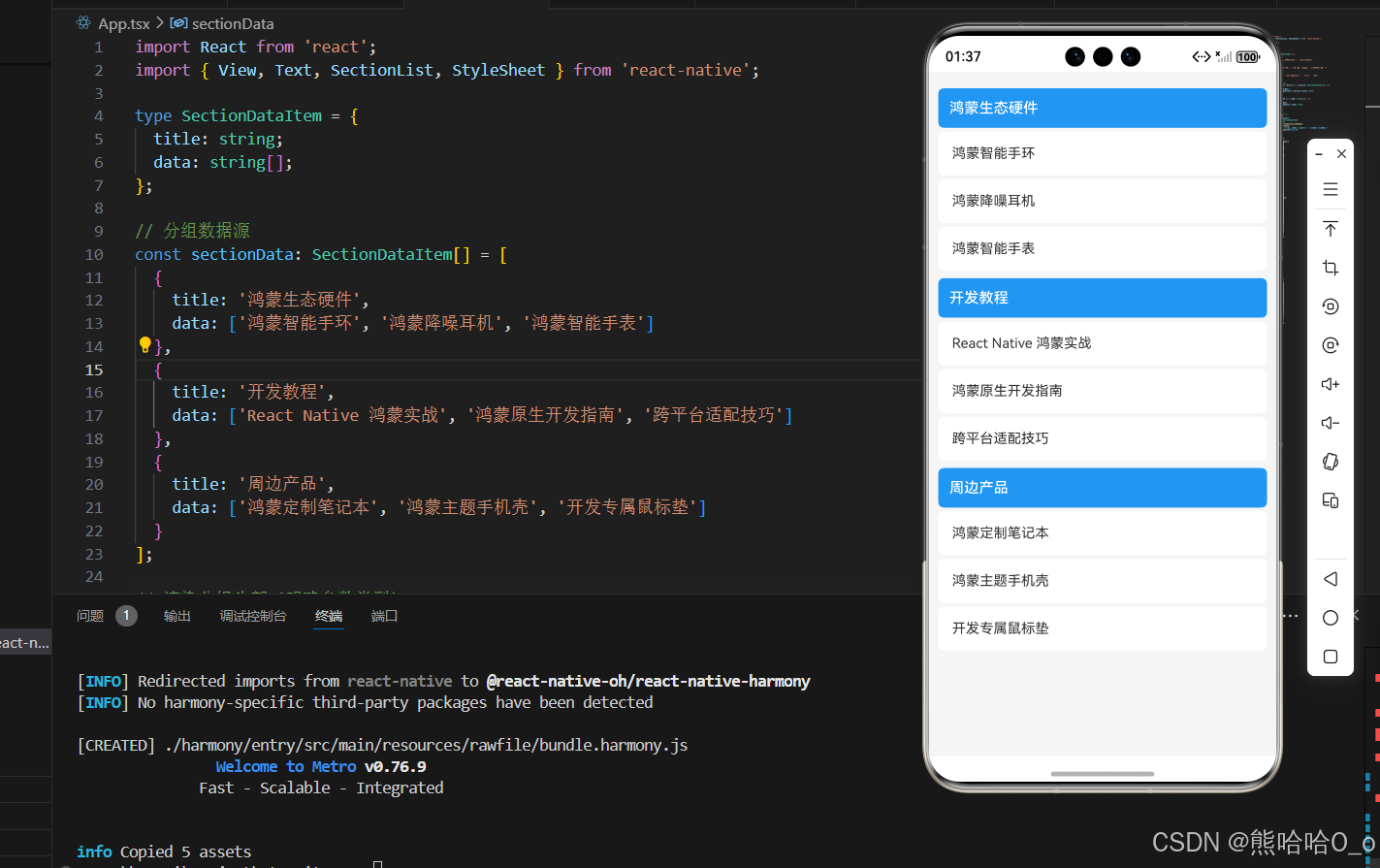
案例 2:开发高频版 - 带分组分割线 + 美化样式
在基础版的基础上,新增「分组分割线、列表项分割线、样式优化」,是实际开发中最常用的标准写法,兼顾美观度与实用性,适配鸿蒙端所有设备。
import React from 'react';
import { View, Text, SectionList, StyleSheet } from 'react-native';

type GoodsItem = {
  id: number;
  name: string;
  price: string;
};
type GoodsSection = {
  title: string;
  data: GoodsItem[];
};

const goodsSectionData: GoodsSection[] = [
  {
    title: '热门推荐',
    data: [
      { id: 1, name: '鸿蒙智能手环', price: '¥199' },
      { id: 2, name: '跨平台开发教程', price: '¥89' }
    ]
  },
  {
    title: '硬件设备',
    data: [
      { id: 3, name: '鸿蒙降噪耳机', price: '¥299' },
      { id: 4, name: '鸿蒙智能手表', price: '¥599' }
    ]
  },
  {
    title: '周边配件',
    data: [
      { id: 5, name: '鸿蒙主题手机壳', price: '¥39' },
      { id: 6, name: '开发专属鼠标垫', price: '¥29' }
    ]
  }
];

const renderSectionHeader = ({ section }: { section: GoodsSection }) => {
  return (
    <View style={[styles.sectionHeader, styles.headerContainer]}>
      <Text style={styles.headerTitle}>{section.title}</Text>
      <Text style={styles.headerCount}>{section.data.length}件商品</Text>
    </View>
  );
};

const renderListItem = ({ item }: { item: GoodsItem }) => {
  return (
    <View style={styles.listItem}>
      <Text style={styles.itemName}>{item.name}</Text>
      <Text style={styles.itemPrice}>{item.price}</Text>
    </View>
  );
};

const renderSectionSeparator = () => {
  return <View style={styles.sectionSeparator} />;
};

const renderItemSeparator = () => {
  return <View style={styles.itemSeparator} />;
};

const BeautySectionList = () => {
  return (
    <View style={styles.container}>
      <SectionList<GoodsItem, GoodsSection>
        sections={goodsSectionData}
        renderSectionHeader={renderSectionHeader}
        renderItem={renderListItem}
        keyExtractor={(item) => item.id.toString()}
        SectionSeparatorComponent={renderSectionSeparator}
        ItemSeparatorComponent={renderItemSeparator}
        showsVerticalScrollIndicator={false}
      />
    </View>
  );
};

const styles = StyleSheet.create({
  container: {
    flex: 1,
    backgroundColor: '#f5f5f5',
    padding: 10,
  },
  sectionHeader: {
    flexDirection: 'row',
    justifyContent: 'space-between',
    alignItems: 'center',
  },
  headerContainer: {
    backgroundColor: '#fff',
    padding: 12,
    borderRadius: 6,
  },
  headerTitle: {
    fontSize: 16,
    color: '#333',
    fontWeight: '600',
  },
  headerCount: {
    fontSize: 12,
    color: '#999',
    backgroundColor: '#eee',
    paddingHorizontal: 6,
    paddingVertical: 2,
    borderRadius: 10,
  },
  listItem: {
    backgroundColor: '#fff',
    padding: 15,
    flexDirection: 'row',
    justifyContent: 'space-between',
    alignItems: 'center',
  },
  itemName: {
    fontSize: 15,
    color: '#333',
  },
  itemPrice: {
    fontSize: 14,
    color: '#FF4444',
    fontWeight: '500',
  },
  sectionSeparator: {
    height: 10,
    backgroundColor: '#f5f5f5',
  },
  itemSeparator: {
    height: 1,
    backgroundColor: '#f0f0f0',
    marginLeft: 15,
    marginRight: 15,
  },
});

export default BeautySectionList;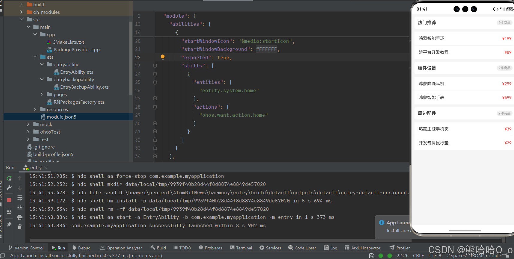
案例 3:综合实战版 - 结合 Image 实现图文分组列表
结合之前学过的 Image 组件,实现「图文结合的分组商品列表」,这是电商类、资讯类 APP 的高频场景,代码完整覆盖数据展示、样式美化、交互逻辑,可直接复用在实际项目中,鸿蒙端完美适配。
import React from 'react';
import { View, Text, Image, SectionList, StyleSheet, TouchableOpacity, Alert } from 'react-native';

type GoodsItem = {
  id: number;
  name: string;
  price: string;
  imgUrl: string;
};

type GoodsSection = {
  title: string;
  data: GoodsItem[];
};

const imageSectionData: GoodsSection[] = [
  {
    title: '鸿蒙生态硬件',
    data: [
      {
        id: 1,
        name: '鸿蒙智能手环',
        price: '¥199',
        imgUrl: 'https://qny.smzdm.com/202304/17/643d28793c2fd2413.jpg_a200.jpg'
      },
      {
        id: 2,
        name: '鸿蒙降噪蓝牙耳机',
        price: '¥299',
        imgUrl: 'https://ts4.tc.mm.bing.net/th/id/OIP-C.oZ62gpgCHArogf4qZROsmwHaEc?rs=1&pid=ImgDetMain&o=7&rm=3'
      }
    ]
  },
  {
    title: '开发教程与书籍',
    data: [
      {
        id: 3,
        name: 'React Native 鸿蒙实战',
        price: '¥89',
        imgUrl: 'https://img.alicdn.com/i3/2780997294/O1CN01xIOru523khbFPZD7a_!!2780997294.png'
      },
      {
        id: 4,
        name: '鸿蒙原生开发指南',
        price: '¥129',
        imgUrl: 'https://img.alicdn.com/i3/2780997294/O1CN01xIOru523khbFPZD7a_!!2780997294.png'
      }
    ]
  }
];

// 列表项点击事件
const handleItemClick = (item: GoodsItem) => {
  Alert.alert('商品详情', `您选择了:${item.name},售价:${item.price}`);
};

// 分组头部渲染
const renderSectionHeader = ({ section }: { section: GoodsSection }) => {
  return (
    <View style={styles.sectionHeader}>
      <Text style={styles.headerTitle}>{section.title}</Text>
    </View>
  );
};

// 图文列表项渲染
const renderListItem = ({ item }: { item: GoodsItem }) => {
  return (
    <TouchableOpacity
      style={styles.listItem}
      onPress={() => handleItemClick(item)}
      activeOpacity={0.85}
    >
      <Image
        source={{ uri: item.imgUrl }}
        style={styles.itemImg}
        resizeMode="cover"
      />
      <View style={styles.itemInfo}>
        <Text style={styles.itemName}>{item.name}</Text>
        <Text style={styles.itemPrice}>{item.price}</Text>
      </View>
    </TouchableOpacity>
  );
};

const ImageSectionList = () => {
  return (
    <View style={styles.container}>
      <SectionList<GoodsItem, GoodsSection>
        sections={imageSectionData}
        renderSectionHeader={renderSectionHeader}
        renderItem={renderListItem}
        keyExtractor={(item) => item.id.toString()}
        SectionSeparatorComponent={() => <View style={styles.sectionSeparator} />}
        ItemSeparatorComponent={() => <View style={styles.itemSeparator} />}
        showsVerticalScrollIndicator={false}
      />
    </View>
  );
};

const styles = StyleSheet.create({
  container: {
    flex: 1,
    backgroundColor: '#f5f5f5',
    padding: 10,
  },
  sectionHeader: {
    backgroundColor: '#fff',
    padding: 12,
    borderRadius: 6,
    marginBottom: 4,
  },
  headerTitle: {
    fontSize: 16,
    color: '#333',
    fontWeight: '600',
  },
  listItem: {
    backgroundColor: '#fff',
    padding: 12,
    flexDirection: 'row',
    alignItems: 'center',
  },
  itemImg: {
    width: 70,
    height: 70,
    borderRadius: 6,
  },
  itemInfo: {
    marginLeft: 12,
    flex: 1,
  },
  itemName: {
    fontSize: 15,
    color: '#333',
    marginBottom: 6,
  },
  itemPrice: {
    fontSize: 14,
    color: '#FF4444',
    fontWeight: '500',
  },
  sectionSeparator: {
    height: 8,
    backgroundColor: '#f5f5f5',
  },
  itemSeparator: {
    height: 1,
    backgroundColor: '#f0f0f0',
    marginLeft: 12,
    marginRight: 12,
  },
});

export default ImageSectionList;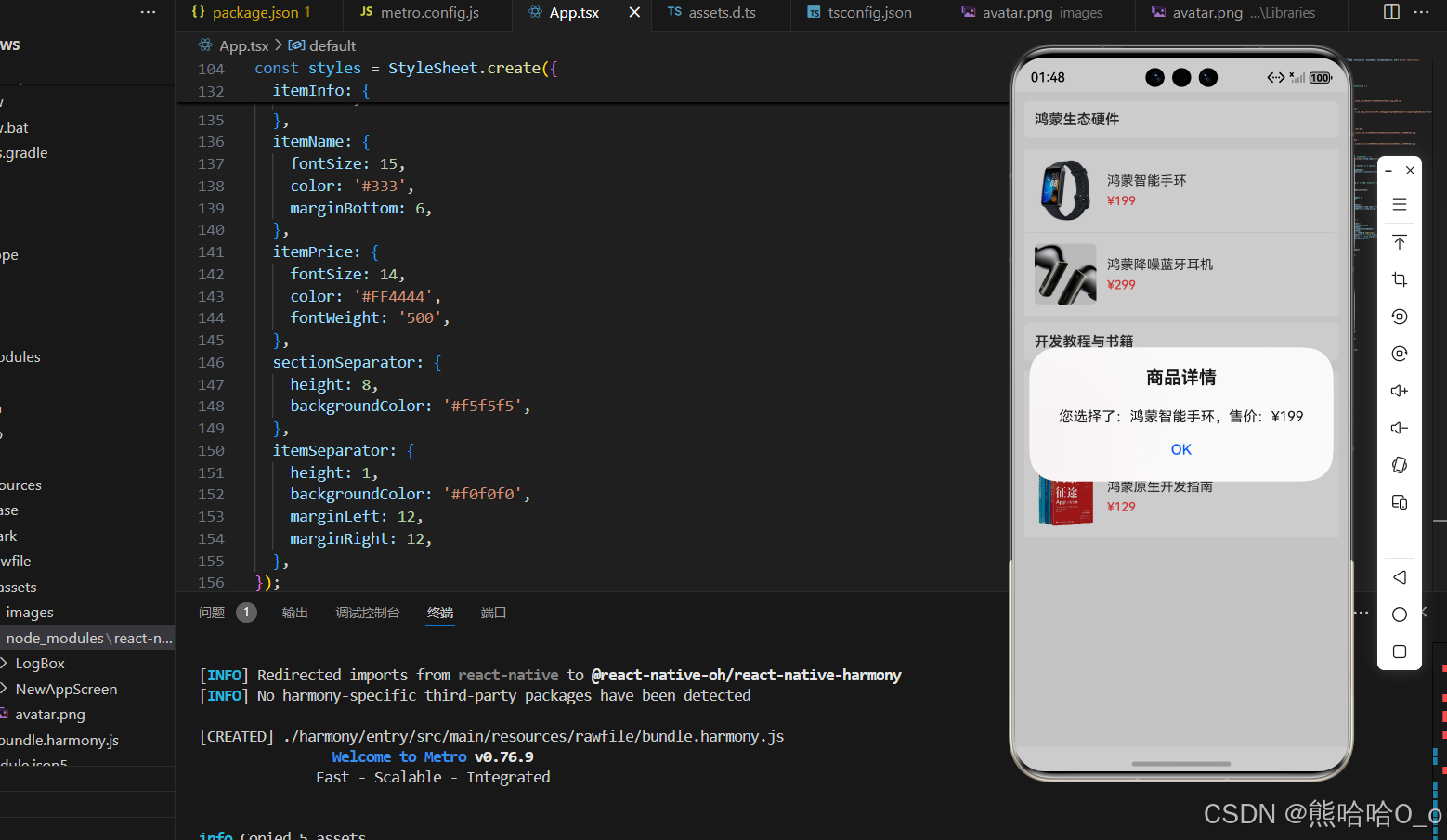
四、高频问题与解决方案
整理了开发中使用 SectionList 时最容易遇到的问题,每个问题均提供精准解决方案,鸿蒙端专属问题已标注,帮助快速排查问题:
-
❌ 问题 1:分组列表不显示,页面一片空白✔ 解决方案:检查
sections数据源格式是否正确(必须包含title和data字段);确认renderSectionHeader和renderItem两个核心属性已配置,且返回有效的 JSX 元素。 -
❌ 问题 2:分组头部样式异常,与列表项重叠✔ 解决方案:给分组头部设置明确的内边距(padding)或外边距(margin);检查是否给 SectionList 设置了 overflow: 'hidden' 导致样式遮挡。
-
❌ 问题 3:滑动列表时,组件复用错乱(内容显示错误)✔ 解决方案:检查
keyExtractor是否返回唯一值,确保不同分组、不同列表项的 key 不重复;避免使用索引作为 key。 -
❌ 问题 4:分组分割线不显示✔ 解决方案:确认
SectionSeparatorComponent属性名首字母大写(RN 组件属性大小写敏感);给分割线组件设置明确的高度和背景色。 -
❌ 问题 5:鸿蒙真机上滚动卡顿,动画不流畅✔ 解决方案:使用固定列表项高度;减少列表项中的复杂嵌套布局;避免在列表项中使用大量 Image 组件(可使用图片懒加载优化)。
欢迎加入开源鸿蒙跨平台社区:https://openharmonycrossplatform.csdn.net

讨论HarmonyOS开发技术,专注于API与组件、DevEco Studio、测试、元服务和应用上架分发等。
更多推荐

 9
9 0
0- 0


 已为社区贡献45条内容

所有评论(0)