Flutter框架开发鸿蒙项目——OutlinedButton详解
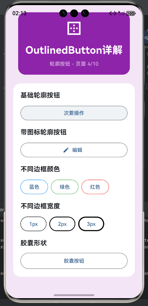
一、OutlinedButton概述
OutlinedButton是介于ElevatedButton和TextButton之间的按钮类型,具有边框但没有背景色。它在视觉上比TextButton突出,但比ElevatedButton低调,适合中等重要性的操作。OutlinedButton通过边框提供视觉边界,让按钮在界面中更加清晰可辨。边框颜色通常与主题色一致,按下或悬停时会有颜色变化和波纹效果,提供交互反馈。OutlinedButton是Material Design推荐的替代旧版OutlineButton的新组件。
OutlinedButton特点
| 特性 | 说明 | 设计意图 | 适用场景 |
|---|---|---|---|
| 有边框 | 有轮廓边框 | 视觉边界清晰 | 中等操作 |
| 无背景 | 透明背景 | 轻量级设计 | 不抢主次 |
| 可定制 | 边框样式灵活 | 适应不同设计 | 个性定制 |
| 波纹反馈 | 点击有涟漪 | 交互反馈 | 用户感知 |
| 中等权重 | 视觉中等突出 | 平衡主次 | 中层操作 |
| 圆角设计 | 标准圆角 | 现代感 | 视觉柔和 |
| 状态响应 | 不同状态不同样式 | 状态清晰 | 交互明确 |
| 灵活搭配 | 与其他按钮配合 | 层次丰富 | 组合使用 |
按钮类型选择流程
三种按钮对比
| 特性 | ElevatedButton | OutlinedButton | TextButton |
|---|---|---|---|
| 背景色 | 有 | 无 | 无 |
| 边框 | 无 | 有 | 无 |
| 阴影 | 有 | 无 | 无 |
| 视觉权重 | 高 | 中 | 低 |
| 适用场景 | 主要操作 | 中等操作 | 辅助操作 |
| 空间占用 | 最大 | 中等 | 最小 |
| 交互反馈 | 波纹+阴影 | 波纹+边框 | 波纹 |
二、OutlinedButton应用场景
OutlinedButton适用于需要强调但不是主要操作的场景。当操作的重要性介于主要操作和次要操作之间时,使用OutlinedButton可以获得平衡的视觉效果。在表单中,用于编辑、修改等中等重要操作。在对话框中,用于稍后、跳过等选项。在卡片或列表中,用于收藏、编辑等功能。OutlinedButton可以与ElevatedButton搭配,形成主次分明的设计层次,也可以与TextButton搭配,区分中等和次要操作。
应用场景分类
| 场景类型 | 示例文案 | 按钮位置 | 重要程度 | 搭配按钮 |
|---|---|---|---|---|
| 编辑操作 | 编辑、修改 | 卡片右侧 | 中等 | 删除(红色) |
| 导航操作 | 上一页、下一页 | 页面底部 | 中等 | 返回首页 |
| 选择操作 | 选择、浏览 | 选项旁 | 中等 | 确认(主要) |
| 稍后操作 | 稍后、跳过 | 对话框 | 中等 | 取消(次要) |
| 详情操作 | 查看详情、展开 | 列表项 | 中等 | 分享(次要) |
| 收藏操作 | 收藏、喜欢 | 卡片角落 | 中等 | 分享(次要) |
| 过滤操作 | 筛选、排序 | 顶部栏 | 中等 | 重置(次要) |
| 下载操作 | 下载、保存 | 内容下方 | 中等 | 打开(主要) |
场景示例
// 对话框按钮组合
AlertDialog(
  title: Text('保存更改'),
  content: Text('是否保存对文档的更改?'),
  actions: [
    TextButton(
      onPressed: () {},
      child: Text('不保存'),
    ),
    OutlinedButton(
      onPressed: () {},
      child: Text('稍后'),
    ),
    ElevatedButton(
      onPressed: () {},
      child: Text('保存'),
    ),
  ],
)

// 卡片操作按钮
Card(
  child: Padding(
    padding: EdgeInsets.all(16),
    child: Column(
      crossAxisAlignment: CrossAxisAlignment.start,
      children: [
        Text('Flutter开发指南', style: TextStyle(fontSize: 18)),
        SizedBox(height: 8),
        Text('¥99.99', style: TextStyle(fontSize: 24, color: Colors.red)),
        SizedBox(height: 16),
        Row(
          children: [
            OutlinedButton.icon(
              icon: Icon(Icons.edit, size: 18),
              label: Text('编辑'),
              onPressed: () {},
            ),
            SizedBox(width: 16),
            OutlinedButton.icon(
              icon: Icon(Icons.delete, size: 18),
              label: Text('删除'),
              style: OutlinedButton.styleFrom(
                foregroundColor: Colors.red,
                side: BorderSide(color: Colors.red),
              ),
              onPressed: () {},
            ),
          ],
        ),
      ],
    ),
  ),
)
三、基础属性详解
OutlinedButton的核心属性与ElevatedButton和TextButton类似,包括onPressed、onLongPress、child、style等。onPressed是必需属性,设置为null时按钮进入禁用状态。onLongPress提供长按回调。child属性定义按钮内容,通常是Text widget。style属性通过ButtonStyle或OutlinedButton.styleFrom控制样式。autofocus和focusNode用于焦点管理。OutlinedButton的特色是可以通过side属性自定义边框样式。
核心属性说明
| 属性 | 类型 | 默认值 | 必需 | 说明 |
|---|---|---|---|---|
| onPressed | VoidCallback | - | 是 | 点击回调,null表示禁用 |
| onLongPress | VoidCallback | null | 否 | 长按回调 |
| child | Widget | - | 是 | 按钮内容 |
| style | ButtonStyle | 主题样式 | 否 | 按钮样式配置 |
| autofocus | bool | false | 否 | 是否自动聚焦 |
| focusNode | FocusNode | null | 否 | 焦点节点 |
基础用法示例
// 最简单的OutlinedButton
OutlinedButton(
  onPressed: () {
    print('点击了轮廓按钮');
  },
  child: Text('边框按钮'),
)

// 带长按事件
OutlinedButton(
  onPressed: () {
    print('点击');
  },
  onLongPress: () {
    print('长按');
  },
  child: Text('长按我'),
)

// 自定义边框样式
OutlinedButton(
  style: OutlinedButton.styleFrom(
    foregroundColor: Colors.blue,
    side: BorderSide(color: Colors.blue, width: 2),
  ),
  onPressed: () {},
  child: Text('蓝色边框'),
)
四、样式定制方法
OutlinedButton的样式定制主要通过OutlinedButton.styleFrom静态方法或ButtonStyle构造函数实现。styleFrom提供了便捷的参数来设置前景色、背景色、边框、内边距等。side属性是OutlinedButton的关键属性,用于设置边框的颜色、宽度和样式。foregroundColor控制文字和图标的颜色,也影响边框颜色。backgroundColor通常保持透明,但在某些状态下可以设置背景色。padding控制内边距,shape控制形状。
styleFrom常用参数
| 参数 | 类型 | 说明 | 示例 |
|---|---|---|---|
| foregroundColor | Color | 前景色(文字/图标/边框) | Colors.blue |
| backgroundColor | Color | 背景色(通常为空) | Colors.transparent |
| disabledForegroundColor | Color | 禁用时的前景色 | Colors.grey |
| side | BorderSide | 边框样式 | BorderSide(color: Colors.blue) |
| padding | EdgeInsetsGeometry | 内边距 | EdgeInsets.all(8) |
| minimumSize | Size | 最小尺寸 | Size(40, 32) |
| shape | OutlinedBorder | 形状 | RoundedRectangleBorder |
| textStyle | TextStyle | 文字样式 | TextStyle(fontSize: 16) |
样式定制示例
// 自定义颜色
OutlinedButton(
  style: OutlinedButton.styleFrom(
    foregroundColor: Colors.blue,
    side: BorderSide(color: Colors.blue, width: 2),
  ),
  onPressed: () {},
  child: Text('蓝色边框'),
)

// 不同边框宽度
OutlinedButton(
  style: OutlinedButton.styleFrom(
    foregroundColor: Colors.green,
    side: BorderSide(color: Colors.green, width: 3),
  ),
  onPressed: () {},
  child: Text('粗边框'),
)

// 虚线边框
OutlinedButton(
  style: OutlinedButton.styleFrom(
    foregroundColor: Colors.purple,
    side: BorderSide(
      color: Colors.purple,
      width: 2,
      style: BorderStyle.solid,
    ),
    shape: RoundedRectangleBorder(
      borderRadius: BorderRadius.circular(8),
    ),
  ),
  onPressed: () {},
  child: Text('圆角边框'),
)

// 胶囊形状
OutlinedButton(
  style: OutlinedButton.styleFrom(
    foregroundColor: Colors.orange,
    side: BorderSide(color: Colors.orange),
    shape: StadiumBorder(),
    padding: EdgeInsets.symmetric(horizontal: 24, vertical: 12),
  ),
  onPressed: () {},
  child: Text('胶囊边框'),
)
五、边框样式定制
边框是OutlinedButton的核心视觉元素,通过side属性可以精细控制边框的样式。BorderSide包含color(颜色)、width(宽度)、style(样式)三个属性。color可以是任何颜色,通常使用主题色或功能色。width控制边框的粗细,默认为1.0,可以根据需要调整。style可以是solid(实线)或none(无边框)。边框样式也可以根据按钮状态动态变化,如按下时加粗、悬停时变色等。
边框样式参数
| 参数 | 类型 | 默认值 | 说明 | 常用值 |
|---|---|---|---|---|
| color | Color | - | 边框颜色 | Colors.blue, Colors.red |
| width | double | 1.0 | 边框宽度 | 1.0, 2.0, 3.0 |
| style | BorderStyle | solid | 边框样式 | BorderStyle.solid |
边框样式示例
// 不同颜色的边框
Row(
  children: [
    OutlinedButton(
      style: OutlinedButton.styleFrom(
        side: BorderSide(color: Colors.blue),
      ),
      onPressed: () {},
      child: Text('蓝色'),
    ),
    SizedBox(width: 16),
    OutlinedButton(
      style: OutlinedButton.styleFrom(
        side: BorderSide(color: Colors.green),
      ),
      onPressed: () {},
      child: Text('绿色'),
    ),
    SizedBox(width: 16),
    OutlinedButton(
      style: OutlinedButton.styleFrom(
        side: BorderSide(color: Colors.red),
      ),
      onPressed: () {},
      child: Text('红色'),
    ),
  ],
)

// 不同宽度的边框
Row(
  children: [
    OutlinedButton(
      style: OutlinedButton.styleFrom(
        side: BorderSide(width: 1),
      ),
      onPressed: () {},
      child: Text('1px'),
    ),
    SizedBox(width: 16),
    OutlinedButton(
      style: OutlinedButton.styleFrom(
        side: BorderSide(width: 2),
      ),
      onPressed: () {},
      child: Text('2px'),
    ),
    SizedBox(width: 16),
    OutlinedButton(
      style: OutlinedButton.styleFrom(
        side: BorderSide(width: 3),
      ),
      onPressed: () {},
      child: Text('3px'),
    ),
  ],
)

// 状态响应式边框
OutlinedButton(
  style: ButtonStyle(
    side: MaterialStateProperty.resolveWith((states) {
      if (states.contains(MaterialState.pressed)) {
        return BorderSide(color: Colors.blue.shade700, width: 2);
      }
      if (states.contains(MaterialState.hovered)) {
        return BorderSide(color: Colors.blue.shade600, width: 2);
      }
      return BorderSide(color: Colors.blue, width: 1.5);
    }),
  ),
  onPressed: () {},
  child: Text('状态响应边框'),
)
六、带图标的OutlinedButton
OutlinedButton支持显示图标,通过icon构造函数或自定义child实现。带图标的OutlinedButton可以在保持边框的同时提供更丰富的视觉表达。图标和文字的组合让按钮功能更加清晰,适合编辑、收藏、分享等操作。图标可以使用Icons中的预定义图标,也可以使用自定义图片。icon构造函数需要提供icon和label两个参数,图标在左,文字在右。
图标按钮设计
| 原则 | 说明 | 注意事项 |
|---|---|---|
| 图标清晰 | 使用明确的图标 | 避免复杂图标 |
| 尺寸合适 | 图标不要太大 | iconSize: 18-20 |
| 颜色一致 | 与边框和文字一致 | 使用foregroundColor |
| 间距合理 | 自动调整间距 | 默认即可 |
| 语义化 | 图标表达含义 | 辅助理解 |
带图标示例
// 使用icon构造函数
OutlinedButton.icon(
  icon: Icon(Icons.edit, size: 18),
  label: Text('编辑'),
  onPressed: () {},
)

OutlinedButton.icon(
  icon: Icon(Icons.favorite_border, size: 18),
  label: Text('收藏'),
  onPressed: () {},
  style: OutlinedButton.styleFrom(
    foregroundColor: Colors.red,
    side: BorderSide(color: Colors.red),
  ),
)

OutlinedButton.icon(
  icon: Icon(Icons.share, size: 18),
  label: Text('分享'),
  onPressed: () {},
)

// 自定义布局
OutlinedButton(
  onPressed: () {},
  style: OutlinedButton.styleFrom(padding: EdgeInsets.symmetric(horizontal: 12)),
  child: Row(
    mainAxisSize: MainAxisSize.min,
    children: [
      Icon(Icons.download, size: 16),
      SizedBox(width: 4),
      Text('下载'),
    ],
  ),
)

// 仅图标
OutlinedButton(
  onPressed: () {},
  style: OutlinedButton.styleFrom(
    minimumSize: Size(48, 48),
    padding: EdgeInsets.zero,
    shape: CircleBorder(),
  ),
  child: Icon(Icons.add),
)
七、OutlinedButton禁用状态
OutlinedButton的禁用状态通过将onPressed设置为null来触发。禁用时,按钮的边框颜色和文字颜色会变为灰色且透明度降低,波纹效果也会禁用。禁用状态对于提供用户反馈和防止误操作非常重要。可以通过disabledForegroundColor和disabledSide属性自定义禁用样式,也可以使用MaterialStateProperty实现更精细的状态控制。
禁用状态应用
| 场景 | 禁用条件 | 恢复条件 | 示例 |
|---|---|---|---|
| 内容为空 | 没有内容 | 有内容 | “编辑” |
| 权限不足 | 没有权限 | 获得权限 | “修改” |
| 已完成 | 操作已完成 | 重新开始 | “重做” |
| 加载中 | 正在加载 | 加载完成 | “保存” |
| 依赖条件 | 前置条件未满足 | 条件满足 | “下一步” |
禁用状态示例
// 基础禁用
OutlinedButton(
onPressed: null,
child: Text('禁用'),
)
// 自定义禁用样式
OutlinedButton(
style: OutlinedButton.styleFrom(
foregroundColor: Colors.blue,
side: BorderSide(color: Colors.blue),
disabledForegroundColor: Colors.grey.shade400,
disabledBackgroundColor: Colors.transparent,
),
onPressed: null,
child: Text('自定义禁用'),
)
// 动态禁用
class DynamicDisableOutlinedButton extends StatefulWidget {
State<DynamicDisableOutlinedButton> createState() => _DynamicDisableOutlinedButtonState();
}
class _DynamicDisableOutlinedButtonState extends State<DynamicDisableOutlinedButton> {
bool _hasChanges = false;
String _content = '';
Widget build(BuildContext context) {
return Column(
children: [
TextField(
decoration: InputDecoration(labelText: '输入内容'),
onChanged: (value) {
setState(() {
_content = value;
_hasChanges = value.isNotEmpty;
});
},
),
SizedBox(height: 16),
OutlinedButton.icon(
icon: Icon(Icons.save, size: 18),
label: Text('保存更改'),
onPressed: _hasChanges ? () {
print('保存: $_content');
} : null,
),
],
);
}
}
八、OutlinedButton最佳实践
在实际开发中,使用OutlinedButton应该遵循一些最佳实践。OutlinedButton应该用于中等重要性的操作,不要用于主要操作或过于次要的操作。边框颜色应该与主题色一致,保持视觉统一。按钮文案应该简洁明了,使用动作动词。禁用状态要清晰,提供用户反馈。可以与ElevatedButton、TextButton搭配使用,形成完整的设计层次。
按钮使用指南
| 操作重要性 | 推荐按钮 | 文案风格 | 位置 |
|---|---|---|---|
| 主要操作 | ElevatedButton | 强动词 | 右侧或底部 |
| 中等操作 | OutlinedButton | 标准动词 | 中间位置 |
| 次要操作 | TextButton | 弱动词 | 左侧或底部 |
| 危险操作 | 红色OutlinedButton | 删除、移除 | 右侧 |
| 信息操作 | 蓝色OutlinedButton | 查看、详情 | 右侧 |
组合使用示例
// 对话框按钮组合
AlertDialog(
  title: Text('确认操作'),
  content: Text('确定要执行此操作吗?'),
  actions: [
    TextButton(
      onPressed: () {},
      child: Text('取消'),
    ),
    OutlinedButton(
      onPressed: () {},
      child: Text('稍后'),
    ),
    ElevatedButton(
      onPressed: () {},
      child: Text('确定'),
    ),
  ],
)

// 卡片操作按钮
Card(
  child: Padding(
    padding: EdgeInsets.all(16),
    child: Column(
      crossAxisAlignment: CrossAxisAlignment.start,
      children: [
        Text('项目标题', style: TextStyle(fontSize: 18)),
        SizedBox(height: 8),
        Text('项目描述内容'),
        SizedBox(height: 16),
        Row(
          children: [
            OutlinedButton.icon(
              icon: Icon(Icons.edit_outline, size: 18),
              label: Text('编辑'),
              onPressed: () {},
            ),
            SizedBox(width: 12),
            OutlinedButton.icon(
              icon: Icon(Icons.share, size: 18),
              label: Text('分享'),
              onPressed: () {},
            ),
            SizedBox(width: 12),
            OutlinedButton.icon(
              icon: Icon(Icons.delete_outline, size: 18),
              label: Text('删除'),
              style: OutlinedButton.styleFrom(
                foregroundColor: Colors.red,
                side: BorderSide(color: Colors.red),
              ),
              onPressed: () {},
            ),
          ],
        ),
      ],
    ),
  ),
)

// 表单按钮
Column(
  children: [
    TextField(decoration: InputDecoration(labelText: '用户名')),
    SizedBox(height: 16),
    TextField(decoration: InputDecoration(labelText: '密码')),
    SizedBox(height: 24),
    Row(
      children: [
        OutlinedButton(
          onPressed: () {},
          child: Text('清空'),
        ),
        SizedBox(width: 12),
        OutlinedButton(
          onPressed: () {},
          child: Text('重置'),
        ),
        Spacer(),
        ElevatedButton(
          onPressed: () {},
          child: Text('登录'),
        ),
      ],
    ),
  ],
)
欢迎加入开源鸿蒙跨平台社区:https://openharmonycrossplatform.csdn.net

讨论HarmonyOS开发技术,专注于API与组件、DevEco Studio、测试、元服务和应用上架分发等。
更多推荐

 14
14 0
0- 0



 已为社区贡献16条内容

所有评论(0)