Flutter 框架跨平台鸿蒙开发——Button综合应用
Button综合应用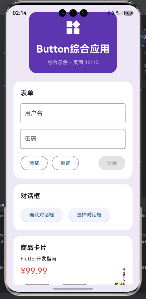
一、综合应用概述
Button组件在实际项目中应用广泛,从简单的表单提交到复杂的交互界面都离不开按钮。综合应用展示了Button组件在不同场景下的使用方式,包括表单按钮、对话框按钮、卡片操作按钮、工具栏按钮等。掌握这些综合应用场景,能帮助开发者在实际项目中合理使用Button组件,构建优秀的用户界面。
应用场景分类
| 场景类型 | 主要按钮 | 次要按钮 | 特点 | 复杂度 |
|---|---|---|---|---|
| 表单操作 | ElevatedButton | OutlinedButton | 验证、提交 | 中等 |
| 对话框操作 | ElevatedButton | TextButton | 确认、取消 | 简单 |
| 卡片操作 | OutlinedButton | TextButton | 编辑、删除 | 中等 |
| 工具栏操作 | IconButton | - | 快速访问 | 简单 |
| 列表操作 | IconButton | TextButton | 行操作 | 中等 |
| 网格操作 | OutlinedButton | - | 多选操作 | 中等 |
| 分页操作 | TextButton | OutlinedButton | 翻页控制 | 简单 |
| 文件操作 | OutlinedButton | TextButton | 上传、下载 | 中等 |
二、表单按钮应用
表单中的按钮是用户完成数据输入后执行操作的主要入口。表单按钮通常包括提交、重置、清空等操作。提交按钮使用ElevatedButton,是表单的主要操作,应该最醒目。重置和清空按钮使用OutlinedButton或TextButton,是次要操作,应该位于提交按钮之前或下方。表单按钮应该有清晰的禁用状态,当表单未验证通过时禁用提交按钮。
表单按钮布局模式
| 模式 | 布局方式 | 主按钮位置 | 次按钮位置 | 适用场景 |
|---|---|---|---|---|
| 标准模式 | 底部固定 | 右侧 | 左侧 | 常见表单 |
| 堆叠模式 | 垂直堆叠 | 底部 | 上方 | 移动端表单 |
| 展开模式 | 可展开 | 隐藏时显示 | 展开时显示 | 复杂表单 |
| 内联模式 | 行内显示 | 右侧 | 左侧 | 简单表单 |
表单按钮示例
class FormButtonsExample extends StatefulWidget {
State<FormButtonsExample> createState() => _FormButtonsExampleState();
}
class _FormButtonsExampleState extends State<FormButtonsExample> {
final _formKey = GlobalKey<FormState>();
final _usernameController = TextEditingController();
final _passwordController = TextEditingController();
bool _isValid = false;
void _validateForm() {
final isValid = _formKey.currentState?.validate() ?? false;
setState(() {
_isValid = isValid;
});
}
void _handleSubmit() {
if (_formKey.currentState?.validate() ?? false) {
print('提交表单');
print('用户名: ${_usernameController.text}');
print('密码: ${_passwordController.text}');
}
}
void _handleReset() {
_formKey.currentState?.reset();
_usernameController.clear();
_passwordController.clear();
setState(() => _isValid = false);
}
void _handleClear() {
_usernameController.clear();
_passwordController.clear();
setState(() => _isValid = false);
}
Widget build(BuildContext context) {
return Scaffold(
appBar: AppBar(title: Text('表单按钮')),
body: Padding(
padding: EdgeInsets.all(16),
child: Form(
key: _formKey,
child: Column(
children: [
TextFormField(
controller: _usernameController,
decoration: InputDecoration(
labelText: '用户名',
border: OutlineInputBorder(),
),
validator: (value) {
if (value == null || value.isEmpty) {
return '请输入用户名';
}
if (value.length < 3) {
return '用户名至少3个字符';
}
return null;
},
onChanged: (_) => _validateForm(),
),
SizedBox(height: 16),
TextFormField(
controller: _passwordController,
decoration: InputDecoration(
labelText: '密码',
border: OutlineInputBorder(),
),
obscureText: true,
validator: (value) {
if (value == null || value.isEmpty) {
return '请输入密码';
}
if (value.length < 6) {
return '密码至少6个字符';
}
return null;
},
onChanged: (_) => _validateForm(),
),
Spacer(),
Divider(),
Padding(
padding: EdgeInsets.symmetric(vertical: 16),
child: Row(
children: [
OutlinedButton(
onPressed: _handleClear,
child: Text('清空'),
),
SizedBox(width: 12),
OutlinedButton(
onPressed: _handleReset,
child: Text('重置'),
),
Spacer(),
ElevatedButton(
onPressed: _isValid ? _handleSubmit : null,
style: ElevatedButton.styleFrom(
backgroundColor: _isValid ? Colors.blue : Colors.grey,
),
child: Text('登录'),
),
],
),
),
],
),
),
),
);
}
void dispose() {
_usernameController.dispose();
_passwordController.dispose();
super.dispose();
}
}
三、对话框按钮应用
对话框中的按钮用于确认或取消某个操作,是重要的用户交互入口。Material Design提供了AlertDialog、SimpleDialog等多种对话框类型。对话框按钮通常放在actions属性中,使用TextButton表示取消操作,OutlinedButton表示次要操作,ElevatedButton表示主要确认操作。按钮应该有清晰的文案,如"确定"、“取消”、"删除"等。
对话框按钮布局
| 对话框类型 | 按钮数量 | 主要按钮 | 次要按钮 | 最少按钮 |
|---|---|---|---|---|
| 确认对话框 | 2个 | 确定 | 取消 | 取消 |
| 警告对话框 | 2个 | 继续 | 取消 | 取消 |
| 信息对话框 | 1个 | 确定 | - | 确定 |
| 选择对话框 | 多个 | - | 多个选项 | 2个选项 |
对话框按钮示例
// 确认对话框
void _showConfirmDialog(BuildContext context) {
  showDialog(
    context: context,
    builder: (context) => AlertDialog(
      title: Text('确认删除'),
      content: Text('确定要删除此项目吗?此操作不可撤销。'),
      actions: [
        TextButton(
          onPressed: () => Navigator.pop(context, false),
          child: Text('取消'),
        ),
        ElevatedButton(
          onPressed: () => Navigator.pop(context, true),
          style: ElevatedButton.styleFrom(
            backgroundColor: Colors.red,
            foregroundColor: Colors.white,
          ),
          child: Text('删除'),
        ),
      ],
    ),
  );
}

// 警告对话框
void _showWarningDialog(BuildContext context) {
  showDialog(
    context: context,
    builder: (context) => AlertDialog(
      title: Row(
        children: [
          Icon(Icons.warning, color: Colors.orange),
          SizedBox(width: 8),
          Text('警告'),
        ],
      ),
      content: Text('此操作可能会影响其他功能,是否继续?'),
      actions: [
        TextButton(
          onPressed: () => Navigator.pop(context),
          child: Text('取消'),
        ),
        OutlinedButton(
          onPressed: () => Navigator.pop(context),
          child: Text('稍后提醒'),
        ),
        ElevatedButton(
          onPressed: () => Navigator.pop(context),
          child: Text('继续'),
        ),
      ],
    ),
  );
}

// 信息对话框
void _showInfoDialog(BuildContext context) {
  showDialog(
    context: context,
    builder: (context) => AlertDialog(
      title: Text('提示'),
      content: Text('操作已成功完成!'),
      actions: [
        ElevatedButton(
          onPressed: () => Navigator.pop(context),
          child: Text('确定'),
        ),
      ],
    ),
  );
}

// 选择对话框
void _showChoiceDialog(BuildContext context) {
  showDialog(
    context: context,
    builder: (context) => SimpleDialog(
      title: Text('请选择'),
      children: [
        SimpleDialogOption(
          onPressed: () => Navigator.pop(context, 1),
          child: Row(
            children: [
              Icon(Icons.star, color: Colors.amber),
              SizedBox(width: 16),
              Text('选项1'),
            ],
          ),
        ),
        SimpleDialogOption(
          onPressed: () => Navigator.pop(context, 2),
          child: Row(
            children: [
              Icon(Icons.star, color: Colors.amber),
              SizedBox(width: 16),
              Text('选项2'),
            ],
          ),
        ),
        SimpleDialogOption(
          onPressed: () => Navigator.pop(context, 3),
          child: Row(
            children: [
              Icon(Icons.star, color: Colors.amber),
              SizedBox(width: 16),
              Text('选项3'),
            ],
          ),
        ),
      ],
    ),
  );
}
四、卡片操作按钮应用
卡片中的按钮用于对卡片内容进行操作,如收藏、分享、编辑、删除等。卡片按钮通常放在卡片的底部或右上角,使用IconButton或OutlinedButton。重要的操作如删除可以用红色强调,收藏操作可以用心形图标表示已收藏状态。卡片按钮应该有合适的间距,避免拥挤。
卡片按钮布局
| 位置 | 按钮类型 | 适用操作 | 数量 |
|---|---|---|---|
| 底部 | Row | 主要操作 | 2-3个 |
| 右上角 | Stack | 快速操作 | 1-2个 |
| 左上角 | Stack | 状态标记 | 1个 |
| 叠加 | Positioned | 悬浮操作 | 1个 |
卡片按钮示例
class CardButtonsExample extends StatelessWidget {
const CardButtonsExample({super.key});
Widget build(BuildContext context) {
return Scaffold(
appBar: AppBar(title: Text('卡片按钮')),
body: ListView(
padding: EdgeInsets.all(16),
children: [
// 商品卡片
Card(
child: Padding(
padding: EdgeInsets.all(16),
child: Column(
crossAxisAlignment: CrossAxisAlignment.start,
children: [
Text(
'Flutter开发指南',
style: TextStyle(fontSize: 18, fontWeight: FontWeight.bold),
),
SizedBox(height: 8),
Text(
'全面介绍Flutter开发的各个方面,适合初学者和进阶开发者。',
style: TextStyle(color: Colors.grey),
),
SizedBox(height: 16),
Row(
children: [
Text(
'¥99.99',
style: TextStyle(
fontSize: 24,
color: Colors.red,
fontWeight: FontWeight.bold,
),
),
SizedBox(width: 16),
Text(
'¥199.99',
style: TextStyle(
fontSize: 16,
color: Colors.grey,
decoration: TextDecoration.lineThrough,
),
),
],
),
SizedBox(height: 16),
Row(
children: [
OutlinedButton.icon(
icon: Icon(Icons.favorite_border, size: 18),
label: Text('收藏'),
onPressed: () {},
),
SizedBox(width: 12),
OutlinedButton.icon(
icon: Icon(Icons.share, size: 18),
label: Text('分享'),
onPressed: () {},
),
Spacer(),
ElevatedButton.icon(
icon: Icon(Icons.shopping_cart, size: 18),
label: Text('加入购物车'),
onPressed: () {},
),
],
),
],
),
),
),
SizedBox(height: 16),
// 列表项卡片
Card(
child: ListTile(
leading: CircleAvatar(child: Text('A')),
title: Text('项目名称'),
subtitle: Text('项目描述内容'),
trailing: Row(
mainAxisSize: MainAxisSize.min,
children: [
IconButton(
icon: Icon(Icons.edit_outline),
tooltip: '编辑',
onPressed: () {},
),
IconButton(
icon: Icon(Icons.delete_outline),
tooltip: '删除',
color: Colors.red.shade400,
onPressed: () {},
),
],
),
),
),
SizedBox(height: 16),
// 带状态按钮的卡片
Card(
child: Stack(
children: [
Padding(
padding: EdgeInsets.all(16),
child: Column(
crossAxisAlignment: CrossAxisAlignment.start,
children: [
Text(
'促销活动',
style: TextStyle(
fontSize: 18,
fontWeight: FontWeight.bold,
),
),
SizedBox(height: 8),
Text('限时特惠,不容错过!'),
SizedBox(height: 16),
ElevatedButton(
onPressed: () {},
child: Text('立即参与'),
),
],
),
),
Positioned(
top: 8,
right: 8,
child: Container(
padding: EdgeInsets.symmetric(horizontal: 8, vertical: 4),
decoration: BoxDecoration(
color: Colors.red,
borderRadius: BorderRadius.circular(12),
),
child: Text(
'限时',
style: TextStyle(color: Colors.white, fontSize: 12),
),
),
),
],
),
),
],
),
);
}
}
五、工具栏按钮应用
工具栏按钮通常放在AppBar或独立的工具栏中,提供快速访问常用功能。工具栏按钮使用IconButton,应该有tooltip提示帮助用户理解功能。工具栏按钮可以使用Divider进行逻辑分组,相关功能的按钮放在一起。工具栏按钮数量应该适中,通常3-5个,过多可以使用PopupMenuButton。
工具栏按钮布局
| 位置 | 按钮类型 | 分隔符 | 数量 |
|---|---|---|---|
| AppBar右侧 | IconButton | Divider | 3-5个 |
| AppBar左侧 | IconButton | - | 1-2个 |
| 独立工具栏 | IconButton | Divider | 不限 |
| 悬浮工具栏 | IconButton | Divider | 3-5个 |
工具栏按钮示例
class ToolbarButtonsExample extends StatelessWidget {
const ToolbarButtonsExample({super.key});
Widget build(BuildContext context) {
return Scaffold(
appBar: AppBar(
title: Text('工具栏按钮'),
actions: [
IconButton(
icon: Icon(Icons.search),
tooltip: '搜索',
onPressed: () {},
),
IconButton(
icon: Icon(Icons.filter_list),
tooltip: '筛选',
onPressed: () {},
),
VerticalDivider(),
IconButton(
icon: Icon(Icons.refresh),
tooltip: '刷新',
onPressed: () {},
),
PopupMenuButton<String>(
icon: Icon(Icons.more_vert),
tooltip: '更多',
onSelected: (value) {
print('选择了: $value');
},
itemBuilder: (context) => [
PopupMenuItem(
value: 'settings',
child: ListTile(
leading: Icon(Icons.settings),
title: Text('设置'),
),
),
PopupMenuItem(
value: 'about',
child: ListTile(
leading: Icon(Icons.info),
title: Text('关于'),
),
),
],
),
],
),
body: Column(
children: [
// 独立工具栏
Container(
height: 56,
color: Colors.grey.shade100,
padding: EdgeInsets.symmetric(horizontal: 16),
child: Row(
children: [
IconButton(
icon: Icon(Icons.format_bold),
tooltip: '加粗',
onPressed: () {},
),
IconButton(
icon: Icon(Icons.format_italic),
tooltip: '斜体',
onPressed: () {},
),
IconButton(
icon: Icon(Icons.format_underlined),
tooltip: '下划线',
onPressed: () {},
),
VerticalDivider(),
IconButton(
icon: Icon(Icons.format_align_left),
tooltip: '左对齐',
onPressed: () {},
),
IconButton(
icon: Icon(Icons.format_align_center),
tooltip: '居中对齐',
onPressed: () {},
),
IconButton(
icon: Icon(Icons.format_align_right),
tooltip: '右对齐',
onPressed: () {},
),
Spacer(),
IconButton(
icon: Icon(Icons.close),
tooltip: '关闭',
onPressed: () {},
),
],
),
),
Divider(),
Expanded(
child: Center(
child: Text('工具栏按钮示例'),
),
),
],
),
// 悬浮按钮
floatingActionButton: FloatingActionButton(
onPressed: () {},
child: Icon(Icons.add),
tooltip: '添加',
),
);
}
}
六、列表操作按钮应用
列表中的按钮用于对列表项进行操作,通常放在ListTile的trailing属性中。列表操作按钮使用IconButton或TextButton,常见的操作包括编辑、删除、分享、收藏等。删除操作可以用红色强调,收藏操作可以用图标切换状态。列表按钮应该有tooltip提示,帮助用户理解功能。
列表按钮布局
| 位置 | 按钮类型 | 数量 | 操作类型 |
|---|---|---|---|
| trailing | IconButton | 1-3个 | 快速操作 |
| leading | IconButton | 1个 | 状态标记 |
| title后 | TextButton | 1个 | 详情跳转 |
列表按钮示例
class ListButtonsExample extends StatefulWidget {
State<ListButtonsExample> createState() => _ListButtonsExampleState();
}
class _ListButtonsExampleState extends State<ListButtonsExample> {
final List<Map<String, dynamic>> _items = [
{'title': '项目1', 'description': '项目描述1', 'favorite': false},
{'title': '项目2', 'description': '项目描述2', 'favorite': true},
{'title': '项目3', 'description': '项目描述3', 'favorite': false},
];
void _toggleFavorite(int index) {
setState(() {
_items[index]['favorite'] = !_items[index]['favorite'];
});
}
void _deleteItem(int index) {
setState(() {
_items.removeAt(index);
});
}
Widget build(BuildContext context) {
return Scaffold(
appBar: AppBar(title: Text('列表按钮')),
body: ListView.separated(
itemCount: _items.length,
separatorBuilder: (context, index) => Divider(),
itemBuilder: (context, index) {
final item = _items[index];
return ListTile(
leading: CircleAvatar(child: Text('${index + 1}')),
title: Text(item['title']),
subtitle: Text(item['description']),
trailing: Row(
mainAxisSize: MainAxisSize.min,
children: [
IconButton(
icon: Icon(
item['favorite'] ? Icons.favorite : Icons.favorite_border,
),
color: item['favorite'] ? Colors.red : null,
tooltip: item['favorite'] ? '取消收藏' : '收藏',
onPressed: () => _toggleFavorite(index),
),
IconButton(
icon: Icon(Icons.edit_outline),
tooltip: '编辑',
onPressed: () {
print('编辑: $index');
},
),
IconButton(
icon: Icon(Icons.delete_outline),
tooltip: '删除',
color: Colors.red.shade400,
onPressed: () {
showDialog(
context: context,
builder: (context) => AlertDialog(
title: Text('确认删除'),
content: Text('确定要删除此项目吗?'),
actions: [
TextButton(
onPressed: () => Navigator.pop(context),
child: Text('取消'),
),
ElevatedButton(
onPressed: () {
Navigator.pop(context);
_deleteItem(index);
},
style: ElevatedButton.styleFrom(
backgroundColor: Colors.red,
foregroundColor: Colors.white,
),
child: Text('删除'),
),
],
),
);
},
),
],
),
onTap: () {
print('点击项目: $index');
},
);
},
),
);
}
}
七、加载状态按钮应用
加载状态按钮在异步操作时显示加载进度,防止用户重复点击。加载状态通过替换按钮内容为加载指示器或临时禁用按钮实现。加载状态应该有明确的视觉反馈,让用户知道操作正在进行。加载完成后恢复按钮正常状态,显示成功或失败信息。
加载状态实现
| 方式 | 视觉效果 | 适用场景 | 实现难度 |
|---|---|---|---|
| 禁用按钮 | 灰色不可点 | 简单操作 | 简单 |
| 替换图标 | 显示加载图标 | 图标按钮 | 中等 |
| 显示进度 | 显示百分比 | 长时操作 | 中等 |
| 按钮外显示 | 独立进度条 | 复杂界面 | 简单 |
加载状态示例
class LoadingButtonExample extends StatefulWidget {
State<LoadingButtonExample> createState() => _LoadingButtonExampleState();
}
class _LoadingButtonExampleState extends State<LoadingButtonExample> {
bool _isLoading = false;
bool _isSuccess = false;
Future<void> _handleSubmit() async {
setState(() {
_isLoading = true;
_isSuccess = false;
});
try {
await Future.delayed(Duration(seconds: 2));
setState(() => _isSuccess = true);
await Future.delayed(Duration(seconds: 1));
setState(() => _isSuccess = false);
} catch (e) {
print('错误: $e');
} finally {
setState(() => _isLoading = false);
}
}
Widget build(BuildContext context) {
return Scaffold(
appBar: AppBar(title: Text('加载状态按钮')),
body: Center(
child: ElevatedButton(
onPressed: _isLoading ? null : _handleSubmit,
style: ElevatedButton.styleFrom(
backgroundColor: _isSuccess ? Colors.green : null,
minimumSize: Size(200, 50),
),
child: _isLoading
? SizedBox(
width: 20,
height: 20,
child: CircularProgressIndicator(
strokeWidth: 2,
valueColor: AlwaysStoppedAnimation<Color>(Colors.white),
),
)
: _isSuccess
? Row(
mainAxisSize: MainAxisSize.min,
children: [
Icon(Icons.check, size: 20),
SizedBox(width: 8),
Text('成功'),
],
)
: Text('点击加载'),
),
),
);
}
}
八、Button综合最佳实践
在实际项目中使用Button组件应该遵循一些最佳实践,确保良好的用户体验和代码可维护性。按钮应该有清晰的视觉层次,主要操作用ElevatedButton,次要操作用OutlinedButton或TextButton。按钮文案应该使用动作动词,简洁明了。禁用状态要明确,提供用户反馈。加载状态要显示进度,让用户知道操作正在进行。按钮位置应该保持一致,形成用户习惯。
最佳实践总结
| 实践 | 说明 | 示例 |
|---|---|---|
| 主次分明 | ElevatedButton为主 | 提交用ElevatedButton |
| 文案清晰 | 动词开头 | “提交"优于"我提交” |
| 禁用明确 | 明确禁用状态 | 表单未完成时禁用 |
| 加载反馈 | 显示加载状态 | 网络请求时显示加载 |
| 位置一致 | 统一按钮位置 | 提交按钮总是在右下角 |
| 间距合理 | 8-16dp间距 | 保持一致间距 |
| 颜色统一 | 遵循主题色 | 危险操作用红色 |
| 状态反馈 | 清晰的状态变化 | 点击有波纹效果 |
综合应用示例
class ComprehensiveButtonExample extends StatelessWidget {
const ComprehensiveButtonExample({super.key});
Widget build(BuildContext context) {
return Scaffold(
appBar: AppBar(
title: Text('综合应用'),
actions: [
IconButton(
icon: Icon(Icons.search),
tooltip: '搜索',
onPressed: () {},
),
IconButton(
icon: Icon(Icons.settings),
tooltip: '设置',
onPressed: () {},
),
],
),
body: ListView(
padding: EdgeInsets.all(16),
children: [
// 表单区域
Card(
child: Padding(
padding: EdgeInsets.all(16),
child: Column(
crossAxisAlignment: CrossAxisAlignment.start,
children: [
Text('表单', style: TextStyle(fontSize: 18, fontWeight: FontWeight.bold)),
SizedBox(height: 16),
TextField(decoration: InputDecoration(labelText: '用户名')),
SizedBox(height: 16),
TextField(decoration: InputDecoration(labelText: '密码')),
SizedBox(height: 16),
Row(
children: [
OutlinedButton(
onPressed: () {},
child: Text('清空'),
),
SizedBox(width: 12),
OutlinedButton(
onPressed: () {},
child: Text('重置'),
),
Spacer(),
ElevatedButton(
onPressed: () {},
child: Text('登录'),
),
],
),
],
),
),
),
SizedBox(height: 16),
// 对话框区域
Card(
child: Padding(
padding: EdgeInsets.all(16),
child: Column(
crossAxisAlignment: CrossAxisAlignment.start,
children: [
Text('对话框', style: TextStyle(fontSize: 18, fontWeight: FontWeight.bold)),
SizedBox(height: 16),
Row(
children: [
ElevatedButton(
onPressed: () => _showConfirmDialog(context),
child: Text('确认对话框'),
),
SizedBox(width: 16),
ElevatedButton(
onPressed: () => _showChoiceDialog(context),
child: Text('选择对话框'),
),
],
),
],
),
),
),
SizedBox(height: 16),
// 卡片区域
Card(
child: Padding(
padding: EdgeInsets.all(16),
child: Column(
crossAxisAlignment: CrossAxisAlignment.start,
children: [
Text('商品', style: TextStyle(fontSize: 18, fontWeight: FontWeight.bold)),
SizedBox(height: 8),
Text('Flutter开发指南'),
SizedBox(height: 8),
Text('¥99.99', style: TextStyle(fontSize: 24, color: Colors.red)),
SizedBox(height: 16),
Row(
children: [
OutlinedButton.icon(
icon: Icon(Icons.favorite_border),
label: Text('收藏'),
onPressed: () {},
),
SizedBox(width: 12),
ElevatedButton.icon(
icon: Icon(Icons.shopping_cart),
label: Text('加入购物车'),
onPressed: () {},
),
],
),
],
),
),
),
],
),
);
}
void _showConfirmDialog(BuildContext context) {
showDialog(
context: context,
builder: (context) => AlertDialog(
title: Text('确认'),
content: Text('确定要执行此操作吗?'),
actions: [
TextButton(
onPressed: () => Navigator.pop(context),
child: Text('取消'),
),
ElevatedButton(
onPressed: () => Navigator.pop(context),
child: Text('确定'),
),
],
),
);
}
void _showChoiceDialog(BuildContext context) {
showDialog(
context: context,
builder: (context) => SimpleDialog(
title: Text('选择'),
children: [
SimpleDialogOption(
onPressed: () => Navigator.pop(context, 1),
child: Text('选项1'),
),
SimpleDialogOption(
onPressed: () => Navigator.pop(context, 2),
child: Text('选项2'),
),
],
),
);
}
}
欢迎加入开源鸿蒙跨平台社区:https://openharmonycrossplatform.csdn.net

讨论HarmonyOS开发技术,专注于API与组件、DevEco Studio、测试、元服务和应用上架分发等。
更多推荐

 23
23 0
0- 0



 已为社区贡献20条内容

所有评论(0)