Flutter 框架跨平台鸿蒙开发——Button状态管理
Button状态管理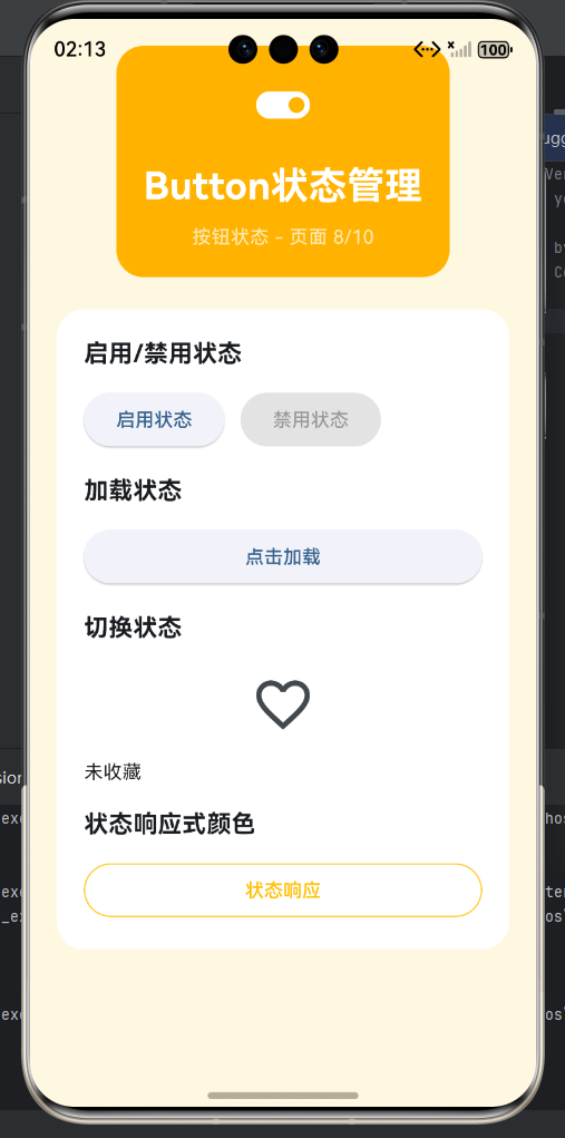
一、Button状态概述
Button组件有丰富的交互状态,包括空闲、悬停、按下、聚焦、禁用、加载等。每种状态都有对应的视觉表现,通过不同的颜色、阴影、透明度等来区分。状态管理不仅影响视觉效果,还影响用户体验,清晰的状态反馈能让用户明确知道按钮的当前状态和可操作性。Material Design为按钮状态定义了标准的行为模式,开发者应该遵循这些规范。
按钮状态生命周期
按钮状态视觉表现
| 状态 | 视觉变化 | ElevatedButton | OutlinedButton | TextButton | IconButton |
|---|---|---|---|---|---|
| 空闲 | 默认样式 | 背景色+阴影 | 边框+文字 | 文字 | 图标 |
| 悬停 | 轻微加深 | 背景变深 | 边框变深 | 文字变深 | 图标变深 |
| 按下 | 阴影减少 | 阴影减小+背景变深 | 边框变粗 | 文字变深 | 图标缩小 |
| 禁用 | 灰色+透明度 | 灰色+低透明度 | 灰色边框 | 灰色文字 | 灰色图标 |
| 加载 | 显示指示器 | 替换为加载动画 | 替换为加载动画 | 禁用 | 替换为加载动画 |
| 聚焦 | 显示焦点环 | 聚焦边框 | 聚焦边框 | 聚焦下划线 | 聚焦边框 |
二、启用/禁用状态
启用和禁用是Button最基本的两种状态,通过onPressed属性控制。当onPressed设置为有效的回调函数时,按钮处于启用状态,可以响应点击。当onPressed设置为null时,按钮自动进入禁用状态,无法响应点击。禁用时,按钮的视觉样式会自动变化,颜色变为灰色且透明度降低,阴影减小或消失,波纹效果禁用。禁用状态对于提供用户反馈和防止误操作非常重要。
禁用状态触发条件
| 条件类型 | 具体场景 | 示例 | 恢复方式 |
|---|---|---|---|
| 内容为空 | 表单未填写完成 | 提交按钮 | 填写内容 |
| 权限不足 | 用户没有相应权限 | 编辑按钮 | 获得权限 |
| 数据不足 | 数量或条件不满足 | 操作按钮 | 满足条件 |
| 网络异常 | 网络不可用 | 请求按钮 | 网络恢复 |
| 操作进行 | 正在执行操作 | 重试按钮 | 操作完成 |
| 依赖条件 | 前置操作未完成 | 下一步按钮 | 完成前置操作 |
| 限制达到 | 数量或次数限制 | 添加按钮 | 重置限制 |
| 已完成 | 操作已完成 | 完成按钮 | 重新开始 |
启用/禁用示例
// 基础禁用
Row(
children: [
ElevatedButton(
onPressed: () {},
child: Text('启用状态'),
),
SizedBox(width: 16),
ElevatedButton(
onPressed: null,
child: Text('禁用状态'),
),
],
)
// 动态禁用
class DynamicDisableButton extends StatefulWidget {
State<DynamicDisableButton> createState() => _DynamicDisableButtonState();
}
class _DynamicDisableButtonState extends State<DynamicDisableButton> {
bool _isValid = false;
String _input = '';
Widget build(BuildContext context) {
return Column(
children: [
TextField(
decoration: InputDecoration(labelText: '请输入内容'),
onChanged: (value) {
setState(() {
_input = value;
_isValid = value.length >= 3;
});
},
),
SizedBox(height: 16),
ElevatedButton(
onPressed: _isValid ? () {
print('提交: $_input');
} : null,
child: Text(_isValid ? '提交' : '请至少输入3个字符'),
),
],
);
}
}
// 自定义禁用样式
ElevatedButton(
style: ElevatedButton.styleFrom(
disabledBackgroundColor: Colors.grey.shade300,
disabledForegroundColor: Colors.grey.shade500,
),
onPressed: null,
child: Text('自定义禁用样式'),
)
三、加载状态
加载状态是按钮在执行异步操作时的一种特殊状态,通常显示加载指示器替换按钮内容。加载状态通过临时禁用按钮或替换child来实现。禁用方式可以防止用户重复点击,替换方式提供更明确的进度反馈。加载指示器通常使用CircularProgressIndicator或LinearProgressIndicator。加载状态应该在网络请求、文件上传、数据处理等异步操作中使用。
加载状态实现方式
| 方式 | 优点 | 缺点 | 适用场景 |
|---|---|---|---|
| 禁用按钮 | 简单直接 | 无进度提示 | 短时操作 |
| 替换图标 | 清晰明了 | 需要状态管理 | 中等时长 |
| 显示进度 | 信息丰富 | 需要更多空间 | 长时操作 |
| 按钮外显示 | 不影响按钮 | 需要额外空间 | 复杂界面 |
加载状态示例
// 基础加载按钮
class LoadingButton extends StatefulWidget {
State<LoadingButton> createState() => _LoadingButtonState();
}
class _LoadingButtonState extends State<LoadingButton> {
bool _loading = false;
Widget build(BuildContext context) {
return ElevatedButton(
onPressed: _loading ? null : () async {
setState(() => _loading = true);
await Future.delayed(Duration(seconds: 2));
setState(() => _loading = false);
},
child: _loading
? SizedBox(
width: 16,
height: 16,
child: CircularProgressIndicator(strokeWidth: 2),
)
: Text('点击加载'),
);
}
}
// 带进度的加载按钮
class ProgressLoadingButton extends StatefulWidget {
State<ProgressLoadingButton> createState() => _ProgressLoadingButtonState();
}
class _ProgressLoadingButtonState extends State<ProgressLoadingButton> {
bool _loading = false;
double _progress = 0.0;
Future<void> _startLoading() async {
setState(() {
_loading = true;
_progress = 0.0;
});
for (int i = 0; i < 10; i++) {
await Future.delayed(Duration(milliseconds: 200));
setState(() {
_progress = (i + 1) / 10;
});
}
setState(() {
_loading = false;
});
}
Widget build(BuildContext context) {
return ElevatedButton(
onPressed: _loading ? null : _startLoading,
style: ElevatedButton.styleFrom(
padding: EdgeInsets.symmetric(horizontal: 24, vertical: 12),
),
child: _loading
? Row(
mainAxisSize: MainAxisSize.min,
children: [
SizedBox(
width: 16,
height: 16,
child: CircularProgressIndicator(
strokeWidth: 2,
value: _progress,
),
),
SizedBox(width: 8),
Text('${(_progress * 100).toInt()}%'),
],
)
: Text('点击加载'),
);
}
}
// 图标按钮加载状态
class IconButtonLoading extends StatefulWidget {
State<IconButtonLoading> createState() => _IconButtonLoadingState();
}
class _IconButtonLoadingState extends State<IconButtonLoading> {
bool _loading = false;
Widget build(BuildContext context) {
return IconButton(
icon: _loading
? SizedBox(
width: 20,
height: 20,
child: CircularProgressIndicator(strokeWidth: 2),
)
: Icon(Icons.download),
onPressed: _loading ? null : () async {
setState(() => _loading = true);
await Future.delayed(Duration(seconds: 2));
setState(() => _loading = false);
},
);
}
}
四、悬停和按下状态
悬停和按下是鼠标或触摸交互时的临时状态,用于提供即时的视觉反馈。悬停状态在鼠标指针移动到按钮上时触发,按下状态在鼠标按下或手指触摸时触发。这些状态通过MaterialState自动处理,开发者可以通过MaterialStateProperty自定义不同状态的样式。悬停时通常略微加深颜色,按下时减小阴影并进一步加深颜色。
状态响应样式
| 状态 | 触发条件 | 常见样式变化 | 视觉目的 |
|---|---|---|---|
| 悬停 | 鼠标悬停 | 颜色略微加深 | 提示可交互 |
| 按下 | 鼠标按下/手指触摸 | 阴影减小,颜色加深 | 提供按压反馈 |
| 聚焦 | 键盘聚焦 | 显示焦点环 | 无障碍支持 |
| 长按 | 长时间按下 | 可自定义 | 特殊功能 |
状态响应示例
// 状态响应式颜色
ElevatedButton(
  style: ButtonStyle(
    backgroundColor: MaterialStateProperty.resolveWith((states) {
      if (states.contains(MaterialState.pressed)) {
        return Colors.blue.shade700;
      }
      if (states.contains(MaterialState.hovered)) {
        return Colors.blue.shade600;
      }
      return Colors.blue;
    }),
  ),
  onPressed: () {},
  child: Text('状态响应'),
)

// 状态响应式elevation
ElevatedButton(
  style: ButtonStyle(
    elevation: MaterialStateProperty.resolveWith((states) {
      if (states.contains(MaterialState.pressed)) {
        return 1.0;
      }
      if (states.contains(MaterialState.hovered)) {
        return 6.0;
      }
      return 4.0;
    }),
  ),
  onPressed: () {},
  child: Text('阴影响应'),
)

// 状态响应式边框
OutlinedButton(
  style: ButtonStyle(
    side: MaterialStateProperty.resolveWith((states) {
      if (states.contains(MaterialState.pressed)) {
        return BorderSide(color: Colors.blue.shade700, width: 2);
      }
      if (states.contains(MaterialState.hovered)) {
        return BorderSide(color: Colors.blue.shade600, width: 2);
      }
      return BorderSide(color: Colors.blue, width: 1.5);
    }),
  ),
  onPressed: () {},
  child: Text('边框响应'),
)

// 覆盖色(overlayColor)
TextButton(
  style: ButtonStyle(
    overlayColor: MaterialStateProperty.resolveWith((states) {
      if (states.contains(MaterialState.pressed)) {
        return Colors.blue.withOpacity(0.2);
      }
      if (states.contains(MaterialState.hovered)) {
        return Colors.blue.withOpacity(0.1);
      }
      return Colors.transparent;
    }),
  ),
  onPressed: () {},
  child: Text('覆盖色响应'),
)
五、切换状态
切换状态是指按钮在两种或多种状态之间切换,如收藏/取消收藏、喜欢/不喜欢等。切换状态通常使用StatefulWidget维护一个布尔值或其他状态变量,在点击时切换状态并根据当前状态显示不同的图标、颜色或文字。切换状态为用户提供直观的反馈,让用户清楚地知道当前的状态。
切换状态类型
| 类型 | 状态变量 | 视觉变化 | 示例 |
|---|---|---|---|
| 二值切换 | bool | 图标/颜色变化 | 收藏、喜欢 |
| 多值切换 | enum | 文字/图标变化 | 排序、筛选 |
| 计数切换 | int | 数字变化 | 数量、评分 |
| 模式切换 | Mode | 文字/布局变化 | 视图模式 |
切换状态示例
// 收藏切换
class FavoriteButton extends StatefulWidget {
State<FavoriteButton> createState() => _FavoriteButtonState();
}
class _FavoriteButtonState extends State<FavoriteButton> {
bool _isFavorite = false;
Widget build(BuildContext context) {
return IconButton(
icon: Icon(
_isFavorite ? Icons.favorite : Icons.favorite_border,
),
color: _isFavorite ? Colors.red : null,
tooltip: _isFavorite ? '取消收藏' : '收藏',
onPressed: () {
setState(() {
_isFavorite = !_isFavorite;
});
},
);
}
}
// 三状态切换
class ThreeStateButton extends StatefulWidget {
State<ThreeStateButton> createState() => _ThreeStateButtonState();
}
class _ThreeStateButtonState extends State<ThreeStateButton> {
int _state = 0; // 0: 推荐, 1: 一般, 2: 不推荐
void _nextState() {
setState(() {
_state = (_state + 1) % 3;
});
}
String get _label {
switch (_state) {
case 0: return '推荐';
case 1: return '一般';
case 2: return '不推荐';
default: return '';
}
}
Color get _color {
switch (_state) {
case 0: return Colors.green;
case 1: return Colors.orange;
case 2: return Colors.red;
default: return Colors.grey;
}
}
Widget build(BuildContext context) {
return OutlinedButton.icon(
icon: Icon(Icons.thumb_up, color: _color),
label: Text(_label, style: TextStyle(color: _color)),
style: OutlinedButton.styleFrom(
side: BorderSide(color: _color),
),
onPressed: _nextState,
);
}
}
六、聚焦状态
聚焦状态在键盘导航和无障碍访问时非常重要,当按钮获得键盘焦点时会触发。聚焦状态通常显示焦点边框或高亮效果,让键盘用户知道当前聚焦的元素。可以通过focusNode属性手动控制焦点,也可以使用autofocus属性让按钮自动获得焦点。聚焦状态的样式可以通过MaterialState.focused来定制。
聚焦状态控制
| 属性 | 类型 | 说明 | 使用场景 |
|---|---|---|---|
| focusNode | FocusNode | 焦点节点 | 手动控制焦点 |
| autofocus | bool | 自动聚焦 | 初始焦点 |
| onFocusChange | Function | 焦点变化回调 | 焦点事件处理 |
聚焦状态示例
// 聚焦样式
class FocusButton extends StatefulWidget {
State<FocusButton> createState() => _FocusButtonState();
}
class _FocusButtonState extends State<FocusButton> {
final FocusNode _focusNode = FocusNode();
void dispose() {
_focusNode.dispose();
super.dispose();
}
Widget build(BuildContext context) {
return ElevatedButton(
focusNode: _focusNode,
style: ButtonStyle(
overlayColor: MaterialStateProperty.resolveWith((states) {
if (states.contains(MaterialState.focused)) {
return Colors.blue.withOpacity(0.3);
}
return Colors.transparent;
}),
),
onPressed: () {},
child: Text('聚焦我(按Tab键)'),
);
}
}
// 自动聚焦
ElevatedButton(
autofocus: true,
onPressed: () {},
child: Text('自动聚焦'),
)
// 焦点变化监听
class FocusChangeListenerButton extends StatefulWidget {
State<FocusChangeListenerButton> createState() => _FocusChangeListenerButtonState();
}
class _FocusChangeListenerButtonState extends State<FocusChangeListenerButton> {
final FocusNode _focusNode = FocusNode();
bool _hasFocus = false;
void initState() {
super.initState();
_focusNode.addListener(_onFocusChange);
}
void dispose() {
_focusNode.removeListener(_onFocusChange);
_focusNode.dispose();
super.dispose();
}
void _onFocusChange() {
setState(() {
_hasFocus = _focusNode.hasFocus;
});
}
Widget build(BuildContext context) {
return ElevatedButton(
focusNode: _focusNode,
style: ElevatedButton.styleFrom(
backgroundColor: _hasFocus ? Colors.blue.shade700 : Colors.blue,
),
onPressed: () {},
child: Text(_hasFocus ? '已聚焦' : '未聚焦'),
);
}
}
七、长按状态
长按状态在用户长时间按住按钮时触发,通常用于触发次要功能或显示更多选项。长按通过onLongPress回调处理,可以执行不同于点击操作的逻辑。长按状态可以有特殊的视觉反馈,如改变图标、显示提示等。长按操作应该有明确的时间阈值,通常为500毫秒以上。
长按使用场景
| 场景 | 短按操作 | 长按操作 | 视觉反馈 |
|---|---|---|---|
| 收藏 | 收藏/取消 | 加入收藏夹 | 提示文字 |
| 删除 | 确认删除 | 永久删除 | 警告颜色 |
| 分享 | 快速分享 | 选择分享方式 | 弹出菜单 |
| 下载 | 开始下载 | 显示下载选项 | 加载动画 |
| 编辑 | 打开编辑 | 显示高级选项 | 箭头图标 |
长按示例
// 基础长按
class LongPressButton extends StatelessWidget {
Widget build(BuildContext context) {
return ElevatedButton(
onPressed: () {
print('短按');
},
onLongPress: () {
print('长按');
},
child: Text('尝试长按'),
);
}
}
// 长按显示菜单
class LongPressMenuButton extends StatefulWidget {
State<LongPressMenuButton> createState() => _LongPressMenuButtonState();
}
class _LongPressMenuButtonState extends State<LongPressMenuButton> {
void _showMenu() {
showDialog(
context: context,
builder: (context) => SimpleDialog(
title: Text('更多选项'),
children: [
SimpleDialogOption(
onPressed: () {
Navigator.pop(context);
print('选项1');
},
child: Text('选项1'),
),
SimpleDialogOption(
onPressed: () {
Navigator.pop(context);
print('选项2');
},
child: Text('选项2'),
),
],
),
);
}
Widget build(BuildContext context) {
return ElevatedButton.icon(
icon: Icon(Icons.more_horiz),
label: Text('长按显示菜单'),
onPressed: () {
print('短按');
},
onLongPress: _showMenu,
);
}
}
// 长按进度
class LongPressProgressButton extends StatefulWidget {
State<LongPressProgressButton> createState() => _LongPressProgressButtonState();
}
class _LongPressProgressButtonState extends State<LongPressProgressButton> {
double _progress = 0.0;
Timer? _timer;
void _startLongPress() {
setState(() => _progress = 0.0);
_timer = Timer.periodic(Duration(milliseconds: 50), (timer) {
setState(() {
_progress += 0.05;
if (_progress >= 1.0) {
timer.cancel();
print('长按完成');
}
});
});
}
void _cancelLongPress() {
_timer?.cancel();
setState(() => _progress = 0.0);
}
void dispose() {
_timer?.cancel();
super.dispose();
}
Widget build(BuildContext context) {
return GestureDetector(
onLongPressStart: (_) => _startLongPress(),
onLongPressEnd: (_) => _cancelLongPress(),
child: ElevatedButton(
onPressed: () {},
child: Stack(
children: [
Center(
child: Text(
_progress > 0 ? '长按中...' : '长按我',
),
),
if (_progress > 0)
Positioned.fill(
child: LinearProgressIndicator(
value: _progress,
backgroundColor: Colors.transparent,
valueColor: AlwaysStoppedAnimation<Color>(Colors.white70),
),
),
],
),
),
);
}
}
八、状态管理最佳实践
良好的状态管理能显著提升用户体验。应该始终提供清晰的状态反馈,让用户知道按钮的当前状态和可操作性。禁用状态要明确,告知用户为什么按钮不可用。加载状态要显示进度,让用户知道操作正在进行。切换状态要有明显的视觉差异,让用户清楚地感知状态变化。状态变化应该流畅,使用动画过渡。避免过多同时变化的按钮,造成界面混乱。
状态管理原则
| 原则 | 说明 | 示例 |
|---|---|---|
| 明确反馈 | 每种状态有清晰视觉表现 | 禁用灰色、加载动画 |
| 合理时机 | 及时更新状态 | 操作开始立即显示加载 |
| 防止误操作 | 加载时禁用相关按钮 | 提交时禁用提交按钮 |
| 流畅过渡 | 使用动画切换状态 | AnimatedOpacity切换可见性 |
| 一致性 | 相同功能状态一致 | 所有收藏按钮状态相同 |
| 可访问 | 支持键盘和屏幕阅读器 | 提供语义标签 |
最佳实践示例
// 综合状态管理
class SmartButton extends StatefulWidget {
State<SmartButton> createState() => _SmartButtonState();
}
class _SmartButtonState extends State<SmartButton> {
bool _isLoading = false;
bool _isSuccess = false;
Future<void> _handlePress() async {
setState(() {
_isLoading = true;
_isSuccess = false;
});
try {
await Future.delayed(Duration(seconds: 2));
setState(() => _isSuccess = true);
} catch (e) {
print('错误: $e');
} finally {
setState(() => _isLoading = false);
}
}
Widget build(BuildContext context) {
return ElevatedButton(
style: ElevatedButton.styleFrom(
backgroundColor: _isSuccess ? Colors.green : null,
),
onPressed: _isLoading ? null : _handlePress,
child: _isLoading
? SizedBox(
width: 16,
height: 16,
child: CircularProgressIndicator(strokeWidth: 2),
)
: _isSuccess
? Row(
mainAxisSize: MainAxisSize.min,
children: [
Icon(Icons.check, size: 18),
SizedBox(width: 8),
Text('成功'),
],
)
: Text('点击执行'),
);
}
}
欢迎加入开源鸿蒙跨平台社区:https://openharmonycrossplatform.csdn.net

讨论HarmonyOS开发技术,专注于API与组件、DevEco Studio、测试、元服务和应用上架分发等。
更多推荐
 17
17 0
0- 0



 已为社区贡献19条内容

所有评论(0)