鸿蒙跨端Flutter学习——FloatingActionButton悬浮按钮详解
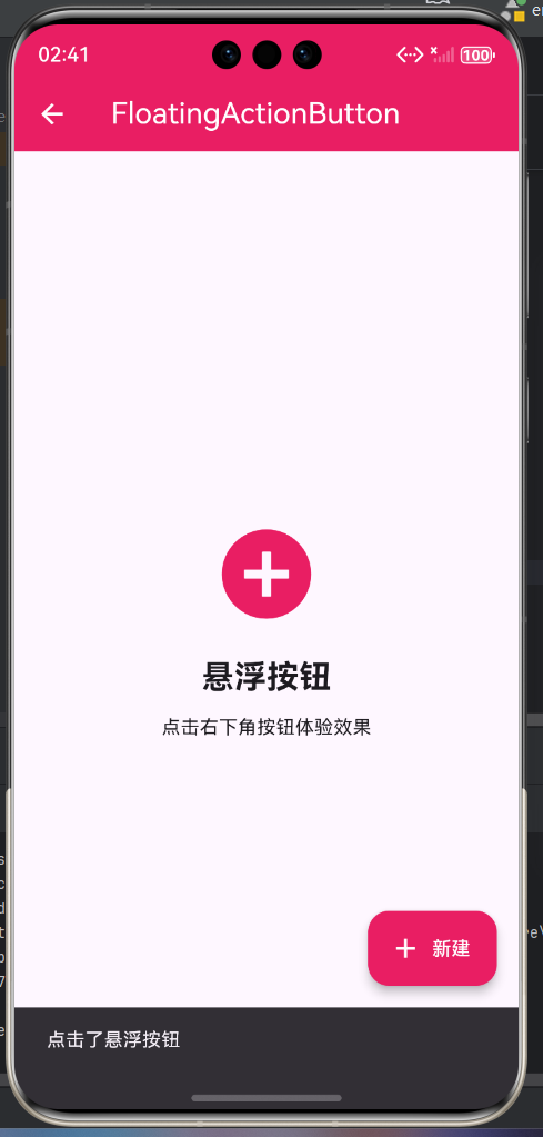
一、FloatingActionButton组件概述
FloatingActionButton(FAB)是Material Design中的特色组件,它是一个悬浮在屏幕上的圆形按钮,通常位于屏幕右下角,用于执行页面中最主要或最常用的操作。FAB的设计理念是让最重要的操作始终可见且易于访问。
FAB的设计理念
FAB遵循Material Design的层次原则,通过阴影和位置来突出显示。它位于其他内容之上,通常在右下角,这个位置是右手拇指最容易触达的区域。
二、FloatingActionButton的主要属性
核心属性详解表
| 属性名 | 类型 | 说明 | 必需 | 默认值 |
|---|---|---|---|---|
| onPressed | VoidCallback | 点击回调 | 否 | null |
| child | Widget | 子组件 | 是 | null |
| tooltip | String | 提示文字 | 否 | null |
| foregroundColor | Color | 前景色(图标和文字) | 否 | null |
| backgroundColor | Color | 背景颜色 | 否 | 主题accentColor |
| elevation | double | 阴影高度 | 否 | 6.0 |
| focusElevation | double | 获得焦点时的阴影 | 否 | 8.0 |
| hoverElevation | double | 悬停时的阴影 | 否 | 8.0 |
| highlightElevation | double | 高亮时的阴影 | 否 | 12.0 |
| disabledElevation | double | 禁用时的阴影 | 否 | 0.0 |
| splashColor | Color | 涟漪颜色 | 否 | null |
| heroTag | Object | Hero动画标签 | 否 | null |
| mini | bool | 是否为小尺寸 | 否 | false |
| shape | ShapeBorder | 形状 | 否 | null |
| clipBehavior | Clip | 裁剪行为 | 否 | Clip.none |
| autofocus | bool | 是否自动获得焦点 | 否 | false |
| isExtended | bool | 是否为扩展样式 | 否 | false |
| materialTapTargetSize | MaterialTapTargetSize | 点击区域大小 | 否 | MaterialTapTargetSize.padded |
FloatingActionButton.extended额外属性
| 属性名 | 类型 | 说明 | 必需 | 默认值 |
|---|---|---|---|---|
| icon | Widget | 图标组件 | 否 | null |
| label | Widget | 标签组件 | 否 | null |
三、基础FloatingActionButton使用
简单的FAB按钮
class BasicFABPage extends StatelessWidget {
const BasicFABPage({super.key});
Widget build(BuildContext context) {
return Scaffold(
appBar: AppBar(
title: const Text('基础FAB'),
backgroundColor: Colors.blue,
foregroundColor: Colors.white,
),
body: ListView.builder(
padding: const EdgeInsets.all(16),
itemCount: 20,
itemBuilder: (context, index) {
return Card(
margin: const EdgeInsets.only(bottom: 12),
child: ListTile(
leading: CircleAvatar(
backgroundColor: Colors.blue.withOpacity(0.2),
child: Text('${index + 1}'),
),
title: Text('列表项 ${index + 1}'),
subtitle: Text('这是第${index + 1}个列表项的详细描述'),
),
);
},
),
floatingActionButton: FloatingActionButton(
onPressed: () {
ScaffoldMessenger.of(context).showSnackBar(
const SnackBar(content: Text('点击了添加按钮')),
);
},
backgroundColor: Colors.blue,
foregroundColor: Colors.white,
child: const Icon(Icons.add),
),
);
}
}
代码说明
这个示例展示了最基本的FAB使用方式。关键点包括:
- 位置:默认位于屏幕右下角
- 颜色:使用主题的强调色,也可以自定义
- 图标:使用Material Icons中的add图标,表示添加操作
- 回调:onPressed处理点击事件
FAB通常用于列表页面,提供添加新项目的快捷入口。这样用户可以随时添加内容,无需滚动到列表顶部或寻找其他添加入口。
四、FloatingActionButton的位置控制
使用FloatingActionButtonLocation
class FABLocationPage extends StatefulWidget {
const FABLocationPage({super.key});
State<FABLocationPage> createState() => _FABLocationPageState();
}
class _FABLocationPageState extends State<FABLocationPage> {
FloatingActionButtonLocation _location = FloatingActionButtonLocation.endFloat;
Widget build(BuildContext context) {
return Scaffold(
appBar: AppBar(
title: const Text('FAB位置控制'),
backgroundColor: Colors.green,
foregroundColor: Colors.white,
),
body: Center(
child: Column(
mainAxisAlignment: MainAxisAlignment.center,
children: [
const Icon(Icons.location_on, size: 80, color: Colors.green),
const SizedBox(height: 20),
Text(
'当前位置: ${_getLocationName()}',
style: const TextStyle(fontSize: 18),
),
const SizedBox(height: 20),
ElevatedButton(
onPressed: () => _changeLocation(),
style: ElevatedButton.styleFrom(
backgroundColor: Colors.green,
foregroundColor: Colors.white,
),
child: const Text('切换位置'),
),
],
),
),
floatingActionButton: FloatingActionButton(
onPressed: () {
ScaffoldMessenger.of(context).showSnackBar(
const SnackBar(content: Text('FAB点击事件')),
);
},
backgroundColor: Colors.green,
foregroundColor: Colors.white,
child: const Icon(Icons.navigation),
),
floatingActionButtonLocation: _location,
);
}
String _getLocationName() {
switch (_location) {
case FloatingActionButtonLocation.endFloat:
return '右下角浮动';
case FloatingActionButtonLocation.centerFloat:
return '底部中央浮动';
case FloatingActionButtonLocation.startTop:
return '左上角';
case FloatingActionButtonLocation.miniStartTop:
return '左上角(迷你)';
case FloatingActionButtonLocation.endDocked:
return '右下角停靠';
case FloatingActionButtonLocation.centerDocked:
return '底部中央停靠';
default:
return '默认';
}
}
void _changeLocation() {
final locations = [
FloatingActionButtonLocation.endFloat,
FloatingActionButtonLocation.centerFloat,
FloatingActionButtonLocation.startTop,
FloatingActionButtonLocation.endDocked,
FloatingActionButtonLocation.centerDocked,
];
setState(() {
_location = locations[(locations.indexOf(_location) + 1) % locations.length];
});
}
}
位置选项说明
FloatingActionButton提供了多种位置选项:
- endFloat:默认位置,右下角浮动
- centerFloat:底部中央浮动
- startTop:左上角固定
- miniStartTop:左上角固定,迷你尺寸
- endDocked:右下角,可以与BottomNavigationBar配合使用
- centerDocked:底部中央,可以与BottomNavigationBar配合使用
选择位置时,要考虑页面布局和用户习惯。右下角是最常用的位置,但某些场景下可能需要其他位置。
五、Extended类型的FAB
带有文字标签的FAB
class ExtendedFABPage extends StatelessWidget {
const ExtendedFABPage({super.key});
Widget build(BuildContext context) {
return Scaffold(
appBar: AppBar(
title: const Text('Extended FAB'),
backgroundColor: Colors.orange,
foregroundColor: Colors.white,
),
body: Center(
child: Column(
mainAxisAlignment: MainAxisAlignment.center,
children: [
const Icon(Icons.description, size: 80, color: Colors.orange),
const SizedBox(height: 20),
const Text(
'Extended FAB',
style: TextStyle(fontSize: 24, fontWeight: FontWeight.bold),
),
const SizedBox(height: 10),
Text(
'点击下方按钮查看效果',
style: TextStyle(color: Colors.grey[600]),
),
const SizedBox(height: 40),
Container(
width: 200,
height: 48,
decoration: BoxDecoration(
color: Colors.orange.withOpacity(0.1),
borderRadius: BorderRadius.circular(24),
),
alignment: Alignment.center,
child: const Text(
'Extended FAB示例',
style: TextStyle(color: Colors.orange),
),
),
],
),
),
floatingActionButton: FloatingActionButton.extended(
onPressed: () {
ScaffoldMessenger.of(context).showSnackBar(
const SnackBar(content: Text('点击了新建按钮')),
);
},
backgroundColor: Colors.orange,
foregroundColor: Colors.white,
icon: const Icon(Icons.add),
label: const Text('新建项目'),
heroTag: 'extended_fab',
),
floatingActionButtonLocation: FloatingActionButtonLocation.centerFloat,
);
}
}
Extended FAB的特点
Extended类型的FAB比标准FAB更适合以下场景:
- 需要更多说明:当操作名称不能只用图标表达时,可以添加文字标签
- 重要操作:对于非常重要的操作,Extended FAB的更大尺寸和文字标签可以吸引更多注意力
- 空间充足:当屏幕空间充足时,Extended FAB可以提供更好的视觉效果
Extended FAB通常用于应用的主要操作入口,比如"新建项目"、"创建文档"等。
六、Mini类型的FAB
迷你尺寸的FAB
class MiniFABPage extends StatelessWidget {
const MiniFABPage({super.key});
Widget build(BuildContext context) {
return Scaffold(
appBar: AppBar(
title: const Text('Mini FAB'),
backgroundColor: Colors.purple,
foregroundColor: Colors.white,
),
body: ListView(
padding: const EdgeInsets.all(16),
children: [
_buildFABExample(
'标准FAB',
'尺寸56dp,用于主要操作',
Icons.add,
false,
),
const SizedBox(height: 20),
_buildFABExample(
'Mini FAB',
'尺寸40dp,用于次要操作',
Icons.add,
true,
),
const SizedBox(height: 40),
const Card(
child: Padding(
padding: EdgeInsets.all(16),
child: Column(
crossAxisAlignment: CrossAxisAlignment.start,
children: [
Text(
'使用场景对比',
style: TextStyle(
fontSize: 18,
fontWeight: FontWeight.bold,
),
),
SizedBox(height: 12),
Text('标准FAB:主要操作,如添加、新建、编辑'),
SizedBox(height: 8),
Text('Mini FAB:次要操作,如搜索、分享、收藏'),
SizedBox(height: 8),
Text('一个页面通常只有一个标准FAB'),
SizedBox(height: 8),
Text('可以有多个Mini FAB,但要谨慎使用'),
],
),
),
),
],
),
floatingActionButton: Column(
mainAxisSize: MainAxisSize.min,
crossAxisAlignment: CrossAxisAlignment.end,
children: [
FloatingActionButton(
mini: true,
heroTag: 'mini_fab_1',
onPressed: () {
ScaffoldMessenger.of(context).showSnackBar(
const SnackBar(content: Text('Mini FAB 1')),
);
},
backgroundColor: Colors.purple,
foregroundColor: Colors.white,
child: const Icon(Icons.search),
),
const SizedBox(height: 12),
FloatingActionButton(
mini: true,
heroTag: 'mini_fab_2',
onPressed: () {
ScaffoldMessenger.of(context).showSnackBar(
const SnackBar(content: Text('Mini FAB 2')),
);
},
backgroundColor: Colors.purple.shade300,
foregroundColor: Colors.white,
child: const Icon(Icons.favorite),
),
const SizedBox(height: 12),
FloatingActionButton(
heroTag: 'standard_fab',
onPressed: () {
ScaffoldMessenger.of(context).showSnackBar(
const SnackBar(content: Text('标准FAB')),
);
},
backgroundColor: Colors.purple,
foregroundColor: Colors.white,
child: const Icon(Icons.add),
),
],
),
);
}
Widget _buildFABExample(
String title,
String subtitle,
IconData icon,
bool isMini,
) {
return Card(
child: Padding(
padding: const EdgeInsets.all(16),
child: Row(
children: [
Container(
width: isMini ? 40 : 56,
height: isMini ? 40 : 56,
decoration: BoxDecoration(
color: Colors.purple,
shape: BoxShape.circle,
boxShadow: [
BoxShadow(
color: Colors.purple.withOpacity(0.3),
blurRadius: 8,
offset: const Offset(0, 4),
),
],
),
child: Icon(icon, color: Colors.white, size: isMini ? 20 : 24),
),
const SizedBox(width: 16),
Expanded(
child: Column(
crossAxisAlignment: CrossAxisAlignment.start,
children: [
Text(
title,
style: const TextStyle(
fontSize: 16,
fontWeight: FontWeight.bold,
),
),
const SizedBox(height: 4),
Text(
subtitle,
style: TextStyle(
fontSize: 14,
color: Colors.grey[600],
),
),
],
),
),
],
),
),
);
}
}
Mini FAB使用指南
Mini FAB(40dp)比标准FAB(56dp)更小,适合用于:
- 次要操作:搜索、分享、收藏等不是核心功能的操作
- 空间有限:当屏幕空间紧张时,使用Mini FAB可以减少遮挡
- 多个操作:当需要多个FAB时,可以用一个标准FAB配合多个Mini FAB
需要注意的是,一个页面不应该有过多的FAB,即使是Mini FAB,也要控制数量,避免界面混乱。
七、自定义FAB样式
个性化外观设计
class CustomStyleFABPage extends StatelessWidget {
const CustomStyleFABPage({super.key});
Widget build(BuildContext context) {
return Scaffold(
appBar: AppBar(
title: const Text('自定义样式FAB'),
backgroundColor: Colors.teal,
foregroundColor: Colors.white,
),
body: ListView(
padding: const EdgeInsets.all(16),
children: [
_buildCustomFABCard(
'渐变背景',
'使用Container创建渐变效果',
Icons.gradient,
_buildGradientFAB(),
),
const SizedBox(height: 16),
_buildCustomFABCard(
'带边框',
'使用shape属性创建边框',
Icons.border_outer,
_buildBorderedFAB(),
),
const SizedBox(height: 16),
_buildCustomFABCard(
'圆角矩形',
'自定义形状为圆角矩形',
Icons.crop_square,
_buildRoundedFAB(),
),
const SizedBox(height: 16),
_buildCustomFABCard(
'带涟漪效果',
'自定义splashColor',
Icons.waves,
_buildRippleFAB(),
),
],
),
);
}
Widget _buildCustomFABCard(String title, String subtitle, IconData icon, Widget fab) {
return Card(
child: Padding(
padding: const EdgeInsets.all(16),
child: Row(
children: [
Icon(icon, color: Colors.teal, size: 48),
const SizedBox(width: 16),
Expanded(
child: Column(
crossAxisAlignment: CrossAxisAlignment.start,
children: [
Text(
title,
style: const TextStyle(
fontSize: 16,
fontWeight: FontWeight.bold,
),
),
const SizedBox(height: 4),
Text(
subtitle,
style: TextStyle(color: Colors.grey[600]),
),
],
),
),
const SizedBox(width: 16),
fab,
],
),
),
);
}
Widget _buildGradientFAB() {
return FloatingActionButton(
onPressed: () {},
heroTag: 'gradient_fab',
child: Ink(
decoration: BoxDecoration(
gradient: const LinearGradient(
colors: [Colors.teal, Colors.cyan],
),
shape: BoxShape.circle,
),
child: const Center(
child: Icon(Icons.add, color: Colors.white),
),
),
);
}
Widget _buildBorderedFAB() {
return Container(
decoration: BoxDecoration(
color: Colors.white,
shape: BoxShape.circle,
border: Border.all(color: Colors.teal, width: 2),
boxShadow: [
BoxShadow(
color: Colors.teal.withOpacity(0.2),
blurRadius: 8,
offset: const Offset(0, 4),
),
],
),
child: FloatingActionButton(
onPressed: () {},
heroTag: 'bordered_fab',
backgroundColor: Colors.white,
foregroundColor: Colors.teal,
elevation: 0,
child: const Icon(Icons.add),
),
);
}
Widget _buildRoundedFAB() {
return FloatingActionButton.extended(
onPressed: () {},
heroTag: 'rounded_fab',
backgroundColor: Colors.teal,
foregroundColor: Colors.white,
shape: RoundedRectangleBorder(
borderRadius: BorderRadius.circular(16),
),
icon: const Icon(Icons.add),
label: const Text('添加'),
);
}
Widget _buildRippleFAB() {
return FloatingActionButton(
onPressed: () {},
heroTag: 'ripple_fab',
backgroundColor: Colors.teal,
foregroundColor: Colors.white,
splashColor: Colors.cyan.withOpacity(0.5),
child: const Icon(Icons.touch_app),
);
}
}
自定义样式技巧
虽然FAB遵循Material Design规范,但仍然可以进行一定程度的个性化:
- 渐变背景:使用Container和LinearGradient创建渐变效果
- 自定义形状:通过shape属性可以改变FAB的形状,比如圆角矩形
- 边框设计:创建带边框的FAB,适合浅色主题
- 涟漪效果:自定义splashColor改变点击时的涟漪颜色
需要注意的是,自定义样式时要保持与Material Design的一致性,不要过度偏离规范,以免影响用户体验。
八、FAB最佳实践
实践总结表
| 实践要点 | 说明 | 优先级 |
|---|---|---|
| 一个标准FAB | 每个页面最多一个标准FAB | 高 |
| 操作优先级 | 只展示最重要/常用的操作 | 高 |
| 图标选择 | 使用Material Icons,清晰易识别 | 高 |
| heroTag唯一 | 多个FAB时要设置不同的heroTag | 高 |
| 避免遮挡 | 确保FAB不遮挡重要内容 | 中 |
| 与底部导航配合 | 使用Docked位置与BottomNavigationBar配合 | 中 |
| 考虑暗色模式 | 在暗色主题下调整颜色 | 中 |
| 添加tooltip | 为FAB添加提示文字 | 低 |
关键实践建议
-
控制数量:一个页面应该只有一个标准FAB,用于最重要的操作。如果有多个操作需要展示,可以考虑使用一个标准FAB和多个Mini FAB,或者使用其他UI组件。
-
选择合适的位置:默认的右下角位置最适合大多数场景。只有在特殊情况下才考虑其他位置,比如当右下角有固定内容时。
-
与BottomNavigationBar配合:当页面同时有BottomNavigationBar和FAB时,应该使用Docked位置(endDocked或centerDocked),让FAB嵌入到导航栏中,避免遮挡。
-
考虑屏幕尺寸:在小屏幕设备上,FAB可能会遮挡更多内容。在大屏幕设备上,可以考虑使用Extended FAB或者调整位置。
-
状态变化:FAB的显示和隐藏应该与页面状态相关。比如,滚动列表时可以隐藏FAB,停止滚动后再显示。
通过遵循这些最佳实践,可以创建出既美观又实用的FloatingActionButton,为用户提供高效的交互体验。
欢迎加入开源鸿蒙跨平台社区:https://openharmonycrossplatform.csdn.net

讨论HarmonyOS开发技术,专注于API与组件、DevEco Studio、测试、元服务和应用上架分发等。
更多推荐
 15
15 0
0- 0



 已为社区贡献20条内容

所有评论(0)