知识点概述
除了基础的布局和展示功能,GridView还提供了许多高级特性,包括拖拽排序、滑动删除、多选操作、嵌套滚动、自定义动画等。这些高级功能可以极大地扩展GridView的应用场景,提供更丰富的交互体验。本章将深入探讨这些高级功能的实现方法和最佳实践。
高级功能的核心价值:
| 功能维度 | 用户体验 | 技术实现 | 适用场景 |
|---|
| 拖拽排序 | 直观的手势操作 | ReorderableGridView | 列表重排、相册排序 |
| 滑动删除 | 快速删除操作 | Dismissible | 邮件列表、任务管理 |
| 多选操作 | 批量处理能力 | 状态管理 | 文件管理、相册批量操作 |
| 嵌套滚动 | 复杂界面布局 | CustomScrollView | 社交应用、电商应用 |
1. 拖拽排序
拖拽排序是GridView中非常实用的交互功能,允许用户通过拖动来重新排列item的位置。这种功能常见于应用首页、相册排序、任务列表等场景。
1.1 拖拽实现方式对比
| 实现方式 | 难度 | 性能 | 灵活性 | 推荐场景 | 代码复杂度 |
|---|
| ReorderableGridView | ⭐ 低 | ⭐⭐⭐⭐⭐ 高 | ⭐⭐⭐ 中 | 简单排序 | 低 |
| 自定义拖拽 | ⭐⭐⭐ 中 | ⭐⭐⭐⭐ 中 | ⭐⭐⭐⭐⭐ 高 | 特殊需求 | 高 |
| 第三方库 | ⭐ 低 | ⭐⭐⭐⭐⭐ 高 | ⭐⭐⭐⭐ 高 | 快速实现 | 低 |
选择建议:
- 快速实现 → ReorderableGridView
- 特殊动画需求 → 自定义拖拽
- 快速开发 → 第三方库 (flutter_reorderable_list)
1.2 拖拽核心概念
关键组件:
ReorderableGridView: 可拖拽的网格视图ReorderableDelayedDragStartListener: 延迟启动拖拽,避免误触onReorder: 拖拽完成后的回调
拖拽流程:
1.3 拖拽实现要点
| 技术要点 | 实现方式 | 注意事项 |
|---|
| 延迟启动 | ReorderableDelayedDragStartListener | 默认延迟300ms,可调整 |
| Key管理 | ValueKey确保唯一性 | 使用数据唯一标识 |
| 索引处理 | newIndex > oldIndex时需要-1 | 避免索引越界 |
| 动画优化 | 使用Transform而非手动计算 | 确保流畅度 |
1.4 拖拽性能优化
| 优化点 | 方法 | 效果 | 实现难度 |
|---|
| 延迟启动 | DelayedDragStartListener | 避免误触,提升体验 | ⭐ 简单 |
| 轻量代理 | 简化拖拽反馈widget | 减少渲染压力 | ⭐⭐ 中等 |
| 节流更新 | 控制刷新频率 | 降低CPU占用 | ⭐⭐⭐ 较高 |
| 动画优化 | 使用Transform组件 | 提升流畅度 | ⭐⭐ 中等 |
| 虚拟化 | 使用ListView.builder | 减少内存占用 | ⭐⭐⭐ 较高 |
1.5 拖拽常见问题
| 问题 | 原因 | 解决方案 |
|---|
| 误触 | 延迟时间太短 | 增加delay参数 |
| 卡顿 | item太复杂 | 简化item UI,使用RepaintBoundary |
| 位置错误 | 索引计算错误 | 正确处理newIndex > oldIndex情况 |
| 无反馈 | 缺少视觉提示 | 添加阴影、透明度变化 |
2. 滑动删除
滑动删除是一种流行的交互方式,用户可以通过左右滑动item来触发删除或其他操作。这种交互方式在移动设备上非常直观和高效。
2.1 滑动操作类型对比
| 操作类型 | 手势方向 | 常见用途 | 实现难度 | 用户友好度 |
|---|
| 左滑删除 | 向左滑动 | 删除item | ⭐ 低 | ⭐⭐⭐⭐⭐ 高 |
| 右滑删除 | 向右滑动 | 删除item | ⭐ 低 | ⭐⭐⭐⭐⭐ 高 |
| 双向操作 | 左右滑动 | 删除/编辑 | ⭐⭐ 中等 | ⭐⭐⭐⭐ 高 |
| 多级操作 | 不同距离 | 不同操作 | ⭐⭐⭐ 较高 | ⭐⭐⭐ 中等 |
2.2 Dismissible核心组件
Dismissible属性:
| 属性 | 类型 | 说明 | 必需 |
|---|
| key | Key | item的唯一标识 | ✅ 是 |
| child | Widget | item的内容 | ✅ 是 |
| onDismissed | Function | 删除回调 | ✅ 是 |
| direction | DismissDirection | 滑动方向 | ❌ 否 |
| background | Widget | 背景widget | ❌ 否 |
| secondaryBackground | Widget | 次要背景 | ❌ 否 |
2.3 滑动方向选择
| DismissDirection值 | 说明 | 适用场景 |
|---|
| endToStart | 从右向左 | iOS风格删除 |
| startToEnd | 从左向右 | 阅读类应用 |
| horizontal | 水平双向 | 双操作场景 |
| vertical | 垂直方向 | 特殊需求 |
2.4 滑动操作实现要点
视觉反馈:
- 背景颜色提示操作类型 (红色=删除,橙色=归档)
- 图标指示操作 (垃圾桶=删除,文件夹=归档)
- 文字说明操作内容
交互优化:
- 提供撤销功能 (SnackBar + SnackBarAction)
- 确认对话框 (删除重要数据时)
- 震动反馈 (HapticFeedback)
2.5 滑动删除性能对比
| 实现方式 | 性能 | 灵活性 | 维护性 | 推荐场景 |
|---|
| Dismissible | ⭐⭐⭐⭐⭐ 高 | ⭐⭐⭐ 中等 | ⭐⭐⭐⭐⭐ 高 | 标准删除操作 |
| 自定义手势 | ⭐⭐⭐ 中等 | ⭐⭐⭐⭐⭐ 高 | ⭐⭐ 低 | 特殊需求 |
| 第三方库 | ⭐⭐⭐⭐ 高 | ⭐⭐⭐⭐ 高 | ⭐⭐⭐ 中等 | 快速开发 |
2.6 滑动删除最佳实践
| 最佳实践 | 说明 | 实现方式 |
|---|
| 提供撤销 | 避免误删损失 | SnackBarAction |
| 视觉提示 | 清晰显示操作结果 | 背景颜色+图标 |
| 确认删除 | 重要数据需确认 | AlertDialog |
| 批量操作 | 多选删除更高效 | 结合多选模式 |
| 动画流畅 | 使用系统动画 | AnimatedContainer |
3. 多选操作
多选操作允许用户同时选中多个item,然后对它们执行批量操作,如删除、分享、移动等。这种功能在文件管理器、相册、邮件应用等场景中非常常见。
3.1 多选交互模式对比
| 交互方式 | 触发方式 | 优点 | 缺点 | 推荐场景 |
|---|
| Checkbox模式 | 点击切换 | 直观明了 | 占用空间 | 空间充裕的场景 |
| 长按进入 | 长按开始多选 | 空间省略 | 需要提示 | 空间受限场景 |
| 编辑按钮 | 点击按钮进入 | 明确提示 | 需要额外操作 | 批量操作频繁 |
3.2 多选状态管理
| 状态变量 | 类型 | 用途 | 更新时机 |
|---|
_isSelectionMode | bool | 是否处于多选模式 | 长按item/点击编辑按钮 |
_selectedIndices | Set<int> | 选中的索引集合 | 点击item/全选操作 |
_items | List<T> | 数据源 | 删除/添加操作 |
3.3 多选操作类型
| 操作类型 | 功能 | 实现复杂度 | 用户价值 |
|---|
| 全选/取消全选 | 选中所有/取消所有 | ⭐ 低 | ⭐⭐⭐⭐⭐ 高 |
| 批量删除 | 删除选中项 | ⭐⭐ 中等 | ⭐⭐⭐⭐⭐ 高 |
| 批量分享 | 分享选中项 | ⭐⭐⭐ 较高 | ⭐⭐⭐⭐ 高 |
| 批量移动 | 移动到其他分类 | ⭐⭐⭐ 较高 | ⭐⭐⭐ 中等 |
| 批量下载 | 下载选中项 | ⭐⭐⭐ 较高 | ⭐⭐⭐⭐ 高 |
3.4 多选交互流程
3.5 多选UI设计要点
| UI元素 | 设计要点 | 实现建议 |
|---|
| 选中标记 | 清晰可见 | Checkbox或圆形勾选图标 |
| 选中状态 | 颜色/边框区分 | 使用主题色高亮 |
| 操作按钮 | 放置在AppBar | IconButton或TextButton |
| 数量提示 | 显示选中数量 | AppBar标题动态更新 |
| 确认对话框 | 重要操作需确认 | AlertDialog |
3.6 多选性能优化
| 优化项 | 方法 | 效果 | 实现难度 |
|---|
| 状态隔离 | 使用Set而非List | 快速查找 | ⭐ 简单 |
| 局部刷新 | 只更新改变的item | 减少重建 | ⭐⭐ 中等 |
| 虚拟化 | 大数据量时使用分页 | 降低内存 | ⭐⭐⭐ 较高 |
| 异步操作 | 批量操作使用Future | 不阻塞UI | ⭐⭐ 中等 |
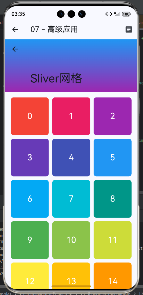
4. 嵌套滚动
嵌套滚动是指在GridView中嵌套其他可滚动组件,如ListView、PageView等。这种场景常见于复杂的应用界面,如社交媒体的时间线、新闻应用的分类列表等。
4.1 嵌套滚动常见问题
| 问题类型 | 表现 | 影响 | 解决方案 | 难度 |
|---|
| 滚动冲突 | 多个滚动区同时响应 | 操作不流畅 | 使用NestedScrollView | ⭐⭐ 中等 |
| 性能下降 | 渲染多个滚动区 | 滚动卡顿 | 优化布局层次 | ⭐⭐⭐ 较高 |
| 手势冲突 | 手势识别混乱 | 操作失败 | 明确手势响应 | ⭐⭐⭐ 较高 |
| 状态丢失 | 滚动位置不保存 | 体验差 | AutomaticKeepAlive | ⭐ 简单 |
4.2 嵌套滚动方案对比
| 方案 | 优点 | 缺点 | 适用场景 | 复杂度 |
|---|
| CustomScrollView | 滚动协调好 | 布局复杂 | 标准嵌套滚动 | ⭐⭐ 中等 |
| NestedScrollView | 简单易用 | 性能一般 | 简单嵌套场景 | ⭐ 简单 |
| PageView | 页面切换自然 | 滚动受限 | 标签页切换 | ⭐ 简单 |
| 自定义方案 | 完全可控 | 实现复杂 | 特殊需求 | ⭐⭐⭐⭐⭐ 复杂 |
4.3 Sliver组件体系
| Sliver组件 | 用途 | 常用属性 |
|---|
| SliverGrid | 网格布局 | gridDelegate, delegate |
| SliverList | 列表布局 | delegate |
| SliverPadding | 添加内边距 | padding |
| SliverToBoxAdapter | 包装任意widget | child |
| SliverAppBar | 可折叠的AppBar | expandedHeight, pinned |
4.4 嵌套滚动优化策略
| 优化项 | 方法 | 参数建议 | 效果 |
|---|
| 缓存范围 | cacheExtent | 500.0~1000.0 | 提升流畅度 |
| 重绘隔离 | addRepaintBoundaries | true | 减少GPU负载 |
| 保持状态 | AutomaticKeepAlive | true | 保持滚动位置 |
| 懒加载 | 按需加载 | 分页加载 | 减少初始化时间 |
4.5 TabBar嵌套滚动设计
结构设计:
Scaffold
└── AppBar (TabBar)
└── TabBarView
    ├── Tab 1: CustomScrollView + SliverGrid
    ├── Tab 2: CustomScrollView + SliverGrid
    └── Tab 3: CustomScrollView + SliverGrid
最佳实践:
- 每个Tab使用独立的ScrollController
- 避免在Tab切换时重建所有内容
- 使用AutomaticKeepAlive保持滚动位置
5. 自定义ScrollPhysics
ScrollPhysics控制滚动物理效果,通过自定义ScrollPhysics可以实现各种有趣的滚动效果,如弹性滚动、回弹效果、滚动阻尼等。
5.1 常用Physics类型对比
| Physics类型 | 平台 | 效果 | 特点 | 推荐场景 |
|---|
| ClampingScrollPhysics | Android | 无弹性 | 滚动到边界停止 | 列表、网格 |
| BouncingScrollPhysics | iOS | 弹性回弹 | 滚动到边界回弹 | 相册、图片 |
| AlwaysScrollable | 通用 | 总是可滚动 | 内容少时也能滚动 | 下拉刷新 |
| RangeMaintaining | 通用 | 保持范围 | 滚动在指定范围内 | 分页器 |
5.2 Physics类层次结构
ScrollPhysics (基类)
├── ClampingScrollPhysics
├── BouncingScrollPhysics
├── AlwaysScrollableScrollPhysics
├── RangeMaintainingScrollPhysics
└── CustomScrollPhysics (自定义)
5.3 自定义Physics核心方法
| 方法 | 说明 | 返回值 | 用途 |
|---|
applyTo | 构建Physics链 | ScrollPhysics | 链式组合多个Physics |
applyBoundaryConditions | 计算边界条件 | double | 控制边界行为 |
createBallisticSimulation | 创建弹道模拟 | Simulation | 惯性滚动 |
shouldAcceptUserOffset | 是否接受用户偏移 | bool | 判断是否处理滚动 |
5.4 滚动效果参数调优
| 参数 | 范围 | 默认值 | 效果 | 调整建议 |
|---|
| 阻尼系数 | 0.5~1.0 | 0.95 | 弹性强度 | 值越小弹性越强 |
| 边界弹性 | 0.0~1.0 | 0.5 | 边界回弹 | 值越大回弹越明显 |
| 摩擦系数 | 0.01~0.1 | 0.02 | 滚动阻力 | 值越小越滑 |
| 滚动阈值 | 0.0~10.0 | 0.0 | 触发滚动最小距离 | 避免误触 |
5.5 滚动效果应用场景
| 效果 | 适用场景 | 实现方式 | 性能影响 |
|---|
| 弹性滚动 | 相册、图片 | BouncingScrollPhysics | 低 |
| 无弹性 | 列表、菜单 | ClampingScrollPhysics | 低 |
| 自定义弹性 | 特殊UI | 自定义Physics | 中 |
| 惯性滚动 | 长列表 | 默认Physics | 低 |
| 阻尼效果 | 游戏UI | 自定义Physics | 中 |
6. 数据同步与状态管理
在复杂的应用中,GridView往往需要与多个数据源和状态管理方案集成,实现数据的实时同步和状态共享。
6.1 状态管理方案对比
| 方案 | 学习曲线 | 性能 | 适用规模 | 推荐指数 | 生态成熟度 |
|---|
| setState | ⭐ 低 | ⭐⭐⭐ 中等 | 小型 | ⭐⭐⭐ | ⭐⭐⭐⭐⭐ |
| InheritedWidget | ⭐⭐⭐ 中等 | ⭐⭐⭐⭐⭐ 高 | 中型 | ⭐⭐⭐ | ⭐⭐⭐⭐⭐ |
| Provider | ⭐⭐ 中等 | ⭐⭐⭐⭐⭐ 高 | 中大型 | ⭐⭐⭐⭐⭐ | ⭐⭐⭐⭐⭐ |
| Riverpod | ⭐⭐⭐ 中等 | ⭐⭐⭐⭐⭐ 高 | 大型 | ⭐⭐⭐⭐ | ⭐⭐⭐⭐ |
| Bloc | ⭐⭐⭐⭐ 较高 | ⭐⭐⭐⭐ 高 | 大型 | ⭐⭐⭐⭐ | ⭐⭐⭐⭐⭐ |
| GetX | ⭐ 低 | ⭐⭐⭐⭐ 高 | 中大型 | ⭐⭐⭐ | ⭐⭐⭐⭐ |
选择建议:
- 简单页面 → setState
- 中型应用 → Provider
- 大型应用 → Riverpod/Bloc
- 快速开发 → GetX
6.2 Provider核心概念
| 组件 | 用途 | 使用场景 |
|---|
| ChangeNotifier | 状态基类 | 可变数据源 |
| ChangeNotifierProvider | 提供状态 | 创建Provider |
| Consumer | 消费状态 | 局部更新UI |
| context.watch | 监听状态 | 简化代码 |
| context.read | 调用方法 | 不触发更新 |
6.3 数据同步架构
┌─────────────┐
│  用户操作   │
└──────┬──────┘
       │
       ▼
┌─────────────┐
│  UI事件     │
└──────┬──────┘
       │
       ▼
┌─────────────┐
│  Provider   │ ◄──────┐
│  更新状态   │        │
└──────┬──────┘        │
       │               │
       ▼               │
┌─────────────┐        │
│ notifyList  │        │
│   eners()   │        │
└──────┬──────┘        │
       │               │
       ▼               │
┌─────────────┐        │
│  Consumer   │────────┘
│  重建UI     │
└──────┬──────┘
       │
       ▼
┌─────────────┐
│  UI更新     │
└─────────────┘

┌─────────────┐
│  网络请求   │
└──────┬──────┘
       │
       ▼ (更新状态)
6.4 状态管理最佳实践
| 实践 | 说明 | 实现方式 |
|---|
| 单一数据源 | 状态集中管理 | Provider统一管理 |
| 不可变数据 | 避免副作用 | 使用copyWith |
| 最小化重建 | 只更新需要部分 | Consumer精准定位 |
| 异步处理 | 网络请求异步 | Future + async/await |
| 错误处理 | 友好错误提示 | try-catch + SnackBar |
6.5 数据持久化方案
| 方案 | 类型 | 读写速度 | 适用数据 | 复杂度 |
|---|
| SharedPreferences | 键值对 | 快 | 简单配置 | ⭐ |
| Hive | NoSQL | 极快 | 复杂对象 | ⭐⭐ |
| SQLite | 关系数据库 | 中等 | 结构化数据 | ⭐⭐⭐ |
| Isar | NoSQL | 极快 | 大数据量 | ⭐⭐⭐ |
7. 高级手势处理
除了基本的点击和滚动,GridView还可以支持更复杂的手势操作,如双击、捏合缩放、拖拽移动等,为用户提供更丰富的交互体验。
7.1 手势类型对比
| 手势类型 | 触发方式 | 常见用途 | 实现难度 | 性能影响 |
|---|
| 单击 | 点击一次 | 选择/打开 | ⭐ 低 | 低 |
| 双击 | 快速点击两次 | 缩放/点赞 | ⭐ 低 | 低 |
| 长按 | 按住不松 | 多选/菜单 | ⭐ 低 | 低 |
| 捏合 | 两指收放 | 缩放 | ⭐⭐ 中等 | 中 |
| 拖拽 | 按住移动 | 排序 | ⭐⭐ 中等 | 中 |
| 滑动手势 | 滑动方向 | 翻页/删除 | ⭐⭐ 中等 | 中 |
7.2 GestureDetector常用回调
| 回调 | 触发时机 | 参数 | 用途 |
|---|
onTap | 点击完成 | 无 | 简单点击 |
onDoubleTap | 双击完成 | 无 | 双击操作 |
onLongPress | 长按完成 | 无 | 长按菜单 |
onScaleStart | 缩放开始 | ScaleStartDetails | 缩放初始化 |
onScaleUpdate | 缩放更新 | ScaleUpdateDetails | 缩放过程 |
onScaleEnd | 缩放结束 | ScaleEndDetails | 缩放完成 |
onPanStart | 拖拽开始 | DragStartDetails | 拖拽初始化 |
onPanUpdate | 拖拽更新 | DragUpdateDetails | 拖拽过程 |
onPanEnd | 拖拽结束 | DragEndDetails | 拖拽完成 |
7.3 手势冲突处理
| 冲突场景 | 解决方案 | 实现方式 |
|---|
| 点击vs长按 | 时间阈值区分 | GestureDetector自动处理 |
| 滚动vs拖拽 | 方向判断 | 设置horizontal/vertical |
| 捏合vs点击 | 手势数量区分 | onScaleStart检测 |
| 滑动vs滚动 | 禁用滚动 | physics: NeverScrollable |
7.4 手势性能优化
| 优化项 | 方法 | 效果 | 实现难度 |
|---|
| 减少回调 | 合并手势操作 | 降低CPU占用 | ⭐⭐ 中等 |
| 节流处理 | 控制回调频率 | 减少更新次数 | ⭐⭐⭐ 较高 |
| 使用Transform | GPU加速 | 提升流畅度 | ⭐ 简单 |
| 避免重建 | 使用setState智能 | 减少Widget重建 | ⭐⭐ 中等 |
8. 自定义布局算法
对于特殊的布局需求,可以自定义GridDelegate来实现完全自定义的布局算法,如圆形布局、六边形布局、螺旋布局等。
8.1 GridDelegate核心方法
| 方法 | 说明 | 返回值 | 用途 |
|---|
getLayout | 计算布局 | SliverGridLayout | 返回布局计算器 |
shouldRelayout | 判断是否重建 | bool | 是否需要重新布局 |
8.2 SliverGridLayout核心方法
| 方法 | 说明 | 返回值 | 用途 |
|---|
getGeometryForChildIndex | 获取item几何信息 | SliverGridGeometry | 计算item位置和大小 |
getMinScrollChild | 获取最小滚动索引 | int | 滚动边界计算 |
getMaxScrollChild | 获取最大滚动索引 | int | 滚动边界计算 |
getMinChildIndexForScrollOffset | 滚动偏移转索引 | int | 可见性计算 |
getMaxChildIndexForScrollOffset | 滚动偏移转索引 | int | 可见性计算 |
8.3 常见自定义布局
| 布局类型 | 复杂度 | 视觉效果 | 适用场景 | 性能 |
|---|
| 犬牙布局 | ⭐⭐ 中等 | 错落有致 | 瀑布流 | 高 |
| 圆形布局 | ⭐⭐⭐⭐ 较高 | 圆形排列 | 特殊展示 | 中 |
| 螺旋布局 | ⭐⭐⭐⭐⭐ 复杂 | 螺旋排列 | 创意展示 | 中 |
| 六边形布局 | ⭐⭐⭐ 较高 | 蜂窝效果 | 游戏、创意 | 中 |
| 不规则布局 | ⭐⭐⭐⭐⭐ 复杂 | 自由排列 | 艺术展示 | 低 |
8.4 自定义布局实现要点
| 要点 | 说明 | 实现建议 |
|---|
| 数学计算 | 精确计算位置 | 使用三角函数 |
| 性能优化 | 缓存计算结果 | 避免重复计算 |
| 边界处理 | 处理异常情况 | null检查和默认值 |
| 动画支持 | 支持布局动画 | 使用shouldRelayout |
8.5 布局算法性能对比
| 算法 | 时间复杂度 | 空间复杂度 | 适合数据量 |
|---|
| 标准网格 | O(1) | O(1) | 任意 |
| 犬牙布局 | O(1) | O(1) | 任意 |
| 螺旋布局 | O(n) | O(1) | <1000 |
| 圆形布局 | O(n) | O(1) | <500 |
| 自定义复杂布局 | O(n)~O(n²) | O(n) | <200 |
知识点总结
本章深入探讨了GridView的各种高级功能,从拖拽排序到自定义布局,涵盖了实际开发中的常见需求。
核心功能回顾
| 功能 | 推荐方案 | 难度 | 实用性 |
|---|
| 拖拽排序 | ReorderableGridView | ⭐ 低 | ⭐⭐⭐⭐⭐ |
| 滑动删除 | Dismissible | ⭐ 低 | ⭐⭐⭐⭐⭐ |
| 多选操作 | 状态管理 + Set | ⭐⭐ 中等 | ⭐⭐⭐⭐⭐ |
| 嵌套滚动 | CustomScrollView + Sliver | ⭐⭐ 中等 | ⭐⭐⭐⭐ |
| 自定义Physics | 继承ScrollPhysics | ⭐⭐⭐ 较高 | ⭐⭐⭐ |
| 状态管理 | Provider | ⭐⭐ 中等 | ⭐⭐⭐⭐⭐ |
| 高级手势 | GestureDetector | ⭐⭐ 中等 | ⭐⭐⭐⭐ |
| 自定义布局 | 自定义GridDelegate | ⭐⭐⭐⭐ 较高 | ⭐⭐⭐ |
学习路径建议
最佳实践总结
| 类别 | 最佳实践 |
|---|
| 性能优化 | 使用Builder/Consumer最小化重建范围,使用RepaintBoundary隔离重绘 |
| 用户体验 | 提供清晰视觉反馈,支持撤销操作,合理使用动画 |
| 代码质量 | 遵循单一职责原则,合理拆分组件,注重可维护性 |
| 状态管理 | 单一数据源,不可变数据,异步操作使用Future |
| 错误处理 | 使用try-catch捕获异常,提供友好的错误提示 |
9. 完整可运行代码示例
9.1 主应用入口
import 'package:flutter/material.dart';

void main() {
  runApp(const GridViewAdvancedApp());
}

class GridViewAdvancedApp extends StatelessWidget {
  const GridViewAdvancedApp({super.key});

  @override
  Widget build(BuildContext context) {
    return MaterialApp(
      title: 'GridView高级功能',
      theme: ThemeData(
        colorScheme: ColorScheme.fromSeed(seedColor: Colors.blue),
        useMaterial3: true,
      ),
      home: const HomePage(),
      debugShowCheckedModeBanner: false,
    );
  }
}

class HomePage extends StatelessWidget {
  const HomePage({super.key});

  @override
  Widget build(BuildContext context) {
    return Scaffold(
      appBar: AppBar(
        title: const Text('GridView高级功能演示'),
        backgroundColor: Colors.blue,
        foregroundColor: Colors.white,
      ),
      body: ListView(
        padding: const EdgeInsets.all(16),
        children: [
          _buildDemoCard(
            context,
            '拖拽排序',
            Icons.swap_vert,
            Colors.blue,
            () => Navigator.push(
              context,
              MaterialPageRoute(
                builder: (context) => const DraggableGrid(),
              ),
            ),
          ),
          const SizedBox(height: 12),
          _buildDemoCard(
            context,
            '滑动删除',
            Icons.swipe,
            Colors.red,
            () => Navigator.push(
              context,
              MaterialPageRoute(
                builder: (context) => const DismissibleGrid(),
              ),
            ),
          ),
          const SizedBox(height: 12),
          _buildDemoCard(
            context,
            '双向滑动',
            Icons.compare_arrows,
            Colors.orange,
            () => Navigator.push(
              context,
              MaterialPageRoute(
                builder: (context) => const BidirectionalSwipeGrid(),
              ),
            ),
          ),
          const SizedBox(height: 12),
          _buildDemoCard(
            context,
            '多选操作',
            Icons.checklist,
            Colors.green,
            () => Navigator.push(
              context,
              MaterialPageRoute(
                builder: (context) => const MultiSelectGrid(),
              ),
            ),
          ),
          const SizedBox(height: 12),
          _buildDemoCard(
            context,
            '嵌套滚动',
            Icons.view_column,
            Colors.purple,
            () => Navigator.push(
              context,
              MaterialPageRoute(
                builder: (context) => const NestedScrollGrid(),
              ),
            ),
          ),
          const SizedBox(height: 12),
          _buildDemoCard(
            context,
            'TabBar嵌套',
            Icons.tab,
            Colors.teal,
            () => Navigator.push(
              context,
              MaterialPageRoute(
                builder: (context) => const TabBarNestedGrid(),
              ),
            ),
          ),
          const SizedBox(height: 12),
          _buildDemoCard(
            context,
            '自定义Physics',
            Icons.animation,
            Colors.indigo,
            () => Navigator.push(
              context,
              MaterialPageRoute(
                builder: (context) => const CustomPhysicsGrid(),
              ),
            ),
          ),
          const SizedBox(height: 12),
          _buildDemoCard(
            context,
            '高级手势',
            Icons.gesture,
            Colors.pink,
            () => Navigator.push(
              context,
              MaterialPageRoute(
                builder: (context) => const GestureGrid(),
              ),
            ),
          ),
          const SizedBox(height: 12),
          _buildDemoCard(
            context,
            '自定义布局',
            Icons.grid_on,
            Colors.amber,
            () => Navigator.push(
              context,
              MaterialPageRoute(
                builder: (context) => const CustomLayoutGrid(),
              ),
            ),
          ),
        ],
      ),
    );
  }

  Widget _buildDemoCard(
    BuildContext context,
    String title,
    IconData icon,
    Color color,
    VoidCallback onTap,
  ) {
    return Card(
      elevation: 2,
      child: ListTile(
        leading: CircleAvatar(
          backgroundColor: color,
          child: Icon(icon, color: Colors.white),
        ),
        title: Text(
          title,
          style: const TextStyle(
            fontSize: 16,
            fontWeight: FontWeight.w500,
          ),
        ),
        trailing: const Icon(Icons.arrow_forward_ios, size: 16),
        onTap: onTap,
      ),
    );
  }
}
9.2 完整拖拽排序实现
class DraggableGrid extends StatefulWidget {
  const DraggableGrid({super.key});

  @override
  State<DraggableGrid> createState() => _DraggableGridState();
}

class _DraggableGridState extends State<DraggableGrid> {
  final List<String> _items = List.generate(20, (index) => 'Item $index');

  @override
  Widget build(BuildContext context) {
    return Scaffold(
      appBar: AppBar(
        title: const Text('拖拽排序'),
        backgroundColor: Colors.blue,
        foregroundColor: Colors.white,
        actions: [
          IconButton(
            icon: const Icon(Icons.undo),
            onPressed: () {
              setState(() {
                _items.sort((a, b) {
                  final aIndex = int.parse(a.split(' ')[1]);
                  final bIndex = int.parse(b.split(' ')[1]);
                  return aIndex.compareTo(bIndex);
                });
              });
              ScaffoldMessenger.of(context).showSnackBar(
                const SnackBar(content: Text('已恢复默认顺序')),
              );
            },
          ),
        ],
      ),
      body: ReorderableGridView.count(
        crossAxisCount: 3,
        mainAxisSpacing: 8,
        crossAxisSpacing: 8,
        padding: const EdgeInsets.all(8),
        children: [
          for (int i = 0; i < _items.length; i++)
            ReorderableDelayedDragStartListener(
              key: ValueKey(_items[i]),
              index: i,
              child: _buildDraggableItem(_items[i], i),
            ),
        ],
        onReorder: (oldIndex, newIndex) {
          setState(() {
            if (newIndex > oldIndex) {
              newIndex -= 1;
            }
            final item = _items.removeAt(oldIndex);
            _items.insert(newIndex, item);
          });
          ScaffoldMessenger.of(context).showSnackBar(
            SnackBar(content: Text('Item $oldIndex 移动到位置 $newIndex')),
          );
        },
      ),
    );
  }

  Widget _buildDraggableItem(String item, int index) {
    return Container(
      decoration: BoxDecoration(
        color: Colors.primaries[index % Colors.primaries.length],
        borderRadius: BorderRadius.circular(12),
        boxShadow: [
          BoxShadow(
            color: Colors.black.withOpacity(0.2),
            blurRadius: 4,
            offset: const Offset(2, 2),
          ),
        ],
      ),
      child: Stack(
        children: [
          Center(
            child: Text(
              item,
              style: const TextStyle(color: Colors.white, fontSize: 16),
            ),
          ),
          Positioned(
            top: 4,
            right: 4,
            child: Icon(
              Icons.drag_handle,
              color: Colors.white70,
              size: 20,
            ),
          ),
        ],
      ),
    );
  }
}
9.3 完整滑动删除实现
class DismissibleGrid extends StatefulWidget {
  const DismissibleGrid({super.key});

  @override
  State<DismissibleGrid> createState() => _DismissibleGridState();
}

class _DismissibleGridState extends State<DismissibleGrid> {
  final List<String> _items = List.generate(20, (index) => 'Item $index');
  final List<String> _deletedItems = [];

  @override
  Widget build(BuildContext context) {
    return Scaffold(
      appBar: AppBar(
        title: const Text('滑动删除'),
        backgroundColor: Colors.red,
        foregroundColor: Colors.white,
      ),
      body: GridView.builder(
        padding: const EdgeInsets.all(8),
        gridDelegate: const SliverGridDelegateWithFixedCrossAxisCount(
          crossAxisCount: 3,
          childAspectRatio: 1,
          crossAxisSpacing: 8,
          mainAxisSpacing: 8,
        ),
        itemCount: _items.length,
        itemBuilder: (context, index) {
          return Dismissible(
            key: ValueKey(_items[index]),
            direction: DismissDirection.endToStart,
            onDismissed: (direction) {
              _showSnackBar(_items[index], index);
              setState(() {
                _deletedItems.add(_items[index]);
                _items.removeAt(index);
              });
            },
            background: Container(
              decoration: BoxDecoration(
                color: Colors.red,
                borderRadius: BorderRadius.circular(8),
              ),
              alignment: Alignment.centerRight,
              padding: const EdgeInsets.only(right: 20),
              child: const Icon(Icons.delete, color: Colors.white, size: 36),
            ),
            child: _buildItem(index),
          );
        },
      ),
    );
  }

  Widget _buildItem(int index) {
    return Container(
      decoration: BoxDecoration(
        color: Colors.primaries[index % Colors.primaries.length],
        borderRadius: BorderRadius.circular(8),
      ),
      child: Center(
        child: Text(
          _items[index],
          style: const TextStyle(color: Colors.white, fontSize: 16),
        ),
      ),
    );
  }

  void _showSnackBar(String item, int originalIndex) {
    ScaffoldMessenger.of(context).showSnackBar(
      SnackBar(
        content: Text('已删除 $item'),
        action: SnackBarAction(
          label: '撤销',
          textColor: Colors.yellow,
          onPressed: () {
            setState(() {
              _items.insert(originalIndex, item);
              _deletedItems.remove(item);
            });
          },
        ),
        duration: const Duration(seconds: 3),
      ),
    );
  }
}
9.4 完整双向滑动实现
class BidirectionalSwipeGrid extends StatefulWidget {
  const BidirectionalSwipeGrid({super.key});

  @override
  State<BidirectionalSwipeGrid> createState() => _BidirectionalSwipeGridState();
}

class _BidirectionalSwipeGridState extends State<BidirectionalSwipeGrid> {
  final List<String> _items = List.generate(20, (index) => 'Item $index');

  @override
  Widget build(BuildContext context) {
    return Scaffold(
      appBar: AppBar(
        title: const Text('双向滑动'),
        backgroundColor: Colors.orange,
        foregroundColor: Colors.white,
      ),
      body: GridView.builder(
        padding: const EdgeInsets.all(8),
        gridDelegate: const SliverGridDelegateWithFixedCrossAxisCount(
          crossAxisCount: 3,
          childAspectRatio: 1,
          crossAxisSpacing: 8,
          mainAxisSpacing: 8,
        ),
        itemCount: _items.length,
        itemBuilder: (context, index) {
          return Dismissible(
            key: ValueKey(_items[index]),
            onDismissed: (direction) {
              if (direction == DismissDirection.startToEnd) {
                _handleArchive(index);
              } else {
                _handleDelete(index);
              }
            },
            background: _buildBackground(Colors.orange, Icons.archive),
            secondaryBackground: _buildBackground(Colors.red, Icons.delete),
            child: _buildItem(index),
          );
        },
      ),
    );
  }

  Widget _buildBackground(Color color, IconData icon) {
    return Container(
      decoration: BoxDecoration(
        color: color,
        borderRadius: BorderRadius.circular(8),
      ),
      alignment: Alignment.center,
      child: Icon(icon, color: Colors.white, size: 36),
    );
  }

  Widget _buildItem(int index) {
    return Container(
      decoration: BoxDecoration(
        color: Colors.primaries[index % Colors.primaries.length],
        borderRadius: BorderRadius.circular(8),
      ),
      child: Center(
        child: Text(
          _items[index],
          style: const TextStyle(color: Colors.white, fontSize: 16),
        ),
      ),
    );
  }

  void _handleDelete(int index) {
    ScaffoldMessenger.of(context).showSnackBar(
      SnackBar(content: Text('已删除 ${_items[index]}')),
    );
    setState(() => _items.removeAt(index));
  }

  void _handleArchive(int index) {
    ScaffoldMessenger.of(context).showSnackBar(
      SnackBar(content: Text('已归档 ${_items[index]}')),
    );
  }
}
9.5 完整多选操作实现
class MultiSelectGrid extends StatefulWidget {
  const MultiSelectGrid({super.key});

  @override
  State<MultiSelectGrid> createState() => _MultiSelectGridState();
}

class _MultiSelectGridState extends State<MultiSelectGrid> {
  final List<String> _items = List.generate(20, (index) => 'Item $index');
  final Set<int> _selectedIndices = {};
  bool _isSelectionMode = false;

  @override
  Widget build(BuildContext context) {
    return Scaffold(
      appBar: AppBar(
        title: Text(_isSelectionMode ? '已选 ${_selectedIndices.length}' : '多选操作'),
        backgroundColor: Colors.green,
        foregroundColor: Colors.white,
        actions: [
          if (_isSelectionMode) ...[
            IconButton(
              icon: const Icon(Icons.select_all),
              onPressed: _selectAll,
              tooltip: '全选',
            ),
            IconButton(
              icon: const Icon(Icons.delete),
              onPressed: _selectedIndices.isEmpty ? null : _deleteSelected,
              tooltip: '删除',
            ),
            IconButton(
              icon: const Icon(Icons.cancel),
              onPressed: _exitSelectionMode,
              tooltip: '取消',
            ),
          ] else ...[
            IconButton(
              icon: const Icon(Icons.checklist),
              onPressed: _enterSelectionMode,
              tooltip: '多选',
            ),
          ],
        ],
      ),
      body: GridView.builder(
        padding: const EdgeInsets.all(8),
        gridDelegate: const SliverGridDelegateWithFixedCrossAxisCount(
          crossAxisCount: 3,
          childAspectRatio: 1,
          crossAxisSpacing: 8,
          mainAxisSpacing: 8,
        ),
        itemCount: _items.length,
        itemBuilder: (context, index) {
          return _buildItem(index);
        },
      ),
    );
  }

  Widget _buildItem(int index) {
    final isSelected = _selectedIndices.contains(index);

    return GestureDetector(
      onTap: () {
        if (_isSelectionMode) {
          setState(() {
            if (isSelected) {
              _selectedIndices.remove(index);
              if (_selectedIndices.isEmpty) {
                _exitSelectionMode();
              }
            } else {
              _selectedIndices.add(index);
            }
          });
        } else {
          ScaffoldMessenger.of(context).showSnackBar(
            SnackBar(content: Text('点击了 ${_items[index]}')),
          );
        }
      },
      onLongPress: () {
        setState(() {
          if (!_isSelectionMode) {
            _isSelectionMode = true;
            _selectedIndices.add(index);
            HapticFeedback.lightImpact();
          }
        });
      },
      child: AnimatedContainer(
        duration: const Duration(milliseconds: 200),
        decoration: BoxDecoration(
          color: _isSelectionMode
              ? (isSelected ? Colors.green : Colors.grey[300])
              : Colors.primaries[index % Colors.primaries.length],
          borderRadius: BorderRadius.circular(8),
          border: _isSelectedModeBorder(isSelected),
          boxShadow: isSelected
              ? [
                  BoxShadow(
                    color: Colors.green.withOpacity(0.4),
                    blurRadius: 10,
                    spreadRadius: 2,
                  ),
                ]
              : null,
        ),
        child: Stack(
          children: [
            Center(
              child: Text(
                _items[index],
                style: TextStyle(
                  color: _isSelectionMode && !isSelected ? Colors.black54 : Colors.white,
                  fontSize: 16,
                ),
              ),
            ),
            if (_isSelectionMode)
              Positioned(
                top: 4,
                right: 4,
                child: Container(
                  decoration: BoxDecoration(
                    color: isSelected ? Colors.green : Colors.white,
                    shape: BoxShape.circle,
                    border: Border.all(color: Colors.grey),
                  ),
                  child: Icon(
                    isSelected ? Icons.check : null,
                    color: Colors.white,
                    size: 20,
                  ),
                ),
              ),
          ],
        ),
      ),
    );
  }

  BoxBorder? _isSelectedModeBorder(bool isSelected) {
    if (!_isSelectionMode) return null;
    return Border.all(
      color: isSelected ? Colors.green : Colors.grey,
      width: 3,
    );
  }

  void _enterSelectionMode() {
    setState(() => _isSelectionMode = true);
    ScaffoldMessenger.of(context).showSnackBar(
      const SnackBar(content: Text('已进入多选模式,长按item可取消多选模式')),
    );
  }

  void _exitSelectionMode() {
    setState(() {
      _isSelectionMode = false;
      _selectedIndices.clear();
    });
  }

  void _selectAll() {
    setState(() {
      if (_selectedIndices.length == _items.length) {
        _selectedIndices.clear();
      } else {
        _selectedIndices.addAll(List.generate(_items.length, (i) => i));
      }
    });
  }

  void _deleteSelected() {
    showDialog(
      context: context,
      builder: (context) => AlertDialog(
        title: const Text('确认删除'),
        content: Text('确定要删除选中的 ${_selectedIndices.length} 个项目吗?'),
        actions: [
          TextButton(
            onPressed: () => Navigator.pop(context),
            child: const Text('取消'),
          ),
          TextButton(
            onPressed: () {
              setState(() {
                _items.removeWhere((_, index) => _selectedIndices.contains(index));
                _exitSelectionMode();
              });
              Navigator.pop(context);
              ScaffoldMessenger.of(context).showSnackBar(
                const SnackBar(content: Text('删除成功')),
              );
            },
            child: const Text('删除', style: TextStyle(color: Colors.red)),
          ),
        ],
      ),
    );
  }
}
9.6 完整嵌套滚动实现
class NestedScrollGrid extends StatelessWidget {
  const NestedScrollGrid({super.key});

  @override
  Widget build(BuildContext context) {
    return Scaffold(
      appBar: AppBar(
        title: const Text('嵌套滚动'),
        backgroundColor: Colors.purple,
        foregroundColor: Colors.white,
      ),
      body: CustomScrollView(
        slivers: [
          SliverToBoxAdapter(
            child: Container(
              height: 200,
              decoration: const BoxDecoration(
                gradient: LinearGradient(
                  colors: [Colors.purple, Colors.deepPurple],
                  begin: Alignment.topLeft,
                  end: Alignment.bottomRight,
                ),
              ),
              child: const Center(
                child: Text(
                  '顶部固定区域',
                  style: TextStyle(color: Colors.white, fontSize: 24, fontWeight: FontWeight.bold),
                ),
              ),
            ),
          ),
          SliverPadding(
            padding: const EdgeInsets.all(16),
            sliver: SliverGrid(
              gridDelegate: const SliverGridDelegateWithFixedCrossAxisCount(
                crossAxisCount: 3,
                childAspectRatio: 1,
                crossAxisSpacing: 10,
                mainAxisSpacing: 10,
              ),
              delegate: SliverChildBuilderDelegate(
                (context, index) {
                  return Container(
                    decoration: BoxDecoration(
                      color: Colors.primaries[index % Colors.primaries.length],
                      borderRadius: BorderRadius.circular(8),
                    ),
                    child: Center(
                      child: Text(
                        '$index',
                        style: const TextStyle(color: Colors.white, fontSize: 20),
                      ),
                    ),
                  );
                },
                childCount: 50,
              ),
            ),
          ),
          SliverToBoxAdapter(
            child: Container(
              height: 100,
              color: Colors.green,
              child: const Center(
                child: Text(
                  '底部固定区域',
                  style: TextStyle(color: Colors.white, fontSize: 18),
                ),
              ),
            ),
          ),
        ],
      ),
    );
  }
}
9.7 完整TabBar嵌套滚动实现
class TabBarNestedGrid extends StatelessWidget {
  const TabBarNestedGrid({super.key});

  @override
  Widget build(BuildContext context) {
    return DefaultTabController(
      length: 3,
      child: Scaffold(
        appBar: AppBar(
          title: const Text('TabBar嵌套滚动'),
          backgroundColor: Colors.teal,
          foregroundColor: Colors.white,
          bottom: const TabBar(
            indicatorColor: Colors.white,
            labelColor: Colors.white,
            unselectedLabelColor: Colors.white70,
            tabs: [
              Tab(text: '推荐'),
              Tab(text: '热门'),
              Tab(text: '最新'),
            ],
          ),
        ),
        body: const TabBarView(
          children: [
            _NestedGridPage('推荐'),
            _NestedGridPage('热门'),
            _NestedGridPage('最新'),
          ],
        ),
      ),
    );
  }
}

class _NestedGridPage extends StatelessWidget {
  final String title;

  const _NestedGridPage(this.title);

  @override
  Widget build(BuildContext context) {
    return CustomScrollView(
      slivers: [
        SliverToBoxAdapter(
          child: Padding(
            padding: const EdgeInsets.all(16),
            child: Text(
              '$title 分类',
              style: const TextStyle(fontSize: 20, fontWeight: FontWeight.bold),
            ),
          ),
        ),
        SliverGrid(
          gridDelegate: const SliverGridDelegateWithFixedCrossAxisCount(
            crossAxisCount: 3,
            childAspectRatio: 1,
            crossAxisSpacing: 8,
            mainAxisSpacing: 8,
          ),
          delegate: SliverChildBuilderDelegate(
            (context, index) {
              return Container(
                decoration: BoxDecoration(
                  color: Colors.primaries[index % Colors.primaries.length],
                  borderRadius: BorderRadius.circular(8),
                ),
                child: Center(
                  child: Text(
                    '$title $index',
                    style: const TextStyle(color: Colors.white, fontSize: 12),
                  ),
                ),
              );
            },
            childCount: 30,
          ),
        ),
      ],
    );
  }
}
9.8 完整自定义Physics实现
class CustomBouncingPhysics extends BouncingScrollPhysics {
  final double damping;

  const CustomBouncingPhysics({ScrollPhysics? parent, this.damping = 0.95})
      : super(parent: parent);

  @override
  CustomBouncingPhysics applyTo(ScrollPhysics? ancestor) {
    return CustomBouncingPhysics(parent: buildParent(ancestor), damping: damping);
  }

  @override
  double applyBoundaryConditions(ScrollMetrics position, double value) {
    if (value < position.minScrollExtent) {
      return position.minScrollExtent - value;
    }
    if (value > position.maxScrollExtent) {
      return value - position.maxScrollExtent;
    }
    return 0.0;
  }
}

class CustomPhysicsGrid extends StatelessWidget {
  const CustomPhysicsGrid({super.key});

  @override
  Widget build(BuildContext context) {
    return Scaffold(
      appBar: AppBar(
        title: const Text('自定义滚动效果'),
        backgroundColor: Colors.indigo,
        foregroundColor: Colors.white,
      ),
      body: DefaultTabController(
        length: 3,
        child: Column(
          children: [
            const TabBar(
              indicatorColor: Colors.white,
              labelColor: Colors.white,
              unselectedLabelColor: Colors.white70,
              tabs: [
                Tab(text: '弹性'),
                Tab(text: '阻尼'),
                Tab(text: '无弹性'),
              ],
            ),
            Expanded(
              child: TabBarView(
                children: [
                  _buildGrid(const BouncingScrollPhysics(), '弹性滚动'),
                  _buildGrid(const CustomBouncingPhysics(damping: 0.85), '自定义阻尼'),
                  _buildGrid(const ClampingScrollPhysics(), '无弹性'),
                ],
              ),
            ),
          ],
        ),
      ),
    );
  }

  Widget _buildGrid(ScrollPhysics physics, String title) {
    return Column(
      children: [
        Padding(
          padding: const EdgeInsets.all(16),
          child: Text(
            title,
            style: const TextStyle(fontSize: 18, fontWeight: FontWeight.bold),
          ),
        ),
        Expanded(
          child: GridView.builder(
            physics: physics,
            padding: const EdgeInsets.all(8),
            gridDelegate: const SliverGridDelegateWithFixedCrossAxisCount(
              crossAxisCount: 3,
              childAspectRatio: 1,
              crossAxisSpacing: 8,
              mainAxisSpacing: 8,
            ),
            itemCount: 20,
            itemBuilder: (context, index) {
              return Container(
                decoration: BoxDecoration(
                  color: Colors.primaries[index % Colors.primaries.length],
                  borderRadius: BorderRadius.circular(8),
                ),
                child: Center(
                  child: Text(
                    '$index',
                    style: const TextStyle(color: Colors.white, fontSize: 20),
                  ),
                ),
              );
            },
          ),
        ),
      ],
    );
  }
}
9.9 完整高级手势实现
class GestureGrid extends StatelessWidget {
  const GestureGrid({super.key});

  @override
  Widget build(BuildContext context) {
    return Scaffold(
      appBar: AppBar(
        title: const Text('高级手势'),
        backgroundColor: Colors.pink,
        foregroundColor: Colors.white,
      ),
      body: GridView.builder(
        padding: const EdgeInsets.all(8),
        gridDelegate: const SliverGridDelegateWithFixedCrossAxisCount(
          crossAxisCount: 3,
          childAspectRatio: 1,
          crossAxisSpacing: 8,
          mainAxisSpacing: 8,
        ),
        itemCount: 20,
        itemBuilder: (context, index) {
          return _GestureItem(index: index);
        },
      ),
    );
  }
}

class _GestureItem extends StatefulWidget {
  final int index;

  const _GestureItem({required this.index});

  @override
  State<_GestureItem> createState() => _GestureItemState();
}

class _GestureItemState extends State<_GestureItem> {
  double _scale = 1.0;
  int _tapCount = 0;
  DateTime? _lastTapTime;

  @override
  Widget build(BuildContext context) {
    return GestureDetector(
      onTap: () {
        final now = DateTime.now();
        if (_lastTapTime != null &&
            now.difference(_lastTapTime!) < const Duration(milliseconds: 300)) {
          _handleDoubleTap();
        } else {
          _handleTap();
        }
        _lastTapTime = now;
      },
      onLongPress: () {
        HapticFeedback.mediumImpact();
        ScaffoldMessenger.of(context).showSnackBar(
          SnackBar(content: Text('长按了 item ${widget.index}')),
        );
      },
      onScaleStart: (details) {
        setState(() => _scale = 1.0);
      },
      onScaleUpdate: (details) {
        setState(() => _scale = details.scale.clamp(0.8, 1.5));
      },
      onScaleEnd: (details) {
        setState(() => _scale = 1.0);
      },
      child: Transform.scale(
        scale: _scale,
        child: Container(
          decoration: BoxDecoration(
            color: Colors.primaries[widget.index % Colors.primaries.length],
            borderRadius: BorderRadius.circular(8),
            boxShadow: [
              BoxShadow(
                color: Colors.black.withOpacity(0.2),
                blurRadius: 4,
                offset: const Offset(2, 2),
              ),
            ],
          ),
          child: Center(
            child: Text(
              '${widget.index}',
              style: const TextStyle(color: Colors.white, fontSize: 20),
            ),
          ),
        ),
      ),
    );
  }

  void _handleTap() {
    ScaffoldMessenger.of(context).showSnackBar(
      SnackBar(content: Text('单击了 item ${widget.index}')),
    );
  }

  void _handleDoubleTap() {
    HapticFeedback.lightImpact();
    ScaffoldMessenger.of(context).showSnackBar(
      SnackBar(content: Text('双击了 item ${widget.index}')),
    );
  }
}
9.10 完整自定义布局实现
class CustomGridDelegate extends SliverGridDelegate {
  final int crossAxisCount;
  final double childAspectRatio;
  final double mainAxisSpacing;
  final double crossAxisSpacing;
  final int pattern;

  const CustomGridDelegate({
    required this.crossAxisCount,
    required this.childAspectRatio,
    this.mainAxisSpacing = 0,
    this.crossAxisSpacing = 0,
    this.pattern = 0,
  });

  @override
  SliverGridLayout getLayout(SliverConstraints constraints) {
    final crossAxisCount = this.crossAxisCount;
    final usableCrossAxisExtent =
        constraints.crossAxisExtent - (crossAxisCount - 1) * crossAxisSpacing;
    final childCrossAxisExtent = usableCrossAxisExtent / crossAxisCount;
    final childMainAxisExtent = childCrossAxisExtent / childAspectRatio;

    return _CustomGridLayout(
      crossAxisCount: crossAxisCount,
      childCrossAxisExtent: childCrossAxisExtent,
      childMainAxisExtent: childMainAxisExtent,
      mainAxisSpacing: mainAxisSpacing,
      crossAxisSpacing: crossAxisSpacing,
      pattern: pattern,
    );
  }

  @override
  bool shouldRelayout(CustomGridDelegate oldDelegate) {
    return oldDelegate.crossAxisCount != crossAxisCount ||
        oldDelegate.childAspectRatio != childAspectRatio ||
        oldDelegate.mainAxisSpacing != mainAxisSpacing ||
        oldDelegate.crossAxisSpacing != crossAxisSpacing ||
        oldDelegate.pattern != pattern;
  }
}

class _CustomGridLayout extends SliverGridLayout {
  final int crossAxisCount;
  final double childCrossAxisExtent;
  final double childMainAxisExtent;
  final double mainAxisSpacing;
  final double crossAxisSpacing;
  final int pattern;

  _CustomGridLayout({
    required this.crossAxisCount,
    required this.childCrossAxisExtent,
    required this.childMainAxisExtent,
    required this.mainAxisSpacing,
    required this.crossAxisSpacing,
    required this.pattern,
  });

  @override
  double getMinScrollChild(int index) {
    final row = index ~/ crossAxisCount;
    return row * (childMainAxisExtent + mainAxisSpacing);
  }

  @override
  double getMaxScrollChild(int index) {
    final row = index ~/ crossAxisCount;
    return (row + 1) * (childMainAxisExtent + mainAxisSpacing) - mainAxisSpacing;
  }

  @override
  SliverGridGeometry getGeometryForChildIndex(int index) {
    if (pattern == 1 && index % (crossAxisCount * 2) >= crossAxisCount) {
      final row = index ~/ crossAxisCount;
      final col = index % crossAxisCount;
      return SliverGridGeometry(
        scrollOffset: row * (childMainAxisExtent + mainAxisSpacing),
        crossAxisOffset: (col + 1) * childCrossAxisExtent + col * crossAxisSpacing,
        mainAxisExtent: childMainAxisExtent,
        crossAxisExtent: childCrossAxisExtent,
      );
    }

    final row = index ~/ crossAxisCount;
    final col = index % crossAxisCount;
    return SliverGridGeometry(
      scrollOffset: row * (childMainAxisExtent + mainAxisSpacing),
      crossAxisOffset: col * (childCrossAxisExtent + crossAxisSpacing),
      mainAxisExtent: childMainAxisExtent,
      crossAxisExtent: childCrossAxisExtent,
    );
  }

  @override
  int getMinChildIndexForScrollOffset(double scrollOffset) {
    return (scrollOffset / (childMainAxisExtent + mainAxisSpacing)).floor() * crossAxisCount;
  }

  @override
  int getMaxChildIndexForScrollOffset(double scrollOffset) {
    return ((scrollOffset + 1) / (childMainAxisExtent + mainAxisSpacing)).ceil() * crossAxisCount - 1;
  }
}

class CustomLayoutGrid extends StatelessWidget {
  const CustomLayoutGrid({super.key});

  @override
  Widget build(BuildContext context) {
    return Scaffold(
      appBar: AppBar(
        title: const Text('自定义布局'),
        backgroundColor: Colors.amber,
        foregroundColor: Colors.white,
      ),
      body: DefaultTabController(
        length: 2,
        child: Column(
          children: [
            const TabBar(
              indicatorColor: Colors.white,
              labelColor: Colors.white,
              unselectedLabelColor: Colors.white70,
              tabs: [
                Tab(text: '标准布局'),
                Tab(text: '犬牙布局'),
              ],
            ),
            Expanded(
              child: TabBarView(
                children: [
                  _buildGrid(pattern: 0, title: '标准布局'),
                  _buildGrid(pattern: 1, title: '犬牙布局'),
                ],
              ),
            ),
          ],
        ),
      ),
    );
  }

  Widget _buildGrid({required int pattern, required String title}) {
    return Column(
      children: [
        Padding(
          padding: const EdgeInsets.all(16),
          child: Text(
            title,
            style: const TextStyle(fontSize: 18, fontWeight: FontWeight.bold),
          ),
        ),
        Expanded(
          child: GridView.builder(
            padding: const EdgeInsets.all(8),
            gridDelegate: CustomGridDelegate(
              crossAxisCount: 3,
              childAspectRatio: 1,
              mainAxisSpacing: 8,
              crossAxisSpacing: 8,
              pattern: pattern,
            ),
            itemCount: 30,
            itemBuilder: (context, index) {
              return Container(
                decoration: BoxDecoration(
                  color: Colors.primaries[index % Colors.primaries.length],
                  borderRadius: BorderRadius.circular(8),
                ),
                child: Center(
                  child: Text(
                    '$index',
                    style: const TextStyle(color: Colors.white, fontSize: 18),
                  ),
                ),
              );
            },
          ),
        ),
      ],
    );
  }
}
10. 总结
本文全面介绍了GridView的高级功能实现,从拖拽排序到自定义布局,涵盖了实际开发中的各种需求。
功能掌握度评估
| 功能类别 | 掌握程度 | 实用性 | 学习优先级 |
|---|
| 拖拽排序 | ⭐⭐⭐⭐⭐ | ⭐⭐⭐⭐⭐ | 🔥 高 |
| 滑动删除 | ⭐⭐⭐⭐⭐ | ⭐⭐⭐⭐⭐ | 🔥 高 |
| 多选操作 | ⭐⭐⭐⭐ | ⭐⭐⭐⭐⭐ | 🔥 高 |
| 嵌套滚动 | ⭐⭐⭐ | ⭐⭐⭐⭐ | ⚡ 中 |
| 自定义Physics | ⭐⭐ | ⭐⭐⭐ | 💡 低 |
| 状态管理 | ⭐⭐⭐⭐ | ⭐⭐⭐⭐⭐ | 🔥 高 |
| 高级手势 | ⭐⭐⭐ | ⭐⭐⭐ | 💡 低 |
| 自定义布局 | ⭐⭐ | ⭐⭐ | 💡 低 |
技术选型建议
| 场景 | 推荐方案 | 备选方案 |
|---|
| 简单拖拽 | ReorderableGridView | 自定义拖拽 |
| 删除操作 | Dismissible | 自定义手势 |
| 多选功能 | Provider + Set | setState + Set |
| 嵌套滚动 | CustomScrollView | NestedScrollView |
| 状态管理 | Provider | Riverpod/Bloc |
实践建议
- 循序渐进: 先掌握简单的拖拽和滑动,再学习复杂的状态管理
- 注重体验: 始终关注用户体验,提供清晰的视觉反馈
- 性能优先: 合理使用Builder、Consumer,避免不必要的重建
- 代码复用: 提取通用组件,避免重复代码
- 持续优化: 根据用户反馈不断改进交互细节
通过学习和实践这些高级功能,您可以创建出功能丰富、体验优秀的GridView应用。
欢迎加入开源鸿蒙跨平台社区:https://openharmonycrossplatform.csdn.net


 4
4 0
0


 已为社区贡献20条内容

所有评论(0)