Flutter框架跨平台鸿蒙开发——Stack和Positioned组件详解
Stack和Positioned组件详解
一、Stack组件概述
Stack是Flutter中用于实现层叠布局的核心组件,它允许子组件以相对于Stack边界的绝对位置进行堆叠。Stack类似于Web开发中的CSS绝对定位(position: absolute),但更加灵活和强大。
Stack的核心价值
Stack的设计理念是提供一种简单而强大的层叠布局方式。与其他布局组件(如Row、Column)不同,Stack不使用方向约束,而是让子组件自由定位,这使得它成为实现卡片设计、图片覆盖、浮动按钮等复杂UI的完美选择。
二、Stack的主要属性
核心属性详解表
| 属性名 | 类型 | 说明 | 必需 | 默认值 |
|---|---|---|---|---|
| alignment | AlignmentGeometry | 未定位子组件的对齐方式 | 否 | AlignmentDirectional.topStart |
| textDirection | TextDirection | 文本方向 | 否 | null |
| fit | StackFit | 未定位子组件的适应方式 | 否 | StackFit.loose |
| clipBehavior | Clip | 裁剪行为 | 否 | Clip.none |
| children | List | 子组件列表 | 否 | [] |
StackFit选项
| 模式 | 说明 | 使用场景 |
|---|---|---|
| StackFit.loose | 子组件可以小于Stack | 大部分情况(默认) |
| StackFit.expand | 子组件扩展到Stack大小 | 需要填满父容器 |
| StackFit.passthrough | 传递父约束 | 保持原始约束 |
Clip选项
| 模式 | 说明 | 使用场景 |
|---|---|---|
| Clip.none | 不裁剪(默认) | 子组件超出边界不需要裁剪 |
| Clip.hardEdge | 硬边裁剪 | 需要快速裁剪 |
| Clip.antiAlias | 抗锯齿裁剪 | 需要平滑边缘 |
| Clip.antiAliasWithSaveLayer | 使用图层裁剪 | 最平滑但性能较低 |
三、最简单的Stack使用
基础代码示例
import 'package:flutter/material.dart';
void main() {
runApp(const StackBasicsApp());
}
class StackBasicsApp extends StatelessWidget {
const StackBasicsApp({super.key});
Widget build(BuildContext context) {
return MaterialApp(
title: 'Stack基础',
theme: ThemeData(
colorScheme: ColorScheme.fromSeed(seedColor: Colors.blue),
useMaterial3: true,
),
home: const BasicStackPage(),
);
}
}
class BasicStackPage extends StatelessWidget {
const BasicStackPage({super.key});
Widget build(BuildContext context) {
return Scaffold(
appBar: AppBar(
title: const Text('Stack基础示例'),
backgroundColor: Colors.blue,
foregroundColor: Colors.white,
),
body: Center(
child: SizedBox(
width: 300,
height: 300,
child: Stack(
children: [
Container(
width: 200,
height: 200,
color: Colors.red.withOpacity(0.7),
child: const Center(
child: Text(
'底层容器',
style: TextStyle(color: Colors.white, fontSize: 18),
),
),
),
Container(
width: 150,
height: 150,
color: Colors.green.withOpacity(0.7),
child: const Center(
child: Text(
'中层容器',
style: TextStyle(color: Colors.white, fontSize: 18),
),
),
),
Container(
width: 100,
height: 100,
color: Colors.blue.withOpacity(0.7),
child: const Center(
child: Text(
'顶层容器',
style: TextStyle(color: Colors.white, fontSize: 18),
),
),
),
],
),
),
),
);
}
}
代码解析
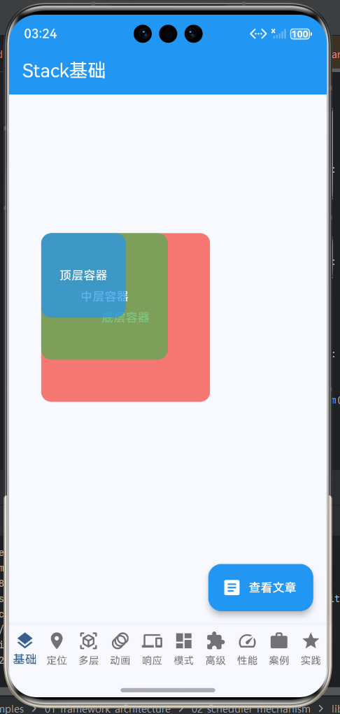
这段代码展示了Stack最基本的使用方式。我们创建了一个300x300的Stack容器,然后在其中放置了三个不同大小的Container。由于没有使用Positioned组件,这些容器会根据Stack的alignment属性(默认为左上角)进行堆叠。
每个Container都设置了半透明颜色(使用withOpacity方法),这样可以清楚地看到层叠效果。后添加的子组件会显示在前面,形成了红→绿→蓝的层叠顺序。
四、使用alignment属性
alignment属性的作用
alignment属性用于控制那些没有使用Positioned定位的子组件在Stack中的对齐方式。它是一个AlignmentGeometry类型的值,可以使用Alignment或AlignmentDirectional来指定。
Alignment坐标系
alignment使用示例
class AlignmentExample extends StatelessWidget {
const AlignmentExample({super.key});
Widget build(BuildContext context) {
return Scaffold(
appBar: AppBar(
title: const Text('alignment属性示例'),
backgroundColor: Colors.blue,
foregroundColor: Colors.white,
),
body: Column(
children: [
// 左上角对齐(默认)
Container(
margin: const EdgeInsets.all(10),
width: 200,
height: 200,
decoration: BoxDecoration(
border: Border.all(color: Colors.black, width: 2),
color: Colors.grey[200],
),
child: Stack(
alignment: Alignment.topLeft,
children: [
Container(
width: 80,
height: 80,
color: Colors.red.withOpacity(0.7),
child: const Center(child: Text('左上')),
),
],
),
),
// 中心对齐
Container(
margin: const EdgeInsets.all(10),
width: 200,
height: 200,
decoration: BoxDecoration(
border: Border.all(color: Colors.black, width: 2),
color: Colors.grey[200],
),
child: Stack(
alignment: Alignment.center,
children: [
Container(
width: 80,
height: 80,
color: Colors.green.withOpacity(0.7),
child: const Center(child: Text('中心')),
),
],
),
),
// 右下角对齐
Container(
margin: const EdgeInsets.all(10),
width: 200,
height: 200,
decoration: BoxDecoration(
border: Border.all(color: Colors.black, width: 2),
color: Colors.grey[200],
),
child: Stack(
alignment: Alignment.bottomRight,
children: [
Container(
width: 80,
height: 80,
color: Colors.blue.withOpacity(0.7),
child: const Center(child: Text('右下')),
),
],
),
),
],
),
);
}
}
五、使用fit属性
fit属性的作用
fit属性决定了那些没有使用Positioned定位的子组件如何适应Stack的大小。它有三种模式,每种模式适合不同的场景。
fit属性对比表
| 模式 | 行为 | 子组件大小 | 使用场景 |
|---|---|---|---|
| StackFit.loose | 子组件可以使用自己的大小 | 原始大小 | 大多数情况 |
| StackFit.expand | 子组件扩展到Stack大小 | 与Stack相同 | 需要填满 |
| StackFit.passthrough | 子组件使用父组件的约束 | 父约束 | 传递约束 |
fit使用示例
class FitExample extends StatelessWidget {
const FitExample({super.key});
Widget build(BuildContext context) {
return Scaffold(
appBar: AppBar(
title: const Text('fit属性示例'),
backgroundColor: Colors.blue,
foregroundColor: Colors.white,
),
body: Column(
children: [
// StackFit.loose
Container(
margin: const EdgeInsets.all(10),
width: 300,
height: 150,
decoration: BoxDecoration(
border: Border.all(color: Colors.black, width: 2),
color: Colors.grey[200],
),
child: Stack(
fit: StackFit.loose,
children: [
Container(
width: 100,
height: 50,
color: Colors.red.withOpacity(0.7),
child: const Center(child: Text('loose\n100x50')),
),
],
),
),
// StackFit.expand
Container(
margin: const EdgeInsets.all(10),
width: 300,
height: 150,
decoration: BoxDecoration(
border: Border.all(color: Colors.black, width: 2),
color: Colors.grey[200],
),
child: Stack(
fit: StackFit.expand,
children: [
Container(
color: Colors.green.withOpacity(0.7),
child: const Center(child: Text('expand\n填满Stack')),
),
],
),
),
],
),
);
}
}
六、Stack与Positioned配合使用
Positioned组件概述
Positioned是Stack的专用子组件,用于相对于Stack边界进行绝对定位。它提供了精确控制子组件位置的能力,是实现复杂层叠布局的关键。
Positioned的主要属性
| 属性名 | 类型 | 说明 |
|---|---|---|
| left | double | 左边缘距离 |
| top | double | 上边缘距离 |
| right | double | 右边缘距离 |
| bottom | double | 下边缘距离 |
| width | double | 宽度 |
| height | double | 高度 |
Positioned使用流程图
Positioned使用示例
class PositionedExample extends StatelessWidget {
const PositionedExample({super.key});
Widget build(BuildContext context) {
return Scaffold(
appBar: AppBar(
title: const Text('Positioned定位示例'),
backgroundColor: Colors.blue,
foregroundColor: Colors.white,
),
body: Center(
child: SizedBox(
width: 300,
height: 300,
child: Stack(
children: [
// 基础容器(未定位)
Container(
width: 200,
height: 200,
decoration: BoxDecoration(
color: Colors.grey[300],
borderRadius: BorderRadius.circular(10),
),
child: const Center(child: Text('基础容器')),
),
// 左上角定位
Positioned(
left: 10,
top: 10,
child: Container(
width: 60,
height: 60,
color: Colors.red,
child: const Center(
child: Text('左上', style: TextStyle(color: Colors.white)),
),
),
),
// 右上角定位
Positioned(
right: 10,
top: 10,
child: Container(
width: 60,
height: 60,
color: Colors.green,
child: const Center(
child: Text('右上', style: TextStyle(color: Colors.white)),
),
),
),
// 左下角定位
Positioned(
left: 10,
bottom: 10,
child: Container(
width: 60,
height: 60,
color: Colors.blue,
child: const Center(
child: Text('左下', style: TextStyle(color: Colors.white)),
),
),
),
// 右下角定位
Positioned(
right: 10,
bottom: 10,
child: Container(
width: 60,
height: 60,
color: Colors.orange,
child: const Center(
child: Text('右下', style: TextStyle(color: Colors.white)),
),
),
),
],
),
),
),
);
}
}
七、常见使用场景
场景一:卡片设计
class CardDesign extends StatelessWidget {
const CardDesign({super.key});
Widget build(BuildContext context) {
return Scaffold(
appBar: AppBar(
title: const Text('卡片设计'),
backgroundColor: Colors.blue,
foregroundColor: Colors.white,
),
body: ListView(
padding: const EdgeInsets.all(16),
children: [
Card(
elevation: 8,
child: Stack(
children: [
// 背景图片
ClipRRect(
borderRadius: const BorderRadius.vertical(top: Radius.circular(12)),
child: Image.network(
'https://via.placeholder.com/400x200',
width: double.infinity,
height: 200,
fit: BoxFit.cover,
),
),
// 渐变遮罩
Positioned.fill(
child: Container(
decoration: BoxDecoration(
gradient: LinearGradient(
begin: Alignment.topCenter,
end: Alignment.bottomCenter,
colors: [
Colors.transparent,
Colors.black.withOpacity(0.7),
],
),
),
),
),
// 标题
Positioned(
left: 16,
bottom: 16,
right: 16,
child: Text(
'Flutter学习指南',
style: TextStyle(
color: Colors.white,
fontSize: 24,
fontWeight: FontWeight.bold,
shadows: [
Shadow(
color: Colors.black.withOpacity(0.5),
blurRadius: 4,
),
],
),
),
),
// 收藏按钮
Positioned(
right: 16,
top: 16,
child: Container(
decoration: BoxDecoration(
color: Colors.white,
shape: BoxShape.circle,
boxShadow: [
BoxShadow(
color: Colors.black.withOpacity(0.2),
blurRadius: 4,
),
],
),
child: const IconButton(
icon: Icon(Icons.favorite_border, color: Colors.red),
onPressed: null,
),
),
),
],
),
),
],
),
);
}
}
场景二:浮动按钮
class FloatingActionButton extends StatelessWidget {
const FloatingActionButton({super.key});
Widget build(BuildContext context) {
return Scaffold(
appBar: AppBar(
title: const Text('浮动按钮'),
backgroundColor: Colors.blue,
foregroundColor: Colors.white,
),
body: Stack(
children: [
// 主内容区域
ListView.builder(
padding: const EdgeInsets.all(16),
itemCount: 20,
itemBuilder: (context, index) {
return Card(
margin: const EdgeInsets.only(bottom: 16),
child: ListTile(
leading: CircleAvatar(
child: Text('${index + 1}'),
),
title: Text('列表项 ${index + 1}'),
subtitle: Text('这是第${index + 1}项的描述信息'),
),
);
},
),
// 浮动添加按钮
Positioned(
right: 16,
bottom: 16,
child: Container(
decoration: BoxDecoration(
gradient: const LinearGradient(
colors: [Colors.blue, Colors.purple],
),
shape: BoxShape.circle,
boxShadow: [
BoxShadow(
color: Colors.blue.withOpacity(0.4),
blurRadius: 12,
spreadRadius: 4,
),
],
),
child: const Icon(Icons.add, size: 32, color: Colors.white),
),
),
// 快速操作按钮
Positioned(
left: 16,
bottom: 16,
child: Row(
children: [
_buildQuickButton(Icons.refresh, Colors.green),
const SizedBox(width: 12),
_buildQuickButton(Icons.settings, Colors.orange),
],
),
),
],
),
);
}
Widget _buildQuickButton(IconData icon, Color color) {
return Container(
decoration: BoxDecoration(
color: color,
shape: BoxShape.circle,
boxShadow: [
BoxShadow(
color: color.withOpacity(0.4),
blurRadius: 8,
spreadRadius: 2,
),
],
),
child: Icon(icon, color: Colors.white),
);
}
}
八、性能优化建议
优化要点
| 优化项 | 说明 | 建议 |
|---|---|---|
| 避免过度嵌套 | 减少Stack层级 | 控制在3层以内 |
| 合理使用clipBehavior | 避免不必要的裁剪 | 默认使用Clip.none |
| 使用const构造函数 | 减少重建 | 静态组件使用const |
| 控制子组件数量 | 过多子组件影响性能 | 建议不超过5个 |
| 使用IndexedStack | 切换显示而不是重建 | 需要切换时使用 |
性能对比示例
class PerformanceExample extends StatelessWidget {
const PerformanceExample({super.key});
Widget build(BuildContext context) {
return Scaffold(
appBar: AppBar(
title: const Text('性能优化'),
backgroundColor: Colors.blue,
foregroundColor: Colors.white,
),
body: Column(
children: [
// 不推荐的写法
Container(
margin: const EdgeInsets.all(16),
padding: const EdgeInsets.all(16),
decoration: BoxDecoration(
border: Border.all(color: Colors.red, width: 2),
borderRadius: BorderRadius.circular(8),
),
child: Column(
crossAxisAlignment: CrossAxisAlignment.start,
children: [
const Text(
'不推荐:过度嵌套',
style: TextStyle(fontSize: 18, fontWeight: FontWeight.bold),
),
const SizedBox(height: 8),
const Text('使用多个Stack嵌套会增加渲染开销'),
Stack(
children: [
Stack(
children: [
Stack(
children: [
Container(
width: 100,
height: 100,
color: Colors.red.withOpacity(0.5),
),
],
),
],
),
],
),
],
),
),
// 推荐的写法
Container(
margin: const EdgeInsets.all(16),
padding: const EdgeInsets.all(16),
decoration: BoxDecoration(
border: Border.all(color: Colors.green, width: 2),
borderRadius: BorderRadius.circular(8),
),
child: Column(
crossAxisAlignment: CrossAxisAlignment.start,
children: [
const Text(
'推荐:单一Stack',
style: TextStyle(fontSize: 18, fontWeight: FontWeight.bold),
),
const SizedBox(height: 8),
const Text('使用Positioned控制所有子组件位置'),
SizedBox(
height: 100,
child: Stack(
children: [
Positioned(
left: 0,
top: 0,
child: Container(
width: 80,
height: 80,
color: Colors.green.withOpacity(0.5),
),
),
Positioned(
right: 0,
bottom: 0,
child: Container(
width: 60,
height: 60,
color: Colors.blue.withOpacity(0.5),
),
),
],
),
),
],
),
),
],
),
);
}
}
九、常见问题与解决方案
问题一:子组件不显示
问题描述:添加到Stack的子组件没有显示
原因分析:
- 子组件大小为0
- Stack本身没有大小
- 子组件被完全覆盖
解决方案:
// 方案1:明确设置子组件大小
Stack(
  children: [
    Container(
      width: 100,  // 明确设置宽度
      height: 100, // 明确设置高度
      color: Colors.red,
    ),
  ],
)

// 方案2:使用Positioned定位
Stack(
  children: [
    Positioned(
      left: 0,
      top: 0,
      child: Container(
        color: Colors.red,
      ),
    ),
  ],
)

// 方案3:设置Stack大小
SizedBox(
  width: 200,
  height: 200,
  child: Stack(
    children: [
      Container(color: Colors.red),
    ],
  ),
)
问题二:定位不准确
问题描述:使用Positioned后,子组件位置不符合预期
原因分析:
- 没有设置Stack的大小
- 使用了错误的定位属性组合
- Stack的padding影响定位
解决方案:
// 正确的定位方式
SizedBox(
  width: 300,
  height: 300,
  child: Stack(
    children: [
      // 方式1:使用left和right
      Positioned(
        left: 10,
        right: 10,
        child: Container(
          height: 50,
          color: Colors.red,
        ),
      ),
      // 方式2:使用left和width
      Positioned(
        left: 10,
        width: 100,
        child: Container(
          height: 50,
          color: Colors.green,
        ),
      ),
      // 方式3:混合使用
      Positioned(
        left: 10,
        top: 70,
        right: 10,
        bottom: 10,
        child: Container(
          color: Colors.blue,
        ),
      ),
    ],
  ),
)
问题三:裁剪问题
问题描述:子组件超出Stack边界显示异常
原因分析:
- Stack的clipBehavior默认为none
- 需要裁剪但未设置
解决方案:
// 方案1:设置clipBehavior
Stack(
  clipBehavior: Clip.antiAlias,
  children: [
    Positioned(
      left: -20,
      top: -20,
      child: Container(
        width: 100,
        height: 100,
        color: Colors.red,
      ),
    ),
  ],
)

// 方案2:使用ClipRRect包装
ClipRRect(
  borderRadius: BorderRadius.circular(12),
  child: Stack(
    children: [
      Container(
        width: 200,
        height: 200,
        color: Colors.red,
      ),
    ],
  ),
)
十、实战案例总结
Stack使用决策树
最佳实践清单
- 合理设置Stack的大小,避免子组件无法显示
- 优先使用Positioned进行精确定位
- 使用alignment处理简单对齐需求
- 根据需要设置fit属性
- 合理使用clipBehavior避免不必要的裁剪
- 控制Stack的嵌套深度
- 使用const构造函数优化性能
- 测试不同屏幕尺寸下的显示效果
通过以上内容的学习,你应该已经掌握了Stack和Positioned组件的核心用法。在实际开发中,Stack是实现复杂UI设计的重要工具,合理使用可以大大提升应用的用户体验。记住,多练习是掌握Stack的关键,建议在实际项目中多尝试不同的布局方案。
欢迎加入开源鸿蒙跨平台社区:https://openharmonycrossplatform.csdn.net

讨论HarmonyOS开发技术,专注于API与组件、DevEco Studio、测试、元服务和应用上架分发等。
更多推荐
 22
22 0
0- 0


 已为社区贡献21条内容

所有评论(0)