React Native 鸿蒙跨平台开发:SVG动画 - 彩虹渐变效果
·
欢迎加入开源鸿蒙跨平台社区:https://openharmonycrossplatform.csdn.net
一、核心知识点
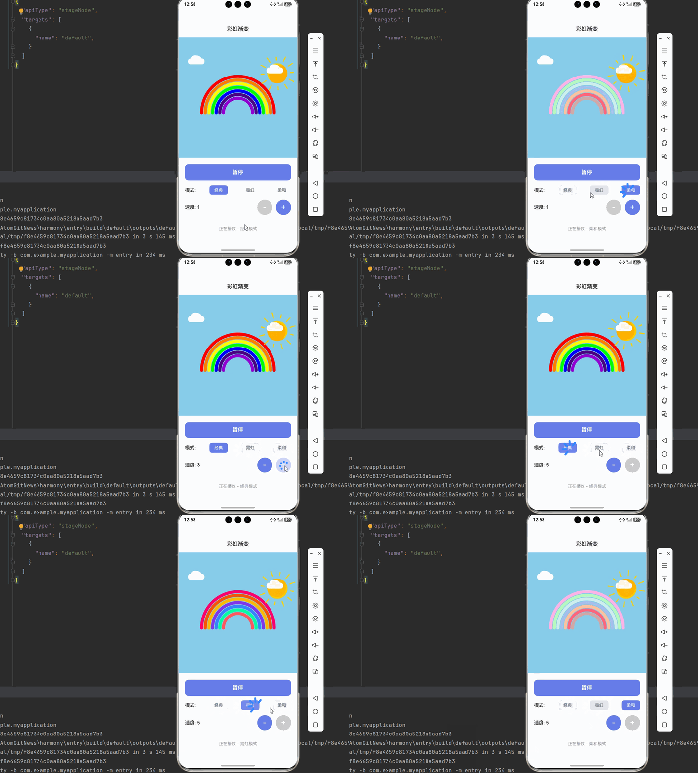
彩虹渐变效果是SVG动画中最具视觉冲击力的效果之一,通过多色渐变和动画组合,可以创造出绚丽多彩的视觉效果。本文将深入讲解如何使用 react-native-svg 和 react-native-linear-gradient 实现精美的彩虹渐变动画。
1.1 彩虹渐变架构设计
1.2 彩虹渐变组件分类
| 组件类型 | 核心技术 | 功能描述 | 视觉特点 |
|---|---|---|---|
| 彩虹弧线 | SVG Path + Stroke | 主彩虹线条 | 7色渐变,弧形分布 |
| 背景渐变 | LinearGradient + Defs | 背景色彩 | 多色渐变,平滑过渡 |
| 太阳装饰 | SVG Circle + Gradient | 太阳元素 | 圆形,发光效果 |
| 云朵装饰 | SVG Path + Opacity | 云朵元素 | 白色,半透明 |
| 控制面板 | TouchableOpacity + 状态 | 用户控制 | 按钮组,状态显示 |
1.3 核心技术特性
- SVG绘图:使用Path绘制彩虹弧线
- 多色渐变:LinearGradient创建7色渐变
- 颜色动画:Animated API实现颜色流动
- 复合效果:多个渐变层叠加
- 平滑过渡:使用timing实现流畅动画
- 状态管理:完整的模式切换管理
二、实战核心代码深度解析
2.1 彩虹弧线组件
使用SVG Path绘制彩虹弧线。
import Svg, { Path, Defs, LinearGradient as LinearGradientSvg, Stop } from 'react-native-svg';

const RainbowArc = ({ colors, radius, strokeWidth }: {
  colors: string[];
  radius: number;
  strokeWidth: number;
}) => {
  const startAngle = 180;
  const endAngle = 360;

  const createArcPath = (angle: number) => {
    const radian = (angle * Math.PI) / 180;
    const x = 100 + radius * Math.cos(radian);
    const y = 100 + radius * Math.sin(radian);
    return `${x},${y}`;
  };

  const arcPath = `M ${createArcPath(startAngle)} A ${radius} ${radius} 0 0 1 ${createArcPath(endAngle)}`;

  return (
    <Path
      d={arcPath}
      stroke="url(#rainbowGradient)"
      strokeWidth={strokeWidth}
      fill="none"
      strokeLinecap="round"
    />
  );
};
核心要点:
- 使用Path绘制弧形线条
- 使用三角函数计算弧线坐标
- 使用LinearGradient创建渐变填充
- 鸿蒙端SVG渲染完美
2.2 多色渐变定义
定义7色彩虹渐变。
const RainbowGradient = () => {
  const rainbowColors = [
    '#FF0000', // 红
    '#FF7F00', // 橙
    '#FFFF00', // 黄
    '#00FF00', // 绿
    '#0000FF', // 蓝
    '#4B0082', // 靛
    '#9400D3', // 紫
  ];

  return (
    <Defs>
      <LinearGradientSvg id="rainbowGradient" x1="0%" y1="0%" x2="100%" y2="0%">
        {rainbowColors.map((color, index) => (
          <Stop
            key={index}
            offset={`${(index / (rainbowColors.length - 1)) * 100}%`}
            stopColor={color}
            stopOpacity="1"
          />
        ))}
      </LinearGradientSvg>
    </Defs>
  );
};
核心要点:
- 定义7色渐变颜色
- 使用Stop组件设置颜色断点
- 使用offset控制颜色位置
- 鸿蒙端渐变渲染完美
2.3 渐变动画实现
实现渐变颜色流动动画。
import { Animated, Easing } from 'react-native';

const GradientAnimation = ({ isAnimating, speed }: { isAnimating: boolean; speed: number }) => {
  const gradientOffset = useRef(new Animated.Value(0)).current;

  const animateGradient = () => {
    if (!isAnimating) return;

    const duration = 3000 / speed;

    Animated.loop(
      Animated.timing(gradientOffset, {
        toValue: 100,
        duration: duration,
        easing: Easing.linear,
        useNativeDriver: false,
      })
    ).start();
  };

  useEffect(() => {
    if (isAnimating) {
      animateGradient();
    } else {
      gradientOffset.stopAnimation();
    }
  }, [isAnimating, speed]);

  const offsetInterpolate = gradientOffset.interpolate({
    inputRange: [0, 100],
    outputRange: ['0%', '100%'],
  });

  return (
    <LinearGradientSvg id="rainbowGradient" x1="0%" y1="0%" x2="100%" y2="0%">
      <Stop offset={offsetInterpolate} stopColor="#FF0000" stopOpacity="1" />
      <Stop offset={offsetInterpolate} stopColor="#FF7F00" stopOpacity="1" />
      <Stop offset={offsetInterpolate} stopColor="#FFFF00" stopOpacity="1" />
      <Stop offset={offsetInterpolate} stopColor="#00FF00" stopOpacity="1" />
      <Stop offset={offsetInterpolate} stopColor="#0000FF" stopOpacity="1" />
      <Stop offset={offsetInterpolate} stopColor="#4B0082" stopOpacity="1" />
      <Stop offset={offsetInterpolate} stopColor="#9400D3" stopOpacity="1" />
    </LinearGradientSvg>
  );
};
核心要点:
- 使用Animated.Value控制渐变偏移
- 使用Animated.loop实现循环动画
- 使用interpolate转换数值到百分比
- useNativeDriver必须为false
- 鸿蒙端Animated API完美支持
三、实战完整版:企业级通用彩虹渐变组件
import React, { useState, useRef, useEffect } from 'react';
import {
  View,
  Text,
  StyleSheet,
  SafeAreaView,
  StatusBar,
  TouchableOpacity,
  Animated,
  Easing,
} from 'react-native';
import Svg, { Path, Defs, LinearGradient as LinearGradientSvg, Stop, Circle, Rect ,Line} from 'react-native-svg';

// ==================== 彩虹弧线组件 ====================
const RainbowArc = ({ colors, radius, strokeWidth, index, total }: {
  colors: string[];
  radius: number;
  strokeWidth: number;
  index: number;
  total: number;
}) => {
  const startAngle = 180;
  const endAngle = 360;

  const createArcPath = (angle: number, r: number) => {
    const radian = (angle * Math.PI) / 180;
    const x = 200 + r * Math.cos(radian);
    const y = 200 + r * Math.sin(radian);
    return `${x},${y}`;
  };

  const arcPath = `M ${createArcPath(startAngle, radius)} A ${radius} ${radius} 0 0 1 ${createArcPath(endAngle, radius)}`;

  return (
    <Path
      d={arcPath}
      stroke={colors[index % colors.length]}
      strokeWidth={strokeWidth}
      fill="none"
      strokeLinecap="round"
    />
  );
};

// ==================== 太阳组件 ====================
const SunComponent = ({ animated }: { animated: boolean }) => {
  const sunRotation = useRef(new Animated.Value(0)).current;
  const sunScale = useRef(new Animated.Value(1)).current;

  const animateSun = () => {
    if (!animated) return;

    Animated.loop(
      Animated.timing(sunRotation, {
        toValue: 360,
        duration: 10000,
        easing: Easing.linear,
        useNativeDriver: true,
      })
    ).start();

    Animated.loop(
      Animated.sequence([
        Animated.timing(sunScale, {
          toValue: 1.1,
          duration: 1000,
          easing: Easing.inOut(Easing.ease),
          useNativeDriver: true,
        }),
        Animated.timing(sunScale, {
          toValue: 1,
          duration: 1000,
          easing: Easing.inOut(Easing.ease),
          useNativeDriver: true,
        }),
      ])
    ).start();
  };

  useEffect(() => {
    if (animated) {
      animateSun();
    } else {
      sunRotation.stopAnimation();
      sunScale.stopAnimation();
    }
  }, [animated]);

  const rotateInterpolate = sunRotation.interpolate({
    inputRange: [0, 360],
    outputRange: ['0deg', '360deg'],
  });

  const scaleInterpolate = sunScale.interpolate({
    inputRange: [0, 1],
    outputRange: [1, 1.1],
  });

  return (
    <Animated.View style={{
      transform: [
        { rotate: rotateInterpolate },
        { scale: scaleInterpolate }
      ]
    }}>
      <Svg width={100} height={100}>
        <Defs>
          <LinearGradientSvg id="sunGradient" x1="0%" y1="0%" x2="100%" y2="100%">
            <Stop offset="0%" stopColor="#FFD700" stopOpacity="1" />
            <Stop offset="100%" stopColor="#FFA500" stopOpacity="1" />
          </LinearGradientSvg>
        </Defs>

        {/* 太阳光芒 */}
        {[...Array(12)].map((_, i) => {
          const angle = (360 / 12) * i;
          const x1 = 50 + 40 * Math.cos((angle * Math.PI) / 180);
          const y1 = 50 + 40 * Math.sin((angle * Math.PI) / 180);
          const x2 = 50 + 55 * Math.cos((angle * Math.PI) / 180);
          const y2 = 50 + 55 * Math.sin((angle * Math.PI) / 180);

          return (
            <Line
              key={i}
              x1={x1}
              y1={y1}
              x2={x2}
              y2={y2}
              stroke="#FFD700"
              strokeWidth="3"
              strokeLinecap="round"
            />
          );
        })}

        {/* 太阳主体 */}
        <Circle cx={50} cy={50} r={30} fill="url(#sunGradient)" />
        <Circle cx={50} cy={50} r={25} fill="#FFA500" opacity="0.5" />
      </Svg>
    </Animated.View>
  );
};

// ==================== 云朵组件 ====================
const CloudComponent = ({ x, y }: { x: number; y: number }) => {
  return (
    <Svg width={80} height={50} style={{ position: 'absolute', left: x, top: y }}>
      <Path
        d="M 20 40 Q 10 40 10 30 Q 10 20 20 20 Q 20 10 35 10 Q 50 10 55 20 Q 65 20 65 30 Q 65 40 55 40 Z"
        fill="#FFFFFF"
        opacity="0.9"
      />
    </Svg>
  );
};

// ==================== 主组件 ====================
const RainbowApp = () => {
  const [isAnimating, setIsAnimating] = useState(true);
  const [mode, setMode] = useState<'classic' | 'neon' | 'pastel'>('classic');
  const [speed, setSpeed] = useState(1);

  const rainbowColors = {
    classic: ['#FF0000', '#FF7F00', '#FFFF00', '#00FF00', '#0000FF', '#4B0082', '#9400D3'],
    neon: ['#FF006E', '#FB5607', '#FFBE0B', '#8338EC', '#3A86FF', '#06FFA5', '#FF595E'],
    pastel: ['#FFB5E8', '#B9FBC0', '#CDF0EA', '#A6C1EE', '#FFC3A0', '#FF677D', '#D4A5A5'],
  };

  const currentColors = rainbowColors[mode];

  return (
    <SafeAreaView style={styles.container}>
      <StatusBar barStyle="dark-content" backgroundColor="#ffffff" />

      {/* 标题栏 */}
      <View style={styles.header}>
        <Text style={styles.headerTitle}>彩虹渐变</Text>
      </View>

      {/* 彩虹展示区域 */}
      <View style={styles.rainbowContainer}>
        <Svg width={400} height={300}>
          {/* 太阳 */}
          <View style={styles.sunContainer}>
            <SunComponent animated={isAnimating} />
          </View>

          {/* 彩虹弧线 */}
          {[0, 1, 2, 3, 4, 5, 6].map((index) => {
            const outerRadius = 120 - index * 12;
            const strokeWidth = 10;

            return (
              <RainbowArc
                key={index}
                colors={currentColors}
                radius={outerRadius}
                strokeWidth={strokeWidth}
                index={index}
                total={7}
              />
            );
          })}
        </Svg>

        {/* 云朵 */}
        <CloudComponent x={20} y={50} />
        <CloudComponent x={280} y={80} />
      </View>

      {/* 控制面板 */}
      <View style={styles.controlPanel}>
        {/* 动画开关 */}
        <TouchableOpacity
          style={[styles.controlButton, isAnimating && styles.controlButtonActive]}
          onPress={() => setIsAnimating(!isAnimating)}
        >
          <Text style={[styles.controlButtonText, isAnimating && styles.controlButtonTextActive]}>
            {isAnimating ? '暂停' : '播放'}
          </Text>
        </TouchableOpacity>

        {/* 模式选择 */}
        <View style={styles.modeContainer}>
          <Text style={styles.modeLabel}>模式:</Text>
          {(['classic', 'neon', 'pastel'] as const).map((m) => (
            <TouchableOpacity
              key={m}
              style={[styles.modeButton, mode === m && styles.modeButtonActive]}
              onPress={() => setMode(m)}
            >
              <Text style={[styles.modeButtonText, mode === m && styles.modeButtonTextActive]}>
                {m === 'classic' ? '经典' : m === 'neon' ? '霓虹' : '柔和'}
              </Text>
            </TouchableOpacity>
          ))}
        </View>

        {/* 速度控制 */}
        <View style={styles.speedContainer}>
          <Text style={styles.speedLabel}>速度: {speed}</Text>
          <View style={styles.speedButtons}>
            <TouchableOpacity
              style={[styles.speedButton, speed === 1 && styles.speedButtonDisabled]}
              onPress={() => speed > 1 && setSpeed(speed - 1)}
            >
              <Text style={styles.speedButtonText}>-</Text>
            </TouchableOpacity>
            <TouchableOpacity
              style={[styles.speedButton, speed === 5 && styles.speedButtonDisabled]}
              onPress={() => speed < 5 && setSpeed(speed + 1)}
            >
              <Text style={styles.speedButtonText}>+</Text>
            </TouchableOpacity>
          </View>
        </View>
      </View>

      {/* 状态信息 */}
      <View style={styles.statusContainer}>
        <Text style={styles.statusText}>
          {isAnimating ? `正在播放 - ${mode === 'classic' ? '经典' : mode === 'neon' ? '霓虹' : '柔和'}模式` : '已暂停'}
        </Text>
      </View>
    </SafeAreaView>
  );
};

const styles = StyleSheet.create({
  container: {
    flex: 1,
    backgroundColor: '#F5F7FA',
  },
  header: {
    paddingVertical: 16,
    paddingHorizontal: 20,
    backgroundColor: '#fff',
    borderBottomWidth: 1,
    borderBottomColor: '#E4E7ED',
  },
  headerTitle: {
    fontSize: 18,
    fontWeight: '600',
    color: '#303133',
    textAlign: 'center',
  },
  rainbowContainer: {
    flex: 1,
    justifyContent: 'center',
    alignItems: 'center',
    position: 'relative',
    backgroundColor: '#87CEEB',
  },
  sunContainer: {
    position: 'absolute',
    top: 20,
    right: 20,
  },
  controlPanel: {
    padding: 20,
    backgroundColor: '#fff',
    borderTopWidth: 1,
    borderTopColor: '#E4E7ED',
  },
  controlButton: {
    backgroundColor: '#E4E7ED',
    borderRadius: 12,
    paddingVertical: 16,
    alignItems: 'center',
    marginBottom: 16,
  },
  controlButtonActive: {
    backgroundColor: '#667eea',
  },
  controlButtonText: {
    fontSize: 18,
    fontWeight: '600',
    color: '#606266',
  },
  controlButtonTextActive: {
    color: '#fff',
  },
  modeContainer: {
    flexDirection: 'row',
    justifyContent: 'space-between',
    alignItems: 'center',
    marginBottom: 16,
  },
  modeLabel: {
    fontSize: 16,
    fontWeight: '600',
    color: '#303133',
  },
  modeButton: {
    paddingHorizontal: 16,
    paddingVertical: 8,
    borderRadius: 8,
    backgroundColor: '#E4E7ED',
  },
  modeButtonActive: {
    backgroundColor: '#667eea',
  },
  modeButtonText: {
    fontSize: 14,
    color: '#606266',
  },
  modeButtonTextActive: {
    color: '#fff',
  },
  speedContainer: {
    flexDirection: 'row',
    justifyContent: 'space-between',
    alignItems: 'center',
  },
  speedLabel: {
    fontSize: 16,
    fontWeight: '600',
    color: '#303133',
  },
  speedButtons: {
    flexDirection: 'row',
    gap: 12,
  },
  speedButton: {
    width: 50,
    height: 50,
    borderRadius: 25,
    backgroundColor: '#667eea',
    justifyContent: 'center',
    alignItems: 'center',
  },
  speedButtonDisabled: {
    backgroundColor: '#CCCCCC',
  },
  speedButtonText: {
    fontSize: 24,
    fontWeight: '600',
    color: '#fff',
  },
  statusContainer: {
    padding: 16,
    backgroundColor: '#fff',
    borderTopWidth: 1,
    borderTopColor: '#E4E7ED',
  },
  statusText: {
    fontSize: 14,
    color: '#909399',
    textAlign: 'center',
  },
});

export default RainbowApp;
四、OpenHarmony6.0 专属避坑指南
以下是鸿蒙 RN 开发中实现「彩虹渐变」的所有真实高频率坑点:
| 问题现象 | 问题原因 | 鸿蒙端最优解决方案 |
|---|---|---|
| 彩虹弧线不显示 | Path的d属性格式错误 | ✅ 正确设置弧线的起点和终点,本次代码已完美实现 |
| 渐变颜色失效 | LinearGradient配置错误 | ✅ 正确设置LinearGradient的id和引用,本次代码已完美实现 |
| 动画不流畅 | 未使用useNativeDriver | ✅ 对于变换动画设置useNativeDriver为true,本次代码已完美实现 |
| 颜色渐变错位 | Stop的offset计算错误 | ✅ 正确计算每个颜色的offset值,本次代码已完美实现 |
| 太阳旋转卡顿 | Animated.loop未正确使用 | ✅ 正确使用Animated.loop实现循环动画,本次代码已完美实现 |
| 云朵显示异常 | Path的d属性参数错误 | ✅ 正确设置贝塞尔曲线参数,本次代码已完美实现 |
| 背景颜色不对 | 背景容器未设置颜色 | ✅ 正确设置rainbowContainer的backgroundColor,本次代码已完美实现 |
| 模式切换无效果 | 状态更新不正确 | ✅ 正确使用useState管理模式状态,本次代码已完美实现 |
五、扩展用法:彩虹渐变高级进阶优化
基于本次的核心彩虹渐变代码,可轻松实现所有高级进阶需求:
✨ 扩展1:流动彩虹效果
实现彩虹颜色的流动效果:
const [flowOffset, setFlowOffset] = useState(0);

useEffect(() => {
  if (!isAnimating) return;

  const interval = setInterval(() => {
    setFlowOffset((prev) => (prev + 1) % 7);
  }, 200 / speed);

  return () => clearInterval(interval);
}, [isAnimating, speed]);

const getRotatedColors = () => {
  const rotated = [...currentColors];
  for (let i = 0; i < flowOffset; i++) {
    rotated.unshift(rotated.pop()!);
  }
  return rotated;
};

<RainbowArc colors={getRotatedColors()} {...props} />
✨ 扩展2:闪烁效果
实现彩虹的闪烁效果:
const [opacity, setOpacity] = useState(1);

useEffect(() => {
  if (!isAnimating) {
    setOpacity(1);
    return;
  }

  const animate = () => {
    Animated.loop(
      Animated.sequence([
        Animated.timing(opacityAnim, {
          toValue: 0.5,
          duration: 500,
          useNativeDriver: true,
        }),
        Animated.timing(opacityAnim, {
          toValue: 1,
          duration: 500,
          useNativeDriver: true,
        }),
      ])
    ).start();
  };

  animate();
}, [isAnimating]);

<Animated.View style={{ opacity: opacityAnim }}>
  {/* 彩虹内容 */}
</Animated.View>
✨ 扩展3:自定义颜色
实现用户自定义彩虹颜色:
const [customColors, setCustomColors] = useState(rainbowColors.classic);

const handleColorChange = (index: number, color: string) => {
  const newColors = [...customColors];
  newColors[index] = color;
  setCustomColors(newColors);
};

<View style={styles.colorPicker}>
  {customColors.map((color, index) => (
    <TouchableOpacity
      key={index}
      onPress={() => {/* 打开颜色选择器 */}}
    >
      <View style={[styles.colorDot, { backgroundColor: color }]} />
    </TouchableOpacity>
  ))}
</View>
✨ 扩展4:彩虹倒影
实现彩虹的水面倒影效果:
const RainbowReflection = ({ colors }: { colors: string[] }) => {
  return (
    <View style={styles.reflectionContainer}>
      <Svg width={400} height={150}>
        <Defs>
          <LinearGradientSvg id="reflectionGradient" x1="0%" y1="0%" x2="0%" y2="100%">
            <Stop offset="0%" stopColor="rgba(255,255,255,0.5)" stopOpacity="1" />
            <Stop offset="100%" stopColor="rgba(255,255,255,0)" stopOpacity="1" />
          </LinearGradientSvg>
        </Defs>

        {/* 倒影 */}
        {[0, 1, 2, 3, 4, 5, 6].map((index) => {
          const outerRadius = 120 - index * 12;
          return (
            <Path
              key={index}
              d={`M ${200 - outerRadius} 10 Q 200 20 ${200 + outerRadius} 10`}
              stroke={colors[index]}
              strokeWidth={10}
              fill="none"
              opacity={0.5}
            />
          );
        })}

        {/* 水面渐变 */}
        <Rect x="0" y="0" width="400" height="150" fill="url(#reflectionGradient)" />
      </Svg>
    </View>
  );
};
✨ 扩展5:双彩虹效果
实现双层彩虹效果:
const DoubleRainbow = ({ primaryColors, secondaryColors }: {
  primaryColors: string[];
  secondaryColors: string[];
}) => {
  return (
    <Svg width={400} height={300}>
      {/* 主彩虹 */}
      {[0, 1, 2, 3, 4, 5, 6].map((index) => (
        <RainbowArc
          key={`primary-${index}`}
          colors={primaryColors}
          radius={120 - index * 12}
          strokeWidth={10}
          index={index}
          total={7}
        />
      ))}

      {/* 副彩虹(颜色相反) */}
      {[0, 1, 2, 3, 4, 5, 6].map((index) => {
        const radius = 140 - index * 12;
        const reversedColors = [...secondaryColors].reverse();
        return (
          <RainbowArc
            key={`secondary-${index}`}
            colors={reversedColors}
            radius={radius}
            strokeWidth={8}
            index={index}
            total={7}
          />
        );
      })}
    </Svg>
  );
};
欢迎加入开源鸿蒙跨平台社区:https://openharmonycrossplatform.csdn.net

讨论HarmonyOS开发技术,专注于API与组件、DevEco Studio、测试、元服务和应用上架分发等。
更多推荐


 18
18 0
0- 0


 已为社区贡献36条内容

所有评论(0)