ReactNative项目鸿蒙化三方库集成实战:react-native-calendars(日历展开和日程模块存在兼容性问题)
欢迎加入开源鸿蒙跨平台社区:https://openharmonycrossplatform.csdn.net
📋 前言
健康管理、行程规划类应用的核心功能。无论是记录日程、选择日期、查看历史记录,都需要一个功能完善的日历组件。react-native-calendars 是 React Native 生态中最流行的日历库,提供了丰富的日历视图和日程管理功能。
🎯 库简介
基本信息
- 库名称:
react-native-calendars - 版本信息:
1.1304.1+react-native-calendars: 支持 RN 0.72 版本1.1313.0+react-native-calendars: 支持 RN 0.77 版本
- 官方仓库: https://github.com/wix/react-native-calendars
- 主要功能:
- 📅 多种日历视图(周视图、月视图)
- 📋 日程管理(Agenda)
- 🎨 完全可定制的主题
- 🗓️ 日期范围选择
- ⭐ 标记特殊日期
- 📱 响应式设计
为什么需要 react-native-calendars?
| 特性 | React Native DatePicker | react-native-calendars |
|---|---|---|
| 日历视图 | ❌ 不支持 | ✅ 支持多种视图 |
| 标记日期 | ❌ 不支持 | ✅ 支持 |
| 日程显示 | ❌ 不支持 | ✅ Agenda 组件 (存在问题) |
| 主题定制 | ⚠️ 有限支持 | ✅ 完全可定制 |
| 周视图/月视图 | ❌ 不支持 | ✅ 支持 |
| HarmonyOS 支持 | ⚠️ 部分支持 | ✅ 完全支持 |
支持的组件
| 组件 | 说明 | HarmonyOS 支持 |
|---|---|---|
| Calendar | 基础日历组件 | ✅ |
| CalendarList | 可滚动的日历列表 | ✅ |
| Agenda | 日程列表组件 | ⚠️ 布局问题 |
| AgendaList | 日程列表(SectionList) | ✅ |
| CalendarProvider | 日历上下文提供者 | ✅ |
| ExpandableCalendar | 可展开的日历 | ⚠️ 布局问题 |
| Timeline | 时间线组件 | ✅ |
| WeekCalendar | 周日历组件 | ✅ |
⚠️ 注意:
Agenda和ExpandableCalendar组件在 HarmonyOS 平台存在布局问题,建议使用Calendar+FlatList组合替代。详见 已知问题 章节。
兼容性验证
在以下环境验证通过:
- RNOH: 0.72.90; SDK: HarmonyOS 6.0.0 Release SDK; IDE: DevEco Studio 6.0.2; ROM: 6.0.0
📦 安装步骤
1. 安装依赖
在项目根目录执行以下命令:
# RN 0.72 版本
npm install react-native-calendars@1.1304.1

# RN 0.77 版本
npm install react-native-calendars@1.1313.0
2. 验证安装
安装完成后,检查 package.json 文件,应该能看到新增的依赖:
{
  "dependencies": {
    "react-native-calendars": "1.1304.1",
    // ... 其他依赖
  }
}
🔧 HarmonyOS 平台配置
react-native-calendars 是纯 JavaScript 库,不需要原生模块配置,安装后即可直接使用。
TypeScript 类型声明
如果遇到 TypeScript 类型错误,需要创建类型声明文件。在 src/types 目录下创建 react-native-calendars.d.ts 文件:
declare module 'react-native-calendars' {
  import { Component } from 'react';
  import { ViewStyle, StyleProp, TextStyle } from 'react-native';

  interface DateData {
    year: number;
    month: number;
    day: number;
    timestamp: number;
    dateString: string;
  }

  interface MarkingProps {
    dotColor?: string;
    marked?: boolean;
    selected?: boolean;
    selectedColor?: string;
    disableTouchEvent?: boolean;
    customStyles?: {
      container?: StyleProp<ViewStyle>;
      text?: StyleProp<TextStyle>;
    };
  }

  interface MarkedDatesType {
    [date: string]: MarkingProps;
  }

  interface CalendarTheme {
    backgroundColor?: string;
    calendarBackground?: string;
    textSectionTitleColor?: string;
    selectedDayBackgroundColor?: string;
    selectedDayTextColor?: string;
    todayTextColor?: string;
    dayTextColor?: string;
    textDisabledColor?: string;
    dotColor?: string;
    selectedDotColor?: string;
    arrowColor?: string;
    monthTextColor?: string;
    agendaDayTextColor?: string;
    agendaDayNumColor?: string;
    agendaTodayColor?: string;
    agendaKnobColor?: string;
  }

  interface AgendaItem {
    name: string;
    time?: string;
    height: number;
    [key: string]: any;
  }

  interface AgendaItemsType {
    [date: string]: AgendaItem[];
  }

  interface CalendarProps {
    current?: string;
    minDate?: string;
    maxDate?: string;
    selected?: string;
    markedDates?: MarkedDatesType;
    markingType?: 'simple' | 'multi-dot' | 'multi-period' | 'custom';
    theme?: CalendarTheme;
    onDayPress?: (day: DateData) => void;
    onDayLongPress?: (day: DateData) => void;
    onMonthChange?: (month: DateData) => void;
    enableSwipeMonths?: boolean;
    hideArrows?: boolean;
    hideExtraDays?: boolean;
    firstDay?: number;
    showWeekNumbers?: boolean;
    style?: StyleProp<ViewStyle>;
  }

  interface AgendaProps {
    items?: AgendaItemsType;
    loadItemsForMonth?: (month: DateData) => void;
    onDayPress?: (day: DateData) => void;
    selected?: string;
    minDate?: string;
    maxDate?: string;
    renderItem?: (item: AgendaItem, isFirst: boolean) => React.ReactNode;
    renderEmptyData?: () => React.ReactNode;
    markedDates?: MarkedDatesType;
    theme?: CalendarTheme;
    style?: StyleProp<ViewStyle>;
  }

  interface CalendarProviderProps {
    date: string;
    onDateChanged?: (date: string, updateSource: string) => void;
    children: React.ReactNode;
  }

  interface ExpandableCalendarProps {
    current?: string;
    minDate?: string;
    maxDate?: string;
    markedDates?: MarkedDatesType;
    markingType?: 'simple' | 'multi-dot' | 'multi-period' | 'custom';
    theme?: CalendarTheme;
    onDayPress?: (day: DateData) => void;
    initialPosition?: 'open' | 'closed';
    hideKnob?: boolean;
    hideArrows?: boolean;
    firstDay?: number;
    style?: StyleProp<ViewStyle>;
  }

  class Calendar extends Component<CalendarProps> {}
  class Agenda extends Component<AgendaProps> {}
  class CalendarProvider extends Component<CalendarProviderProps> {}
  class ExpandableCalendar extends Component<ExpandableCalendarProps> {}

  export {
    Calendar,
    Agenda,
    CalendarProvider,
    ExpandableCalendar,
    DateData,
    MarkingProps,
    MarkedDatesType,
    CalendarTheme,
    AgendaItem,
    AgendaItemsType,
  };
}
然后即可使用 import { Calendar, DateData, AgendaItem } from 'react-native-calendars' 进行导入。
📖 API 详解
🔷 Calendar 组件
Calendar 组件是日历库的核心,提供了完整的日历展示和日期选择功能。
1. selected - 选中日期 ⭐
初始选中的日期。
import { Calendar } from 'react-native-calendars';
import { useState } from 'react';

const CalendarDemo = () => {
  const [selected, setSelected] = useState('');

  return (
    <Calendar
      selected={selected}
      onDayPress={(day) => setSelected(day.dateString)}
    />
  );
};
2. onDayPress - 日期点击回调 ⭐
日期被点击时触发。
<Calendar
  onDayPress={(day) => {
    console.log('选中的日期:', day.dateString);
    console.log('年份:', day.year);
    console.log('月份:', day.month);
    console.log('日:', day.day);
  }}
/>
3. onDayLongPress - 日期长按回调
日期被长按时触发。
<Calendar
  onDayLongPress={(day) => {
    console.log('长按日期:', day.dateString);
  }}
/>
4. markedDates - 标记日期 ⭐
需要被标记的日期集合。
<Calendar
  markedDates={{
    '2024-01-01': { selected: true, marked: true, dotColor: 'red' },
    '2024-01-15': { selected: true, selectedColor: 'orange' },
    '2024-01-20': { marked: true, dotColor: '#00adf5' },
    '2024-01-25': { disabled: true, disableTouchEvent: true },
  }}
/>
markedDates 配置项:
| 属性 | 类型 | 说明 |
|---|---|---|
| selected | boolean | 是否选中 |
| selectedColor | string | 选中背景色 |
| marked | boolean | 是否标记 |
| dotColor | string | 圆点颜色 |
| disabled | boolean | 是否禁用 |
| disableTouchEvent | boolean | 是否禁用触摸 |
| activeOpacity | number | 选中透明度 |
| label | string | 自定义标签 |
5. minDate / maxDate - 日期范围 ⭐
可选择的最小/最大日期。
<Calendar
  minDate="2024-01-01"
  maxDate="2024-12-31"
/>
6. current - 初始显示月份
初始显示的月份。
<Calendar
  current="2024-06-01"
/>
7. initialDate - 初始日期
初始选中的日期(变更会以该值为准重新初始化)。
<Calendar
  initialDate="2024-06-15"
/>
8. hideExtraDays - 隐藏其他月份日期
是否在月份页面中隐藏其他月份的日期。
// 显示其他月份的灰色日期
<Calendar hideExtraDays={false} />

// 隐藏其他月份的日期
<Calendar hideExtraDays={true} />
9. showSixWeeks - 显示六周
是否始终在每个月份显示六周。
<Calendar showSixWeeks={true} />
10. disableMonthChange - 禁用月份切换
当点击其他月份的日期时是否禁用月份切换。
<Calendar disableMonthChange={true} />
11. enableSwipeMonths - 启用月份滑动
是否启用月份滑动切换功能。
<Calendar enableSwipeMonths={true} />
12. disabledByDefault - 默认禁用所有日期
是否默认禁用所有日期。
<Calendar disabledByDefault={true} />
13. firstDay - 周起始日
设置一周的第一天是星期几(0=周日,1=周一)。
// 周一开始
<Calendar firstDay={1} />

// 周日开始(默认)
<Calendar firstDay={0} />
14. headerStyle - 头部样式
传递给标题头的样式。
<Calendar
  headerStyle={{
    backgroundColor: '#f0f0f0',
    borderBottomWidth: 1,
    borderBottomColor: '#ddd',
  }}
/>
15. renderHeader - 自定义头部 ⭐
用自定义标题替换默认标题。
<Calendar
  renderHeader={(date) => {
    const year = date.toString('yyyy');
    const month = date.toString('MMMM');
    return (
      <View style={styles.customHeader}>
        <Text style={styles.customHeaderText}>
          {year}年 {month}
        </Text>
      </View>
    );
  }}
/>
16. customHeaderTitle - 自定义头部标题
用自定义元素替换默认标题。
<Calendar
  customHeaderTitle={
    <Text style={styles.headerTitle}>2024年6月</Text>
  }
/>
17. monthFormat - 月份格式
标题头的月份格式。
// 显示完整月份名
<Calendar monthFormat="MMMM yyyy" />

// 显示缩写月份名
<Calendar monthFormat="MMM yyyy" />

// 仅显示年月
<Calendar monthFormat="yyyy年MM月" />
18. hideDayNames - 隐藏日期名称
是否隐藏日期名称行。
<Calendar hideDayNames={true} />
19. hideArrows / disableArrowLeft / disableArrowRight - 箭头控制 ⭐
控制导航箭头的显示和禁用。
// 隐藏所有箭头
<Calendar hideArrows={true} />

// 禁用左箭头
<Calendar disableArrowLeft={true} />

// 禁用右箭头
<Calendar disableArrowRight={true} />
20. renderArrow - 自定义箭头 ⭐
用自定义箭头替换默认箭头。
<Calendar
  renderArrow={(direction) => (
    <Text style={styles.arrow}>
      {direction === 'left' ? '‹' : '›'}
    </Text>
  )}
/>
21. onPressArrowLeft / onPressArrowRight - 箭头点击回调
按下左右箭头时执行的处理函数。
<Calendar
  onPressArrowLeft={(month) => {
    console.log('上一个月:', month);
  }}
  onPressArrowRight={(month) => {
    console.log('下一个月:', month);
  }}
/>
22. dayComponent - 自定义日期组件 ⭐
用自定义日期渲染组件替换默认日期组件。
<Calendar
  dayComponent={({ date, state }) => (
    <View style={styles.dayContainer}>
      <Text style={[
        styles.dayText,
        state === 'disabled' && styles.disabledDay,
        state === 'today' && styles.today,
      ]}>
        {date.day}
      </Text>
      {state !== 'disabled' && (
        <View style={styles.dot} />
      )}
    </View>
  )}
/>
23. onMonthChange - 月份变化回调
日历中月份变更时执行的处理函数。
<Calendar
  onMonthChange={(month) => {
    console.log('当前月份:', month.dateString);
  }}
/>
24. onVisibleMonthsChange - 可见月份变化回调
日历中可见月份变更时执行的处理函数。
<Calendar
  onVisibleMonthsChange={(months) => {
    console.log('可见月份:', months.map(m => m.dateString));
  }}
/>
25. markingType - 标记类型
设置日期标记的类型。
// 多选标记
<Calendar markingType="multi-dot" />

// 期间标记
<Calendar markingType="period" />

// 自定义标记
<Calendar markingType="custom" />
🔷 CalendarList 组件
CalendarList 是可滚动的日历列表组件。
26. pastScrollRange / futureScrollRange - 滚动范围 ⭐
允许向过去/未来方向滚动显示的最大月份数量。
<CalendarList
  pastScrollRange={12}  // 显示过去12个月
  futureScrollRange={12} // 显示未来12个月
/>
27. calendarStyle - 日历样式
用于设置日历容器元素的样式。
<CalendarList
  calendarStyle={{
    borderRadius: 10,
    borderWidth: 1,
    borderColor: '#ddd',
  }}
/>
28. calendarHeight / calendarWidth - 日历尺寸
动态设置日历高度/宽度。
<CalendarList
  calendarHeight={300}
  calendarWidth={350}
/>
29. staticHeader - 固定头部
当 horizontal 为 true 时是否使用固定不滚动的标题头。
<CalendarList
  horizontal={true}
  staticHeader={true}
/>
30. showScrollIndicator - 显示滚动指示器
是否启用垂直/水平滚动指示器。
<CalendarList
  showScrollIndicator={true}
/>
31. animateScroll - 启用自动滚动动画
是否启用月份自动滚动的动画效果。
<CalendarList
  animateScroll={true}
/>
🔷 Agenda 组件(组件存在日程不对其的情况)
Agenda 组件用于显示日程列表。
32. items - 日程列表 ⭐
必须在议程中显示的项目列表。
<Agenda
  items={{
    '2024-01-15': [
      { name: '会议', height: 80 },
      { name: '约会', height: 60 },
    ],
    '2024-01-16': [
      { name: '出差', height: 100 },
    ],
    '2024-01-17': [],  // 空日期
  }}
/>
33. selected - 初始选中日期
初始选中的日期。
<Agenda
  selected="2024-01-15"
/>
34. hideKnob - 隐藏旋钮
是否隐藏旋钮。
<Agenda hideKnob={true} />
35. showClosingKnob - 始终显示旋钮
旋钮是否应始终可见(hideKnob=false时)。
<Agenda showClosingKnob={true} />
36. loadItemsForMonth - 加载月份数据 ⭐
当需要加载特定月份时执行的处理函数。
<Agenda
  loadItemsForMonth={(month) => {
    console.log('加载月份数据:', month.dateString);
    // 在这里获取日程数据
  }}
/>
37. onDayChange - 日期变化回调
当日期发生变化时执行的处理函数。
<Agenda
  onDayChange={(day) => {
    console.log('日期变化:', day.dateString);
  }}
/>
38. onCalendarToggled - 日历开关回调
打开或关闭日历时执行的处理函数。
<Agenda
  onCalendarToggled={(visible) => {
    console.log('日历可见性:', visible);
  }}
/>
39. renderKnob - 自定义旋钮
将默认议程的旋钮替换为自定义旋钮。
<Agenda
  renderKnob={() => (
    <View style={styles.knob} />
  )}
/>
40. renderList - 自定义列表
用自定义实现的组件覆盖内部列表。
<Agenda
  renderList={(listData) => (
    <FlatList
      data={listData}
      renderItem={renderItem}
      keyExtractor={item => item.name}
    />
  )}
/>
41. showOnlySelectedDayItems - 仅显示选中日期项目
是否仅显示所选日期的项目。
<Agenda showOnlySelectedDayItems={true} />
42. renderEmptyData - 空数据渲染
将默认空数据渲染替换为自定义渲染。
<Agenda
  renderEmptyData={() => (
    <View style={styles.emptyData}>
      <Text>当天没有日程</Text>
    </View>
  )}
/>
🔷 CalendarProvider 组件
CalendarProvider 是日历上下文提供者,用于包装需要共享日历状态的组件。
43. date - 初始日期 ⭐
初始日期,格式为 ‘yyyy-MM-dd’。
import { CalendarProvider } from 'react-native-calendars';

const CalendarApp = () => {
  return (
    <CalendarProvider date="2024-01-15">
      <ExpandableCalendar />
    </CalendarProvider>
  );
};
44. onDateChanged - 日期变化回调
日期变更时执行的处理函数。
<CalendarProvider
  date="2024-01-15"
  onDateChanged={(date) => {
    console.log('日期变更:', date);
  }}
>
  <Calendar />
</CalendarProvider>
45. onMonthChange - 月份变化回调
月份变更时执行的处理函数。
<CalendarProvider
  onMonthChange={(month) => {
    console.log('月份变更:', month.dateString);
  }}
>
  <Calendar />
</CalendarProvider>
46. showTodayButton - 显示今天按钮
是否显示"今天"按钮。
<CalendarProvider showTodayButton={true}>
  <Calendar />
</CalendarProvider>
47. todayButtonStyle - 今天按钮样式
"今天"按钮的样式。
<CalendarProvider
  showTodayButton={true}
  todayButtonStyle={styles.todayButton}
>
  <Calendar />
</CalendarProvider>
🔷 ExpandableCalendar 组件(组件存在不对齐情况)
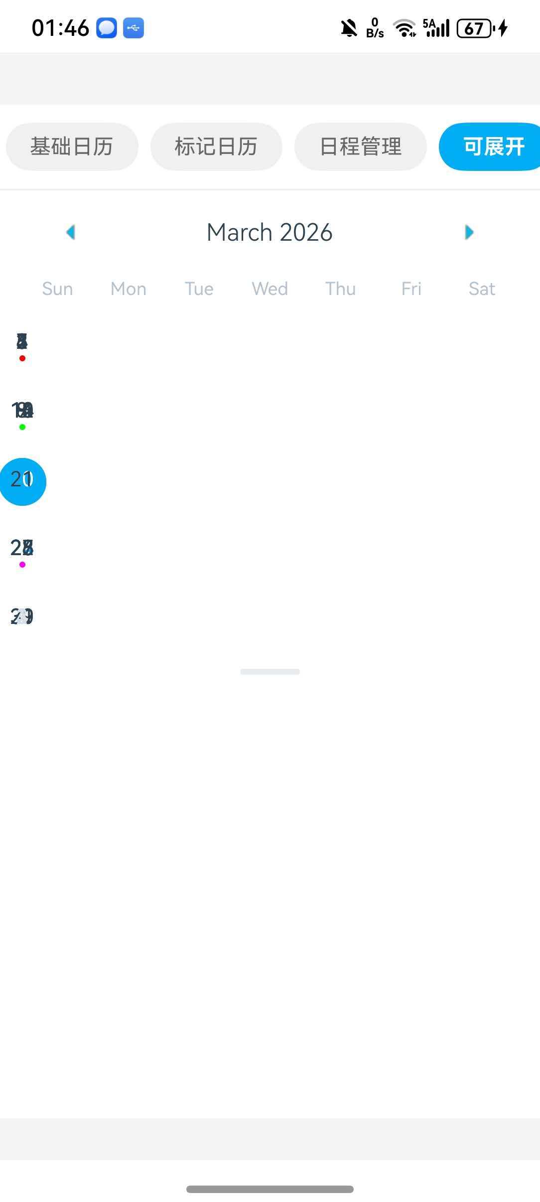
ExpandableCalendar 是可展开/收起的日历组件。
48. disablePan - 禁用拖动
是否禁用拖动展开/收起。
<ExpandableCalendar disablePan={false} />
🔷 Theme 配置
Calendar 组件支持通过 theme 属性进行主题定制。
49. theme - 主题配置 ⭐
用于覆盖日历组件特定样式的主题配置。
<Calendar
  theme={{
    backgroundColor: '#ffffff',
    calendarBackground: '#ffffff',
    textSectionTitleColor: '#b6c1cd',
    selectedDayBackgroundColor: '#00adf5',
    selectedDayTextColor: '#ffffff',
    todayTextColor: '#00adf5',
    dayTextColor: '#2d4150',
    textDisabledColor: '#d9e1e8',
    dotColor: '#00adf5',
    arrowColor: '#00adf5',
    monthTextColor: '#2d4150',
    indicatorColor: '#00adf5',
    textDayFontWeight: '400',
    textMonthFontWeight: 'bold',
    textDayHeaderFontWeight: '500',
    textDayFontSize: 16,
    textMonthFontSize: 18,
    textDayHeaderFontSize: 14,
  }}
/>
📱 完整示例
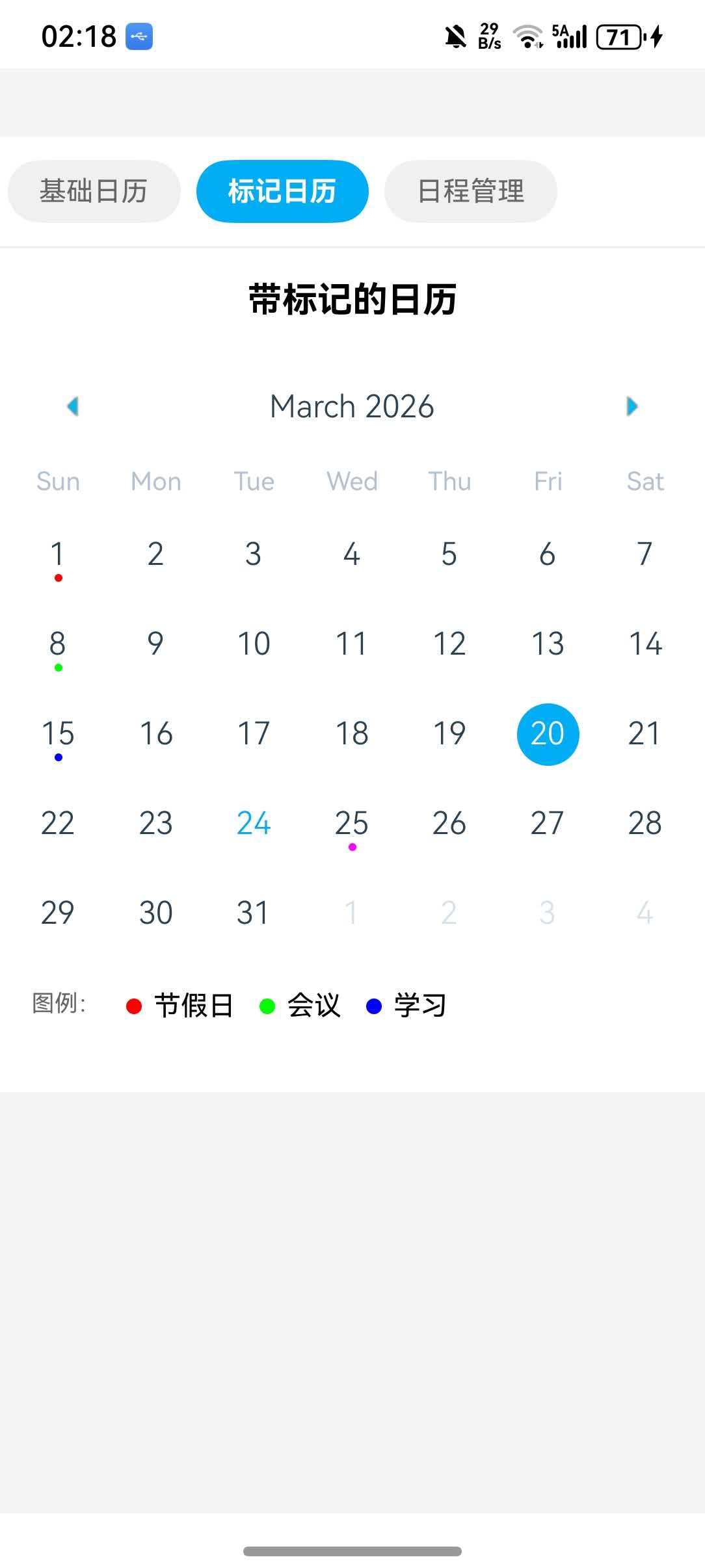
本节展示一个综合性的日历应用示例,包含了基础日历、日期标记和日程管理三种常见场景。
⚠️ 注意:由于
Agenda和ExpandableCalendar组件在 HarmonyOS 平台存在布局问题,本示例使用Calendar+FlatList组合实现日程管理功能。
import React, { useState } from 'react';
import { View, Text, StyleSheet, SafeAreaView, ScrollView, FlatList, TouchableOpacity } from 'react-native';
import { Calendar, DateData } from 'react-native-calendars';

interface ScheduleItem {
  id: string;
  name: string;
  time: string;
}

const CalendarDemo = () => {
  const [selected, setSelected] = useState('');
  const [currentView, setCurrentView] = useState('basic');
  const [selectedDate, setSelectedDate] = useState('2026-03-15');

  const markedDates = {
    '2026-03-01': { marked: true, dotColor: '#ff0000' },
    '2026-03-08': { marked: true, dotColor: '#00ff00' },
    '2026-03-15': { marked: true, dotColor: '#0000ff' },
    '2026-03-20': { selected: true, selectedColor: '#00adf5' },
    '2026-03-25': { marked: true, dotColor: '#ff00ff' },
  };

  const scheduleData: { [key: string]: ScheduleItem[] } = {
    '2026-03-15': [
      { id: '1', name: '产品评审会议', time: '09:00' },
      { id: '2', name: '午餐约会', time: '12:00' },
    ],
    '2026-03-16': [
      { id: '3', name: '健身', time: '07:00' },
      { id: '4', name: '团队周会', time: '14:00' },
    ],
    '2026-03-17': [
      { id: '5', name: '客户拜访', time: '10:00' },
    ],
    '2026-03-19': [
      { id: '6', name: '项目交付', time: '16:00' },
    ],
  };

  const renderBasicCalendar = () => (
    <View style={styles.calendarContainer}>
      <Text style={styles.viewTitle}>基础日历</Text>
      <Calendar
        onDayPress={(day: DateData) => setSelected(day.dateString)}
        markedDates={{
          [selected]: {
            selected: true,
            selectedColor: '#00adf5',
          },
        }}
        theme={{
          todayTextColor: '#00adf5',
          selectedDayBackgroundColor: '#00adf5',
        }}
      />
      {selected && (
        <Text style={styles.selectedText}>选中的日期: {selected}</Text>
      )}
    </View>
  );

  const renderMarkedCalendar = () => (
    <View style={styles.calendarContainer}>
      <Text style={styles.viewTitle}>带标记的日历</Text>
      <Calendar
        markedDates={markedDates}
        theme={{
          todayTextColor: '#00adf5',
        }}
      />
      <View style={styles.legend}>
        <Text style={styles.legendText}>图例:</Text>
        <View style={styles.legendItem}>
          <View style={[styles.dot, { backgroundColor: '#ff0000' }]} />
          <Text>节假日</Text>
        </View>
        <View style={styles.legendItem}>
          <View style={[styles.dot, { backgroundColor: '#00ff00' }]} />
          <Text>会议</Text>
        </View>
        <View style={styles.legendItem}>
          <View style={[styles.dot, { backgroundColor: '#0000ff' }]} />
          <Text>学习</Text>
        </View>
      </View>
    </View>
  );

  const renderScheduleItem = ({ item }: { item: ScheduleItem }) => (
    <View style={styles.scheduleItem}>
      <Text style={styles.timeText}>{item.time}</Text>
      <Text style={styles.nameText}>{item.name}</Text>
    </View>
  );

  const renderScheduleView = () => {
    const scheduleMarkedDates = Object.keys(scheduleData).reduce((acc, date) => {
      acc[date] = {
        marked: true,
        dotColor: '#00adf5',
        selected: date === selectedDate,
        selectedColor: '#00adf5',
      };
      return acc;
    }, {} as any);

    return (
      <View style={styles.scheduleContainer}>
        <Calendar
          onDayPress={(day: DateData) => setSelectedDate(day.dateString)}
          markedDates={scheduleMarkedDates}
          theme={{
            todayTextColor: '#00adf5',
            selectedDayBackgroundColor: '#00adf5',
          }}
        />
        <View style={styles.scheduleList}>
          <Text style={styles.dateHeader}>{selectedDate} 日程</Text>
          <FlatList
            data={scheduleData[selectedDate] || []}
            keyExtractor={(item) => item.id}
            renderItem={renderScheduleItem}
            ListEmptyComponent={
              <Text style={styles.emptyText}>当天没有日程</Text>
            }
          />
        </View>
      </View>
    );
  };

  const views = [
    { key: 'basic', label: '基础日历', component: renderBasicCalendar },
    { key: 'marked', label: '标记日历', component: renderMarkedCalendar },
    { key: 'schedule', label: '日程管理', component: renderScheduleView },
  ];

  return (
    <SafeAreaView style={styles.container}>
      <View style={styles.tabContainer}>
        <ScrollView horizontal showsHorizontalScrollIndicator={false}>
          {views.map((view) => (
            <View
              key={view.key}
              style={[
                styles.tab,
                currentView === view.key && styles.activeTab,
              ]}
            >
              <Text
                style={[
                  styles.tabText,
                  currentView === view.key && styles.activeTabText,
                ]}
                onPress={() => setCurrentView(view.key)}
              >
                {view.label}
              </Text>
            </View>
          ))}
        </ScrollView>
      </View>
      {views.find((v) => v.key === currentView)?.component()}
    </SafeAreaView>
  );
};

const styles = StyleSheet.create({
  container: {
    flex: 1,
    backgroundColor: '#f5f5f5',
  },
  tabContainer: {
    backgroundColor: '#fff',
    paddingVertical: 12,
    borderBottomWidth: 1,
    borderBottomColor: '#eee',
  },
  tab: {
    paddingHorizontal: 16,
    paddingVertical: 8,
    marginHorizontal: 4,
    borderRadius: 20,
    backgroundColor: '#f0f0f0',
  },
  activeTab: {
    backgroundColor: '#00adf5',
  },
  tabText: {
    fontSize: 14,
    color: '#666',
  },
  activeTabText: {
    color: '#fff',
    fontWeight: 'bold',
  },
  calendarContainer: {
    backgroundColor: '#fff',
    paddingBottom: 20,
  },
  viewTitle: {
    fontSize: 18,
    fontWeight: 'bold',
    textAlign: 'center',
    paddingVertical: 16,
    backgroundColor: '#fff',
  },
  selectedText: {
    textAlign: 'center',
    marginTop: 16,
    fontSize: 14,
    color: '#666',
  },
  legend: {
    flexDirection: 'row',
    flexWrap: 'wrap',
    padding: 16,
    gap: 12,
  },
  legendItem: {
    flexDirection: 'row',
    alignItems: 'center',
    gap: 6,
  },
  legendText: {
    fontSize: 12,
    color: '#666',
  },
  dot: {
    width: 8,
    height: 8,
    borderRadius: 4,
  },
  scheduleContainer: {
    flex: 1,
    backgroundColor: '#fff',
  },
  scheduleList: {
    flex: 1,
    padding: 16,
  },
  dateHeader: {
    fontSize: 18,
    fontWeight: 'bold',
    marginBottom: 16,
  },
  scheduleItem: {
    flexDirection: 'row',
    padding: 16,
    backgroundColor: '#f5f5f5',
    borderRadius: 8,
    marginBottom: 8,
  },
  timeText: {
    fontSize: 14,
    color: '#00adf5',
    width: 60,
  },
  nameText: {
    fontSize: 14,
    color: '#333',
    flex: 1,
  },
  emptyText: {
    fontSize: 16,
    color: '#999',
    textAlign: 'center',
    marginTop: 32,
  },
});

export default CalendarDemo;
🔧 高级技巧
1. 自定义日期样式
<Calendar
  dayComponent={({ date, state }) => (
    <View style={styles.dayWrapper}>
      <Text style={[
        styles.dayText,
        state === 'disabled' && styles.disabledText,
        state === 'today' && styles.todayText,
        date.dateString === selected && styles.selectedText,
      ]}>
        {date.day}
      </Text>
      {state !== 'disabled' && (
        <View style={[
          styles.dot,
          date.dateString === selected && styles.selectedDot,
        ]} />
      )}
    </View>
  )}
/>

const styles = StyleSheet.create({
  dayWrapper: {
    alignItems: 'center',
    justifyContent: 'center',
  },
  dayText: {
    fontSize: 16,
    color: '#333',
  },
  disabledText: {
    color: '#d9e1e8',
  },
  todayText: {
    color: '#00adf5',
    fontWeight: 'bold',
  },
  selectedText: {
    color: '#fff',
    fontWeight: 'bold',
  },
  dot: {
    width: 4,
    height: 4,
    borderRadius: 2,
    backgroundColor: '#00adf5',
    marginTop: 2,
  },
  selectedDot: {
    backgroundColor: '#fff',
  },
});
2. 范围选择
const [range, setRange] = useState({ start: '', end: '' });

const handleDayPress = (day) => {
  if (!range.start || (range.start && range.end)) {
    setRange({ start: day.dateString, end: '' });
  } else {
    if (day.dateString >= range.start) {
      setRange({ ...range, end: day.dateString });
    } else {
      setRange({ start: day.dateString, end: range.start });
    }
  }
};

const markedDates = {};
if (range.start) {
  markedDates[range.start] = {
    startingDay: true,
    color: '#00adf5',
    textColor: '#fff',
  };
}
if (range.start && range.end) {
  let current = range.start;
  while (current !== range.end) {
    const next = addDays(parseISO(current), 1);
    current = format(next, 'yyyy-MM-dd');
    if (current !== range.end) {
      markedDates[current] = {
        color: '#e0f0ff',
        textColor: '#00adf5',
      };
    }
  }
  markedDates[range.end] = {
    endingDay: true,
    color: '#00adf5',
    textColor: '#fff',
  };
}

<Calendar markedDates={markedDates} markingType="period" />
3. 多选日期
const [selectedDates, setSelectedDates] = useState([]);

const handleDayPress = (day) => {
  if (selectedDates.includes(day.dateString)) {
    setSelectedDates(selectedDates.filter(d => d !== day.dateString));
  } else {
    setSelectedDates([...selectedDates, day.dateString]);
  }
};

const markedDates = selectedDates.reduce((acc, date) => ({
  ...acc,
  [date]: {
    selected: true,
    selectedColor: '#00adf5',
  },
}), {});

<Calendar
  markedDates={markedDates}
  onDayPress={handleDayPress}
/>
🚨 已知问题
ExpandableCalendar 布局问题
问题描述:在 HarmonyOS 平台上,ExpandableCalendar 组件可能出现以下布局问题:
- 日期圆圈和星期标题对不齐
- 日期文字重叠
- 多个日期挤在一个圆圈内
影响范围:此问题仅影响 ExpandableCalendar 组件,其他组件(Calendar、Agenda、WeekCalendar 等)正常工作。
解决方案:
- 使用替代方案:使用基础的
Calendar组件配合自定义展开逻辑 - 使用 WeekCalendar:如果只需要周视图,可以使用
WeekCalendar组件 - 等待修复:关注官方仓库的更新,等待 HarmonyOS 平台的兼容性修复
示例 - 使用 Calendar 替代 ExpandableCalendar:
import React, { useState } from 'react';
import { View, Text, TouchableOpacity, StyleSheet } from 'react-native';
import { Calendar } from 'react-native-calendars';

const CustomExpandableCalendar = () => {
  const [isExpanded, setIsExpanded] = useState(true);
  const [selected, setSelected] = useState('');

  return (
    <View style={styles.container}>
      <TouchableOpacity
        style={styles.header}
        onPress={() => setIsExpanded(!isExpanded)}
      >
        <Text style={styles.headerText}>
          {isExpanded ? '收起日历 ▲' : '展开日历 ▼'}
        </Text>
      </TouchableOpacity>

      {isExpanded && (
        <Calendar
          onDayPress={(day) => setSelected(day.dateString)}
          markedDates={{
            [selected]: { selected: true, selectedColor: '#00adf5' },
          }}
        />
      )}
    </View>
  );
};

const styles = StyleSheet.create({
  container: {
    backgroundColor: '#fff',
  },
  header: {
    padding: 16,
    backgroundColor: '#f5f5f5',
    alignItems: 'center',
  },
  headerText: {
    fontSize: 16,
    color: '#333',
  },
});
Agenda 日程对齐问题
问题描述:在 HarmonyOS 平台上,Agenda 组件可能出现以下布局问题:
- 日程项与日期不对齐
- 日程显示在相邻日期之间
- 滚动时日程位置错乱
影响范围:此问题仅影响 Agenda 组件。
解决方案:使用 Calendar + FlatList 组合实现日程管理功能
示例 - 使用 Calendar + FlatList 替代 Agenda:
import React, { useState } from 'react';
import { View, Text, FlatList, StyleSheet, TouchableOpacity } from 'react-native';
import { Calendar, DateData } from 'react-native-calendars';

interface ScheduleItem {
  id: string;
  name: string;
  time: string;
}

const ScheduleDemo = () => {
  const [selectedDate, setSelectedDate] = useState('2026-03-15');

  const scheduleData: { [key: string]: ScheduleItem[] } = {
    '2026-03-15': [
      { id: '1', name: '产品评审会议', time: '09:00' },
      { id: '2', name: '午餐约会', time: '12:00' },
    ],
    '2026-03-16': [
      { id: '3', name: '健身', time: '07:00' },
      { id: '4', name: '团队周会', time: '14:00' },
    ],
    '2026-03-17': [
      { id: '5', name: '客户拜访', time: '10:00' },
    ],
    '2026-03-19': [
      { id: '6', name: '项目交付', time: '16:00' },
    ],
  };

  const markedDates = Object.keys(scheduleData).reduce((acc, date) => {
    acc[date] = {
      marked: true,
      dotColor: '#00adf5',
      selected: date === selectedDate,
      selectedColor: '#00adf5',
    };
    return acc;
  }, {} as any);

  const renderScheduleItem = ({ item }: { item: ScheduleItem }) => (
    <View style={styles.scheduleItem}>
      <Text style={styles.timeText}>{item.time}</Text>
      <Text style={styles.nameText}>{item.name}</Text>
    </View>
  );

  return (
    <View style={styles.container}>
      <Calendar
        onDayPress={(day: DateData) => setSelectedDate(day.dateString)}
        markedDates={markedDates}
        theme={{
          todayTextColor: '#00adf5',
          selectedDayBackgroundColor: '#00adf5',
        }}
      />
      <View style={styles.scheduleList}>
        <Text style={styles.dateHeader}>
          {selectedDate} 日程
        </Text>
        <FlatList
          data={scheduleData[selectedDate] || []}
          keyExtractor={(item) => item.id}
          renderItem={renderScheduleItem}
          ListEmptyComponent={
            <Text style={styles.emptyText}>当天没有日程</Text>
          }
        />
      </View>
    </View>
  );
};

const styles = StyleSheet.create({
  container: {
    flex: 1,
    backgroundColor: '#fff',
  },
  scheduleList: {
    flex: 1,
    padding: 16,
  },
  dateHeader: {
    fontSize: 18,
    fontWeight: 'bold',
    marginBottom: 16,
  },
  scheduleItem: {
    flexDirection: 'row',
    padding: 16,
    backgroundColor: '#f5f5f5',
    borderRadius: 8,
    marginBottom: 8,
  },
  timeText: {
    fontSize: 14,
    color: '#00adf5',
    width: 60,
  },
  nameText: {
    fontSize: 14,
    color: '#333',
    flex: 1,
  },
  emptyText: {
    fontSize: 16,
    color: '#999',
    textAlign: 'center',
    marginTop: 32,
  },
});

export default ScheduleDemo;
❓ 常见问题
1. 日历不显示
问题:日历组件安装后不显示。
解决方案:
- 检查是否正确导入了组件:
import { Calendar } from 'react-native-calendars' - 确认组件在有效的容器中
- 检查样式是否覆盖了显示属性
2. 标记日期不生效
问题:设置了 markedDates 但日期没有标记。
解决方案:
- 确认 markedDates 的格式正确:
{ 'yyyy-MM-dd': { marked: true } } - 检查 key 是否使用正确的日期字符串格式
- 确认日期字符串与 current 或 selected 日期格式一致
3. onDayPress 不触发
问题:点击日期没有触发回调。
解决方案:
- 检查是否设置了
disabled={true}导致日期不可点击 - 确认日期在 minDate 和 maxDate 范围内
- 检查是否有其他组件遮挡了日历
4. 主题样式不生效
问题:设置了 theme 但样式没有变化。
解决方案:
- 确认 theme 属性名称正确
- 有些样式可能需要通过具体的样式属性设置
- 检查是否有其他样式覆盖了 theme 设置
📚 参考资料
✅ 总结
这个库存在很多问题,并不建议引入使用,使用默认的Calender我觉得可以。

讨论HarmonyOS开发技术,专注于API与组件、DevEco Studio、测试、元服务和应用上架分发等。
更多推荐

 10
10 0
0- 0


 已为社区贡献36条内容

所有评论(0)