ReactNative for OpenHarmony项目鸿蒙化三方库:rn-placeholder — 骨架屏占位组件
欢迎加入开源鸿蒙跨平台社区:https://openharmonycrossplatform.csdn.net
📌 开发环境声明:本文基于 React Native 0.72.90 版本进行开发适配
🚀 一、开篇引言
rn-placeholder 是一个优雅的占位符组件库,用于在内容加载时显示骨架屏(Skeleton Screen)效果。它提供了 Placeholder、PlaceholderLine、PlaceholderMedia 等基础组件,以及 Fade、Shine、ShineOverlay 等多种动画效果,帮助开发者快速实现内容加载占位,提升用户体验。本文将带你深入了解如何在 HarmonyOS 平台上集成和使用这个实用的占位符组件库。
1.1 你将学到什么?
- ✅ rn-placeholder 的核心组件与概念
- ✅ HarmonyOS 平台的完整集成流程
- ✅ Placeholder、PlaceholderLine、PlaceholderMedia 组件使用
- ✅ 多种动画效果的应用
- ✅ 自定义占位符样式与布局
📦 二、库概览
2.1 基本信息
| 项目 | 内容 |
|---|---|
| 库名称 | rn-placeholder |
| 版本信息 | 3.0.3 |
| 官方仓库 | https://github.com/mfrachet/rn-placeholder |
| 开源协议 | MIT |
2.2 版本兼容性
| 三方库版本 | 支持RN版本 | 说明 |
|---|---|---|
| 3.0.3 | 0.72/0.77 | 推荐使用 |
2.3 核心能力矩阵
| 能力项 | 描述 | HarmonyOS 支持 |
|---|---|---|
| Placeholder | 占位符容器组件 | ✅ 完全支持 |
| PlaceholderLine | 行占位符组件 | ✅ 完全支持 |
| PlaceholderMedia | 媒体占位符组件 | ✅ 完全支持 |
| Fade | 淡入淡出动画 | ✅ 完全支持 |
| Shine | 闪光动画 | ✅ 完全支持 |
| ShineOverlay | 闪光覆盖层动画 | ✅ 完全支持 |
| Progressive | 渐进加载动画 | ✅ 完全支持 |
| Loader | 加载器动画 | ✅ 完全支持 |
2.4 动画效果对比
| 动画名称 | 效果描述 | 适用场景 |
|---|---|---|
| Fade | 整体淡入淡出效果 | 通用加载场景 |
| Shine | 局部闪光效果 | 现代风格应用 |
| ShineOverlay | 覆盖层闪光效果 | 浅色背景应用 |
| Progressive | 渐进式加载效果 | 数据逐步加载场景 |
| Loader | ActivityIndicator 风格 | iOS 风格应用 |
📖 三、安装与配置
3.2 安装依赖
在项目根目录执行以下命令:
npm install rn-placeholder@3.0.3 --legacy-peer-deps
3.3 验证安装
安装完成后,检查 package.json 文件中是否包含以下依赖:
{
  "dependencies": {
    "rn-placeholder": "^3.0.3"
  }
}
3.4 无需原生配置
rn-placeholder 是纯 JavaScript 库,基于 React Native Animated API 实现,不依赖任何原生模块。
3.5 基本导入
import {
  Placeholder,
  PlaceholderMedia,
  PlaceholderLine,
  Fade,
  Shine,
  ShineOverlay,
  Progressive,
  Loader,
} from 'rn-placeholder';
📖 四、API 详解
4.1 Placeholder 容器组件
Placeholder 是所有占位符组件的外层容器,它负责管理占位符的整体布局和动画效果。单独使用 Placeholder 并不会产生有趣的效果,需要在其中放入 PlaceholderLine 或 PlaceholderMedia 等子组件才能发挥作用。
核心功能:
Placeholder 组件接受 React Native View 的全部属性,同时提供了几个特有的属性来控制占位符的布局和动画。它通过 Left 和 Right 属性可以在左右两侧放置 PlaceholderMedia 组件,形成常见的列表项布局。
Animation 属性:
Animation 属性接受一个动画组件,用于为占位符添加动画效果。rn-placeholder 提供了 Fade、Shine、ShineOverlay、Progressive、Loader 五种动画组件,每种都有独特的视觉效果。动画组件会自动应用到 Placeholder 内的所有子组件上。
Left 和 Right 属性:
Left 和 Right 属性用于在占位符的左右两侧放置媒体组件。通常传入 PlaceholderMedia 组件,用于表示头像、图标等元素。这两个属性使得创建常见的列表项布局变得非常简单。
import { Placeholder, PlaceholderMedia, PlaceholderLine, Fade } from 'rn-placeholder';

const PlaceholderExample = () => {
  return (
    <Placeholder
      Animation={Fade}
      Left={PlaceholderMedia}
      Right={PlaceholderMedia}
    >
      <PlaceholderLine width={80} />
      <PlaceholderLine />
      <PlaceholderLine width={30} />
    </Placeholder>
  );
};
布局说明:
Placeholder 组件使用 flex 布局,子组件会垂直排列。Left 和 Right 属性指定的组件会分别放置在内容的左右两侧。这种设计非常适合创建类似列表项、卡片等常见的 UI 布局。
4.2 PlaceholderLine 行占位符组件
PlaceholderLine 是占位符的两种基础可视组件之一,用于表示文本行。它显示为一个灰色的矩形条,模拟文本内容的占位效果。
视觉特点:
PlaceholderLine 默认显示为一个浅灰色的矩形条,高度为 12,宽度为 100%(相对于父容器)。多条 PlaceholderLine 组合使用时,会自动添加底部边距,形成类似段落文本的视觉效果。
width 属性:
width 属性控制行占位符的宽度,可以设置为数字(表示百分比)或字符串。例如 width={80} 表示宽度为父容器的 80%,width=“200px” 表示固定宽度 200 像素。通过设置不同的宽度值,可以模拟不同长度的文本行。
height 属性:
height 属性控制行占位符的高度,默认值为 12。可以根据实际文本大小调整这个值,例如标题可以使用较大的高度,正文使用默认高度。
color 属性:
color 属性设置占位符的颜色,默认为 “#efefef”。可以根据应用的配色方案调整这个值,使占位符与整体设计风格保持一致。
noMargin 属性:
noMargin 属性控制是否添加底部边距,默认为 false(添加边距)。当需要紧密排列多个占位符时,可以设置为 true。
import { Placeholder, PlaceholderLine, Shine } from 'rn-placeholder';

const LineExample = () => {
  return (
    <Placeholder Animation={Shine}>
      <PlaceholderLine width={60} height={20} />
      <PlaceholderLine width={90} />
      <PlaceholderLine width={70} />
      <PlaceholderLine width={40} noMargin />
    </Placeholder>
  );
};
使用技巧:
- 第一行通常使用较大的高度和较短的宽度,模拟标题
- 中间行使用默认高度和变化的宽度,模拟正文
- 最后一行设置 noMargin={true},避免多余空白
4.3 PlaceholderMedia 媒体占位符组件
PlaceholderMedia 是占位符的另一种基础可视组件,用于表示图片、头像等媒体元素。它显示为一个灰色的方块或圆形,模拟媒体内容的占位效果。
视觉特点:
PlaceholderMedia 默认显示为一个 40x40 的灰色方块。通过 isRound 属性可以将其变为圆形,非常适合表示头像。它也可以单独使用,不一定要放在 Placeholder 容器内。
size 属性:
size 属性控制媒体占位符的大小(宽度和高度相同),默认值为 40。可以根据实际需求调整,例如头像可以使用 48 或 60,缩略图可以使用 80 或 100。
isRound 属性:
isRound 属性控制媒体占位符是否为圆形,默认为 false(方形)。设置为 true 时,占位符会显示为圆形,非常适合表示用户头像。
color 属性:
color 属性设置占位符的颜色,默认为 “#efefef”。与 PlaceholderLine 保持一致的颜色可以获得更好的视觉效果。
import { Placeholder, PlaceholderMedia, PlaceholderLine, Fade } from 'rn-placeholder';

const MediaExample = () => {
  return (
    <View style={styles.container}>
      <Placeholder Animation={Fade} Left={PlaceholderMedia}>
        <PlaceholderLine width={50} height={16} />
        <PlaceholderLine width={80} />
      </Placeholder>

      <Placeholder Animation={Fade} Left={() => (
        <PlaceholderMedia size={60} isRound />
      )}>
        <PlaceholderLine width={40} height={14} />
        <PlaceholderLine width={60} />
        <PlaceholderLine width={30} />
      </Placeholder>
    </View>
  );
};
自定义样式:
PlaceholderMedia 支持 style 属性,可以进一步自定义样式。例如添加边框、阴影等效果,使占位符更接近实际内容的样式。
4.4 Fade 淡入淡出动画
Fade 是最基础的动画效果,它会让占位符内容在指定的时间间隔内逐渐清晰和模糊,形成呼吸般的效果。
动画原理:
Fade 动画通过改变占位符的透明度来实现效果。占位符会在完全可见和半透明之间循环变化,给人一种"等待中"的感觉。这种动画效果简洁、不突兀,适合大多数应用场景。
自定义参数:
Fade 动画支持通过属性自定义动画参数。可以通过 animationDuration 属性调整动画周期时长,通过 animationEasing 属性设置缓动函数。
import { Placeholder, PlaceholderLine, Fade } from 'rn-placeholder';

const FadeExample = () => {
  return (
    <Placeholder
      Animation={props => (
        <Fade
          {...props}
          style={{ backgroundColor: '#f0f0f0' }}
        />
      )}
    >
      <PlaceholderLine />
      <PlaceholderLine />
      <PlaceholderLine />
    </Placeholder>
  );
};
使用场景:
Fade 动画是最通用的动画效果,适合各种加载场景。它的视觉效果柔和,不会分散用户注意力,同时又能清晰地传达"加载中"的状态。
4.5 Shine 闪光动画
Shine 动画实现了一种从左到右的闪光效果,类似于 iOS 系统的骨架屏效果。它通过动画占位符的不同部分来实现闪光效果,视觉效果现代、精致。
动画原理:
Shine 动画会在占位符上创建一个从左到右移动的高亮区域,模拟光线扫过的效果。与 ShineOverlay 不同,Shine 动画是直接对占位符进行动画,而不是添加覆盖层。
视觉特点:
Shine 动画的闪光效果更加自然,不会出现覆盖层带来的样式问题。它适合各种背景颜色,不需要担心与背景色的兼容性问题。
import { Placeholder, PlaceholderLine, PlaceholderMedia, Shine } from 'rn-placeholder';

const ShineExample = () => {
  return (
    <Placeholder
      Animation={Shine}
      Left={() => <PlaceholderMedia isRound size={50} />}
    >
      <PlaceholderLine width={50} height={16} />
      <PlaceholderLine width={80} />
      <PlaceholderLine width={60} />
    </Placeholder>
  );
};
使用场景:
Shine 动画适合现代风格的应用,特别是需要精致视觉效果的场景。它的闪光效果流畅自然,能够给用户一种"正在加载"的明确反馈。
4.6 ShineOverlay 覆盖层闪光动画
ShineOverlay 动画通过在占位符上添加一个从左到右移动的覆盖层来实现闪光效果。它的视觉效果类似于 Shine,但实现方式不同。
动画原理:
ShineOverlay 在占位符上方添加一个半透明的覆盖层,覆盖层从左到右移动,产生闪光效果。这种实现方式简单,但需要注意覆盖层与背景色的兼容性。
使用限制:
ShineOverlay 动画在不自定义样式时效果最佳,仅在白色背景上显示灰色线条时表现良好。如果自定义了占位符颜色或背景色,可能会出现视觉问题。
import { Placeholder, PlaceholderLine, ShineOverlay } from 'rn-placeholder';

const ShineOverlayExample = () => {
  return (
    <View style={{ backgroundColor: '#fff', padding: 20 }}>
      <Placeholder Animation={ShineOverlay}>
        <PlaceholderLine />
        <PlaceholderLine />
        <PlaceholderLine />
      </Placeholder>
    </View>
  );
};
使用建议:
ShineOverlay 适合简单的白色背景场景。如果需要更灵活的自定义,建议使用 Shine 动画代替。
4.7 Progressive 渐进加载动画
Progressive 动画实现了一种渐进式加载效果,占位符会逐步显示,模拟数据逐步加载的过程。
动画原理:
Progressive 动画会让占位符的内容逐步显现,从左到右或从上到下逐渐显示。这种效果给人一种数据正在逐步加载的感觉,非常适合分步加载的场景。
适用场景:
Progressive 动画特别适合数据分步加载的场景,例如先加载标题,再加载正文,最后加载图片。它能够给用户一种"加载进度"的反馈,减少等待的焦虑感。
import { Placeholder, PlaceholderLine, PlaceholderMedia, Progressive } from 'rn-placeholder';

const ProgressiveExample = () => {
  return (
    <Placeholder
      Animation={Progressive}
      Left={() => <PlaceholderMedia size={60} />}
    >
      <PlaceholderLine width={60} height={18} />
      <PlaceholderLine width={90} />
      <PlaceholderLine width={70} />
      <PlaceholderLine width={50} noMargin />
    </Placeholder>
  );
};
4.8 Loader 加载器动画
Loader 动画基于各平台原生的 ActivityIndicator 实现,显示一个系统风格的加载指示器。
动画原理:
Loader 动画会在占位符中心显示一个 ActivityIndicator,使用系统原生的加载动画风格。在 iOS 上显示 UIActivityIndicatorView 风格,在 Android 上显示 ProgressBar 风格。
视觉特点:
Loader 动画的视觉效果与系统原生加载指示器一致,用户非常熟悉。它适合需要与系统风格保持一致的应用。
import { Placeholder, PlaceholderLine, Loader } from 'rn-placeholder';

const LoaderExample = () => {
  return (
    <Placeholder Animation={Loader}>
      <PlaceholderLine />
      <PlaceholderLine />
      <PlaceholderLine />
    </Placeholder>
  );
};
使用场景:
Loader 动画适合 iOS 风格的应用,或者需要与系统原生加载效果保持一致的场景。
4.9 自定义动画
rn-placeholder 支持自定义动画效果,可以通过创建自定义动画组件来实现独特的加载效果。
自定义动画原理:
自定义动画组件需要接收 props 参数,并将其传播到子组件。props 中包含动画相关的属性,如 animating、animationDuration 等。自定义动画组件需要正确处理这些属性,否则会出现异常行为。
import { Placeholder, PlaceholderLine } from 'rn-placeholder';
import { Animated, Easing } from 'react-native';

const CustomAnimation = (props: any) => {
  const { children, style } = props;

  return (
    <Animated.View style={[style, { opacity: 0.6 }]}>
      {children}
    </Animated.View>
  );
};

const CustomAnimationExample = () => {
  return (
    <Placeholder Animation={CustomAnimation}>
      <PlaceholderLine />
      <PlaceholderLine />
      <PlaceholderLine />
    </Placeholder>
  );
};
💻 五、完整代码示例
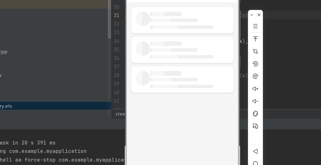
一个完整的骨架屏加载示例:
import React, { useState, useEffect } from 'react';
import {
  View,
  Text,
  StyleSheet,
  SafeAreaView,
  ScrollView,
  TouchableOpacity,
  Image,
} from 'react-native';
import {
  Placeholder,
  PlaceholderMedia,
  PlaceholderLine,
  Fade,
  Shine,
} from 'rn-placeholder';

interface User {
  id: number;
  name: string;
  avatar: string;
  title: string;
  description: string;
}

const mockUsers: User[] = [
  { id: 1, name: '张三', avatar: 'https://i.pravatar.cc/100?img=1', title: '前端开发工程师', description: '专注于 React Native 跨平台开发' },
  { id: 2, name: '李四', avatar: 'https://i.pravatar.cc/100?img=2', title: '后端开发工程师', description: '专注于 Node.js 服务端开发' },
  { id: 3, name: '王五', avatar: 'https://i.pravatar.cc/100?img=3', title: 'UI 设计师', description: '专注于移动端 UI/UX 设计' },
];

const UserCard = ({ user }: { user: User }) => (
  <View style={styles.card}>
    <Image source={{ uri: user.avatar }} style={styles.avatar} />
    <View style={styles.cardContent}>
      <Text style={styles.name}>{user.name}</Text>
      <Text style={styles.title}>{user.title}</Text>
      <Text style={styles.description}>{user.description}</Text>
    </View>
  </View>
);

const UserCardPlaceholder = () => (
  <View style={styles.card}>
    <Placeholder
      Animation={Shine}
      Left={() => <PlaceholderMedia isRound size={50} />}
    >
      <PlaceholderLine width={40} height={16} style={styles.namePlaceholder} />
      <PlaceholderLine width={60} height={12} />
      <PlaceholderLine width={80} height={12} noMargin />
    </Placeholder>
  </View>
);

const PlaceholderDemo = () => {
  const [loading, setLoading] = useState(true);
  const [users, setUsers] = useState<User[]>([]);

  useEffect(() => {
    const timer = setTimeout(() => {
      setUsers(mockUsers);
      setLoading(false);
    }, 2000);

    return () => clearTimeout(timer);
  }, []);

  const handleRefresh = () => {
    setLoading(true);
    setUsers([]);
    setTimeout(() => {
      setUsers(mockUsers);
      setLoading(false);
    }, 2000);
  };

  return (
    <SafeAreaView style={styles.container}>
      <View style={styles.header}>
        <Text style={styles.headerTitle}>用户列表</Text>
        <TouchableOpacity style={styles.refreshButton} onPress={handleRefresh}>
          <Text style={styles.refreshText}>刷新</Text>
        </TouchableOpacity>
      </View>

      <ScrollView contentContainerStyle={styles.content}>
        {loading ? (
          <>
            <UserCardPlaceholder />
            <UserCardPlaceholder />
            <UserCardPlaceholder />
          </>
        ) : (
          users.map(user => <UserCard key={user.id} user={user} />)
        )}
      </ScrollView>
    </SafeAreaView>
  );
};

const styles = StyleSheet.create({
  container: {
    flex: 1,
    backgroundColor: '#f5f5f5',
  },
  header: {
    flexDirection: 'row',
    justifyContent: 'space-between',
    alignItems: 'center',
    backgroundColor: '#fff',
    paddingHorizontal: 16,
    paddingVertical: 12,
    borderBottomWidth: 1,
    borderBottomColor: '#eee',
  },
  headerTitle: {
    fontSize: 18,
    fontWeight: 'bold',
    color: '#333',
  },
  refreshButton: {
    backgroundColor: '#007AFF',
    paddingHorizontal: 16,
    paddingVertical: 6,
    borderRadius: 14,
  },
  refreshText: {
    color: '#fff',
    fontSize: 14,
    fontWeight: '500',
  },
  content: {
    padding: 16,
  },
  card: {
    backgroundColor: '#fff',
    borderRadius: 12,
    padding: 16,
    marginBottom: 12,
    flexDirection: 'row',
    shadowColor: '#000',
    shadowOffset: { width: 0, height: 2 },
    shadowOpacity: 0.1,
    shadowRadius: 4,
    elevation: 3,
  },
  avatar: {
    width: 50,
    height: 50,
    borderRadius: 25,
    marginRight: 12,
  },
  cardContent: {
    flex: 1,
  },
  name: {
    fontSize: 16,
    fontWeight: '600',
    color: '#333',
    marginBottom: 4,
  },
  namePlaceholder: {
    marginBottom: 8,
  },
  title: {
    fontSize: 13,
    color: '#666',
    marginBottom: 4,
  },
  description: {
    fontSize: 12,
    color: '#999',
  },
});

export default PlaceholderDemo;
📋 六、属性参考
Placeholder 属性
| 属性 | 类型 | 必填 | 说明 |
|---|---|---|---|
| Animation | ComponentType | 否 | 动画组件 |
| Left | ComponentType | 否 | 左侧组件 |
| Right | ComponentType | 否 | 右侧组件 |
| style | object | 否 | 自定义样式 |
PlaceholderLine 属性
| 属性 | 类型 | 必填 | 默认值 | 说明 |
|---|---|---|---|---|
| width | number | 否 | 100 | 宽度(百分比) |
| height | number | 否 | 12 | 高度 |
| color | string | 否 | #efefef | 颜色 |
| noMargin | boolean | 否 | false | 是否取消底部边距 |
| style | object | 否 | - | 自定义样式 |
PlaceholderMedia 属性
| 属性 | 类型 | 必填 | 默认值 | 说明 |
|---|---|---|---|---|
| size | number | 否 | 40 | 大小(宽高相同) |
| isRound | boolean | 否 | false | 是否为圆形 |
| color | string | 否 | #efefef | 颜色 |
| style | object | 否 | - | 自定义样式 |
⚠️ 七、常见问题
Q1: 占位符不显示?
A: 确保 Placeholder 组件内有 PlaceholderLine 或 PlaceholderMedia 子组件。单独使用 Placeholder 不会显示任何内容。
Q2: 动画效果不流畅?
A: 检查是否有其他繁重的动画同时运行。可以尝试调整 animationDuration 属性来优化动画效果。
Q3: 如何自定义占位符颜色?
A: 通过 color 属性设置占位符颜色,建议与应用的整体配色方案保持一致。
Q4: ShineOverlay 动画显示异常?
A: ShineOverlay 动画在白色背景上效果最佳。如果使用其他背景色,建议改用 Shine 动画。
📝 八、总结
rn-placeholder 为 HarmonyOS 平台提供了优雅的骨架屏解决方案,通过组合 Placeholder、PlaceholderLine、PlaceholderMedia 等组件,可以快速实现各种加载占位效果。通过本篇文章,你已经掌握了:
- 核心组件的使用方法
- 多种动画效果的应用场景
- 自定义占位符样式和布局
- 实际项目中的最佳实践

讨论HarmonyOS开发技术,专注于API与组件、DevEco Studio、测试、元服务和应用上架分发等。
更多推荐
 5
5 0
0- 0


 已为社区贡献44条内容

所有评论(0)