HarmonyOS 6.1 实战:Tabs 标签页布局全面解析
·
前言
Tabs 是 ArkUI 中实现标签页(底部导航、顶部分类导航)的专用组件,内置切换动画和 TabContent 懒加载,开发者只需定义 TabBar 和对应内容。本文演示从基础用法到自定义 TabBar 样式的完整实现。
运行效果
初始状态(底部导航第一页)
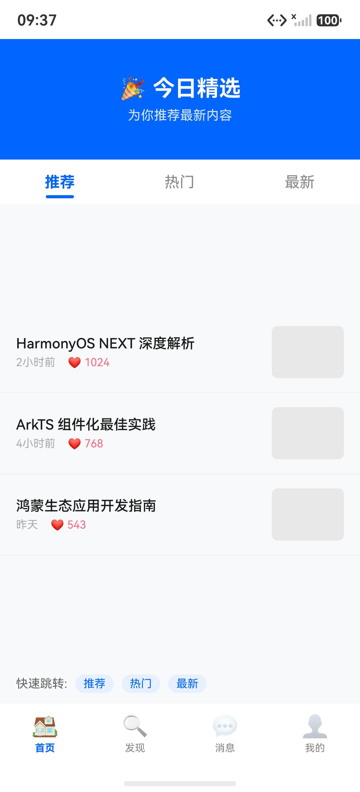
切换到第三页
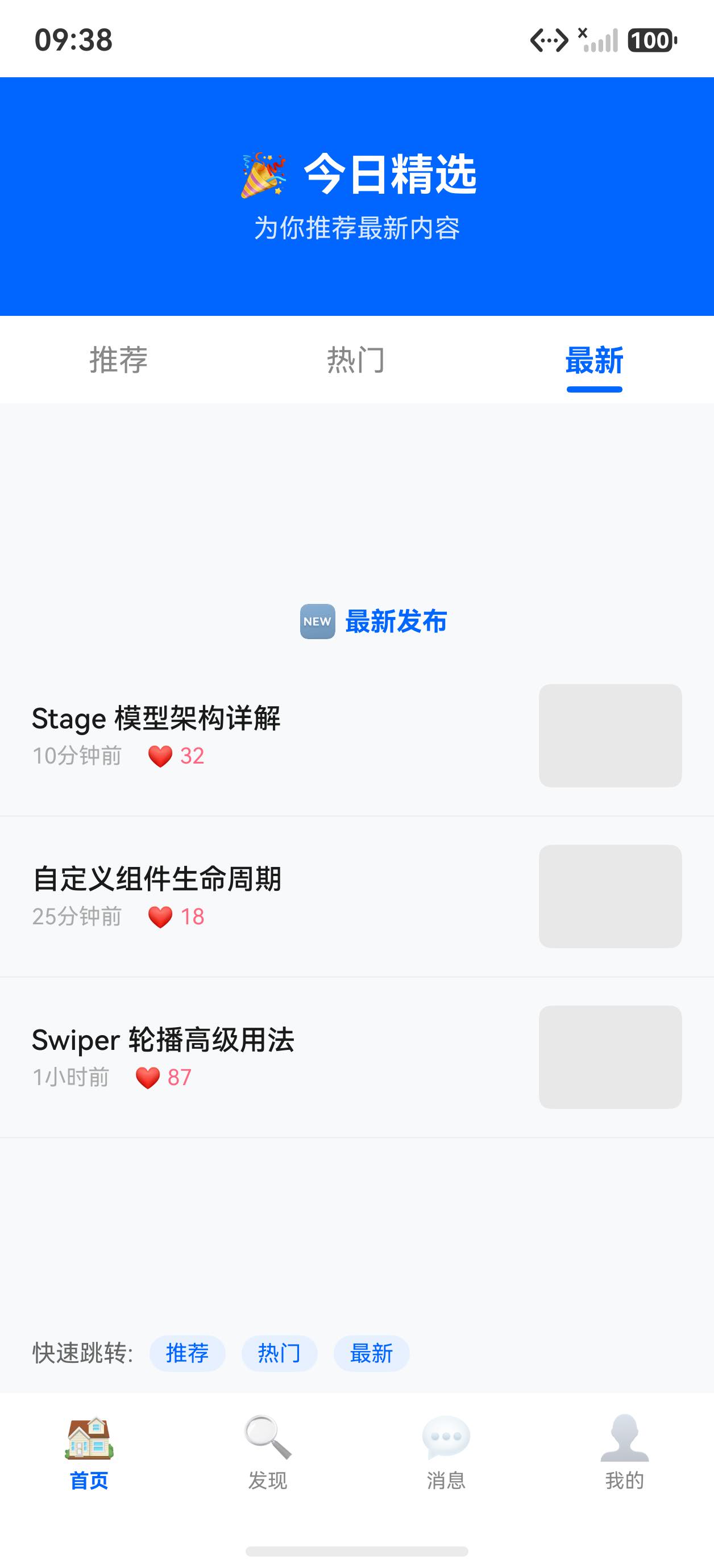
核心 API 一览
| API | 说明 |
|---|---|
Tabs({ barPosition, index, controller? }) | 标签页容器 |
TabContent() | 每个标签页的内容区域 |
.tabBar(string/CustomBuilder/TabBarStyle) | 标签页头,支持文字、自定义组件 |
.barPosition(BarPosition) | 标签栏位置:Start(顶部)/ End(底部) |
.scrollable(bool) | 标签栏是否可横向滚动 |
.animationDuration(ms) | 内容切换动画时长,0 表示禁用 |
.onChange(idx) | 页签切换回调 |
TabsController.changeIndex(n) | 编程式切换标签页 |
完整示例代码
interface ArticleItem {
  title: string
  time: string
  category: string
}

@Entry
@Component
struct Index {
  @State currentTab: number = 0
  @State innerTab: number = 0

  private controller: TabsController = new TabsController()

  private navItems: string[] = ['🏠 首页', '📰 资讯', '🧩 组件']
  private navIcons: string[] = ['🏠', '📰', '🧩', '👤']

  private subTabs: string[] = ['推荐', '热门', '最新']

  private sampleArticles: ArticleItem[] = [
    { title: 'HarmonyOS 6.1 正式发布,带来 200+ 新特性', time: '2分钟前', category: '推荐' },
    { title: 'ArkUI 组件完整教程:从入门到实战', time: '15分钟前', category: '推荐' },
    { title: '折叠屏开发指南:双栏布局最佳实践', time: '1小时前', category: '热门' },
    { title: '鸿蒙应用性能优化:渲染帧率提升 40%', time: '2小时前', category: '热门' },
    { title: 'RelativeContainer 高级布局技巧详解', time: '3小时前', category: '最新' },
    { title: 'Navigation 组件完全指南:路由与传参', time: '昨天', category: '最新' },
  ]

  @Builder
  tabBarItem(icon: string, label: string, idx: number) {
    Column({ space: 4 }) {
      Text(icon).fontSize(22)
      Text(label.replace(/^[^\s]+ /, ''))
        .fontSize(10)
        .fontColor(this.currentTab === idx ? '#0066ff' : '#888888')
        .fontWeight(this.currentTab === idx ? FontWeight.Bold : FontWeight.Normal)
    }
    .width('100%')
    .height('100%')
    .justifyContent(FlexAlign.Center)
    .alignItems(HorizontalAlign.Center)
    .backgroundColor(this.currentTab === idx ? '#f0f5ff' : '#ffffff')
  }

  @Builder
  articleCard(item: ArticleItem) {
    Column({ space: 6 }) {
      Text(item.title)
        .fontSize(15)
        .fontColor('#1a1a1a')
        .fontWeight(FontWeight.Medium)
        .maxLines(2)
        .textOverflow({ overflow: TextOverflow.Ellipsis })
      Row({ space: 8 }) {
        Text(item.category)
          .fontSize(11)
          .fontColor('#0066ff')
          .backgroundColor('#f0f5ff')
          .padding({ left: 6, right: 6, top: 2, bottom: 2 })
          .borderRadius(4)
        Text(item.time)
          .fontSize(11)
          .fontColor('#aaa')
      }
    }
    .width('100%')
    .padding({ left: 16, right: 16, top: 14, bottom: 14 })
    .backgroundColor('#ffffff')
    .border({ width: { bottom: 1 }, color: '#f5f5f5' })
    .alignItems(HorizontalAlign.Start)
  }

  build() {
    // 外层:底部导航 Tabs
    Tabs({ barPosition: BarPosition.End, index: this.currentTab, controller: this.controller }) {

      // ── Tab 1: 首页 ──
      TabContent() {
        Column() {
          // 嵌套 Tabs:顶部分类导航
          Tabs({ barPosition: BarPosition.Start, index: this.innerTab }) {
            ForEach(this.subTabs, (tab: string, tabIdx: number) => {
              TabContent() {
                List() {
                  ForEach(this.sampleArticles, (article: ArticleItem) => {
                    ListItem() {
                      this.articleCard(article)
                    }
                  })
                }
                .width('100%')
                .height('100%')
                .backgroundColor('#f8f8f8')
              }
              .tabBar(
                Column() {
                  Text(tab)
                    .fontSize(14)
                    .fontColor(this.innerTab === tabIdx ? '#0066ff' : '#555')
                    .fontWeight(this.innerTab === tabIdx ? FontWeight.Bold : FontWeight.Normal)
                    .height(40)
                  Column()
                    .width(this.innerTab === tabIdx ? 24 : 0)
                    .height(2)
                    .backgroundColor('#0066ff')
                    .borderRadius(1)
                }
                .height(44)
                .justifyContent(FlexAlign.Center)
              )
            })
          }
          .scrollable(false)
          .animationDuration(200)
          .onChange((idx: number) => { this.innerTab = idx })
          .layoutWeight(1)
        }
        .width('100%')
        .height('100%')
      }
      .tabBar(this.tabBarItem('🏠', '首页', 0))

      // ── Tab 2: 资讯 ──
      TabContent() {
        Column({ space: 16 }) {
          Text('📰 资讯中心')
            .fontSize(20)
            .fontWeight(FontWeight.Bold)
            .padding({ top: 32, left: 16 })
          Text('暂无新资讯,敬请期待')
            .fontSize(14)
            .fontColor('#aaa')
        }
        .width('100%')
        .height('100%')
        .alignItems(HorizontalAlign.Start)
      }
      .tabBar(this.tabBarItem('📰', '资讯', 1))

      // ── Tab 3: 组件 ──
      TabContent() {
        Column({ space: 16 }) {
          Text('🧩 组件中心')
            .fontSize(20)
            .fontWeight(FontWeight.Bold)
            .padding({ top: 32, left: 16 })
          Text('200+ ArkUI 内置组件,持续更新中')
            .fontSize(14)
            .fontColor('#aaa')
            .padding({ left: 16 })
        }
        .width('100%')
        .height('100%')
        .alignItems(HorizontalAlign.Start)
      }
      .tabBar(this.tabBarItem('🧩', '组件', 2))
    }
    .scrollable(false)
    .animationDuration(300)
    .onChange((idx: number) => { this.currentTab = idx })
    .width('100%')
    .height('100%')
    .backgroundColor('#f8f8f8')
  }
}
关键知识点
1. barPosition:标签栏位置
Tabs({ barPosition: BarPosition.End })    // 底部(移动应用底部导航)
Tabs({ barPosition: BarPosition.Start })  // 顶部(内容分类导航)
2. tabBar 的三种写法
// 方式 1:字符串(最简单,只有文字)
TabContent() { ... }.tabBar('首页')

// 方式 2:@Builder 引用(自定义图标 + 文字)
TabContent() { ... }.tabBar(this.myTabBarBuilder)

// 方式 3:SubTabBarStyle / BottomTabBarStyle 内置样式
TabContent() { ... }.tabBar(new SubTabBarStyle('首页'))
TabContent() { ... }.tabBar(new BottomTabBarStyle($r('app.media.home'), '首页'))
3. 嵌套 Tabs
Tabs 支持嵌套使用,外层做底部导航,内层做顶部分类切换。注意两层的 currentTab 状态要分开管理:
@State outerTab: number = 0  // 外层(底部导航)
@State innerTab: number = 0  // 内层(顶部分类)
4. animationDuration
.animationDuration(300)   // 300ms 滑动动画(默认)
.animationDuration(0)     // 禁用动画,立即切换
内容区域的切换动画时长,不影响 tabBar 本身的高亮状态更新速度。
5. scrollable 标签栏滚动
当标签页很多时,设置 .scrollable(true) 让 tabBar 可以横向滚动,避免标签文字被压缩:
Tabs()
  .scrollable(true)  // tabBar 超出宽度时可横向滚动
6. TabsController 编程式切换
private controller: TabsController = new TabsController()

Tabs({ controller: this.controller }) { ... }

// 跳转到第 2 个 Tab(下标 1)
this.controller.changeIndex(1)
小结
Tabs专为标签页场景设计,比手写Column + if/else切换更规范、有内置动画barPosition.End做底部导航,barPosition.Start做顶部分类,可嵌套使用tabBar支持字符串、@Builder、内置 Style 三种方式,自定义程度依次增加- 当选中状态(高亮颜色、指示器)依赖
@State currentTab,必须在onChange中同步更新 - 多层嵌套时每层的
currentTab状态需独立维护,避免相互干扰

讨论HarmonyOS开发技术,专注于API与组件、DevEco Studio、测试、元服务和应用上架分发等。
更多推荐



 5
5 0
0- 0


 已为社区贡献56条内容

所有评论(0)