HarmonyOS 6.1 实战:SideBarContainer 侧边栏导航详解
·
前言
SideBarContainer 是 ArkUI 专为平板/大屏设备设计的侧边导航容器,在宽屏下展示侧边栏 + 主内容双栏布局,窄屏时自动折叠为汉堡菜单。本文演示从基础用法到自定义侧边栏的完整实现。
运行效果
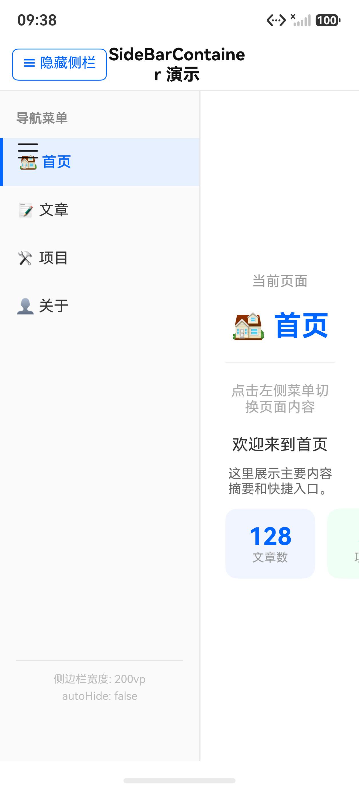
初始状态(侧边栏展开,首页)
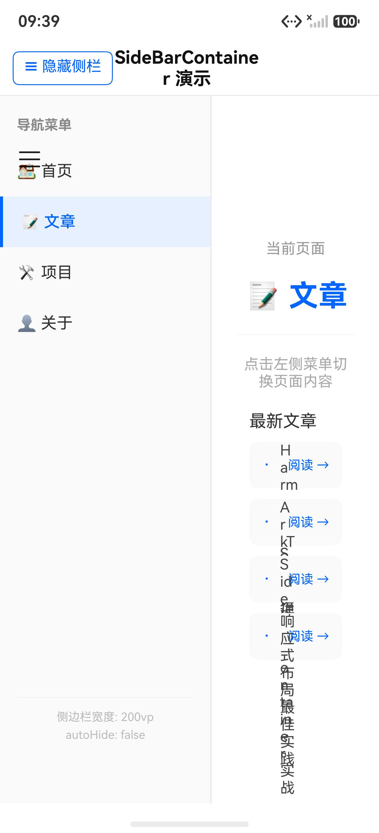
切换到文章页
核心 API 一览
| API | 说明 |
|---|---|
SideBarContainer(SideBarContainerType) | 侧边栏容器,第一个子组件为侧边栏,第二个为主内容 |
SideBarContainerType.Embed | 侧边栏嵌入主内容区,推挤主内容(默认) |
SideBarContainerType.Overlay | 侧边栏浮于主内容上方 |
.showSideBar(bool) | 控制侧边栏显隐 |
.sideBarWidth(n) | 侧边栏宽度 |
.minSideBarWidth(n) | 侧边栏最小宽度 |
.maxSideBarWidth(n) | 侧边栏最大宽度 |
.autoHide(bool) | 窄屏时自动隐藏侧边栏 |
.showControlButton(bool) | 是否显示系统控制按钮 |
.onChange(bool) | 侧边栏展开/收起状态变化回调 |
完整示例代码
interface NavItem {
icon: string
label: string
badge: number
}
interface Article {
title: string
summary: string
time: string
icon: string
}
@Entry
@Component
struct Index {
@State selectedNav: number = 0
@State sideBarVisible: boolean = true
private navItems: NavItem[] = [
{ icon: '🏠', label: '首页', badge: 0 },
{ icon: '📝', label: '文章', badge: 3 },
{ icon: '🛠', label: '项目', badge: 0 },
{ icon: '👤', label: '关于', badge: 0 },
]
private articles: Article[] = [
{ title: 'ArkUI Stack 布局详解', summary: '深入理解 Stack 层叠布局与 Overlay 浮层...', time: '5分钟前', icon: '📐' },
{ title: 'List 高性能渲染', summary: '虚拟化列表与 ListItemGroup 分组吸顶实战...', time: '1小时前', icon: '📋' },
{ title: 'Swiper 轮播图实战', summary: 'DotIndicator 自定义、SwiperController 编程控制...', time: '昨天', icon: '🎠' },
]
@Builder
sideBarContent() {
Column({ space: 0 }) {
// 用户信息区
Column({ space: 8 }) {
Text('👨💻')
.fontSize(48)
.width(72)
.height(72)
.textAlign(TextAlign.Center)
.backgroundColor('#e8f0ff')
.borderRadius(36)
Text('HarmonyOS 开发者')
.fontSize(16)
.fontWeight(FontWeight.Bold)
.fontColor('#1a1a1a')
Text('harmony@dev.com')
.fontSize(12)
.fontColor('#888888')
}
.width('100%')
.padding({ top: 40, bottom: 20 })
.alignItems(HorizontalAlign.Center)
.backgroundColor('#f8faff')
.border({ width: { bottom: 1 }, color: '#e8eeff' })
// 导航列表
ForEach(this.navItems, (item: NavItem, idx: number) => {
Row({ space: 0 }) {
Text(item.icon)
.fontSize(22)
.width(36)
.textAlign(TextAlign.Center)
Text(item.label)
.fontSize(15)
.fontColor(this.selectedNav === idx ? '#0066ff' : '#333333')
.fontWeight(this.selectedNav === idx ? FontWeight.Bold : FontWeight.Normal)
.layoutWeight(1)
.padding({ left: 8 })
if (item.badge > 0) {
Text(item.badge.toString())
.fontSize(11)
.fontColor('#ffffff')
.backgroundColor('#ff4444')
.width(20)
.height(20)
.textAlign(TextAlign.Center)
.borderRadius(10)
}
}
.width('100%')
.height(52)
.padding({ left: 20, right: 16 })
.backgroundColor(this.selectedNav === idx ? '#f0f5ff' : 'transparent')
.border({
width: { left: this.selectedNav === idx ? 3 : 0 },
color: { left: '#0066ff' }
})
.onClick(() => {
this.selectedNav = idx
})
})
}
.width('100%')
.height('100%')
.backgroundColor('#ffffff')
}
@Builder
mainContent() {
Column({ space: 0 }) {
// 顶部工具栏
Row({ space: 12 }) {
Button('')
.width(44)
.height(44)
.borderRadius(22)
.backgroundColor('#f5f5f5')
.onClick(() => { this.sideBarVisible = !this.sideBarVisible })
Text(this.navItems[this.selectedNav].label)
.fontSize(18)
.fontWeight(FontWeight.Bold)
.fontColor('#1a1a1a')
.layoutWeight(1)
Text('⋯')
.fontSize(24)
.fontColor('#333')
.padding({ right: 4 })
}
.width('100%')
.height(56)
.padding({ left: 16, right: 16 })
.backgroundColor('#ffffff')
.border({ width: { bottom: 1 }, color: '#f0f0f0' })
// 内容区
if (this.selectedNav === 0) {
// 首页内容
Scroll() {
Column({ space: 16 }) {
// 欢迎卡片
Column({ space: 8 }) {
Text('👋 欢迎回来')
.fontSize(22)
.fontWeight(FontWeight.Bold)
.fontColor('#1a1a1a')
Text('今天是学习 HarmonyOS 的好日子!')
.fontSize(14)
.fontColor('#666')
}
.width('100%')
.padding(20)
.backgroundColor('#0066ff')
.borderRadius(14)
.alignItems(HorizontalAlign.Start)
// 统计数据
Row({ space: 12 }) {
Column({ space: 4 }) {
Text('42').fontSize(28).fontWeight(FontWeight.Bold).fontColor('#0066ff')
Text('已学文章').fontSize(12).fontColor('#888')
}
.layoutWeight(1)
.height(80)
.backgroundColor('#f0f5ff')
.borderRadius(12)
.justifyContent(FlexAlign.Center)
Column({ space: 4 }) {
Text('7').fontSize(28).fontWeight(FontWeight.Bold).fontColor('#ff6600')
Text('连续天数').fontSize(12).fontColor('#888')
}
.layoutWeight(1)
.height(80)
.backgroundColor('#fff5f0')
.borderRadius(12)
.justifyContent(FlexAlign.Center)
Column({ space: 4 }) {
Text('95%').fontSize(28).fontWeight(FontWeight.Bold).fontColor('#00aa44')
Text('完成率').fontSize(12).fontColor('#888')
}
.layoutWeight(1)
.height(80)
.backgroundColor('#f0fff5')
.borderRadius(12)
.justifyContent(FlexAlign.Center)
}
}
.width('100%')
.padding({ left: 16, right: 16, top: 16, bottom: 16 })
}
.layoutWeight(1)
} else if (this.selectedNav === 1) {
// 文章列表
List() {
ForEach(this.articles, (article: Article) => {
ListItem() {
Row({ space: 12 }) {
Text(article.icon)
.fontSize(28)
.width(52)
.height(52)
.textAlign(TextAlign.Center)
.backgroundColor('#f0f5ff')
.borderRadius(12)
Column({ space: 4 }) {
Text(article.title)
.fontSize(15)
.fontWeight(FontWeight.Medium)
.fontColor('#1a1a1a')
.maxLines(1)
.textOverflow({ overflow: TextOverflow.Ellipsis })
Text(article.summary)
.fontSize(12)
.fontColor('#888')
.maxLines(2)
.textOverflow({ overflow: TextOverflow.Ellipsis })
Text(article.time)
.fontSize(11)
.fontColor('#bbb')
}
.layoutWeight(1)
.alignItems(HorizontalAlign.Start)
}
.width('100%')
.padding({ left: 16, right: 16, top: 14, bottom: 14 })
.backgroundColor('#ffffff')
}
})
}
.divider({ strokeWidth: 1, color: '#f5f5f5', startMargin: 80 })
.layoutWeight(1)
} else {
// 其他页面占位
Column({ space: 12 }) {
Text(this.navItems[this.selectedNav].icon).fontSize(56)
Text(this.navItems[this.selectedNav].label + ' 页面')
.fontSize(20)
.fontWeight(FontWeight.Bold)
.fontColor('#1a1a1a')
Text('内容建设中,敬请期待…')
.fontSize(14)
.fontColor('#aaa')
}
.layoutWeight(1)
.justifyContent(FlexAlign.Center)
.alignItems(HorizontalAlign.Center)
}
}
.width('100%')
.height('100%')
.backgroundColor('#f8f8f8')
}
build() {
SideBarContainer(SideBarContainerType.Embed) {
this.sideBarContent()
this.mainContent()
}
.showSideBar(this.sideBarVisible)
.sideBarWidth(220)
.minSideBarWidth(180)
.maxSideBarWidth(280)
.autoHide(false)
.showControlButton(true)
.onChange((show: boolean) => {
this.sideBarVisible = show
})
.width('100%')
.height('100%')
}
}
关键知识点
1. 子组件顺序:第一个是侧边栏,第二个是主内容
SideBarContainer 的子组件顺序有严格规定:
SideBarContainer() {
  sideBarBuilder()  // ① 侧边栏(必须是第一个)
  mainContent()     // ② 主内容区(必须是第二个)
}
2. Embed vs Overlay 类型
// Embed(默认):侧边栏展开时,主内容区被压缩
SideBarContainer(SideBarContainerType.Embed)

// Overlay:侧边栏展开时,浮于主内容之上,主内容不被压缩
SideBarContainer(SideBarContainerType.Overlay)
| 场景 | 推荐类型 |
|---|---|
| 平板主导航,主内容需全屏时 | Embed |
| 移动端抽屉菜单 | Overlay |
3. showControlButton 与 showSideBar 双重控制
.showControlButton(true):显示系统内置的三角形箭头按钮(右上角),点击收起/展开侧边栏.showSideBar(this.sideBarVisible):编程式控制显隐,需配合.onChange()同步状态
// 手动汉堡菜单按钮
Button('☰')
  .onClick(() => { this.sideBarVisible = !this.sideBarVisible })

SideBarContainer()
  .showSideBar(this.sideBarVisible)
  .showControlButton(false)  // 隐藏系统按钮,使用自定义汉堡菜单
  .onChange((show: boolean) => {
    this.sideBarVisible = show  // 同步系统拖拽改变的状态
  })
4. 宽度三元组
.sideBarWidth(220)       // 默认宽度
.minSideBarWidth(160)    // 最小(用户拖拽下限)
.maxSideBarWidth(320)    // 最大(用户拖拽上限)
侧边栏宽度支持用户拖拽调整,min/max 限定调整范围。
5. autoHide
.autoHide(true)   // 小屏时自动隐藏侧边栏(折叠屏手机形态推荐)
.autoHide(false)  // 始终显示(平板形态推荐)
小结
SideBarContainer专为平板/大屏双栏布局设计,支持侧边栏的显隐、拖拽调宽- 子组件顺序严格:第一个子组件是侧边栏,第二个是主内容区
Embed模式侧边栏占用空间,Overlay模式侧边栏悬浮在主内容上showSideBar与onChange配合才能保持状态同步(系统按钮和自定义按钮都能正确工作)autoHide(true)配合折叠屏的状态监听,可以自动在不同屏幕形态下切换显隐

讨论HarmonyOS开发技术,专注于API与组件、DevEco Studio、测试、元服务和应用上架分发等。
更多推荐


 5
5 0
0- 0


 已为社区贡献56条内容

所有评论(0)