HarmonyOS 6.1 实战:GridRow/GridCol 响应式栅格布局详解
·
前言
栅格系统是响应式布局的基石。HarmonyOS ArkUI 提供了 GridRow + GridCol 组件,实现类似 Bootstrap 的 12 列栅格,支持针对不同屏幕断点(xs/sm/md/lg/xl/xxl)配置不同的列宽和偏移量,让同一套代码在手机和平板上呈现最优布局。
运行效果
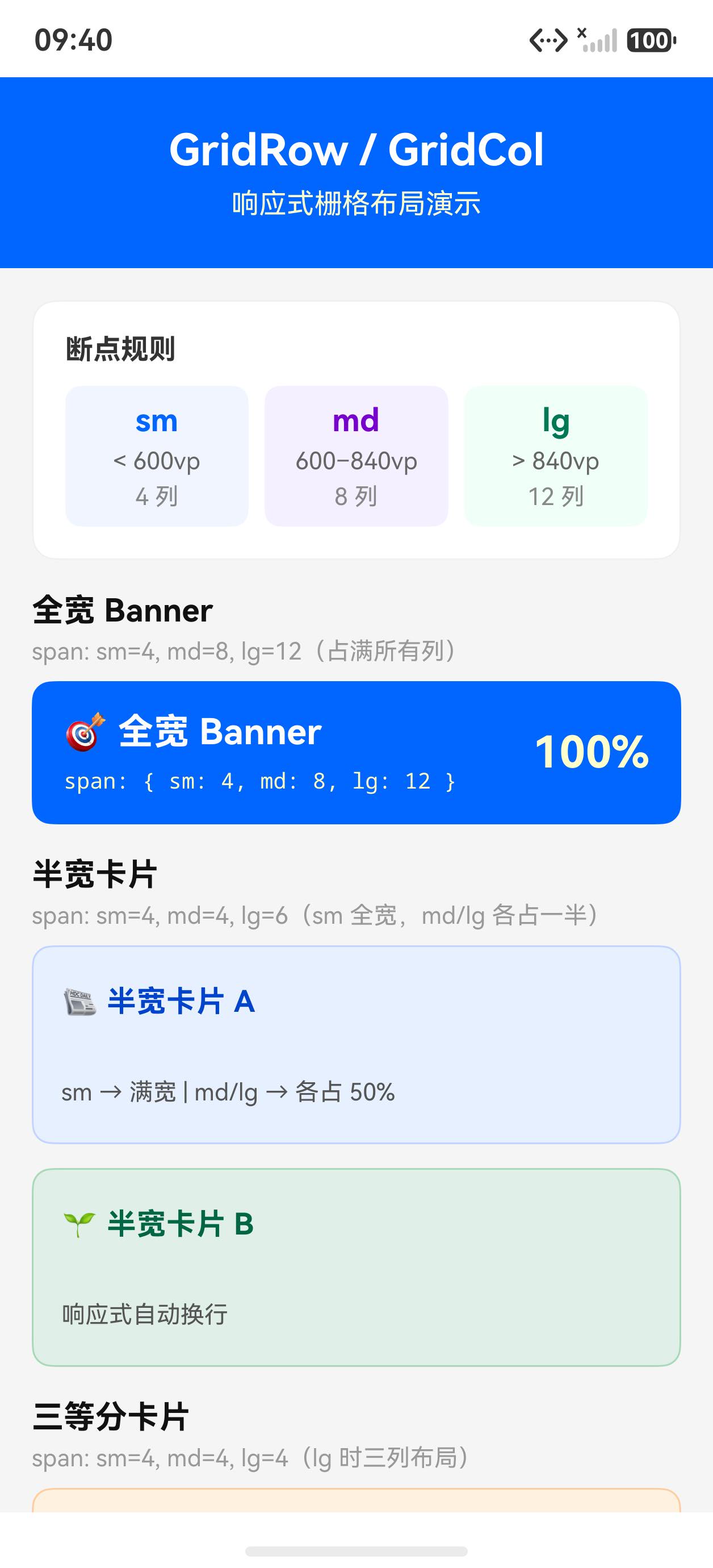
初始状态(12 列基础栅格)
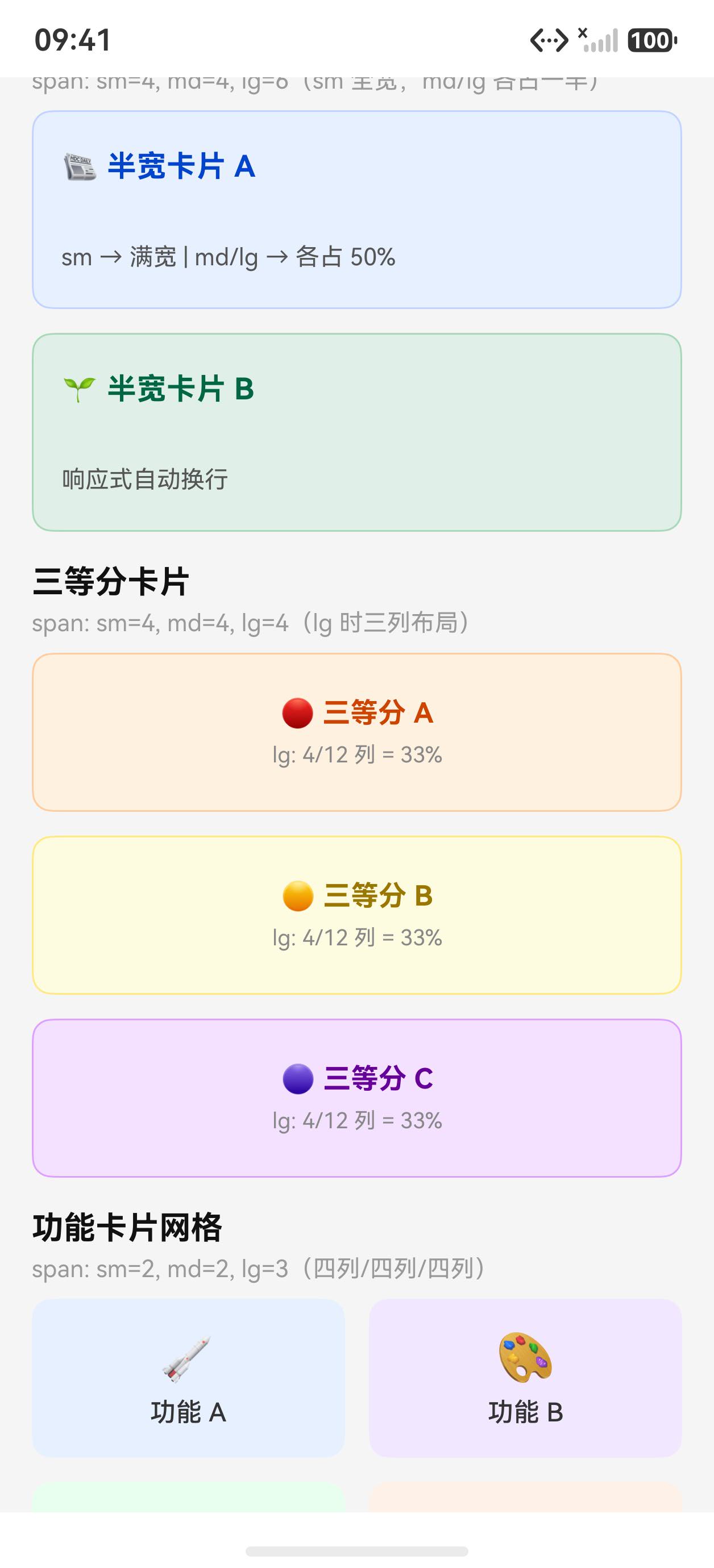
滚动后查看更多布局示例
核心 API 一览
| API | 说明 |
|---|---|
GridRow({ columns, gutter, breakpoints }) | 栅格行容器 |
GridCol({ span, offset, order }) | 栅格列容器 |
columns | 总列数,可为数字或各断点配置对象 |
gutter | 列间距,支持数字或 { x, y } 对象 |
breakpoints | 自定义断点宽度数组,默认 [320, 600, 840, 1080, 1440] |
span | 占几列,数字或各断点配置对象 |
offset | 左侧偏移几列 |
order | 显示顺序(数值小的在前) |
完整示例代码
@Entry
@Component
struct Index {
  build() {
    Scroll() {
      Column({ space: 24 }) {
        Text('GridRow / GridCol 响应式栅格')
          .fontSize(20)
          .fontWeight(FontWeight.Bold)
          .fontColor('#1a1a1a')
          .width('100%')
          .padding({ left: 16, top: 20 })

        // ── 示例 1: 基础 12 列等分 ──
        Column({ space: 8 }) {
          Text('① 12 列等分(每列占 2 格)')
            .fontSize(14).fontWeight(FontWeight.Bold).fontColor('#333')
            .padding({ left: 16 })

          GridRow({ columns: 12, gutter: { x: 4, y: 4 } }) {
            ForEach([1,2,3,4,5,6,7,8,9,10,11,12], (n: number) => {
              GridCol({ span: 2 }) {
                Column() {
                  Text(n.toString())
                    .fontSize(11)
                    .fontColor('#ffffff')
                }
                .height(36)
                .backgroundColor(n % 2 === 0 ? '#0066ff' : '#3388ff')
                .borderRadius(4)
                .justifyContent(FlexAlign.Center)
              }
            })
          }
          .padding({ left: 16, right: 16 })
        }

        // ── 示例 2: 不等宽布局(主内容 + 侧边栏)──
        Column({ space: 8 }) {
          Text('② 主内容 8 格 + 侧边栏 4 格')
            .fontSize(14).fontWeight(FontWeight.Bold).fontColor('#333')
            .padding({ left: 16 })

          GridRow({ columns: 12, gutter: 12 }) {
            GridCol({ span: 8 }) {
              Column({ space: 6 }) {
                Text('主内容区').fontSize(14).fontWeight(FontWeight.Bold).fontColor('#333')
                Text('span: 8 / 12').fontSize(12).fontColor('#888')
                Text('这里是主要内容,通常展示文章正文、列表或图表等。')
                  .fontSize(12).fontColor('#555').lineHeight(20)
              }
              .width('100%')
              .padding(14)
              .backgroundColor('#f0f5ff')
              .borderRadius(10)
              .alignItems(HorizontalAlign.Start)
            }
            GridCol({ span: 4 }) {
              Column({ space: 6 }) {
                Text('侧边栏').fontSize(14).fontWeight(FontWeight.Bold).fontColor('#333')
                Text('span: 4 / 12').fontSize(12).fontColor('#888')
                Text('推荐阅读、标签云等辅助内容。')
                  .fontSize(12).fontColor('#555').lineHeight(20)
              }
              .width('100%')
              .padding(14)
              .backgroundColor('#fff8f0')
              .borderRadius(10)
              .alignItems(HorizontalAlign.Start)
            }
          }
          .padding({ left: 16, right: 16 })
        }

        // ── 示例 3: 响应式断点配置 ──
        Column({ space: 8 }) {
          Text('③ 响应式配置(sm 占满 / lg 均分 3 格)')
            .fontSize(14).fontWeight(FontWeight.Bold).fontColor('#333')
            .padding({ left: 16 })
          Text('(宽屏下每个色块占 4 格,窄屏下占满 12 格)')
            .fontSize(12).fontColor('#888').padding({ left: 16 })

          GridRow({ columns: 12, gutter: 12 }) {
            ForEach(['#ff6b6b', '#feca57', '#48dbfb'], (color: string, idx: number) => {
              // sm(手机):span=12,lg(平板):span=4
              GridCol({ span: { sm: 12, md: 6, lg: 4 } }) {
                Column({ space: 4 }) {
                  Text('色块 ' + (idx + 1).toString())
                    .fontSize(14).fontColor('#fff').fontWeight(FontWeight.Bold)
                  Text('sm:12 / md:6 / lg:4')
                    .fontSize(10).fontColor('rgba(255,255,255,0.8)')
                }
                .width('100%')
                .height(70)
                .backgroundColor(color)
                .borderRadius(10)
                .justifyContent(FlexAlign.Center)
              }
            })
          }
          .padding({ left: 16, right: 16 })
        }

        // ── 示例 4: offset 偏移与 order 排序 ──
        Column({ space: 8 }) {
          Text('④ offset 偏移 + order 排序')
            .fontSize(14).fontWeight(FontWeight.Bold).fontColor('#333')
            .padding({ left: 16 })

          GridRow({ columns: 12, gutter: 8 }) {
            // 占 6 格,左偏移 3 格(居中)
            GridCol({ span: 6, offset: 3 }) {
              Column() {
                Text('span:6 offset:3').fontSize(11).fontColor('#fff')
                Text('居中对齐').fontSize(10).fontColor('rgba(255,255,255,0.8)')
              }
              .width('100%').height(48)
              .backgroundColor('#0066ff').borderRadius(8)
              .justifyContent(FlexAlign.Center)
            }
            // order=1:虽然声明在后,但 order 小则排在前
            GridCol({ span: 4, order: 1 }) {
              Column() {
                Text('order:1').fontSize(11).fontColor('#fff')
              }
              .width('100%').height(48)
              .backgroundColor('#00aa44').borderRadius(8)
              .justifyContent(FlexAlign.Center)
            }
            GridCol({ span: 4, order: 2 }) {
              Column() {
                Text('order:2').fontSize(11).fontColor('#fff')
              }
              .width('100%').height(48)
              .backgroundColor('#ff6600').borderRadius(8)
              .justifyContent(FlexAlign.Center)
            }
            GridCol({ span: 4, order: 3 }) {
              Column() {
                Text('order:3').fontSize(11).fontColor('#fff')
              }
              .width('100%').height(48)
              .backgroundColor('#cc3300').borderRadius(8)
              .justifyContent(FlexAlign.Center)
            }
          }
          .padding({ left: 16, right: 16 })
        }

        // ── 示例 5: 卡片瀑布式栅格 ──
        Column({ space: 8 }) {
          Text('⑤ 卡片式内容网格(6 列 / 手机 2 列)')
            .fontSize(14).fontWeight(FontWeight.Bold).fontColor('#333')
            .padding({ left: 16 })

          GridRow({ columns: 12, gutter: { x: 10, y: 10 } }) {
            ForEach([
              { title: '布局', icon: '📐', color: '#e8f0ff', count: '8 篇' },
              { title: '列表', icon: '📋', color: '#fff0e8', count: '5 篇' },
              { title: '动画', icon: '✨', color: '#e8fff0', count: '6 篇' },
              { title: '网络', icon: '🌐', color: '#f8e8ff', count: '4 篇' },
              { title: '状态', icon: '🔄', color: '#ffeee8', count: '7 篇' },
              { title: '调试', icon: '🐛', color: '#eef8ff', count: '3 篇' },
            ], (item: { title: string, icon: string, color: string, count: string }) => {
              GridCol({ span: { sm: 6, md: 4, lg: 2 } }) {
                Column({ space: 6 }) {
                  Text(item.icon).fontSize(28)
                  Text(item.title)
                    .fontSize(14).fontWeight(FontWeight.Bold).fontColor('#333')
                  Text(item.count)
                    .fontSize(11).fontColor('#888')
                }
                .width('100%')
                .height(90)
                .backgroundColor(item.color)
                .borderRadius(12)
                .justifyContent(FlexAlign.Center)
                .border({ width: 1, color: '#e8e8e8' })
              }
            })
          }
          .padding({ left: 16, right: 16 })
        }

        Column().height(24)
      }
      .width('100%')
    }
    .width('100%')
    .height('100%')
    .backgroundColor('#ffffff')
  }
}
关键知识点
1. 断点系统(breakpoints)
ArkUI 内置 6 个屏幕宽度断点:
| 断点 | 宽度范围 | 代表设备 |
|---|---|---|
xs | < 320vp | 超小屏 |
sm | 320–600vp | 手机竖屏(最常用) |
md | 600–840vp | 手机横屏 / 小平板 |
lg | 840–1080vp | 标准平板 |
xl | 1080–1440vp | 大平板 / 桌面 |
xxl | > 1440vp | 超大屏 |
2. span 配置响应式列宽
// 固定列宽:所有断点都占 6 格
GridCol({ span: 6 })

// 响应式配置:不同断点不同列宽
GridCol({ span: { sm: 12, md: 6, lg: 4 } })
// 手机:占满全行;小平板:占一半;平板:占 1/3
3. offset 实现列偏移
GridCol({ span: 8, offset: 2 })
// 占 8 格,左侧留 2 格空白 → 内容在 12 格中居中偏右
4. gutter 配置行列间距
GridRow({ gutter: 12 })           // 行列间距均为 12vp
GridRow({ gutter: { x: 12, y: 8 } })  // 列间距 12,行间距 8
5. 自定义 columns(非 12 列)
栅格不一定是 12 列,可以根据设计需要调整:
// 平板用 24 列,精度更高
GridRow({ columns: { sm: 4, md: 8, lg: 12 } })
小结
GridRow + GridCol实现响应式 12 列栅格,无需手写断点媒体查询span和offset支持各断点独立配置,一套代码适配手机和平板gutter同时控制行间距和列间距,避免手动计算 margin/paddingorder属性可调整视觉顺序,实现移动端与桌面端不同的信息架构- 典型布局:手机单列(span:12)、小平板双列(span:6)、平板三列(span:4)

讨论HarmonyOS开发技术,专注于API与组件、DevEco Studio、测试、元服务和应用上架分发等。
更多推荐



 4
4 0
0- 0


 已为社区贡献56条内容

所有评论(0)