HarmonyOS 6.1 实战:Scroll + Stack 联动实现商品页吸顶 Header
·
前言
电商应用中最常见的交互之一:页面顶部有大图 Banner,其下紧跟分类标签栏,当用户向下滚动超过 Banner 高度后,标签栏“吸顶“固定显示;继续滚动商品列表时,标签栏始终可见。本文用 Stack + Scroll + onScroll 实现这一联动效果,无需原生 StickyList API。
运行效果
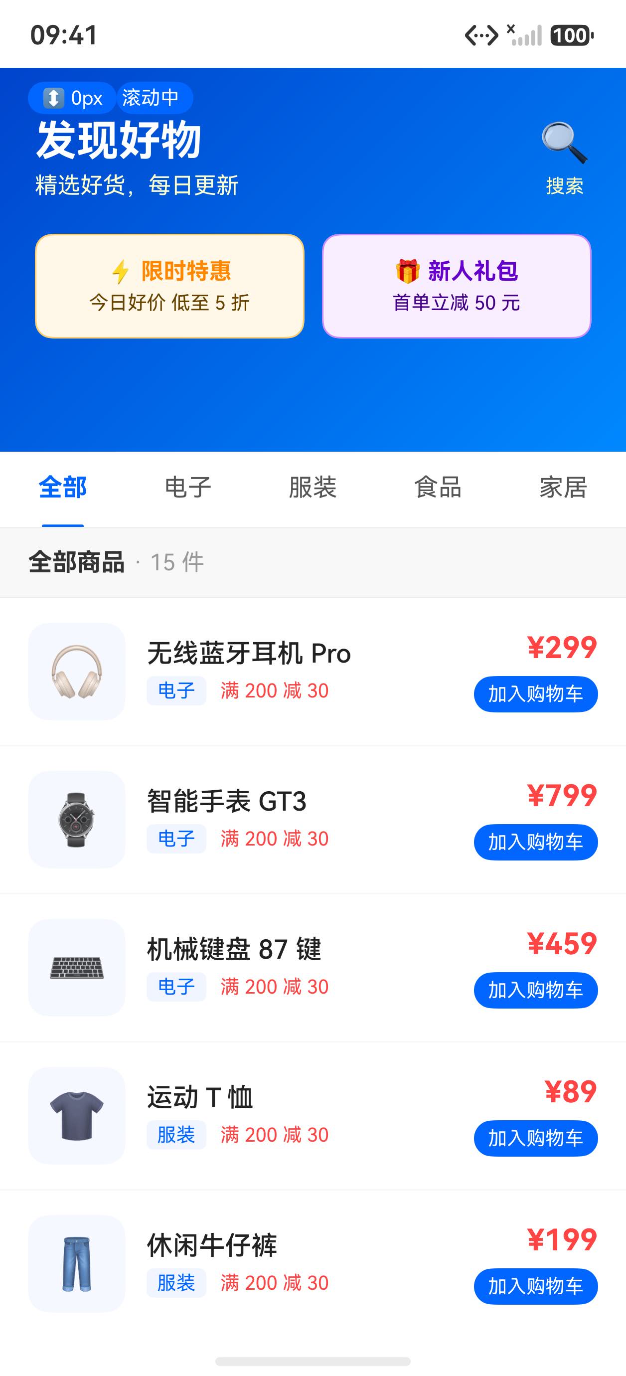
初始状态(Banner + 分类标签)
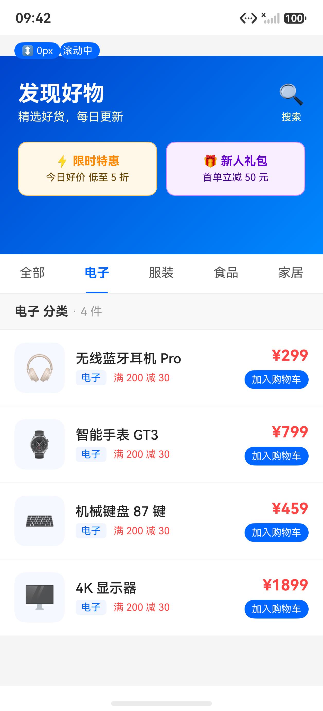
滚动后(标签栏吸顶,显示商品列表)
核心实现原理
Stack (alignContent: Alignment.Top)
├── Scroll(主内容:Banner + 内联标签栏 + 商品列表)
│     └── 监听 onScroll → 更新 scrollOffsetY
└── if (scrollOffsetY >= HEADER_HEIGHT)
      Column (固定吸顶标签栏,position y=0, zIndex=10)
当 scrollOffsetY >= HEADER_HEIGHT(Banner 高度)时,在 Stack 顶部渲染固定的标签栏覆盖层,产生“吸顶“效果。
完整示例代码
interface ProductItem {
  name: string
  price: string
  category: string
  icon: string
}

@Entry
@Component
struct Index {
  @State scrollOffsetY: number = 0
  @State activeTab: number = 0

  private scroller: Scroller = new Scroller()
  private HEADER_HEIGHT: number = 220
  private TAB_HEIGHT: number = 44

  private tabs: string[] = ['全部', '电子', '服装', '食品', '家居']

  private allProducts: ProductItem[] = [
    { name: '无线蓝牙耳机 Pro', price: '¥299', category: '电子', icon: '🎧' },
    { name: '智能手表 GT3', price: '¥799', category: '电子', icon: '⌚' },
    { name: '机械键盘 87 键', price: '¥459', category: '电子', icon: '⌨️' },
    { name: '运动 T 恤', price: '¥89', category: '服装', icon: '👕' },
    { name: '休闲牛仔裤', price: '¥199', category: '服装', icon: '👖' },
    { name: '运动鞋 Air', price: '¥349', category: '服装', icon: '👟' },
    { name: '有机燕麦片 1kg', price: '¥39', category: '食品', icon: '🥣' },
    { name: '进口坚果礼盒', price: '¥128', category: '食品', icon: '🥜' },
    { name: '绿茶 250g', price: '¥58', category: '食品', icon: '🍵' },
    { name: '北欧风台灯', price: '¥168', category: '家居', icon: '💡' },
    { name: '简约书架', price: '¥289', category: '家居', icon: '📚' },
    { name: '香薰蜡烛套装', price: '¥79', category: '家居', icon: '🕯️' },
    { name: '4K 显示器', price: '¥1899', category: '电子', icon: '🖥️' },
    { name: '羽绒外套', price: '¥599', category: '服装', icon: '🧥' },
    { name: '手冲咖啡豆', price: '¥88', category: '食品', icon: '☕' },
  ]

  private getFilteredProducts(): ProductItem[] {
    let activeTabName = this.tabs[this.activeTab]
    if (activeTabName === '全部') {
      return this.allProducts
    }
    let result: ProductItem[] = []
    for (let i = 0; i < this.allProducts.length; i++) {
      if (this.allProducts[i].category === activeTabName) {
        result.push(this.allProducts[i])
      }
    }
    return result
  }

  @Builder
  tabBar(isFixed: boolean) {
    Row({ space: 0 }) {
      ForEach(this.tabs, (tab: string, idx: number) => {
        Column({ space: 0 }) {
          Text(tab)
            .fontSize(14)
            .fontWeight(this.activeTab === idx ? FontWeight.Bold : FontWeight.Normal)
            .fontColor(this.activeTab === idx ? '#0066ff' : '#555')
            .height(this.TAB_HEIGHT - 2)
            .textAlign(TextAlign.Center)
          // 下划线指示器
          Text('')
            .width(this.activeTab === idx ? 24 : 0)
            .height(2)
            .backgroundColor('#0066ff')
            .borderRadius(1)
        }
        .layoutWeight(1)
        .height(this.TAB_HEIGHT)
        .justifyContent(FlexAlign.Center)
        .onClick(() => {
          this.activeTab = idx
        })
      })
    }
    .width('100%')
    .height(this.TAB_HEIGHT)
    .backgroundColor('#ffffff')
    .border({ width: { bottom: 1 }, color: '#f0f0f0' })
    // 吸顶时显示投影
    .shadow(isFixed
      ? { radius: 6, color: '#00000015', offsetX: 0, offsetY: 3 }
      : { radius: 0, color: 'transparent', offsetX: 0, offsetY: 0 })
  }

  @Builder
  productCard(item: ProductItem) {
    Row() {
      Column() {
        Text(item.icon).fontSize(28)
      }
      .width(56).height(56)
      .backgroundColor('#f5f8ff').borderRadius(12)
      .justifyContent(FlexAlign.Center)
      .margin({ right: 12 })

      Column({ space: 4 }) {
        Text(item.name)
          .fontSize(15).fontColor('#222').fontWeight(FontWeight.Medium)
          .maxLines(1).textOverflow({ overflow: TextOverflow.Ellipsis })
        Row({ space: 8 }) {
          Text(item.category)
            .fontSize(11).fontColor('#0066ff')
            .backgroundColor('#f0f5ff')
            .padding({ left: 6, right: 6, top: 2, bottom: 2 }).borderRadius(4)
          Text('满 200 减 30').fontSize(11).fontColor('#ff4444')
        }
      }
      .layoutWeight(1).alignItems(HorizontalAlign.Start)

      Column({ space: 6 }) {
        Text(item.price)
          .fontSize(17).fontWeight(FontWeight.Bold).fontColor('#ff4444')
        Text('加入购物车')
          .fontSize(11).fontColor('#ffffff')
          .backgroundColor('#0066ff')
          .padding({ left: 8, right: 8, top: 4, bottom: 4 }).borderRadius(12)
      }
      .alignItems(HorizontalAlign.End)
    }
    .width('100%')
    .padding({ left: 16, right: 16, top: 14, bottom: 14 })
    .backgroundColor('#ffffff')
    .border({ width: { bottom: 1 }, color: '#f8f8f8' })
  }

  build() {
    Stack({ alignContent: Alignment.Top }) {
      // ── 主滚动体 ──
      Scroll(this.scroller) {
        Column({ space: 0 }) {
          // Hero Banner(可滚走)
          Column({ space: 12 }) {
            Row() {
              Column({ space: 4 }) {
                Text('发现好物').fontSize(24).fontWeight(FontWeight.Bold).fontColor('#ffffff')
                Text('精选好货,每日更新').fontSize(13).fontColor('#ffffffcc')
              }
              .alignItems(HorizontalAlign.Start).layoutWeight(1)

              Column({ space: 4 }) {
                Text('🔍').fontSize(24)
                Text('搜索').fontSize(11).fontColor('#ffffffbb')
              }
              .alignItems(HorizontalAlign.Center)
            }
            .width('100%').padding({ left: 20, right: 20, top: 28, bottom: 8 })

            Row({ space: 10 }) {
              Column({ space: 4 }) {
                Text('⚡ 限时特惠').fontSize(13).fontWeight(FontWeight.Bold).fontColor('#ff8800')
                Text('今日好价 低至 5 折').fontSize(11).fontColor('#664400')
              }
              .layoutWeight(1).height(60).backgroundColor('#fff8e8').borderRadius(10)
              .justifyContent(FlexAlign.Center).alignItems(HorizontalAlign.Center)
              .border({ width: 1, color: '#ffcc66' })

              Column({ space: 4 }) {
                Text('🎁 新人礼包').fontSize(13).fontWeight(FontWeight.Bold).fontColor('#6600cc')
                Text('首单立减 50 元').fontSize(11).fontColor('#440088')
              }
              .layoutWeight(1).height(60).backgroundColor('#f8eeff').borderRadius(10)
              .justifyContent(FlexAlign.Center).alignItems(HorizontalAlign.Center)
              .border({ width: 1, color: '#cc88ff' })
            }
            .padding({ left: 20, right: 20, bottom: 16 })
          }
          .width('100%').height(this.HEADER_HEIGHT)
          .backgroundColor('#0066ff')
          .linearGradient({ angle: 135, colors: [['#0044cc', 0], ['#0088ff', 1]] })

          // 内联标签栏(随页面滚动,Banner 消失后被吸顶层覆盖)
          this.tabBar(false)

          // 商品列表
          Column({ space: 0 }) {
            Row() {
              Text(this.tabs[this.activeTab] === '全部' ? '全部商品' : this.tabs[this.activeTab] + ' 分类')
                .fontSize(14).fontWeight(FontWeight.Bold).fontColor('#333')
              Text(' · ' + this.getFilteredProducts().length.toString() + ' 件')
                .fontSize(13).fontColor('#999')
            }
            .width('100%').height(40)
            .padding({ left: 16, right: 16 })
            .backgroundColor('#f8f8f8')
            .border({ width: { bottom: 1 }, color: '#eeeeee' })

            ForEach(this.getFilteredProducts(), (item: ProductItem) => {
              this.productCard(item)
            })

            Column().width('100%').height(32).backgroundColor('#f5f5f5')
          }
          .width('100%').backgroundColor('#ffffff')
        }
        .width('100%')
      }
      .onScroll((_xOffset: number, _yOffset: number) => {
        this.scrollOffsetY = this.scroller.currentOffset().yOffset
      })
      .scrollBar(BarState.Off)
      .width('100%').height('100%').backgroundColor('#f5f5f5')

      // ── 吸顶标签栏(当滚过 Banner 后才显示)──
      if (this.scrollOffsetY >= this.HEADER_HEIGHT) {
        Column() {
          this.tabBar(true)
        }
        .width('100%')
        .position({ x: 0, y: 0 })
        .zIndex(10)
      }

      // 滚动状态角标
      Row() {
        Text('↕ ' + Math.round(this.scrollOffsetY).toString() + 'px')
          .fontSize(11).fontColor('#ffffff')
          .padding({ left: 8, right: 8, top: 3, bottom: 3 })
          .backgroundColor(this.scrollOffsetY >= this.HEADER_HEIGHT ? '#00aa55' : '#0066ff')
          .borderRadius(10)
        Text(this.scrollOffsetY >= this.HEADER_HEIGHT ? ' 吸顶中' : ' 滚动中')
          .fontSize(11).fontColor('#ffffff')
          .padding({ right: 8, top: 3, bottom: 3 })
          .backgroundColor(this.scrollOffsetY >= this.HEADER_HEIGHT ? '#00aa55' : '#0066ff')
          .borderRadius(10)
      }
      .position({ x: 16, y: 8 })
      .zIndex(20)
      .borderRadius(12)
      .shadow({ radius: 4, color: '#00000020', offsetX: 0, offsetY: 2 })
    }
    .width('100%').height('100%')
  }
}
关键知识点
1. Stack + 条件渲染实现吸顶
核心思路:在 Stack 顶部用 if 条件渲染一个固定在 y=0 的覆盖层:
Stack({ alignContent: Alignment.Top }) {
  Scroll() { ... }
    .onScroll(() => {
      this.scrollOffsetY = this.scroller.currentOffset().yOffset
    })

  // 吸顶覆盖层
  if (this.scrollOffsetY >= HEADER_HEIGHT) {
    Column() { this.tabBar(true) }
      .position({ x: 0, y: 0 })  // 固定在顶部
      .zIndex(10)                 // 覆盖在滚动内容之上
  }
}
2. onScroll 获取绝对偏移
.onScroll(dx, dy) 的参数是增量,用 scroller.currentOffset().yOffset 获取绝对位移:
.onScroll((_x: number, _y: number) => {
  this.scrollOffsetY = this.scroller.currentOffset().yOffset
})
3. 吸顶时显示阴影
@Builder tabBar(isFixed: boolean) 接收参数,当 isFixed=true 时给标签栏加投影,增强层次感:
@Builder
tabBar(isFixed: boolean) {
  Row() { ... }
    .shadow(isFixed
      ? { radius: 6, color: '#00000015', offsetX: 0, offsetY: 3 }
      : { radius: 0, color: 'transparent', offsetX: 0, offsetY: 0 })
}
4. RowAttribute 不支持 .overflow()
Row 组件没有 .overflow() 属性(.overflow() 仅存在于 Text 等文本组件),如果需要裁剪超出内容,改用 .clip(true):
// 错误:Row 没有 .overflow()
Row() { ... }.overflow(Overflow.Hidden)

// 正确:用 .clip()
Row() { ... }.clip(true)
5. @Builder 参数传递
@Builder 方法支持传参,可以根据参数渲染不同状态的 UI:
@Builder tabBar(isFixed: boolean) {
  // 根据 isFixed 调整 shadow、backgroundColor 等
}

// 调用
this.tabBar(false)  // 内联标签栏
this.tabBar(true)   // 吸顶覆盖层
小结
- 吸顶效果的关键:
Stack包裹 +onScroll监听偏移量 +if条件渲染固定覆盖层 - 获取绝对滚动位置用
scroller.currentOffset().yOffset,不要用onScroll的差量参数累加 - 吸顶覆盖层通过
.position({ x:0, y:0 })+.zIndex(n)固定在最顶部 Row没有.overflow()属性,裁剪用.clip(true)- 同一个
@Builder方法传不同参数可渲染“滚动版“和“吸顶版“两种状态,避免代码重复

讨论HarmonyOS开发技术,专注于API与组件、DevEco Studio、测试、元服务和应用上架分发等。
更多推荐



 5
5 0
0- 0


 已为社区贡献56条内容

所有评论(0)