动画按钮组件开发实战:HarmonyOS ArkTS 多彩交互动画按钮应用解析
一、应用概述
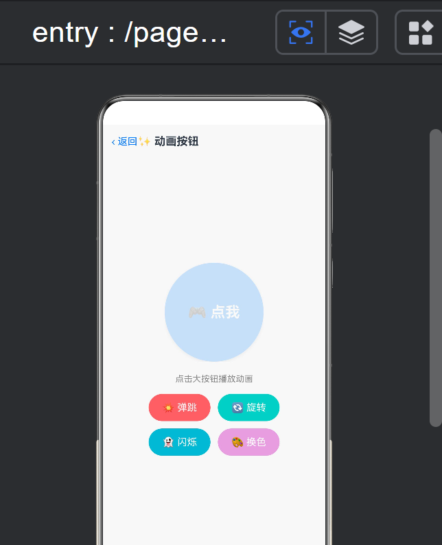
动画按钮是移动应用中最基础也是最重要的交互元素之一。一个精心设计的动画按钮不仅能提升用户体验,还能引导用户操作、传达品牌个性、增加界面的趣味性。本文将以 HarmonyOS ArkTS 框架为基础,详细解析一个功能丰富的动画按钮组件的开发过程,该组件支持缩放、旋转、淡入淡出三种核心动画效果,以及多种动画触发方式。
1.1 功能特性
- 缩放动画(Scale):按钮在触发时按比例放大或缩小,产生"弹跳"效果
- 旋转动画(Rotate):按钮在触发时绕中心轴旋转指定角度
- 淡入淡出动画(Fade):按钮在触发时改变透明度,产生渐隐渐现效果
- 组合动画:支持同时应用多种动画效果
- 可配置参数:动画时长、曲线、延迟、循环次数等均可自定义
- 多触发方式:支持点击触发、长按触发、悬停触发等多种模式
- 状态反馈:按钮在不同状态(正常/按下/禁用)下有不同视觉表现
1.2 适用场景
- 表单提交按钮
- 功能开关按钮
- 菜单展开按钮
- 收藏/点赞按钮
- 播放/暂停控制按钮
- 游戏中的交互按钮
1.3 技术亮点
动画按钮组件是对 ArkTS 动画系统的全面应用,涵盖了隐式动画、显式动画、关键帧动画等多种动画实现方式,是学习 ArkTS 动画机制的经典案例。
二、技术架构
2.1 整体架构
┌──────────────────────────────────────────┐
│         AnimatedButtonContainer          │
│          (动画按钮控制器)               │
├──────────────────────────────────────────┤
│  ┌────────────────────────────────────┐  │
│  │         AnimatedButton             │  │
│  │  ┌────────────────────────────┐   │  │
│  │  │       按钮背景层            │   │  │
│  │  │  ┌──────────────────────┐  │   │  │
│  │  │  │    按钮内容层         │  │   │  │
│  │  │  │  (图标/文字/组合)    │  │   │  │
│  │  │  └──────────────────────┘  │   │  │
│  │  └────────────────────────────┘   │  │
│  └────────────────────────────────────┘  │
│                                          │
│  ┌────────────────────────────────────┐  │
│  │       动画效果控制层               │  │
│  │  Scale | Rotate | Fade | 组合     │  │
│  └────────────────────────────────────┘  │
└──────────────────────────────────────────┘
2.2 核心数据结构
// 动画类型枚举
enum AnimationType {
  SCALE = 'scale',
  ROTATE = 'rotate',
  FADE = 'fade',
  COMBINE = 'combine'
}

// 动画配置接口
interface AnimationConfig {
  type: AnimationType;           // 动画类型
  duration: number;              // 动画时长(毫秒)
  curve: Curve;                  // 动画曲线
  delay: number;                 // 延迟时间(毫秒)
  iterations: number;            // 循环次数(-1 = 无限)

  // 缩放参数
  scaleFrom?: number;            // 初始缩放比例
  scaleTo?: number;              // 目标缩放比例

  // 旋转参数
  rotateFrom?: number;           // 初始角度
  rotateTo?: number;             // 目标角度(度)

  // 淡入淡出参数
  opacityFrom?: number;          // 初始透明度
  opacityTo?: number;            // 目标透明度
}

// 按钮状态枚举
enum ButtonState {
  NORMAL = 'normal',     // 正常状态
  PRESSED = 'pressed',   // 按下状态
  ACTIVE = 'active',     // 激活状态
  DISABLED = 'disabled'  // 禁用状态
}

// 触发方式枚举
enum TriggerMode {
  CLICK = 'click',           // 点击触发
  LONG_PRESS = 'longPress',  // 长按触发
  HOVER = 'hover',           // 悬停触发
  TOGGLE = 'toggle'          // 切换模式
}
2.3 状态管理模型
@State buttonState: ButtonState      → 按钮当前状态
@State isAnimating: boolean          → 是否正在动画
@State isActive: boolean             → 切换模式的激活状态

@State scaleValue: number = 1.0      → 当前缩放值
@State rotateValue: number = 0       → 当前旋转角度
@State opacityValue: number = 1.0    → 当前透明度值
三、核心代码分析
3.1 动画按钮主组件
@Component
struct AnimatedButton {
  // 基础属性
  private label: string = '';            // 按钮文字
  private icon?: ResourceStr;            // 按钮图标
  private width: number = 120;           // 按钮宽度
  private height: number = 48;           // 按钮高度
  private borderRadius: number = 24;     // 圆角
  private backgroundColor: ResourceColor = '#0A59F7'; // 背景色

  // 动画配置
  private config: AnimationConfig = {
    type: AnimationType.SCALE,
    duration: 300,
    curve: Curve.EaseOut,
    delay: 0,
    iterations: 1,
    scaleFrom: 1.0,
    scaleTo: 1.2,
    rotateFrom: 0,
    rotateTo: 45,
    opacityFrom: 1.0,
    opacityTo: 0.5
  };

  // 触发方式
  private triggerMode: TriggerMode = TriggerMode.CLICK;

  // 状态管理
  @State buttonState: ButtonState = ButtonState.NORMAL;
  @State isAnimating: boolean = false;
  @State isActive: boolean = false;

  // 动画值
  @State scaleValue: number = 1.0;
  @State rotateValue: number = 0;
  @State opacityValue: number = 1.0;

  // 回调
  private onClick?: () => void;
  private onStateChange?: (state: ButtonState) => void;

  build() {
    Button({
      type: ButtonType.Normal,
      stateEffect: false // 禁用默认点击效果,使用自定义动画
    }) {
      Row({ space: 8 }) {
        if (this.icon) {
          Image(this.icon)
            .width(20)
            .height(20)
            .fillColor(Color.White)
        }
        if (this.label) {
          Text(this.label)
            .fontSize(16)
            .fontColor(Color.White)
            .fontWeight(FontWeight.Medium)
        }
      }
      .justifyContent(FlexAlign.Center)
      .alignItems(VerticalAlign.Center)
    }
    .width(this.width)
    .height(this.height)
    .borderRadius(this.borderRadius)
    .backgroundColor(this.getButtonColor())
    .shadow(this.getButtonShadow())
    // 应用动画变换
    .scale({ x: this.scaleValue, y: this.scaleValue })
    .rotate({ angle: this.rotateValue })
    .opacity(this.opacityValue)
    // 隐式动画配置
    .animation({
      duration: this.config.duration,
      curve: this.config.curve,
      delay: this.config.delay,
      iterations: this.config.iterations === -1 ? Infinity : this.config.iterations
    })
    // 事件绑定
    .onClick(() => {
      if (this.buttonState === ButtonState.DISABLED) return;
      this.handleButtonAction();
    })
    .onTouch((event: TouchEvent) => {
      if (this.buttonState === ButtonState.DISABLED) return;
      if (event.type === TouchType.Down) {
        this.buttonState = ButtonState.PRESSED;
      } else if (event.type === TouchType.Up || event.type === TouchType.Cancel) {
        this.buttonState = this.isActive ? ButtonState.ACTIVE : ButtonState.NORMAL;
      }
    })
    .gesture(
      LongPressGesture({ duration: 500 })
        .onAction(() => {
          if (this.triggerMode === TriggerMode.LONG_PRESS) {
            this.handleButtonAction();
          }
        })
    )
    .enabled(this.buttonState !== ButtonState.DISABLED)
  }

  // 处理按钮操作
  handleButtonAction() {
    if (this.isAnimating) return;

    this.isAnimating = true;

    // 切换模式特殊处理
    if (this.triggerMode === TriggerMode.TOGGLE) {
      this.isActive = !this.isActive;
      this.buttonState = this.isActive ? ButtonState.ACTIVE : ButtonState.NORMAL;
    }

    // 触发动画
    this.startAnimation();

    // 回调
    this.onClick?.();
    this.onStateChange?.(this.buttonState);
  }
}
3.2 动画效果实现
不同类型的动画通过修改对应的 @State 变量实现:
// 启动动画
startAnimation() {
  switch (this.config.type) {
    case AnimationType.SCALE:
      this.playScaleAnimation();
      break;
    case AnimationType.ROTATE:
      this.playRotateAnimation();
      break;
    case AnimationType.FADE:
      this.playFadeAnimation();
      break;
    case AnimationType.COMBINE:
      this.playCombineAnimation();
      break;
  }
}

// 缩放动画
playScaleAnimation() {
  // 先放大到目标值
  animateTo({
    duration: this.config.duration / 2,
    curve: Curve.EaseOut,
    onFinish: () => {
      // 再回弹到正常大小
      animateTo({
        duration: this.config.duration / 2,
        curve: Curve.SpringMotion,
        onFinish: () => {
          this.isAnimating = false;
        }
      }, () => {
        this.scaleValue = 1.0;
      })
    }
  }, () => {
    this.scaleValue = this.config.scaleTo!;
  })
}

// 旋转动画
playRotateAnimation() {
  animateTo({
    duration: this.config.duration,
    curve: Curve.EaseOut,
    onFinish: () => {
      // 自动回正
      animateTo({
        duration: this.config.duration / 2,
        curve: Curve.SpringMotion,
        onFinish: () => {
          this.isAnimating = false;
        }
      }, () => {
        this.rotateValue = 0;
      })
    }
  }, () => {
    this.rotateValue = this.config.rotateTo!;
  })
}

// 淡入淡出动画
playFadeAnimation() {
  animateTo({
    duration: this.config.duration / 2,
    curve: Curve.EaseOut,
    onFinish: () => {
      // 恢复透明度
      animateTo({
        duration: this.config.duration / 2,
        curve: Curve.EaseIn,
        onFinish: () => {
          this.isAnimating = false;
        }
      }, () => {
        this.opacityValue = 1.0;
      })
    }
  }, () => {
    this.opacityValue = this.config.opacityTo!;
  })
}

// 组合动画
playCombineAnimation() {
  animateTo({
    duration: this.config.duration,
    curve: Curve.EaseOut,
    onFinish: () => {
      // 回弹
      animateTo({
        duration: this.config.duration / 2,
        curve: Curve.SpringMotion,
        onFinish: () => {
          this.isAnimating = false;
          this.scaleValue = 1.0;
          this.rotateValue = 0;
          this.opacityValue = 1.0;
        }
      }, () => {
        this.scaleValue = 1.0;
        this.rotateValue = 0;
        this.opacityValue = 1.0;
      })
    }
  }, () => {
    this.scaleValue = this.config.scaleTo!;
    this.rotateValue = this.config.rotateTo!;
    this.opacityValue = this.config.opacityTo!;
  })
}
动画设计思路:
每种动画都采用"前进-回弹"的两段式设计:
- 第一阶段(前进):从初始值过渡到目标值,使用
EaseOut曲线,动作流畅自然 - 第二阶段(回弹):从目标值回到初始值,使用
SpringMotion曲线,模拟物理弹性
这种设计给用户带来"按钮被按下去又弹回来"的物理质感,比单一的线性动画更生动。
3.3 自定义按钮样式
根据按钮状态动态调整视觉样式:
// 获取按钮颜色
getButtonColor(): ResourceColor {
  switch (this.buttonState) {
    case ButtonState.NORMAL:
      return this.backgroundColor;
    case ButtonState.PRESSED:
      return this.darkenColor(this.backgroundColor, 0.2);
    case ButtonState.ACTIVE:
      return this.activeColor || this.backgroundColor;
    case ButtonState.DISABLED:
      return '#CCCCCC';
  }
}

// 获取按钮阴影
getButtonShadow(): Shadow {
  if (this.buttonState === ButtonState.DISABLED) {
    return { radius: 0, color: 'transparent' };
  }

  const elevation = this.buttonState === ButtonState.PRESSED ? 2 : 6;
  return {
    radius: elevation,
    color: 'rgba(0, 0, 0, 0.15)',
    offsetX: 0,
    offsetY: elevation / 2
  };
}

// 颜色加深工具函数
darkenColor(color: string, factor: number): string {
  // 将颜色值按因子加深
  const hex = color.replace('#', '');
  const r = parseInt(hex.substring(0, 2), 16);
  const g = parseInt(hex.substring(2, 4), 16);
  const b = parseInt(hex.substring(4, 6), 16);

  const newR = Math.round(r * (1 - factor));
  const newG = Math.round(g * (1 - factor));
  const newB = Math.round(b * (1 - factor));

  return `#${newR.toString(16).padStart(2, '0')}${newG.toString(16).padStart(2, '0')}${newB.toString(16).padStart(2, '0')}`;
}
3.4 切换模式(Toggle)实现
切换模式下的按钮表现为"开/关"两种状态,每次点击切换状态:
// 切换状态视觉反馈
toggleStateVisual() {
  if (this.isActive) {
    // 激活状态:填充色 + 图标变化
    animateTo({
      duration: this.config.duration,
      curve: Curve.EaseOut
    }, () => {
      this.buttonState = ButtonState.ACTIVE;
      this.scaleValue = 1.0;
    })

    // 激活指示器动画(可选)
    if (this.activeIndicator) {
      // 显示激活指示器
    }
  } else {
    // 非激活状态:恢复默认
    animateTo({
      duration: this.config.duration,
      curve: Curve.EaseOut
    }, () => {
      this.buttonState = ButtonState.NORMAL;
      this.scaleValue = 1.0;
    })
  }
}
3.5 使用 @Builder 构建不同样式按钮
@Builder
PrimaryButton(config: AnimationConfig) {
  AnimatedButton({
    label: '主要按钮',
    width: 160,
    height: 52,
    borderRadius: 26,
    backgroundColor: '#0A59F7',
    config: config,
    onClick: () => {
      console.log('主要按钮被点击');
    }
  })
}

@Builder
IconButton(icon: ResourceStr) {
  AnimatedButton({
    icon: icon,
    width: 48,
    height: 48,
    borderRadius: 24,
    backgroundColor: '#FFFFFF',
    config: { type: AnimationType.SCALE, scaleTo: 0.9 },
    onClick: () => {
      console.log('图标按钮被点击');
    }
  })
}
四、HarmonyOS关键技术应用
4.1 动画系统深度解析
ArkTS 提供了三层动画能力:
| 层级 | API | 适用场景 | 本应用使用 |
|---|---|---|---|
| 隐式动画 | .animation() | 属性变化自动过渡 | 按钮状态变化 |
| 显式动画 | animateTo() | 复杂动画控制 | 按钮点击动画 |
| 关键帧动画 | keyframeTo() | 多阶段动画 | 组合动画 |
隐式动画 vs 显式动画的选择:
// 隐式动画:适合简单的、由状态驱动的动画
Button('示例')
  .scale({ x: this.scaleValue, y: this.scaleValue })
  .animation({
    duration: 300,
    curve: Curve.EaseOut
  })
  .onClick(() => {
    this.scaleValue = 1.2; // 自动触发动画
  })

// 显式动画:适合复杂的、多阶段的动画
Button('示例')
  .onClick(() => {
    animateTo({
      duration: 300,
      curve: Curve.EaseOut,
      onFinish: () => {
        // 动画完成后执行第二阶段
        animateTo({...}, () => {
          this.scaleValue = 1.0;
        })
      }
    }, () => {
      this.scaleValue = 1.2;
    })
  })
4.2 动画曲线选择
ArkTS 提供了丰富的动画曲线,不同的曲线适用于不同的场景:
// 弹性曲线 - 适合按钮点击回弹
Curve.SpringMotion
// 效果:超过目标值再回弹,模拟物理弹簧

// 缓出曲线 - 适合按钮按下
Curve.EaseOut
// 效果:开始时快速,结束时减速

// 缓入缓出 - 适合平滑过渡
Curve.EaseInOut
// 效果:开始和结束都慢,中间快

// 弹性曲线 - 适合强调效果
Curve.Spring
// 效果:多次回弹振荡

// 自定义三次贝塞尔曲线
Curve.cubicBezier(0.25, 0.1, 0.25, 1.0)
4.3 手势系统集成
// 组合手势:点击 + 长按
Button()
  .gesture(
    GestureGroup(GestureMode.Exclusive,
      TapGesture()
        .onAction(() => {
          // 单击处理
          this.handleSingleTap();
        }),
      LongPressGesture({ duration: 500 })
        .onAction(() => {
          // 长按处理
          this.handleLongPress();
        })
        .onActionEnd(() => {
          // 长按结束
          this.handleLongPressEnd();
        })
    )
  )
GestureMode.Exclusive 确保两个手势互斥,避免了单击和长按的冲突。
五、UI设计与交互
5.1 视觉设计
按钮状态视觉规范:
| 状态 | 背景色 | 阴影 | 缩放 | 透明度 |
|---|---|---|---|---|
| Normal | 主题色 | 6px 阴影 | 1.0 | 1.0 |
| Pressed | 加深 20% | 2px 阴影 | 0.95 | 1.0 |
| Active | 强调色 | 4px 阴影 | 1.0 | 1.0 |
| Disabled | 灰色 | 无阴影 | 1.0 | 0.5 |
尺寸规范:
大按钮:宽度 240px,高度 56px,圆角 28px
中按钮:宽度 160px,高度 48px,圆角 24px(默认)
小按钮:宽度 100px,高度 36px,圆角 18px
图标按钮:宽度 48px,高度 48px,圆角 24px
5.2 交互反馈设计
动画按钮的交互遵循"预览 → 执行 → 确认"的三段式反馈流程:
- 预览阶段(悬停):按钮亮度略微变化,暗示可交互
- 执行阶段(点击):按钮执行缩放/旋转/淡出动画,提供操作反馈
- 确认阶段(动画结束):按钮恢复到正常状态,等待下一次操作
5.3 无障碍设计
// 无障碍支持
Button('提交')
  .accessibilityText('提交表单按钮')
  .accessibilityLevel('yes')
  .accessibilityDescription('点击后提交当前表单数据')
  .accessibilityRole('button')
  .focusable(true)
  .onKeyEvent((event: KeyEvent) => {
    if (event.keyCode === KeyCode.KEYCODE_ENTER) {
      this.handleButtonAction();
    }
  })
六、性能优化与最佳实践
6.1 动画性能优化
// 1. 使用 transform 代替 layout 属性动画
// ❌ 触发布局重排
.width(this.animatedWidth)
.height(this.animatedHeight)

// ✅ 仅触发合成
.scale({ x: this.scaleValue, y: this.scaleValue })
.rotate({ angle: this.rotateValue })

// 2. 启用硬件加速
.scale({ x: 1.2, y: 1.2 })
.renderGroup(true) // 启用渲染组,提升性能

// 3. 降低动画复杂度
// 避免同时对过多属性做动画
// 建议同时动画的属性不超过 3 个

// 4. 合理设置动画时长
// 点击反馈:100-200ms
// 状态切换:200-400ms
// 强调效果:400-800ms
6.2 防止重复触发
// 使用防抖机制防止快速点击
private lastTapTime: number = 0;
private readonly DEBOUNCE_INTERVAL = 300; // 防抖间隔

handleButtonAction() {
  const now = Date.now();
  if (now - this.lastTapTime < this.DEBOUNCE_INTERVAL) {
    return; // 防抖:忽略此次触发
  }
  this.lastTapTime = now;

  // 执行实际操作
  this.startAnimation();
  this.onClick?.();
}
6.3 组件复用与配置化
// 预设按钮样式
const BUTTON_PRESETS = {
  primary: {
    backgroundColor: '#0A59F7',
    width: 160,
    height: 48,
    borderRadius: 24,
    config: {
      type: AnimationType.SCALE,
      duration: 300,
      scaleTo: 1.05
    }
  },
  danger: {
    backgroundColor: '#FF4444',
    width: 160,
    height: 48,
    borderRadius: 24,
    config: {
      type: AnimationType.SHAKE,
      duration: 400
    }
  },
  success: {
    backgroundColor: '#4CAF50',
    width: 160,
    height: 48,
    borderRadius: 24,
    config: {
      type: AnimationType.COMBINE,
      duration: 500,
      scaleTo: 1.1,
      rotateTo: 10
    }
  }
};

// 使用预设
Button(this.buttonPresets.primary)
七、总结与扩展思路
7.1 项目总结
本文完整解析了基于 HarmonyOS ArkTS 框架的动画按钮组件开发,覆盖以下核心技术:
- 动画系统:隐式动画、显式动画、关键帧动画的综合运用
- 状态管理:多状态(Normal/Pressed/Active/Disabled)的管理与切换
- 手势系统:点击、长按、悬停手势的处理
- 组件设计:可配置、可复用的组件封装方案
- 性能优化:防止重复触发、合理使用动画属性
7.2 扩展思路
新增动画效果
- 抖动动画(Shake):按钮左右快速抖动,用于错误提示
- 脉冲动画(Pulse):按钮持续缩放脉冲,用于吸引注意力
- 光晕动画(Glow):按钮边缘发光效果
- 碎裂动画(Shatter):按钮碎裂后再重组
- 波纹动画(Ripple):Material Design 风格的点击波纹
交互模式扩展
- 手势按钮:支持上滑、下滑等手势操作
- 语音按钮:集成语音识别,语音触发点击
- 压力按钮:支持 3D Touch 压力感应(设备支持时)
- 协同按钮:多设备协同操作
应用场景深化
- 游戏技能按钮:带冷却时间显示的动画按钮
- 悬浮操作按钮:可拖拽的 FAB 按钮
- 进度按钮:按钮本身显示操作进度
- 情感按钮:根据用户情绪显示不同动画效果
7.3 设计哲学
动画按钮的设计体现了"反馈驱动交互"的理念——用户每一次操作都获得及时、明确的视觉反馈,从而建立操作与结果之间的因果认知。这种设计哲学可以扩展到整个应用的设计中:
按钮动画 → 页面转场 → 微交互 → 品牌体验
    ↓          ↓         ↓         ↓
  即时反馈   连贯导航   情感连接   品牌认知
在 HarmonyOS 生态中,优秀的动画设计是提升用户体验的关键竞争力。掌握 ArkTS 动画系统,将为开发者打造高品质的鸿蒙应用奠定坚实基础。
项目代码已完整开源。动画按钮组件是 ArkTS 动画系统的综合实践,开发者可以基于此学习框架并创造出更多富有创意的交互效果。

讨论HarmonyOS开发技术,专注于API与组件、DevEco Studio、测试、元服务和应用上架分发等。
更多推荐
 5
5 0
0- 0


 已为社区贡献78条内容

所有评论(0)