鸿蒙原生ArkTS布局方式之Tabs+Indicator下标指示器布局深度解析
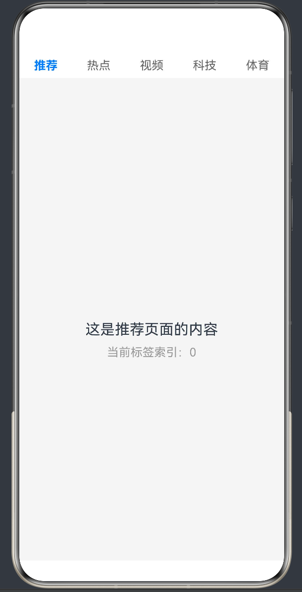
项目演示
引言
在移动应用开发中,标签页(Tab)是一种极其常见的界面交互模式,广泛应用于新闻资讯、社交应用、电商平台等各类应用场景。标签页能够将复杂的内容进行分类展示,用户通过点击或滑动即可在不同内容板块之间切换,极大提升了应用的易用性和信息组织效率。
鸿蒙HarmonyOS NEXT作为新一代智能终端操作系统,提供了强大的ArkTS声明式UI框架,为开发者构建高性能、沉浸式的用户界面提供了丰富的组件和工具。其中,Tabs组件是实现标签页布局的核心组件,配合自定义指示器(Indicator),可以打造出精美的动态下划线效果,为用户带来流畅的视觉体验。
本文将深入探讨鸿蒙原生ArkTS布局方式中,如何使用Tabs组件结合自定义指示器实现动态下划线效果。我们将从ArkTS基础概念入手,详细讲解Tabs组件的核心API(API Level 24),分析自定义指示器的实现原理,探讨动画效果的优化策略,并通过完整的实战案例展示如何构建一个高质量的标签页应用。
一、ArkTS声明式UI基础
1.1 ArkTS概述
ArkTS是HarmonyOS NEXT推出的新一代声明式UI开发语言,它基于TypeScript扩展而来,结合了声明式编程范式和响应式状态管理,为开发者提供了简洁、高效的UI开发体验。
ArkTS的核心特点包括:
- 声明式语法:通过描述UI的"状态"而非"过程"来构建界面,代码更加直观易读
- 响应式状态管理:使用装饰器(如@State、@Prop、@Link等)实现状态与UI的自动同步
- 组件化开发:支持自定义组件和Builder,实现UI的复用和模块化
- 类型安全:基于TypeScript,提供完整的类型检查和智能提示
1.2 核心装饰器
在ArkTS中,装饰器是实现响应式UI的关键。以下是常用的装饰器:
@Entry
@Component
struct MyComponent {
  @State count: number = 0;
  @Prop message: string = '';
  @Link selectedIndex: number = 0;

  build() {
    // UI构建逻辑
  }
}
@Entry:标识组件为页面入口组件@Component:标识组件为自定义组件@State:声明组件内部状态,状态变化时自动触发UI更新@Prop:接收父组件传递的只读属性@Link:与父组件的状态建立双向绑定
1.3 布局容器
ArkTS提供了丰富的布局容器组件,用于组织和排列子组件:
Column:垂直布局容器,子组件从上到下排列Row:水平布局容器,子组件从左到右排列Stack:堆叠布局容器,子组件重叠显示Grid:网格布局容器,子组件按行列排列List:列表布局容器,用于展示滚动列表
这些布局容器可以组合使用,构建复杂的界面结构。
1.4 状态驱动UI更新
ArkTS的声明式UI采用状态驱动的更新机制。当组件的状态发生变化时,框架会自动检测变化并更新相关的UI部分,无需手动操作DOM。
@Entry
@Component
struct Counter {
  @State count: number = 0;

  build() {
    Column() {
      Text(`计数: ${this.count}`)
        .fontSize(20)

      Button('增加')
        .onClick(() => {
          this.count++;
        })
    }
  }
}
这种机制大大简化了UI开发,使开发者能够专注于业务逻辑而非UI更新细节。
二、Tabs组件核心API详解(API Level 24)
2.1 Tabs组件概述
Tabs组件是鸿蒙ArkUI提供的标签页容器组件,用于实现多标签内容切换的界面模式。在API Level 24中,Tabs组件提供了丰富的配置选项和事件回调,支持多种标签栏样式和内容切换方式。
2.2 Tabs组件构造函数
Tabs组件的构造函数接收一个可选的配置对象:
Tabs(value?: { barPosition?: BarPosition; controller?: TabsController })
barPosition:指定标签栏的位置,可选值为BarPosition.Start(顶部)或BarPosition.End(底部),默认为BarPosition.Startcontroller:Tabs控制器,用于程序化控制Tabs的选中状态和滚动位置
2.3 核心属性方法
2.3.1 barMode方法
barMode方法用于设置标签栏的显示模式:
Tabs()
  .barMode(BarMode.Fixed)
BarMode枚举包含以下值:
BarMode.Fixed:标签栏固定显示,所有标签均匀分布,适用于标签数量较少的场景BarMode.Scrollable:标签栏可滚动,标签数量较多时自动启用横向滚动,适用于标签数量不确定或较多的场景
2.3.2 barHeight方法
barHeight方法用于设置标签栏的高度:
Tabs()
  .barHeight(56)
2.3.3 onChange方法
onChange方法用于监听标签切换事件:
Tabs()
  .onChange((index: number) => {
    console.info(`当前选中标签索引: ${index}`);
  })
当用户点击标签或滑动切换标签时,该回调会被触发,并传入当前选中标签的索引值。
2.3.4 vertical方法
vertical方法用于设置Tabs的排列方向:
Tabs()
  .vertical(true)
默认为水平方向。
2.4 TabContent组件
TabContent组件用于定义每个标签对应的内容区域:
Tabs() {
  TabContent() {
    Column() {
      Text('标签1内容')
    }
  }
  .tabBar('标签1')

  TabContent() {
    Column() {
      Text('标签2内容')
    }
  }
  .tabBar('标签2')
}
tabBar方法用于设置标签栏的显示内容。
2.5 TabsController控制器
TabsController用于程序化控制Tabs组件:
private tabsController: TabsController = new TabsController();
this.tabsController.changeIndex(2);
常用方法:
changeIndex(index: number):切换到指定索引的标签currentIndex:获取当前选中的标签索引
2.6 完整示例:基础Tabs组件使用
@Entry
@Component
struct BasicTabsExample {
  private tabsController: TabsController = new TabsController();
  private tabTitles: string[] = ['推荐', '热点', '视频', '科技'];

  build() {
    Column() {
      Tabs({ controller: this.tabsController, barPosition: BarPosition.Start }) {
        ForEach(this.tabTitles, (title: string) => {
          TabContent() {
            Column() {
              Text(`这是${title}页面`)
                .fontSize(20)
            }
            .width('100%')
            .height('100%')
            .justifyContent(FlexAlign.Center)
          }
          .tabBar(title)
        })
      }
      .barMode(BarMode.Fixed)
      .barHeight(56)
      .onChange((index: number) => {
        console.info(`切换到标签: ${this.tabTitles[index]}`);
      })
    }
    .width('100%')
    .height('100%')
  }
}
三、自定义下划线指示器实现原理
3.1 为什么需要自定义指示器
虽然Tabs组件提供了基本的标签切换功能,但其默认的选中状态样式较为简单,通常只是改变文字颜色或背景色。为了提升用户体验,很多应用会采用动态下划线指示器效果。
3.2 实现思路分析
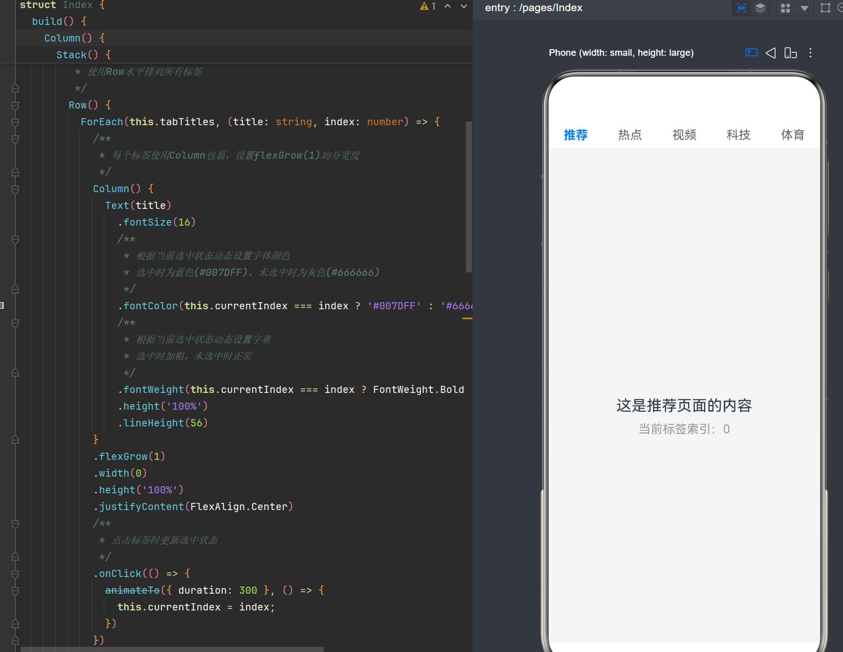
实现自定义下划线指示器的核心思路是:
- 使用Stack布局叠加标签栏和指示器
- 动态计算指示器位置
- 添加过渡动画
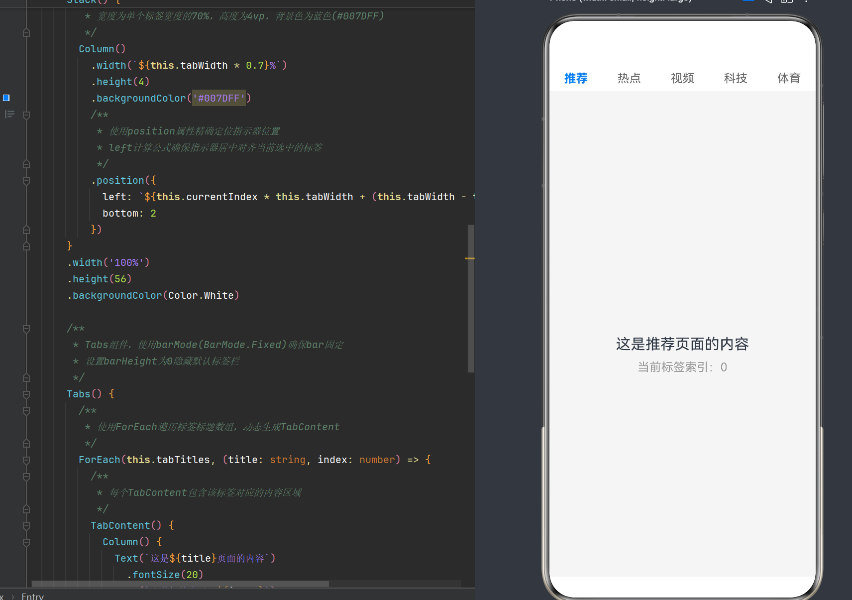
3.3 位置计算原理
假设我们有N个标签,每个标签的宽度为总宽度的1/N:
- 单个标签宽度百分比:
tabWidth = 100 / N - 指示器宽度:
tabWidth * 0.7 - 指示器左偏移量:
currentIndex * tabWidth + (tabWidth - indicatorWidth) / 2
3.4 使用animateTo实现平滑动画
animateTo是ArkTS提供的动画函数:
animateTo({ duration: 300 }, () => {
  this.currentIndex = newIndex;
})
3.5 完整实现示例
@Entry
@Component
struct CustomIndicatorExample {
  @State currentIndex: number = 0;
  private tabTitles: string[] = ['推荐', '热点', '视频', '科技', '体育'];

  private get tabWidth(): number {
    return 100 / this.tabTitles.length;
  }

  build() {
    Column() {
      Stack() {
        Row() {
          ForEach(this.tabTitles, (title: string, index: number) => {
            Column() {
              Text(title)
                .fontSize(16)
                .fontColor(this.currentIndex === index ? '#007DFF' : '#666666')
                .fontWeight(this.currentIndex === index ? FontWeight.Bold : FontWeight.Normal)
                .height('100%')
                .lineHeight(56)
            }
            .flexGrow(1)
            .width(0)
            .height('100%')
            .justifyContent(FlexAlign.Center)
            .onClick(() => {
              animateTo({ duration: 300 }, () => {
                this.currentIndex = index;
              })
            })
          })
        }
        .width('100%')
        .height(56)

        Column()
          .width(`${this.tabWidth * 0.7}%`)
          .height(4)
          .backgroundColor('#007DFF')
          .position({
            left: `${this.currentIndex * this.tabWidth + (this.tabWidth - this.tabWidth * 0.7) / 2}%`,
            bottom: 2
          })
      }
      .width('100%')
      .height(56)
      .backgroundColor(Color.White)

      Tabs() {
        ForEach(this.tabTitles, (title: string, index: number) => {
          TabContent() {
            Column() {
              Text(`这是${title}页面`)
                .fontSize(20)
            }
            .width('100%')
            .height('100%')
            .justifyContent(FlexAlign.Center)
          }
          .tabBar(this.EmptyTabBar)
        })
      }
      .barMode(BarMode.Fixed)
      .barHeight(0)
      .onChange((index: number) => {
        animateTo({ duration: 300 }, () => {
          this.currentIndex = index;
        })
      })
      .flexGrow(1)
      .width('100%')
    }
    .width('100%')
    .height('100%')
    .backgroundColor('#F5F5F5')
  }

  @Builder EmptyTabBar() {
    Column()
      .width(0)
      .height(0)
  }
}
四、动画效果优化策略
4.1 动画类型选择
推荐使用translate动画,因为它只涉及位置变化,计算量最小。
4.2 动画时长设置
推荐范围:250ms - 350ms
4.3 缓动曲线配置
animateTo({
  duration: 300,
  curve: Curve.EaseOut
}, () => {
  this.currentIndex = newIndex;
})
4.4 性能优化技巧
- 使用百分比布局
- 避免过度绘制
- 利用硬件加速
五、实战案例:新闻资讯类应用标签页
5.1 需求分析
构建一个新闻资讯类应用的标签页界面,包含以下功能:
- 顶部自定义标签栏,支持5个标签切换
- 动态下划线指示器,平滑滑动效果
- 标签选中状态高亮
- 内容区域根据选中标签显示不同内容
- 支持点击和滑动两种切换方式
5.2 项目结构
MyApplication/
├── entry/
│   └── src/
│       └── main/
│           └── ets/
│               ├── pages/
│               │   └── Index.ets
│               └── components/
│                   └── TabBar.ets
5.3 自定义TabBar组件
@Component
struct TabBar {
  @State currentIndex: number = 0;
  @Link selectedIndex: number;
  private tabTitles: string[];

  constructor(tabTitles: string[]) {
    this.tabTitles = tabTitles;
  }

  private get tabWidth(): number {
    return 100 / this.tabTitles.length;
  }

  build() {
    Stack() {
      Row() {
        ForEach(this.tabTitles, (title: string, index: number) => {
          Column() {
            Text(title)
              .fontSize(16)
              .fontColor(this.currentIndex === index ? '#007DFF' : '#666666')
              .fontWeight(this.currentIndex === index ? FontWeight.Bold : FontWeight.Normal)
              .height('100%')
              .lineHeight(56)
          }
          .flexGrow(1)
          .width(0)
          .height('100%')
          .justifyContent(FlexAlign.Center)
          .onClick(() => {
            animateTo({ duration: 300, curve: Curve.EaseOut }, () => {
              this.currentIndex = index;
              this.selectedIndex = index;
            })
          })
        })
      }
      .width('100%')
      .height(56)

      Column()
        .width(`${this.tabWidth * 0.7}%`)
        .height(4)
        .backgroundColor('#007DFF')
        .position({
          left: `${this.currentIndex * this.tabWidth + (this.tabWidth - this.tabWidth * 0.7) / 2}%`,
          bottom: 2
        })
    }
    .width('100%')
    .height(56)
    .backgroundColor(Color.White)
  }
}
5.4 主页面实现
@Entry
@Component
struct Index {
  @State selectedIndex: number = 0;
  private tabTitles: string[] = ['推荐', '热点', '视频', '科技', '体育'];

  build() {
    Column() {
      TabBar({ tabTitles: this.tabTitles, selectedIndex: $selectedIndex })

      Tabs() {
        ForEach(this.tabTitles, (title: string, index: number) => {
          TabContent() {
            NewsContent({ title: title, index: index })
          }
          .tabBar(this.EmptyTabBar)
        })
      }
      .barMode(BarMode.Fixed)
      .barHeight(0)
      .onChange((index: number) => {
        animateTo({ duration: 300, curve: Curve.EaseOut }, () => {
          this.selectedIndex = index;
        })
      })
      .flexGrow(1)
      .width('100%')
    }
    .width('100%')
    .height('100%')
    .backgroundColor('#F5F5F5')
  }

  @Builder EmptyTabBar() {
    Column()
      .width(0)
      .height(0)
  }
}

@Component
struct NewsContent {
  private title: string;
  private index: number;

  constructor(title: string, index: number) {
    this.title = title;
    this.index = index;
  }

  build() {
    Column() {
      Text(`这是${this.title}页面`)
        .fontSize(24)
        .fontWeight(FontWeight.Bold)

      Text(`当前标签索引: ${this.index}`)
        .fontSize(16)
        .fontColor('#999999')
        .margin({ top: 10 })

      Text('以下是推荐内容列表:')
        .fontSize(18)
        .margin({ top: 30 })

      List() {
        ForEach([1, 2, 3, 4, 5], (item: number) => {
          ListItem() {
            Text(`${this.title}新闻 ${item}`)
              .fontSize(16)
              .padding(16)
          }
        })
      }
      .width('100%')
      .margin({ top: 20 })
    }
    .width('100%')
    .height('100%')
    .justifyContent(FlexAlign.Center)
    .padding(20)
  }
}
5.5 运行效果
运行后可以看到:
- 顶部白色标签栏,包含5个标签
- 默认选中"推荐"标签,文字显示为蓝色加粗,下方有蓝色下划线指示器
- 点击任意标签,指示器会平滑滑动到对应标签下方
- 内容区域显示当前选中标签的详细信息和模拟新闻列表
- 滑动内容区域也可以切换标签
六、进阶功能扩展
6.1 支持可滚动标签栏
@Component
struct ScrollableTabBar {
  @State currentIndex: number = 0;
  private tabTitles: string[];

  constructor(tabTitles: string[]) {
    this.tabTitles = tabTitles;
  }

  build() {
    Stack() {
      Scroll() {
        Row() {
          ForEach(this.tabTitles, (title: string, index: number) => {
            Column() {
              Text(title)
                .fontSize(16)
                .fontColor(this.currentIndex === index ? '#007DFF' : '#666666')
                .fontWeight(this.currentIndex === index ? FontWeight.Bold : FontWeight.Normal)
                .padding({ left: 20, right: 20 })
                .height('100%')
                .lineHeight(56)
            }
            .height('100%')
            .justifyContent(FlexAlign.Center)
            .onClick(() => {
              animateTo({ duration: 300 }, () => {
                this.currentIndex = index;
              })
            })
          })
        }
        .width('auto')
        .height(56)
      }
      .scrollable(ScrollDirection.Horizontal)
      .scrollBar(BarState.Off)
      .width('100%')
      .height(56)

      Column()
        .width(80)
        .height(4)
        .backgroundColor('#007DFF')
        .position({
          left: `${this.currentIndex * 100 + 20}px`,
          bottom: 2
        })
    }
    .width('100%')
    .height(56)
    .backgroundColor(Color.White)
  }
}
6.2 添加标签角标
@Builder TabWithBadge(title: string, badgeCount: number, isSelected: boolean) {
  Column() {
    Stack() {
      Text(title)
        .fontSize(16)
        .fontColor(isSelected ? '#007DFF' : '#666666')
        .fontWeight(isSelected ? FontWeight.Bold : FontWeight.Normal)

      if (badgeCount > 0) {
        Text(`${badgeCount > 99 ? '99+' : badgeCount}`)
          .fontSize(10)
          .fontColor(Color.White)
          .backgroundColor('#FF4D4F')
          .padding({ left: 4, right: 4, top: 1, bottom: 1 })
          .borderRadius(10)
          .position({
            right: -10,
            top: -5
          })
      }
    }
    .height('100%')
    .lineHeight(56)
  }
}
6.3 渐变色指示器
Column()
  .width(`${this.tabWidth * 0.7}%`)
  .height(4)
  .linearGradient({
    direction: GradientDirection.Left,
    colors: [['#007DFF', 0], ['#5B8FF9', 1]]
  })
  .position({
    left: `${this.currentIndex * this.tabWidth + (this.tabWidth - this.tabWidth * 0.7) / 2}%`,
    bottom: 2
  })
6.4 圆角指示器
Column()
  .width(`${this.tabWidth * 0.7}%`)
  .height(4)
  .backgroundColor('#007DFF')
  .borderRadius(2)
  .position({
    left: `${this.currentIndex * this.tabWidth + (this.tabWidth - this.tabWidth * 0.7) / 2}%`,
    bottom: 2
  })
七、性能优化与最佳实践
7.1 避免不必要的状态更新
- 使用
@State而非@Link或@Prop来管理本地状态 - 在
onChange回调中避免执行复杂的计算逻辑
7.2 合理使用动画
- 限制动画时长在250ms-350ms之间
- 避免在动画过程中触发其他状态更新
7.3 布局优化
- 减少嵌套容器的层级
- 使用
flexGrow和flexShrink而非固定尺寸
7.4 代码组织最佳实践
- 将标签栏封装为独立组件
- 使用
@Builder提取重复的UI逻辑 - 将状态管理和UI渲染分离
八、常见问题与解决方案
8.1 指示器位置偏移
解决方案:
- 确保标签宽度计算正确
- 检查指示器左偏移量公式
- 使用百分比而非固定像素值
8.2 动画卡顿
解决方案:
- 减少动画时长
- 避免在动画过程中执行复杂计算
- 使用
Curve.EaseOut缓动曲线
8.3 Tabs内容不显示
解决方案:
- 确保
TabContent内部有有效的布局容器 - 检查
Tabs组件的高度设置 - 验证
barHeight是否正确设置
8.4 标签栏与内容区域不同步
解决方案:
- 在
Tabs的onChange回调中同步更新标签栏状态 - 使用
animateTo确保状态更新时带有动画效果
九、总结
本文详细介绍了鸿蒙原生ArkTS布局方式中,使用Tabs组件结合自定义指示器实现动态下划线效果的完整方案。通过深入分析ArkTS声明式UI基础、Tabs组件核心API、自定义指示器实现原理、动画优化策略以及实战案例,我们展示了如何构建一个高质量的标签页应用。
核心要点总结:
- 布局结构:使用Column + Stack + Row组合布局
- 状态管理:使用@State管理当前选中标签索引
- 位置计算:通过百分比计算标签宽度和指示器位置
- 动画效果:使用animateTo实现平滑的指示器滑动动画
- 组件复用:将标签栏封装为独立组件
希望本文能够帮助开发者更好地理解和应用鸿蒙ArkTS的标签页布局技术。
附录:完整示例代码
@Entry
@Component
struct Index {
  @State currentIndex: number = 0;
  private tabTitles: string[] = ['推荐', '热点', '视频', '科技', '体育'];

  private get tabWidth(): number {
    return 100 / this.tabTitles.length;
  }

  build() {
    Column() {
      Stack() {
        Row() {
          ForEach(this.tabTitles, (title: string, index: number) => {
            Column() {
              Text(title)
                .fontSize(16)
                .fontColor(this.currentIndex === index ? '#007DFF' : '#666666')
                .fontWeight(this.currentIndex === index ? FontWeight.Bold : FontWeight.Normal)
                .height('100%')
                .lineHeight(56)
            }
            .flexGrow(1)
            .width(0)
            .height('100%')
            .justifyContent(FlexAlign.Center)
            .onClick(() => {
              animateTo({ duration: 300, curve: Curve.EaseOut }, () => {
                this.currentIndex = index;
              })
            })
          })
        }
        .width('100%')
        .height(56)

        Column()
          .width(`${this.tabWidth * 0.7}%`)
          .height(4)
          .backgroundColor('#007DFF')
          .borderRadius(2)
          .position({
            left: `${this.currentIndex * this.tabWidth + (this.tabWidth - this.tabWidth * 0.7) / 2}%`,
            bottom: 2
          })
      }
      .width('100%')
      .height(56)
      .backgroundColor(Color.White)

      Tabs() {
        ForEach(this.tabTitles, (title: string, index: number) => {
          TabContent() {
            Column() {
              Text(`这是${title}页面的内容`)
                .fontSize(20)
              Text(`当前标签索引:${index}`)
                .fontSize(16)
                .fontColor('#999999')
                .margin({ top: 10 })
            }
            .width('100%')
            .height('100%')
            .justifyContent(FlexAlign.Center)
          }
          .tabBar(this.EmptyTabBar)
        })
      }
      .barMode(BarMode.Fixed)
      .barHeight(0)
      .onChange((index: number) => {
        animateTo({ duration: 300, curve: Curve.EaseOut }, () => {
          this.currentIndex = index;
        })
      })
      .flexGrow(1)
      .width('100%')
    }
    .width('100%')
    .height('100%')
    .backgroundColor('#F5F5F5')
  }

  @Builder EmptyTabBar() {
    Column()
      .width(0)
      .height(0)
  }
}

讨论HarmonyOS开发技术,专注于API与组件、DevEco Studio、测试、元服务和应用上架分发等。
更多推荐



 7
7 0
0- 0


 已为社区贡献45条内容

所有评论(0)