HarmonyOS ArkTS 自适应布局与响应式设计实战指南
文章目录

每日一句正能量
你的价值从来不取决于他人的解读,你的人生也无需活在别人的认知框架里。
如果我所有的社会标签都被拿走,我是否依然认可自己?如果答案是否,说明你仍活在别人框架里。
摘要
在 HarmonyOS 多设备生态中,同一套 ArkTS 代码需要同时适配手机、平板、折叠屏、2in1 乃至智慧屏等多种形态。传统的固定像素布局已无法满足"一次开发,多端部署"的战略目标。本文从 ArkTS 响应式布局的核心原理出发,深入剖析 GridRow/GridCol 栅格系统、MediaQuery 媒体查询、Display 显示控制等关键 API 的设计思想与使用范式,并结合一个完整的「智慧办公仪表盘」实战案例,演示如何从零构建一套覆盖 xs 到 xl 五个断点的自适应布局方案。文章最后给出性能优化建议与常见踩坑指南,帮助开发者在实际项目中落地高质量的响应式界面。
一、自适应布局概述:为什么需要响应式设计
HarmonyOS 的设备矩阵横跨智能手表(<320vp)、手机(320–520vp)、折叠屏(展开态 520–840vp)、平板(840–1280vp)以及 2in1/PC(>1280vp)。不同设备的屏幕宽度、宽高比、交互方式差异巨大,如果为每种设备单独编写页面,将导致代码冗余、维护成本飙升。
ArkTS 提供的自适应布局体系,核心解决三个问题:
- 空间适配:组件如何在不同宽度下自动调整列数、间距和尺寸;
- 内容取舍:窄屏时隐藏次要信息,宽屏时展示完整内容;
- 交互迁移:触控优先的按钮在键鼠场景下需要支持 Hover、右键菜单等增强交互。
响应式设计的本质不是"缩放",而是"重构"——根据可用空间重新组织信息架构。
二、核心 API 与组件架构
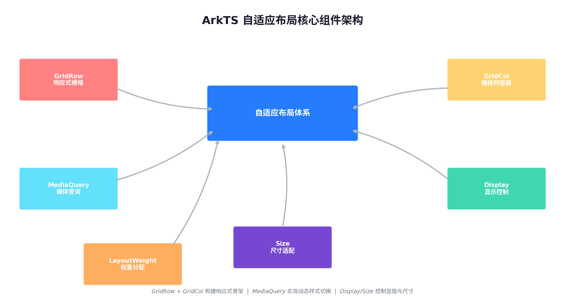
ArkTS 的自适应布局体系由三大支柱构成:栅格系统(GridRow/GridCol)、媒体查询(MediaQuery)和显示控制(Display/Size)。三者协同工作,形成完整的响应式能力闭环。
2.1 GridRow / GridCol 响应式栅格
GridRow 是 HarmonyOS 提供的响应式栅格容器,支持按断点动态调整总列数、列间距和边距。GridCol 作为其子组件,通过 span、offset、order 等属性控制自身在栅格中的占位行为。
// 定义断点与栅格配置
interface BreakpointConfig {
  value: string[];      // 断点阈值,如 ["320vp", "520vp", "840vp", "1280vp"]
  displayCount: number[]; // 各断点下的总列数
  gutter: Length[];     // 列间距
  margin: Length[];     // 边距
}
2.2 MediaQuery 媒体查询
MediaQuery 允许开发者监听屏幕宽度、高度、方向、深色模式等系统状态变化,并在 @Watch 装饰器驱动下自动触发 UI 刷新。
@Entry
@Component
struct MediaQueryPage {
  @State isWide: boolean = false;

  aboutToAppear() {
    // 注册媒体查询监听器
    mediaquery.matchMediaSync('(width >= 840vp)').on('change', (result) => {
      this.isWide = result.matches;
    });
  }
}
2.3 Display / Size 显示控制
displayPriority:控制组件在不同断点下的显示优先级,低优先级组件在空间不足时自动隐藏;layoutWeight:在Row/Column中按权重分配剩余空间,类似 Web 的flex-grow;size:结合minWidth、maxWidth设置组件的弹性尺寸边界。
三、响应式断点设计:五档体系实战
合理的断点设计是响应式布局的基石。HarmonyOS 官方推荐采用五档断点体系,覆盖从手表到 PC 的全设备矩阵。
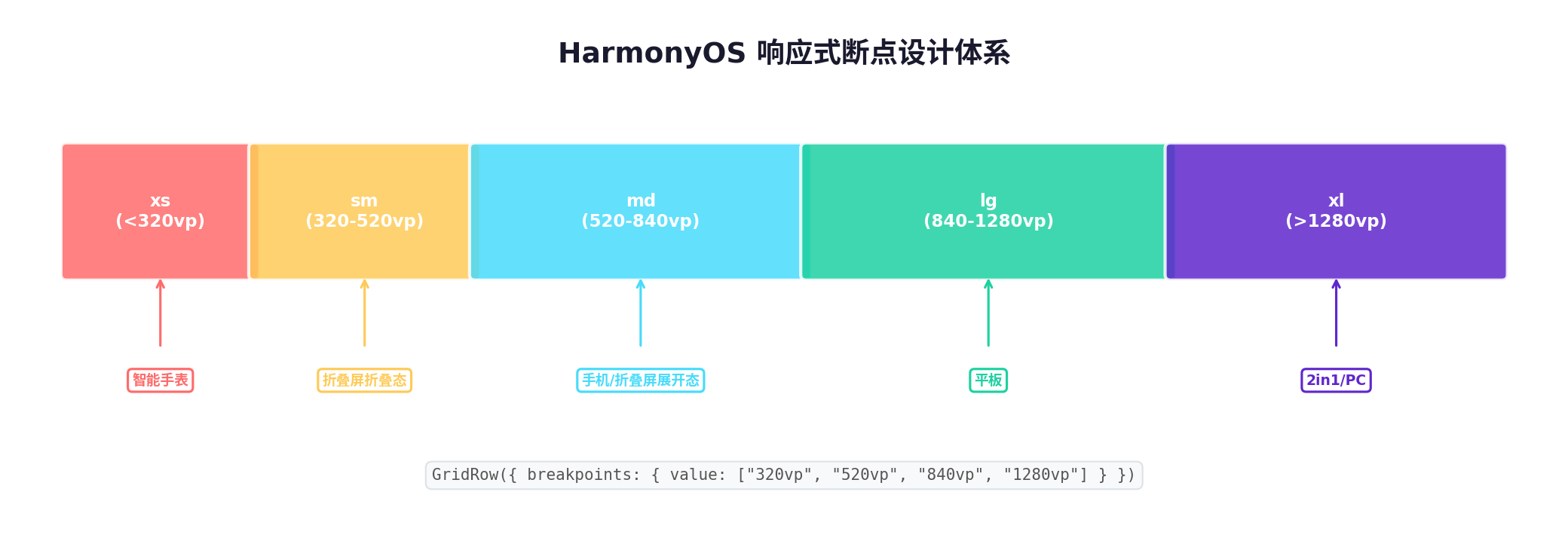
| 断点代号 | 宽度范围 | 典型设备 | 总列数建议 | 布局策略 |
|---|---|---|---|---|
| xs | < 320 vp | 智能手表 | 4 列 | 单列堆叠,极简信息 |
| sm | 320–520 vp | 手机 | 4 列 | 单列为主,卡片全宽 |
| md | 520–840 vp | 折叠屏展开态 | 8 列 | 双列网格,侧边栏可收起 |
| lg | 840–1280 vp | 平板 | 12 列 | 三列网格,固定侧边栏 |
| xl | > 1280 vp | 2in1 / PC | 12 列 | 多列+合并,充分利用宽屏 |
断点值的选取遵循"内容优先"原则:不是根据设备型号硬编码,而是根据你的内容在什么宽度下需要改变布局来确定。例如,当卡片宽度小于 280 vp 时阅读体验下降,这就是一个自然的断点。
四、MediaQuery 动态响应机制
当设备发生旋转、折叠屏展开/折叠、或窗口被用户手动调整大小时,系统会触发 MediaQuery 的 change 事件。ArkTS 的声明式 UI 框架会自动比对状态变化前后的差异,执行最小化 DOM 更新。
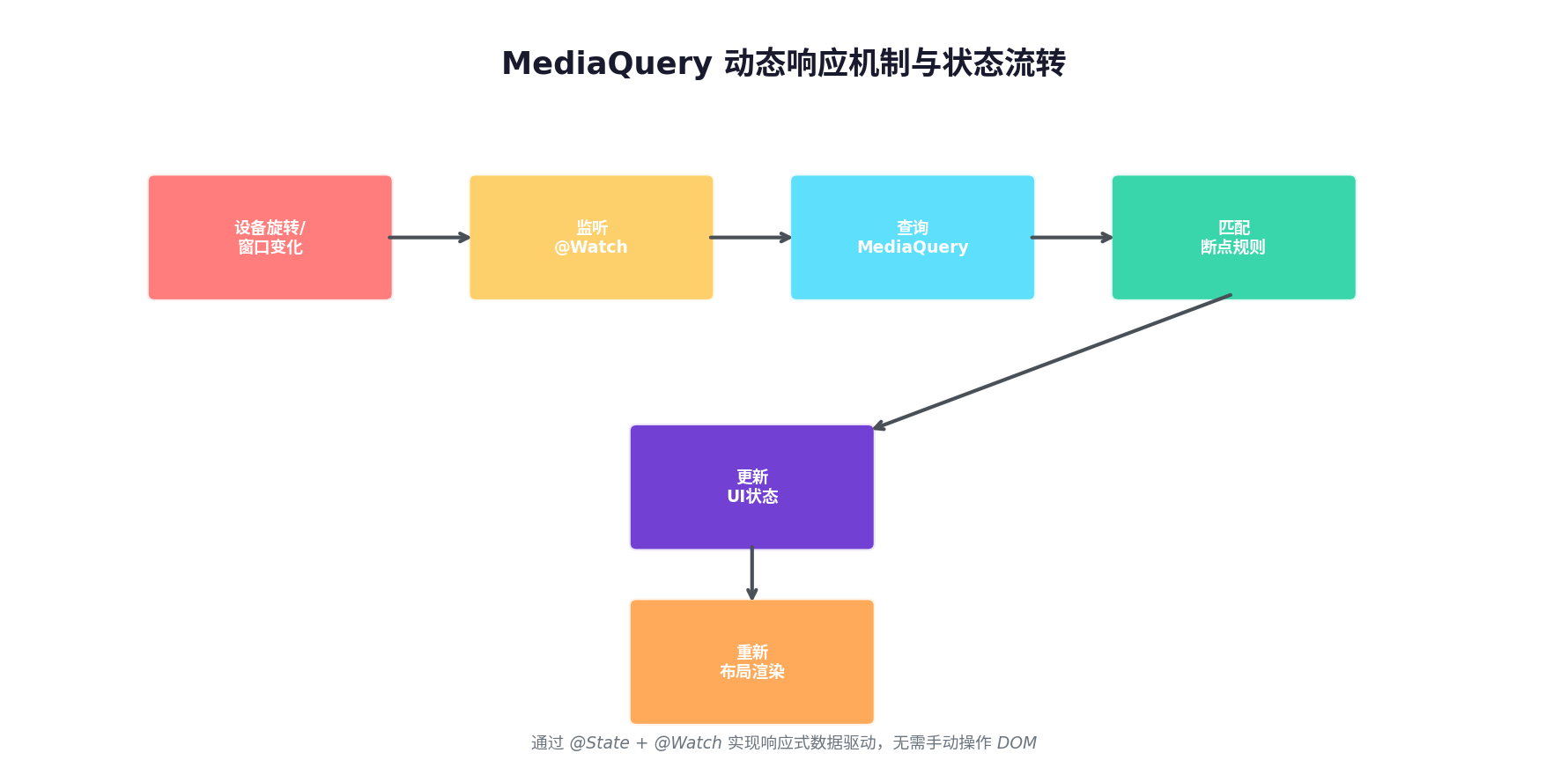
关键点在于:所有响应式状态必须定义为 @State 或 @StorageLink,并通过 @Watch 监听变化。框架底层使用 Proxy 代理实现细粒度依赖追踪,只有真正依赖该状态的组件才会重绘,避免了全页面刷新的性能损耗。
五、实战案例:智慧办公仪表盘
下面通过一个完整的「智慧办公仪表盘」案例,演示如何将上述理论落地为可运行的 ArkTS 代码。
5.1 需求分析
仪表盘包含四个核心模块:
- 待办事项(优先级最高,任何屏幕都必须显示)
- 日程日历(md 及以上显示)
- 团队动态(lg 及以上显示)
- 数据报表(xl 时展开为宽图表,sm 时折叠为迷你卡片)
5.2 完整代码实现
// BreakpointConstants.ets —— 断点常量定义
export class BreakpointConstants {
  static readonly BREAKPOINT_XS: string = 'xs';
  static readonly BREAKPOINT_SM: string = 'sm';
  static readonly BREAKPOINT_MD: string = 'md';
  static readonly BREAKPOINT_LG: string = 'lg';
  static readonly BREAKPOINT_XL: string = 'xl';

  static readonly BREAKPOINT_RANGES: Map<string, string> = new Map([
    [BreakpointConstants.BREAKPOINT_XS, '(0vp, 320vp)'],
    [BreakpointConstants.BREAKPOINT_SM, '(320vp, 520vp)'],
    [BreakpointConstants.BREAKPOINT_MD, '(520vp, 840vp)'],
    [BreakpointConstants.BREAKPOINT_LG, '(840vp, 1280vp)'],
    [BreakpointConstants.BREAKPOINT_XL, '(1280vp, +∞)'],
  ]);

  static readonly GRID_COLUMN_COUNTS: Map<string, number> = new Map([
    [BreakpointConstants.BREAKPOINT_XS, 4],
    [BreakpointConstants.BREAKPOINT_SM, 4],
    [BreakpointConstants.BREAKPOINT_MD, 8],
    [BreakpointConstants.BREAKPOINT_LG, 12],
    [BreakpointConstants.BREAKPOINT_XL, 12],
  ]);
}
// BreakpointSystem.ets —— 断点监听与状态管理
import mediaquery from '@ohos.mediaquery';
import { BreakpointConstants } from './BreakpointConstants';

export class BreakpointSystem {
  private currentBreakpoint: string = BreakpointConstants.BREAKPOINT_SM;
  private listeners: mediaquery.MediaQueryListener[] = [];

  register(callback: (breakpoint: string) => void): void {
    BreakpointConstants.BREAKPOINT_RANGES.forEach((range, breakpoint) => {
      const listener = mediaquery.matchMediaSync(range);
      listener.on('change', (result) => {
        if (result.matches) {
          this.currentBreakpoint = breakpoint;
          callback(breakpoint);
        }
      });
      this.listeners.push(listener);
    });
  }

  unregister(): void {
    this.listeners.forEach(listener => listener.off('change'));
    this.listeners = [];
  }

  getCurrentBreakpoint(): string {
    return this.currentBreakpoint;
  }
}
// DashboardPage.ets —— 主页面实现
import { BreakpointSystem } from '../utils/BreakpointSystem';
import { BreakpointConstants } from '../utils/BreakpointConstants';

@Entry
@Component
struct DashboardPage {
  @State currentBreakpoint: string = BreakpointConstants.BREAKPOINT_SM;
  @State isSidebarOpen: boolean = true;
  private breakpointSystem: BreakpointSystem = new BreakpointSystem();

  aboutToAppear() {
    this.breakpointSystem.register((breakpoint) => {
      this.currentBreakpoint = breakpoint;
      // lg 以下自动收起侧边栏
      if (breakpoint === BreakpointConstants.BREAKPOINT_SM ||
          breakpoint === BreakpointConstants.BREAKPOINT_MD) {
        this.isSidebarOpen = false;
      } else {
        this.isSidebarOpen = true;
      }
    });
  }

  aboutToDisappear() {
    this.breakpointSystem.unregister();
  }

  // 根据断点获取 GridCol 的 span 值
  getSpan(module: string): number {
    const cols = BreakpointConstants.GRID_COLUMN_COUNTS.get(this.currentBreakpoint) ?? 4;
    switch (module) {
      case 'todo': return cols;        // 待办:始终全宽
      case 'calendar': return cols >= 8 ? cols / 2 : cols;  // 日程:宽屏半宽
      case 'team': return cols >= 12 ? cols / 3 : cols;     // 团队:大屏三分之一
      case 'chart': return cols >= 12 ? cols * 2 / 3 : cols; // 图表:大屏占三分之二
      default: return cols;
    }
  }

  @Builder
  TodoCard() {
    Column() {
      Text('待办事项').fontSize(18).fontWeight(FontWeight.Bold).margin(12)
      ForEach([1, 2, 3, 4], (item: number) => {
        Row() {
          Checkbox().margin(8)
          Text(`完成 ArkTS 响应式布局第 ${item} 节`).fontSize(14)
        }
        .width('100%')
        .padding(8)
        .backgroundColor('#f8f9fa')
        .borderRadius(8)
        .margin({ top: 6 })
      })
    }
    .width('100%')
    .padding(16)
    .backgroundColor('#ffffff')
    .borderRadius(12)
    .shadow({ radius: 8, color: 'rgba(0,0,0,0.06)' })
  }

  @Builder
  CalendarCard() {
    Column() {
      Text('日程日历').fontSize(18).fontWeight(FontWeight.Bold).margin(12)
      Grid() {
        ForEach([1, 2, 3, 4, 5, 6, 7], (day: number) => {
          GridItem() {
            Text(`${day}`).fontSize(14).fontColor(day === 3 ? '#0d6efd' : '#333')
          }
          .width(36)
          .height(36)
          .backgroundColor(day === 3 ? '#e7f1ff' : 'transparent')
          .borderRadius(18)
        })
      }
      .columnsTemplate('1fr 1fr 1fr 1fr 1fr 1fr 1fr')
      .rowsTemplate('1fr 1fr')
      .width('100%')
      .height(100)
    }
    .width('100%')
    .padding(16)
    .backgroundColor('#ffffff')
    .borderRadius(12)
    .shadow({ radius: 8, color: 'rgba(0,0,0,0.06)' })
    // md 以下隐藏
    .displayPriority(this.currentBreakpoint >= BreakpointConstants.BREAKPOINT_MD ? 1 : 0)
  }

  @Builder
  TeamCard() {
    Column() {
      Text('团队动态').fontSize(18).fontWeight(FontWeight.Bold).margin(12)
      ForEach(['张三提交了 PR', '李四发布了需求', '王五修复了 Bug'], (msg: string) => {
        Text(msg).fontSize(13).fontColor('#666').margin(6)
      })
    }
    .width('100%')
    .padding(16)
    .backgroundColor('#ffffff')
    .borderRadius(12)
    .shadow({ radius: 8, color: 'rgba(0,0,0,0.06)' })
    // lg 以下隐藏
    .displayPriority(this.currentBreakpoint >= BreakpointConstants.BREAKPOINT_LG ? 1 : 0)
  }

  @Builder
  ChartCard() {
    Column() {
      Text('数据报表').fontSize(18).fontWeight(FontWeight.Bold).margin(12)
      // 模拟图表区域
      Row() {
        ForEach([40, 65, 30, 85, 55, 70, 45], (h: number) => {
          Column() {
            Blank()
            Column()
              .width(24)
              .height(`${h}%`)
              .backgroundColor('#0d6efd')
              .borderRadius({ topLeft: 4, topRight: 4 })
          }
          .width(36)
          .height(120)
          .justifyContent(FlexAlign.End)
        })
      }
      .width('100%')
      .justifyContent(FlexAlign.SpaceAround)
      .padding(12)
      .backgroundColor('#f8f9fa')
      .borderRadius(8)
    }
    .width('100%')
    .padding(16)
    .backgroundColor('#ffffff')
    .borderRadius(12)
    .shadow({ radius: 8, color: 'rgba(0,0,0,0.06)' })
  }

  build() {
    Column() {
      // 顶部导航栏
      Row() {
        Text('智慧办公仪表盘').fontSize(20).fontWeight(FontWeight.Bold)
        Blank()
        Text(`当前断点: ${this.currentBreakpoint}`)
          .fontSize(12)
          .fontColor('#888')
          .padding(6)
          .backgroundColor('#f1f3f5')
          .borderRadius(4)
      }
      .width('100%')
      .height(56)
      .padding({ left: 20, right: 20 })
      .backgroundColor('#ffffff')
      .shadow({ radius: 4, color: 'rgba(0,0,0,0.04)' })

      // 响应式栅格主体
      GridRow({
        breakpoints: {
          value: ['320vp', '520vp', '840vp', '1280vp'],
          reference: BreakpointsReference.WindowSize
        },
        columns: {
          xs: 4, sm: 4, md: 8, lg: 12, xl: 12
        },
        gutter: { x: '16vp', y: '16vp' },
        margin: { left: '20vp', right: '20vp', top: '16vp', bottom: '16vp' }
      }) {
        GridCol({ span: { xs: 4, sm: 4, md: 8, lg: 12, xl: 12 } }) {
          this.TodoCard()
        }

        GridCol({ span: { xs: 0, sm: 0, md: 4, lg: 4, xl: 4 } }) {
          this.CalendarCard()
        }

        GridCol({ span: { xs: 0, sm: 0, md: 0, lg: 4, xl: 4 } }) {
          this.TeamCard()
        }

        GridCol({ span: { xs: 4, sm: 4, md: 8, lg: 8, xl: 8 } }) {
          this.ChartCard()
        }
      }
      .width('100%')
      .layoutWeight(1)
    }
    .width('100%')
    .height('100%')
    .backgroundColor('#f5f7fa')
  }
}
5.3 效果对比
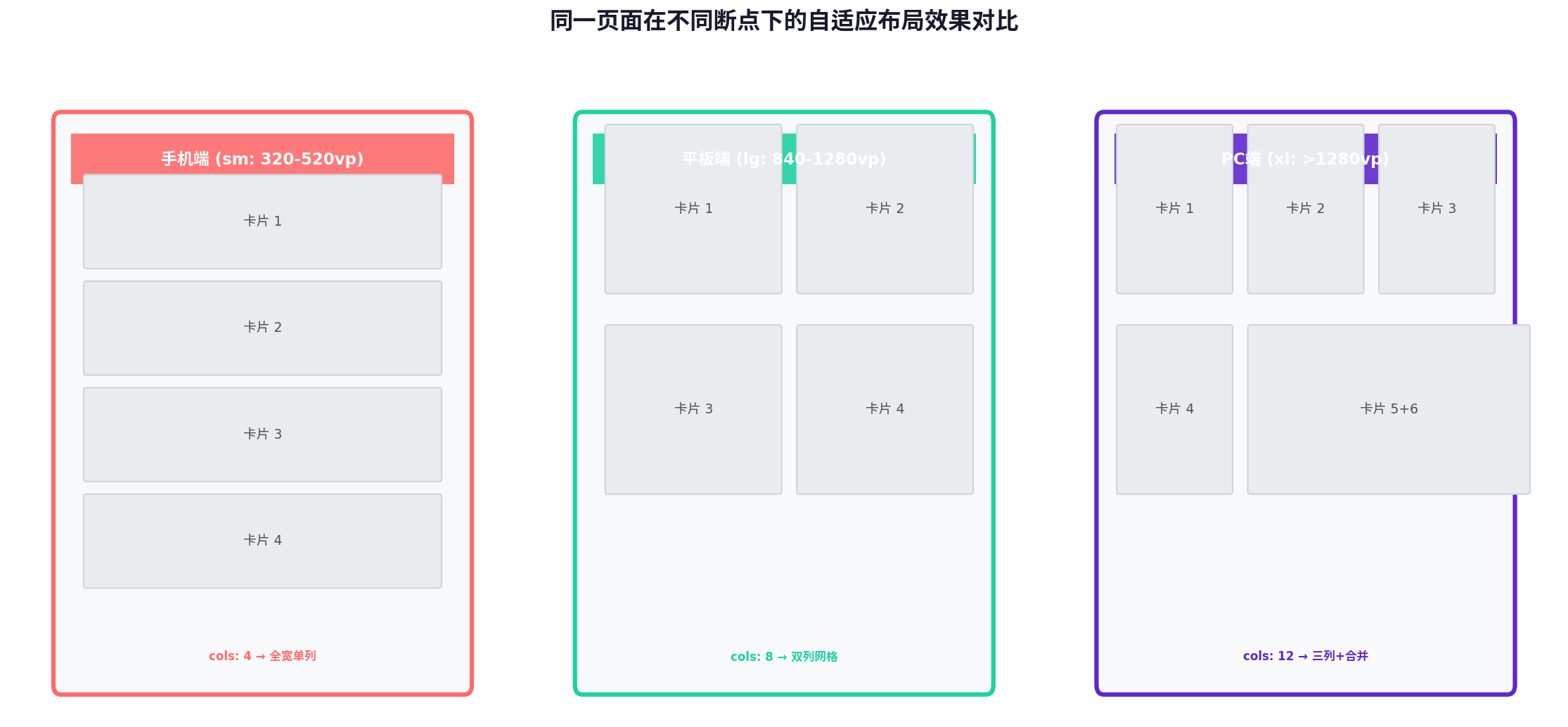
下图展示了同一套代码在手机、平板、PC 三种形态下的自适应渲染效果:
六、性能优化与最佳实践
6.1 避免过度重绘
MediaQuery 的 change 事件可能在窗口拖拽过程中高频触发(如 60 次/秒)。建议对回调函数做防抖处理,或仅在断点真正切换时执行状态更新:
private lastBreakpoint: string = '';

onBreakpointChange(bp: string) {
  if (bp === this.lastBreakpoint) return; // 忽略同断点重复触发
  this.lastBreakpoint = bp;
  this.currentBreakpoint = bp;
  // 执行布局更新...
}
6.2 合理使用 displayPriority
displayPriority 的隐藏逻辑由框架自动计算,但开发者应遵循"信息层级递减"原则:核心内容(如导航、主操作按钮)优先级设为最高,辅助信息(如广告位、推荐列表)优先级降低。避免将关键功能设为低优先级导致用户无法访问。
6.3 图片资源的自适应
不同断点下应加载不同分辨率的图片资源,避免在手表上加载 4K 大图浪费内存:
Image($r(`app.media.banner_${this.currentBreakpoint}`))
  .objectFit(ImageFit.Cover)
  .alt($r('app.media.banner_default'))
6.4 折叠屏特殊处理
折叠屏存在"折叠态"与"展开态"两种形态,宽度可能从 sm 直接跳变到 md/lg。建议在 aboutToAppear 中预计算初始断点,并监听 display 模块的折叠状态变化:
import display from '@ohos.display';

aboutToAppear() {
  display.on('foldStatusChange', (data) => {
    // FOLD_STATUS_EXPANDED / FOLD_STATUS_FOLDED
    this.handleFoldChange(data.foldStatus);
  });
}
七、总结
ArkTS 的自适应布局体系通过 GridRow/GridCol 栅格系统 提供结构化的空间分配能力,MediaQuery 实现动态状态感知,Display/Size 完成细粒度的显隐与尺寸控制。三者有机结合,使得开发者能够以声明式的方式描述"在什么条件下呈现什么布局",而非命令式地操作 DOM。
在实际项目中,建议遵循以下 checklist:
- 定义符合业务需求的断点体系(不盲目照搬官方五档)
- 将断点监听封装为可复用的
BreakpointSystem工具类 - 核心模块使用
GridCol的span属性控制占位,次要模块使用displayPriority控制显隐 - 对
MediaQuery回调做防抖或断点去重,避免高频重绘 - 折叠屏设备单独测试折叠/展开态的切换流畅度
- 为不同断点准备差异化图片资源,降低内存占用
响应式设计的终极目标,不是让界面在所有设备上看起来"一样",而是在所有设备上都"好用"。掌握 ArkTS 自适应布局,是每一位 HarmonyOS 开发者走向多设备生态的必经之路。
转载自:https://blog.csdn.net/u014727709/article/details/163050350
欢迎 👍点赞✍评论⭐收藏,欢迎指正

讨论HarmonyOS开发技术,专注于API与组件、DevEco Studio、测试、元服务和应用上架分发等。
更多推荐

 1
1 0
0- 0


 已为社区贡献270条内容

所有评论(0)