HarmonyOS ArkTS 组件样式与主题系统深度实战
文章目录

每日一句正能量
站在山脚的人,永远不懂山顶的风景有多么震撼,甘居溪畔的人,终究不懂大海的波涛有多么汹涌。
没有亲身攀登,就无法理解风、缺氧和云海带来的复合体验。山脚的人自有平地的安稳逻辑,但你无需为此否定自己的震撼。当不被理解时,停止强行解释,转而寻找“也登过另一座山的人”——跨越认知鸿沟需要同频者,而非翻译官。
摘要
在 HarmonyOS 应用开发中,样式管理往往是从「写死颜色值」到「构建工程化主题系统」的演进过程。ArkTS 提供了从声明式 Decorative API、组件级 @Styles、全局 @Extend,到动态 AttributeModifier,再到系统级 ColorToken 与 Design Token 的完整样式能力栈。本文从底层原理出发,逐层剖析 ArkTS 样式系统的技术架构,对比三种复用机制的适用边界,并通过一个完整的「企业级主题切换系统」实战案例,演示如何从零搭建一套支持浅色/深色/品牌色三套主题、可热切换、可扩展的 Token 化样式体系。文章最后给出大型项目中的性能优化建议与常见陷阱规避方案,帮助开发者建立专业级的样式工程化思维。
一、ArkTS 样式系统概览
ArkTS 的样式体系并非简单的 CSS 移植,而是围绕声明式 UI 范式重新设计的分层架构。理解这一架构,是掌握 ArkTS 样式能力的前提。
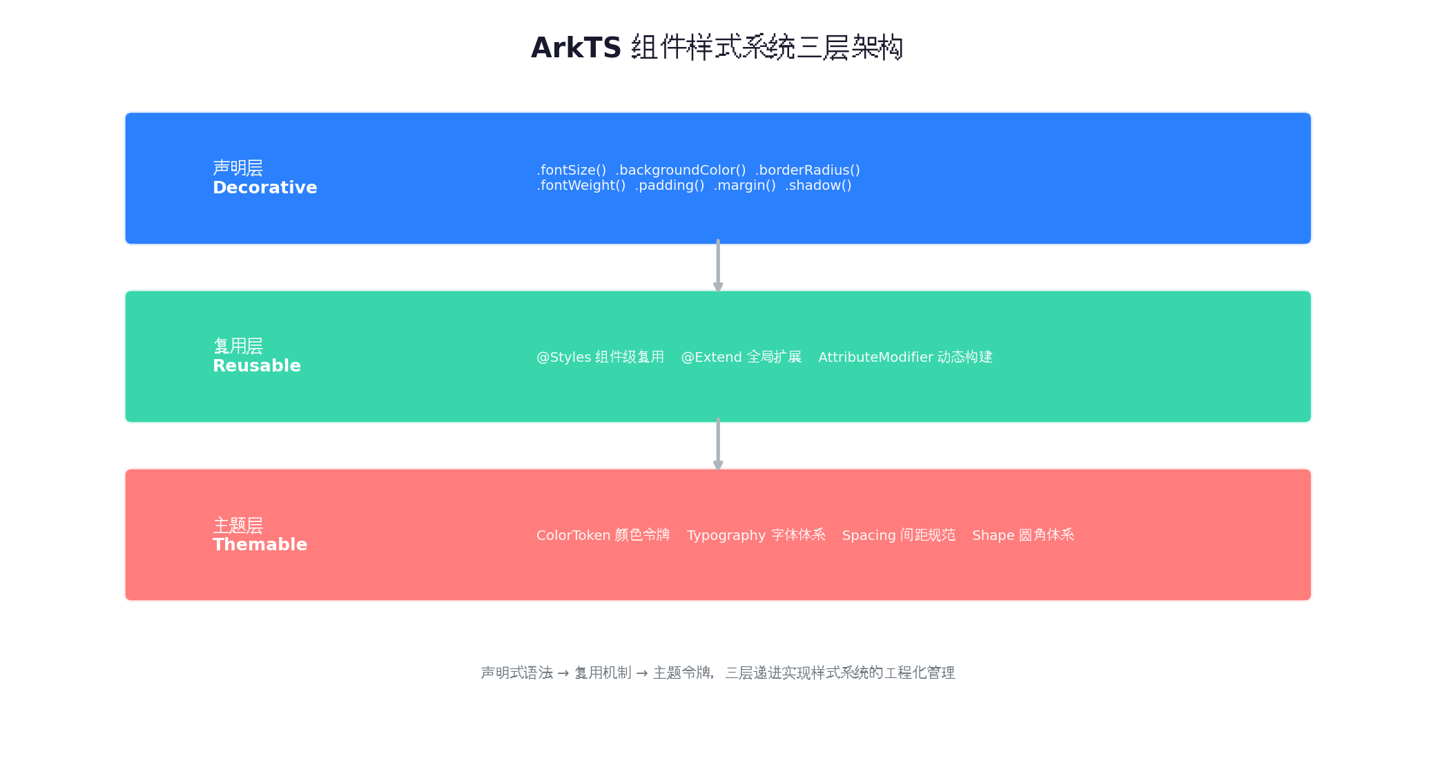
1.1 三层架构模型
声明层(Decorative):最基础的样式声明,通过链式调用直接作用于组件,如 .fontSize(16).backgroundColor('#fff')。这一层面向「一次性使用」场景,代码直观但难以复用。
复用层(Reusable):通过 @Styles、@Extend 和 AttributeModifier 将样式逻辑抽象为可复用单元。这一层解决「重复代码」问题,是中型项目的核心工作层。
主题层(Themable):通过 ColorToken、Typography、Spacing、Shape 等 Design Token 将样式语义化。这一层面向「设计系统」级别的大型项目,实现「修改一处,全局生效」。
1.2 与传统 CSS 的本质差异
ArkTS 样式是「编译期确定 + 运行期动态」的混合模型:
- 编译期:
@Styles和@Extend在编译阶段展开,不占用运行时开销; - 运行期:
AttributeModifier和状态变量绑定的样式在运行时计算,支持动态主题切换。
这种设计使得 ArkTS 在保证性能的同时,保留了足够的灵活性。
二、声明式样式:Decorative API
Decorative API 是 ArkTS 组件样式的最基础形式,所有组件都支持通过链式调用设置外观属性。
2.1 常用样式属性分类
Text('示例文本')
  // 文本样式
  .fontSize(16)
  .fontColor('#1a1a2e')
  .fontWeight(FontWeight.Medium)
  .maxLines(2)
  .textOverflow({ overflow: TextOverflow.Ellipsis })
  // 盒模型
  .width('100%')
  .height(48)
  .padding({ left: 16, right: 16 })
  .margin({ top: 8, bottom: 8 })
  // 背景与边框
  .backgroundColor('#f8f9fa')
  .borderRadius(8)
  .border({ width: 1, color: '#e9ecef' })
  // 阴影与效果
  .shadow({ radius: 4, color: 'rgba(0,0,0,0.06)', offsetX: 0, offsetY: 2 })
2.2 尺寸单位的演进
ArkTS 支持多种尺寸单位,开发者应根据场景合理选择:
| 单位 | 说明 | 适用场景 |
|---|---|---|
| px | 物理像素 | 极少使用,避免硬编码 |
| vp | 虚拟像素,随屏幕密度自动缩放 | 通用场景,推荐默认使用 |
| fp | 字体像素,随系统字体大小设置变化 | 文本尺寸,确保无障碍 |
| lpx | 逻辑像素,以屏幕宽度为基准的百分比 | 响应式布局中的相对尺寸 |
| % | 相对于父容器 | 弹性布局 |
// 推荐写法:使用 vp 作为默认单位,fp 作为字体单位
Text('标题')
  .fontSize('18fp')      // 字体用 fp,响应系统字号设置
  .width('100%')         // 宽度用百分比
  .height(48)            // 高度用 vp(数字默认即 vp)
  .padding('16vp')       // 显式标注也可
三、样式复用机制:@Styles 与 @Extend
当多个组件共享相同样式时,硬编码会导致维护噩梦。ArkTS 提供了 @Styles 和 @Extend 两种编译期复用机制。
3.1 @Styles:组件级样式复用
@Styles 定义在组件内部或全局,用于封装一组静态样式属性。
// 全局 @Styles(所有组件可用)
@Styles function cardStyle() {
  .backgroundColor('#ffffff')
  .borderRadius(12)
  .shadow({ radius: 8, color: 'rgba(0,0,0,0.06)' })
  .padding(16)
}

// 组件内使用
@Component
struct MyPage {
  // 组件内 @Styles(仅当前组件可用)
  @Styles titleStyle() {
    .fontSize(20)
    .fontWeight(FontWeight.Bold)
    .fontColor('#1a1a2e')
  }

  build() {
    Column() {
      Text('卡片标题')
        .titleStyle()  // 调用组件内 @Styles
      Column() {
        Text('卡片内容')
      }
      .cardStyle()     // 调用全局 @Styles
    }
  }
}
@Styles 的局限:
- 不支持参数传递,无法根据不同状态返回不同样式;
- 不支持条件逻辑(if/else)和状态变量引用;
- 只能封装属性调用,不能封装
@Builder结构。
3.2 @Extend:带参数的全局样式扩展
@Extend 在 @Styles 基础上增加了参数能力,适用于需要根据不同输入生成差异化样式的场景。
// 全局 @Extend,接收参数
@Extend(Text) function emphasisText(color: ResourceColor, size: number) {
  .fontColor(color)
  .fontSize(size)
  .fontWeight(FontWeight.Bold)
}

// 使用
Text('重要提示')
  .emphasisText('#ff6b6b', 18)

Text('普通提示')
  .emphasisText('#0d6efd', 14)
@Extend 的局限:
- 仅支持装饰器语法标注的组件类型(如
@Extend(Text)); - 同样不支持状态变量和条件逻辑;
- 参数必须在调用时显式传入,无法响应运行时状态变化。
3.3 能力对比与选型策略
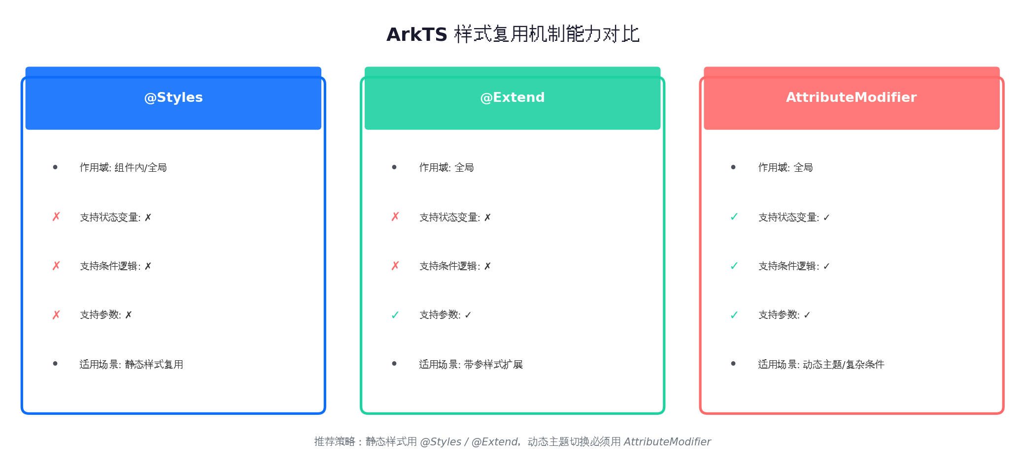
| 特性 | @Styles | @Extend | AttributeModifier |
|---|---|---|---|
| 作用域 | 组件内 / 全局 | 全局 | 全局 |
| 参数支持 | ✗ | ✓ | ✓ |
| 状态变量 | ✗ | ✗ | ✓ |
| 条件逻辑 | ✗ | ✗ | ✓ |
| 运行时开销 | 编译期展开,零开销 | 编译期展开,零开销 | 运行时构建,有开销 |
| 适用场景 | 静态样式复用 | 带参静态扩展 | 动态主题 / 复杂条件 |
选型建议:
- 纯静态样式复用 →
@Styles - 需要参数化但无状态依赖 →
@Extend - 需要响应主题切换、状态变化 →
AttributeModifier
四、AttributeModifier:动态样式构建
当样式需要根据运行时状态(如主题模式、用户偏好、网络状态)动态变化时,@Styles 和 @Extend 无能为力。此时必须使用 AttributeModifier。
4.1 核心原理
AttributeModifier 是一个接口,开发者实现其方法,在运行时根据条件动态构建属性集合。框架会在状态变化时自动重新调用 applyXxx 方法,更新组件外观。
// 定义一个通用的主题修饰器
class ThemeModifier implements AttributeModifier<TextAttribute> {
  private theme: ThemeModel;

  constructor(theme: ThemeModel) {
    this.theme = theme;
  }

  applyNormalAttribute(instance: TextAttribute): void {
    instance
      .fontColor(this.theme.colors.onSurface)
      .fontSize(this.theme.typography.bodyLarge.size)
      .fontWeight(this.theme.typography.bodyLarge.weight);
  }

  // 可扩展:applyPressedAttribute、applyDisabledAttribute 等
}

// 使用
@State themeModifier: AttributeModifier<TextAttribute> = new ThemeModifier(defaultTheme);

Text('动态主题文本')
  .attributeModifier(this.themeModifier)
4.2 与 @State 的联动
AttributeModifier 的真正威力在于与 @State 的联动。当主题状态变化时,所有使用该修饰器的组件会自动刷新。
@Entry
@Component
struct ThemeDemoPage {
  @State isDarkMode: boolean = false;
  @State textModifier: AttributeModifier<TextAttribute> =
    new ThemeModifier(LightTheme);

  toggleTheme() {
    this.isDarkMode = !this.isDarkMode;
    // 重新创建 Modifier,触发 UI 刷新
    this.textModifier = new ThemeModifier(
      this.isDarkMode ? DarkTheme : LightTheme
    );
  }

  build() {
    Column() {
      Text('主题切换演示')
        .attributeModifier(this.textModifier)

      Button('切换主题')
        .onClick(() => this.toggleTheme())
    }
  }
}
4.3 性能注意事项
AttributeModifier 在运行时动态构建属性,存在一定开销。优化策略包括:
- 缓存 Modifier 实例:避免每次状态变化都重新
new,可复用未变化的实例; - 细粒度拆分:将频繁变化的属性(如颜色)和不常变化的属性(如字体)拆分为多个 Modifier;
- 避免在循环中创建:列表项的 Modifier 应在数据模型中预创建,而非在
build中动态生成。
五、主题系统设计:ColorToken 与 Design Token
对于企业级应用,硬编码颜色值是技术债务的温床。Design Token 体系将样式抽象为语义化令牌,实现设计到开发的无损传递。
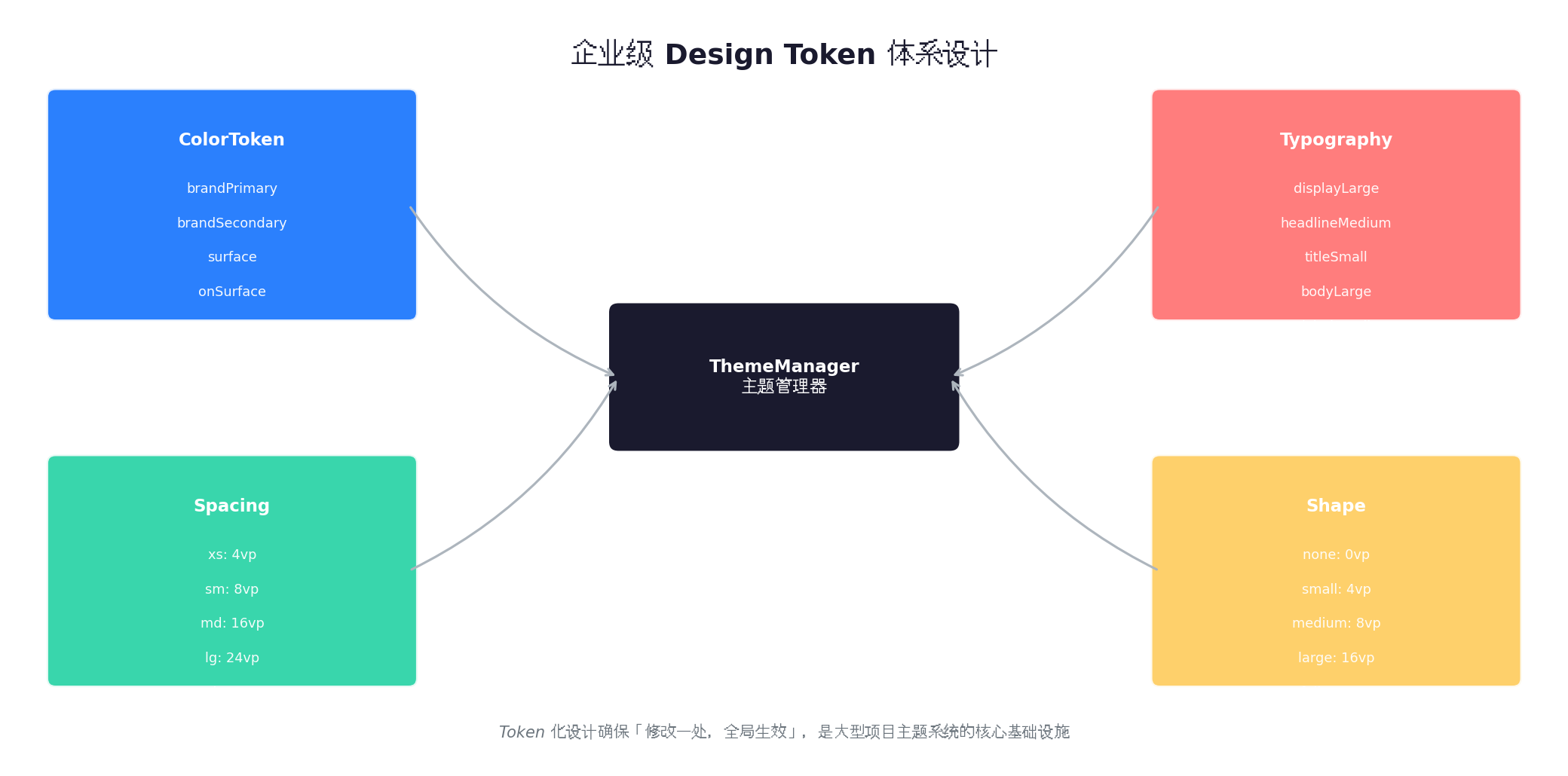
5.1 ColorToken:语义化颜色令牌
ColorToken 不是具体的颜色值,而是「这个颜色在什么场景下使用」的语义描述。
// theme/ColorToken.ets
export class ColorToken {
  // 品牌色
  static readonly brandPrimary: ResourceColor = '#0d6efd';
  static readonly brandSecondary: ResourceColor = '#6c757d';

  // 表面色(背景层级)
  static readonly surface: ResourceColor = '#ffffff';
  static readonly surfaceVariant: ResourceColor = '#f8f9fa';

  // 内容色(文字/图标)
  static readonly onSurface: ResourceColor = '#1a1a2e';
  static readonly onSurfaceVariant: ResourceColor = '#6c757d';

  // 状态色
  static readonly error: ResourceColor = '#dc3545';
  static readonly success: ResourceColor = '#198754';
  static readonly warning: ResourceColor = '#ffc107';

  // 深色模式覆盖
  static readonly darkSurface: ResourceColor = '#121212';
  static readonly darkOnSurface: ResourceColor = '#e0e0e0';
}
5.2 Typography:字体体系
// theme/Typography.ets
export interface TextStyle {
  size: number | string;
  weight: FontWeight;
  lineHeight?: number;
}

export class Typography {
  static readonly displayLarge: TextStyle = { size: '32fp', weight: FontWeight.Bold, lineHeight: 40 };
  static readonly headlineMedium: TextStyle = { size: '24fp', weight: FontWeight.Bold, lineHeight: 32 };
  static readonly titleSmall: TextStyle = { size: '18fp', weight: FontWeight.Medium, lineHeight: 24 };
  static readonly bodyLarge: TextStyle = { size: '16fp', weight: FontWeight.Regular, lineHeight: 24 };
  static readonly bodySmall: TextStyle = { size: '14fp', weight: FontWeight.Regular, lineHeight: 20 };
  static readonly labelSmall: TextStyle = { size: '12fp', weight: FontWeight.Medium, lineHeight: 16 };
}
5.3 Spacing 与 Shape
// theme/Spacing.ets
export class Spacing {
  static readonly xs: number = 4;
  static readonly sm: number = 8;
  static readonly md: number = 16;
  static readonly lg: number = 24;
  static readonly xl: number = 32;
  static readonly xxl: number = 48;
}

// theme/Shape.ets
export class Shape {
  static readonly none: number = 0;
  static readonly small: number = 4;
  static readonly medium: number = 8;
  static readonly large: number = 16;
  static readonly full: number = 999; // 胶囊形
}
六、实战案例:企业级主题切换系统
下面通过一个完整的「企业级主题切换系统」,演示如何将上述理论整合为可落地的工程方案。
6.1 需求分析
- 支持浅色、深色、品牌色三套主题;
- 支持运行时热切换,无需重启应用;
- 主题配置持久化到 Preferences;
- 所有组件通过 Token 引用样式,无硬编码颜色。
6.2 核心代码实现
// theme/ThemeModel.ets
export interface ThemeModel {
  name: string;
  colors: {
    brandPrimary: ResourceColor;
    brandSecondary: ResourceColor;
    surface: ResourceColor;
    surfaceVariant: ResourceColor;
    onSurface: ResourceColor;
    onSurfaceVariant: ResourceColor;
    error: ResourceColor;
    success: ResourceColor;
  };
  typography: typeof Typography;
  isDark: boolean;
}

export const LightTheme: ThemeModel = {
  name: 'light',
  colors: {
    brandPrimary: '#0d6efd',
    brandSecondary: '#6c757d',
    surface: '#ffffff',
    surfaceVariant: '#f8f9fa',
    onSurface: '#1a1a2e',
    onSurfaceVariant: '#6c757d',
    error: '#dc3545',
    success: '#198754',
  },
  typography: Typography,
  isDark: false,
};

export const DarkTheme: ThemeModel = {
  name: 'dark',
  colors: {
    brandPrimary: '#bb86fc',
    brandSecondary: '#03dac6',
    surface: '#121212',
    surfaceVariant: '#1e1e1e',
    onSurface: '#e0e0e0',
    onSurfaceVariant: '#a0a0a0',
    error: '#cf6679',
    success: '#03dac6',
  },
  typography: Typography,
  isDark: true,
};

export const BrandTheme: ThemeModel = {
  name: 'brand',
  colors: {
    brandPrimary: '#ff6b6b',
    brandSecondary: '#feca57',
    surface: '#fff5f5',
    surfaceVariant: '#ffe0e0',
    onSurface: '#4a0000',
    onSurfaceVariant: '#8b0000',
    error: '#c0392b',
    success: '#27ae60',
  },
  typography: Typography,
  isDark: false,
};
// theme/ThemeManager.ets
import preferences from '@ohos.data.preferences';

export class ThemeManager {
  private static instance: ThemeManager;
  private currentTheme: ThemeModel = LightTheme;
  private listeners: ((theme: ThemeModel) => void)[] = [];
  private pref: preferences.Preferences | null = null;

  static getInstance(): ThemeManager {
    if (!ThemeManager.instance) {
      ThemeManager.instance = new ThemeManager();
    }
    return ThemeManager.instance;
  }

  async init(context: Context) {
    this.pref = await preferences.getPreferences(context, 'app_theme');
    const saved = await this.pref.get('theme_name', 'light');
    this.currentTheme = this.resolveTheme(saved as string);
  }

  private resolveTheme(name: string): ThemeModel {
    switch (name) {
      case 'dark': return DarkTheme;
      case 'brand': return BrandTheme;
      default: return LightTheme;
    }
  }

  getCurrentTheme(): ThemeModel {
    return this.currentTheme;
  }

  async switchTheme(name: string) {
    this.currentTheme = this.resolveTheme(name);
    await this.pref?.put('theme_name', name);
    await this.pref?.flush();
    this.listeners.forEach(cb => cb(this.currentTheme));
  }

  onThemeChange(callback: (theme: ThemeModel) => void) {
    this.listeners.push(callback);
  }
}
// components/ThemeText.ets
import { ThemeManager } from '../theme/ThemeManager';
import { ThemeModel } from '../theme/ThemeModel';

class ThemeTextModifier implements AttributeModifier<TextAttribute> {
  private theme: ThemeModel;
  private style: 'body' | 'title' | 'caption';

  constructor(theme: ThemeModel, style: 'body' | 'title' | 'caption' = 'body') {
    this.theme = theme;
    this.style = style;
  }

  applyNormalAttribute(instance: TextAttribute): void {
    const typo = this.theme.typography;
    const styleMap = {
      body: typo.bodyLarge,
      title: typo.headlineMedium,
      caption: typo.labelSmall,
    };
    const s = styleMap[this.style];

    instance
      .fontColor(this.theme.colors.onSurface)
      .fontSize(s.size)
      .fontWeight(s.weight);

    if (s.lineHeight) {
      instance.lineHeight(s.lineHeight);
    }
  }
}

@Component
export struct ThemeText {
  @State text: string = '';
  @State style: 'body' | 'title' | 'caption' = 'body';
  @State modifier: AttributeModifier<TextAttribute> =
    new ThemeTextModifier(ThemeManager.getInstance().getCurrentTheme(), 'body');

  aboutToAppear() {
    ThemeManager.getInstance().onThemeChange((theme) => {
      this.modifier = new ThemeTextModifier(theme, this.style);
    });
  }

  build() {
    Text(this.text)
      .attributeModifier(this.modifier)
  }
}
// pages/SettingsPage.ets —— 主题切换页面
import { ThemeManager } from '../theme/ThemeManager';
import { ThemeText } from '../components/ThemeText';

@Entry
@Component
struct SettingsPage {
  @State currentThemeName: string = 'light';
  private themeManager: ThemeManager = ThemeManager.getInstance();

  aboutToAppear() {
    this.currentThemeName = this.themeManager.getCurrentTheme().name;
  }

  async onThemeSelect(name: string) {
    await this.themeManager.switchTheme(name);
    this.currentThemeName = name;
  }

  @Builder
  ThemeOption(name: string, label: string, color: ResourceColor) {
    Row() {
      Circle()
        .width(20)
        .height(20)
        .fill(color)
        .stroke(this.currentThemeName === name ? '#0d6efd' : 'transparent')
        .strokeWidth(3)

      Text(label)
        .fontSize(16)
        .fontColor('#1a1a2e')
        .margin({ left: 12 })

      Blank()

      if (this.currentThemeName === name) {
        Text('✓')
          .fontSize(18)
          .fontColor('#0d6efd')
          .fontWeight(FontWeight.Bold)
      }
    }
    .width('100%')
    .height(56)
    .padding({ left: 16, right: 16 })
    .backgroundColor('#ffffff')
    .borderRadius(8)
    .onClick(() => this.onThemeSelect(name))
  }

  build() {
    Column() {
      ThemeText({ text: '主题设置', style: 'title' })
        .margin({ top: 24, bottom: 16 })

      Column({ space: 12 }) {
        this.ThemeOption('light', '浅色模式', '#ffffff');
        this.ThemeOption('dark', '深色模式', '#121212');
        this.ThemeOption('brand', '品牌主题', '#ff6b6b');
      }
      .width('100%')
      .padding(16)
    }
    .width('100%')
    .height('100%')
    .backgroundColor('#f5f7fa')
  }
}
6.3 主题切换效果
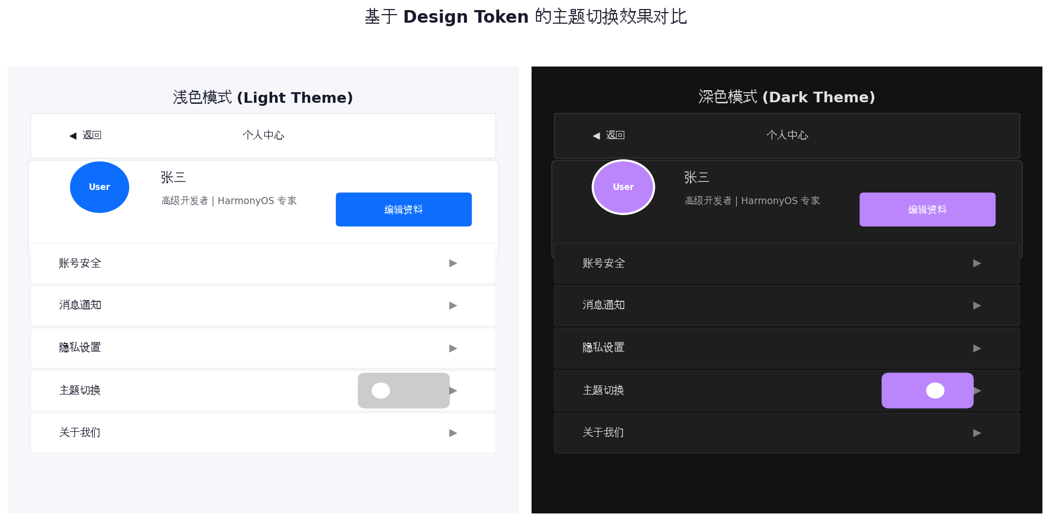
通过 Token 化设计,同一套布局代码在浅色、深色、品牌色三种主题下呈现出完全不同的视觉风格,而无需修改任何组件逻辑。
七、性能优化与最佳实践
7.1 Modifier 实例复用
频繁创建 AttributeModifier 实例会导致 GC 压力。对于不随主题变化的属性,应拆分为独立的静态 Modifier:
// 静态部分:所有主题共享
const staticModifier: AttributeModifier<TextAttribute> = {
  applyNormalAttribute(instance) {
    instance.maxLines(2).textOverflow({ overflow: TextOverflow.Ellipsis });
  }
};

// 动态部分:随主题变化
const dynamicModifier = new ThemeTextModifier(currentTheme);

Text('内容')
  .attributeModifier(staticModifier)
  .attributeModifier(dynamicModifier)
7.2 避免深层嵌套的状态传递
在大型应用中,直接在每个组件中监听 ThemeManager 会导致大量监听器注册。推荐使用 @StorageLink 或全局状态管理(如 AppStorage)进行主题状态的统一广播:
// 在 Entry 处注入全局主题状态
AppStorage.setOrCreate('currentTheme', LightTheme);

// 子组件通过 @StorageLink 订阅
@StorageLink('currentTheme') theme: ThemeModel = LightTheme;
7.3 图片资源适配
主题切换时,图片也应跟随变化。建议将主题相关的图片放入 resources 的限定词目录中:
resources/
├── base/
│   └── media/
│       └── logo.png          # 默认
├── dark/
│   └── media/
│       └── logo.png          # 深色模式覆盖
└── brand/
    └── media/
        └── logo.png            # 品牌主题覆盖
通过 $r('app.media.logo') 引用时,系统会根据当前主题自动加载对应限定词目录下的资源。
7.4 常见陷阱
| 陷阱 | 说明 | 解决方案 |
|---|---|---|
| 硬编码颜色 | 直接在组件中写 #ffffff |
全部替换为 ColorToken 引用 |
| Modifier 中滥用 if/else | 导致运行时频繁重建 | 将条件判断提前到数据层,Modifier 只负责应用 |
| 忽略 fp 单位 | 字体不使用 fp,导致系统字号设置无效 | 所有文本尺寸统一使用 fp |
| 主题切换闪烁 | 大量组件同时刷新导致视觉闪烁 | 使用 animateTo 包裹状态变更,启用过渡动画 |
八、总结
ArkTS 的样式系统从 Decorative API 到 AttributeModifier,再到 Design Token 体系,形成了一个由浅入深、由静态到动态的能力梯度。在实际项目中,开发者应根据团队规模和项目复杂度选择合适的层级:
- 小型项目:Decorative API +
@Styles即可满足需求; - 中型项目:引入
@Extend和AttributeModifier,实现参数化和动态样式; - 大型项目:必须建立完整的 Design Token 体系,通过
ThemeManager统一管理颜色、字体、间距、圆角,实现设计到开发的无缝协作。
样式工程化的终极目标,不是让代码更复杂,而是让「修改一处,全局生效」成为现实。掌握 ArkTS 组件样式与主题系统,是构建专业级 HarmonyOS 应用的必修课。
转载自:https://blog.csdn.net/u014727709/article/details/163085748
欢迎 👍点赞✍评论⭐收藏,欢迎指正

讨论HarmonyOS开发技术,专注于API与组件、DevEco Studio、测试、元服务和应用上架分发等。
更多推荐
 1
1 0
0- 0


 已为社区贡献270条内容

所有评论(0)