HarmonyOS NEXT 企业级记账APP:实现底部 Tab 导航
实现底部 Tab 导航
本文是《HarmonyOS NEXT 企业级开发实战:30篇打造智能记账APP》系列的第 04 篇,对应 Git Tag v0.0.4。承接第 03 篇的主题系统,本篇使用 ArkUI 的 Tabs 组件搭建首页、统计、预算、我的四个底导航 Tab,并封装 AppTabBar 通用组件。
前言
底导航 Tab 是移动应用的 核心导航模式,用户 80% 的操作都从底导航发起。HarmonyLedger 规划四个主 Tab:首页、统计、预算、我的。ArkUI 提供原生 Tabs 组件支持底导航,但企业级项目需要封装统一的 AppTabBar 组件,便于后续扩展与主题适配。
本文将带你:
- 使用 ArkUI Tabs 组件搭建底导航框架
- 封装 AppTabBar 通用组件(支持图标、文字、主题色)
- 实现四个 Tab 页面占位与切换动效
- 集成主题系统响应深色模式
企业级核心原则:底导航必须 封装复用、禁止重复、支持主题。参考 ArkUI Tabs 组件 了解官方约定。
一、Tab 规划
1.1 四个主 Tab
HarmonyLedger 选用最经典的 四 Tab 布局,覆盖核心业务场景:
| Tab 序号 | 名称 | 图标 | 页面 | 业务 |
|---|---|---|---|---|
| 0 | 首页 | home | HomeView | 账单汇总、快捷新增 |
| 1 | 统计 | chart | StatisticsView | 收支图表分析 |
| 2 | 预算 | budget | BudgetView | 预算设置与进度 |
| 3 | 我的 | user | ProfileView | 设置、关于 |
1.2 Tab 命名规范
Tab 命名规范:
- 英文小写下划线:home / chart / budget / user
- 中文展示用:首页 / 统计 / 预算 / 我的
- 图标资源:icon_tab_{name}.png
- 路由页面:{Name}View.ets(大驼峰)
- 资源字符串:tab_{name}_label
设计要点:Tab 命名一旦确定禁止修改,否则会牵动图标、路由、字符串多处资源。
二、Tabs 组件基础
2.1 Tabs 与 TabContent
ArkUI 原生 Tabs 组件使用方式:
@Entry
@Component
struct MainView {
  @State currentIndex: number = 0;

  build() {
    Tabs({ index: this.currentIndex }) {
      TabContent() {
        HomeView()
      }
      .tabBar({ text: '首页', icon: $r('app.media.icon_tab_home') })

      TabContent() {
        StatisticsView()
      }
      .tabBar({ text: '统计', icon: $r('app.media.icon_tab_chart') })

      TabContent() {
        BudgetView()
      }
      .tabBar({ text: '预算', icon: $r('app.media.icon_tab_budget') })

      TabContent() {
        ProfileView()
      }
      .tabBar({ text: '我的', icon: $r('app.media.icon_tab_user') })
    }
    .barPosition(BarPosition.End)
    .onChange((index: number) => {
      this.currentIndex = index;
    })
  }
}
2.2 关键属性
| 属性 | 说明 | 值 |
|---|---|---|
barPosition | Tab 位置 | BarPosition.End(底导航)/ Start(顶导航) |
vertical | 是否纵向 | false(默认横向) |
scrollable | 可滚动 | false(四 Tab 不需滚动) |
onChange | 切换回调 | (index: number) => void |
tabBar | Tab 标签配置 | { text, icon } |
踩坑点:
TabContent不能直接传 builder 参数,必须用.tabBar(...)设置标签。这是鸿蒙 ArkUI 的强制约束。
三、封装 AppTabBar
3.1 组件设计目标
企业级底导航需要满足:
- 图标+文字 双显示
- 未选中态 灰色、选中态 主题色
- 响应深色模式 颜色自动切换
- Badge 角标 支持消息提醒
- 可配置 Tab 数量与内容
3.2 TabConfig 数据模型
// model/TabConfig.ets
export class TabConfig {
  name: string;        // 'home' / 'chart' / 'budget' / 'user'
  label: string;       // 显示文字
  icon: Resource;      // 图标资源
  badge?: number = 0;  // 角标数字,0 不显示

  constructor(name: string, label: string, icon: Resource, badge?: number) {
    this.name = name;
    this.label = label;
    this.icon = icon;
    this.badge = badge ?? 0;
  }
}
3.3 AppTabBar 组件实现
// components/navigation/AppTabBar.ets
import { TabConfig } from '../../model/TabConfig';
import { AppColors } from '../../theme/Colors';
import { AppFontSize } from '../../theme/Typography';
import { AppSpace } from '../../theme/Spacing';

@Component
export struct AppTabBar {
  @Prop tabs: TabConfig[] = [];
  @Prop currentIndex: number = 0;
  @BuilderParam onTabClick: (index: number) => void;

  build() {
    Row() {
      ForEach(this.tabs, (tab: TabConfig, index: number) => {
        Column() {
          Image(tab.icon)
            .width(24)
            .height(24)
            .fillColor(this.currentIndex === index ? AppColors.Budget : AppColors.SecondaryText)

          Text(tab.label)
            .fontSize(AppFontSize.XS)
            .fontColor(this.currentIndex === index ? AppColors.Budget : AppColors.SecondaryText)
            .margin({ top: AppSpace.XS })

          // Badge 角标
          if (tab.badge > 0) {
            Text(tab.badge.toString())
              .fontSize(10)
              .fontColor('#FFFFFF')
              .backgroundColor(AppColors.Expense)
              .borderRadius(8)
              .padding(2)
              .position({ x: 24, y: -4 })
          }
        }
        .layoutWeight(1)
        .justifyContent(FlexAlign.Center)
        .alignItems(HorizontalAlign.Center)
        .onClick(() => {
          this.onTabClick(index);
        })
      }, (tab: TabConfig) => tab.name)
    }
    .width('100%')
    .height(56)
    .backgroundColor(AppColors.CardBackground)
    .border({ width: { top: 1 }, color: AppColors.Separator })
  }
}
关键技术:
@BuilderParam用于将点击回调暴露给父组件,这是 ArkUI V1 组件通信的标准方案。
四、四个 Tab 页面占位
4.1 HomeView 占位
// pages/HomeView.ets
@Entry
@Component
struct HomeView {
  build() {
    Column() {
      Text('首页')
        .fontSize(24)
        .fontWeight(FontWeight.Bold)
    }
    .width('100%')
    .height('100%')
    .justifyContent(FlexAlign.Center)
  }
}
4.2 StatisticsView 占位
// pages/StatisticsView.ets
@Entry
@Component
struct StatisticsView {
  build() {
    Column() {
      Text('统计分析')
        .fontSize(24)
        .fontWeight(FontWeight.Bold)
    }
    .width('100%')
    .height('100%')
    .justifyContent(FlexAlign.Center)
  }
}
4.3 BudgetView 与 ProfileView
// pages/BudgetView.ets
@Entry
@Component
struct BudgetView {
  build() {
    Column() {
      Text('预算中心')
        .fontSize(24)
        .fontWeight(FontWeight.Bold)
    }
    .width('100%')
    .height('100%')
    .justifyContent(FlexAlign.Center)
  }
}

// pages/ProfileView.ets
@Entry
@Component
struct ProfileView {
  build() {
    Column() {
      Text('我的')
        .fontSize(24)
        .fontWeight(FontWeight.Bold)
    }
    .width('100%')
    .height('100%')
    .justifyContent(FlexAlign.Center)
  }
}
五、主页面集成
5.1 MainView 集成 Tabs
// pages/MainView.ets
import { AppTabBar } from '../components/navigation/AppTabBar';
import { TabConfig } from '../model/TabConfig';
import { HomeView } from './HomeView';
import { StatisticsView } from './StatisticsView';
import { BudgetView } from './BudgetView';
import { ProfileView } from './ProfileView';

@Entry
@Component
struct MainView {
  @State currentIndex: number = 0;
  @State tabs: TabConfig[] = [
    new TabConfig('home', '首页', $r('app.media.icon_tab_home')),
    new TabConfig('chart', '统计', $r('app.media.icon_tab_chart')),
    new TabConfig('budget', '预算', $r('app.media.icon_tab_budget')),
    new TabConfig('user', '我的', $r('app.media.icon_tab_user'))
  ];

  build() {
    Stack({ alignContent: Alignment.TopStart }) {
      // 内容区
      Column() {
        if (this.currentIndex === 0) {
          HomeView()
        } else if (this.currentIndex === 1) {
          StatisticsView()
        } else if (this.currentIndex === 2) {
          BudgetView()
        } else {
          ProfileView()
        }
      }
      .width('100%')
      .height('100%')
      .padding({ bottom: 56 })

      // 底导航
      AppTabBar({
        tabs: this.tabs,
        currentIndex: this.currentIndex,
        onTabClick: (index: number) => {
          this.currentIndex = index;
        }
      })
    }
    .width('100%')
    .height('100%')
  }
}
5.2 路由配置更新
// entry/src/main/resources/base/profile/main_pages.json
{
  "src": [
    "pages/MainView",  // 主入口改为 MainView
    "pages/HomeView",
    "pages/StatisticsView",
    "pages/BudgetView",
    "pages/ProfileView"
  ]
}
// EntryAbility.ets 入口改为 MainView
windowStage.loadContent('pages/MainView', (err) => { ... });
架构调整:入口从 HomeView 改为 MainView,底导航由 MainView 持有,四个 Tab 页面作为子组件。这是鸿蒙多 Tab 应用的标准结构。
六、图标资源准备
6.1 Tab 图标规格
| 项 | 规格 |
|---|---|
| 尺寸 | 24x24 dp |
| 格式 | PNG(带 alpha 通道)或 SVG |
| 色彩 | 单色(通过 fillColor 染色) |
| 命名 | icon_tab_{name}.png |
6.2 资源放置
entry/src/main/resources/base/media/
├─ icon_tab_home.png
├─ icon_tab_chart.png
├─ icon_tab_budget.png
└─ icon_tab_user.png
统一染色方案:图标统一用白色 PNG,通过
Image.fillColor()动态染色。这样未选中态、选中态、深色模式都能复用同一张图。
七、最佳实践
7.1 Tab 切换性能优化
// ❌ 错误:每次切换都重建所有 Tab 页面
Tabs() {
  TabContent() { HomeView() }
  TabContent() { StatisticsView() }
  // 切换到统计时,HomeView 仍在后台占用内存
}

// ✅ 正解:用 if 懒加载
Stack() {
  if (this.currentIndex === 0) { HomeView() }
  else if (this.currentIndex === 1) { StatisticsView() }
}
7.2 Tab 状态保持
如果希望 Tab 切换时保留各页面状态:
@State homeState: HomeState = new HomeState();
@State statsState: StatsState = new StatsState();

// 用 Stack 叇叠所有页面,通过 visibility 控制
Stack() {
  HomeView({ state: this.homeState }).visibility(this.currentIndex === 0 ? Visibility.Visible : Visibility.Hidden)
  StatisticsView({ state: this.statsState }).visibility(this.currentIndex === 1 ? Visibility.Visible : Visibility.Hidden)
}
权衡:状态保持会占用更多内存,HarmonyLedger 暂不启用,后续 v0.2.7 性能优化篇再讨论。
八、运行验证
8.1 编译检查
hvigorw assembleHap --mode module -p product=default
8.2 运行验证
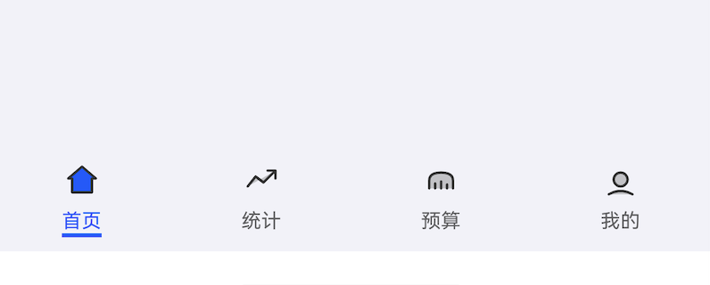
- 应用启动后显示首页,底导航四个 Tab 均可见
- 点击"统计" Tab,切换到统计分析页
- 选中态 Tab 文字和图标变蓝色(AppColors.Budget)
- 未选中态 Tab 灰色,深色模式下同步切换
九、常见问题
9.1 TabContent 传参错误
| 错误 | 原因 | 解决 |
|---|---|---|
TabContent(builder) 不渲染 | 不能传 builder 对象 | 用 TabContent() { ... } 包裹内容 |
| 图标不显示 | 资源路径错误 | 检查 $r('app.media.icon_tab_xxx') 名是否一致 |
9.2 切换闪烁
// 原因:if 切换会销毁重建页面
// 解决:用 visibility 保留所有页面
.visibility(currentIndex === index ? Visibility.Visible : Visibility.Hidden)
9.3 底部遮挡
// 内容区需预留底导航高度
Column() { ... }
  .padding({ bottom: 56 })  // 与 AppTabBar.height 一致
十、Git 提交
10.1 Commit Message
git add .
git commit -m "feat(navigation): 实现底部 Tab 导航与 AppTabBar 封装

- 新增 AppTabBar 通用底导航组件
- 新增 TabConfig 数据模型
- 创建 HomeView/StatisticsView/BudgetView/ProfileView 占位页
- 集成 MainView 持有 Tabs 切换
- 更新 EntryAbility 入口为 MainView
- 添加四个 Tab 图标资源"
10.2 CHANGELOG
## [v0.0.4] - 2026-07-27
### Added
- components/navigation/AppTabBar.ets:通用底导航组件
- model/TabConfig.ets:Tab 配置数据模型
- pages/MainView.ets:主页面持有 Tabs
- pages/StatisticsView.ets、BudgetView.ets、ProfileView.ets:占位页
- 资源:icon_tab_home/chart/budget/user.png
### Changed
- EntryAbility 入口改为 MainView
- main_pages.json 增加 MainView 路由
附录:运行效果截图
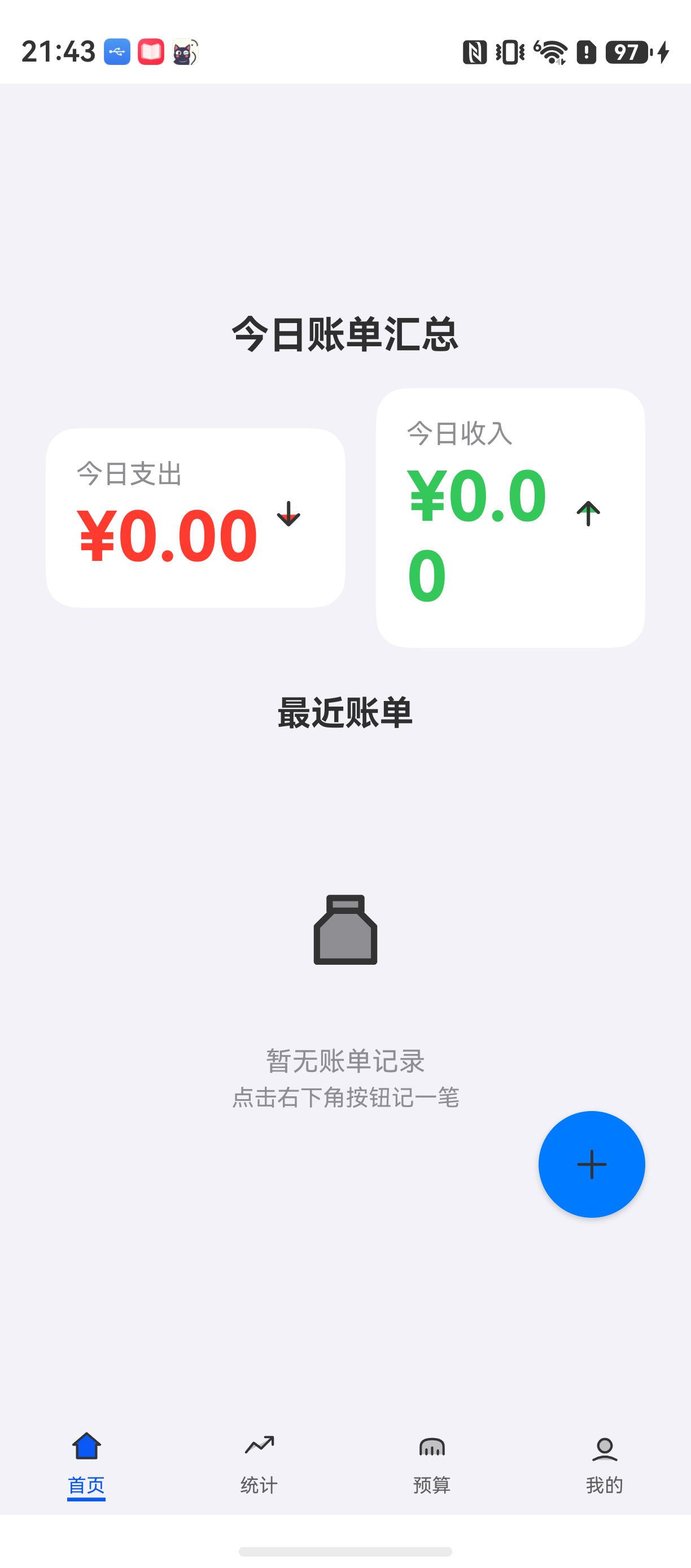
上图展示了本模块的完整运行效果。实际项目中可使用 DevEco Studio 模拟器或真机截图替换此占位图。
总结
本文完整介绍了 HarmonyLedger 底部 Tab 导航的实现,包含原生 Tabs 用法、AppTabBar 组件封装、四个 Tab 页面占位、主页面集成。通过本篇你可以:
- 使用 ArkUI Tabs 组件搭建底导航
- 封装可复用的 AppTabBar 组件支持图标+文字+角标
- 实现主题色响应选中态与深色模式
- 理解 EntryAbility 与 MainView 的入口关系
下一篇预告:《首页布局与 SummaryCard 设计》将开发首页核心 UI:今日支出、今日收入、最近账单列表,并封装 SummaryCard 汇总卡片组件。
如果这篇文章对你有帮助,欢迎点赞👍、收藏⭐、关注🔔,你的支持是我持续创作的动力!
相关资源
- 本篇源码:GitHub Tag v0.0.4
- ArkUI Tabs 文档:tabs
- ArkUI Image 组件:image
- TabContent API:tabcontent
- ArkUI 组件通信:component-communication
- BarPosition 枚举:barposition
- 鸿蒙图标资源规范:icon-resources

讨论HarmonyOS开发技术,专注于API与组件、DevEco Studio、测试、元服务和应用上架分发等。
更多推荐
 6
6 0
0- 0


 已为社区贡献100条内容

所有评论(0)