HarmonyOS7 综合布局:仪表盘首页从设计到实现的完整过程
文章目录
前言
前面几十篇文章逐个讲了 ArkUI 的各种组件、装饰器和技巧。这篇文章把这些知识串起来,做一个完整的仪表盘首页。这个页面包含了头部问候、Banner 横幅、统计卡片、快捷入口、最近更新列表——是典型的"功能聚合首页"。
通过这个项目,你会看到 @Builder、@State、ForEach、Badge、自定义组件等知识点在实际页面中是如何配合使用的。
效果预览
页面的整体结构从上到下分为五个区域:
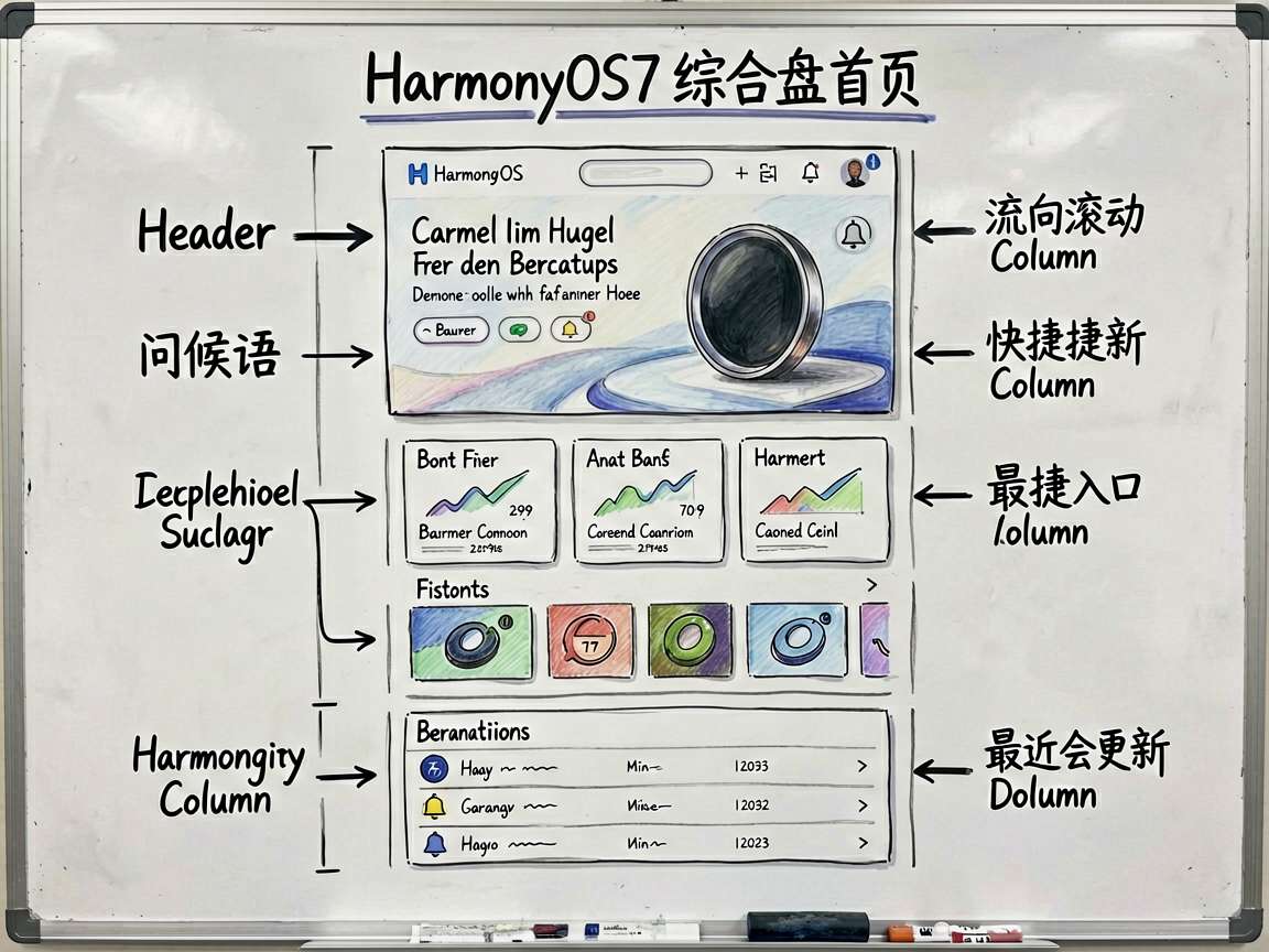
┌─────────────────────────┐
│ 问候语 + 通知铃铛       │  Header
├─────────────────────────┤
│ 欢迎使用 ArkUI          │  Banner
│ 探索 60+ 个组件演示     │
├─────────────────────────┤
│ [12项目][85%完成]...    │  统计卡片
├─────────────────────────┤
│ 快捷入口: 动画/状态/... │  快捷操作
├─────────────────────────┤
│ 最近更新:               │  更新列表
│  > 动画综合展示  刚刚   │
│  > 主题切换功能 10分钟前 │
└─────────────────────────┘
布局思路
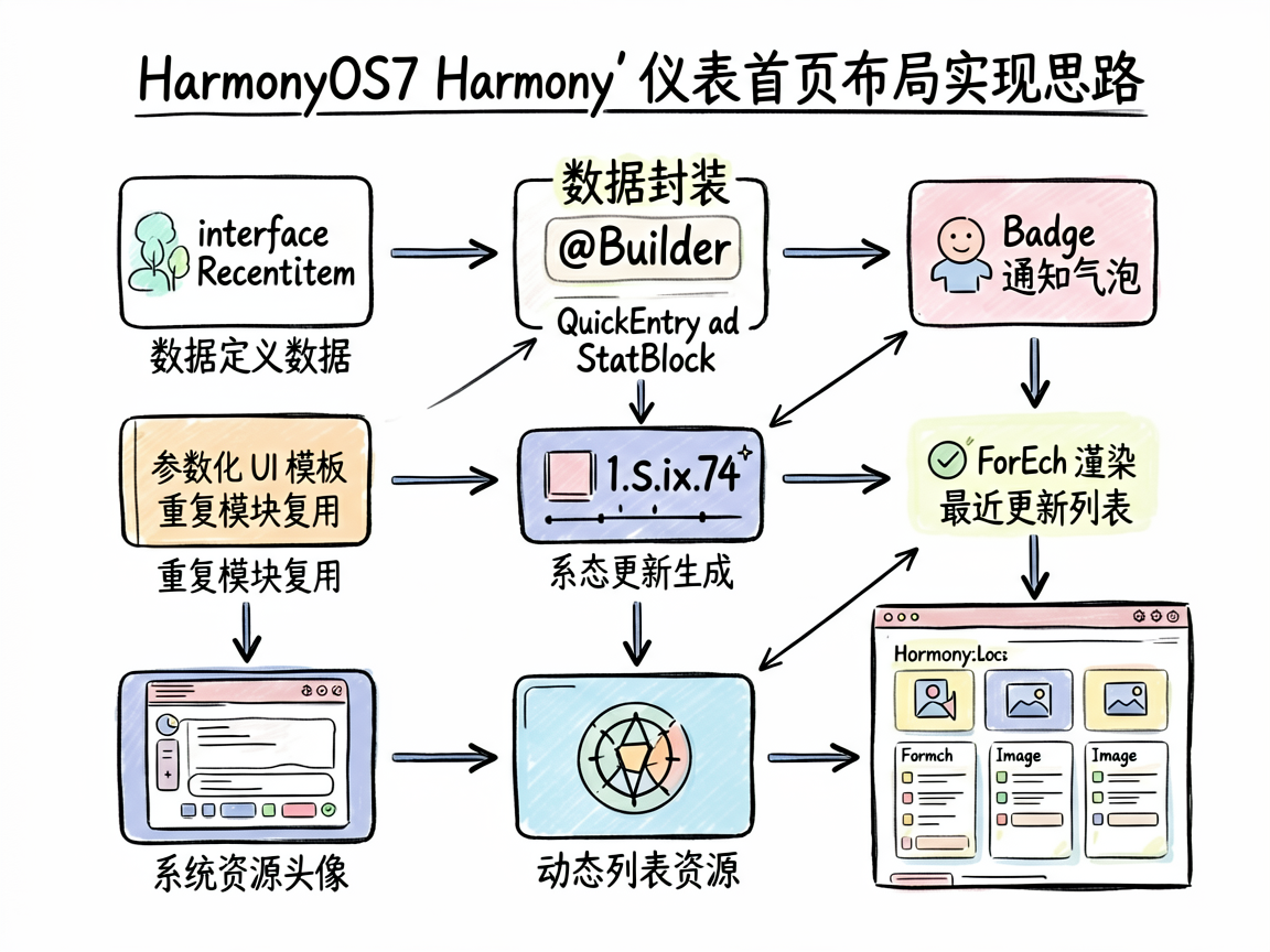
整体采用 Scroll > Column 的纵向滚动布局。每个区域是一个独立的卡片(白色背景 + 圆角 + padding),之间用 margin 留间距。
关键设计决策:
- @Builder 封装重复 UI:快捷入口和统计卡片都是重复模式,用
@Builder封装 - Badge 通知气泡:铃铛图标加上
Badge显示未读数
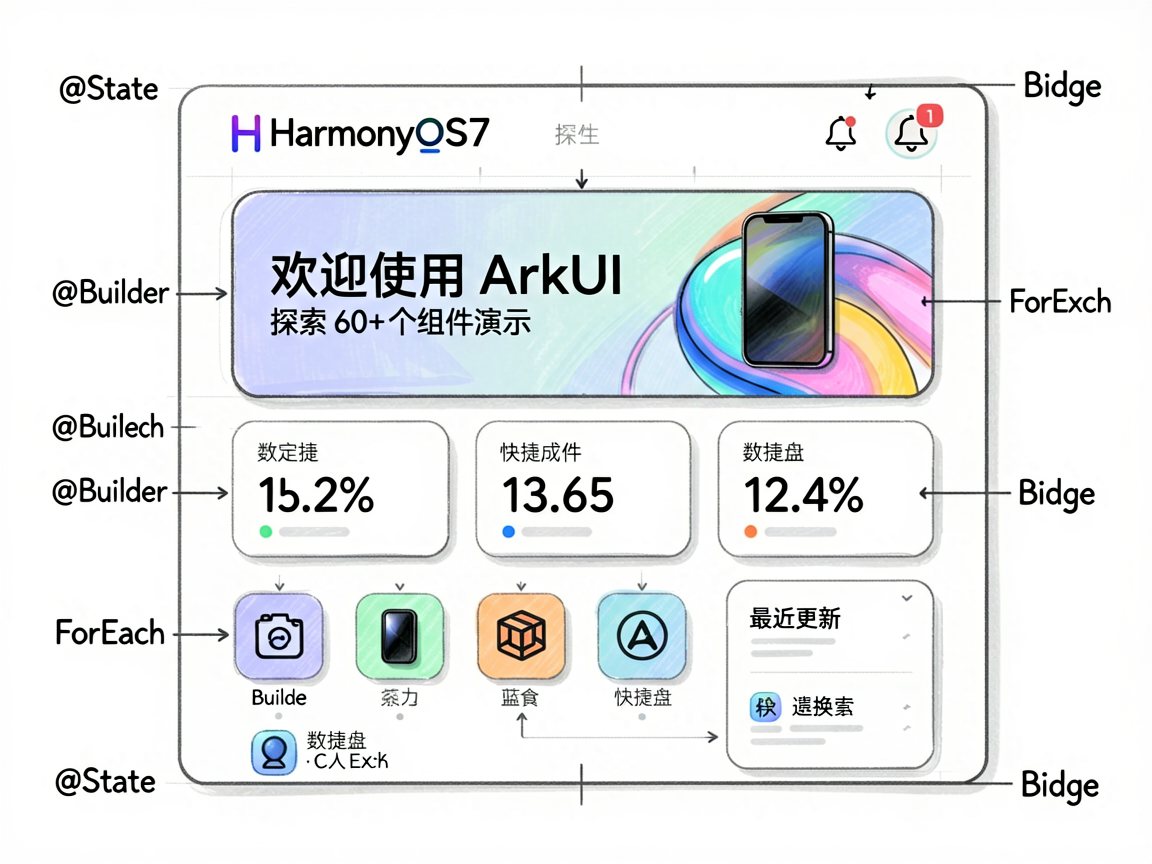
- ForEach 渲染列表:最近更新用
ForEach动态生成 - Image 使用系统资源:头像区域使用
$r('sys.media.xxx')引用系统资源
编码实现
数据定义
interface RecentItem {
  title: string
  desc: string
  time: string
}
用 interface 定义最近更新项的数据结构。
@Builder 封装
快捷入口 Builder:
@Builder QuickEntry(icon: string, label: string) {
  Column() {
    Text(icon).fontSize(28)
    Text(label).fontSize(11).fontColor('#666666').margin({ top: 4 })
  }
  .width(60).height(60).backgroundColor('#F8F9FA').borderRadius(12)
  .justifyContent(FlexAlign.Center).alignItems(HorizontalAlign.Center)
}
统计卡片 Builder:
@Builder StatBlock(value: string, label: string, color: string) {
  Column() {
    Text(value).fontSize(28).fontWeight(FontWeight.Bold).fontColor(color)
    Text(label).fontSize(11).fontColor('#666666').margin({ top: 2 })
  }
  .layoutWeight(1).height(70)
  .backgroundColor('#F8F9FA').borderRadius(10)
  .justifyContent(FlexAlign.Center).alignItems(HorizontalAlign.Center)
}
两个 @Builder 都是参数化的 UI 模板,使用时传入不同的数据就能生成不同的实例。
完整页面代码
@Entry
@Component
struct DashboardHomePage {
  @State userName: string = '开发者'
  @State notificationCount: number = 3
  private recentItems: RecentItem[] = [
    { title: '动画综合展示', desc: '已更新', time: '刚刚' },
    { title: '主题切换功能', desc: '新增演示', time: '10分钟前' },
    { title: '组件通信模式', desc: '完善示例', time: '1小时前' }
  ]

  @Builder QuickEntry(icon: string, label: string) {
    Column() {
      Text(icon).fontSize(28)
      Text(label).fontSize(11).fontColor('#666666').margin({ top: 4 })
    }
    .width(60).height(60).backgroundColor('#F8F9FA').borderRadius(12)
    .justifyContent(FlexAlign.Center).alignItems(HorizontalAlign.Center)
  }

  @Builder StatBlock(value: string, label: string, color: string) {
    Column() {
      Text(value).fontSize(28).fontWeight(FontWeight.Bold).fontColor(color)
      Text(label).fontSize(11).fontColor('#666666').margin({ top: 2 })
    }
    .layoutWeight(1).height(70)
    .backgroundColor('#F8F9FA').borderRadius(10)
    .justifyContent(FlexAlign.Center).alignItems(HorizontalAlign.Center)
  }

  build() {
    Column() {
      Scroll() {
        Column() {
          // === Header ===
          Row() {
            Column() {
              Image($r('sys.media.ohos_ic_public_arrow_down'))
              Text('上午好,').fontSize(13).fontColor('#666666')
              Text(this.userName).fontSize(20).fontWeight(FontWeight.Bold)
            }.alignItems(HorizontalAlign.Start).layoutWeight(1)
            Badge({
              count: this.notificationCount,
              position: BadgePosition.RightTop,
              style: { badgeSize: 16, badgeColor: '#FF3B30' }
            }) {
              Text('\u{1F514}').fontSize(24)
            }
          }
          .width('100%').margin({ bottom: 12 })

          // === Banner ===
          Column() {
            Column() {
              Text('欢迎使用 ArkUI')
                .fontSize(18).fontWeight(FontWeight.Bold).fontColor('#FFFFFF')
              Text('探索 60+ 个 ArkUI 组件和功能演示')
                .fontSize(12).fontColor('#FFFFFF').opacity(0.8)
                .margin({ top: 6 })
            }
          }
          .width('100%').height(120)
          .backgroundColor('#4D96FF').borderRadius(16)
          .padding(20).justifyContent(FlexAlign.Center)

          // === 统计卡片 ===
          Row({ space: 8 }) {
            this.StatBlock('12', '项目', '#4D96FF')
            this.StatBlock('85%', '完成', '#6BCB77')
            this.StatBlock('6', '任务', '#FFA500')
            this.StatBlock('98', '积分', '#9B59B6')
          }
          .width('100%').margin({ top: 12 })

          // === 快捷入口 ===
          Column() {
            Text('快捷入口')
              .fontSize(14).fontWeight(FontWeight.Medium).margin({ bottom: 8 })
            Row({ space: 12 }) {
              this.QuickEntry('\u{1F4CA}', '动画')
              this.QuickEntry('\u{1F517}', '状态')
              this.QuickEntry('\u{1F9E9}', '组件')
              this.QuickEntry('\u{2699}\u{FE0F}', '设置')
            }.width('100%').justifyContent(FlexAlign.SpaceEvenly)
          }
          .width('100%').backgroundColor('#FFFFFF').borderRadius(12)
          .padding(16).margin({ top: 10 })

          // === 最近更新 ===
          Column() {
            Text('最近更新')
              .fontSize(14).fontWeight(FontWeight.Medium).margin({ bottom: 8 })
            ForEach(this.recentItems, (item: RecentItem) => {
              Row() {
                Column() {
                  Text(item.title.slice(0, 1)).fontColor('#FFFFFF').fontSize(16)
                }
                .width(36).height(36)
                .backgroundColor('#4D96FF').borderRadius(18)
                .justifyContent(FlexAlign.Center)
                Column() {
                  Text(item.title).fontSize(14).fontWeight(FontWeight.Medium)
                  Text(`${item.desc} \u{00B7} ${item.time}`)
                    .fontSize(11).fontColor('#666666')
                }.alignItems(HorizontalAlign.Start)
                  .margin({ left: 10 }).layoutWeight(1)
              }
              .width('100%').padding(8).backgroundColor('#F8F9FA')
              .borderRadius(8).margin({ bottom: 6 })
            }, (item: RecentItem): string => item.title)
          }
          .width('100%').backgroundColor('#FFFFFF').borderRadius(12)
          .padding(16).margin({ top: 10 })
        }
        .width('100%')
      }
      .layoutWeight(1)
    }
    .width('100%').height('100%').backgroundColor('#F5F6FA').padding(16)
  }
}
踩坑总结
坑1:Badge 的包裹对象
Badge 必须包裹一个子组件。常见做法是包裹 Text(显示图标字符)或 Image。包裹对象就是角标的"宿主"。
坑2:@Builder 的参数传递
this.StatBlock('12', '项目', '#4D96FF') 这种调用方式,参数是按值传递的。如果在 @Builder 内部想引用 this 上的状态变量,是可以的——@Builder 天然能访问组件的 this。
坑3:ForEach 的 key 生成
最近更新列表的 ForEach 加了第三个参数 (item: RecentItem): string => item.title 作为唯一 key。这个 key 帮助框架在数据变化时精准识别哪些项是新增的、哪些是已有的,从而做出高效的 UI 更新。
坑4:layoutWeight 的使用场景
StatBlock 用了 .layoutWeight(1),让四个统计块均分父容器宽度。注意 layoutWeight 只在 Row/Column 的 Flex 布局中生效,在 Scroll 内部可能不生效。
优化建议
响应式适配:在不同屏幕宽度下调整布局:
// 小屏:2列统计卡片
// 大屏:4列统计卡片
if (this.screenWidth < 400) {
  Column({ space: 8 }) { /* 2列 */ }
} else {
  Row({ space: 8 }) { /* 4列 */ }
}
下拉刷新:给 Scroll 加上 Refresh 容器,实现下拉刷新数据:
Refresh({ refreshing: $$this.isRefreshing }) {
  Scroll() { /* ... */ }
}
.onRefreshing(() => {
  this.loadData()
})
骨架屏:数据加载中时显示骨架屏占位,提升加载体验。
模块化拆分:页面结构复杂后,把每个区域(Header、Banner、Stats、QuickEntries、RecentList)拆成独立的 @Component,主页面只负责组合。
写在最后
仪表盘首页是一个综合性很强的页面,它把 ArkUI 的各种基础能力串在了一起:布局容器(Column、Row、Scroll)、数据展示(Text、Image、Badge)、列表渲染(ForEach)、代码复用(@Builder)、状态管理(@State)。把这些基本功练扎实了,更复杂的页面也不在话下。希望这个案例能给你一些布局设计上的启发。

讨论HarmonyOS开发技术,专注于API与组件、DevEco Studio、测试、元服务和应用上架分发等。
更多推荐


 9
9 0
0- 0


 已为社区贡献100条内容

所有评论(0)