HarmonyOS7 架构解析:组件间通信的六种模式与选型指南
前言
组件化开发的核心挑战不是"怎么拆组件",而是"拆完之后组件之间怎么通信"。父子组件要同步数据,兄弟组件要互相影响,跨层级组件要共享状态——每种场景都有对应的最佳方案。
这篇文章以一个"聊天对话"为案例,把 ArkUI 中组件间通信的主要模式梳理一遍,帮你在不同场景下做出正确选择。
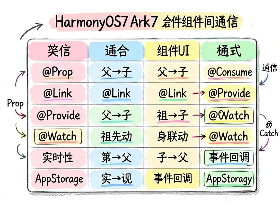
方案对比表
| 通信模式 | 方向 | 层级限制 | 实时性 | 适用场景 |
|---------|------|---------|--------|---------|
| @Prop | 父→子 | 相邻层 | 即时 | 传递只读数据 |
| @Link | 父↔子 | 相邻层 | 即时 | 双向同步 |
| @Provide/@Consume | 祖先↔后代 | 跨层级 | 即时 | 主题、全局状态 |
| @Watch | 自身 | - | 即时 | 联动计算 |
| 事件回调 | 子→父 | 相邻层 | 即时 | 点击、完成通知 |
| AppStorage | 全局 | 无限制 | 即时 | 跨页面共享 |
选型建议
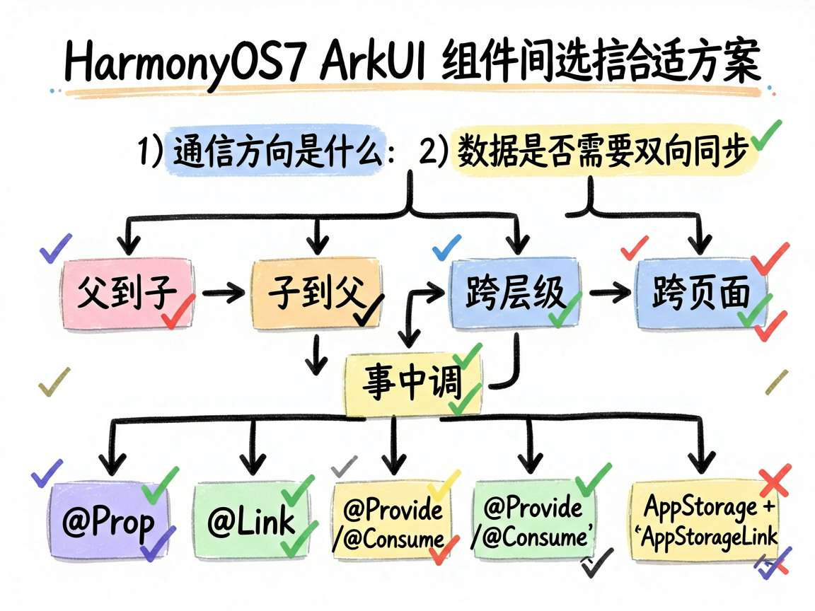
问自己两个问题:
1. 通信方向是什么?
- 父到子:
@Prop(只读)或@Link(双向) - 子到父:事件回调(
onClick、自定义回调) - 跨层级:
@Provide/@Consume - 跨页面:
AppStorage+@StorageLink
2. 数据需要双向同步吗?
- 需要:
@Link或@Provide/@Consume
- 不需要:
@Prop(更轻量)
详细实现
消息气泡子组件
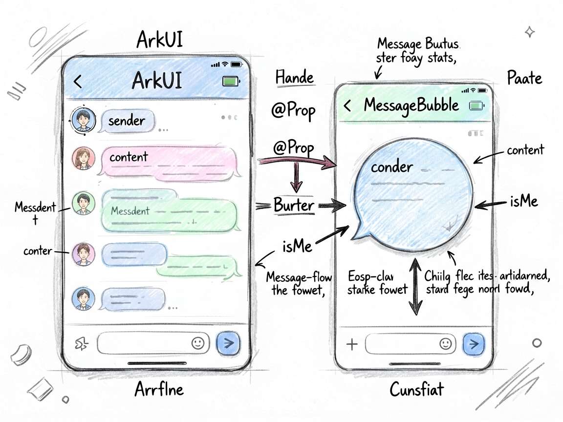
先看子组件 MessageBubble,它通过 @Prop 接收消息数据:
@Component
struct MessageBubble {
  @Prop sender: string = ''
  @Prop content: string = ''
  @Prop isMe: boolean = false

  build() {
    Column() {
      Text(this.sender)
        .fontSize(11).fontColor('#666666')
        .margin({ bottom: 4 })
      Text(this.content)
        .fontSize(14).fontColor(this.isMe ? '#FFFFFF' : '#333333')
        .padding(10)
        .backgroundColor(this.isMe ? '#4D96FF' : '#F0F0F0')
        .borderRadius(12)
        .constraintSize({ maxWidth: '80%' })
    }
    .alignItems(this.isMe ? HorizontalAlign.End : HorizontalAlign.Start)
    .width('100%')
    .padding({
      left: this.isMe ? 40 : 8,
      right: this.isMe ? 8 : 40
    })
    .margin({ bottom: 8 })
  }
}
这个组件用了 @Prop(单向),因为消息内容只需要展示,不需要子组件修改。
父组件管理消息列表
父组件持有消息数组,并处理发送逻辑:
interface ChatMessage {
  sender: string
  content: string
  isMe: boolean
}

@Entry
@Component
struct ComponentCommPage {
  @State messages: ChatMessage[] = [
    { sender: '客服', content: '您好,请问有什么可以帮您?', isMe: false },
    { sender: '我', content: '我想了解下 ArkUI 组件通信', isMe: true },
    { sender: '客服', content: '好的,组件通信主要通过 @Prop、@Link、事件回调等方式实现', isMe: false },
  ]
  @State inputText: string = ''
  @State unreadCount: number = 1

  build() {
    Column() {
      Scroll() {
        Column() {
          Text('组件通信')
            .fontSize(18).fontWeight(FontWeight.Bold).margin({ bottom: 8 })

          Column() {
            Row() {
              Text('消息对话')
                .fontSize(14).fontWeight(FontWeight.Medium).layoutWeight(1)
              Text(`${this.unreadCount} 条未读`)
                .fontSize(11)
                .padding({ left: 8, right: 8, top: 2, bottom: 2 })
                .backgroundColor('#FF6B6B').fontColor('#FFFFFF')
                .borderRadius(10)
            }
            .width('100%').margin({ bottom: 12 })

            ForEach(this.messages, (msg: ChatMessage) => {
              MessageBubble({
                sender: msg.sender,
                content: msg.content,
                isMe: msg.isMe
              })
            })

            Row() {
              TextInput({ placeholder: '输入消息...', text: this.inputText })
                .layoutWeight(1)
                .onChange((value: string) => { this.inputText = value })
              Button('发送')
                .margin({ left: 8 })
                .onClick(() => {
                  if (this.inputText.trim()) {
                    this.messages = this.messages.concat([{
                      sender: '我',
                      content: this.inputText,
                      isMe: true
                    }])
                    this.inputText = ''
                    this.unreadCount++
                  }
                })
            }
            .width('100%').margin({ top: 12 })
          }
          .width('100%').backgroundColor('#FFFFFF').borderRadius(12).padding(16)
        }
        .width('100%')
      }
      .layoutWeight(1)
    }
    .width('100%').height('100%').backgroundColor('#F5F6FA').padding(16)
  }
}
优劣分析
@Prop 的优势与局限
MessageBubble 用 @Prop 是正确的选择:
- 消息内容只用于展示,不需要修改
- 父组件统一管理消息列表
- 组件无副作用,可安全复用
但如果子组件需要修改数据(比如一个输入框组件),@Prop 就不够了,得用 @Link。
事件回调模式
ArkUI 中"子通知父"最常用的方式是事件回调。系统组件已经内置了大量回调(onClick、onChange、onSubmit),自定义组件也可以通过函数参数实现类似机制:
@Component
struct CustomInput {
  onSend: (text: string) => void = () => {}
  @State text: string = ''

  build() {
    Row() {
      TextInput().onChange((v) => { this.text = v })
      Button('发送').onClick(() => { this.onSend(this.text) })
    }
  }
}

// 使用
CustomInput({
  onSend: (text: string) => {
    this.messages = this.messages.concat([{ sender: '我', content: text, isMe: true }])
  }
})
跨组件通信方案选择流程
需要通信?
├── 父子组件
│   ├── 父→子只读 → @Prop
│   ├── 父子双向 → @Link
│   └── 子→父通知 → 事件回调
├── 跨层级
│   └── @Provide / @Consume
└── 跨页面
    └── AppStorage / EventBus
实际案例
回到聊天应用的场景,各层通信关系:
App(AppStorage 存储用户信息)
  └── ChatPage(@State 管理消息列表)
        ├── MessageBubble(@Prop 接收消息数据)
        ├── MessageBubble(@Prop 接收消息数据)
        └── InputArea(事件回调通知父组件发送消息)
每种通信模式各司其职,数据流清晰明了。
写在最后
组件通信是组件化架构的骨架。选对通信方式,数据流自然清晰;选错了,代码就是一团乱麻。把 @Prop、@Link、@Provide/@Consume、事件回调这几种方式理解透彻,面对任何组件通信场景都能从容应对。

讨论HarmonyOS开发技术,专注于API与组件、DevEco Studio、测试、元服务和应用上架分发等。
更多推荐

 6
6 0
0- 0


 已为社区贡献100条内容

所有评论(0)