HarmonyOS7 组件设计:自定义组件封装与复用的最佳实践
·
文章目录
前言
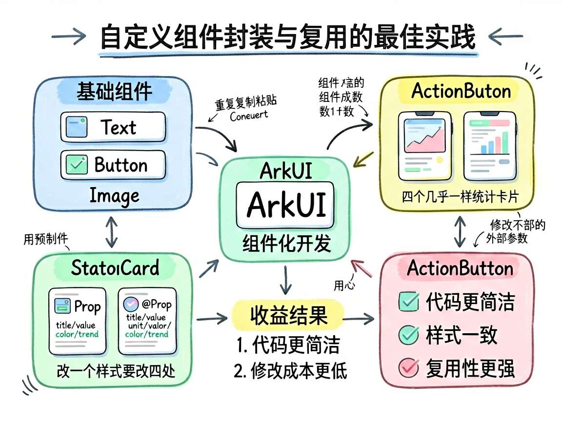
组件化是 ArkUI 开发的核心思想。系统提供的 Text、Button、Image 是基础积木,但实际项目中总需要更高级的"预制件"——一个带标题、数值、趋势指标的数据卡片,一个带图标和标签的操作按钮。把这些模式封装成自定义组件,整个项目的开发效率和一致性都会大幅提升。
这篇文章通过封装 StatCard(统计数据卡片)和 ActionButton(快捷操作按钮)两个组件,讲讲自定义组件设计的那些门道。
反面教材:不封装会怎样
假设你要做一个仪表盘首页,需要四个统计卡片:
// 第一个卡片
Column() {
  Text('总用户').fontSize(12).fontColor('#666666')
  Row() {
    Text('12.8').fontSize(24).fontWeight(FontWeight.Bold).fontColor('#4D96FF')
    Text('万').fontSize(12).fontColor('#666666').margin({ left: 2, top: 8 })
  }.margin({ top: 4 })
  Text('+12.5%').fontSize(11).fontColor('#6BCB77').margin({ top: 2 })
}
.layoutWeight(1).height(80).backgroundColor('#F8F9FA')
.borderRadius(10).padding(12).justifyContent(FlexAlign.Center)

// 第二个卡片...复制粘贴改参数
// 第三个卡片...再复制粘贴
// 第四个卡片...继续复制粘贴
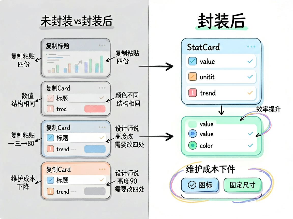
四份几乎一样的代码,只是标题、数值、颜色不同。设计师说"卡片高度从 80 改成 90",你得改四个地方。这就是不封装的代价。
正确姿势:封装自定义组件
StatCard 组件
@Component
struct StatCard {
  @Prop title: string = ''
  @Prop value: string = ''
  @Prop unit: string = ''
  @Prop color: string = '#4D96FF'
  @Prop trend: string = ''

  build() {
    Column() {
      Text(this.title).fontSize(12).fontColor('#666666')
      Row() {
        Text(this.value).fontSize(24)
          .fontWeight(FontWeight.Bold).fontColor(this.color)
        Text(this.unit).fontSize(12)
          .fontColor('#666666').margin({ left: 2, top: 8 })
      }.margin({ top: 4 })
      if (this.trend) {
        Text(this.trend).fontSize(11)
          .fontColor(this.trend.startsWith('+') ? '#6BCB77' : '#FF6B6B')
          .margin({ top: 2 })
      }
    }
    .layoutWeight(1).height(80)
    .backgroundColor('#F8F9FA').borderRadius(10).padding(12)
    .justifyContent(FlexAlign.Center)
  }
}
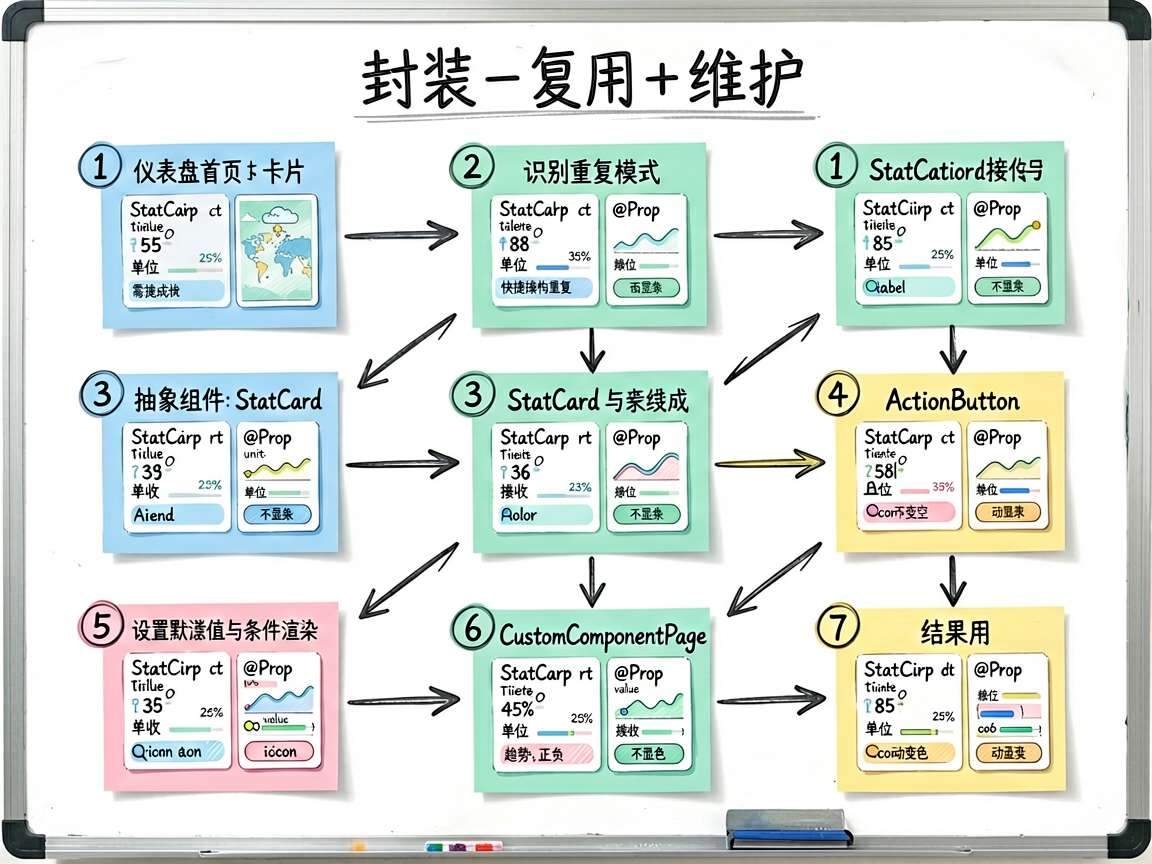
设计要点:
- 用
@Prop接收外部参数,组件内部不修改这些值 - 给参数设默认值,使用时可以省略不重要的参数
trend为空时不渲染趋势文本(if (this.trend))- 趋势值的颜色根据正负号自动判断
ActionButton 组件
@Component
struct ActionButton {
  @Prop label: string = ''
  @Prop color: string = '#4D96FF'
  @Prop icon: string = ''

  build() {
    Column() {
      Text(this.icon).fontSize(28)
      Text(this.label).fontSize(12)
        .fontColor('#666666').margin({ top: 4 })
    }
    .width(70).height(70).backgroundColor('#F8F9FA').borderRadius(12)
    .justifyContent(FlexAlign.Center).alignItems(HorizontalAlign.Center)
  }
}
ActionButton 更简单——一个图标加一个标签,固定大小,圆角容器。
使用封装后的组件
封装好之后,使用方代码变得极其简洁:
@Entry
@Component
struct CustomComponentPage {
  build() {
    Column() {
      Scroll() {
        Column() {
          Text('自定义组件')
            .fontSize(18).fontWeight(FontWeight.Bold).margin({ bottom: 8 })

          Column() {
            Text('统计数据卡片 (StatCard)')
              .fontSize(14).fontWeight(FontWeight.Medium).margin({ bottom: 8 })
            Row({ space: 8 }) {
              StatCard({
                title: '总用户', value: '12.8', unit: '万',
                color: '#4D96FF', trend: '+12.5%'
              })
              StatCard({
                title: '活跃度', value: '86.5', unit: '%',
                color: '#6BCB77', trend: '+3.2%'
              })
            }.width('100%')
            Row({ space: 8 }) {
              StatCard({
                title: '转化率', value: '5.2', unit: '%',
                color: '#FFA500', trend: '-0.8%'
              })
              StatCard({
                title: '满意度', value: '4.8', unit: '分',
                color: '#9B59B6', trend: '+0.3'
              })
            }.width('100%').margin({ top: 8 })
          }
          .width('100%').backgroundColor('#FFFFFF').borderRadius(12).padding(16)

          Column() {
            Text('快捷操作 (ActionButton)')
              .fontSize(14).fontWeight(FontWeight.Medium).margin({ bottom: 8 })
            Row({ space: 12 }) {
              ActionButton({ icon: '\u{1F4CA}', label: '统计' })
              ActionButton({ icon: '\u{1F4DD}', label: '笔记' })
              ActionButton({ icon: '\u{1F4F7}', label: '拍照' })
              ActionButton({ icon: '\u{2699}\u{FE0F}', label: '设置' })
            }
            .width('100%').justifyContent(FlexAlign.SpaceEvenly)
          }
          .width('100%').backgroundColor('#FFFFFF').borderRadius(12)
          .padding(16).margin({ top: 10 })
        }
        .width('100%')
      }
      .layoutWeight(1)
    }
    .width('100%').height('100%').backgroundColor('#F5F6FA').padding(16)
  }
}
对比反面教材,代码量减少了一大半,而且语义清晰——一看就知道这里是四个统计卡片加四个快捷按钮。
原理解析
@Component 和 @Entry 的区别
@Component:标记为自定义组件,可以被其他组件引用@Entry:标记为页面入口组件,可以直接被路由导航到
一个组件可以同时标记 @Entry 和 @Component,但只有入口页面需要 @Entry。
@Prop 的单向数据流
@Prop 是父到子的单向传递。父组件修改了值,子组件会更新;子组件修改 @Prop 变量不会影响父组件。这保证了组件的数据流向清晰可控。
组件的复用粒度
封装组件时要考虑"粒度"——太大则不够灵活,太小则收益不明显。经验法则:
- 5 行以下的 UI 片段:用
@Builder就够了 - 5~30 行的 UI 结构:封装为
@Component - 30 行以上的复杂结构:考虑拆分为多个子组件组合
实践清单
封装自定义组件时,逐项检查:
- 组件命名语义化(StatCard 而非 MyComponent1)
- 暴露的
@Prop参数都有默认值 - 组件内部不持有业务逻辑(纯展示型最佳)
- 样式参数可配置(颜色、大小、边距等)
- 考虑了空值和无数据的情况
- 文档或注释说明了用法
检查表格
| 维度 | 好的组件 | 差的组件 |
|---|---|---|
| 命名 | StatCard、ActionButton | MyComp、View1 |
| 参数 | 有默认值,类型明确 | 全部必填,缺一个就报错 |
| 职责 | 单一职责(展示统计数据) | 又展示又请求又处理逻辑 |
| 样式 | 颜色、大小可配置 | 写死颜色和尺寸 |
| 复用性 | 多处使用无副作用 | 依赖外部特定状态 |
写在最后
自定义组件封装是提升开发效率的利器。好的组件设计让使用者一看参数就知道怎么用,不用看实现细节。StatCard 和 ActionButton 这种小而精的组件,是项目中最常被复用的"积木块"。养成封装习惯,代码质量自然就上去了。

讨论HarmonyOS开发技术,专注于API与组件、DevEco Studio、测试、元服务和应用上架分发等。
更多推荐
 9
9 0
0- 0


 已为社区贡献100条内容

所有评论(0)