HarmonyOS7 UI 布局:Gauge 仪表盘组件实现数据可视化面板
·
前言
仪表盘是一种常见的数据可视化形式——CPU 使用率、汽车时速、电池电量,用半圆形的表盘来展示数值大小,直观又有科技感。ArkUI 提供了 Gauge 组件,几行代码就能画出一个带刻度和颜色渐变的仪表盘。
这篇文章用 Gauge 做一个"CPU 使用率监控面板",支持手动调整数值,并根据阈值显示不同的状态提示。
效果预览
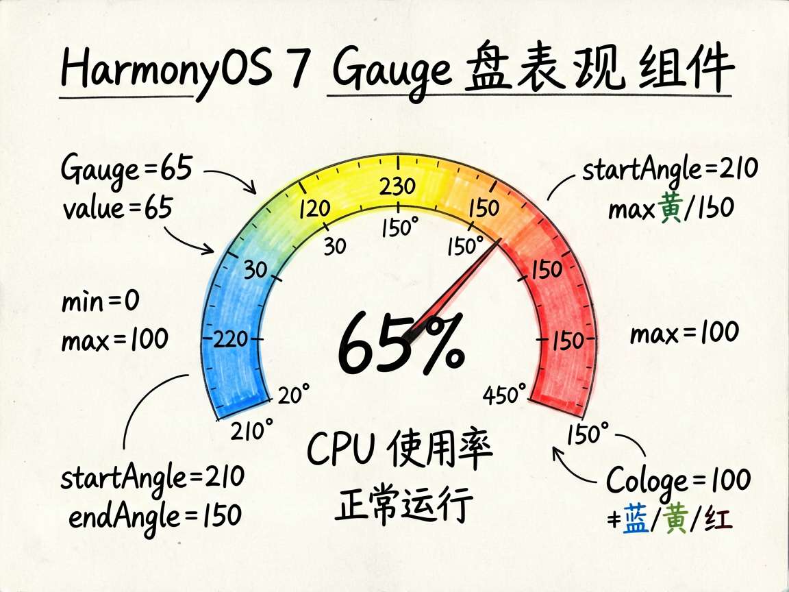
最终效果:
- 一个 210° ~ 150° 的半圆仪表盘
- 颜色从蓝(低值)渐变到黄(中值)再到红(高值)
- 中央显示当前数值的百分比
- 下方有状态提示(正常/警告/危险)
- 通过滑块或按钮调整数值
布局思路
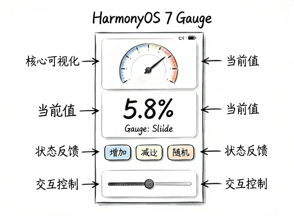
Column(居中布局)
├── Gauge 仪表盘(核心)
├── 数值文本(大字号)
├── 状态标签
├── 操作按钮(增加/减少/随机)
└── Slider 滑块
逐步实现
Gauge 组件配置
Gauge({ value: this.gaugeValue, min: 0, max: 100 })
  .width(200).height(200)
  .startAngle(210)          // 起始角度
  .endAngle(150)            // 结束角度
  .colors([
    ['#4D96FF', 1],         // 蓝色段
    ['#FFD93D', 1],         // 黄色段
    ['#FF6B6B', 1]          // 红色段
  ])
关键属性解读:
| 属性 | 说明 |
|---|---|
value | 当前值 |
min/max | 值域范围 |
startAngle | 仪表盘起始角度(0° = 3 点钟方向) |
endAngle | 仪表盘结束角度 |
colors | 颜色渐变段,格式为 [颜色, 权重][] |
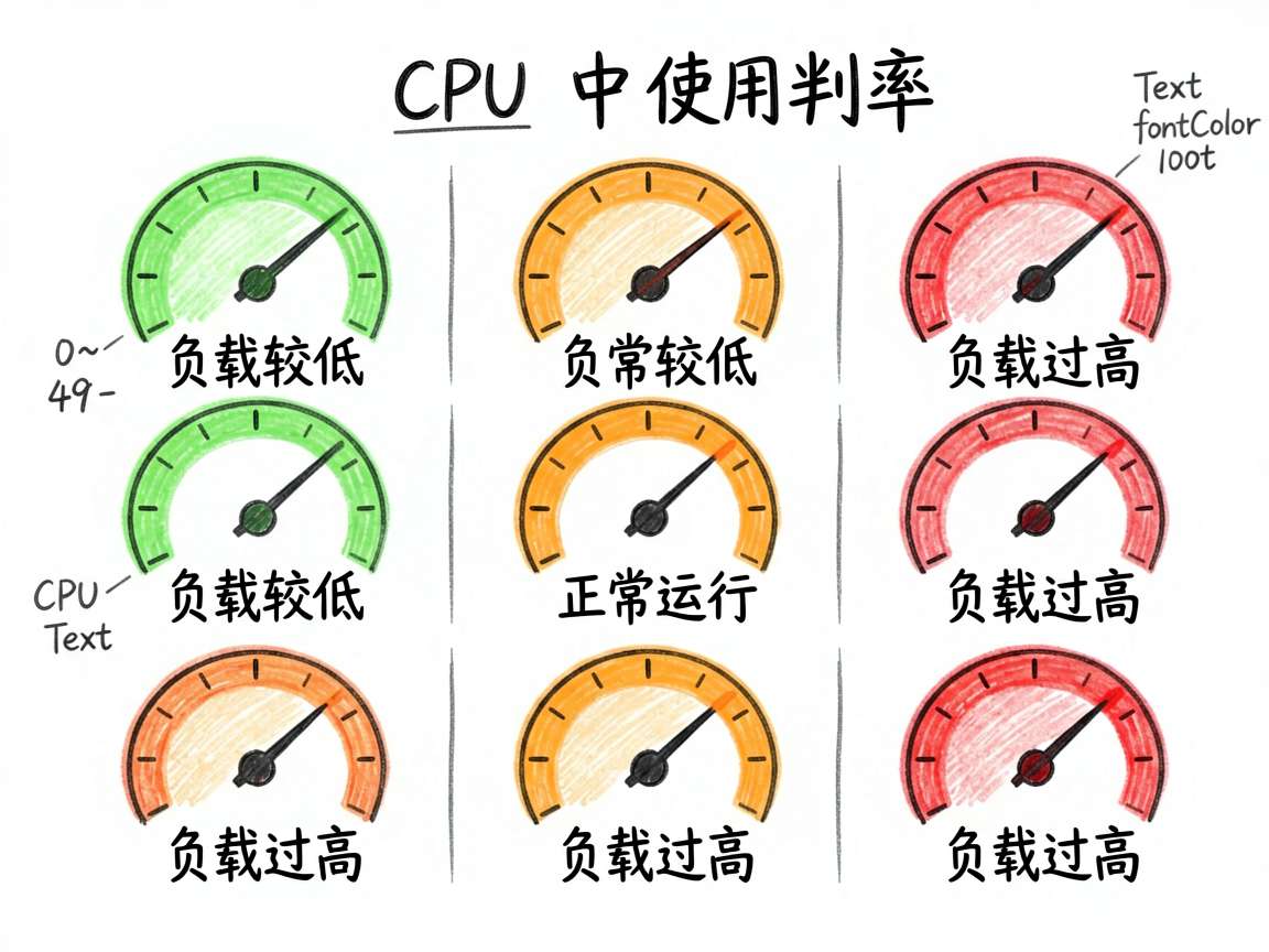
startAngle(210) 和 endAngle(150) 组合出一个大约 300° 的弧形——从左下角开始,顺时针到右下角结束,形成经典的仪表盘造型。
阈值状态判断
根据数值范围显示不同的状态提示:
Text(this.gaugeValue >= 80 ? '负载过高' :
     this.gaugeValue >= 50 ? '正常运行' : '负载较低')
  .fontSize(13)
  .fontColor(
    this.gaugeValue >= 80 ? '#FF6B6B' :
    this.gaugeValue >= 50 ? '#FFA500' : '#6BCB77'
  )
三个阈值区间:
- 0~49:绿色 “负载较低”
- 50~79:橙色 “正常运行”
- 80~100:红色 “负载过高”
完整页面代码
@Entry
@Component
struct GaugeDashboard {
  @State gaugeValue: number = 65
  @State gaugeLabel: string = 'CPU 使用率'

  build() {
    Column() {
      Scroll() {
        Column() {
          Text('Gauge 仪表盘')
            .fontSize(18).fontWeight(FontWeight.Bold).margin({ bottom: 8 })

          Column() {
            Text('仪表盘组件')
              .fontSize(14).fontWeight(FontWeight.Medium).margin({ bottom: 12 })

            Column() {
              Gauge({ value: this.gaugeValue, min: 0, max: 100 })
                .width(200).height(200)
                .startAngle(210)
                .endAngle(150)
                .colors([
                  ['#4D96FF', 1],
                  ['#FFD93D', 1],
                  ['#FF6B6B', 1]
                ])
            }
            .width('100%').alignItems(HorizontalAlign.Center)

            Text(`${this.gaugeValue}%`)
              .fontSize(40).fontWeight(FontWeight.Bold).fontColor('#4D96FF')
            Text(this.gaugeLabel)
              .fontSize(14).fontColor('#666666').margin({ top: 4 })

            Text(this.gaugeValue >= 80 ? '负载过高' :
                 this.gaugeValue >= 50 ? '正常运行' : '负载较低')
              .fontSize(13)
              .fontColor(this.gaugeValue >= 80 ? '#FF6B6B' :
                this.gaugeValue >= 50 ? '#FFA500' : '#6BCB77')
              .margin({ top: 4 })

            Row({ space: 8 }) {
              Button('增加').onClick(() => {
                this.gaugeValue = Math.min(100, this.gaugeValue + 10)
              })
              Button('减少').onClick(() => {
                this.gaugeValue = Math.max(0, this.gaugeValue - 10)
              })
              Button('随机').onClick(() => {
                this.gaugeValue = Math.floor(Math.random() * 100)
              })
            }
            .width('100%').justifyContent(FlexAlign.SpaceEvenly)
            .margin({ top: 16 })

            Text('拖拽滑块调整')
              .fontSize(11).fontColor('#666666').margin({ top: 8 })
            Slider({ value: $$this.gaugeValue, min: 0, max: 100, step: 1 })
              .trackColor('#E0E0E0').selectedColor('#4D96FF')
              .width('100%')
          }
          .width('100%').backgroundColor('#FFFFFF').borderRadius(12).padding(16)
        }
        .width('100%')
      }
      .layoutWeight(1)
    }
    .width('100%').height('100%').backgroundColor('#F5F6FA').padding(16)
  }
}
踩坑记录
坑1:角度设置不直观
startAngle 和 endAngle 使用的是标准数学角度——0° 在 3 点钟方向,逆时针增加。要画出一个常见的仪表盘弧形,需要理解这个角度系统。多试几次就能找到感觉。
坑2:colors 权重的理解
colors 数组中每项的第二个参数是权重,不是百分比。[蓝, 1], [黄, 1], [红, 1] 表示三等分。如果想让蓝色段占更多,可以写成 [蓝, 2], [黄, 1], [红, 1]。
坑3:数值动画
Gauge 组件本身没有内置的数值过渡动画。如果需要指针平滑旋转,可以配合 animateTo 显式添加动画:
Button('随机').onClick(() => {
  animateTo({ duration: 500, curve: Curve.EaseOut }, () => {
    this.gaugeValue = Math.floor(Math.random() * 100)
  })
})
写在最后
Gauge 组件让仪表盘这种看似复杂的可视化效果变得触手可及。不需要 Canvas 绘图,不需要第三方库,ArkUI 原生就支持。在做监控面板、健康数据展示、性能分析这类页面时,Gauge 能给你的应用增添一份专业感。

讨论HarmonyOS开发技术,专注于API与组件、DevEco Studio、测试、元服务和应用上架分发等。
更多推荐

 6
6 0
0- 0


 已为社区贡献100条内容

所有评论(0)