HarmonyOS 6(API 23)实战:从零构建企业级自定义导航栏——沉浸式体验、动态主题与多设备适配全解析
文章目录

每日一句正能量
只要你仍愿向未知敞开一扇窗,光就可能从意想不到的方向照进来。
“仍愿”——不是一时,是持续。封闭是安全的,但也是暗的。敞开会有风沙,但光也是这么进来的。
摘要
摘要:在 HarmonyOS 应用开发中,系统默认的 Navigation 组件虽然能够快速搭建页面框架,但在追求极致用户体验的商业级应用中,开发者往往面临导航栏样式单一、沉浸式体验不足、多设备适配困难等痛点。本文基于 HarmonyOS 6(API 23)最新能力,从窗口层配置到 UI 组件封装,系统性地讲解如何构建一套支持沉浸式背景、动态主题切换、多设备自适应的企业级自定义导航栏方案。文章涵盖完整的 WindowManager 工具类封装、安全区自动计算、折叠屏适配策略以及性能优化最佳实践,提供可直接落地的工程代码。
一、系统导航栏现状与痛点分析
1.1 系统默认导航栏的局限性
HarmonyOS 提供的 Navigation 组件是快速开发的首选,但在实际商业项目中,开发者常遇到以下问题:
| 痛点 | 具体表现 | 影响 |
|---|---|---|
| 样式固化 | 标题栏背景色、字体、按钮样式受系统限制 | 难以实现品牌视觉统一 |
| 沉浸式缺失 | 状态栏与标题栏物理割裂,存在明显色块边界 | 视觉体验断层,高端感不足 |
| 动态适配弱 | 深色模式、横竖屏切换时状态栏颜色无法自动适配 | 需要逐页手动处理 |
| 多设备差异大 | 手机、折叠屏、平板的状态栏/导航条高度不一致 | 布局错位、内容遮挡 |
| 交互扩展难 | 难以在导航栏中嵌入搜索框、分段控件、头像等复杂元素 | 交互效率受限 |
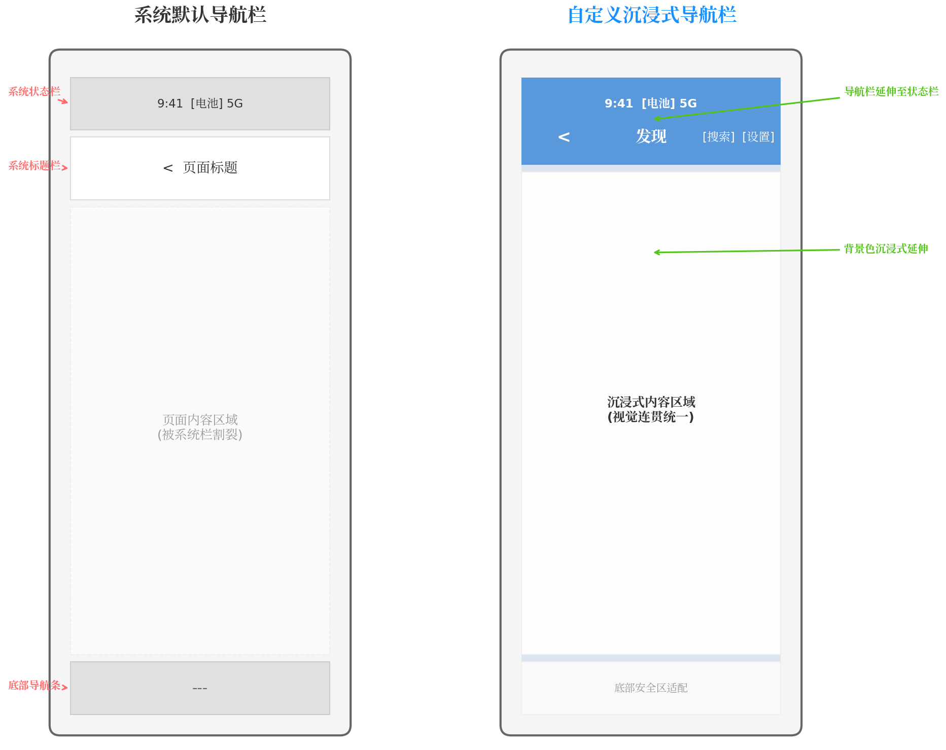
图1:左侧为系统默认导航栏,状态栏、标题栏、底部导航条各自独立,视觉割裂;右侧为自定义沉浸式导航栏,背景色延伸至状态栏,视觉连贯统一。
1.2 自定义导航栏的核心价值
通过完全自定义导航栏,开发者可以:
- 实现品牌视觉统一:将导航栏背景与应用主题色融合,支持渐变、毛玻璃、图片背景等高级效果
- 提升屏幕利用率:导航栏内容延伸至状态栏区域,增加有效显示高度约 24–32 vp
- 增强交互灵活性:自由组合返回按钮、标题、搜索框、操作按钮、头像等组件
- 保证多设备一致性:通过安全区计算自动适配手机、折叠屏、平板等多种形态
二、沉浸式自定义导航栏架构设计
2.1 整体架构分层
为了实现高内聚、低耦合的自定义导航栏方案,我们将架构划分为三层:
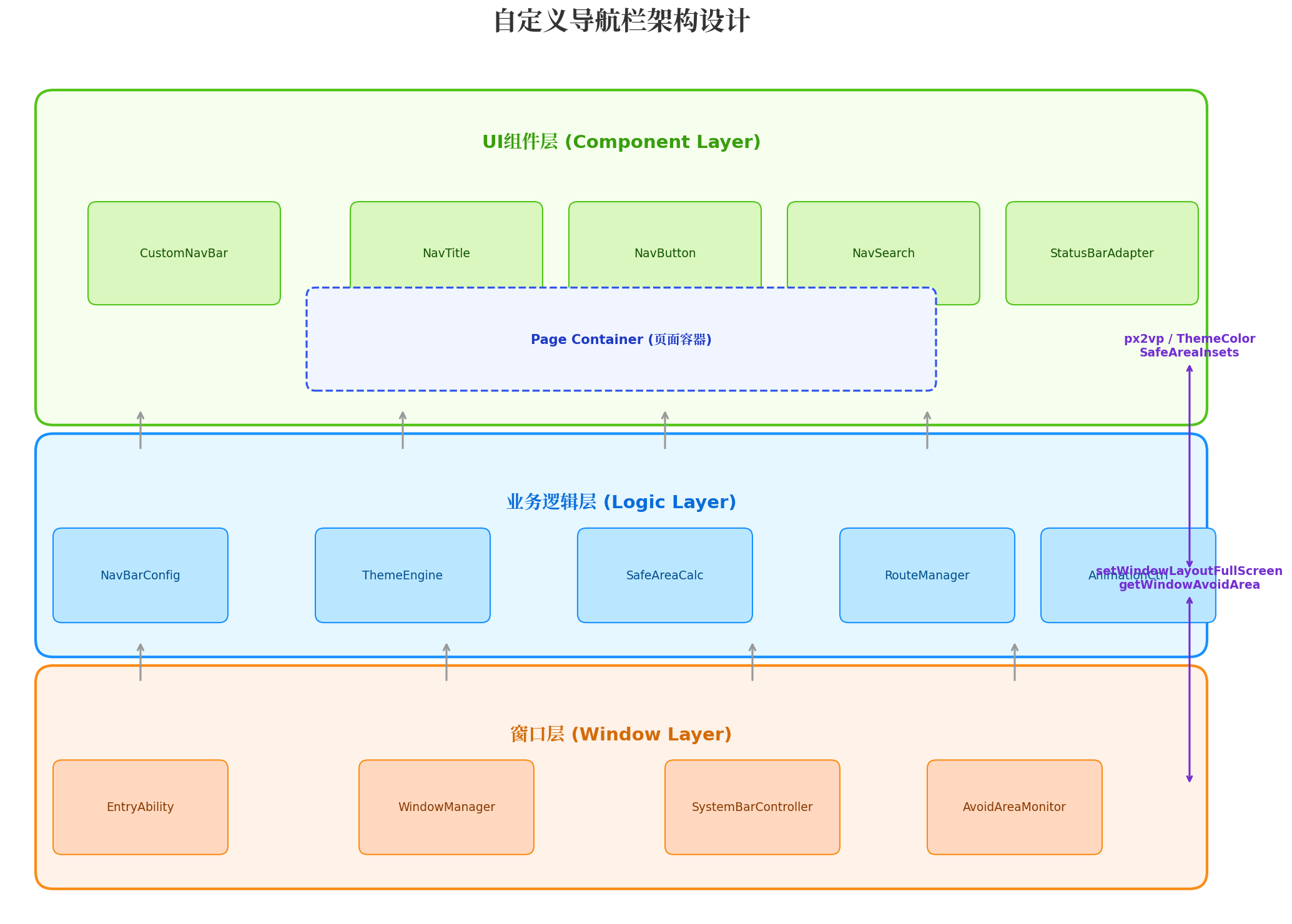
图2:自定义导航栏三层架构。窗口层负责与系统 Window 交互,业务逻辑层处理主题、安全区、路由等通用逻辑,UI 组件层提供可复用的导航栏原子组件。
窗口层(Window Layer)
EntryAbility:应用入口,负责初始化窗口配置WindowManager:封装窗口全屏、状态栏属性设置等操作SystemBarController:状态栏/导航条的显隐与颜色控制AvoidAreaMonitor:监听安全区变化(如折叠屏展开/收起)
业务逻辑层(Logic Layer)
NavBarConfig:导航栏配置项(高度、背景、按钮等)ThemeEngine:主题引擎,管理深浅色模式与品牌色SafeAreaCalc:安全区计算,将 px 转换为 vpRouteManager:路由管理,控制返回按钮显隐与页面标题AnimationCtrl:导航栏显隐/变色动画控制
UI 组件层(Component Layer)
CustomNavBar:自定义导航栏容器组件NavTitle:标题组件,支持主标题/副标题NavButton:导航按钮组件,支持图标/文字混合NavSearch:嵌入式搜索框组件StatusBarAdapter:状态栏颜色自适应组件
三、核心实现:窗口级沉浸式配置
3.1 窗口全屏与系统栏隐藏
实现沉浸式导航栏的第一步是在 EntryAbility 中开启窗口全屏模式,并隐藏系统默认的标题栏。
// entry/src/main/ets/entryability/EntryAbility.ets
import { AbilityConstant, UIAbility, Want } from '@kit.AbilityKit';
import { window } from '@kit.ArkUI';
import { WindowManager } from '../utils/WindowManager';

export default class EntryAbility extends UIAbility {
  onWindowStageCreate(windowStage: window.WindowStage): void {
    windowStage.loadContent('pages/Index', (err) => {
      if (err.code) {
        console.error('Failed to load the content:', JSON.stringify(err));
        return;
      }
    });

    const mainWindow = windowStage.getMainWindowSync();
    WindowManager.setupImmersive(mainWindow);
  }

  onWindowStageDestroy(): void {
    WindowManager.destroy();
  }
}
3.2 WindowManager 工具类封装
WindowManager 是整个方案的核心工具类,负责窗口配置、安全区获取、状态栏属性设置等底层操作。
// entry/src/main/ets/utils/WindowManager.ets
import { window } from '@kit.ArkUI';
import { BusinessError } from '@kit.BasicServicesKit';

export class WindowManager {
  private static windowInstance: window.Window | null = null;
  private static avoidAreaCallback: ((data: window.AvoidAreaOptions) => void) | null = null;

  static setupImmersive(win: window.Window): void {
    this.windowInstance = win;
    try {
      win.setWindowLayoutFullScreen(true);
      win.setWindowSystemBarProperties({
        statusBarColor: '#00000000',
        statusBarContentColor: '#FFFFFF',
        navigationBarColor: '#00000000',
        navigationBarContentColor: '#FFFFFF'
      });
      win.setWindowSystemBarEnable(['status', 'navigationIndicator']);
      this.cacheSafeArea(win);

      this.avoidAreaCallback = (data: window.AvoidAreaOptions) => {
        if (data.type === window.AvoidAreaType.TYPE_SYSTEM) {
          AppStorage.setOrCreate('safeTop', px2vp(data.area.topRect.height));
        }
        if (data.type === window.AvoidAreaType.TYPE_NAVIGATION_INDICATOR) {
          AppStorage.setOrCreate('safeBottom', px2vp(data.area.bottomRect.height));
        }
      };
      win.on('avoidAreaChange', this.avoidAreaCallback);
    } catch (err) {
      console.error('WindowManager setup failed:', (err as BusinessError).message);
    }
  }

  private static cacheSafeArea(win: window.Window): void {
    const systemArea = win.getWindowAvoidArea(window.AvoidAreaType.TYPE_SYSTEM);
    const navArea = win.getWindowAvoidArea(window.AvoidAreaType.TYPE_NAVIGATION_INDICATOR);
    AppStorage.setOrCreate('safeTop', px2vp(systemArea.topRect.height));
    AppStorage.setOrCreate('safeBottom', px2vp(navArea.bottomRect.height));
    AppStorage.setOrCreate('safeLeft', px2vp(systemArea.leftRect.width));
    AppStorage.setOrCreate('safeRight', px2vp(systemArea.rightRect.width));
  }

  static setStatusBarContentColor(color: string): void {
    if (!this.windowInstance) return;
    this.windowInstance.setWindowSystemBarProperties({
      statusBarContentColor: color
    });
  }

  static getWindowInstance(): window.Window | null {
    return this.windowInstance;
  }

  static destroy(): void {
    if (this.windowInstance && this.avoidAreaCallback) {
      this.windowInstance.off('avoidAreaChange', this.avoidAreaCallback);
    }
    this.windowInstance = null;
    this.avoidAreaCallback = null;
  }
}
关键注意点:
setWindowLayoutFullScreen(true)是沉浸式的基础,开启后内容将延伸至状态栏和导航条下方px2vp()转换必不可少:getWindowAvoidArea返回的是物理像素 px,而 ArkUI 布局使用 vp,必须通过px2vp()转换avoidAreaChange监听:折叠屏展开/收起、分屏、旋转等场景会导致安全区高度变化,必须动态监听并更新
四、自定义导航栏组件封装
4.1 CustomNavBar 核心组件
CustomNavBar 是整个方案的核心 UI 组件,它负责渲染导航栏背景、状态栏占位、标题区域和操作按钮。
// entry/src/main/ets/components/CustomNavBar.ets
import { window } from '@kit.ArkUI';

// 导航栏配置接口
export interface NavBarOptions {
  title?: string;
  subTitle?: string;
  backgroundColor?: ResourceColor;
  backgroundImage?: ResourceStr;
  backgroundBlur?: number; // 毛玻璃模糊程度 0-1
  titleColor?: ResourceColor;
  leftButtons?: NavButtonItem[];
  rightButtons?: NavButtonItem[];
  showBackButton?: boolean;
  onBack?: () => void;
  enableStatusBarAdapt?: boolean; // 是否自动适配状态栏文字颜色
}

export interface NavButtonItem {
  icon?: ResourceStr;
  text?: string;
  action: () => void;
}

@Component
export struct CustomNavBar {
  @Prop options: NavBarOptions;
  @StorageProp('safeTop') safeTop: number = 0;
  @StorageProp('safeBottom') safeBottom: number = 0;
  @State statusBarContentColor: string = '#FFFFFF';

  // 导航栏总高度 = 状态栏高度 + 内容区高度(默认 56vp)
  private readonly NAV_CONTENT_HEIGHT: number = 56;

  aboutToAppear() {
    if (this.options.enableStatusBarAdapt !== false) {
      this.adaptStatusBarColor();
    }
  }

  // 根据背景色亮度自动设置状态栏文字颜色
  private adaptStatusBarColor(): void {
    const bgColor = this.options.backgroundColor?.toString() ?? '#4A90D9';
    const isDark = this.isDarkColor(bgColor);
    const targetColor = isDark ? '#FFFFFF' : '#000000';
    this.statusBarContentColor = targetColor;
    WindowManager.setStatusBarContentColor(targetColor);
  }

  // 简单判断颜色亮度(实际项目中可使用更精确的算法)
  private isDarkColor(color: string): boolean {
    const hex = color.replace('#', '');
    if (hex.length < 6) return true;
    const r = parseInt(hex.substring(0, 2), 16);
    const g = parseInt(hex.substring(2, 4), 16);
    const b = parseInt(hex.substring(4, 6), 16);
    const brightness = (r * 299 + g * 587 + b * 114) / 1000;
    return brightness < 128;
  }

  build() {
    Stack({ alignContent: Alignment.TopStart }) {
      // 背景层:支持纯色、图片、毛玻璃
      if (this.options.backgroundImage) {
        Image(this.options.backgroundImage)
          .width('100%')
          .height(this.safeTop + this.NAV_CONTENT_HEIGHT)
          .objectFit(ImageFit.Cover)
          .expandSafeArea([SafeAreaType.SYSTEM], [SafeAreaEdge.TOP])
      } else {
        Column()
          .width('100%')
          .height(this.safeTop + this.NAV_CONTENT_HEIGHT)
          .backgroundColor(this.options.backgroundColor ?? '#4A90D9')
          .expandSafeArea([SafeAreaType.SYSTEM], [SafeAreaEdge.TOP])
      }

      // 毛玻璃遮罩层
      if (this.options.backgroundBlur && this.options.backgroundBlur > 0) {
        Column()
          .width('100%')
          .height(this.safeTop + this.NAV_CONTENT_HEIGHT)
          .backgroundBlurStyle(BlurStyle.Thin, { colorMode: ThemeColorMode.Light, adaptiveColor: AdaptiveColor.Default })
          .opacity(this.options.backgroundBlur)
      }

      // 内容层
      Row() {
        // 左侧按钮区
        Row({ space: 8 }) {
          if (this.options.showBackButton !== false) {
            NavButton({
              icon: $r('app.media.ic_back'),
              action: () => {
                if (this.options.onBack) {
                  this.options.onBack();
                } else {
                  // 默认返回上一页
                  const nav = AppStorage.get<NavPathStack>('navPathStack');
                  nav?.pop();
                }
              }
            })
          }
          ForEach(this.options.leftButtons ?? [], (btn: NavButtonItem) => {
            NavButton({ icon: btn.icon, text: btn.text, action: btn.action })
          })
        }
        .layoutWeight(1)
        .justifyContent(FlexAlign.Start)

        // 中间标题区
        Column({ space: 2 }) {
          if (this.options.title) {
            Text(this.options.title)
              .fontSize(18)
              .fontWeight(FontWeight.Bold)
              .fontColor(this.options.titleColor ?? '#FFFFFF')
              .maxLines(1)
              .textOverflow({ overflow: TextOverflow.Ellipsis })
          }
          if (this.options.subTitle) {
            Text(this.options.subTitle)
              .fontSize(12)
              .fontColor((this.options.titleColor ?? '#FFFFFF') as string + 'CC')
              .maxLines(1)
          }
        }
        .layoutWeight(2)
        .alignItems(HorizontalAlign.Center)

        // 右侧按钮区
        Row({ space: 8 }) {
          ForEach(this.options.rightButtons ?? [], (btn: NavButtonItem) => {
            NavButton({ icon: btn.icon, text: btn.text, action: btn.action })
          })
        }
        .layoutWeight(1)
        .justifyContent(FlexAlign.End)
      }
      .width('100%')
      .height(this.NAV_CONTENT_HEIGHT)
      .padding({ left: 16, right: 16 })
      .margin({ top: this.safeTop })
      .zIndex(10)
    }
    .width('100%')
    .height(this.safeTop + this.NAV_CONTENT_HEIGHT)
  }
}
4.2 NavButton 原子组件
// entry/src/main/ets/components/NavButton.ets
@Component
export struct NavButton {
  @Prop icon?: ResourceStr;
  @Prop text?: string;
  @Prop action: () => void = () => {};
  @Prop tintColor: ResourceColor = '#FFFFFF';

  build() {
    Button({ type: ButtonType.Circle }) {
      if (this.icon) {
        Image(this.icon)
          .width(24)
          .height(24)
          .fillColor(this.tintColor)
      } else if (this.text) {
        Text(this.text)
          .fontSize(14)
          .fontColor(this.tintColor)
      }
    }
    .width(40)
    .height(40)
    .backgroundColor('rgba(255,255,255,0.1)')
    .onClick(() => this.action())
  }
}
五、动态主题与状态栏适配
5.1 主题引擎设计
在实际项目中,导航栏需要支持多种主题模式:浅色、深色、跟随系统。我们通过 ThemeEngine 统一管理颜色资源。
// entry/src/main/ets/utils/ThemeEngine.ets
import { configuration } from '@kit.ArkUI';

export enum ThemeMode {
  LIGHT = 'light',
  DARK = 'dark',
  SYSTEM = 'system'
}

export class ThemeEngine {
  private static currentMode: ThemeMode = ThemeMode.SYSTEM;

  static init(mode: ThemeMode = ThemeMode.SYSTEM): void {
    this.currentMode = mode;
    if (mode === ThemeMode.SYSTEM) {
      const ctx = getContext();
      const config = ctx.config;
      const isDark = config.colorMode === configuration.ConfigurationConstant.ColorMode.COLOR_MODE_DARK;
      AppStorage.setOrCreate('isDarkMode', isDark);
    } else {
      AppStorage.setOrCreate('isDarkMode', mode === ThemeMode.DARK);
    }
  }

  static getNavBarColors(isDark: boolean): NavBarThemeColors {
    return isDark ? {
      background: '#1F1F1F',
      title: '#FFFFFF',
      button: '#D9D9D9',
      statusBarContent: '#FFFFFF'
    } : {
      background: '#4A90D9',
      title: '#FFFFFF',
      button: '#FFFFFF',
      statusBarContent: '#FFFFFF'
    };
  }
}

interface NavBarThemeColors {
  background: string;
  title: string;
  button: string;
  statusBarContent: string;
}
5.2 页面级主题切换
当页面滚动时,导航栏背景可能需要从透明变为实色,同时状态栏文字颜色也要相应切换。
// 在页面中使用 onScroll 监听实现导航栏渐变
@Entry
@Component
struct DetailPage {
  @State scrollY: number = 0;
  @State navOpacity: number = 0;
  @State navBgColor: string = '#4A90D9';
  @State titleColor: string = '#FFFFFF';
  private readonly THRESHOLD: number = 150; // 滚动阈值

  onScrollScroll(event: ScrollEvent) {
    this.scrollY = event.yOffset;
    const ratio = Math.min(this.scrollY / this.THRESHOLD, 1);
    this.navOpacity = ratio;
    // 当背景变为浅色时,切换状态栏文字为黑色
    if (ratio > 0.5) {
      WindowManager.setStatusBarContentColor('#000000');
      this.titleColor = '#333333';
    } else {
      WindowManager.setStatusBarContentColor('#FFFFFF');
      this.titleColor = '#FFFFFF';
    }
  }

  build() {
    Stack({ alignContent: Alignment.TopStart }) {
      Scroll() {
        Column() {
          // 顶部大图区域
          Image($r('app.media.banner'))
            .width('100%')
            .height(250)
            .objectFit(ImageFit.Cover)

          // 内容区域
          Column({ space: 16 }) {
            Text('文章标题')
              .fontSize(22)
              .fontWeight(FontWeight.Bold)
            Text('这里是详细内容...')
              .fontSize(16)
              .fontColor('#666666')
          }
          .padding(16)
          .backgroundColor('#FFFFFF')
          .borderRadius({ topLeft: 16, topRight: 16 })
          .margin({ top: -20 })
        }
        .width('100%')
      }
      .scrollBar(BarState.Off)
      .onScroll((event) => this.onScrollScroll(event))

      // 浮动导航栏
      CustomNavBar({
        options: {
          title: '详情页',
          backgroundColor: this.navBgColor,
          titleColor: this.titleColor,
          showBackButton: true,
          enableStatusBarAdapt: false // 手动控制
        }
      })
      .opacity(this.navOpacity)
      .animation({ duration: 200, curve: Curve.EaseInOut })
    }
    .width('100%')
    .height('100%')
  }
}
六、多设备适配与折叠屏兼容
6.1 安全区适配策略
HarmonyOS 6 提供了 expandSafeArea 和 SafeArea 组件两种安全区适配方案。在我们的自定义导航栏中,采用 “背景延伸 + 内容避让” 的组合策略:
- 背景层:使用
expandSafeArea将背景色/背景图延伸至状态栏和导航条区域 - 内容层:通过
AppStorage获取的安全区高度设置padding/margin,确保交互元素不被遮挡
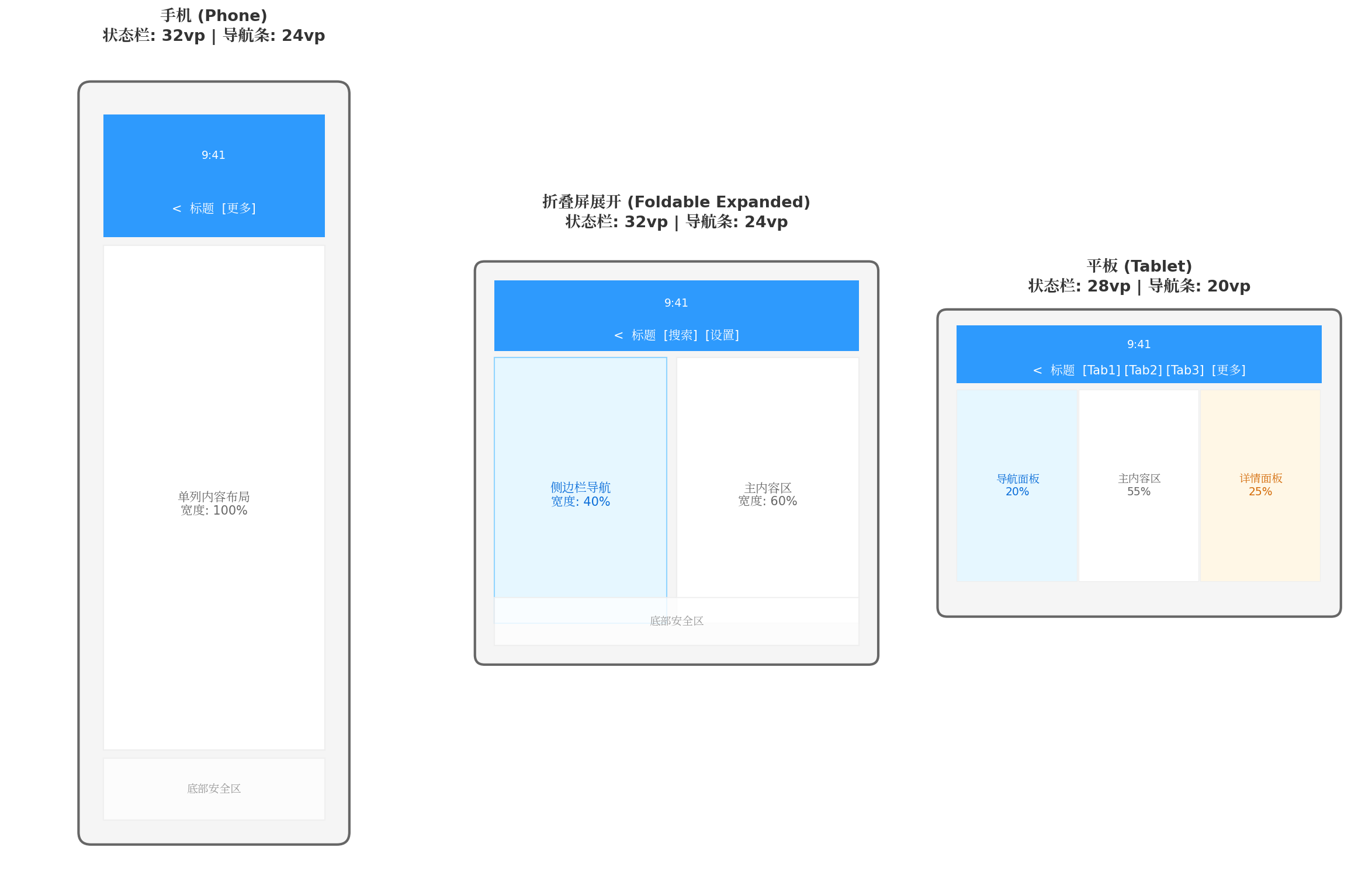
图4:多设备适配策略。手机采用单列布局,导航栏全宽延伸;折叠屏展开后采用双栏布局,导航栏宽度自适应;平板采用三栏布局,导航栏集成 Tab 切换。
6.2 折叠屏专项适配
折叠屏设备在展开/收起时,窗口尺寸和安全区会发生显著变化。我们需要在 EntryAbility 中监听配置变更:
// entry/src/main/ets/entryability/EntryAbility.ets
export default class EntryAbility extends UIAbility {
  onConfigurationUpdate(newConfig: Configuration): void {
    // 屏幕尺寸变化时重新计算安全区
    const win = WindowManager.getWindowInstance();
    if (win) {
      WindowManager.cacheSafeArea(win);
    }

    // 通知所有页面更新布局
    AppStorage.setOrCreate('screenWidth', px2vp(newConfig.windowMetrics?.width ?? 0));
    AppStorage.setOrCreate('screenHeight', px2vp(newConfig.windowMetrics?.height ?? 0));
  }
}
6.3 响应式导航栏布局
利用 ArkUI 的响应式布局能力,根据屏幕宽度动态调整导航栏内部结构:
@Component
struct ResponsiveNavBar {
  @StorageProp('screenWidth') screenWidth: number = 400;

  build() {
    CustomNavBar({
      options: {
        title: this.screenWidth > 600 ? 'HarmonyOS 企业级应用平台' : '首页',
        rightButtons: this.screenWidth > 600 ? [
          { text: '搜索', action: () => {} },
          { text: '消息', action: () => {} },
          { text: '我的', action: () => {} }
        ] : [
          { icon: $r('app.media.ic_more'), action: () => {} }
        ]
      }
    })
  }
}
七、完整实战案例
7.1 电商首页场景
以下是一个完整的电商首页实现,包含渐变沉浸式导航栏、搜索框嵌入、分类 Tab 集成:
// entry/src/main/ets/pages/HomePage.ets
import { CustomNavBar, NavBarOptions } from '../components/CustomNavBar';

@Entry
@Component
struct HomePage {
  @State selectedTab: number = 0;
  private tabs: string[] = ['推荐', '手机', '电脑', '家电', '服饰'];

  build() {
    Column() {
      // 自定义导航栏(渐变背景 + 嵌入式搜索框)
      Stack({ alignContent: Alignment.Bottom }) {
        Column()
          .width('100%')
          .height(120)
          .linearGradient({
            direction: GradientDirection.Top,
            colors: [['#FF6B6B', 0.0], ['#4A90D9', 1.0]]
          })
          .expandSafeArea([SafeAreaType.SYSTEM], [SafeAreaEdge.TOP])

        Row({ space: 12 }) {
          Image($r('app.media.ic_logo'))
            .width(32)
            .height(32)
            .borderRadius(16)

          // 嵌入式搜索框
          Search({ placeholder: '搜索商品、品牌' })
            .width('60%')
            .height(36)
            .backgroundColor('rgba(255,255,255,0.25)')
            .placeholderColor('#FFFFFF')
            .textColor('#FFFFFF')

          Image($r('app.media.ic_scan'))
            .width(24)
            .height(24)
            .fillColor('#FFFFFF')

          Image($r('app.media.ic_cart'))
            .width(24)
            .height(24)
            .fillColor('#FFFFFF')
        }
        .width('100%')
        .height(56)
        .padding({ left: 16, right: 16 })
        .margin({ bottom: 8 })
      }
      .width('100%')
      .height(120)

      // 分类 Tab
      Row({ space: 16 }) {
        ForEach(this.tabs, (tab: string, index: number) => {
          Text(tab)
            .fontSize(index === this.selectedTab ? 16 : 14)
            .fontWeight(index === this.selectedTab ? FontWeight.Bold : FontWeight.Normal)
            .fontColor(index === this.selectedTab ? '#4A90D9' : '#666666')
            .onClick(() => this.selectedTab = index)
        })
      }
      .width('100%')
      .height(44)
      .padding({ left: 16, right: 16 })
      .scrollable(ScrollDirection.Horizontal)

      // 内容列表
      List({ space: 12 }) {
        ListItem() {
          Text('商品列表内容区域')
            .width('100%')
            .height(200)
            .backgroundColor('#F5F5F5')
            .textAlign(TextAlign.Center)
        }
      }
      .width('100%')
      .layoutWeight(1)
      .padding({ left: 16, right: 16 })
    }
    .width('100%')
    .height('100%')
    .backgroundColor('#FFFFFF')
  }
}
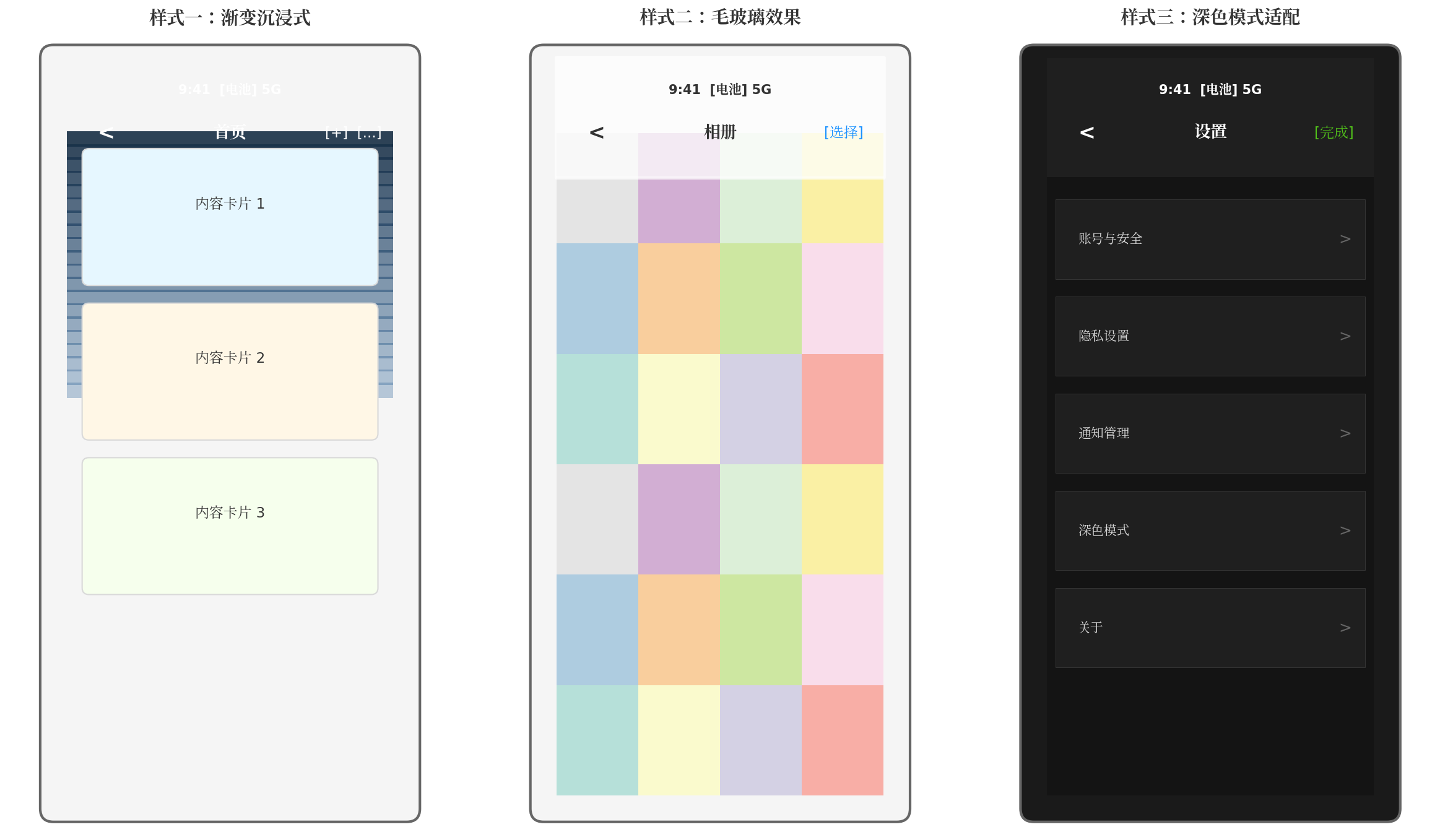
图3:三种典型自定义导航栏样式。左为渐变沉浸式,适用于首页/发现页;中为毛玻璃效果,适用于相册/内容浏览页;右为深色模式适配,适用于设置页/夜间场景。
八、性能优化与最佳实践
8.1 性能优化要点
| 优化项 | 方案 | 收益 |
|---|---|---|
| 避免重复计算安全区 | 在 EntryAbility 中一次性计算并写入 AppStorage |
减少每页 aboutToAppear 中的异步查询 |
| 导航栏背景缓存 | 使用 Image 组件的 objectFit 和 renderMode 控制渲染质量 |
降低 GPU 负载 |
| 状态栏颜色批量更新 | 避免在 onScroll 中频繁调用 setWindowSystemBarProperties |
减少 IPC 通信开销 |
| 组件复用 | 将 CustomNavBar 设计为 @Component 而非 @Entry |
支持多页面复用,减少内存占用 |
| 懒加载按钮 | 右侧操作按钮超过 2 个时使用菜单折叠 | 减少布局节点数 |
8.2 避坑指南
-
hideTitleBar(true)与setWindowLayoutFullScreen的区别:前者仅隐藏 Navigation 组件的标题栏,后者将窗口设为全屏。两者需配合使用才能实现真正的沉浸式。 -
折叠屏适配必监听
avoidAreaChange:折叠屏展开后,状态栏高度可能从 32vp 变为 0(部分设备),不监听会导致布局错位。 -
深色模式下的状态栏文字:当导航栏背景为深色时设置白色文字,背景为浅色时必须切换为黑色,否则状态栏时间/电量将不可见。
-
横屏安全区:横屏时状态栏可能位于左侧(刘海侧),需同时处理
safeLeft和safeRight。 -
API 版本兼容性:
expandSafeArea在 API 11+ 支持完整功能,低版本需使用setWindowLayoutFullScreen+ 手动 Padding 方案。
8.3 代码规范建议
// 推荐:将导航栏配置集中管理
export const NavBarConfigs: Record<string, NavBarOptions> = {
  home: {
    title: '首页',
    backgroundColor: '#4A90D9',
    showBackButton: false,
    rightButtons: [
      { icon: $r('app.media.ic_search'), action: () => router.pushUrl({ url: 'pages/Search' }) },
      { icon: $r('app.media.ic_notice'), action: () => router.pushUrl({ url: 'pages/Notice' }) }
    ]
  },
  detail: {
    title: '商品详情',
    backgroundColor: '#FFFFFF',
    titleColor: '#333333',
    showBackButton: true,
    enableStatusBarAdapt: true
  }
};
总结
本文从架构设计到代码实现,完整讲解了 HarmonyOS 6 下企业级自定义导航栏的构建方案。核心要点包括:
- 窗口层配置:通过
WindowManager封装setWindowLayoutFullScreen、setWindowSystemBarProperties等底层 API,实现全局沉浸式初始化 - 安全区管理:利用
getWindowAvoidArea获取系统安全区,结合px2vp转换和avoidAreaChange监听,确保折叠屏/旋转场景下的布局正确性 - 组件化封装:将导航栏拆分为
CustomNavBar、NavButton、NavTitle等原子组件,支持背景色/图片/毛玻璃多种模式 - 动态主题适配:根据背景色亮度自动计算状态栏文字颜色,支持深浅色模式切换和滚动渐变效果
- 多设备兼容:通过响应式布局和配置监听,实现手机、折叠屏、平板的自适应导航栏体验
自定义导航栏是 HarmonyOS 应用走向精品化的关键一步。希望本文的方案能够帮助开发者快速搭建出兼具视觉美感与交互效率的导航体系,为用户提供更沉浸、更统一的全场景体验。
转载自:https://blog.csdn.net/u014727709/article/details/163307921
欢迎 👍点赞✍评论⭐收藏,欢迎指正

讨论HarmonyOS开发技术,专注于API与组件、DevEco Studio、测试、元服务和应用上架分发等。
更多推荐
 2
2 0
0- 0


 已为社区贡献286条内容

所有评论(0)