HarmonyOS NEXT 企业级记账APP:封装 BillCard 通用组件
·
封装 BillCard 通用组件
本文是《HarmonyOS NEXT 企业级开发实战:30篇打造智能记账APP》系列的第 06 篇,对应 Git Tag v0.0.6。承接第 05 篇的首页占位 BillCard,本篇完善账单卡片组件,支持分类图标、金额语义色、备注展示与点击回调。
前言
BillCard 是记账应用使用频率最高的组件——首页列表、搜索结果、分类详情、统计明细都要用它。如果每次都复制一份代码,后期维护成本巨大。企业级项目必须 一次封装、处处复用。
本文将带你:
- 完善 BillCard 组件支持分类图标与备注
- 通过
@Prop+@BuilderParam暴露完整接口 - 添加长按手势回调(长按弹出删除菜单)
- 集成主题系统响应深色模式
- 编写组件自验证用例
企业级核心原则:公共组件必须 接口稳定、样式独立、可测试。参考 ArkUI 组件开发 了解官方约定。
一、BillCard 接口规划
1.1 完整接口设计
| Prop | 类型 | 必填 | 说明 |
|---|---|---|---|
billId | string | 是 | 账单 ID(用于回调定位) |
money | number | 是 | 金额(分) |
type | BillType | 是 | 收入/支出枚举 |
categoryName | string | 是 | 分类名称 |
categoryIcon | Resource | 否 | 分类图标,默认用 type 图标 |
remark | string | 否 | 备注,空则不渲染 |
date | string | 否 | 日期文字,空则不渲染 |
onClick | builder | 是 | 点击回调 |
onLongPress | builder | 否 | 长按回调 |
1.2 数据模型升级
// constants/BillType.ets
export enum BillType {
  EXPENSE = 'expense',
  INCOME = 'income'
}
// model/Bill.ets(升级版)
import { BillType } from '../constants/BillType';

export class Bill {
  id: string;
  money: number;        // 分
  type: BillType;
  categoryId: string;
  categoryName: string;
  categoryIcon: Resource = $r('app.media.icon_default');
  remark: string = '';
  date: number = Date.now();

  constructor(id: string, money: number, type: BillType, categoryId: string, categoryName: string) {
    this.id = id;
    this.money = money;
    this.type = type;
    this.categoryId = categoryId;
    this.categoryName = categoryName;
  }
}
设计要点:
Bill模型从 v0.0.5 占位升级为完整结构,后续 Repository 篇会用此模型持久化。
二、BillCard 组件实现
2.1 完整源码
// components/bill/BillCard.ets
import { BillType } from '../../constants/BillType';
import { AppColors } from '../../theme/Colors';
import { AppFontSize, AppFontWeight } from '../../theme/Typography';
import { AppSpace } from '../../theme/Spacing';
import { MoneyUtil } from '../../utils/MoneyUtil';

@Component
export struct BillCard {
  @Prop billId: string = '';
  @Prop money: number = 0;
  @Prop type: BillType = BillType.EXPENSE;
  @Prop categoryName: string = '';
  @Prop categoryIcon: Resource = $r('app.media.icon_default');
  @Prop remark: string = '';
  @Prop date: string = '';
  @BuilderParam onClick: () => void;
  @BuilderParam onLongPress: () => void;

  private getSemanticColor(): string {
    return this.type === BillType.INCOME ? AppColors.Income : AppColors.Expense;
  }

  build() {
    Row() {
      // 左侧:分类图标
      Column() {
        Image(this.categoryIcon)
          .width(40)
          .height(40)
          .fillColor(this.getSemanticColor())
      }
      .width(48)
      .height(48)
      .justifyContent(FlexAlign.Center)
      .alignItems(HorizontalAlign.Center)
      .backgroundColor(this.getSemanticColor() + '20')  // 20% 透明度
      .borderRadius(24)

      // 中间:分类名 + 备注 + 日期
      Column() {
        Text(this.categoryName)
          .fontSize(AppFontSize.MD)
          .fontColor(AppColors.PrimaryText)
          .fontWeight(AppFontWeight.Medium)
          .maxLines(1)
          .textOverflow({ overflow: TextOverflow.Ellipsis })

        if (this.remark.length > 0) {
          Text(this.remark)
            .fontSize(AppFontSize.SM)
            .fontColor(AppColors.SecondaryText)
            .margin({ top: 2 })
            .maxLines(1)
            .textOverflow({ overflow: TextOverflow.Ellipsis })
        }

        if (this.date.length > 0) {
          Text(this.date)
            .fontSize(AppFontSize.XS)
            .fontColor(AppColors.SecondaryText)
            .margin({ top: 2 })
        }
      }
      .layoutWeight(1)
      .alignItems(HorizontalAlign.Start)
      .margin({ left: AppSpace.MD })

      // 右侧:金额
      Text(`${this.type === BillType.INCOME ? '+' : '-'}¥${MoneyUtil.format(this.money)}`)
        .fontSize(AppFontSize.LG)
        .fontColor(this.getSemanticColor())
        .fontWeight(AppFontWeight.Bold)
    }
    .width('100%')
    .padding(AppSpace.CardPadding)
    .backgroundColor(AppColors.CardBackground)
    .borderRadius(AppSpace.CardRadius)
    .justifyContent(FlexAlign.SpaceBetween)
    .alignItems(HorizontalAlign.Center)
    .onClick(() => {
      this.onClick();
    })
    .gesture(
      LongPressGesture({ duration: 500 })
        .onAction(() => {
          if (this.onLongPress) {
            this.onLongPress();
          }
        })
    )
  }
}
2.2 关键实现解析
@Prop单向数据:父组件传入只读,BillCard 内不能修改@BuilderParam回调暴露:父组件传入函数,BillCard 内调用实现事件上报getSemanticColor方法:根据 type 动态返回语义色,避免重复三元判断if条件渲染:remark/date 为空时不占位,保持 UI 紧凑maxLines + textOverflow:长文本自动省略,防止破坏布局gesture长按:500ms 长按触发回调,兼容 onClick 与长按
三、分类图标占位
3.1 默认分类图标资源
entry/src/main/resources/base/media/
├─ icon_category_food.png      # �餐饮
├─ icon_category_transport.png # 交通
├─ icon_category_salary.png    # 工资
├─ icon_category_bonus.png     # 剔金
├─ icon_category_default.png   # 默认
3.2 分类图标使用约定
| 类型 | 图标 | 颜色处理 |
|---|---|---|
| 餐饮 | icon_category_food.png | 按 type 染色(绿/红) |
| 交通 | icon_category_transport.png | 按 type 染色 |
| 工资 | icon_category_salary.png | 绿色(收入) |
| 默认 | icon_category_default.png | 按 type 染色 |
图标规格:统一 40x40 PNG,白色单色,通过
fillColor染色。这样未选中、深色模式都能复用。
四、首页集成升级
4.1 HomeViewModel 升级
// viewmodel/HomeViewModel.ets(升级版)
import { Bill } from '../model/Bill';
import { BillType } from '../constants/BillType';
import { MoneyUtil } from '../utils/MoneyUtil';

export class HomeViewModel {
  todayExpense: string = '0.00';
  todayIncome: string = '0.00';
  recentBills: Bill[] = [];

  loadMockData(): void {
    const mockBills: Bill[] = [
      this.createMockBill('1', 3500, BillType.EXPENSE, 'food', '餐', '红烧肉套餐'),
      this.createMockBill('2', 8000, BillType.INCOME, 'salary', '工资', '今日工资'),
      this.createMockBill('3', 2500, BillType.EXPENSE, 'transport', '交通', '打车'),
      this.createMockBill('4', 4800, BillType.EXPENSE, 'food', '餐', '晚餐'),
      this.createMockBill('5', 60000, BillType.INCOME, 'bonus', '奖金', '项目奖')
    ];
    this.recentBills = mockBills;

    const expenseSum = mockBills.filter(b => b.type === BillType.EXPENSE)
      .reduce((sum, b) => sum + b.money, 0);
    const incomeSum = mockBills.filter(b => b.type === BillType.INCOME)
      .reduce((sum, b) => sum + b.money, 0);
    this.todayExpense = MoneyUtil.format(expenseSum);
    this.todayIncome = MoneyUtil.format(incomeSum);
  }

  private createMockBill(id: string, money: number, type: BillType, catId: string, catName: string, remark: string): Bill {
    const bill = new Bill(id, money, type, catId, catName);
    bill.remark = remark;
    bill.categoryIcon = this.getCategoryIcon(catId);
    bill.date = Date.now();
    return bill;
  }

  private getCategoryIcon(catId: string): Resource {
    switch (catId) {
      case 'food': return $r('app.media.icon_category_food');
      case 'transport': return $r('app.media.icon_category_transport');
      case 'salary': return $r('app.media.icon_category_salary');
      case 'bonus': return $r('app.media.icon_category_bonus');
      default: return $r('app.media.icon_category_default');
    }
  }

  goBillDetail(billId: string): void {
    // RouterUtil.go('/bill/detail', { id: billId });
  }
  deleteBill(billId: string): void {
    // 待 v0.0.7 Repository 篇实现
  }
}
4.2 HomeView 使用 BillCard
// pages/HomeView.ets(BillCard 部分升级)
import { BillCard } from '../components/bill/BillCard';
import { DateUtil } from '../utils/DateUtil';

@Entry
@Component
struct HomeView {
  @State viewModel: HomeViewModel = new HomeViewModel();

  aboutToAppear() {
    this.viewModel.loadMockData();
  }

  build() {
    Scroll() {
      Column() {
        // ... 汇总卡部分同前 ...

        List({ space: AppSpace.SM }) {
          ForEach(this.viewModel.recentBills, (bill: Bill) => {
            ListItem() {
              BillCard({
                billId: bill.id,
                money: bill.money,
                type: bill.type,
                categoryName: bill.categoryName,
                categoryIcon: bill.categoryIcon,
                remark: bill.remark,
                date: DateUtil.formatTime(bill.date),
                onClick: () => { this.viewModel.goBillDetail(bill.id); },
                onLongPress: () => { this.viewModel.deleteBill(bill.id); }
              })
            }
          }, (bill: Bill) => bill.id)
        }
        .layoutWeight(1)
        .padding({ bottom: 80 })
      }
    }
  }
}
五、DateUtil 工具类
5.1 完整实现
// utils/DateUtil.ets
export class DateUtil {
  /** 时间戳 → HH:mm */
  static formatTime(timestamp: number): string {
    const date = new Date(timestamp);
    const h = date.getHours().toString().padStart(2, '0');
    const m = date.getMinutes().toString().padStart(2, '0');
    return `${h}:${m}`;
  }

  /** 时间戳 → YYYY-MM-DD */
  static formatDate(timestamp: number): string {
    const date = new Date(timestamp);
    const y = date.getFullYear();
    const m = (date.getMonth() + 1).toString().padStart(2, '0');
    const d = date.getDate().toString().padStart(2, '0');
    return `${y}-${m}-${d}`;
  }

  /** 时间戳 → YYYY-MM-DD HH:mm */
  static formatDateTime(timestamp: number): string {
    return `${this.formatDate(timestamp)} ${this.formatTime(timestamp)}`;
  }

  /** 获取今日 0 点时间戳 */
  static todayStart(): number {
    const now = new Date();
    now.setHours(0, 0, 0, 0);
    return now.getTime();
  }

  /** 获取今日 23:59:59 时间戳 */
  static todayEnd(): number {
    return this.todayStart() + 24 * 60 * 60 * 1000 - 1;
  }
}
5.2 命名规范
| 方法 | 输入 | 输出 | 用途 |
|---|---|---|---|
formatTime | 时间戳 | HH:mm | 账单时间显示 |
formatDate | 时间戳 | YYYY-MM-DD | 账单日期 |
formatDateTime | 时间戳 | YYYY-MM-DD HH:mm | 完整时间 |
todayStart | — | 时间戳 | 查询今日范围 |
todayEnd | — | 时间戳 | 查询今日范围 |
六、最佳实践
6.1 @Prop vs @Link
// @Prop:单向,父→子只读
@Prop money: number = 0;
// 父组件改 money,BillCard 同步刷新
// BillCard 内禁止改 money

// @Link:双向,父子互改
@Link money: number;
// 父子任一方改,另一方同步刷新
// 用于表单输入场景
| 装饰器 | 数据流 | 使用场景 |
|---|---|---|
@Prop | 单向 | 展示型组件(如 BillCard) |
@Link | 双向 | 表单型组件(如 MoneyInput) |
@State | 内部 | 组件私有状态 |
@BuilderParam | 回调 | 事件上报 |
6.2 长按与单击冲突
// ArkUI 会自动处理:500ms 长按触发 onAction,短按触发 onClick
// 无需手动 debounce
.gesture(LongPressGesture({ duration: 500 }).onAction(() => { ... }))
6.3 颜色透明度拼接
// ❌ 错误:部分 ArkUI 版本不支持 alpha 通道
.backgroundColor('#FF000080')

// ✅ 正解:字符串拼接 20% hex
.backgroundColor('#FF0000' + '20')  // = '#FF000020'
七、运行验证
7.1 编译检查
hvigorw assembleHap --mode module -p product=default
7.2 视觉验证
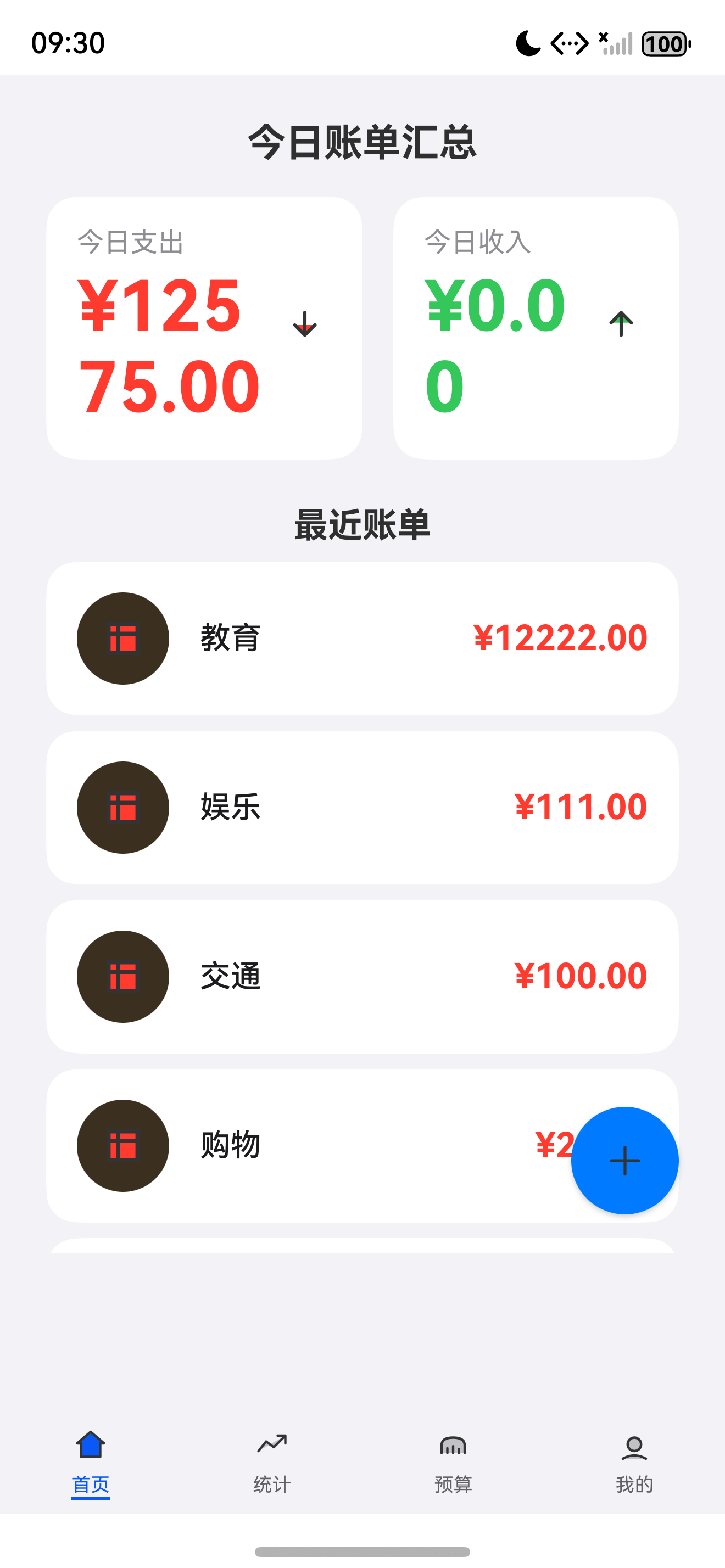
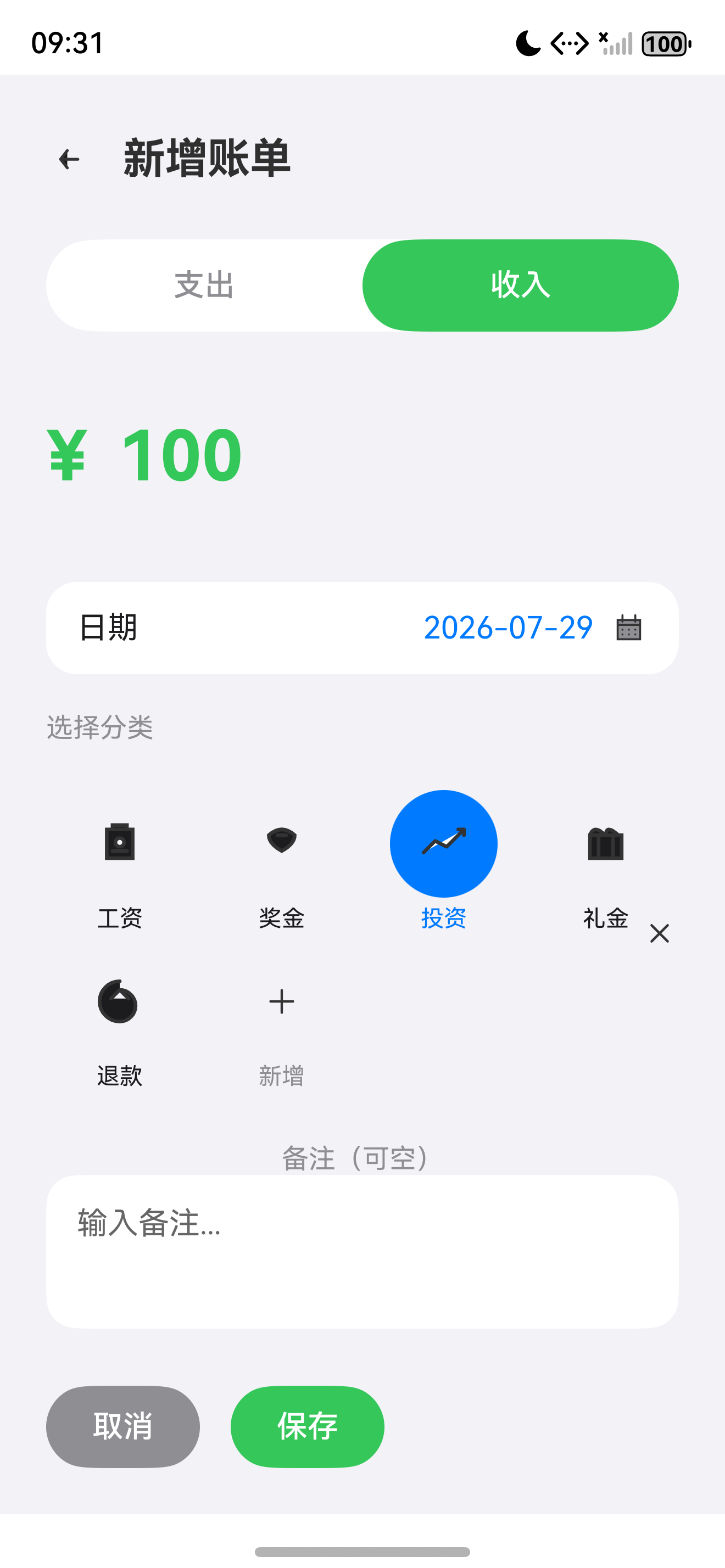
八、常见问题
8.1 @BuilderParam 必填问题
// 错误:未传 onLongPress 时调用报错
if (this.onLongPress) { this.onLongPress(); }
// ArkTS 严格模式下,可选 builder 仍需判空

// 解决:用 void 默认值或可选标记
@BuilderParam onLongPress?: () => void;
8.2 长按无效
// 错误:放在 Row 内层无效
Row() { Text().gesture(LongPressGesture()) }

// 正解:gesture 必须放在最外层容器
Row() { ... }
.gesture(LongPressGesture())
8.3 图标不显示
| 原因 | 解决 |
|---|---|
$r('app.media.xxx') 名错 | 检查 resources/base/media/ 文件名 |
| PNG 不带 alpha | 用 Image.fillColor 染色必须透明背景 |
| fillColor 颜色错 | 颜色字符串需为 #RRGGBB 6 位 hex |
九、Git 提交
9.1 Commit Message
git add .
git commit -m "feat(component): 封装 BillCard 通用账单卡片

- 完善 BillCard 支持分类图标、备注、日期、长按
- 新增 BillType 枚举与升级 Bill 模型
- 升级 HomeViewModel Mock 数据含分类图标
- 新增 DateUtil 工具类处理时间格式化
- 添加 5 个分类图标资源(food/transport/salary/bonus/default)"
9.2 CHANGELOG
## [v0.0.6] - 2026-07-27
### Added
- components/bill/BillCard.ets:完善版账单卡片
- constants/BillType.ets:账单类型枚举
- utils/DateUtil.ets:日期工具类
- 资源:icon_category_food/transport/salary/bonus/default.png
### Changed
- model/Bill.ets:升级为完整数据模型
- viewmodel/HomeViewModel.ets:支持分类图标 Mock
总结
本文完整介绍了 BillCard 通用组件的封装,涵盖接口设计、完整实现、分类图标、长按交互、ViewModel 升级、DateUtil 工具类。通过本篇你可以:
- 设计稳定的公共组件接口(
@Prop+@BuilderParam) - 实现收入/支出语义色与 +/- 符号自动切换
- 添加长按手势回调
- 用 DateUtil 统一日期格式化
- 升级 Bill 模型为完整数据结构
下一篇预告:《设计 Repository 与数据模型》 将设计 BaseRepository 抽象基类与 BillRepository/CategoryRepository/BudgetRepository,并接入 PersistenceV2 数据库。
如果这篇文章对你有帮助,欢迎点赞👍、收藏⭐、关注🔔,你的支持是我持续创作的动力!
相关资源
- 本篇源码:GitHub Tag v0.0.6
- ArkUI 组件开发:component-development
- ArkUI Gesture 文档:gesture
- @Prop 装饰器:prop-decorator
- @BuilderParam 装饰器:builderparam-decorator
- ArkUI Image fillColor:image-fillcolor
- 鸿蒙手势识别:gesture-recognition

讨论HarmonyOS开发技术,专注于API与组件、DevEco Studio、测试、元服务和应用上架分发等。
更多推荐
 7
7 0
0- 0


 已为社区贡献100条内容

所有评论(0)