自定义组件:从 struct 到状态管理 V2 的完整实践

适用版本:HarmonyOS 5.0.0+ / API 12+(V2 部分)
难度:中级
预计阅读时间:35 分钟
配套代码:见文末工程目录
写在前面
ArkUI 中一切可见元素都是组件。框架直接提供的叫系统组件(Text、Image、Button 等),开发者自己定义的叫自定义组件。当页面超过两三百行代码,或者同一个 UI 片段需要重复出现时,把逻辑封装成自定义组件就成了必须做的事。
自定义组件有三个核心特征:可组合(组合系统组件及属性方法)、可重用(在不同父组件中作为独立实例使用)、数据驱动 UI 更新(状态变量变化自动触发刷新)。理解这三个特征,就理解了自定义组件设计的出发点和约束来源。
一、基本结构:struct + @Component + build()
自定义组件由三部分构成:struct 声明数据结构,@Component(或 @ComponentV2)装饰器标记为自定义组件,build() 函数定义 UI。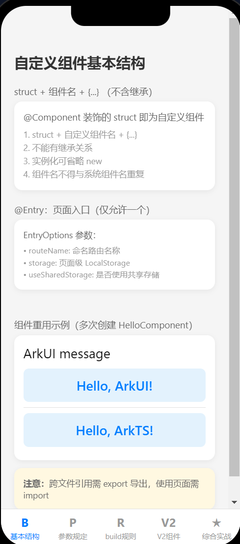
1.1 最简自定义组件
@Component
struct HelloComponent {
  @State message: string = 'Hello, World!';

  build() {
    Row() {
      Text(this.message)
        .fontSize(20)
        .margin(10)
        .onClick(() => {
          this.message = 'Hello, ArkUI!';
        })
    }
    .height('100%')
  }
}
@State message 是状态变量,点击文本后 message 改变,框架自动刷新 Text 组件。这就是"数据驱动 UI 更新"——你改变数据,UI 跟着变,不需要手动操作 DOM。
1.2 struct 的约束
- struct + 自定义组件名 +
{...}构成组件,不能有继承关系。 - struct 的实例化可以省略
new。 - 自定义组件名、类名、函数名不得与系统组件名重复(不能起名叫
Text、Image等)。
1.3 @Entry:页面入口
@Entry 装饰的自定义组件作为 UI 页面的入口。单个 UI 页面中仅允许一个 @Entry 组件。
从 API 10 开始,@Entry 可以接受 EntryOptions 参数:
| 参数 | 类型 | 说明 |
|---|---|---|
| routeName | string | 命名路由页面名称 |
| storage | LocalStorage | 页面级 UI 状态存储 |
| useSharedStorage | boolean | 是否使用 loadContent 传入的 LocalStorage 实例 |
@Entry({ routeName: 'myPage' })
@Component
struct MyComponent {
  // ...
}
useSharedStorage 设为 true 时优先使用 loadContent 传入的 LocalStorage,此时 storage 参数无效。
1.4 跨文件引用
如果自定义组件定义在其他文件中,需要 export 导出,使用页面 import 导入:
// HelloComponent.ets
@Component
export struct HelloComponent {
  @State message: string = 'Hello, World!';
  build() {
    Text(this.message).fontSize(20)
  }
}

// ParentComponent.ets
import { HelloComponent } from './HelloComponent';

@Entry
@Component
struct ParentComponent {
  build() {
    Column() {
      HelloComponent({ message: 'Hello World!' })
      Divider()
      HelloComponent({ message: 'Hello ArkTS!' })
    }
    .width('100%')
  }
}
多次创建 HelloComponent 并传入不同参数,每个实例独立维护自己的状态——这就是"可重用"。
二、成员函数与变量
自定义组件除了必须实现 build() 函数,还可以定义其他成员函数和成员变量。
2.1 成员函数约束
成员函数仅能从组件内部访问,不建议声明为静态函数。
@Component
struct MyComponent {
  // 成员函数
  calcTextValue(): string {
    return 'Hello World';
  }

  build() {
    Text(this.calcTextValue())  // 内部访问,允许
  }
}
2.2 成员变量约束
成员变量仅能从组件内部访问,不建议声明为静态变量。本地初始化有些可选、有些必选,取决于使用的装饰器。
2.3 函数传递给子组件
父组件可以把箭头函数传递给子组件,子组件在事件回调中调用:
@Entry
@Component
struct Parent {
  @State cnt: number = 0;

  submit: () => void = () => {
    this.cnt++;
  };

  build() {
    Column() {
      Text(`${this.cnt}`).fontSize(20)
      Son({ submitArrow: this.submit })
    }
  }
}

@Component
struct Son {
  submitArrow?: () => void;

  build() {
    Button('add')
      .onClick(() => {
        if (this.submitArrow) {
          this.submitArrow();
        }
      })
  }
}
箭头函数的 this 是词法作用域,指向 Parent 组件实例,所以 this.cnt++ 能正确修改父组件状态。
三、参数规定:初始化规则速查
自定义组件的成员变量根据装饰器不同,初始化规则不同。下面两张表是开发中最常查阅的规则。
3.1 @Component(V1)成员变量初始化规则
| 变量类型 | 本地初始化 | 从父组件传入 |
|---|---|---|
| 普通变量 | 必选 | 可选,传入非 undefined 时使用传入值 |
| @State | 必选 | 可选,传入非 undefined 时使用传入值 |
| @Prop | 可选 | 可选,无本地默认值时必选 |
| @Link | 不支持 | 必选,需传入状态变量 |
| @ObjectLink | 不支持 | 必选,需传入 @Observed 装饰的 class 实例 |
| @Provide | 必选 | 可选 |
| @Consume | 不支持(API 20 起可选) | 不支持,通过别名/变量名匹配 @Provide |
| @StorageProp | 必选 | 不支持,通过 AppStorage 对应 key 初始化 |
| @StorageLink | 必选 | 不支持,通过 AppStorage 对应 key 初始化 |
| @LocalStorageProp | 必选 | 不支持 |
| @LocalStorageLink | 必选 | 不支持 |
3.2 @ComponentV2(V2)成员变量初始化规则
| 变量类型 | 本地初始化 | 从父组件传入 |
|---|---|---|
| 普通变量 | 必选 | 不支持 |
| @Local | 必选 | 不支持 |
| @Param | 可选 | 可选,无本地默认值时必选 |
| @Event | 可选 | 可选,无默认且未传入时自动生成空函数 |
| @Provider | 必选 | 不支持 |
| @Consumer | 必选 | 不支持,通过别名/变量名匹配 @Provider |
3.3 普通变量传参示例
@Component
struct MyComponent {
  countDownFrom: number = 0;
  color: Color = Color.Blue;

  build() {
    Column() {
      Text(`${this.countDownFrom}`)
        .fontSize(20)
        .backgroundColor(this.color)
    }
    .width('100%')
  }
}

@Entry
@Component
struct ParentComponent {
  private someColor: Color = Color.Pink;

  build() {
    Column() {
      MyComponent({ countDownFrom: 10, color: this.someColor })
    }
  }
}
普通变量本地初始化是必选的(countDownFrom: number = 0),从父组件传入是可选的——传入时使用传入值,不传入时使用本地默认值。
四、build() 函数实现规则
build() 函数定义自定义组件的声明式 UI 描述。ArkUI 对 build() 内部可写的语句有严格约束,以下逐一说明。
4.1 根节点唯一且必要
@Entry装饰的组件:build()根节点必须为容器组件(Column、Row、Stack 等)。@Component装饰的组件:build()根节点可以为非容器组件(Text、Image 等)。ForEach禁止作为根节点。
@Entry
@Component
struct MyComponent {
  build() {
    // @Entry:根节点必须为容器组件
    Row() {
      ChildComponent()
    }
    .height('100%')
  }
}

@Component
struct ChildComponent {
  build() {
    // @Component:根节点可为非容器组件
    Image($r('app.media.startIcon'))
  }
}
4.2 不允许声明本地变量
build() {
  let num: number = 1;  // 编译报错
}
4.3 不允许直接使用 console.info
build() {
  console.info('print debug log');  // 编译报错
}
在事件回调或成员函数内部使用 console.info 是允许的。
4.4 不允许创建本地作用域
build() {
  {
    // 编译报错:不允许本地作用域
  }
}
4.5 不允许调用非 @Builder 装饰的方法
@Component
struct ParentComponent {
  doSomeCalculations() {}

  @Builder
  doSomeRender() {
    Text('Hello World')
  }

  calcTextValue(): string {
    return 'Hello World';
  }

  build() {
    Column() {
      // 反例:不能调用非 @Builder 方法
      // this.doSomeCalculations();

      // 正例:调用 @Builder 方法
      this.doSomeRender()

      // 正例:TS 方法的返回值作为参数
      Text(this.calcTextValue())
    }
  }
}
4.6 不允许 switch,使用 if 替代
build() {
  Column() {
    // 反例:不允许 switch
    // switch(expression) { case 1: Text('...') ... }

    // 正例:使用 if
    if (this.expression === 1) {
      Text('...')
    } else if (this.expression === 2) {
      Image('...')
    } else {
      Text('...')
    }
  }
}
4.7 不允许三元表达式渲染 UI,使用 if 替代
build() {
  Column() {
    // 反例:不允许三元表达式
    // (this.aVar > 10) ? Text('...') : Image('...')

    // 正例:使用 if
    if (this.aVar > 10) {
      Text('...')
    } else {
      Image('...')
    }
  }
}
4.8 不允许直接改变状态变量
@Component
struct MyComponent {
  @State count: number = 1;

  build() {
    Column() {
      // 反例:在 build() 中直接改变状态变量
      Text(`${this.count++}`)  // 危险!
    }
  }
}
在 build() 中改变状态变量会导致渲染循环:
- 全量更新(API 8 及以前):
Text每次渲染都执行this.count++,触发状态变化,引发下一轮build(),陷入无限循环。 - 最小化更新(API 9+):只有
Text组件更新时才会执行this.count++,但首次渲染会导致Text渲染两次,影响性能。
这个限制也适用于 @Builder、@Extend、@Styles 方法内部,以及在计算参数时调用的函数中改变状态。
隐蔽的反例——数组排序:
// 反例:sort() 改变了原数组,filter() 返回新数组
ForEach(this.arr.sort().filter(...), item => { ... })

// 正例:filter 返回新数组后 sort
ForEach(this.arr.filter((item, index) => index >= 2).sort(), (item) => { ... })
4.9 build() 规则速查表
| 规则 | 允许 | 禁止 |
|---|---|---|
| 根节点 | 唯一且必要 | ForEach 作为根节点 |
| 本地变量 | — | let / const 声明 |
| console | 在函数/回调内使用 | 直接在 UI 描述中使用 |
| 作用域 | — | { } 本地作用域 |
| 方法调用 | @Builder 方法、TS 方法返回值作为参数 | 非 @Builder 方法直接调用 |
| 条件判断 | if / else if / else |
switch |
| 表达式 | — | 三元表达式渲染 UI |
| 状态变量 | 在事件回调中改变 | 在 build() 中直接改变 |
五、@ComponentV2:状态管理 V2
从 API 12 开始,ArkUI 引入了 @ComponentV2 装饰器,提供全新的状态管理能力。
5.1 V2 装饰器概览
@ComponentV2 装饰的 struct 为 V2 自定义组件,仅可使用以下状态变量装饰器:
| V2 装饰器 | 对应 V1 装饰器 | 作用 |
|---|---|---|
| @Local | @State | 组件内部状态 |
| @Param | @Prop | 从父组件接收参数(只读) |
| @Once | — | 仅初始化一次,后续不更新 |
| @Event | — | 声明事件回调 |
| @Provider | @Provide | 向后代组件提供数据 |
| @Consumer | @Consume | 从祖先组件接收数据 |
5.2 @Local:组件内部状态
@Entry
@ComponentV2
struct ComponentV2Test {
  @Local message: string = 'Hello World';

  build() {
    Column() {
      Text(this.message)
        .fontSize(20)
        .onClick(() => {
          this.message = 'Welcome';
        })
    }
  }
}
@Local 和 @State 的效果类似——改变变量值会驱动 UI 刷新。区别在于 @Local 不接受从父组件传入的初始化值。
5.3 @Param + @Event:父子通信
V2 组件通过 @Param 接收参数,通过 @Event 声明回调:
@ComponentV2
struct V2ChildComponent {
  @Param title: string = '默认标题';
  @Param count: number = 0;
  @Param maxCount?: number = 99;

  @Event onIncrease: (count: number) => void = (count: number) => {};

  build() {
    Row() {
      Button('-')
        .onClick(() => {
          if (this.count > 0) {
            this.onIncrease(this.count - 1);
          }
        })

      Text(`${this.count}`).fontSize(24)

      Button('+')
        .onClick(() => {
          if (this.count < this.maxCount) {
            this.onIncrease(this.count + 1);
          }
        })
    }
  }
}

@Entry
@ComponentV2
struct ParentPage {
  @Local childCount: number = 5;

  build() {
    V2ChildComponent({
      title: '计数器组件',
      count: this.childCount,
      maxCount: 10,
      onIncrease: (newCount: number) => {
        this.childCount = newCount;
      }
    })
  }
}
@Param 是只读的——子组件不能直接修改 count,需要通过 @Event 回调通知父组件修改。这比 V1 的 @Link 双向绑定更安全,数据流向更清晰。
5.4 @Provider / @Consumer:跨层级通信
@ComponentV2
struct V2ProviderComponent {
  @Provider('themeColor') themeColor: string = '#007DFF';

  build() {
    Column() {
      Button('红色').onClick(() => { this.themeColor = '#FF4444'; })
      V2ConsumerComponent()
    }
  }
}

@ComponentV2
struct V2ConsumerComponent {
  @Consumer('themeColor') themeColor: string = '#999999';

  build() {
    Text(`当前色值: ${this.themeColor}`)
      .fontColor(this.themeColor)
  }
}
@Provider 和 @Consumer 通过别名匹配(这里是 'themeColor'),中间可以隔任意层级。与 V1 的 @Provide/@Consume 类似,但 API 更规范。
5.5 V1 vs V2 对比
| 特性 | @Component (V1) | @ComponentV2 (V2) |
|---|---|---|
| 状态变量 | @State / @Prop / @Link | @Local / @Param / @Once |
| 事件回调 | 箭头函数传递 | @Event |
| 跨层级通信 | @Provide / @Consume | @Provider / @Consumer |
| LocalStorage | 支持 | 暂不支持 |
| 组件冻结 | 不支持 | 支持(ComponentOptions) |
| 最低版本 | API 9 | API 12 |
| 元服务支持 | API 11+ | API 12+ |
| ArkTS 卡片 | API 9+ | API 23+ |
两者无法同时装饰同一个 struct。新项目建议直接用 V2,老项目可以渐进迁移。
5.6 @ReusableV2
@ReusableV2 装饰 V2 自定义组件,使其具备复用能力,与 @Reusable 装饰 V1 组件对应:
@ReusableV2
@ComponentV2
struct MyComponent {
  // ...
}
六、自定义组件通用样式
自定义组件通过 . 链式调用设置通用样式,但样式不是直接设置给组件内部的子组件,而是设置在一个不可见容器组件上。
@Component
struct ChildComponent {
  build() {
    Button(`Hello World`)
      .width('90%')
      .margin(10)
  }
}

@Entry
@Component
struct MyComponent {
  build() {
    Row() {
      ChildComponent()
        .width(300)           // 设置在不可见容器上
        .height(300)          // 设置在不可见容器上
        .backgroundColor(Color.Pink)  // 设置在不可见容器上
    }
  }
}
ArkUI 给 ChildComponent 套了一个不可见容器,width(300)、height(300)、backgroundColor(Color.Pink) 设置在这个容器上,而不是 ChildComponent 内部的 Button。渲染结果:粉色背景出现在 Button 外围,而非 Button 本身。
如果需要样式直接影响内部组件,应该在子组件的 build() 内部设置,或通过参数传递。
七、自定义组件支持跨 Ability 迁移(API 24+)
API 24 前,自定义组件实例在跨 Ability 后,改变状态变量无法触发 UI 刷新。API 24 开始,通过 module.json5 配置使能:
{
  "module": {
    "metadata": [
      {
        "name": "enableCustomComponentCrossAbility",
        "value": "true"
      }
    ]
  }
}
注意事项:
- 系统升级到 API 24 之前,即使配置了也不会生效。
- 不建议在原 Ability 的
onBackground阶段异步修改迁移组件中的状态变量——此时可以赋值,但无法触发 UI 刷新。 - 仅支持组件树上的自定义组件迁移。通过
OH_ArkUI_GetNodeHandleFromNapiValue等方式获取的、未挂载在组件树上的组件不支持迁移。
典型场景是使用 BuilderNode + NodeController 创建组件节点,在 Ability A 中挂载到组件树,迁移到 Ability B 后重新挂载,组件状态保持连续。
八、综合实战:卡片+计数器+状态管理
下面是一个综合示例,整合了自定义组件的基本结构、参数传递、函数回调、@Builder 方法、通用样式和数据驱动更新。
// 卡片组件(可复用)
@Component
export struct InfoCard {
  @State title: string = '卡片标题';
  @State content: string = '卡片内容';
  @State bgColor: string = '#FFFFFF';
  private onTap?: () => void;

  build() {
    Column({ space: 8 }) {
      Text(this.title)
        .fontSize(16)
        .fontWeight(FontWeight.Bold)

      Text(this.content)
        .fontSize(14)
        .fontColor('#666')
    }
    .width('100%')
    .padding(16)
    .backgroundColor(this.bgColor)
    .borderRadius(12)
    .onClick(() => {
      if (this.onTap) this.onTap();
    })
  }
}

// 计数器组件(@Prop + 函数回调)
@Component
export struct CounterComponent {
  @Prop label: string = '计数';
  @Prop current: number = 0;
  onIncrement?: () => void;
  onDecrement?: () => void;

  build() {
    Row({ space: 16 }) {
      Button('-')
        .onClick(() => { if (this.onDecrement) this.onDecrement(); })

      Text(`${this.current}`)
        .fontSize(28)
        .fontWeight(FontWeight.Bold)

      Button('+')
        .onClick(() => { if (this.onIncrement) this.onIncrement(); })
    }
  }
}

// 状态标签组件(使用 @Builder + if 条件渲染)
@Component
struct StatusTag {
  @Prop status: string = 'active';

  @Builder
  tagText(text: string, color: string) {
    Text(text)
      .fontSize(12)
      .fontColor(color)
      .padding({ left: 8, right: 8, top: 4, bottom: 4 })
      .borderRadius(4)
  }

  build() {
    if (this.status === 'active') {
      this.tagText('运行中', '#00C853')
    } else if (this.status === 'paused') {
      this.tagText('已暂停', '#FF9800')
    } else {
      this.tagText('已停止', '#FF6B6B')
    }
  }
}

// 页面入口
@Entry
@Component
struct ComprehensivePage {
  @State taskCount: number = 0;
  @State completedCount: number = 3;
  @State selectedCard: number = -1;
  @State appStatus: string = 'active';

  private cards: Array<string> = ['任务管理', '数据统计', '系统设置'];

  build() {
    Column({ space: 16 }) {
      // 状态标签
      StatusTag({ status: this.appStatus })

      // 计数器复用
      CounterComponent({
        label: '任务总数',
        current: this.taskCount,
        onIncrement: () => { this.taskCount++; },
        onDecrement: () => { if (this.taskCount > 0) this.taskCount--; }
      })

      CounterComponent({
        label: '已完成',
        current: this.completedCount,
        onIncrement: () => { this.completedCount++; },
        onDecrement: () => { if (this.completedCount > 0) this.completedCount--; }
      })

      // 卡片列表复用 + 通用样式
      ForEach(this.cards, (item: string, index: number) => {
        InfoCard({
          title: item,
          content: `点击第 ${index + 1} 张卡片`,
          bgColor: this.selectedCard === index ? '#E3F2FD' : '#FFFFFF',
          onTap: () => { this.selectedCard = index; }
        })
          .width('90%')
          .borderRadius(12)
      }, (item: string) => item)

      // 数据驱动进度条
      Text(`完成率:${this.taskCount > 0 ?
        Math.round(this.completedCount / this.taskCount * 100) : 0}%`)
        .fontSize(20)
        .fontWeight(FontWeight.Bold)
        .fontColor('#007DFF')
    }
  }
}
这个示例展示了:组件重用(CounterComponent 多次创建)、参数传递(@Prop + 普通变量)、函数回调(onIncrement / onDecrement)、@Builder 方法(StatusTag 内的 tagText)、条件渲染(if 替代 switch)、通用样式(.width() / .borderRadius() 设置在不可见容器上)以及数据驱动更新(状态变量改变触发进度条刷新)。
九、常见问题
Q:自定义组件和系统组件有什么本质区别?
A:系统组件由框架提供,开发者直接使用(如 Text、Image)。自定义组件由开发者定义,封装了 UI 片段和部分业务逻辑。自定义组件内部可以组合系统组件和其他自定义组件,但不能有继承关系。
Q:@Component 和 @ComponentV2 能不能混用?
A:不能同时装饰同一个 struct。但一个项目中可以混用 V1 和 V2 组件——V1 组件内部可以使用 V2 子组件,反之亦然。新项目建议直接用 V2。
Q:为什么 build() 里不能写 switch 和三元表达式?
A:ArkUI 的声明式 UI 需要在编译期确定 UI 结构树。switch 和三元表达式的分支在运行时动态选择,编译器无法静态分析 UI 结构,因此禁止使用。if 语句是 ArkUI 支持的条件渲染语法,编译器能正确处理。
Q:自定义组件设置样式为什么不生效在内部组件上?
A:ArkUI 给自定义组件套了一个不可见容器组件,链式调用设置的样式作用在容器上。如果需要样式直接影响内部组件,在子组件的 build() 内设置,或通过参数传入。
Q:跨 Ability 迁移有什么实际意义?
A:在自由流转场景中,组件从一个 Ability 迁移到另一个 Ability 时,如果不支持跨 Ability 迁移,自定义组件的状态变量改变无法触发 UI 刷新。API 24 的这个能力让组件状态在迁移后保持连续,用户体验更流畅。
总结
自定义组件是 ArkUI 开发的核心能力。掌握以下几个关键点,就能应对绝大多数场景:
| 知识点 | 要点 |
|---|---|
| 基本结构 | struct + @Component + build(),无继承,可省略 new |
| @Entry | 页面入口,每页仅一个,支持 routeName 和 storage |
| 参数规定 | V1 用 @State/@Prop/@Link,V2 用 @Local/@Param/@Event |
| build() 规则 | 根节点唯一、禁本地变量/console/switch/三元/状态变更 |
| 通用样式 | 设置在不可见容器上,非内部子组件 |
| V1 vs V2 | V2 数据流更清晰,支持组件冻结,但暂不支持 LocalStorage |
| 跨 Ability | API 24+,module.json5 配置 enableCustomComponentCrossAbility |

讨论HarmonyOS开发技术,专注于API与组件、DevEco Studio、测试、元服务和应用上架分发等。
更多推荐
 4
4 0
0- 0


 已为社区贡献37条内容

所有评论(0)