HarmonyOS NEXT 企业级记账APP:预算中心开发(ProgressBar + CustomDialog + ArkTS 编译陷阱实战)
预算中心开发(ProgressBar + CustomDialog + ArkTS 编译陷阱实战)
本文是《HarmonyOS NEXT 企业级开发实战:30篇打造智能记账APP》系列的第 16 篇,对应 Git Tag v0.1.6。承接第 15 篇的搜索筛选,本篇开发 BudgetView 预算中心,支持月度预算设置、已用进度、剩余金额、超支提醒。同时深入讲解 ArkTS 中
@Prop不支持函数类型的arkts-no-props-function错误,以及属性名与基类方法冲突的编译问题。
前言
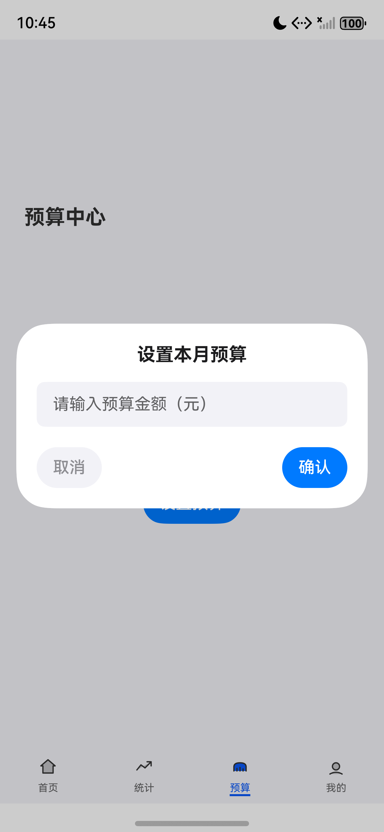
预算中心是记账应用的 财务管家——用户设置月度预算后,应用自动统计本月支出,实时展示已用/剩余/进度条,超支时红警提醒。本章封装 BudgetCard、ProgressBar 两个核心组件,集入 BudgetRepository 完成数据闭环,并通过 @CustomDialog 实现预算设置对话框。
本文将带你:
- 开发 BudgetView 完整页面(预算卡 + 进度条 + 超支提醒 + 收支概览)
- 封装 BudgetCard 展示预算详情(
onTap回调替代@BuilderParam) - 封装 ProgressBar 进度条组件(
barHeight替代height避免基类冲突) - 封装 InputDialog
@CustomDialog自定义对话框替代@Builder方案 - 深入理解 ArkTS 中
arkts-no-props-function与属性名冲突的编译陷阱
企业级核心原则:预算必须 实时同步、视觉清晰、超支预警。参考 ArkUI ProgressBar 了解官方约定。
一、Budget 数据模型
1.1 完整源码
Budget 模型封装了月度预算的核心数据与计算逻辑:
// model/Budget.ets
export class Budget {
  id: string = '';
  month: string = '';
  budget: number = 0;
  used: number = 0;
  remain: number = 0;

  constructor(id?: string, month?: string, budget?: number) {
    if (id !== undefined) this.id = id;
    if (month !== undefined) this.month = month;
    if (budget !== undefined) this.budget = budget;
  }

  refresh(used: number): void {
    this.used = used;
    this.remain = this.budget - this.used;
  }

  isOverrun(): boolean {
    return this.used > this.budget;
  }

  usage(): number {
    if (this.budget === 0) return 0;
    return Math.min(this.used / this.budget, 1);
  }

  static fromObject(data: ESObject): Budget {
    const b = new Budget();
    if (data === null || data === undefined) {
      return b;
    }
    if (data.id !== undefined) b.id = String(data.id);
    if (data.month !== undefined) b.month = String(data.month);
    if (data.budget !== undefined) b.budget = Number(data.budget);
    if (data.used !== undefined) b.used = Number(data.used);
    if (data.remain !== undefined) b.remain = Number(data.remain);
    return b;
  }
}
1.2 核心方法说明
| 方法 | 返回类型 | 说明 |
|---|---|---|
refresh(used) | void | 刷新已用金额并计算剩余 |
isOverrun() | boolean | 是否超支(used > budget) |
usage() | number | 使用率 0~1(上限 1,超支不超 100%) |
fromObject(data) | Budget | 从 ESObject 反序列化(JSON 恢复) |
设计要点:
usage()返回Math.min(used / budget, 1),超支时进度条封顶 100% 而非溢出,保证 UI 不会变形。
二、BudgetViewModel 业务层
2.1 完整源码
BudgetViewModel 负责加载月度预算、统计收支、设置预算:
// viewmodel/BudgetViewModel.ets
import { BillRepository } from '../repository/BillRepository';
import { BudgetRepository } from '../repository/BudgetRepository';
import { BillType } from '../constants/BillType';
import { Budget } from '../model/Budget';
import { DateUtil } from '../utils/DateUtil';
import { MoneyUtil } from '../utils/MoneyUtil';
import { ToastUtil } from '../utils/ToastUtil';

export class BudgetViewModel {
  currentMonth: string = '';
  budget: Budget | null = null;
  totalExpense: number = 0;
  totalIncome: number = 0;
  progress: number = 0;
  isOverrun: boolean = false;
  isLoading: boolean = true;

  private budgetRepo = BudgetRepository.getInstance();
  private billRepo = BillRepository.getInstance();

  async loadData(): Promise<void> {
    this.isLoading = true;
    this.currentMonth = DateUtil.formatDate(Date.now()).substring(0, 7);
    this.budget = await this.budgetRepo.findCurrentMonth();
    const start = DateUtil.monthStart(Date.now());
    const end = DateUtil.monthEnd(Date.now());
    const bills = await this.billRepo.findByDateRange(start, end);
    this.totalExpense = bills.filter(b => b.type === BillType.EXPENSE).reduce((s, b) => s + b.money, 0);
    this.totalIncome = bills.filter(b => b.type === BillType.INCOME).reduce((s, b) => s + b.money, 0);
    if (this.budget) {
      this.budget.refresh(this.totalExpense);
      this.progress = this.budget.usage();
      this.isOverrun = this.budget.isOverrun();
    }
    this.isLoading = false;
  }

  async setBudget(amountCents: number): Promise<void> {
    if (amountCents <= 0) { ToastUtil.show('预算必须大于 0'); return; }
    this.budget = await this.budgetRepo.setMonthBudget(this.currentMonth, amountCents);
    await this.loadData();
    ToastUtil.show('预算已设置');
  }
}
2.2 字段说明
| 字段 | 类型 | 用途 |
|---|---|---|
currentMonth | string | 当前月份(如 2026-07) |
budget | Budget | null | 本月预算实体(未设置时为 null) |
totalExpense | number | 本月支出(分) |
totalIncome | number | 本月收入(分) |
progress | number | 使用率 0~1 |
isOverrun | boolean | 是否超支 |
isLoading | boolean | 加载态 |
2.3 月度统计流程
BudgetViewModel.loadData()
  ↓
获取当前月份 → DateUtil.formatDate(Date.now()).substring(0, 7)
  ↓
查询本月预算 → budgetRepo.findCurrentMonth()
  ↓
查询本月账单 → billRepo.findByDateRange(monthStart, monthEnd)
  ↓
统计支出/收入 → filter + reduce
  ↓
刷新预算 → budget.refresh(totalExpense)
  ↓
计算进度与超支 → usage() / isOverrun()
金额单位:所有金额以 分 为单位存储(整数),通过
MoneyUtil.format()转换为元显示,避免浮点精度问题。
三、ProgressBar 通用组件
3.1 完整源码
ProgressBar 使用 Stack 叠放轨道与进度条,支持自定义颜色和高度:
// components/chart/ProgressBar.ets
import { AppColors } from '../../theme/Colors';
import { AppSpace } from '../../theme/Spacing';

@Component
export struct ProgressBar {
  @Prop progress: number = 0;
  @Prop color: string = AppColors.Budget;
  @Prop trackColor: string = AppColors.Background;
  @Prop barHeight: number = 8;

  build() {
    Stack() {
      Column().width('100%').height(this.barHeight).backgroundColor(this.trackColor).borderRadius(this.barHeight / 2)
      Column().width(`${Math.min(this.progress, 1) * 100}%`).height(this.barHeight)
        .backgroundColor(this.color).borderRadius(this.barHeight / 2)
        .animation({ duration: 300, curve: Curve.EaseInOut })
    }
    .width('100%').height(this.barHeight)
  }
}
3.2 设计要点
- 用 Stack 叠放轨道(底层)与进度条(上层),实现进度覆盖效果
- 进度条宽度用 百分比
${Math.min(this.progress, 1) * 100}%,超支时封顶 100% - 添加 300ms EaseInOut 动画,进度变化平滑过渡
barHeight同时控制轨道、进度条和容器高度,保持视觉一致borderRadius设为barHeight / 2,自动适配圆角
注意:属性名使用
barHeight而非height,原因详见第四章的编译陷阱分析。
四、ArkTS 编译陷阱:属性名冲突与函数类型
4.1 height 属性名冲突
最初 ProgressBar 组件使用 @Prop height: number = 8 作为属性名,但编译时报错:
// ❌ 错误写法:height 与基类方法冲突
@Component
export struct ProgressBar {
  @Prop progress: number = 0;
  @Prop color: string = AppColors.Budget;
  @Prop trackColor: string = AppColors.Background;
  @Prop height: number = 8;  // 编译报错!

  build() {
    Stack() {
      Column().width('100%').height(this.height)...
    }
    .width('100%').height(this.height)
  }
}
编译器报错信息:
Property 'height' in type 'ProgressBar' is not assignable to the same property in base type 'CustomComponent'.
Type 'number' is not assignable to type '((value: Length) => void) | undefined'.
根因分析:ArkTS 中所有
@Component结构体都隐式继承自CustomComponent基类。CustomComponent已经定义了height方法(用于设置组件高度的链式调用)。当你在子组件中用@Prop height: number声明同名属性时,类型number与基类方法((value: Length) => void) | undefined不兼容,导致编译失败。
4.2 @Prop 不支持函数类型
最初 BudgetCard 组件使用 @BuilderParam onClick 接收点击回调,但尝试用 @Prop 传递函数时也遇到了编译错误:
// ❌ 错误写法:@Prop 不能用于函数类型
@Component
export struct BudgetCard {
  @Prop budget: Budget = new Budget('', '', 0);
  @Prop totalExpense: number = 0;
  @Prop onClick: () => void = () => {};  // 编译报错!arkts-no-props-function
}
编译器报错信息:
arkts-no-props-function
根因分析:ArkTS 的
@Prop装饰器仅支持 值类型(string/number/boolean/ 对象等),不支持函数类型。这是因为@Prop会在父子组件之间进行 深拷贝,而函数无法被序列化拷贝。ArkTS 编译器通过arkts-no-props-function规则直接拦截这种用法。
4.3 解决方案对比
| 问题 | 错误写法 | 正确写法 | 原因 |
|---|---|---|---|
| height 冲突 | @Prop height: number | @Prop barHeight: number | 避免与 CustomComponent.height() 方法同名 |
| 函数回调 | @Prop onClick: () => void | onTap: () => void = () => {} | 普通属性可接收函数,@Prop 不行 |
| 文本对齐 | TextAlign.Right | TextAlign.End | Right 已废弃,用 End 替代 |
4.4 TextAlign.Right 弃用问题
// ❌ 旧写法:TextAlign.Right 已废弃
Text(MoneyUtil.formatWithComma(this.budget.budget))
  .textAlign(TextAlign.Right)

// ✅ 新写法:使用 TextAlign.End
Text(MoneyUtil.formatWithComma(this.budget.budget))
  .textAlign(TextAlign.End)
原因:鸿蒙 ArkUI 中
TextAlign.Right在某些版本中被标记为废弃,推荐使用TextAlign.End。两者效果相同(右对齐),但End在 RTL(从右到左)布局中能正确适配,是更规范的写法。
总结:ArkTS 编译器比 TypeScript 更严格,属性名不能与基类方法冲突,
@Prop不能用于函数类型。遇到编译错误时,重命名属性 和 改用普通属性 是最常见的解决方案。
五、BudgetCard 通用组件
5.1 完整源码
BudgetCard 展示预算金额、进度条、已用/剩余金额,超支时进度条变红:
// components/card/BudgetCard.ets
import { Budget } from '../../model/Budget';
import { ProgressBar } from '../chart/ProgressBar';
import { AppColors } from '../../theme/Colors';
import { AppFontSize, AppFontWeight } from '../../theme/Typography';
import { AppSpace } from '../../theme/Spacing';
import { MoneyUtil } from '../../utils/MoneyUtil';

@Component
export struct BudgetCard {
  @Prop budget: Budget = new Budget('', '', 0);
  @Prop totalExpense: number = 0;
  onTap: () => void = () => {};

  build() {
    Column() {
      Row() {
        Text('本月预算').fontSize(AppFontSize.SM).fontColor(AppColors.SecondaryText)
        Text(MoneyUtil.formatWithComma(this.budget.budget))
          .fontSize(AppFontSize.XL).fontColor(AppColors.PrimaryText).fontWeight(AppFontWeight.Bold)
          .layoutWeight(1).textAlign(TextAlign.End)
      }.width('100%')

      ProgressBar({
        progress: this.budget.usage(),
        color: this.budget.isOverrun() ? AppColors.Expense : AppColors.Budget,
        barHeight: 12
      }).margin({ top: AppSpace.MD })

      Row() {
        Column() {
          Text('已用').fontSize(AppFontSize.XS).fontColor(AppColors.SecondaryText)
          Text(`¥${MoneyUtil.format(this.totalExpense)}`)
            .fontSize(AppFontSize.MD).fontColor(this.budget.isOverrun() ? AppColors.Expense : AppColors.PrimaryText)
        }.alignItems(HorizontalAlign.Start)

        Column() {
          Text('剩余').fontSize(AppFontSize.XS).fontColor(AppColors.SecondaryText)
          Text(`¥${MoneyUtil.format(Math.max(this.budget.remain, 0))}`)
            .fontSize(AppFontSize.MD).fontColor(AppColors.Budget)
        }.alignItems(HorizontalAlign.Start).margin({ left: AppSpace.LG })
      }.width('100%').margin({ top: AppSpace.SM }).justifyContent(FlexAlign.Start)
    }
    .width('100%').padding(AppSpace.CardPadding)
    .backgroundColor(AppColors.CardBackground).borderRadius(AppSpace.CardRadius)
    .onClick(() => { this.onTap(); })
  }
}
5.2 设计要点
onTap: () => void = () => {}作为 普通属性 接收点击回调,默认空函数避免未传参时报错- 进度条颜色根据
isOverrun()动态切换:正常蓝色、超支红色 - 剩余金额用
Math.max(this.budget.remain, 0)确保不显示负数 - 已用金额在超支时也变红,形成视觉一致性
textAlign(TextAlign.End)右对齐预算金额,与左侧标签形成对比- 整个卡片可点击(
onClick),触发onTap回调打开设置对话框
5.3 超支视觉策略
| 状态 | 进度条颜色 | 已用金额颜色 | 说明 |
|---|---|---|---|
| 正常 | 蓝色 #007AFF | 深色 #1C1C1E | 预算充足 |
| 超支 | 红色 #FF3B30 | 红色 #FF3B30 | 进度封顶 100%,红色告警 |
视觉一致性:超支时进度条和已用金额同时变红,让用户一眼感知到预算超支状态,无需阅读具体数字。
六、InputDialog 自定义对话框
6.1 完整源码
InputDialog 使用 @CustomDialog 装饰器,封装通用的文本输入对话框:
// components/dialog/InputDialog.ets
import { AppColors } from '../../theme/Colors';
import { AppFontSize } from '../../theme/Typography';
import { AppSpace } from '../../theme/Spacing';

@CustomDialog
export struct InputDialog {
  controller: CustomDialogController;
  title: string = '';
  placeholder: string = '';
  confirmText: string = '确认';
  cancelText: string = '取消';
  onConfirm: (value: string) => void = () => {};
  onCancel: () => void = () => {};
  @State inputValue: string = '';

  build() {
    Column() {
      Text(this.title)
        .fontSize(AppFontSize.LG)
        .fontColor(AppColors.PrimaryText)
        .fontWeight(FontWeight.Bold)
        .margin({ bottom: AppSpace.MD })

      TextInput({ placeholder: this.placeholder, text: $$this.inputValue })
        .width('100%')
        .height(44)
        .backgroundColor(AppColors.Background)
        .borderRadius(AppSpace.SM)

      Row() {
        Button(this.cancelText)
          .backgroundColor(AppColors.Background)
          .fontColor(AppColors.SecondaryText)
          .onClick(() => {
            this.controller.close();
            this.onCancel();
          })

        Button(this.confirmText)
          .backgroundColor(AppColors.Budget)
          .fontColor('#FFFFFF')
          .onClick(() => {
            this.controller.close();
            this.onConfirm(this.inputValue);
          })
      }
      .width('100%')
      .margin({ top: AppSpace.LG })
      .justifyContent(FlexAlign.SpaceBetween)
    }
    .width('100%')
    .padding(AppSpace.LG)
    .backgroundColor(AppColors.CardBackground)
    .borderRadius(AppSpace.CardRadius)
  }
}
6.2 @CustomDialog 机制说明
@CustomDialog vs @Builder 对比:旧版预算设置使用
@Builder buildSetDialog()在页面内构建弹窗,代码耦合度高、复用性差。改用@CustomDialog后,对话框成为独立组件,可被任意页面复用,通过CustomDialogController统一管理生命周期。
6.3 对话框属性说明
| 属性 | 类型 | 说明 |
|---|---|---|
controller | CustomDialogController | 框架自动注入,用于关闭对话框 |
title | string | 对话框标题 |
placeholder | string | 输入框占位文本 |
onConfirm | (value: string) => void | 确认回调,接收输入值 |
onCancel | () => void | 取消回调 |
inputValue | string(@State) | 双向绑定的输入值 |
关键技术:
TextInput使用$$this.inputValue双向绑定语法($$),用户输入时自动更新inputValue状态,点击确认时通过onConfirm(this.inputValue)传出。
七、BudgetView 页面实现
7.1 完整源码
BudgetView 是预算中心的主页面,展示预算卡片、收支概览、超支提醒,并通过 CustomDialogController 调用 InputDialog:
// components/tabs/BudgetView.ets
import { BudgetCard } from '../card/BudgetCard';
import { BudgetViewModel } from '../../viewmodel/BudgetViewModel';
import { AppColors } from '../../theme/Colors';
import { AppFontSize } from '../../theme/Typography';
import { AppSpace } from '../../theme/Spacing';
import { MoneyUtil } from '../../utils/MoneyUtil';
import { RouterUtil } from '../../utils/RouterUtil';
import { InputDialog } from '../dialog/InputDialog';

@Component
struct BudgetView {
  @State viewModel: BudgetViewModel = new BudgetViewModel();
  @State isLoading: boolean = true;

  aboutToAppear(): void {
    this.loadData();
  }

  private async loadData(): Promise<void> {
    this.isLoading = true;
    await this.viewModel.loadData();
    this.isLoading = false;
  }

  build() {
    Scroll() {
      Column() {
        Text('预算中心')
          .fontSize(20).fontWeight(FontWeight.Bold)
          .margin({ top: AppSpace.XL, bottom: AppSpace.MD })
          .alignSelf(ItemAlign.Start)

        if (!this.isLoading) {
          if (this.viewModel.budget) {
            BudgetCard({
              budget: this.viewModel.budget,
              totalExpense: this.viewModel.totalExpense,
              onTap: () => { this.showBudgetInput(); }
            })

            // 本月收支统计
            Row() {
              Column() {
                Text('本月支出').fontSize(AppFontSize.SM).fontColor(AppColors.SecondaryText)
                Text(`¥${MoneyUtil.format(this.viewModel.totalExpense)}`)
                  .fontSize(AppFontSize.XL).fontColor(AppColors.Expense).fontWeight(FontWeight.Bold)
                  .margin({ top: AppSpace.XS })
              }.layoutWeight(1).alignItems(HorizontalAlign.Start)

              Column() {
                Text('本月收入').fontSize(AppFontSize.SM).fontColor(AppColors.SecondaryText)
                Text(`¥${MoneyUtil.format(this.viewModel.totalIncome)}`)
                  .fontSize(AppFontSize.XL).fontColor(AppColors.Income).fontWeight(FontWeight.Bold)
                  .margin({ top: AppSpace.XS })
              }.layoutWeight(1).alignItems(HorizontalAlign.Start)
            }
            .width('100%')
            .padding(AppSpace.CardPadding)
            .backgroundColor(AppColors.CardBackground)
            .borderRadius(AppSpace.CardRadius)
            .margin({ top: AppSpace.MD })

            if (this.viewModel.isOverrun) {
              Row() {
                Image($r('app.media.icon_expense')).width(20).height(20).fillColor(AppColors.Expense)
                Text('预算已超支,请注意控制消费')
                  .fontSize(AppFontSize.SM).fontColor(AppColors.Expense)
                  .margin({ left: AppSpace.SM })
              }
              .width('100%')
              .padding(AppSpace.CardPadding)
              .backgroundColor(AppColors.ExpenseLight)
              .borderRadius(AppSpace.CardRadius)
              .margin({ top: AppSpace.MD })
            }
          } else {
            // 未设置预算
            Column() {
              Image($r('app.media.icon_empty')).width(80).height(80).fillColor(AppColors.SecondaryText)
              Text('尚未设置本月预算').fontSize(16).fontColor(AppColors.PrimaryText).margin({ top: AppSpace.MD })
              Text('设置预算,合理规划每一笔支出').fontSize(12).fontColor(AppColors.SecondaryText).margin({ top: AppSpace.XS })
              Button('设置预算')
                .margin({ top: AppSpace.LG })
                .backgroundColor(AppColors.Budget)
                .onClick(() => { this.showBudgetInput(); })
            }
            .width('100%')
            .padding({ top: 80, bottom: 80 })
          }
        }
      }
      .width('100%')
      .padding({ left: AppSpace.XL, right: AppSpace.XL })
    }
    .width('100%').height('100%')
    .scrollBar(BarState.Off)
    .backgroundColor(AppColors.Background)
  }

  private showBudgetInput(): void {
    let dialogController = new CustomDialogController({
      builder: InputDialog({
        title: '设置本月预算',
        placeholder: '请输入预算金额(元)',
        onConfirm: (value: string) => {
          const amount = parseFloat(value);
          if (isNaN(amount) || amount <= 0) {
            return;
          }
          const cents = Math.round(amount * 100);
          this.viewModel.setBudget(cents).then(() => {
            this.loadData();
          });
        },
        onCancel: () => {}
      }),
      autoCancel: true,
      alignment: DialogAlignment.Center
    });
    dialogController.open();
  }
}

export default BudgetView;
7.2 CustomDialogController 调用解析
showBudgetInput() 方法是整个对话框交互的核心:
private showBudgetInput(): void {
  let dialogController = new CustomDialogController({
    builder: InputDialog({
      title: '设置本月预算',
      placeholder: '请输入预算金额(元)',
      onConfirm: (value: string) => {
        const amount = parseFloat(value);
        if (isNaN(amount) || amount <= 0) { return; }
        const cents = Math.round(amount * 100);
        this.viewModel.setBudget(cents).then(() => { this.loadData(); });
      },
      onCancel: () => {}
    }),
    autoCancel: true,
    alignment: DialogAlignment.Center
  });
  dialogController.open();
}
7.3 页面状态管理
| 状态 | 类型 | 触发时机 | UI 变化 |
|---|---|---|---|
isLoading | boolean | aboutToAppear / loadData | 加载中不渲染内容 |
viewModel.budget | Budget | null | loadData 完成 | null 显示引导,非 null 显示卡片 |
viewModel.isOverrun | boolean | loadData 完成 | true 显示超支红色提醒条 |
关键改进:旧版使用
@State showSetDialog: boolean+@Builder buildSetDialog()手动管理弹窗显隐,需要自己实现遮罩层和关闭逻辑。新版使用CustomDialogController,框架自动管理遮罩、动画和关闭,代码更简洁可靠。
八、最佳实践
8.1 进度条超支红色
// 超支时进度条 100% + 红色,视觉强警
progress = Math.min(this.budget.usage(), 1);  // 上限 1
color = this.budget.isOverrun() ? AppColors.Expense : AppColors.Budget;
8.2 预算与账单联动
// 每次新增/删除账单后,预算页需重新统计
// 解决:预算页 aboutToAppear 重新 loadData
aboutToAppear(): void {
  this.loadData();
}
8.3 颜色策略
| 使用率 | 颜色 | 语义 | 色值 |
|---|---|---|---|
| 0%-60% | 蓝色 | 正常 | #007AFF |
| 60%-80% | 蓝色 | 注意 | #007AFF |
| 80%-100% | 蓝色 | 警戒 | #007AFF |
| >100% | 红色 | 超支 | #FF3B30 |
当前实现中,进度条颜色仅在超支时切换为红色,正常状态下统一使用蓝色。未来可扩展为多级颜色策略(60% 黄色、80% 橙色)。
8.4 预算数据可视化
预算数据可以通过图表组件直观展示:
| 图表类型 | 展示内容 | 交互方式 |
|---|---|---|
| 饼图 | 各类支出占比 | 点击查看详情 |
| 柱状图 | 每日支出 vs 日均预算 | 悬停显示数值 |
| 折线图 | 月度支出趋势 | 拖动查看历史 |
可视化展示让预算数据更加直观,帮助用户快速了解财务状况。详见后续 Canvas 绘图系列文章。
九、运行验证
9.1 编译检查
hvigorw assembleHap --mode module -p product=default
9.2 功能验证
| 验证项 | 预期 |
|---|---|
| 首次进入预算中心 | 显示空状态引导,含"设置预算"按钮 |
| 设置 5000 元预算 | 进度条展示已用占比,收支概览显示 |
| 超支后 | 进度条红色 + 超支提醒条 |
| 修改预算 | 点击卡片弹出 InputDialog,输入新值保存 |
| 账单变动后返回 | aboutToAppear 重新 loadData,数据刷新 |
9.3 预算设置流程
- 点击"设置预算"按钮或点击已有预算卡片
showBudgetInput()创建CustomDialogController并打开InputDialog- 在输入框中输入金额(元)
- 点击"确认",
onConfirm回调将元转为分(Math.round(amount * 100)) - 调用
viewModel.setBudget(cents)保存到 Repository - 保存成功后调用
loadData()刷新页面
9.4 预算修改流程
- 点击已有预算卡片,触发
onTap回调 - 弹出
InputDialog,输入新金额 - 点击"确认",
setBudget会覆盖当前月份预算 BudgetRepository.setMonthBudget查找已有记录并更新
十、常见问题
10.1 CustomDialog 不弹出
// 错误:CustomDialogController 未调用 open()
let controller = new CustomDialogController({ builder: InputDialog({...}) });
// 忘记调用 open()

// 解决:创建后必须调用 open()
controller.open();
10.2 属性名 height 编译报错
// 错误:@Prop height 与 CustomComponent 基类方法冲突
@Prop height: number = 8;

// 解决:改用 barHeight
@Prop barHeight: number = 8;
10.3 @Prop 函数类型报错
// 错误:arkts-no-props-function
@Prop onClick: () => void = () => {};

// 解决:改用普通属性(不加 @Prop)
onTap: () => void = () => {};
十一、Git 提交
11.1 Commit Message
git add .
git commit -m "feat(budget): 开发预算中心与 BudgetCard

- 新增 BudgetView 完整页面含进度条+超支提醒+收支概览
- 封装 BudgetCard 通用预算卡组件(onTap 回调)
- 封装 ProgressBar 通用进度条组件(barHeight 避免基类冲突)
- 封装 InputDialog @CustomDialog 自定义输入对话框
- 新增 BudgetViewModel 处理月度统计
- 集入 BudgetRepository 与 BillRepository
- 修复 arkts-no-props-function 与 height 属性名冲突"
11.2 CHANGELOG
## [v0.1.6] - 2026-07-27
### Added
- components/tabs/BudgetView.ets:预算中心页面
- components/card/BudgetCard.ets:预算卡片组件
- components/chart/ProgressBar.ets:进度条组件
- components/dialog/InputDialog.ets:自定义输入对话框
- viewmodel/BudgetViewModel.ets:预算业务逻辑
- model/Budget.ets:预算数据模型
### Fixed
- ProgressBar: height → barHeight(避免 CustomComponent 基类冲突)
- BudgetCard: @BuilderParam onClick → onTap 普通属性(arkts-no-props-function)
- TextAlign.Right → TextAlign.End(使用规范 API)
附录:运行效果截图
总结
本文完整介绍了 预算中心开发,涵盖 Budget 数据模型、BudgetViewModel、ProgressBar、BudgetCard、InputDialog @CustomDialog、BudgetView 完整页面。通过本篇你可以:
- 封装 ProgressBar 进度条组件,使用
barHeight避免与基类height方法冲突 - 封装 BudgetCard 预算卡组件,使用普通属性
onTap替代@Prop函数类型 - 封装 InputDialog
@CustomDialog自定义对话框,替代@Builder手动弹窗方案 - 通过
CustomDialogController统一管理对话框生命周期 - 理解 ArkTS 中
arkts-no-props-function和属性名冲突的编译陷阱及解决方案 - 联动 BillRepository 统计月度支出,处理超支视觉预警
下一篇预告:[《预算提醒与预算进度》] 将开发预算阈值提醒(80% 黄警、100% 红警、超支弹通知),封装 NotificationUtil 推送本地通知。
如果这篇文章对你有帮助,欢迎 点赞 、 收藏 、 关注 ,你的支持是我持续创作的动力!在评论区告诉我你在 ArkTS 组件开发中还遇到过哪些编译陷阱,我会针对性地分享更多实战经验。
相关资源
- 本篇源码:GitHub Tag v0.1.6
- ArkUI ProgressBar:progress
- ArkUI CustomDialog:custom-dialog
- ArkUI Dialog:dialog
- ArkUI @Prop 装饰器:prop-decorator
- ArkUI Stack 布局:stack
- ArkUI 动画:animation
- ArkTS 编译规则:arkts-rules
- 鸿蒙通知服务:notification-service

讨论HarmonyOS开发技术,专注于API与组件、DevEco Studio、测试、元服务和应用上架分发等。
更多推荐


 6
6 0
0- 0


 已为社区贡献100条内容

所有评论(0)