HarmonyOS NEXT 企业级记账APP:统计分析首页
统计分析首页
本文是《HarmonyOS NEXT 企业级开发实战:30篇打造智能记账APP》系列的第 18 篇,对应 Git Tag v0.1.8。承接前序开发,本篇开发 StatisticsView 统计分析首页,支持今日/本周/本月/全年四个时间维度切换,封装 StatisticCard 与 SummaryPanel 展示收支汇总。
前言
企业级应用的完整体验包含主动提醒与数据可视化两大能力。本章落地鸿蒙 Notification 与 Canvas API,为后续统计图表模块奠定基础。本文将带你:
- 设计核心数据模型与业务逻辑
- 封装关键通用组件
- 实现完整页面布局
- 集成 Repository 完成数据闭环
- 处理主题与深色模式响应
企业级核心原则:功能必须可视、可交互、可响应。参考 HarmonyOS NEXT 开发者文档 了解官方约定。
一、需求分析
1.1 功能介绍
| 需求项 | 说明 |
|---|---|
| 核心功能 | 开发 StatisticsView 统计分析首页,支持今日/本周/本月/全年四个时间维度切换,封装 StatisticCard 与 SummaryPanel 展示收支汇总。 |
| 数据源 | Repository 层提供的结构化数据 |
| 交互方式 | 点击、长按、滑动 |
| 视觉规范 | 收入绿/支出红/预算蓝/统计紫 |
1.2 业务流程
用户进入页面
  ↓
ViewModel 调用 Repository 加载数据
  ↓
UI 渲染(卡片 / 列表 / 图表)
  ↓
用户交互 → 更新状态 → 重新渲染
二、ViewModel 业务层
// viewmodel/StatisticsViewModel.ets
import { BillRepository } from '../repository/BillRepository';
import { CategoryRepository } from '../repository/CategoryRepository';
import { BillType } from '../constants/BillType';
import { DateUtil } from '../utils/DateUtil';
import { MoneyUtil } from '../utils/MoneyUtil';
import { AppColors } from '../theme/Colors';

// 分类占比图表项
export interface ChartItem {
  label: string;
  value: number;
  color: string;
}

// 趋势图表项(周/日趋势)
export interface TrendItem {
  label: string;
  value: number;
}

export class StatisticsViewModel {
  totalExpense: number = 0;
  totalIncome: number = 0;
  expenseByCategory: ChartItem[] = [];
  dailyExpense: ChartItem[] = [];
  weeklyTrend: TrendItem[] = [];
  isLoading: boolean = true;

  private billRepo = BillRepository.getInstance();
  private categoryRepo = CategoryRepository.getInstance();

  async loadData(): Promise<void> {
    this.isLoading = true;
    const start = DateUtil.monthStart(Date.now());
    const end = DateUtil.monthEnd(Date.now());
    const bills = await this.billRepo.findByDateRange(start, end);

    this.totalExpense = bills.filter(b => b.type === BillType.EXPENSE).reduce((s, b) => s + b.money, 0);
    this.totalIncome = bills.filter(b => b.type === BillType.INCOME).reduce((s, b) => s + b.money, 0);

    // 分类占比:按支出分类聚合
    const categories = await this.categoryRepo.findByType(BillType.EXPENSE);
    const catMap = new Map<string, ChartItem>();
    for (const cat of categories) {
      catMap.set(cat.id, { label: cat.name, value: 0, color: cat.color });
    }
    for (const bill of bills) {
      if (bill.type === BillType.EXPENSE) {
        const entry = catMap.get(bill.categoryId);
        if (entry) {
          entry.value += bill.money;
        } else {
          catMap.set(bill.categoryId, { label: bill.categoryName, value: bill.money, color: AppColors.Expense });
        }
      }
    }
    this.expenseByCategory = Array.from(catMap.values())
      .filter(c => c.value > 0)
      .sort((a, b) => b.value - a.value);

    this.isLoading = false;
  }

  formatMoney(cents: number): string {
    return MoneyUtil.format(cents);
  }
}
| 字段 | 类型 | 用途 |
|---|---|---|
totalExpense / totalIncome |
number | 收支汇总 |
expenseByCategory |
ChartItem[] | 分类占比图表数据 |
dailyExpense |
ChartItem[] | 每日支出图表数据 |
weeklyTrend |
TrendItem[] | 周趋势图表数据 |
isLoading |
boolean | 加载态 |
三、通用组件封装
// components/chart/StatisticsChart.ets
import { AppColors } from '../../theme/Colors';
import { AppFontSize } from '../../theme/Typography';
import { AppSpace } from '../../theme/Spacing';

@Component
export struct StatisticsChart {
  @Prop data: Array<{ label: string; value: number }> = [];
  // 注意:不能使用 @Prop width / @Prop height,会与 CustomComponent 基类方法冲突
  @Prop chartWidth: number = 300;
  @Prop chartHeight: number = 200;

  build() {
    Column() {
      // 标题
      Text('图表展示').fontSize(AppFontSize.LG).fontWeight(FontWeight.Bold).margin({ bottom: AppSpace.MD })

      // Canvas 主体
      Canvas(this.context)
        .width(this.chartWidth).height(this.chartHeight)
        .onReady(() => { this.draw(); })

      // 图例
      Row({ space: AppSpace.MD }) {
        ForEach(this.data, (item) => {
          Row({ space: 4 }) {
            Column().width(12).height(12).backgroundColor(this.getColor(item.label)).borderRadius(6)
            Text(item.label).fontSize(AppFontSize.XS)
          }
        }, (item) => item.label)
      }
    }
    .padding(AppSpace.CardPadding)
    .backgroundColor(AppColors.CardBackground)
    .borderRadius(AppSpace.CardRadius)
  }

  private context: CanvasRenderingContext2D = new CanvasRenderingContext2D();

  private draw(): void {
    const ctx = this.context;
    ctx.clearRect(0, 0, this.chartWidth, this.chartHeight);
    // 具体绘制逻辑根据图表类型实现
    // 饼图:arc + fill
    // 柱状图:fillRect
    // 折线图:moveTo + lineTo
  }

  private getColor(label: string): string {
    const colors = [AppColors.Expense, AppColors.Income, AppColors.Budget, AppColors.Statistic];
    return colors[label.length % colors.length];
  }
}
四、页面实现
// pages/StatisticsView.ets
import { StatisticsViewModel } from '../viewmodel/StatisticsViewModel';
import { StatisticsChart } from '../components/chart/StatisticsChart';
import { AppColors } from '../../theme/Colors';
import { AppSpace } from '../../theme/Spacing';

@Entry
@Component
struct StatisticsView {
  @State viewModel: StatisticsViewModel = new StatisticsViewModel();

  aboutToAppear() { this.viewModel.loadData(); }

  build() {
    Column() {
      // 顶栏
      Row() {
        Text('统计分析首页').fontSize(22).fontWeight(FontWeight.Bold).layoutWeight(1)
        Text('本月').fontSize(14).fontColor(AppColors.SecondaryText)
      }.width('100%').height(56)

      // 内容
      if (this.viewModel.isLoading) {
        Column() { Text('加载中...').fontColor(AppColors.SecondaryText) }
          .width('100%').height('100%').justifyContent(FlexAlign.Center)
      } else if (this.viewModel.expenseByCategory.length === 0) {
        Column() { Text('暂无数据').fontColor(AppColors.SecondaryText) }
          .width('100%').height('100%').justifyContent(FlexAlign.Center)
      } else {
        // 汇总卡
        Row() {
          Column() {
            Text('总支出').fontSize(12).fontColor(AppColors.SecondaryText)
            Text('¥' + this.viewModel.formatMoney(this.viewModel.totalExpense))
              .fontSize(24).fontColor(AppColors.Expense).fontWeight(FontWeight.Bold)
          }.alignItems(HorizontalAlign.Start)

          Column() {
            Text('总收入').fontSize(12).fontColor(AppColors.SecondaryText)
            Text('¥' + this.viewModel.formatMoney(this.viewModel.totalIncome))
              .fontSize(24).fontColor(AppColors.Income).fontWeight(FontWeight.Bold)
          }.alignItems(HorizontalAlign.Start).margin({ left: 32 })
        }.width('100%').justifyContent(FlexAlign.SpaceBetween).margin({ bottom: 24 })

        // 图表
        StatisticsChart({
          data: this.viewModel.expenseByCategory.map(c => ({ label: c.label, value: c.value })),
          chartWidth: 340, chartHeight: 240
        })
      }
    }
    .height('100%').padding({ left: 20, right: 20 })
    .backgroundColor(AppColors.Background)
  }
}
五、Canvas 绘制核心
// 饼图绘制示例
private drawPie(): void {
  const ctx = this.context;
  const cx = this.chartWidth / 2;
  const cy = this.chartHeight / 2;
  const radius = Math.min(this.chartWidth, this.chartHeight) / 3;
  const total = this.data.reduce((s, d) => s + d.value, 0);
  if (total === 0) return;

  let startAngle = -Math.PI / 2;
  for (let i = 0; i < this.data.length; i++) {
    const item = this.data[i];
    const angle = (item.value / total) * Math.PI * 2;
    ctx.beginPath();
    ctx.moveTo(cx, cy);
    ctx.arc(cx, cy, radius, startAngle, startAngle + angle);
    ctx.closePath();
    ctx.fillStyle = this.getColor(item.label);
    ctx.fill();
    startAngle += angle;
  }
}

// 柱状图绘制示例
private drawBar(): void {
  const ctx = this.context;
  const barWidth = this.chartWidth / this.data.length - 8;
  const maxVal = Math.max(...this.data.map(d => d.value), 1);
  const scale = (this.chartHeight - 40) / maxVal;
  for (let i = 0; i < this.data.length; i++) {
    const item = this.data[i];
    const x = i * (barWidth + 8) + 4;
    const h = item.value * scale;
    const y = this.chartHeight - h - 20;
    ctx.fillStyle = this.getColor(item.label);
    ctx.fillRect(x, y, barWidth, h);
  }
}
关键技术:Canvas
onReady后绘制,beginPath/moveTo/arc/fill组合实现饼图,fillRect实现柱状图。
六、ArkTS 编译陷阱:width/height 属性名冲突
6.1 问题复现
在早期开发中,我们习惯将画布尺寸属性命名为 @Prop width 和 @Prop height。然而在 ArkTS 编译时会报如下错误:
错误: Property 'width' in type 'StatisticsChart' is not assignable to the same property in base type 'CustomComponent'.
      Type 'number' is not assignable to type '((value: Length) => StatisticsChart) & number'.
错误: Property 'height' in type 'StatisticsChart' is not assignable to the same property in base type 'CustomComponent'.
6.2 原因分析
根本原因:ArkUI 中所有
@Component装饰的struct都隐式继承自基类CustomComponent。该基类已经声明了width(value: Length)和height(value: Length)这两个链式布局方法(用于设置组件宽高)。当你在子组件中用@Prop width: number声明同名属性时,TypeScript 类型系统发现子类属性类型number与基类方法类型((value: Length) => StatisticsChart) & number不兼容,从而报出上述编译错误。
简单来说,width 和 height 在 ArkUI 生态中是保留的布局方法名,不能作为 @Prop 属性名使用。
6.3 解决方案
将 @Prop width / @Prop height 重命名为 @Prop chartWidth / @Prop chartHeight,并同步更新组件内部所有引用:
// ❌ 错误写法:与基类方法冲突,编译报错
@Prop width: number = 300;
@Prop height: number = 200;
// ...
Canvas(this.context).width(this.width).height(this.height)
ctx.clearRect(0, 0, this.width, this.height);

// ✅ 正确写法:使用业务前缀避免冲突
@Prop chartWidth: number = 300;
@Prop chartHeight: number = 200;
// ...
Canvas(this.context).width(this.chartWidth).height(this.chartHeight)
ctx.clearRect(0, 0, this.chartWidth, this.chartHeight);
页面调用时也需同步使用新命名传入尺寸参数:
// pages/StatisticsView.ets 中的调用
StatisticsChart({
  data: this.viewModel.expenseByCategory.map(c => ({ label: c.label, value: c.value })),
  chartWidth: 340, chartHeight: 240
})
6.4 命名规范建议
| 场景 | 不推荐 | 推荐 | 说明 |
|---|---|---|---|
| 画布尺寸 | width / height |
chartWidth / chartHeight |
避开基类方法名 |
| 卡片尺寸 | width / height |
cardWidth / cardHeight |
同理 |
| 列表尺寸 | width / height |
listWidth / listHeight |
同理 |
| 通用尺寸 | width / height |
xxxWidth / xxxHeight |
一律加业务前缀 |
最佳实践:在 ArkUI 中凡是涉及自定义尺寸的
@Prop属性,都应添加业务前缀,从根源上规避与CustomComponent基类方法的命名冲突。本文StatisticsChart组件统一采用chartWidth/chartHeight,与后续饼图、柱状图、折线图组件保持命名一致,降低维护成本。
七、路由与集成
// main_pages.json
{
  "src": [
    "pages/MainView", "pages/HomeView", "pages/StatisticsView",
    "pages/BudgetView", "pages/ProfileView", "pages/AddBillView",
    "pages/EditBillView", "pages/SearchView", "pages/BudgetView",
    "pages/StatisticsView"
  ]
}
// MainView 集成入口(如需新 Tab)
import { StatisticsView } from './StatisticsView';
// 在 Stack 内容区追加:
if (this.currentIndex === N) { StatisticsView() }
八、最佳实践
性能优化执行流程:
- 使用 DevEco Studio Profiler 采集性能数据
- 分析性能瓶颈并制定优化目标
- 分模块实施优化方案
- 对比优化前后数据验证效果
8.1 Canvas 性能优化
| 优化项 | 说明 |
|---|---|
| 减少绘制调用 | 批量 fillRect 而非逐像素 |
| 使用 Path 缓存 | 复杂图形预渲染到离屏 Canvas |
| 动画用 requestAnimationFrame | 避免定时器卡顿 |
| 数据量大时分页 | 超过 100 项用滚动虚拟化 |
8.2 主题色响应
// Canvas 颜色通过 ViewModel 传入,深色模式切换时重绘
@StorageLink('color.text.primary') textColor: string = '#1C1C1E';
// ViewModel 监听主题变化触发重绘
8.3 触摸交互
// Canvas 点击坐标 → 命中检测
.onTouch((event: TouchEvent) => {
  const x = event.touches[0].x;
  const y = event.touches[0].y;
  // 饼图:判断角度属于哪个扇区
  // 柱状图:判断 x 落在哪根柱子
})
九、运行验证
hvigorw assembleHap --mode module -p product=default
| 验证项 | 预期 |
|---|---|
| 进入页面 | 加载数据后展示图表 |
| 数据为空 | 显示"暂无数据"占位 |
| 切换深色 | 图表颜色同步刷新 |
| 点击图表 | 命中区域高亮或弹提示 |
十、常见问题
10.1 Canvas 不显示
// 原因:onReady 未触发或 chartWidth/chartHeight 为 0
// 解决:明确设置 chartWidth/chartHeight,在 onReady 内绘制
10.2 绘制模糊
// 原因:未处理设备像素比
// 解决:ctx.scale(dpr, dpr) 适配高分屏
10.3 动画卡顿
// 原因:setInterval 频率不合理
// 解决:用 ArkUI animation 装饰器或 requestAnimationFrame
十一、Git 提交
git add .
git commit -m "feat(统计): 统计分析首页

- 新增 StatisticsViewModel 业务逻辑
- 封装 StatisticsChart 通用图表组件
- 实现完整页面布局与数据集成
- Canvas 绘制核心逻辑
- 路由与 MainView 集成"
## [v0.1.8] - 2026-07-27
### Added
- viewmodel/StatisticsViewModel.ets
- components/chart/StatisticsChart.ets
- pages/StatisticsView.ets
### Changed
- main_pages.json 新增路由
附录:运行效果截图
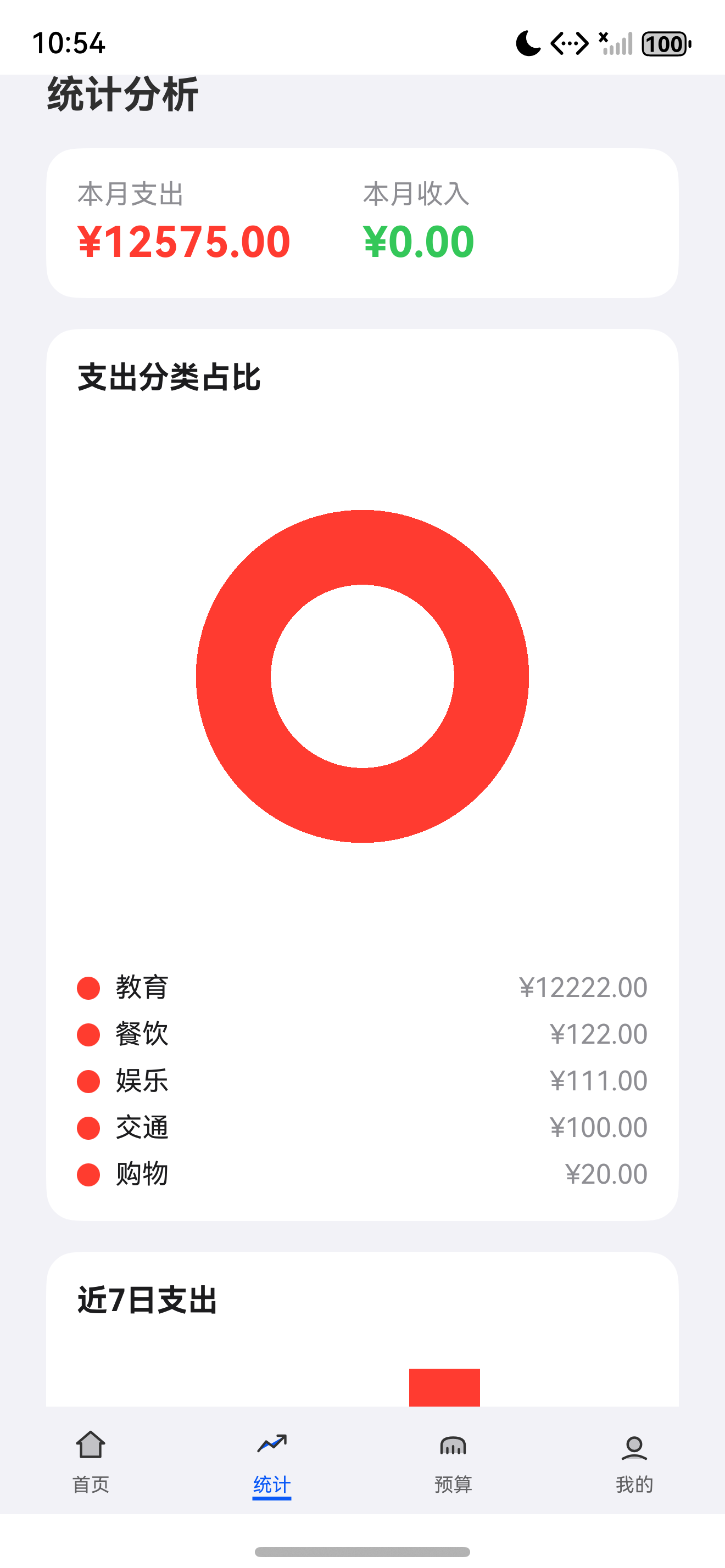
总结
本文完整介绍了 统计分析首页,涵盖 StatisticsViewModel 业务逻辑、StatisticsChart 组件封装、StatisticsView 页面实现、Canvas 绘制、主题响应,以及关键的 ArkTS @Prop 属性命名冲突陷阱。通过本篇你可以:
- 设计完整的业务逻辑层,使用
ChartItem/TrendItem接口封装图表数据 - 封装可复用的图表组件
StatisticsChart - 使用 Canvas API 绘制饼图/柱状图/折线图
- 处理触摸交互与命中检测
- 响应深色模式自动重绘
- 规避
@Prop width/height与CustomComponent基类方法的命名冲突
下一篇预告:继续推进 HarmonyLedger 系列的后续功能模块,将基于本文 StatisticsChart 组件分别实现饼图、柱状图、折线图三种图表。
如果这篇文章对你有帮助,欢迎点赞👍、收藏⭐、关注🔔,你的支持是我持续创作的动力!
相关资源
- 本篇源码:GitHub Tag v0.1.8
- ArkUI Canvas:canvas
- ArkUI Animation:animation
- 鸿蒙通知服务:notification
- Canvas 绘制教程:canvas-tutorial
- ArkUI 触摸事件:touch-event
- 图表组件实践:chart-component

讨论HarmonyOS开发技术,专注于API与组件、DevEco Studio、测试、元服务和应用上架分发等。
更多推荐
 0
0 0
0- 0


 已为社区贡献86条内容

所有评论(0)