HarmonyOS 6.0 半模态bindSheet与全模态bindContentCover——HarmonyOS NEXT弹窗层级的终极方案
HarmonyOS NEXT从API 12开始,给弹窗交互带来了两位重量级选手——半模态bindSheet和全模态bindContentCover。很多开发者还在用CustomDialogController硬扛,殊不知这两个新API才是正解——这篇把bindSheet与bindContentCover的完整方案讲清楚。
bindSheet基础:用@State控制半模态的显隐
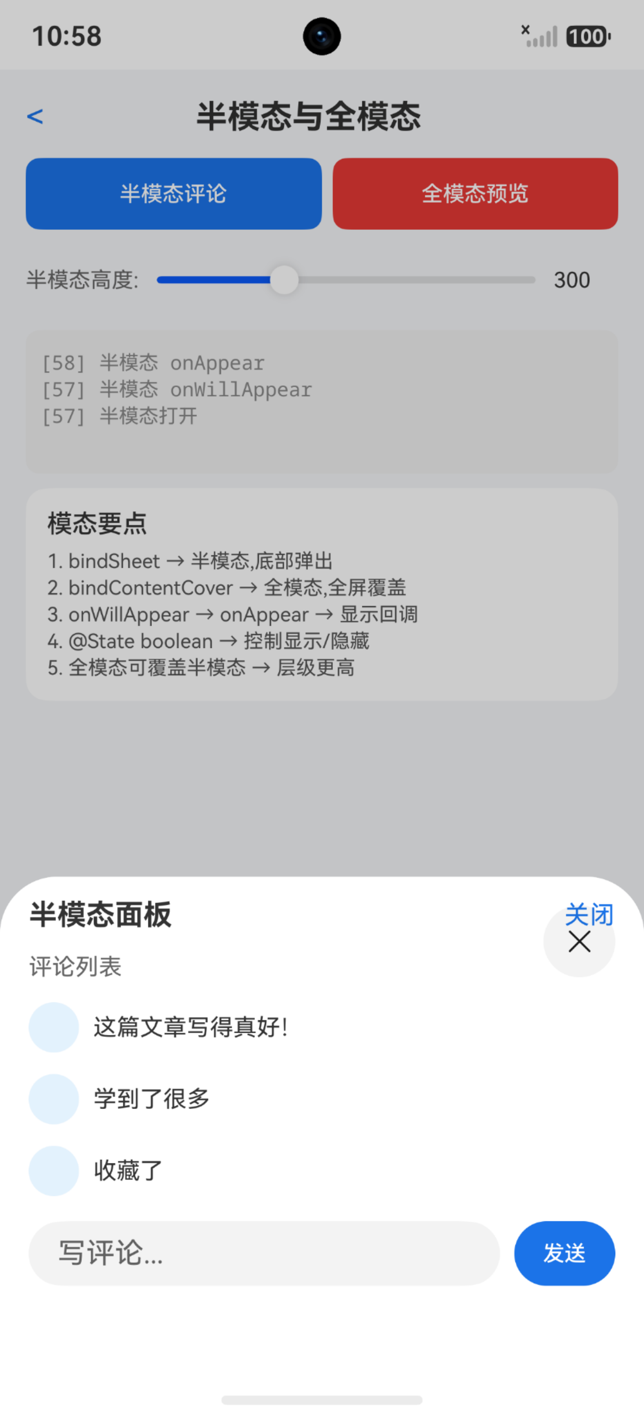
半模态(bindSheet)只覆盖屏幕下半部分,用户能看到背后的页面内容。显示和隐藏完全由@State布尔值驱动,就像开关灯一样简单。
@Entry
@Component
struct SheetBasicDemo {
  @State isSheetShow: boolean = false;

  @Builder sheetBuilder() {
    Column() {
      Text('这是半模态内容').fontSize(18).fontWeight(FontWeight.Bold)
      Text('用户可以看到背景页面').fontSize(14).fontColor('#666666')
      Button('关闭半模态')
        .margin({ top: 20 })
        .onClick(() => {
          this.isSheetShow = false; // 状态驱动关闭
        })
    }
    .padding(24)
    .height(300)
    .width('100%')
    .backgroundColor(Color.White)
  }

  build() {
    Column() {
      Button('打开半模态')
        .onClick(() => {
          this.isSheetShow = true; // 状态驱动打开
        })
        .bindSheet(this.isSheetShow, this.sheetBuilder(), {
          height: 300,
          backgroundColor: Color.White
        })
    }
    .width('100%')
    .height('100%')
    .justifyContent(FlexAlign.Center)
  }
}
isSheetShow设为true弹出,false缩回。状态即UI——这是ArkUI的核心思想。
注意:bindSheet必须绑定在组件上,不能脱离组件单独调用。
SheetOptions详解:高度、背景、detents多档位
bindSheet的第三个参数SheetOptions控制外观和行为。detents是API 12新增的多档位能力,让半模态可以在不同高度间切换。
@Entry
@Component
struct SheetOptionsDemo {
  @State isSheetShow: boolean = false;

  @Builder multiDetentSheet() {
    Column() {
      Text('多档位半模态').fontSize(20).fontWeight(FontWeight.Bold).margin({ bottom: 16 })
      List({ space: 10 }) {
        ForEach(['项目一', '项目二', '项目三'], (item: string) => {
          ListItem() {
            Text(item).fontSize(16).padding(12).backgroundColor('#f5f5f5').borderRadius(8).width('100%')
          }
        })
      }
      .width('100%').layoutWeight(1).margin({ top: 16 })
    }
    .padding(20).width('100%')
  }

  build() {
    Column() {
      Button('多档位半模态')
        .onClick(() => { this.isSheetShow = true; })
        .bindSheet(this.isSheetShow, this.multiDetentSheet(), {
          detents: [SheetSize.MEDIUM, SheetSize.LARGE, 600],
          backgroundColor: Color.White,
          showClose: true,
          dragBar: true // 显示拖拽条,提示可拖拽切换档位
        })
    }
    .width('100%').height('100%').justifyContent(FlexAlign.Center)
  }
}
SheetSize.MEDIUM大约屏幕一半,SheetSize.LARGE接近全屏,也可以直接写vp数值。用户通过上下拖拽在档位间切换。
关键区别:detents和height互斥,设了detents就不要再设height。
bindSheet生命周期:精准把握每个时机
半模态有四个生命周期回调——onWillAppear、onAppear、onWillDisappear、onDisappear,触发顺序依次执行。
@Entry
@Component
struct SheetLifecycleDemo {
  @State isSheetShow: boolean = false;
  @State sheetData: string[] = [];

  @Builder lifecycleSheet() {
    Column() {
      Text('生命周期演示').fontSize(20).fontWeight(FontWeight.Bold).margin({ bottom: 16 })
      ForEach(this.sheetData, (item: string) => {
        Text(item).fontSize(16).padding(8).width('100%')
      })
      Button('关闭').margin({ top: 20 }).onClick(() => { this.isSheetShow = false; })
    }
    .padding(24).width('100%')
  }

  build() {
    Column() {
      Button('打开带生命周期的半模态')
        .onClick(() => { this.isSheetShow = true; })
        .bindSheet(this.isSheetShow, this.lifecycleSheet(), {
          height: 400,
          backgroundColor: Color.White,
          onWillAppear: () => {
            // 动画开始前,预加载数据
            this.sheetData = ['数据1', '数据2', '数据3'];
          },
          onAppear: () => {
            // 动画结束后,可以安全操作UI
          },
          onWillDisappear: () => {
            // 关闭动画开始前,保存状态
          },
          onDisappear: () => {
            // 关闭动画结束后,清理资源
            this.sheetData = [];
          }
        })
    }
    .width('100%').height('100%').justifyContent(FlexAlign.Center)
  }
}
onWillAppear适合做数据准备,onAppear时用户已可交互,onWillDisappear不要做耗时操作。
注意:onWillDisappear里不要做耗时操作,否则会卡住关闭动画。
自定义Sheet内容:@Builder打造复杂面板
默认半模态只是白板容器,内容由@Builder定制。评论面板、分享面板、表单输入都可以塞进去。
interface CommentItem {
  userName: string;
  content: string;
  time: string;
}

@Entry
@Component
struct CommentSheetDemo {
  @State isSheetShow: boolean = false;
  @State commentInput: string = '';
  @State commentList: CommentItem[] = [
    { userName: '小明', content: '这篇文章写得好!', time: '2分钟前' },
    { userName: '小红', content: '学习了,收藏了', time: '5分钟前' }
  ];

  @Builder commentPanelBuilder() {
    Column() {
      Row() {
        Text('评论').fontSize(18).fontWeight(FontWeight.Bold)
        Text(`${this.commentList.length}条`).fontSize(14).fontColor('#999999')
      }.width('100%').justifyContent(FlexAlign.SpaceBetween).padding(16)

      List({ space: 12 }) {
        ForEach(this.commentList, (item: CommentItem) => {
          ListItem() {
            Row() {
              Text(item.userName).fontSize(14).fontWeight(FontWeight.Medium).width(60)
              Column() {
                Text(item.content).fontSize(14)
                Text(item.time).fontSize(12).fontColor('#999999').margin({ top: 4 })
              }.layoutWeight(1)
            }.width('100%')
          }
        })
      }.layoutWeight(1).padding({ left: 16, right: 16 })

      Row() {
        TextInput({ placeholder: '写评论...', text: this.commentInput })
          .layoutWeight(1).onChange((value: string) => { this.commentInput = value; })
        Button('发送').margin({ left: 8 }).onClick(() => {
          if (this.commentInput.length > 0) {
            this.commentList.push({ userName: '我', content: this.commentInput, time: '刚刚' });
            this.commentInput = '';
          }
        })
      }.padding(16)
    }
    .height(500).backgroundColor(Color.White)
  }

  build() {
    Column() {
      Button('打开评论面板')
        .onClick(() => { this.isSheetShow = true; })
        .bindSheet(this.isSheetShow, this.commentPanelBuilder(), {
          detents: [SheetSize.MEDIUM, SheetSize.LARGE],
          backgroundColor: Color.White,
          dragBar: true
        })
    }
    .width('100%').height('100%').justifyContent(FlexAlign.Center)
  }
}
@Builder里可以放任何UI组件,半模态只是容器,内容完全自定义——比AlertDialog灵活太多了。
注意:@Builder中引用的@State变量必须属于当前组件,跨组件传参用@Prop或@Link。
bindContentCover:全屏模态的完整方案
bindSheet是"半遮面",bindContentCover就是"全屏幕"——完全覆盖底层页面,适合图片查看、文档阅读等全屏场景。
@Entry
@Component
struct ContentCoverDemo {
  @State isCoverShow: boolean = false;
  @State currentImageUrl: string = '';

  @Builder fullScreenCover() {
    Column() {
      Row() {
        Text('返回').fontSize(16).fontColor(Color.White)
          .onClick(() => { this.isCoverShow = false; })
        Text('图片查看器').fontSize(18).fontColor(Color.White).layoutWeight(1).textAlign(TextAlign.Center)
        Text('').width(50)
      }.width('100%').height(56).padding({ left: 16, right: 16 }).backgroundColor('#000000')

      Column() {
        Image(this.currentImageUrl).objectFit(ImageFit.Contain).width('100%').layoutWeight(1)
      }.layoutWeight(1).width('100%').justifyContent(FlexAlign.Center).backgroundColor('#000000')
    }
    .width('100%').height('100%').backgroundColor('#000000')
  }

  build() {
    Column() {
      Image('https://example.com/thumb.jpg')
        .width(200).height(200).borderRadius(8)
        .onClick(() => {
          this.currentImageUrl = 'https://example.com/full.jpg';
          this.isCoverShow = true;
        })
        .bindContentCover(this.isCoverShow, this.fullScreenCover(), {
          modalTransition: ModalTransition.Default,
          backgroundColor: Color.Black,
          onAppear: () => {},
          onDisappear: () => {}
        })
    }
    .width('100%').height('100%').justifyContent(FlexAlign.Center)
  }
}
用法和bindSheet如出一辙,区别在于全屏覆盖,底层页面完全不可见。
关键区别:bindContentCover不支持detents,它本身就是全屏的。
ModalTransition转场动画与全模态生命周期
全模态的生命周期回调和bindSheet完全一致。多了一个ModalTransition属性控制转场动画。
@Entry
@Component
struct CoverTransitionDemo {
  @State isSlideCover: boolean = false;
  @State isFadeCover: boolean = false;

  @Builder slideCoverBuilder() {
    Column() {
      Text('底部滑入效果').fontSize(20).fontColor(Color.White).margin({ top: 100 })
      Button('关闭').onClick(() => { this.isSlideCover = false; }).margin({ top: 20 })
    }
    .width('100%').height('100%').backgroundColor('#1a73e8')
    .justifyContent(FlexAlign.Start).alignItems(HorizontalAlign.Center)
  }

  @Builder fadeCoverBuilder() {
    Column() {
      Text('透明渐变效果').fontSize(20).fontColor(Color.White).margin({ top: 100 })
      Button('关闭').onClick(() => { this.isFadeCover = false; }).margin({ top: 20 })
    }
    .width('100%').height('100%').backgroundColor('#e8710a')
    .justifyContent(FlexAlign.Start).alignItems(HorizontalAlign.Center)
  }

  build() {
    Column({ space: 20 }) {
      Button('底部滑入')
        .onClick(() => { this.isSlideCover = true; })
        .bindContentCover(this.isSlideCover, this.slideCoverBuilder(), {
          modalTransition: ModalTransition.Default
        })
      Button('透明渐变')
        .onClick(() => { this.isFadeCover = true; })
        .bindContentCover(this.isFadeCover, this.fadeCoverBuilder(), {
          modalTransition: ModalTransition.FADE
        })
    }
    .width('100%').height('100%').justifyContent(FlexAlign.Center)
  }
}
三种模式:Default(底部滑入)、FADE(透明渐变)、NONE(无动画)。图片查看器用Default,沉浸式用FADE。
注意:全模态不支持横竖屏切换和路由跳转,需要导航请用Navigation替代。
半模态与全模态的层级叠加
API 12的杀手级能力——半模态上可以再拉起全模态,全模态关闭后半模态还在。后拉起的模态覆盖先前的,就像叠罗汉。
@Entry
@Component
struct LayeredModalDemo {
  @State isSheetShow: boolean = false;
  @State isCoverShow: boolean = false;

  @Builder tripInfoSheet() {
    Column() {
      Text('行程信息').fontSize(20).fontWeight(FontWeight.Bold).margin({ bottom: 16 })
      Row() {
        Column() { Text('00:25'); Text('始发站') }.width(100).alignItems(HorizontalAlign.Center)
        Column() { Text('G1234'); Text('8时1分') }.layoutWeight(1).alignItems(HorizontalAlign.Center)
        Column() { Text('08:26'); Text('终点站') }.width(100).alignItems(HorizontalAlign.Center)
      }.width('100%').padding(16).backgroundColor('#f5f5f5').borderRadius(8)

      Button('选择乘车人').width('100%').margin({ top: 20 })
        .onClick(() => { this.isCoverShow = true; })
        .bindContentCover(this.isCoverShow, this.passengerCover(), {
          modalTransition: ModalTransition.Default,
          backgroundColor: Color.White
        })
    }
    .padding(20).backgroundColor(Color.White)
  }

  @Builder passengerCover() {
    Column() {
      Row() {
        Text('返回').fontColor('#007dfe').onClick(() => { this.isCoverShow = false; })
        Text('选择乘车人').fontSize(18).layoutWeight(1).textAlign(TextAlign.Center)
        Text('').width(50)
      }.width('100%').padding(16)
      Column() {
        Text('张三').fontSize(18).padding(16).width('100%').backgroundColor('#f5f5f5').margin({ bottom: 8 })
        Text('李四').fontSize(18).padding(16).width('100%').backgroundColor('#f5f5f5')
      }.padding(16)
      Button('确定').width('90%').margin({ top: 20 }).onClick(() => { this.isCoverShow = false; })
    }
    .width('100%').height('100%').backgroundColor('#f5f5f5')
  }

  build() {
    Column() {
      Button('查看行程')
        .onClick(() => { this.isSheetShow = true; })
        .bindSheet(this.isSheetShow, this.tripInfoSheet(), {
          detents: [SheetSize.MEDIUM, SheetSize.LARGE],
          backgroundColor: Color.White
        })
    }
    .width('100%').height('100%').justifyContent(FlexAlign.Center)
  }
}
全模态的bindContentCover绑在半模态内部的按钮上。全模态关闭后,半模态依然显示——因为@State独立控制,互不干扰。
关键区别:全模态层级天然高于半模态。先拉全模态再拉半模态,半模态会被挡住。
踩坑清单
| 问题 | 原因 | 解决 |
|---|---|---|
| 半模态不弹出 | isShow初始值为true | 初始值必须设为false |
| bindSheet内容为空 | @Builder未定义或引用错误 | 确保Builder名称一致且有内容 |
| detents不生效 | 同时设置了height属性 | 去掉height,只用detents |
| 半模态拖拽无反应 | dragBar未设为true | dragBar: true显示拖拽指示条 |
| 全模态关闭后半模态也消失 | 共用同一个@State变量 | 各用独立的布尔变量控制 |
| 全模态中路由跳转失败 | bindContentCover不支持路由 | 用Navigation替代全模态 |
| 生命周期回调不触发 | 回调写在options之外 | 必须写在bindSheet的options参数内 |
| 半模态内容滚动冲突 | 未设置nestedScroll | 滚动容器加nestedScroll属性 |
| ModalTransition.FADE无动画 | SDK版本低于API 12 | 升级SDK至API 12+ |
| 全模态中横竖屏切换异常 | bindContentCover不支持 | 避免在全模态中切换屏幕方向 |

讨论HarmonyOS开发技术,专注于API与组件、DevEco Studio、测试、元服务和应用上架分发等。
更多推荐



 1
1 0
0- 0


 已为社区贡献85条内容

所有评论(0)