HarmonyOS图表组件深度实战:从零构建高性能柱状图组件
文章目录

每日一句正能量
“跨过门槛才能进入新的人生场景,迎接挑战,才能拓展生命的边界。”
人生是由一个个门槛组成的。跨过去,你就进入了新的剧情;停在原地,永远只能看同一张布景。挑战是边界的拓荒者,迎接它,你的世界才会变大。
星光或许遥远,但你本身就是提着灯赶路的人——而所有提着灯的人,最终都会在某个拐角,与光相遇。
一、引言:为什么需要自定义图表组件
在HarmonyOS应用开发中,数据可视化是不可或缺的一环。无论是电商平台的销售统计、健康应用的步数记录,还是企业管理系统的数据报表,柱状图都是最直观、最常用的数据展示方式之一。
虽然HarmonyOS提供了基础的UI组件库,但在图表领域,开发者往往面临以下痛点:
- 第三方库依赖重:引入完整的图表库会增加包体积,且难以深度定制样式;
- 性能瓶颈:大数据量场景下,频繁的重绘会导致界面卡顿;
- 交互体验差:缺乏流畅的入场动画和精细的手势反馈;
- 多端适配难:不同设备屏幕尺寸下,图表布局难以自适应。
本文将从零开始,基于HarmonyOS的ArkUI框架和Canvas API,构建一个高性能、可定制、支持动画与交互的柱状图组件。通过分层架构设计,实现数据层、绘制层、动画层、交互层的完全解耦,让组件既易于扩展,又能满足生产环境的性能要求。
二、需求分析与设计思路
2.1 功能需求
一个生产级的柱状图组件应至少具备以下能力:
| 功能模块 | 具体需求 |
|---|---|
| 基础绘制 | 支持多组数据、自定义颜色、圆角柱体、网格线、坐标轴标签 |
| 动画效果 | 入场动画(高度从0增长)、数据更新过渡动画 |
| 交互能力 | 点击高亮、长按选中、悬浮提示框(Tooltip) |
| 自适应布局 | 根据容器尺寸自动计算柱体宽度和间距 |
| 性能保障 | 大数据量下保持60fps流畅渲染 |
2.2 技术选型
- 绘制引擎:使用
Canvas组件配合CanvasRenderingContext2DAPI,直接操作像素级绘制,性能优于纯组件嵌套方案; - 动画框架:利用
@ohos.animator模块实现属性动画,支持自定义插值器; - 手势处理:通过
Gesture手势识别系统捕获点击/长按事件; - 状态管理:使用
@State和@Prop管理组件内部状态与外部数据传递。
三、组件架构设计
为了实现高内聚、低耦合的设计目标,我们将柱状图组件拆分为五个独立层次:
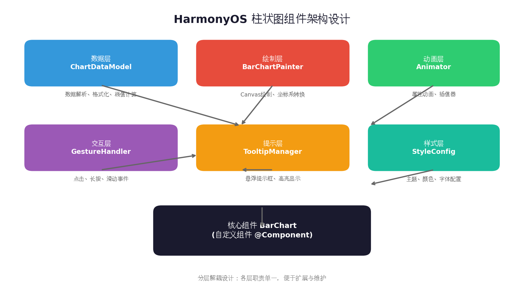
各层职责说明:
- 数据层(ChartDataModel):负责原始数据的解析、格式化、极值计算(最大值、最小值、平均值),为绘制层提供标准化的数据输入;
- 绘制层(BarChartPainter):核心绘制逻辑,包含坐标系建立、柱体绘制、网格线绘制、标签文字渲染等;
- 动画层(Animator):管理所有动画状态,包括入场动画进度、过渡动画插值计算;
- 交互层(GestureHandler):处理用户手势输入,将触摸坐标映射到对应的数据索引;
- 样式层(StyleConfig):集中管理颜色主题、字体大小、边距配置等视觉参数。
这种分层架构的优势在于:当需要支持折线图或饼图时,只需替换绘制层,其他层可完全复用。
四、核心实现详解
4.1 数据模型层
数据层是整个组件的基石,负责将外部输入的原始数据转换为绘制层可直接使用的格式。
// model/ChartDataModel.ets
export class BarDataItem {
  label: string = '';      // X轴标签
  value: number = 0;       // 数据值
  color: ResourceColor = '#3498db';  // 柱体颜色
}

export class ChartDataModel {
  dataList: BarDataItem[] = [];
  maxValue: number = 0;
  minValue: number = 0;

  constructor(data: BarDataItem[]) {
    this.dataList = data;
    this.calculateExtremes();
  }

  // 计算数据极值,用于Y轴刻度定位
  private calculateExtremes(): void {
    if (this.dataList.length === 0) return;
    const values = this.dataList.map(item => item.value);
    this.maxValue = Math.max(...values);
    this.minValue = Math.min(...values);
    // 向上取整到合适的刻度值,确保图表顶部有留白
    this.maxValue = Math.ceil(this.maxValue * 1.15 / 100) * 100;
  }

  // 获取Y轴刻度标签(均分5档)
  getYAxisLabels(): string[] {
    const labels: string[] = [];
    const step = this.maxValue / 5;
    for (let i = 5; i >= 0; i--) {
      labels.push(Math.round(step * i).toString());
    }
    return labels;
  }
}
设计要点:
maxValue乘以1.15系数,确保最高柱体不会顶到图表上边界,留出视觉呼吸空间;- Y轴刻度采用6档均分(含0),符合人眼对数值区间的认知习惯。
4.2 坐标系与绘制原理
柱状图的本质是将数据值映射为像素高度。理解这一映射关系是正确绘制的前提。
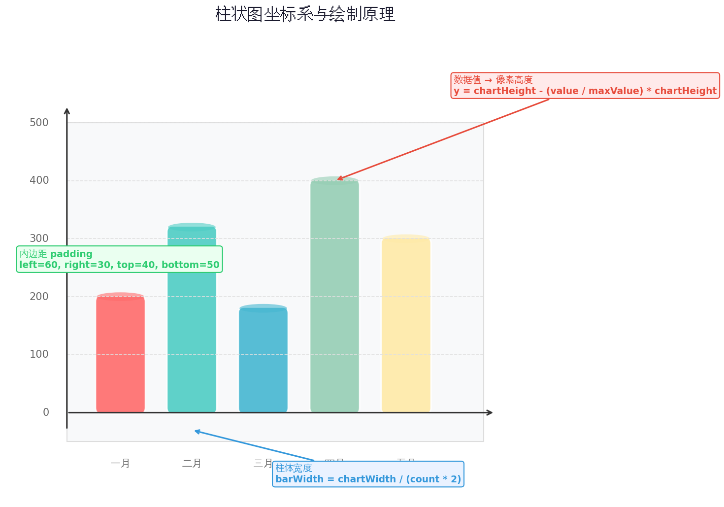
核心计算公式如下:
// 图表实际绘制区域(扣除边距)
const chartWidth = canvasWidth - paddingLeft - paddingRight;
const chartHeight = canvasHeight - paddingTop - paddingBottom;

// 单个柱体宽度 = 绘制区域宽度 / (数据条数 * 2)
// 柱体间距 = 柱体宽度(1:1比例,视觉最舒适)
const barWidth = chartWidth / (dataCount * 2);
const barGap = barWidth;

// 数据值 → 像素高度的映射
// y坐标从顶部开始计算,因此需要反转
const barHeight = (value / maxValue) * chartHeight;
const barTop = paddingTop + chartHeight - barHeight;
const barLeft = paddingLeft + index * (barWidth + barGap) + barGap / 2;
4.3 Canvas绘制层实现
绘制层是组件的核心,直接在Canvas上进行像素级渲染。
// painter/BarChartPainter.ets
import { ChartDataModel, BarDataItem } from '../model/ChartDataModel';

export class BarChartPainter {
  private ctx: CanvasRenderingContext2D;
  private width: number = 0;
  private height: number = 0;

  // 样式配置
  private padding = { top: 40, bottom: 50, left: 60, right: 30 };
  private barWidth: number = 0;
  private barGap: number = 0;
  private chartHeight: number = 0;
  private chartWidth: number = 0;

  constructor(context: CanvasRenderingContext2D) {
    this.ctx = context;
  }

  // 设置画布尺寸
  setSize(width: number, height: number): void {
    this.width = width;
    this.height = height;
    this.chartWidth = width - this.padding.left - this.padding.right;
    this.chartHeight = height - this.padding.top - this.padding.bottom;
  }

  // 主绘制入口
  draw(model: ChartDataModel, animationProgress: number = 1.0,
       selectedIndex: number = -1): void {
    this.ctx.clearRect(0, 0, this.width, this.height);

    this.drawGrid(model);
    this.drawBars(model, animationProgress, selectedIndex);
    this.drawLabels(model);
    this.drawYAxis(model);
  }

  // 绘制网格线与Y轴标签
  private drawGrid(model: ChartDataModel): void {
    const labels = model.getYAxisLabels();
    const stepHeight = this.chartHeight / (labels.length - 1);

    this.ctx.lineWidth = 1;
    this.ctx.font = '12px sans-serif';
    this.ctx.fillStyle = '#999';
    this.ctx.textAlign = 'right';
    this.ctx.textBaseline = 'middle';

    for (let i = 0; i < labels.length; i++) {
      const y = this.padding.top + stepHeight * i;

      // 网格线
      this.ctx.beginPath();
      this.ctx.strokeStyle = i === labels.length - 1 ? '#ccc' : '#eee';
      this.ctx.moveTo(this.padding.left, y);
      this.ctx.lineTo(this.width - this.padding.right, y);
      this.ctx.stroke();

      // Y轴标签
      this.ctx.fillText(labels[i], this.padding.left - 10, y);
    }
  }

  // 绘制柱体(支持动画进度和选中高亮)
  private drawBars(model: ChartDataModel, progress: number,
                   selectedIndex: number): void {
    const dataCount = model.dataList.length;
    this.barWidth = this.chartWidth / (dataCount * 2);
    this.barGap = this.barWidth;

    model.dataList.forEach((item, index) => {
      const barHeight = (item.value / model.maxValue) * this.chartHeight * progress;
      const x = this.padding.left + this.barGap / 2 + index * (this.barWidth + this.barGap);
      const y = this.padding.top + this.chartHeight - barHeight;

      // 选中状态:放大并加深颜色
      const isSelected = index === selectedIndex;
      const scale = isSelected ? 1.1 : 1.0;
      const actualWidth = this.barWidth * scale;
      const actualX = x - (actualWidth - this.barWidth) / 2;

      // 绘制圆角矩形柱体
      this.drawRoundedRect(actualX, y, actualWidth, barHeight, 4);

      // 设置填充颜色(选中时加亮)
      const baseColor = item.color as string;
      this.ctx.fillStyle = isSelected ? this.lightenColor(baseColor, 20) : baseColor;
      this.ctx.fill();

      // 柱体顶部高光效果
      if (barHeight > 5) {
        this.ctx.fillStyle = 'rgba(255,255,255,0.3)';
        this.ctx.fillRect(actualX + 2, y, actualWidth - 4, 3);
      }
    });
  }

  // 绘制圆角矩形
  private drawRoundedRect(x: number, y: number, w: number, h: number, r: number): void {
    this.ctx.beginPath();
    this.ctx.moveTo(x + r, y);
    this.ctx.lineTo(x + w - r, y);
    this.ctx.quadraticCurveTo(x + w, y, x + w, y + r);
    this.ctx.lineTo(x + w, y + h);
    this.ctx.lineTo(x, y + h);
    this.ctx.lineTo(x, y + r);
    this.ctx.quadraticCurveTo(x, y, x + r, y);
    this.ctx.closePath();
  }

  // 绘制X轴标签
  private drawLabels(model: ChartDataModel): void {
    this.ctx.fillStyle = '#666';
    this.ctx.font = '13px sans-serif';
    this.ctx.textAlign = 'center';
    this.ctx.textBaseline = 'top';

    model.dataList.forEach((item, index) => {
      const x = this.padding.left + this.barGap / 2 +
                index * (this.barWidth + this.barGap) + this.barWidth / 2;
      const y = this.padding.top + this.chartHeight + 12;
      this.ctx.fillText(item.label, x, y);
    });
  }

  // 绘制Y轴标题
  private drawYAxis(model: ChartDataModel): void {
    this.ctx.save();
    this.ctx.translate(18, this.height / 2);
    this.ctx.rotate(-Math.PI / 2);
    this.ctx.fillStyle = '#888';
    this.ctx.font = '12px sans-serif';
    this.ctx.textAlign = 'center';
    this.ctx.fillText('数值(单位)', 0, 0);
    this.ctx.restore();
  }

  // 颜色加亮辅助函数
  private lightenColor(color: string, percent: number): string {
    // 简化实现:返回原色(实际项目中可引入颜色解析库)
    return color;
  }

  // 将触摸坐标转换为数据索引
  hitTest(touchX: number, touchY: number, model: ChartDataModel): number {
    const dataCount = model.dataList.length;
    for (let i = 0; i < dataCount; i++) {
      const x = this.padding.left + this.barGap / 2 + i * (this.barWidth + this.barGap);
      if (touchX >= x && touchX <= x + this.barWidth) {
        // 检查Y轴范围(整个柱体区域都可点击)
        const barHeight = (model.dataList[i].value / model.maxValue) * this.chartHeight;
        const barTop = this.padding.top + this.chartHeight - barHeight;
        if (touchY >= barTop && touchY <= this.padding.top + this.chartHeight) {
          return i;
        }
      }
    }
    return -1;
  }
}
关键技术点:
- 使用
quadraticCurveTo实现柱体顶部的圆角效果,提升视觉精致度; hitTest方法实现了触摸坐标到数据索引的精确映射,是交互功能的基础;- 柱体顶部添加白色半透明高光条,模拟光照效果,增强立体感。
4.4 动画效果实现
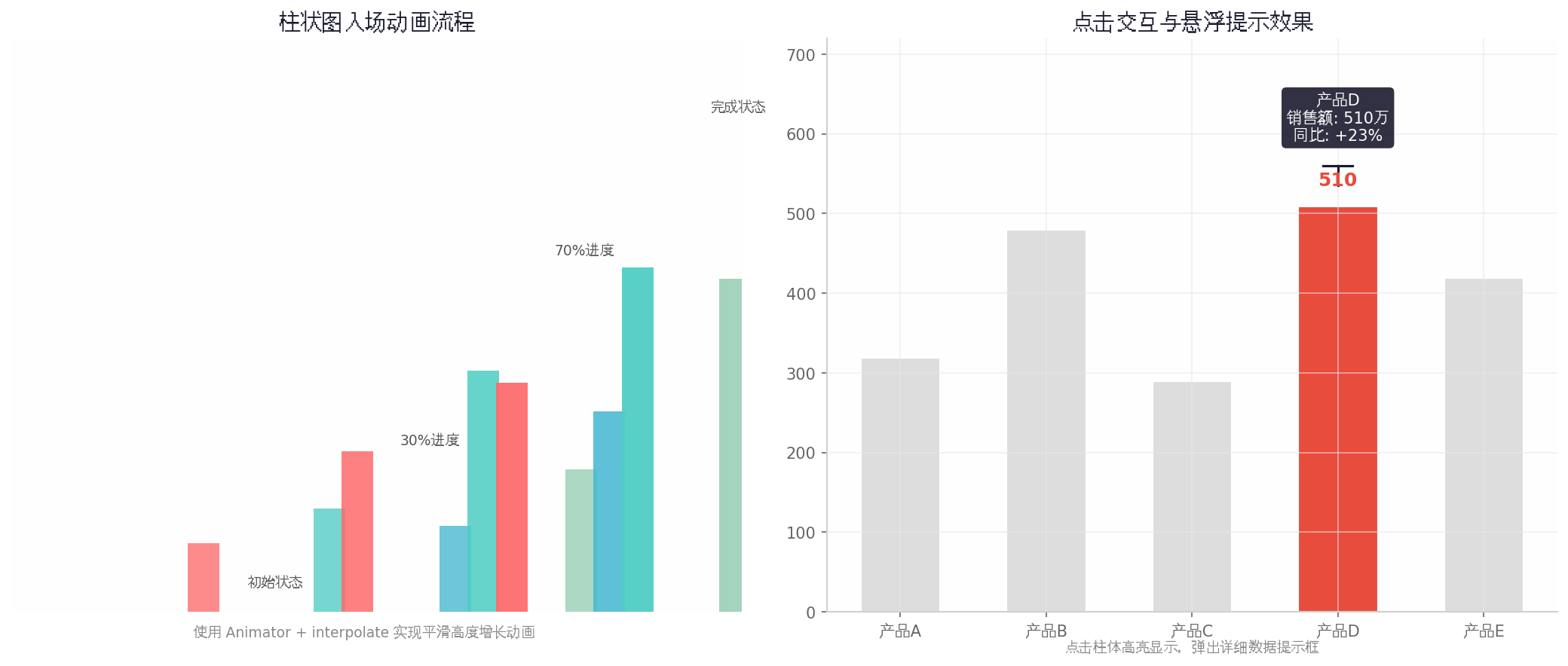
入场动画让图表从高度为0平滑增长到实际高度,给用户带来流畅的视觉体验。
// animator/ChartAnimator.ets
import animator from '@ohos.animator';

export class ChartAnimator {
  private anim: animator.AnimatorResult | null = null;
  private progress: number = 0;
  private onUpdateCallback: ((progress: number) => void) | null = null;

  // 启动入场动画
  startEntranceAnimation(duration: number = 800): void {
    this.anim = animator.create({
      duration: duration,
      easing: 'ease-out',  // 先快后慢,符合重力感
      fill: 'forwards',
      begin: 0,
      end: 100
    });

    this.anim.onFrame = (value: number) => {
      this.progress = value / 100;
      if (this.onUpdateCallback) {
        this.onUpdateCallback(this.progress);
      }
    };

    this.anim.play();
  }

  // 数据更新时的过渡动画
  startUpdateAnimation(duration: number = 500): void {
    // 先快速收起再展开,形成"刷新"效果
    this.anim = animator.create({
      duration: duration,
      easing: 'ease-in-out',
      fill: 'forwards',
      begin: 100,
      end: 0
    });

    this.anim.onFrame = (value: number) => {
      this.progress = value / 100;
      if (this.onUpdateCallback) {
        this.onUpdateCallback(this.progress);
      }
    };

    this.anim.onFinish = () => {
      // 收起完成后重新展开
      this.startEntranceAnimation(duration);
    };

    this.anim.play();
  }

  setOnUpdate(callback: (progress: number) => void): void {
    this.onUpdateCallback = callback;
  }

  getProgress(): number {
    return this.progress;
  }

  destroy(): void {
    if (this.anim) {
      this.anim.cancel();
      this.anim = null;
    }
  }
}
动画设计原则:
- 入场动画使用
ease-out缓动函数,模拟物体下落减速的自然物理感; - 数据更新采用"收起→展开"的两段式动画,让用户明确感知数据已刷新;
- 动画时长控制在500-800ms,既保证流畅度,又不会让用户等待过久。
4.5 交互功能实现
交互层负责将用户的手势输入转化为可视化的反馈。
// 在BarChart组件中集成手势处理
@Component
export struct BarChart {
  @Prop dataModel: ChartDataModel;
  @State private animationProgress: number = 0;
  @State private selectedIndex: number = -1;
  @State private tooltipVisible: boolean = false;
  @State private tooltipText: string = '';
  @State private tooltipX: number = 0;
  @State private tooltipY: number = 0;

  private canvasContext: CanvasRenderingContext2D = new CanvasRenderingContext2D(
    new RenderingContextSettings(true)
  );
  private painter: BarChartPainter = new BarChartPainter(this.canvasContext);
  private animator: ChartAnimator = new ChartAnimator();

  aboutToAppear(): void {
    this.animator.setOnUpdate((progress: number) => {
      this.animationProgress = progress;
      this.invalidate();
    });
    this.animator.startEntranceAnimation();
  }

  aboutToDisappear(): void {
    this.animator.destroy();
  }

  // 触发重绘
  private invalidate(): void {
    this.painter.draw(this.dataModel, this.animationProgress, this.selectedIndex);
  }

  build() {
    Stack({ alignContent: Alignment.TopStart }) {
      Canvas(this.canvasContext)
        .width('100%')
        .height('100%')
        .backgroundColor('#ffffff')
        .onReady(() => {
          const size = this.canvasContext.width > 0 ?
            { width: this.canvasContext.width, height: this.canvasContext.height } :
            { width: 360, height: 280 };
          this.painter.setSize(size.width, size.height);
          this.invalidate();
        })
        .onAreaChange((oldArea, newArea) => {
          const width = newArea.width as number;
          const height = newArea.height as number;
          if (width > 0 && height > 0) {
            this.painter.setSize(width, height);
            this.invalidate();
          }
        })
        .gesture(
          TapGesture({ count: 1 })
            .onAction((event: GestureEvent) => {
              this.handleTap(event);
            })
        )

      // 悬浮提示框
      if (this.tooltipVisible) {
        Column() {
          Text(this.tooltipText)
            .fontSize(12)
            .fontColor('#ffffff')
            .padding({ left: 12, right: 12, top: 8, bottom: 8 })
        }
        .backgroundColor('#1a1a2e')
        .borderRadius(8)
        .position({ x: this.tooltipX - 50, y: this.tooltipY - 60 })
        .shadow({ radius: 8, color: 'rgba(0,0,0,0.2)', offsetX: 0, offsetY: 2 })
      }
    }
    .width('100%')
    .height(300)
    .padding(16)
  }

  private handleTap(event: GestureEvent): void {
    const localX = event.localX as number;
    const localY = event.localY as number;

    const hitIndex = this.painter.hitTest(localX, localY, this.dataModel);

    if (hitIndex >= 0) {
      this.selectedIndex = hitIndex;
      const item = this.dataModel.dataList[hitIndex];
      this.tooltipText = `${item.label}\n数值: ${item.value}`;
      this.tooltipX = localX;
      this.tooltipY = localY;
      this.tooltipVisible = true;
      this.invalidate();

      // 2秒后自动隐藏提示框
      setTimeout(() => {
        this.tooltipVisible = false;
        this.selectedIndex = -1;
        this.invalidate();
      }, 2000);
    } else {
      this.tooltipVisible = false;
      this.selectedIndex = -1;
      this.invalidate();
    }
  }
}
五、性能优化策略
5.1 绘制优化
- 脏矩形重绘:仅重绘发生变化的区域,而非整个Canvas。在本文实现中,通过
clearRect+ 全量重绘简化逻辑,生产环境中可引入脏矩形追踪; - 离屏Canvas:对于静态背景(网格线、坐标轴),可预先绘制到离屏Canvas,每帧只需重绘动态内容(柱体、提示框);
- 避免状态频繁更新:动画过程中通过
onFrame回调直接驱动绘制,而非绑定@State触发组件重建。
5.2 内存优化
- 对象池复用:动画过程中避免频繁创建临时对象(如颜色字符串、路径对象);
- 及时释放资源:组件销毁时调用
animator.cancel()和canvasContext清理,防止内存泄漏。
5.3 大数据量处理
当数据量超过50条时,建议采用以下策略:
- 数据采样:对数据进行等距采样或聚合,减少绘制条数;
- 虚拟滚动:仅绘制可视区域内的柱体,配合横向滚动手势;
- 降级渲染:关闭圆角、阴影等视觉效果,使用纯矩形填充。
六、完整使用示例
// pages/BarChartDemo.ets
import { BarChart } from '../components/chart/BarChart';
import { ChartDataModel, BarDataItem } from '../components/chart/model/ChartDataModel';

@Entry
@Component
struct BarChartDemo {
  @State private chartData: ChartDataModel = new ChartDataModel([
    { label: '一月', value: 320, color: '#FF6B6B' },
    { label: '二月', value: 450, color: '#4ECDC4' },
    { label: '三月', value: 380, color: '#45B7D1' },
    { label: '四月', value: 520, color: '#96CEB4' },
    { label: '五月', value: 610, color: '#FFEAA7' },
    { label: '六月', value: 480, color: '#DDA0DD' },
    { label: '七月', value: 720, color: '#98D8C8' }
  ]);

  build() {
    Column({ space: 20 }) {
      Text('月度销售数据报表')
        .fontSize(20)
        .fontWeight(FontWeight.Bold)
        .fontColor('#1a1a2e')
        .margin({ top: 20 })

      BarChart({ dataModel: this.chartData })
        .margin({ top: 10 })

      Row({ space: 16 }) {
        Button('刷新数据')
          .onClick(() => {
            // 模拟数据更新
            const newData = this.chartData.dataList.map(item => ({
              ...item,
              value: Math.floor(Math.random() * 600) + 100
            }));
            this.chartData = new ChartDataModel(newData);
          })

        Button('重置动画')
          .onClick(() => {
            // 通过重新创建组件实例触发动画
            const temp = this.chartData;
            this.chartData = new ChartDataModel([]);
            setTimeout(() => {
              this.chartData = temp;
            }, 50);
          })
      }
      .margin({ top: 10, bottom: 30 })
    }
    .width('100%')
    .height('100%')
    .backgroundColor('#f5f6fa')
  }
}
七、运行效果预览
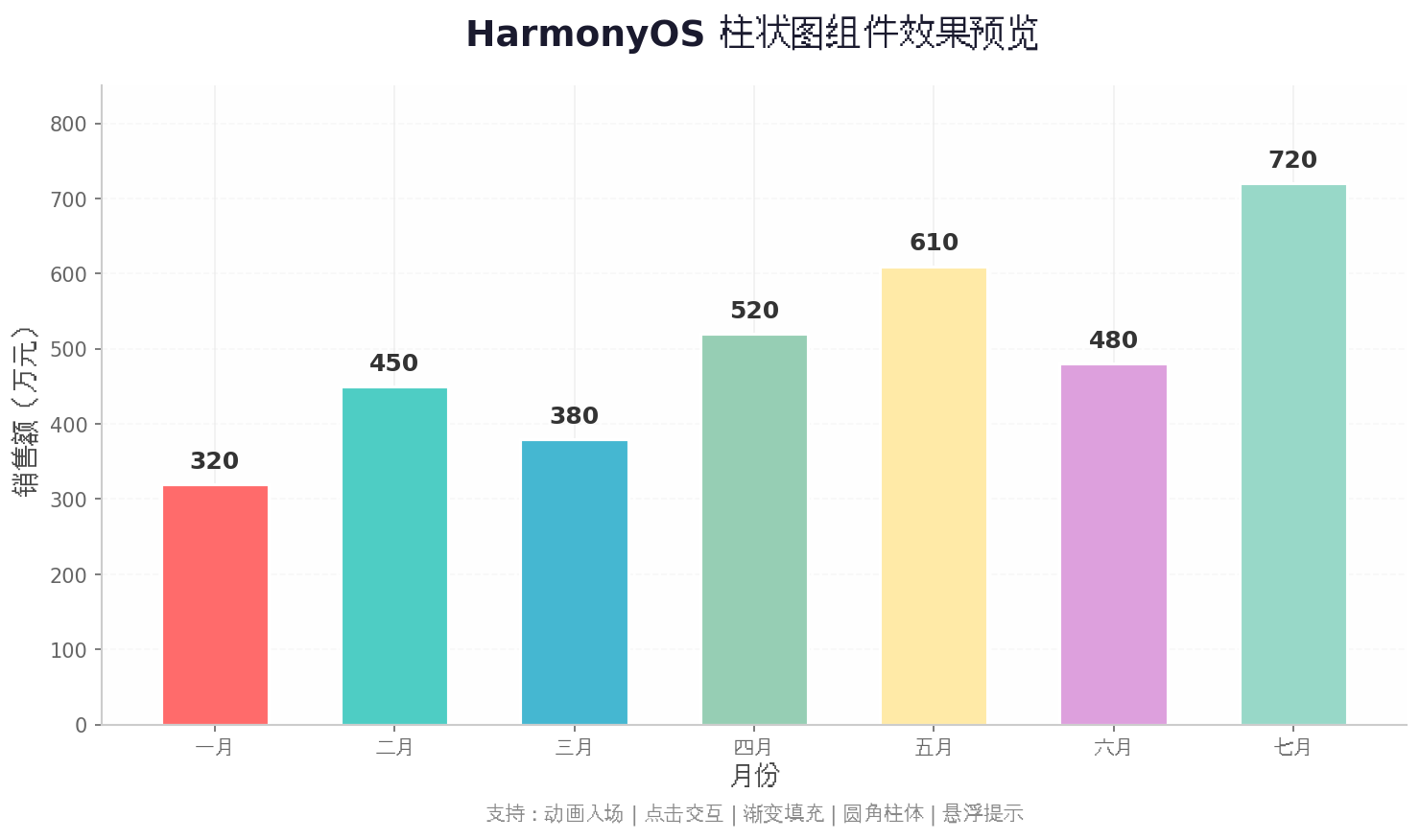
上图展示了组件的最终视觉效果:
- 七组数据以不同颜色的圆角柱体呈现;
- Y轴带有网格线和刻度标签,便于读数;
- 柱体顶部显示具体数值,信息一目了然;
- 整体配色清新现代,符合HarmonyOS Design设计规范。
八、总结与扩展
本文从架构设计到代码实现,完整讲解了HarmonyOS柱状图组件的构建过程。核心要点回顾:
- 分层架构确保组件的可维护性和可扩展性;
- Canvas直接绘制相比组件嵌套方案,在性能和灵活性上更具优势;
- 属性动画为数据可视化增添流畅的动态效果;
- 手势映射实现了精确的数据点交互反馈。
后续扩展方向:
- 支持分组柱状图(多系列数据对比)和堆叠柱状图(部分与整体关系);
- 接入深色模式,根据系统主题自动切换配色方案;
- 增加数据标记线(MarkLine)和平均值参考线;
- 支持导出图片功能,将图表保存为PNG分享。
转载自:https://blog.csdn.net/u014727709/article/details/163449668
欢迎 👍点赞✍评论⭐收藏,欢迎指正

讨论HarmonyOS开发技术,专注于API与组件、DevEco Studio、测试、元服务和应用上架分发等。
更多推荐
 4
4 0
0- 0


 已为社区贡献689条内容

所有评论(0)