Rating 评分组件——从星级展示到高阶自定义评分系统的完整开发指南
文章目录

每日一句正能量
“不要因为自己的工作已经完成了99%,就觉得可以放松了,真正决定成败的往往是那最后的1%。”
99%是产品,最后的1%是作品;99%是及格,最后的1%是惊艳。就像烧水,烧到99度水还没开,只差那1度,前面的能量都白费了。最后的收尾工作、交付时的细节检查,往往决定了你在别人心中是“靠谱”还是“将就”。
摘要
摘要:在电商、外卖、出行、内容社区等各类应用中,评分系统是连接用户反馈与平台优化的核心纽带。HarmonyOS ArkUI 框架提供的 Rating(评分) 组件,以轻量化的接口设计、灵活的自定义能力和完善的交互事件体系,为开发者构建专业级评分功能提供了官方标准方案。本文将从组件架构、核心 API、基础用法、进阶实战以及自定义扩展等多个维度,系统讲解 Rating 组件的完整开发方案,帮助开发者快速构建兼具美观与实用的评分系统。
一、引言:评分组件在现代应用中的价值
评分系统是现代移动应用不可或缺的基础设施之一。无论是用户购买商品后的满意度评价、骑手配送服务的服务质量打分,还是应用商店中用户对 App 的星级评定,评分组件都承担着量化用户反馈、辅助决策判断、驱动产品迭代的关键角色。
一个优秀的评分组件需要满足以下核心诉求:
- 视觉直观:通过星级、进度条等可视化形式,让用户一眼感知评分高低
- 交互流畅:支持点击、滑动等多种交互方式,评分过程自然无阻塞
- 精度可控:支持整星、半星甚至更小粒度的评分精度,满足不同业务场景
- 样式可定制:支持自定义图标、颜色、尺寸,与品牌视觉体系保持一致
- 模式灵活:既能作为交互式输入组件,也能作为只读展示指示器
HarmonyOS 的 Rating 组件 从 API Version 7 开始提供支持,在 API 9 之后全面支持 ArkTS 卡片场景。经过多个版本的迭代,该组件在功能完备性、性能表现和可扩展性方面均已达到生产级标准,是鸿蒙生态中构建评分系统的首选官方组件。
二、Rating 组件架构与核心概念
在深入代码之前,我们先从架构层面理解 Rating 组件的设计模型。
2.1 组件接口设计
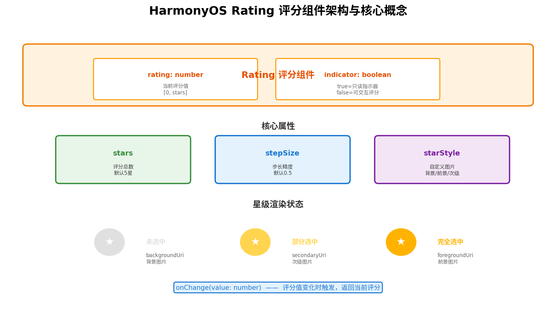
Rating 组件采用极简的接口设计,仅需两个核心参数即可完成初始化:
Rating(options?: { rating: number, indicator?: boolean })
- rating(必填):当前评分值,取值范围为
[0, stars]。小于 0 时按 0 处理,大于 stars 时按最大值处理。该参数支持双向绑定,当用户交互改变评分时,绑定的状态变量会自动同步更新。 - indicator(可选):控制组件的工作模式。
false(默认)表示可交互评分模式,用户可点击或滑动改变评分;true表示只读指示器模式,仅用于展示评分结果,不可交互。
这种"一个组件、两种模式"的设计,使得开发者无需引入额外的展示组件,仅凭一个 Rating 即可覆盖评分输入和评分展示两种场景,显著降低了代码复杂度和维护成本。
2.2 核心属性体系
Rating 组件提供了三个关键属性,用于精细控制评分行为与视觉表现:
| 属性 | 类型 | 默认值 | 说明 |
|---|---|---|---|
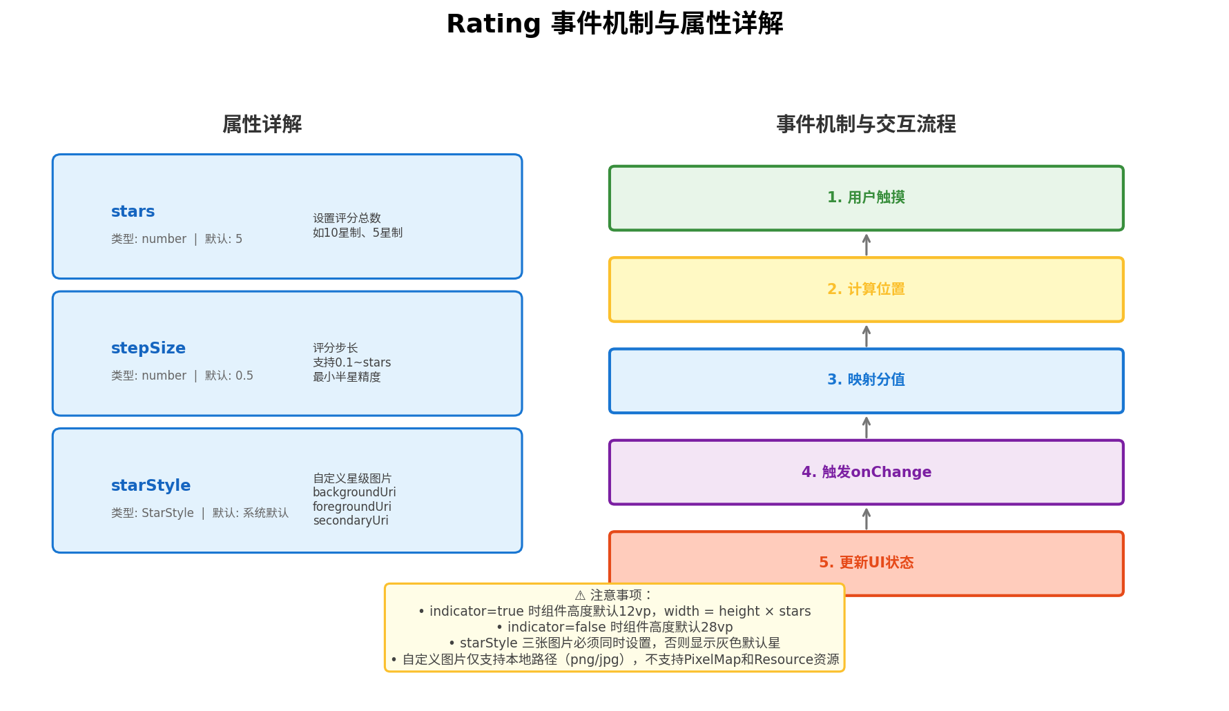
stars | number | 5 | 设置评分总数,支持任意正整数。常见取值有 5(五星制)和 10(十分制) |
stepSize | number | 0.5 | 评分步长,控制用户每次交互的最小评分变化量。取值范围为 [0.1, stars] |
starStyle | StarStyle | 系统默认 | 自定义星级图片,包含 backgroundUri(未选中)、foregroundUri(选中)、secondaryUri(部分选中)三个字段 |
2.3 星级渲染的三态模型
Rating 组件在渲染时,根据当前评分值与每个星级的位置关系,将每个星级渲染为三种状态之一:
- 完全选中(foreground):当评分值覆盖整个星级区域时,使用前景图片渲染
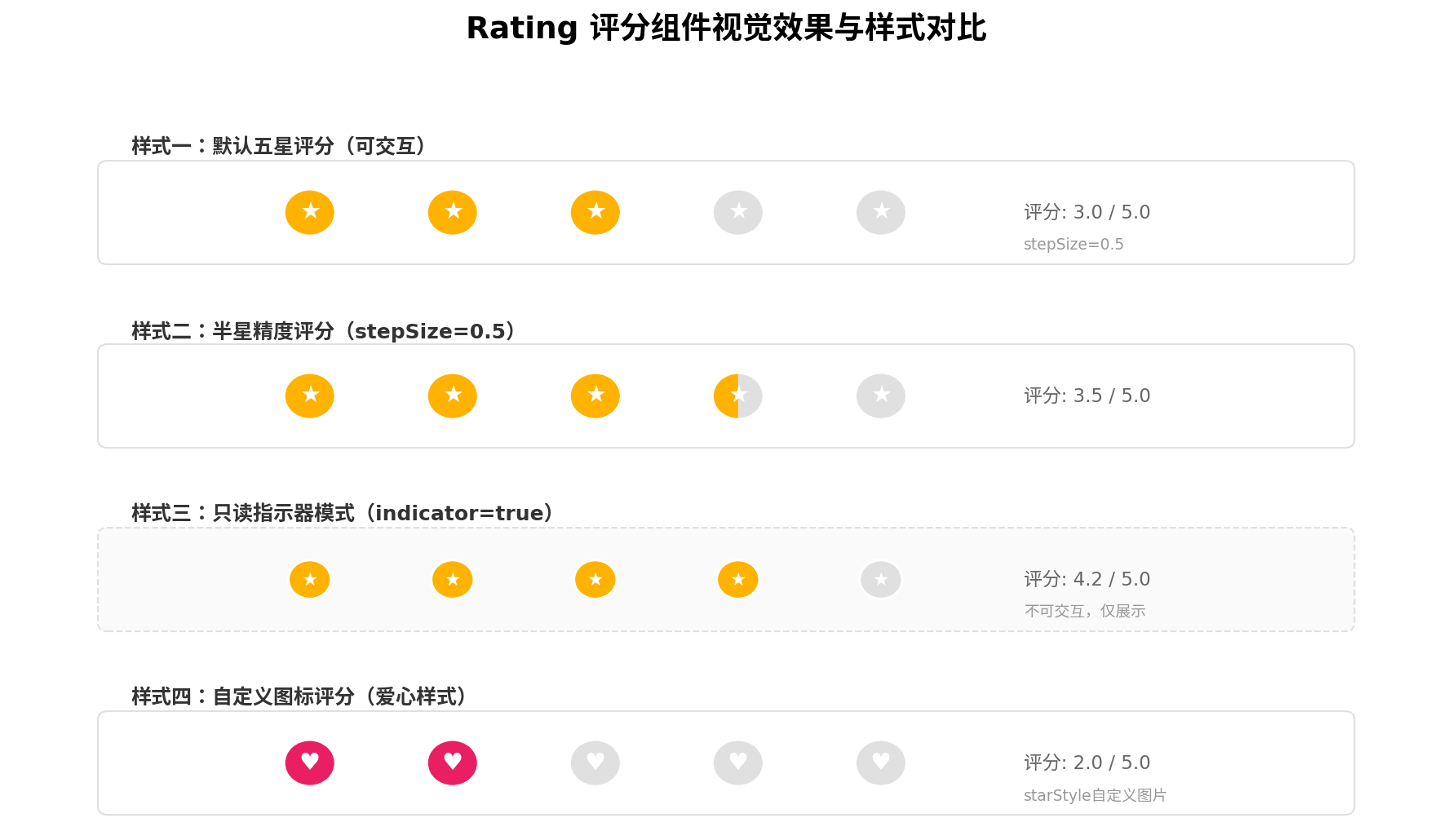
- 部分选中(secondary):当评分值仅覆盖星级区域的一部分时(如半星场景),使用次级图片渲染左侧,背景图片渲染右侧
- 未选中(background):当评分值未覆盖该星级时,使用背景图片渲染
三态模型是实现半星、四分之一星等精细化评分展示的核心机制。开发者通过提供对应的三套图片资源,即可实现完全自定义的视觉风格。
三、核心 API 与事件机制详解
3.1 尺寸与布局特性
Rating 组件的尺寸行为在不同模式下存在差异,这是开发中需要特别注意的细节:
- indicator = true(只读模式):默认组件高度
height = 12.0vp,组件宽度width = height × stars。整体呈现紧凑的迷你尺寸,适合嵌入列表项、卡片等空间受限的场景。 - indicator = false(交互模式):默认组件高度
height = 28.0vp,组件宽度同样为width = height × stars。更大的触摸区域确保了用户交互的准确性。
当开发者自定义宽高时,单个星级的绘制区域为 [width / stars, height]。为保证星级显示为正方形,建议采用 width = height × stars 的等比设置方式。
3.2 onChange 事件回调
Rating 组件仅提供一个事件回调 onChange,在用户通过点击或滑动改变评分值时触发:
.onChange((value: number) => {
  // value 为当前评分值
  this.rating = value
})
虽然事件接口简洁,但配合 ArkTS 的状态管理机制,已足以覆盖绝大多数业务场景。对于需要监听评分开始、评分结束等更细粒度事件的场景,可以通过外层容器的手势系统(PanGesture、TapGesture)进行扩展实现。
3.3 自定义图片规范
starStyle 属性是 Rating 组件实现品牌视觉定制的关键。其类型定义为:
interface StarStyle {
  backgroundUri: string   // 未选中状态的图片路径
  foregroundUri: string   // 完全选中状态的图片路径
  secondaryUri: string    // 部分选中状态的图片路径
}
使用自定义图片时需注意以下规范:
- 三张图片必须同时设置,若任一字段为
undefined或空字符串,组件将回退到系统默认的灰色星形图源 - 图片格式支持:png、jpg 等常见格式,支持本地路径和网络图片 URL
- 暂不支持 PixelMap 类型和 Resource 资源类型,图片加载方式为异步
- 图片尺寸建议:为保证渲染清晰度,建议提供与目标显示尺寸匹配或更高分辨率的图片资源
四、基础用法:快速上手 Rating
4.1 最简单的五星评分
下面展示 Rating 组件最基础的使用方式——一个可交互的五星评分条:
// RatingBasicDemo.ets
@Entry
@Component
struct RatingBasicDemo {
  @State currentRating: number = 3.5

  build() {
    Column({ space: 24 }) {
      Text('请为本次服务评分')
        .fontSize(20)
        .fontWeight(FontWeight.Medium)
        .fontColor('#182431')

      Rating({ rating: this.currentRating, indicator: false })
        .stars(5)
        .stepSize(0.5)
        .margin({ top: 16 })
        .onChange((value: number) => {
          this.currentRating = value
          console.info(`用户评分: ${value}`)
        })

      Text(`当前评分: ${this.currentRating}`)
        .fontSize(16)
        .fontColor('rgba(24,36,49,0.60)')
        .margin({ top: 16 })
    }
    .width('100%')
    .height('100%')
    .backgroundColor('#F1F3F5')
    .justifyContent(FlexAlign.Center)
  }
}
代码要点解析:
- 双向绑定:
rating: this.currentRating将组件状态与@State变量绑定,用户交互后评分值自动同步到状态变量 - 步长控制:
stepSize(0.5)设置最小评分单位为半星,用户每次点击或滑动至少改变 0.5 分 - 事件响应:
onChange回调接收最新的评分值,可用于表单收集、网络请求等后续操作
4.2 只读展示模式
当 Rating 用于展示商品评分、服务评分等已有数据时,应设置为指示器模式:
Rating({ rating: 4.2, indicator: true })
  .stars(5)
  .stepSize(0.1)
指示器模式下,组件尺寸自动缩小至 12.0vp 高度,适合嵌入列表项、评价卡片等场景。stepSize(0.1) 的设置确保了评分展示精度,即使后端返回 4.2 这样的小数评分,也能准确渲染。
五、进阶实战:商品评价系统完整实现
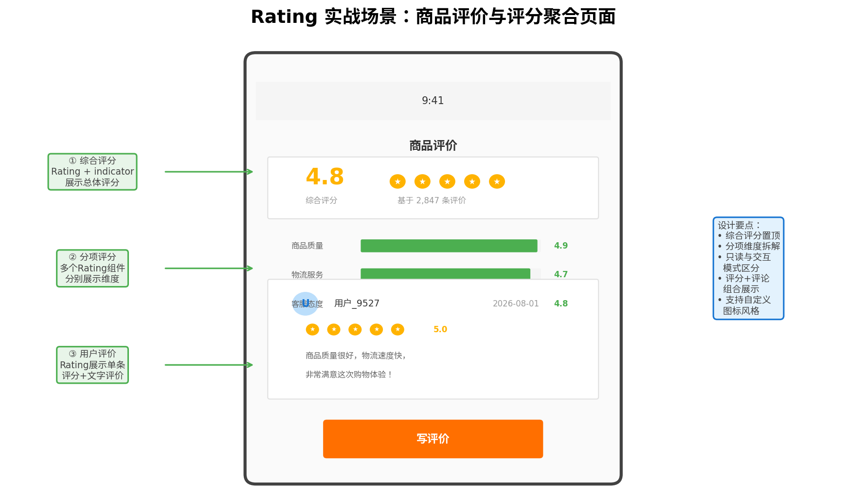
基础用法只能应对单一评分场景,在实际业务中,评分系统往往需要与多维评价、评论列表、评分统计等模块深度整合。下面以电商商品评价系统为例,展示一个生产级的 Rating 综合应用方案。
5.1 数据模型设计
首先定义评价系统的数据模型:
// models/RatingModel.ets

export interface RatingDimension {
  name: string        // 维度名称,如"商品质量"
  score: number      // 维度评分
  maxScore: number   // 维度满分,通常为5
}

export interface ReviewItem {
  userId: string
  userName: string
  avatar: string
  rating: number
  content: string
  createTime: string
  images?: string[]
}

export interface ProductRating {
  overallScore: number
  totalCount: number
  dimensions: RatingDimension[]
  reviews: ReviewItem[]
}

export const MOCK_PRODUCT_RATING: ProductRating = {
  overallScore: 4.8,
  totalCount: 2847,
  dimensions: [
    { name: '商品质量', score: 4.9, maxScore: 5 },
    { name: '物流服务', score: 4.7, maxScore: 5 },
    { name: '客服态度', score: 4.8, maxScore: 5 }
  ],
  reviews: [
    {
      userId: 'u001',
      userName: '用户_9527',
      avatar: '',
      rating: 5.0,
      content: '商品质量很好,物流速度快,非常满意这次购物体验!',
      createTime: '2026-08-01'
    }
  ]
}
5.2 评价页面完整实现
// pages/ProductRatingPage.ets
import { ProductRating, ReviewItem, MOCK_PRODUCT_RATING } from '../models/RatingModel'

@Entry
@Component
struct ProductRatingPage {
  @State productRating: ProductRating = MOCK_PRODUCT_RATING
  @State isWritingReview: boolean = false
  @State userRating: number = 5.0
  @State userComment: string = ''

  @Builder
  OverallRatingSection() {
    Column({ space: 8 }) {
      Row({ space: 16 }) {
        Column({ space: 4 }) {
          Text(this.productRating.overallScore.toFixed(1))
            .fontSize(36)
            .fontWeight(FontWeight.Bold)
            .fontColor('#FFB300')
          Text('综合评分')
            .fontSize(12)
            .fontColor('#999')
        }
        .alignItems(HorizontalAlign.Start)

        Column({ space: 4 }) {
          Rating({ rating: this.productRating.overallScore, indicator: true })
            .stars(5)
            .stepSize(0.1)
          Text(`基于 ${this.productRating.totalCount} 条评价`)
            .fontSize(12)
            .fontColor('#999')
        }
        .layoutWeight(1)
        .alignItems(HorizontalAlign.Start)
      }
      .width('100%')
      .padding(16)
      .backgroundColor(Color.White)
      .borderRadius(12)
    }
  }

  @Builder
  DimensionRatingSection() {
    Column({ space: 12 }) {
      Text('分项评分')
        .fontSize(16)
        .fontWeight(FontWeight.Medium)
        .fontColor('#182431')
        .width('100%')

      ForEach(this.productRating.dimensions, (dim: RatingDimension) => {
        Row({ space: 12 }) {
          Text(dim.name)
            .fontSize(14)
            .fontColor('#666')
            .width(70)

          // 使用 Rating 作为只读指示器
          Rating({ rating: dim.score, indicator: true })
            .stars(dim.maxScore)
            .stepSize(0.1)
            .height(14)

          Text(dim.score.toFixed(1))
            .fontSize(14)
            .fontColor('#4CAF50')
            .fontWeight(FontWeight.Medium)
        }
        .width('100%')
        .justifyContent(FlexAlign.SpaceBetween)
      })
    }
    .width('100%')
    .padding(16)
    .backgroundColor(Color.White)
    .borderRadius(12)
  }

  @Builder
  ReviewItemCard(review: ReviewItem) {
    Column({ space: 8 }) {
      Row({ space: 8 }) {
        Circle()
          .width(32)
          .height(32)
          .fill('#BBDEFB')
        Text(review.userName)
          .fontSize(14)
          .fontColor('#182431')
          .layoutWeight(1)
        Text(review.createTime)
          .fontSize(11)
          .fontColor('#999')
      }
      .width('100%')

      Row({ space: 8 }) {
        Rating({ rating: review.rating, indicator: true })
          .stars(5)
          .stepSize(0.5)
          .height(14)
        Text(review.rating.toFixed(1))
          .fontSize(12)
          .fontColor('#FFB300')
      }

      Text(review.content)
        .fontSize(14)
        .fontColor('#666')
        .width('100%')
    }
    .width('100%')
    .padding(16)
    .backgroundColor(Color.White)
    .borderRadius(12)
  }

  @Builder
  WriteReviewSheet() {
    Column({ space: 16 }) {
      Text('撰写评价')
        .fontSize(18)
        .fontWeight(FontWeight.Bold)
        .fontColor('#182431')

      Text('请为商品评分')
        .fontSize(14)
        .fontColor('#666')

      Rating({ rating: this.userRating, indicator: false })
        .stars(5)
        .stepSize(1)
        .height(40)
        .onChange((value: number) => {
          this.userRating = value
        })

      TextInput({ placeholder: '分享您的使用体验...', text: $$this.userComment })
        .width('100%')
        .height(120)
        .backgroundColor('#F5F5F5')
        .borderRadius(8)

      Button('提交评价')
        .width('100%')
        .height(48)
        .backgroundColor('#FF6F00')
        .onClick(() => {
          this.submitReview()
        })
    }
    .width('100%')
    .padding(24)
    .backgroundColor(Color.White)
    .borderRadius({ topLeft: 20, topRight: 20 })
  }

  build() {
    Stack({ alignContent: Alignment.Bottom }) {
      Column({ space: 12 }) {
        this.OverallRatingSection()
        this.DimensionRatingSection()

        Text(`用户评价 (${this.productRating.totalCount})`)
          .fontSize(16)
          .fontWeight(FontWeight.Medium)
          .fontColor('#182431')
          .width('100%')
          .padding({ left: 16, top: 8 })

        List({ space: 12 }) {
          ForEach(this.productRating.reviews, (review: ReviewItem) => {
            ListItem() {
              this.ReviewItemCard(review)
            }
          })
        }
        .width('100%')
        .layoutWeight(1)
        .padding({ left: 16, right: 16 })
      }
      .width('100%')
      .height('100%')
      .backgroundColor('#F1F3F5')

      // 底部写评价按钮
      Button('写评价')
        .width('90%')
        .height(48)
        .backgroundColor('#FF6F00')
        .margin({ bottom: 24 })
        .onClick(() => {
          this.isWritingReview = true
        })
    }
    .width('100%')
    .height('100%')
  }

  private async submitReview() {
    const reviewData = {
      rating: this.userRating,
      content: this.userComment,
      timestamp: new Date().toISOString()
    }
    console.info('提交评价:', JSON.stringify(reviewData))
    // 执行网络请求...
    this.isWritingReview = false
    this.userRating = 5.0
    this.userComment = ''
  }
}
5.3 实战要点总结
- 模式区分使用:综合评分和单项评分展示使用
indicator: true只读模式,写评价弹窗中使用indicator: false交互模式,两种模式各司其职 - 精度差异化配置:展示场景使用
stepSize(0.1)保证精度,输入场景使用stepSize(1)简化用户操作 - 组件复用:通过
@Builder将评价卡片、评分区块封装为可复用的构建函数,提升代码可维护性 - 数据驱动:评价列表使用
ForEach动态渲染,配合后端接口可轻松实现分页加载
六、高阶自定义:打造品牌专属评分系统
6.1 自定义星级图标
通过 starStyle 属性,可以将默认的星形图标替换为品牌专属图标(如爱心、笑脸、钻石等):
@State customRating: number = 3.5

Rating({ rating: this.customRating, indicator: false })
  .stars(5)
  .stepSize(0.5)
  .starStyle({
    backgroundUri: '/common/images/heart_empty.png',
    foregroundUri: '/common/images/heart_filled.png',
    secondaryUri: '/common/images/heart_half.png'
  })
  .onChange((value: number) => {
    this.customRating = value
  })
6.2 动态评分反馈
结合 animateTo 为评分变化添加动画效果,提升交互质感:
@State animatedRating: number = 0

Rating({ rating: this.animatedRating, indicator: false })
  .stars(5)
  .stepSize(0.5)
  .onChange((value: number) => {
    animateTo({ duration: 200, curve: Curve.EaseOut }, () => {
      this.animatedRating = value
    })
  })
6.3 评分标签联动
在用户评分过程中,根据评分值动态显示对应的文字标签,增强反馈感:
@State currentScore: number = 0

private getRatingLabel(score: number): string {
  if (score <= 1) return '非常不满意'
  if (score <= 2) return '不满意'
  if (score <= 3) return '一般'
  if (score <= 4) return '满意'
  return '非常满意'
}

Column({ space: 12 }) {
  Rating({ rating: this.currentScore, indicator: false })
    .stars(5)
    .stepSize(1)
    .onChange((value: number) => {
      this.currentScore = value
    })

  Text(this.getRatingLabel(this.currentScore))
    .fontSize(16)
    .fontColor(this.currentScore >= 4 ? '#4CAF50' : '#FF9800')
    .animation({ duration: 200 })
}
6.4 多维度评分表单
在服务评价场景中,通常需要用户对多个维度分别评分:
interface ServiceDimension {
  name: string
  score: number
}

@State dimensions: ServiceDimension[] = [
  { name: '服务态度', score: 5 },
  { name: '响应速度', score: 5 },
  { name: '解决效果', score: 5 }
]

Column({ space: 16 }) {
  ForEach(this.dimensions, (dim: ServiceDimension, index: number) => {
    Row({ space: 12 }) {
      Text(dim.name)
        .fontSize(14)
        .fontColor('#666')
        .width(80)

      Rating({ rating: dim.score, indicator: false })
        .stars(5)
        .stepSize(1)
        .onChange((value: number) => {
          this.dimensions[index] = { ...dim, score: value }
        })

      Text(`${dim.score}分`)
        .fontSize(14)
        .fontColor('#FFB300')
    }
    .width('100%')
    .justifyContent(FlexAlign.SpaceBetween)
  })
}
七、性能优化与最佳实践
7.1 图片资源优化
自定义星级图片时,应注意以下优化策略:
- 尺寸适配:根据目标显示尺寸提供适当分辨率的图片,避免过大图片造成内存浪费
- 格式选择:优先使用 PNG 格式(支持透明通道),纯色图标可考虑使用矢量图或系统绘制替代
- 缓存策略:频繁使用的评分图标应置于应用资源目录,利用系统资源缓存机制减少重复加载
7.2 列表场景性能
在评价列表中,每个列表项都可能包含 Rating 组件。为避免长列表滚动时的性能问题:
List() {
  ForEach(this.reviews, (review: ReviewItem) => {
    ListItem() {
      ReviewCard({ review: review })
    }
    .reuseId('review_item')  // 启用组件复用
  })
}
通过设置 reuseId 启用列表项组件复用,可显著降低 Rating 组件的重复创建开销。
7.3 可访问性支持
为评分组件添加语义化标签,确保视障用户能够正确理解评分信息:
Rating({ rating: this.score, indicator: true })
  .accessibilityText(`商品评分 ${this.score} 分,满分 5 分`)
  .accessibilityDescription('该商品的用户综合评分')
7.4 状态持久化
在写评价场景中,应防止用户意外退出导致已填写的评分和评论丢失:
@State draftRating: number = 0
@State draftComment: string = ''

aboutToDisappear() {
  // 页面销毁时保存草稿
  AppStorage.set('rating_draft', JSON.stringify({
    rating: this.draftRating,
    comment: this.draftComment
  }))
}

aboutToAppear() {
  // 页面加载时恢复草稿
  const draft = AppStorage.get<string>('rating_draft')
  if (draft) {
    const data = JSON.parse(draft)
    this.draftRating = data.rating
    this.draftComment = data.comment
  }
}
八、常见问题与解决方案
Q1:indicator=true 时星星变得很小,如何调整?
indicator 模式下默认高度为 12vp,如需更大尺寸,可显式设置宽高:
Rating({ rating: 4.5, indicator: true })
  .width(200)
  .height(28)  // 显式设置高度覆盖默认值
Q2:自定义图片设置后显示为灰色默认星?
starStyle 的三个字段必须同时设置有效值,否则组件会回退到默认灰色星形。请检查:
- 图片路径是否正确(支持本地路径和网络 URL)
- 图片资源是否已正确打包到应用中
- 三个 URI 字段是否均有非空值
Q3:如何实现十分制评分?
将 stars 属性设置为 10 即可:
Rating({ rating: 8.5, indicator: true })
  .stars(10)
  .stepSize(0.5)
注意:当 stars 较大时,建议适当增加组件宽度,避免星级图片被过度压缩。
九、总结
本文从组件架构、核心 API、基础用法、进阶实战、高阶自定义以及性能优化六个维度,全面解析了 HarmonyOS Rating 评分组件的开发方案。通过电商商品评价系统的完整案例,展示了如何将 Rating 与多维评分、评论列表、数据持久化等实际业务深度结合。
核心要点回顾:
- Rating 采用 rating + indicator 双参数接口,一个组件覆盖输入与展示两种模式
- stars / stepSize / starStyle 三大属性精准控制评分总数、精度和视觉风格
- 三态渲染模型(foreground / secondary / background)支撑半星及更精细的评分展示
- 生产级应用需关注 模式区分、精度配置、组件复用、状态持久化 四大核心问题
- 配合
@Builder、animateTo、AppStorage等 ArkUI 特性可打造沉浸式评分体验
Rating 组件虽然接口简洁,但要在复杂业务场景中用得优雅、稳定、可扩展,仍需开发者对交互细节和性能特性有深入理解。希望本文能为你的鸿蒙应用评分系统开发提供有价值的参考。
转载自:https://blog.csdn.net/u014727709/article/details/163450134
欢迎 👍点赞✍评论⭐收藏,欢迎指正

讨论HarmonyOS开发技术,专注于API与组件、DevEco Studio、测试、元服务和应用上架分发等。
更多推荐
 2
2 0
0- 0


 已为社区贡献861条内容

所有评论(0)