Collapse 折叠面板组件——从零构建高阶可复用折叠系统的完整开发指南
文章目录

每日一句正能量
“如果努力方向错了,那么停下来便是进步。”
我们从小被教育“坚持就是胜利”,却很少被告知“止损也是智慧”。如果你在错误的路上奔跑,跑得越快,离目的地越远。此时,停下不是懦弱,而是巨大的进步——它阻止了更大的沉没成本,为你开辟了新的可能。
摘要
摘要:在移动应用的信息架构设计中,如何在有限的屏幕空间内高效组织大量内容,是每一位开发者必须面对的挑战。折叠面板(Collapse/Accordion)通过"展开-收起"的交互模式,将次要信息优雅地收纳,仅在用户需要时呈现,既保证了首屏的信息密度,又避免了视觉拥挤。然而,HarmonyOS ArkUI 框架目前并未提供内置的 Collapse 组件,这意味着开发者需要基于基础组件自行构建。本文将从架构设计、基础实现、动画优化、嵌套结构到生产级实战,系统讲解如何在鸿蒙生态中从零打造一个功能完备、动画流畅、可高度复用的折叠面板系统。
一、引言:为什么 ArkUI 没有内置 Collapse?
在 Material Design、Ant Design 等主流设计体系中,折叠面板(Accordion)都是标配组件。但在 HarmonyOS ArkUI 中,开发者会发现官方组件库中并没有名为 Collapse 或 Accordion 的现成组件。
这并非设计疏漏,而是 ArkUI “组合优于继承” 设计哲学的体现——通过 Column、Row、Stack 等基础容器,配合 @State 状态管理和 .animation() 隐式动画,开发者可以灵活构建出符合自身业务需求的折叠面板。这种设计给予了开发者极大的自由度,但也对组件封装能力提出了更高要求。
折叠面板在现代应用中的典型应用场景包括:
- 商品详情页:规格参数、图文详情、售后政策等模块的折叠展示
- FAQ 帮助中心:问答列表的展开收起,提升信息检索效率
- 设置页面:将大量设置项按类别分组折叠,降低认知负担
- 文件目录树:多级文件夹的嵌套展开,构建层级浏览体验
- 表单分组:长表单的步骤化折叠,引导用户分阶段填写
二、Collapse 组件架构设计
在动手编码之前,我们先从架构层面规划折叠面板组件的设计模型。
2.1 核心状态模型
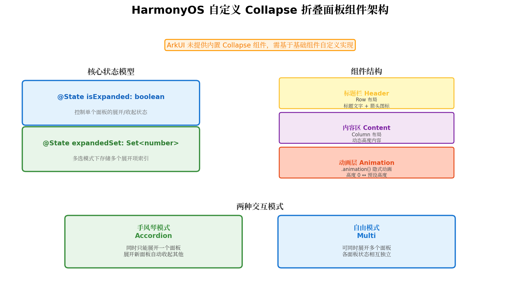
折叠面板的本质是一个状态驱动的可见性控制系统。其状态模型可分为两种:
单面板状态(适用于独立折叠项):
@State isExpanded: boolean = false // 控制单个面板的展开/收起
多面板状态(适用于手风琴/多选模式):
@State expandedSet: Set<number> = new Set() // 存储多个展开项的索引
使用 Set 而非数组存储展开状态,天然具备去重能力,且 has()、add()、delete() 等操作的时间复杂度为 O(1),性能优异。
2.2 组件结构拆解
一个完整的折叠面板项(CollapseItem)由三部分组成:
| 部分 | 组件 | 职责 |
|---|---|---|
| 标题栏 Header | Row | 承载标题文字、图标、箭头指示器,响应点击事件 |
| 内容区 Content | Column | 承载折叠内容,通过高度控制显示/隐藏 |
| 动画层 Animation | .animation() | 为高度变化提供平滑的过渡动画 |
2.3 两种交互模式
| 模式 | 特点 | 适用场景 |
|---|---|---|
| 手风琴模式(Accordion) | 同时只能展开一个面板,展开新面板自动收起其他 | FAQ、商品详情分类 |
| 自由模式(Multi) | 可同时展开多个面板,各面板状态相互独立 | 设置项、筛选条件 |
三、基础实现:单面板展开/收起
下面从最基础的单个折叠面板开始,逐步构建完整功能。
3.1 最简折叠面板
// CollapseBasicDemo.ets
@Entry
@Component
struct CollapseBasicDemo {
  @State isExpanded: boolean = false

  build() {
    Column({ space: 16 }) {
      Text('基础折叠面板示例')
        .fontSize(20)
        .fontWeight(FontWeight.Bold)
        .fontColor('#182431')
        .width('100%')

      // 折叠面板容器
      Column() {
        // 标题栏(点击区域)
        Row() {
          Text('点击展开查看更多内容')
            .fontSize(16)
            .fontColor('#333')
            .layoutWeight(1)

          Text(this.isExpanded ? '▲' : '▼')
            .fontSize(14)
            .fontColor('#999')
            .animation({ duration: 200 })  // 箭头旋转动画
        }
        .width('100%')
        .padding(16)
        .backgroundColor(Color.White)
        .borderRadius(12)
        .onClick(() => {
          this.isExpanded = !this.isExpanded
        })

        // 内容区(可折叠部分)
        Column() {
          Text('这里是折叠面板的内容区域。')
            .fontSize(14)
            .fontColor('#666')
            .width('100%')
            .padding({ left: 16, right: 16, bottom: 16 })

          Text('可以包含任意复杂的 UI 结构,包括文本、图片、列表、按钮等。')
            .fontSize(14)
            .fontColor('#666')
            .width('100%')
            .padding({ left: 16, right: 16, bottom: 16 })
        }
        .width('100%')
        .clip(true)  // 裁剪溢出内容
        .height(this.isExpanded ? 120 : 0)  // 通过高度控制显示/隐藏
        .animation({
          duration: 300,
          curve: Curve.FastOutSlowIn
        })
      }
      .width('100%')
      .backgroundColor(Color.White)
      .borderRadius(12)
      .shadow({ radius: 8, color: 'rgba(0,0,0,0.06)', offsetX: 0, offsetY: 2 })
    }
    .width('100%')
    .height('100%')
    .padding(16)
    .backgroundColor('#F5F5F5')
  }
}
代码要点解析:
- 高度驱动显示:通过
.height(this.isExpanded ? 120 : 0)控制内容区的显示与隐藏。当高度为 0 时,内容被完全隐藏;当高度为预设值时,内容完整展示。 - clip 裁剪:
.clip(true)确保内容在收起过程中被正确裁剪,避免内容溢出到标题栏区域。 - 隐式动画:
.animation()修饰器会自动监听.height()属性的变化,在状态切换时生成平滑的过渡动画。 - 箭头动画:标题栏的箭头图标通过
.animation()实现状态切换时的旋转/变化效果,增强交互反馈。
3.2 箭头旋转动画增强
为了让展开/收起的状态切换更加直观,可以为箭头添加旋转动画:
@State rotateAngle: number = 0

Image($r('app.media.ic_arrow_down'))
  .width(16)
  .height(16)
  .fillColor('#999')
  .rotate({ angle: this.isExpanded ? 180 : 0 })  // 展开时旋转180度
  .animation({ duration: 300, curve: Curve.EaseInOut })
四、进阶实现:手风琴模式与多选模式
单面板只能应对最简单的场景,在实际业务中,通常需要管理一组折叠面板的状态。
4.1 数据模型设计
// models/CollapseModel.ets

export interface CollapseItem {
  id: string
  title: string
  content: string
  disabled?: boolean  // 是否禁用展开
}

export enum CollapseMode {
  SINGLE = 'single',    // 手风琴模式:单选
  MULTI = 'multi'       // 自由模式:多选
}
4.2 手风琴模式(Accordion)完整实现
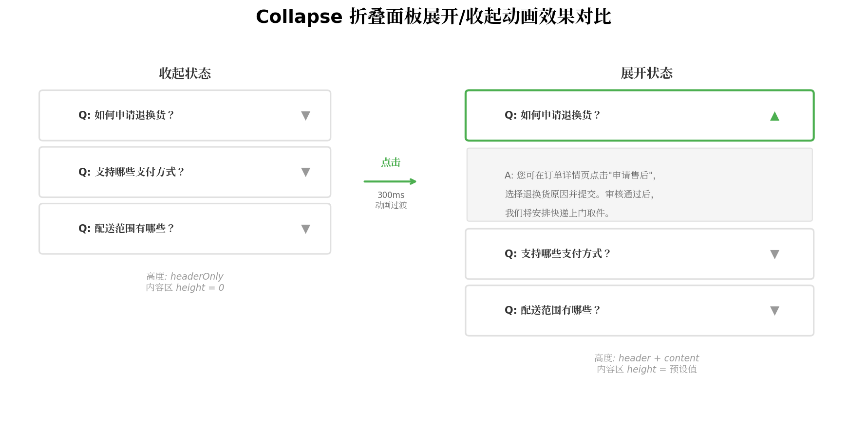
手风琴模式下,同时只能展开一个面板,展开新面板时自动收起已展开的面板:
// components/AccordionComponent.ets
import { CollapseItem, CollapseMode } from '../models/CollapseModel'

@Component
export struct AccordionComponent {
  @Prop items: CollapseItem[]
  @Prop mode: CollapseMode = CollapseMode.SINGLE
  @State expandedIndex: number = -1  // -1 表示全部收起
  @State expandedSet: Set<number> = new Set()

  private toggleItem(index: number) {
    if (this.items[index].disabled) {
      return
    }

    if (this.mode === CollapseMode.SINGLE) {
      // 手风琴模式:展开新项,收起旧项
      this.expandedIndex = this.expandedIndex === index ? -1 : index
    } else {
      // 多选模式:切换当前项状态
      if (this.expandedSet.has(index)) {
        this.expandedSet.delete(index)
      } else {
        this.expandedSet.add(index)
      }
      // 触发状态更新
      this.expandedSet = new Set(this.expandedSet)
    }
  }

  private isExpanded(index: number): boolean {
    if (this.mode === CollapseMode.SINGLE) {
      return this.expandedIndex === index
    }
    return this.expandedSet.has(index)
  }

  @Builder
  HeaderBuilder(item: CollapseItem, index: number) {
    Row() {
      Text(item.title)
        .fontSize(15)
        .fontColor(item.disabled ? '#CCCCCC' : '#182431')
        .fontWeight(FontWeight.Medium)
        .layoutWeight(1)

      Image($r('app.media.ic_arrow_down'))
        .width(16)
        .height(16)
        .fillColor(item.disabled ? '#CCCCCC' : '#999999')
        .rotate({
          angle: this.isExpanded(index) ? 180 : 0
        })
        .animation({ duration: 300, curve: Curve.EaseInOut })
    }
    .width('100%')
    .padding(16)
    .backgroundColor(Color.White)
    .border({
      width: { bottom: index < this.items.length - 1 ? 1 : 0 },
      color: '#F0F0F0'
    })
    .onClick(() => {
      this.toggleItem(index)
    })
  }

  @Builder
  ContentBuilder(item: CollapseItem, index: number) {
    Column() {
      Text(item.content)
        .fontSize(14)
        .fontColor('#666666')
        .lineHeight(22)
        .width('100%')
        .padding({ left: 16, right: 16, bottom: 16 })
    }
    .width('100%')
    .clip(true)
    .height(this.isExpanded(index) ? 100 : 0)
    .animation({
      duration: 300,
      curve: Curve.FastOutSlowIn
    })
  }

  build() {
    Column({ space: 0 }) {
      ForEach(this.items, (item: CollapseItem, index: number) => {
        Column({ space: 0 }) {
          this.HeaderBuilder(item, index)
          this.ContentBuilder(item, index)
        }
        .width('100%')
      }, (item: CollapseItem) => item.id)
    }
    .width('100%')
    .backgroundColor(Color.White)
    .borderRadius(12)
    .shadow({
      radius: 8,
      color: 'rgba(0,0,0,0.06)',
      offsetX: 0,
      offsetY: 2
    })
  }
}
4.3 使用示例
// pages/FAQPage.ets
import { AccordionComponent } from '../components/AccordionComponent'
import { CollapseItem, CollapseMode } from '../models/CollapseModel'

@Entry
@Component
struct FAQPage {
  private faqItems: CollapseItem[] = [
    {
      id: '1',
      title: 'Q: 如何申请退换货?',
      content: '您可在订单详情页点击"申请售后",选择退换货原因并提交。审核通过后,我们将安排快递上门取件。'
    },
    {
      id: '2',
      title: 'Q: 支持哪些支付方式?',
      content: '目前支持微信支付、支付宝、银联卡、花呗分期等多种支付方式。'
    },
    {
      id: '3',
      title: 'Q: 配送范围有哪些?',
      content: '全国大部分地区支持配送,偏远地区可能需要额外3-5个工作日。'
    },
    {
      id: '4',
      title: 'Q: 会员权益如何领取?',
      content: '注册即送7天会员体验,完成首单后自动升级为正式会员,享受全场95折优惠。',
      disabled: false
    }
  ]

  build() {
    Column({ space: 16 }) {
      Text('常见问题')
        .fontSize(22)
        .fontWeight(FontWeight.Bold)
        .fontColor('#182431')
        .width('100%')
        .padding({ left: 16, top: 16 })

      AccordionComponent({
        items: this.faqItems,
        mode: CollapseMode.SINGLE
      })
      .padding(16)
    }
    .width('100%')
    .height('100%')
    .backgroundColor('#F5F5F5')
  }
}
五、动态高度处理:三大方案深度对比
折叠面板实现中最棘手的环节,是内容高度的动态处理。由于 ArkUI 的隐式动画需要明确的目标值,而内容高度往往是不固定的,这就产生了矛盾。
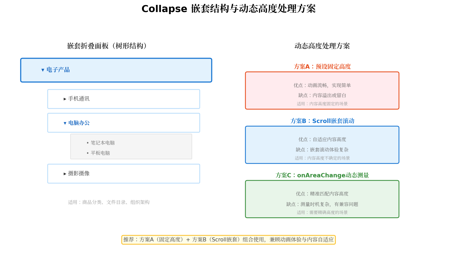
5.1 方案一:预设固定高度(推荐)
对于内容高度相对固定的场景(如 FAQ 问答、规格参数),直接预设一个足够大的高度值:
@State contentHeight: number = 200  // 预设内容高度

Column() {
  // 内容
}
.height(this.isExpanded ? this.contentHeight : 0)
.animation({ duration: 300, curve: Curve.FastOutSlowIn })
优点:动画流畅,实现简单,性能最优
缺点:内容超出预设高度会被截断,不足时底部留白
适用:FAQ、规格参数、短文本内容
5.2 方案二:Scroll 嵌套滚动
对于内容高度不确定且可能很长的场景,在内容区外层包裹 Scroll 组件:
@State contentHeight: number = 300  // 最大展示高度

Column() {
  Scroll() {
    Column() {
      // 任意长度的内容
      ForEach(this.longContentList, (item) => { /* ... */ })
    }
  }
  .width('100%')
  .height('100%')
}
.height(this.isExpanded ? this.contentHeight : 0)
.animation({ duration: 300 })
优点:内容自适应,可滚动查看全部内容
缺点:嵌套滚动可能产生手势冲突
适用:长文本、图文混排、评论列表
5.3 方案三:onAreaChange 动态测量
理论上可以通过 onAreaChange 回调动态测量内容真实高度:
@State measuredHeight: number = 0

Column() {
  Column() {
    // 内容
  }
  .onAreaChange((oldValue: Area, newValue: Area) => {
    this.measuredHeight = Number(newValue.height)
  })
}
.height(this.isExpanded ? this.measuredHeight : 0)
注意:此方案在 ArkUI 当前版本中存在限制——当父容器高度为 0 时,子组件的 onAreaChange 可能无法正确报告真实高度。因此生产环境建议优先使用方案一或方案二的组合策略。
六、高级实战:商品详情页折叠面板系统
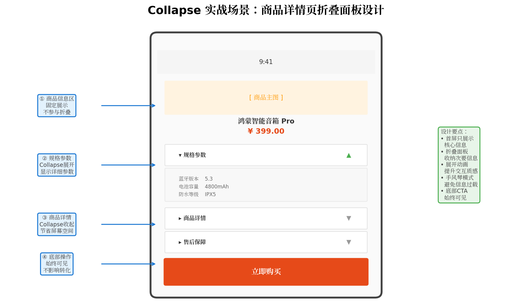
下面以电商商品详情页为例,展示一个生产级的折叠面板综合应用方案。
6.1 数据模型设计
// models/ProductDetailModel.ets

export interface ProductSpec {
  label: string
  value: string
}

export interface CollapseSection {
  id: string
  title: string
  type: 'spec' | 'detail' | 'service' | 'review'
  data: ProductSpec[] | string | ReviewSummary
  defaultExpanded: boolean
}

export interface ReviewSummary {
  totalCount: number
  averageScore: number
  tags: string[]
}
6.2 商品详情页完整实现
// pages/ProductDetailPage.ets
import { ProductSpec, CollapseSection, ReviewSummary } from '../models/ProductDetailModel'

@Entry
@Component
struct ProductDetailPage {
  @State expandedSet: Set<string> = new Set(['spec'])  // 默认展开规格参数

  private sections: CollapseSection[] = [
    {
      id: 'spec',
      title: '规格参数',
      type: 'spec',
      defaultExpanded: true,
      data: [
        { label: '商品编号', value: 'HS-2024-001' },
        { label: '上市时间', value: '2024年12月' },
        { label: '产品重量', value: '约680g' },
        { label: '蓝牙版本', value: '蓝牙 5.3' },
        { label: '防水等级', value: 'IPX5' },
        { label: '电池容量', value: '4800mAh' },
        { label: '充电接口', value: 'Type-C' },
        { label: '扬声器功率', value: '30W' }
      ] as ProductSpec[]
    },
    {
      id: 'detail',
      title: '商品详情',
      type: 'detail',
      defaultExpanded: false,
      data: '本产品采用最新一代鸿蒙智联技术,支持多设备协同控制...'
    },
    {
      id: 'service',
      title: '售后保障',
      type: 'service',
      defaultExpanded: false,
      data: [
        { label: '保修期限', value: '1年质保' },
        { label: '退换政策', value: '7天无理由退换' },
        { label: '客服热线', value: '400-888-8888' }
      ] as ProductSpec[]
    },
    {
      id: 'review',
      title: '用户评价',
      type: 'review',
      defaultExpanded: false,
      data: {
        totalCount: 2847,
        averageScore: 4.8,
        tags: ['音质好', '续航强', '外观精美']
      } as ReviewSummary
    }
  ]

  aboutToAppear() {
    // 初始化默认展开项
    this.sections.forEach(section => {
      if (section.defaultExpanded) {
        this.expandedSet.add(section.id)
      }
    })
    this.expandedSet = new Set(this.expandedSet)
  }

  private toggleSection(id: string) {
    if (this.expandedSet.has(id)) {
      this.expandedSet.delete(id)
    } else {
      this.expandedSet.add(id)
    }
    this.expandedSet = new Set(this.expandedSet)
  }

  private isExpanded(id: string): boolean {
    return this.expandedSet.has(id)
  }

  @Builder
  SectionHeader(section: CollapseSection) {
    Row() {
      Text(section.title)
        .fontSize(16)
        .fontWeight(FontWeight.Medium)
        .fontColor('#182431')
        .layoutWeight(1)

      Row({ space: 8 }) {
        if (section.type === 'review') {
          Text(`${(section.data as ReviewSummary).totalCount}条评价`)
            .fontSize(13)
            .fontColor('#999')
        }
        Image($r('app.media.ic_arrow_down'))
          .width(16)
          .height(16)
          .fillColor('#999')
          .rotate({ angle: this.isExpanded(section.id) ? 180 : 0 })
          .animation({ duration: 300, curve: Curve.EaseInOut })
      }
    }
    .width('100%')
    .padding(16)
    .backgroundColor(Color.White)
    .onClick(() => {
      this.toggleSection(section.id)
    })
  }

  @Builder
  SpecContent(specs: ProductSpec[]) {
    Column({ space: 0 }) {
      ForEach(specs, (spec: ProductSpec, index: number) => {
        Row() {
          Text(spec.label)
            .fontSize(13)
            .fontColor('#888888')
            .width(100)
          Text(spec.value)
            .fontSize(13)
            .fontColor('#333333')
            .layoutWeight(1)
        }
        .width('100%')
        .padding({ top: 10, bottom: 10 })
        .border({
          width: { bottom: index < specs.length - 1 ? 1 : 0 },
          color: '#F5F5F5'
        })
      })
    }
    .width('100%')
    .padding({ left: 16, right: 16, bottom: 16 })
  }

  @Builder
  DetailContent(content: string) {
    Column() {
      Text(content)
        .fontSize(14)
        .fontColor('#666666')
        .lineHeight(22)
        .width('100%')
        .padding({ left: 16, right: 16, bottom: 16 })

      // 图文详情图片占位
      Column() {
        Text('[ 商品详情图片 ]')
          .fontSize(12)
          .fontColor('#CCC')
      }
      .width('100%')
      .height(200)
      .backgroundColor('#F5F5F5')
      .borderRadius(8)
      .margin({ left: 16, right: 16, bottom: 16 })
      .justifyContent(FlexAlign.Center)
    }
    .width('100%')
  }

  @Builder
  ServiceContent(specs: ProductSpec[]) {
    this.SpecContent(specs)
  }

  @Builder
  ReviewContent(summary: ReviewSummary) {
    Column({ space: 12 }) {
      Row({ space: 8 }) {
        Text(summary.averageScore.toFixed(1))
          .fontSize(28)
          .fontWeight(FontWeight.Bold)
          .fontColor('#FFB300')
        Column({ space: 4 }) {
          // 星级展示
          Row() {
            ForEach([1, 2, 3, 4, 5], (star: number) => {
              Text('★')
                .fontSize(14)
                .fontColor(star <= Math.floor(summary.averageScore) ? '#FFB300' : '#E0E0E0')
            })
          }
          Text(`基于 ${summary.totalCount} 条评价`)
            .fontSize(12)
            .fontColor('#999')
        }
      }
      .width('100%')
      .padding({ left: 16, right: 16 })

      // 评价标签
      Row({ space: 8 }) {
        ForEach(summary.tags, (tag: string) => {
          Text(tag)
            .fontSize(12)
            .fontColor('#666')
            .padding({ left: 10, right: 10, top: 4, bottom: 4 })
            .backgroundColor('#F5F5F5')
            .borderRadius(12)
        })
      }
      .width('100%')
      .padding({ left: 16, right: 16, bottom: 16 })
    }
    .width('100%')
  }

  @Builder
  SectionContent(section: CollapseSection) {
    Column() {
      if (section.type === 'spec' || section.type === 'service') {
        this.SpecContent(section.data as ProductSpec[])
      } else if (section.type === 'detail') {
        this.DetailContent(section.data as string)
      } else if (section.type === 'review') {
        this.ReviewContent(section.data as ReviewSummary)
      }
    }
    .width('100%')
    .clip(true)
    .height(this.isExpanded(section.id) ? 400 : 0)  // 预设足够大的高度
    .animation({
      duration: 300,
      curve: Curve.FastOutSlowIn
    })
  }

  build() {
    Stack({ alignContent: Alignment.Bottom }) {
      Column() {
        // 商品图片区域(固定展示)
        Column() {
          Text('[ 商品主图 ]')
            .fontSize(14)
            .fontColor('#FF9800')
        }
        .width('100%')
        .height(200)
        .backgroundColor('#FFF3E0')
        .justifyContent(FlexAlign.Center)

        // 商品标题价格
        Column({ space: 4 }) {
          Text('鸿蒙智能音箱 Pro')
            .fontSize(18)
            .fontWeight(FontWeight.Bold)
            .fontColor('#182431')
          Text('¥ 399.00')
            .fontSize(22)
            .fontWeight(FontWeight.Bold)
            .fontColor('#E64A19')
        }
        .width('100%')
        .padding(16)
        .alignItems(HorizontalAlign.Start)

        // 折叠面板区域
        Column({ space: 8 }) {
          ForEach(this.sections, (section: CollapseSection) => {
            Column({ space: 0 }) {
              this.SectionHeader(section)
              this.SectionContent(section)
            }
            .width('100%')
            .backgroundColor(Color.White)
            .borderRadius(12)
          }, (section: CollapseSection) => section.id)
        }
        .width('100%')
        .padding({ left: 12, right: 12 })
      }
      .width('100%')
      .height('100%')
      .backgroundColor('#F5F5F5')

      // 底部购买按钮(始终可见)
      Row({ space: 12 }) {
        Button('加入购物车')
          .height(48)
          .layoutWeight(1)
          .backgroundColor('#FF9800')
          .fontColor(Color.White)

        Button('立即购买')
          .height(48)
          .layoutWeight(1)
          .backgroundColor('#E64A19')
          .fontColor(Color.White)
      }
      .width('100%')
      .padding(16)
      .backgroundColor(Color.White)
    }
    .width('100%')
    .height('100%')
  }
}
6.3 实战要点总结
- 多类型内容适配:通过
type字段区分不同类型的折叠内容(规格、详情、售后、评价),分别渲染对应的@Builder内容模板 - 默认展开策略:通过
defaultExpanded配置,让核心信息(如规格参数)默认展开,次要信息默认收起 - 状态持久化:使用
Set<string>存储展开状态,支持多选模式,用户可以自由组合查看多个板块 - 底部 CTA 固定:购买按钮始终固定在底部,不受折叠面板状态影响,确保转化路径畅通
七、嵌套折叠面板:树形结构实现
在文件管理器、商品分类等场景中,需要实现多层级的嵌套折叠:
// models/TreeNodeModel.ets

export interface TreeNode {
  id: string
  title: string
  children?: TreeNode[]
  isLeaf: boolean
}

// components/TreeCollapseComponent.ets
@Component
export struct TreeCollapseComponent {
  @Prop node: TreeNode
  @State isExpanded: boolean = false
  @State level: number = 0

  @Builder
  NodeBuilder() {
    Row({ space: 8 }) {
      // 缩进
      Row().width(this.level * 20)

      // 展开/收起图标(仅非叶子节点)
      if (!this.node.isLeaf) {
        Text(this.isExpanded ? '▾' : '▸')
          .fontSize(12)
          .fontColor('#999')
          .width(16)
      } else {
        Row().width(16)
      }

      // 节点图标
      Text(this.node.isLeaf ? '📄' : '📁')
        .fontSize(14)

      // 节点标题
      Text(this.node.title)
        .fontSize(14)
        .fontColor(this.node.isLeaf ? '#333' : '#1976D2')
        .layoutWeight(1)
    }
    .width('100%')
    .padding({ left: 12, top: 10, bottom: 10 })
    .backgroundColor(this.node.isLeaf ? Color.White : '#F8F9FA')
    .onClick(() => {
      if (!this.node.isLeaf) {
        this.isExpanded = !this.isExpanded
      }
    })
  }

  build() {
    Column({ space: 0 }) {
      this.NodeBuilder()

      // 子节点区域
      if (!this.node.isLeaf && this.node.children) {
        Column({ space: 0 }) {
          ForEach(this.node.children, (child: TreeNode) => {
            TreeCollapseComponent({
              node: child,
              level: this.level + 1
            })
          }, (child: TreeNode) => child.id)
        }
        .width('100%')
        .clip(true)
        .height(this.isExpanded ? 'auto' : 0)
        .animation({ duration: 250 })
      }
    }
    .width('100%')
  }
}
八、性能优化与最佳实践
8.1 避免过度重绘
折叠面板在展开/收起时会触发 build() 重新执行。对于包含大量子组件的内容区,建议使用条件渲染延迟构建:
Column() {
  if (this.isExpanded) {
    HeavyContentComponent()  // 仅在展开时构建
  }
}
8.2 动画性能优化
- 动画时长控制在 200~400ms 之间,过短显得突兀,过长影响操作效率
- 使用
Curve.FastOutSlowIn曲线,模拟自然的物理运动 - 避免在动画过程中执行耗时操作(如网络请求、复杂计算)
8.3 可访问性支持
Row() {
  Text('规格参数')
}
.accessibilityText(this.isExpanded ? '收起规格参数' : '展开规格参数')
.accessibilityDescription('点击查看商品详细规格参数')
8.4 手势冲突处理
当折叠面板嵌套在 Scroll 或 List 中时,点击标题栏展开面板后,外层滚动容器可能需要自动滚动以确保展开内容可见:
.onClick(() => {
  this.isExpanded = !this.isExpanded
  if (this.isExpanded) {
    // 延迟执行,等待动画完成后滚动
    setTimeout(() => {
      this.scroller.scrollToIndex(index)
    }, 350)
  }
})
九、总结
本文从架构设计、基础实现、动画优化、嵌套结构到生产级实战,系统讲解了如何在 HarmonyOS ArkUI 中从零构建一个功能完备的折叠面板系统。由于 ArkUI 未提供内置 Collapse 组件,开发者需要基于 Column、Row、@State 和 .animation() 等基础能力自行封装。
核心要点回顾:
- 折叠面板的本质是状态驱动的可见性控制,核心状态模型分为单面板(
boolean)和多面板(Set<number>)两种 - 高度驱动显示是最可靠的实现方式,配合
.clip(true)和.animation()实现平滑过渡 - 预设固定高度方案在大多数场景下最为稳定可靠,内容超出时可用
Scroll嵌套处理 - 手风琴模式通过单状态变量实现互斥展开,自由模式通过
Set实现多选管理 - 生产级应用需关注多类型内容适配、默认展开策略、底部 CTA 固定、可访问性支持等细节
- 嵌套折叠面板可通过递归组件实现树形结构,适用于文件目录、商品分类等场景
折叠面板虽然看似简单,但要在复杂业务场景中用得优雅、稳定、可扩展,仍需开发者对状态管理、动画系统和性能特性有深入理解。希望本文能为你的鸿蒙应用开发提供有价值的参考。
转载自:https://blog.csdn.net/u014727709/article/details/163450302
欢迎 👍点赞✍评论⭐收藏,欢迎指正

讨论HarmonyOS开发技术,专注于API与组件、DevEco Studio、测试、元服务和应用上架分发等。
更多推荐
 2
2 0
0- 0


 已为社区贡献861条内容

所有评论(0)