HarmonyOS ArkUI实战:从零构建企业级主题系统设计
文章目录

每日一句正能量
所谓一生,归根到底就是一瞬间持续的积累。
生命的长度不是由时间决定的,而是由你如何度过每一个瞬间决定的。你把注意力放在哪里,把心力倾注在哪里,那一瞬间就被赋予了重量。无数个有重量的瞬间连起来,就是厚重的一生。
一、前言
在现代移动应用开发中,主题系统已成为提升用户体验与品牌认知的核心基础设施。无论是跟随系统深浅色模式的自动适配,还是支持用户自定义品牌色的个性化换肤,一套健壮、可扩展的主题系统都是高品质应用的标配。HarmonyOS ArkUI框架从API 12开始提供了官方主题换肤能力,同时开发者也可以基于资源目录切换、动态属性等多种技术路径实现灵活的主题管理。
本文将深入探讨HarmonyOS主题系统的完整设计与实现方案,覆盖官方Theme API、资源目录切换、动态属性三种核心技术路径,并结合状态管理与持久化存储,构建一套可落地的企业级主题系统。
二、主题系统的应用场景与挑战
2.1 典型应用场景
主题系统在各类应用中有着广泛的应用价值:
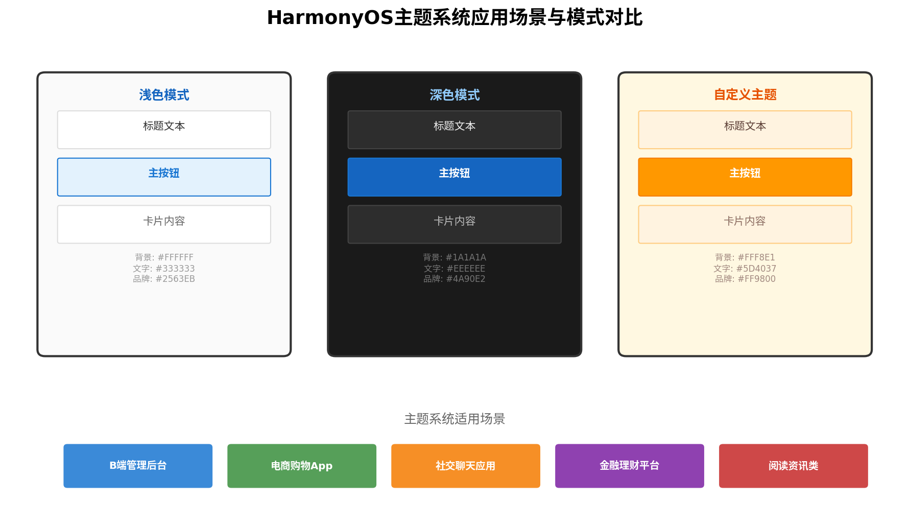
- 浅色模式:日间使用场景,以白色/浅灰为背景,深色文字保证可读性,品牌色用于强调操作按钮。
- 深色模式:夜间或低光环境使用,以深灰/黑色为背景,降低屏幕亮度对眼睛的刺激,同时节省OLED屏幕功耗。
- 自定义主题:企业品牌定制(如企业蓝、活力橙)、节日主题(春节红、中秋金)等场景,强化品牌视觉识别。
2.2 技术挑战
构建主题系统面临以下核心挑战:
- 状态同步:主题切换后,所有已渲染组件需即时响应颜色变化,不能出现"半白半黑"的闪烁。
- 持久化记忆:用户选择的主题偏好需在应用重启后保持,不能每次打开都恢复默认。
- 系统适配:需监听系统深浅色模式变化,支持"跟随系统"策略。
- 性能影响:主题切换不应触发全量页面重建,需最小化重绘范围。
三、三种技术方案对比
HarmonyOS生态中实现主题切换主要有三种技术路径,各有适用场景:
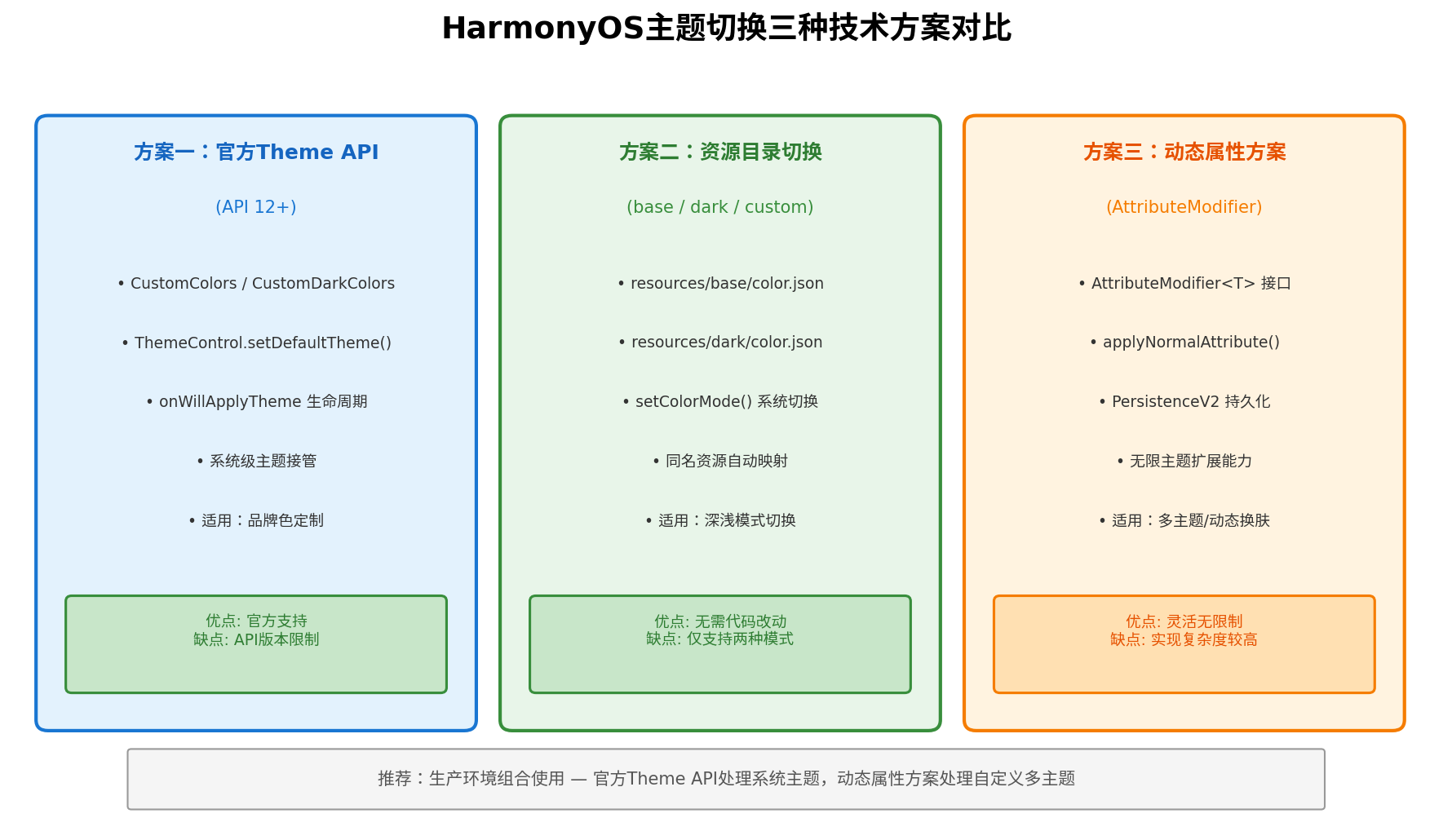
| 方案 | 核心机制 | 适用场景 | 优缺点 |
|---|---|---|---|
| 官方Theme API | CustomColors + ThemeControl | 品牌色定制、系统级主题 | 官方支持,但受API版本限制 |
| 资源目录切换 | base/dark资源目录 + setColorMode | 深浅模式切换 | 无需代码改动,但仅支持两种模式 |
| 动态属性方案 | AttributeModifier<T> + PersistenceV2 | 多主题/动态换肤 | 灵活无限制,但实现复杂度较高 |
生产环境推荐组合使用:官方Theme API处理系统主题与品牌色,动态属性方案处理自定义多主题扩展。
四、主题系统架构设计
4.1 四层架构模型
企业级主题系统采用四层架构设计,确保关注点分离与可维护性:
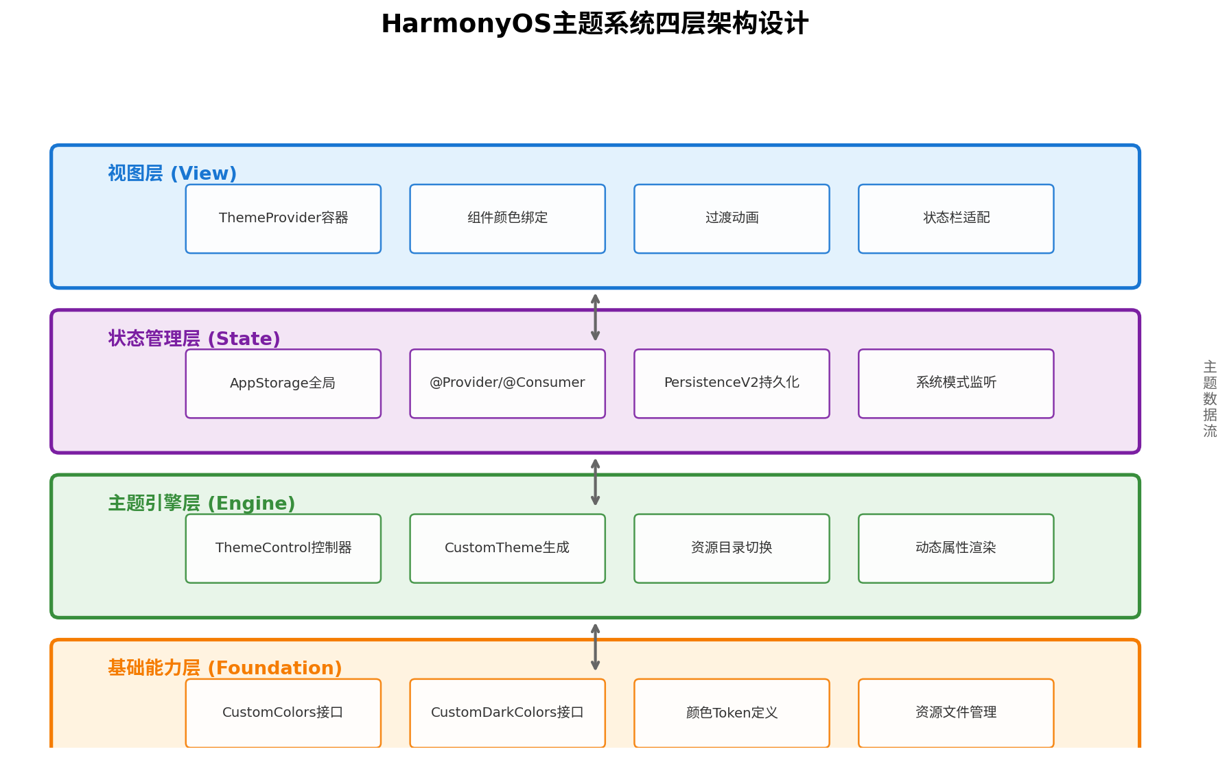
- 基础能力层(Foundation):定义
CustomColors/CustomDarkColors接口、颜色Token规范、资源文件管理。 - 主题引擎层(Engine):
ThemeControl控制器管理主题生命周期,CustomTheme生成器构建主题实例。 - 状态管理层(State):通过
AppStorage或@Provider/@Consumer实现跨组件状态共享,PersistenceV2持久化用户偏好。 - 视图层(View):
ThemeProvider容器包裹组件树,组件通过onWillApplyTheme生命周期或动态属性绑定主题色。
五、方案一:官方Theme API(API 12+)
5.1 核心接口
从API 12开始,ArkUI提供了@kit.ArkUI中的主题相关接口:
import { ThemeControl, CustomColors, CustomTheme, CustomDarkColors } from '@kit.ArkUI';
CustomColors:浅色主题颜色接口,定义字体、背景、品牌等颜色Token。CustomDarkColors:深色主题颜色接口,与浅色模式一一对应。CustomTheme:主题对象,包含colors和darkColors两个属性。ThemeControl:主题控制器,用于设置全局默认主题。
5.2 主题颜色定义
// theme/AppTheme.ets
import { CustomColors, CustomDarkColors, CustomTheme } from '@kit.ArkUI';

// 浅色主题颜色
export class LightColors implements CustomColors {
  fontPrimary = '#FF1A1A1A';        // 主要文字
  fontSecondary = '#FF666666';      // 次要文字
  fontTertiary = '#FF999999';       // 辅助文字
  backgroundPrimary = '#FFF8F9FA';  // 页面背景
  backgroundSecondary = '#FFFFFFFF'; // 卡片背景
  brand = '#FF2563EB';              // 品牌色
  warning = '#FFF59E0B';            // 警告色
  alert = '#FFEF4444';              // 错误色
  confirm = '#FF10B981';            // 成功色
  compBackgroundPrimary = '#FFFFFFFF';
  compBackgroundSecondary = '#FFF3F4F6';
  compEmphasizeSecondary = '#332563EB';
  compDivider = '#FFE5E7EB';
}

// 深色主题颜色
export class DarkColors implements CustomDarkColors {
  fontPrimary = '#FFF3F4F6';        // 主要文字
  fontSecondary = '#FFD1D5DB';      // 次要文字
  fontTertiary = '#FF9CA3AF';       // 辅助文字
  backgroundPrimary = '#FF111827';  // 页面背景
  backgroundSecondary = '#FF1F2937'; // 卡片背景
  brand = '#FF3B82F6';              // 品牌色
  warning = '#FFFBBF24';            // 警告色
  alert = '#FFF87171';              // 错误色
  confirm = '#FF34D399';            // 成功色
  compBackgroundPrimary = '#FF1F2937';
  compBackgroundSecondary = '#FF374151';
  compEmphasizeSecondary = '#333B82F6';
  compDivider = '#FF374151';
}

// 主题实现类
export class AppTheme implements CustomTheme {
  colors: CustomColors;
  darkColors: CustomDarkColors;

  constructor(colors: CustomColors, darkColors: CustomDarkColors) {
    this.colors = colors;
    this.darkColors = darkColors;
  }
}

// 默认主题实例
export const defaultTheme = new AppTheme(new LightColors(), new DarkColors());
5.3 应用入口初始化
在Ability创建时初始化主题,并设置颜色模式为不指定(由应用自主控制):
// entry/src/main/ets/entryability/EntryAbility.ets
import { AbilityConstant, ConfigurationConstant, UIAbility, Want } from '@kit.AbilityKit';
import { window, ThemeControl } from '@kit.ArkUI';
import { defaultTheme } from '../theme/AppTheme';

export default class EntryAbility extends UIAbility {
  onCreate(want: Want, launchParam: AbilityConstant.LaunchParam): void {
    // 设置颜色模式为不指定,由应用自己控制
    try {
      this.context.getApplicationContext().setColorMode(
        ConfigurationConstant.ColorMode.COLOR_MODE_NOT_SET
      );
    } catch (err) {
      console.error('Failed to set colorMode:', err);
    }
  }

  onWindowStageCreate(windowStage: window.WindowStage): void {
    // 在加载页面之前设置默认主题
    ThemeControl.setDefaultTheme(defaultTheme);

    windowStage.loadContent('pages/Index', (err) => {
      if (err.code) {
        console.error('Failed to load content:', err);
        return;
      }
      console.info('Succeeded in loading content.');
    });
  }
}
5.4 页面中使用主题
组件通过onWillApplyTheme生命周期获取当前主题颜色:
// pages/ThemeDemo.ets
import { Theme, CustomColors } from '@kit.ArkUI';

@Entry
@Component
struct ThemeDemoPage {
  @State menuBgColor: ResourceColor = '#FFF8F9FA';
  @State textColor: ResourceColor = '#FF1A1A1A';
  @State brandColor: ResourceColor = '#FF2563EB';

  onWillApplyTheme(theme: Theme) {
    // 主题切换时自动回调,更新组件颜色
    this.menuBgColor = theme.colors.backgroundSecondary;
    this.textColor = theme.colors.fontPrimary;
    this.brandColor = theme.colors.brand;
  }

  build() {
    Column({ space: 16 }) {
      Text('官方Theme API演示')
        .fontSize(20)
        .fontWeight(FontWeight.Bold)
        .fontColor(this.textColor)

      Column({ space: 8 }) {
        Text('品牌色按钮')
          .fontSize(14)
          .fontColor(Color.White)
          .textAlign(TextAlign.Center)
          .width('80%')
          .height(44)
          .backgroundColor(this.brandColor)
          .borderRadius(8)

        Text('卡片区域')
          .fontSize(14)
          .fontColor(this.textColor)
          .width('80%')
          .height(80)
          .backgroundColor(this.menuBgColor)
          .borderRadius(8)
          .border({ width: 1, color: '#FFE5E7EB' })
      }
      .width('100%')
      .padding(16)
    }
    .width('100%')
    .height('100%')
    .padding({ top: 40 })
    .backgroundColor('#FFF8F9FA')
  }
}
六、方案二:资源目录切换
6.1 资源目录结构
通过resources下的base和dark目录存放同名不同值的资源:
resources/
├── base/
│   ├── element/
│   │   ├── color.json      # 浅色颜色定义
│   │   └── string.json     # 浅色文本定义
│   └── media/
│       └── icon.png        # 浅色图标
└── dark/
    ├── element/
    │   ├── color.json      # 深色颜色定义(name相同,value不同)
    │   └── string.json     # 深色文本定义
    └── media/
        └── icon.png        # 深色图标
6.2 颜色资源定义
// resources/base/element/color.json
{
  "color": [
    { "name": "page_background", "value": "#FFFFFF" },
    { "name": "text_primary", "value": "#333333" },
    { "name": "brand_color", "value": "#2563EB" },
    { "name": "card_background", "value": "#F8F9FA" }
  ]
}

// resources/dark/element/color.json
{
  "color": [
    { "name": "page_background", "value": "#1A1A1A" },
    { "name": "text_primary", "value": "#EEEEEE" },
    { "name": "brand_color", "value": "#3B82F6" },
    { "name": "card_background", "value": "#2D2D2D" }
  ]
}
6.3 代码中切换模式
import { ConfigurationConstant } from '@kit.AbilityKit';

class ThemeManager {
  private context: Context;

  constructor(context: Context) {
    this.context = context;
  }

  // 切换到深色模式
  switchToDark() {
    this.context.getApplicationContext().setColorMode(
      ConfigurationConstant.ColorMode.COLOR_MODE_DARK
    );
  }

  // 切换到浅色模式
  switchToLight() {
    this.context.getApplicationContext().setColorMode(
      ConfigurationConstant.ColorMode.COLOR_MODE_LIGHT
    );
  }

  // 跟随系统
  followSystem() {
    this.context.getApplicationContext().setColorMode(
      ConfigurationConstant.ColorMode.COLOR_MODE_NOT_SET
    );
  }
}

// 页面中使用资源引用
@Entry
@Component
struct ResourceThemePage {
  build() {
    Column() {
      Text($r('app.string.app_title'))
        .fontSize(20)
        .fontColor($r('app.color.text_primary'))

      Column() {
        Text('卡片内容')
          .fontColor($r('app.color.text_primary'))
      }
      .width('80%')
      .height(100)
      .backgroundColor($r('app.color.card_background'))
      .borderRadius(8)
    }
    .width('100%')
    .height('100%')
    .backgroundColor($r('app.color.page_background'))
  }
}
七、方案三:动态属性方案(推荐用于多主题)
7.1 主题状态管理
使用PersistenceV2持久化主题偏好,确保重启后保持用户选择:
// theme/ThemeState.ets
import { PersistenceV2, type } from '@kit.ArkUI';

@ObservedV2
export class ThemeState {
  // 当前主题模式:light / dark / auto
  @Trace themeMode: string = 'auto';
  // 当前品牌色
  @Trace brandColor: string = '#2563EB';
  // 是否启用动态主题
  @Trace isCustomTheme: boolean = false;

  static getInstance(): ThemeState {
    return PersistenceV2.connect(ThemeState, () => new ThemeState())!;
  }

  // 判断当前是否为深色模式
  isDarkMode(): boolean {
    if (this.themeMode === 'dark') return true;
    if (this.themeMode === 'light') return false;
    // auto模式下读取系统配置
    const config = getContext().config;
    return config.colorMode === 0; // 0 = dark
  }
}
7.2 动态属性修饰器
实现AttributeModifier<T>接口,根据主题状态动态设置组件样式:
// theme/ThemeModifiers.ets
import { AttributeModifier, TextAttribute, ColumnAttribute, ButtonAttribute } from '@kit.ArkUI';
import { ThemeState } from './ThemeState';

// 文本动态属性
export class ThemeTextModifier implements AttributeModifier<TextAttribute> {
  private fontSize?: number;
  private isBold?: boolean;

  setFontSize(size: number): ThemeTextModifier {
    this.fontSize = size;
    return this;
  }

  setBold(bold: boolean): ThemeTextModifier {
    this.isBold = bold;
    return this;
  }

  applyNormalAttribute(instance: TextAttribute): void {
    const state = ThemeState.getInstance();
    const isDark = state.isDarkMode();

    instance.fontColor(isDark ? '#FFF3F4F6' : '#FF1A1A1A');
    if (this.fontSize) instance.fontSize(this.fontSize);
    if (this.isBold) instance.fontWeight(FontWeight.Bold);
  }
}

// 容器动态属性
export class ThemeColumnModifier implements AttributeModifier<ColumnAttribute> {
  applyNormalAttribute(instance: ColumnAttribute): void {
    const state = ThemeState.getInstance();
    const isDark = state.isDarkMode();

    instance.backgroundColor(isDark ? '#FF111827' : '#FFF8F9FA');
  }
}

// 按钮动态属性
export class ThemeButtonModifier implements AttributeModifier<ButtonAttribute> {
  private isPrimary: boolean = true;

  setPrimary(primary: boolean): ThemeButtonModifier {
    this.isPrimary = primary;
    return this;
  }

  applyNormalAttribute(instance: ButtonAttribute): void {
    const state = ThemeState.getInstance();
    const brandColor = state.brandColor;

    if (this.isPrimary) {
      instance.backgroundColor(brandColor);
      instance.fontColor(Color.White);
    } else {
      instance.backgroundColor(brandColor + '1A'); // 10%透明度
      instance.fontColor(brandColor);
    }
  }
}
7.3 页面中使用动态属性
// pages/DynamicThemePage.ets
import { ThemeState } from '../theme/ThemeState';
import { ThemeTextModifier, ThemeColumnModifier, ThemeButtonModifier } from '../theme/ThemeModifiers';

@Entry
@ComponentV2
struct DynamicThemePage {
  @Local themeState: ThemeState = ThemeState.getInstance();

  build() {
    Column() {
      Text('动态属性主题方案')
        .attributeModifier(new ThemeTextModifier().setFontSize(20).setBold(true))
        .margin({ bottom: 20 })

      Column({ space: 12 }) {
        Button('主要按钮')
          .attributeModifier(new ThemeButtonModifier().setPrimary(true))
          .width('80%')
          .height(44)
          .onClick(() => {
            // 切换品牌色
            this.themeState.brandColor = '#EF4444';
          })

        Button('次要按钮')
          .attributeModifier(new ThemeButtonModifier().setPrimary(false))
          .width('80%')
          .height(44)
          .onClick(() => {
            this.themeState.brandColor = '#10B981';
          })

        Text('当前品牌色: ' + this.themeState.brandColor)
          .attributeModifier(new ThemeTextModifier().setFontSize(14))
      }
      .width('100%')
      .padding(16)
    }
    .width('100%')
    .height('100%')
    .attributeModifier(new ThemeColumnModifier())
  }
}
八、系统深色模式监听
实现"跟随系统"策略,需监听系统配置变化:
// theme/SystemThemeListener.ets
import { ConfigurationConstant } from '@kit.AbilityKit';

export class SystemThemeListener {
  private callback?: (isDark: boolean) => void;

  startListening(context: Context, onChange: (isDark: boolean) => void) {
    this.callback = onChange;
    // 注册配置变更监听
    context.registerConfigurationObserver({
      onConfigurationUpdated: (config) => {
        const isDark = config.colorMode === ConfigurationConstant.ColorMode.COLOR_MODE_DARK;
        onChange(isDark);
      }
    });
  }

  stopListening(context: Context) {
    // 取消监听
  }
}
九、主题切换过渡动画
为了提升用户体验,主题切换时应添加平滑的过渡动画:
// 在组件build中添加动画
Column() {
  // 组件内容
}
.width('100%')
.height('100%')
.backgroundColor(this.bgColor)
.animation({
  duration: 300,
  curve: Curve.EaseInOut,
  iterations: 1,
  playMode: PlayMode.Normal
})
十、完整使用示例与运行效果
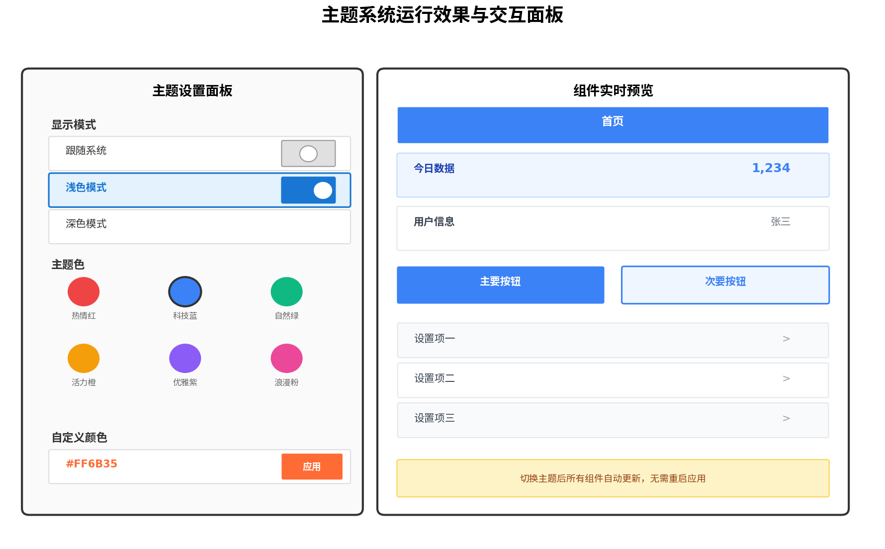
以下是一个完整的主题设置页面,集成三种模式切换与品牌色选择:
// pages/ThemeSettings.ets
import { ThemeState } from '../theme/ThemeState';
import { ConfigurationConstant } from '@kit.AbilityKit';

@Entry
@ComponentV2
struct ThemeSettingsPage {
  @Local themeState: ThemeState = ThemeState.getInstance();

  private brandColors: string[] = ['#2563EB', '#EF4444', '#10B981', '#F59E0B', '#8B5CF6', '#EC4899'];

  private setThemeMode(mode: string) {
    this.themeState.themeMode = mode;
    const context = getContext().getApplicationContext();
    if (mode === 'dark') {
      context.setColorMode(ConfigurationConstant.ColorMode.COLOR_MODE_DARK);
    } else if (mode === 'light') {
      context.setColorMode(ConfigurationConstant.ColorMode.COLOR_MODE_LIGHT);
    } else {
      context.setColorMode(ConfigurationConstant.ColorMode.COLOR_MODE_NOT_SET);
    }
  }

  build() {
    Scroll() {
      Column({ space: 20 }) {
        Text('主题设置')
          .fontSize(22)
          .fontWeight(FontWeight.Bold)
          .fontColor(this.themeState.isDarkMode() ? '#FFF3F4F6' : '#FF1A1A1A')
          .margin({ top: 20, bottom: 10 })

        // 显示模式选择
        Column({ space: 8 }) {
          Text('显示模式')
            .fontSize(16)
            .fontWeight(FontWeight.Bold)
            .fontColor(this.themeState.isDarkMode() ? '#FFD1D5DB' : '#FF666666')
            .width('100%')
            .margin({ bottom: 8 })

          this.ModeOption('跟随系统', 'auto')
          this.ModeOption('浅色模式', 'light')
          this.ModeOption('深色模式', 'dark')
        }
        .width('90%')
        .padding(16)
        .backgroundColor(this.themeState.isDarkMode() ? '#FF1F2937' : '#FFFFFFFF')
        .borderRadius(12)

        // 品牌色选择
        Column({ space: 8 }) {
          Text('主题色')
            .fontSize(16)
            .fontWeight(FontWeight.Bold)
            .fontColor(this.themeState.isDarkMode() ? '#FFD1D5DB' : '#FF666666')
            .width('100%')
            .margin({ bottom: 8 })

          Flex({ wrap: FlexWrap.Wrap, justifyContent: FlexAlign.SpaceBetween }) {
            ForEach(this.brandColors, (color: string) => {
              Column() {
                Circle()
                  .width(40)
                  .height(40)
                  .fill(color)
                  .stroke(this.themeState.brandColor === color ? '#333' : 'transparent')
                  .strokeWidth(3)
                  .onClick(() => {
                    this.themeState.brandColor = color;
                    this.themeState.isCustomTheme = true;
                  })
              }
              .width('33%')
              .padding(8)
            }, (color: string) => color)
          }
          .width('100%')
        }
        .width('90%')
        .padding(16)
        .backgroundColor(this.themeState.isDarkMode() ? '#FF1F2937' : '#FFFFFFFF')
        .borderRadius(12)

        // 预览区域
        Column({ space: 12 }) {
          Text('实时预览')
            .fontSize(16)
            .fontWeight(FontWeight.Bold)
            .fontColor(this.themeState.isDarkMode() ? '#FFD1D5DB' : '#FF666666')
            .width('100%')

          Text('预览文本')
            .fontSize(14)
            .fontColor(this.themeState.isDarkMode() ? '#FFF3F4F6' : '#FF1A1A1A')

          Button('品牌色按钮')
            .width('100%')
            .height(44)
            .backgroundColor(this.themeState.brandColor)
            .fontColor(Color.White)
            .borderRadius(8)
        }
        .width('90%')
        .padding(16)
        .backgroundColor(this.themeState.isDarkMode() ? '#FF1F2937' : '#FFFFFFFF')
        .borderRadius(12)
      }
      .width('100%')
      .padding({ bottom: 40 })
    }
    .width('100%')
    .height('100%')
    .backgroundColor(this.themeState.isDarkMode() ? '#FF111827' : '#FFF8F9FA')
    .scrollBar(BarState.Auto)
  }

  @Builder
  ModeOption(label: string, mode: string) {
    Row() {
      Text(label)
        .fontSize(14)
        .fontColor(this.themeState.isDarkMode() ? '#FFF3F4F6' : '#FF1A1A1A')
        .layoutWeight(1)

      Radio({ value: mode, group: 'theme_mode' })
        .checked(this.themeState.themeMode === mode)
        .onChange(() => {
          this.setThemeMode(mode);
        })
    }
    .width('100%')
    .height(44)
    .padding({ left: 12, right: 12 })
    .backgroundColor(this.themeState.themeMode === mode
      ? (this.themeState.isDarkMode() ? '#FF374151' : '#FFEFF6FF')
      : Color.Transparent)
    .borderRadius(8)
    .onClick(() => {
      this.setThemeMode(mode);
    })
  }
}
运行效果
十一、性能优化与最佳实践
| 优化策略 | 实现方式 | 效果 |
|---|---|---|
| 避免硬编码 | 所有颜色引用主题变量 | 切换时无需修改组件代码 |
| 状态局部化 | @Consumer替代全局遍历 | 仅受影响组件重绘 |
| 持久化懒加载 | PersistenceV2按需连接 | 启动时不阻塞主线程 |
| 过渡动画 | animation修饰器 | 视觉平滑,避免闪烁 |
| 资源预加载 | base/dark目录资源 | 切换时无网络请求延迟 |
十二、总结
本文系统阐述了HarmonyOS ArkUI框架下主题系统的三种实现方案:官方Theme API适合品牌色定制与系统级主题接管;资源目录切换适合简单的深浅模式切换;动态属性方案则提供了最灵活的多主题扩展能力。通过PersistenceV2持久化用户偏好、@Provider/@Consumer实现状态共享、onWillApplyTheme生命周期响应主题变更,可构建一套完整的企业级主题系统。
在实际项目中,建议根据业务复杂度选择合适的技术路径:简单应用使用资源目录方案即可;需要多主题定制的应用推荐动态属性方案;追求系统原生体验的应用可优先采用官方Theme API。三种方案也可组合使用,发挥各自优势。
希望本文能为鸿蒙生态开发者在构建高品质、可定制化的应用界面时提供系统性的技术参考。
转载自:https://blog.csdn.net/u014727709/article/details/163450465
欢迎 👍点赞✍评论⭐收藏,欢迎指正

讨论HarmonyOS开发技术,专注于API与组件、DevEco Studio、测试、元服务和应用上架分发等。
更多推荐
 3
3 0
0- 0


 已为社区贡献861条内容

所有评论(0)