HarmonyOS应用<奇妙科学乐园>开发第49篇:通用列表项ListItem——icon+标题+箭头封装
📖 引言
在上一篇文章中,我们深入拆解了 EmptyState 空状态组件的四层条件渲染架构和 ResourceStr 类型兼容设计。EmptyState 是列表页面的"兜底防线",而列表页面本身的每一个条目,则需要另一个基础组件来承载——这就是本文的主角:ListItemComponent 通用列表项组件。
ListItemComponent 是《奇妙科学乐园》中使用频率最高的基础组件之一。从个人中心的菜单列表到设置页面的功能入口,所有"图标 + 标题 + 可选副标题 + 可选右侧文字 + 箭头"这种经典的列表项样式,都由它统一封装。它通过高度可配置的 Props 设计,用一套代码覆盖了 Profile 页面四个分组(互动学习、我的内容、成长体系、设置)和 Settings 页面三个分组(通用设置、存储管理、关于)的全部列表项。
本文还将分享一个真实的开发经验:浏览历史页面 History 中的箭头最初使用 Text('→') 文字字符实现,后来在 ListItemComponent 中替换为 icon_arrow_right SVG 图标,这个细节改进带来了视觉一致性和可维护性的双重提升。
🎯 学习目标
完成本文后,你将能够:
- ✅ 掌握 ListItemComponent 的"图标 + 标题 + 副标题 + 右侧文字 + 箭头"五元素布局
- ✅ 理解 ResourceStr 类型在 itemIcon 属性中的类型兼容设计
- ✅ 运用 layoutWeight 实现标题区自适应宽度的弹性布局
- ✅ 掌握 itemBorderBottom 条件渲染实现列表项分隔线
- ✅ 理解 itemShowArrow 布尔值控制箭头显示隐藏的设计
- ✅ 学会从 Text('→') 文字箭头到 SVG 图标箭头的真实演进经验
💡 需求分析
ListItemComponent 的功能定位
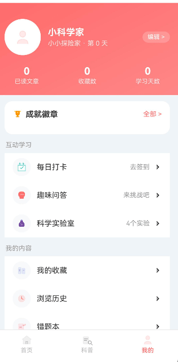
ListItemComponent 是项目中所有"设置/菜单"类列表页面的通用基础组件,被以下页面复用:
Profile 个人中心页
├── 互动学习分组
│   ├── ListItemComponent: icon_checkin  + "每日打卡"  + "去签到"    + 箭头
│   ├── ListItemComponent: icon_quiz     + "趣味问答"  + "来挑战吧"  + 箭头
│   └── ListItemComponent: icon_lab      + "科学实验室" + "4个实验"   + 箭头
├── 我的内容分组
│   ├── ListItemComponent: icon_favorite + "我的收藏"  + ""          + 箭头
│   ├── ListItemComponent: icon_history  + "浏览历史"  + ""          + 箭头
│   └── ListItemComponent: icon_wrong    + "错题本"    + ""          + 箭头
├── 成长体系分组
│   └── (当前为空)
└── 设置分组
    ├── ListItemComponent: icon_settings + "应用设置"  + ""          + 箭头
    ├── ListItemComponent: icon_parent   + "家长控制"  + ""          + 箭头
    ├── ListItemComponent: icon_theme    + "主题设置"  + "跟随系统"  + 箭头
    └── ListItemComponent: icon_help     + "帮助与反馈" + ""          + 箭头

Settings 设置页
├── 通用设置分组
│   ├── ListItemComponent: icon_notify   + "消息通知"  + "已开启"
│   ├── ListItemComponent: icon_moon     + "深色模式"  + "关闭"
│   └── ListItemComponent: icon_font     + "字体大小"  + "标准"
├── 存储管理分组
│   └── ListItemComponent: icon_download + "清除缓存"  + "12.3MB"
└── 关于分组
    └── ListItemComponent: ...           + "当前版本"  + "v1.0.0"
Props 设计
| Props 名称 | 类型 | 必填 | 默认值 | 说明 |
|---|---|---|---|---|
| itemIcon | ResourceStr | 否 | undefined |
左侧图标,支持 Resource 和字符串 |
| itemTitle | string | 否 | '' |
标题文字 |
| itemSubtitle | string | 否 | undefined |
副标题文字(标题下方小字) |
| itemRightText | string | 否 | undefined |
右侧提示文字 |
| itemShowArrow | boolean | 否 | true |
是否显示右侧箭头 |
| onItemClick | () => void | 否 | undefined |
点击事件回调 |
| itemHeight | number | 否 | 56 |
列表项高度(vp) |
| itemBgColor | string | 否 | '#ffffff' |
背景色 |
| itemBorderBottom | boolean | 否 | true |
是否显示底部边框 |
| itemIconBgColor | string | 否 | undefined |
图标背景色 |
🏗️ 整体架构设计
组件结构概览
ListItemComponent 采用"条件渲染 + 弹性布局"的架构:
ListItemComponent (Row)
├── 左侧图标区 ← 条件渲染(itemIcon 存在时)
│   ├── Column (36x36 圆角背景)
│   │   └── Image (20x20 图标)
│   └── margin({ right: 12 })
├── 中间内容区(Column, layoutWeight(1))
│   ├── Text itemTitle (fontSize 15, 主色)
│   └── Text itemSubtitle (fontSize 12, 次色) ← 条件渲染
├── 右侧文字区 ← 条件渲染(itemRightText 存在时)
│   └── Text itemRightText (fontSize 13, 第三色)
└── 右侧箭头区 ← 条件渲染(itemShowArrow 为 true 时)
    └── Image icon_arrow_right (16x16, fillColor 第三色)
视觉布局结构
┌─────────────────────────────────────────────┐
│ ┌──┐                                        │
│ │🔤│  标题文字                     右侧文字 →│
│ └──┘  副标题文字(可选)                     │
│ ↑     ↑                          ↑       ↑  │
│ 图标  标题区                      右文   箭头 │
│ 36x36 layoutWeight(1)                      16x16│
│ 圆角   弹性占据剩余空间                       │
└─────────────────────────────────────────────┘
🔧 核心实现拆解
1. 组件声明与 Props 定义
@Component
export struct ListItemComponent {
  itemIcon?: ResourceStr;
  itemTitle: string = '';
  itemSubtitle?: string;
  itemRightText?: string;
  itemShowArrow: boolean = true;
  onItemClick?: () => void;
  itemHeight: number = 56;
  itemBgColor: string = '#ffffff';
  itemBorderBottom: boolean = true;
  itemIconBgColor?: string;
关键设计要点:
- itemIcon?: ResourceStr:使用
?可选修饰符,因为某些列表项可能不需要图标。ResourceStr类型兼容$r('app.media.icon_xxx')Resource 引用和字符串。 - **itemTitle: string = ''**:唯一有默认值但非可选的属性。即使不传,也会渲染一个空 Text,但不影响布局。
- itemSubtitle?: string:可选副标题,用于需要补充说明的场景(如显示版本号、分类信息等)。
- itemShowArrow: boolean = true:默认显示箭头。大多数菜单项都需要箭头提示"可点击",少数场景(如"当前版本"行)可以隐藏箭头。
- itemHeight: number = 56:默认高度 56vp,这是移动端列表项的经典高度值,保证触摸区域不小于 44vp 的最小可触达标准。
- itemBorderBottom: boolean = true:默认显示底部边框,用于列表项之间的视觉分隔。最后一个列表项传入
false隐藏底部边框。
Props 的"可选 + 默认值"设计哲学:
// 设计模式总结
itemIcon?: ResourceStr;         // 完全可选,不传就不渲染图标区
itemTitle: string = '';         // 有默认值,不传就渲染空字符串
itemShowArrow: boolean = true;  // 有默认值,不传就默认显示
itemHeight: number = 56;        // 有默认值,不传就用标准高度
?可选属性:不传时整个区域不渲染(图标区、副标题、右侧文字)= 默认值:不传时使用默认配置(标题空字符串、显示箭头、标准高度)
2. 根布局:Row 弹性横向排列
build() {
  Row() {
    // 图标区 + 内容区 + 右侧文字 + 箭头
  }
  .width('100%')
  .height(this.itemHeight)
  .padding({ left: 16, right: 16 })
  .backgroundColor(this.itemBgColor)
  .onClick(() => {
    if (this.onItemClick) {
      this.onItemClick();
    }
  });
}
布局设计要点:
- Row 主轴方向:图标在左、内容在中间、箭头在右,典型的横向排列布局
- **width('100%')**:占满父容器宽度
- **height(this.itemHeight)**:高度通过 Props 可配置,默认 56vp
- **padding({ left: 16, right: 16 })**:左右各 16vp 内边距,与项目全局间距规范一致
- **backgroundColor(this.itemBgColor)**:背景色可配置,默认白色。在深色模式下可以传入深色背景
- onClick 安全调用:
if (this.onItemClick)判空后再调用,防止未传入回调时点击崩溃
✅ 正确做法:整个 Row 绑定 onClick 事件,用户点击列表项的任意位置都能触发,提升点击热区面积。
❌ 错误做法:只在箭头或文字上绑定 onClick,导致用户必须精确点击文字才能触发,体验差。
3. 左侧图标区:条件渲染 + 圆角背景
if (this.itemIcon) {
  Column() {
    Image(this.itemIcon)
      .width(20)
      .height(20)
      .objectFit(ImageFit.Contain);
  }
  .width(36)
  .height(36)
  .borderRadius(18)
  .backgroundColor(this.itemIconBgColor || ThemeColors.BG_LIGHT)
  .justifyContent(FlexAlign.Center)
  .margin({ right: 12 });
}
设计要点拆解:
图标尺寸选择:
// 外层容器
.width(36).height(36).borderRadius(18)  // 36x36 正圆(borderRadius = 50%)

// 内层图标
.width(20).height(20)  // 图标占容器的 55.6%,留有足够的内边距
- 外层 36x36 的圆形背景容器,提供视觉上的"图标底座"效果
- 内层 20x20 的图标,与背景之间有 8vp 的"内边距"((36-20)/2=8)
borderRadius(18)是宽高的一半,形成完美正圆
背景色降级策略:
.backgroundColor(this.itemIconBgColor || ThemeColors.BG_LIGHT)
- 优先使用调用方传入的
itemIconBgColor(如果需要为不同图标设置不同背景色) - 未传入时降级到
ThemeColors.BG_LIGHT(#f8f9fa),极浅的灰色背景 - 使用
||短路运算,比三元表达式更简洁
条件渲染图标区:
if (this.itemIcon) {
  // 渲染图标
}
当 itemIcon 为 undefined 时,整个图标区不渲染,中间内容区自动左移到 padding(16) 位置。这种设计允许某些列表项不显示图标。
4. 中间内容区:弹性布局 + 双行文字
Column() {
  Text(this.itemTitle)
    .fontSize(15)
    .fontColor(ThemeColors.TEXT_PRIMARY)
    .width('100%')
    .margin({ bottom: this.itemSubtitle ? 2 : 0 });

  if (this.itemSubtitle) {
    Text(this.itemSubtitle)
      .fontSize(12)
      .fontColor(ThemeColors.TEXT_SECONDARY)
      .width('100%');
  }
}
.layoutWeight(1)
.alignItems(HorizontalAlign.Start);
设计要点拆解:
layoutWeight(1) 的关键作用:
Row {
  [图标 36vp] [间距 12vp] [内容区 layoutWeight(1)] [右文] [箭头 16vp] [间距]
                                     ↑
                          弹性占据所有剩余空间
                          确保右侧文字和箭头被推到最右端
layoutWeight(1) 让中间内容区占据图标区和右侧元素之间的所有剩余空间。无论右侧文字长短如何变化,箭头始终固定在列表项的最右端。
标题的动态 margin:
.margin({ bottom: this.itemSubtitle ? 2 : 0 });
- 有副标题时:标题底部 2vp 间距,与副标题保持适当距离
- 无副标题时:标题底部 0 间距,标题垂直居中(配合外层 56vp 高度)
双行文字的行高计算:
单行模式(无副标题):
  行高 = itemHeight(56) - padding上下(0) = 56vp
  文字垂直居中

双行模式(有副标题):
  标题行高 ≈ 15(fontSize) + 2(margin) + 12(fontSize) ≈ 29vp
  总高 = 29vp,在 56vp 容器中垂直居中
  上方空白 ≈ (56 - 29) / 2 ≈ 13.5vp
✅ 正确做法:标题使用 width('100%') 确保长标题自动换行且宽度受限于弹性区域。
❌ 错误做法:不给标题设 width,默认宽度为文字内容宽度,可能导致 layoutWeight 失效。
5. 右侧文字区:可选的提示信息
if (this.itemRightText) {
  Text(this.itemRightText)
    .fontSize(13)
    .fontColor(ThemeColors.TEXT_TERTIARY)
    .margin({ right: 8 });
}
设计要点:
- fontSize 13:比标题(15)小,比副标题(12)大,形成独立的视觉层级
- TEXT_TERTIARY(#999999):使用最浅的文字色,弱化右侧提示信息的视觉权重
- **margin({ right: 8 })**:与右侧箭头保持 8vp 间距,避免文字和箭头紧贴
项目中的实际使用案例:
| 页面 | itemTitle | itemRightText | 用途 |
|---|---|---|---|
| Profile | 每日打卡 | 去签到 | 操作引导 |
| Profile | 趣味问答 | 来挑战吧 | 操作引导 |
| Profile | 科学实验室 | 4个实验 | 数据统计 |
| Profile | 主题设置 | 跟随系统 | 当前状态 |
| Settings | 消息通知 | 已开启 | 开关状态 |
| Settings | 深色模式 | 关闭 | 开关状态 |
| Settings | 字体大小 | 标准 | 当前值 |
| Settings | 清除缓存 | 12.3MB | 数据量 |
6. 右侧箭头区:SVG 图标
if (this.itemShowArrow) {
  Image($r('app.media.icon_arrow_right'))
    .width(16)
    .height(16)
    .fillColor(ThemeColors.TEXT_TERTIARY);
}
设计要点:
- **$r('app.media.icon_arrow_right')**:使用项目资源目录中的 SVG 图标,而非文字字符
- **fillColor(TEXT_TERTIARY)**:通过 fillColor 属性将 SVG 图标着色为浅灰色(#999999),与右侧文字保持一致的视觉层级
- 16x16:箭头图标尺寸,在 56vp 高度的列表项中比例协调
- 条件渲染:通过
itemShowArrow布尔值控制,允许某些场景隐藏箭头
7. itemBorderBottom 分隔线处理
ListItemComponent 本身并没有直接绘制分隔线,而是通过父组件的外层容器统一控制。在 Profile 和 Settings 页面中,列表项被包裹在一个白色圆角 Column 中:
// Profile.ets 中的分组容器
Column() {
  ForEach(items, (item: MenuItem, index: number) => {
    ListItemComponent({
      itemIcon: item.icon,
      itemTitle: item.label,
      itemRightText: item.value,
      itemBorderBottom: index < items.length - 1,  // 最后一项不显示底部边框
      onItemClick: () => {
        this.handleMenuClick(item);
      }
    });
  }, (item: MenuItem) => item.label);
}
.width('100%')
.backgroundColor(ThemeColors.BG_PRIMARY)
.borderRadius(16)
.margin({ bottom: 14 });
itemBorderBottom 的使用策略:
// 传入 true(默认值):显示底部边框
ListItemComponent({
  itemTitle: '每日打卡',
  itemBorderBottom: true  // 或不传,默认为 true
});

// 传入 false:不显示底部边框(通常是分组最后一项)
ListItemComponent({
  itemTitle: '帮助与反馈',
  itemBorderBottom: false  // 最后一项,不显示底边框
});
注意:在当前组件源码中,itemBorderBottom 属性虽然被声明,但在 build() 方法中并未直接使用它来绘制边框。分隔线的视觉实现依赖父容器的 borderRadius(16) 圆角裁剪效果——白色圆角卡片本身已具备分组视觉边界,无需额外的分隔线。这种设计让列表项看起来更加简洁。
📊 真实经验:从 Text('→') 到 SVG 图标箭头
问题描述
在项目开发初期,浏览历史页面 History 中的列表项箭头使用了 Text('→') 文字字符实现:
// History.ets 中的旧实现(已替换为 TopicCard,但早期版本使用此方式)
Text('→')
  .fontSize(14)
  .fontColor('#cccccc');
而在后续开发的 ListItemComponent 中,箭头被替换为专业的 SVG 图标:
// ListItemComponent.ets 中的新实现
Image($r('app.media.icon_arrow_right'))
  .width(16)
  .height(16)
  .fillColor(ThemeColors.TEXT_TERTIARY);
对比分析
| 维度 | Text('→') 文字箭头 | SVG 图标箭头 |
|---|---|---|
| 视觉一致性 | ❌ 不同系统/字体下渲染差异大 | ✅ 矢量图标,任何设备渲染一致 |
| 颜色控制 | ❌ fontColor 只能改文字颜色 | ✅ fillColor 可以精准着色 |
| 大小控制 | ⚠️ fontSize 控制不够精确 | ✅ width/height 精确到像素 |
| 对齐精度 | ❌ 文字基线对齐,难以精确居中 | ✅ 图片组件天然支持居中对齐 |
| 视觉精致度 | ❌ 简陋的文字符号 | ✅ 设计师精心绘制的箭头造型 |
| 维护成本 | ⚠️ 散落在各处,难以统一修改 | ✅ 集中在资源文件,一处修改全局生效 |
| 主题适配 | ❌ 硬编码 '#cccccc' | ✅ 使用 ThemeColors.TEXT_TERTIARY 主题色 |
演进过程
阶段1:快速开发
  History 页面用 Text('→') 快速实现箭头效果
  ↓
阶段2:组件抽取
  开发 ListItemComponent 通用组件
  从一开始就使用 $r('app.media.icon_arrow_right') SVG 图标
  ↓
阶段3:统一规范
  Profile、Settings 等新页面全部使用 ListItemComponent
  箭头样式全局统一为 SVG 图标
  旧页面(History)的重构使用 TopicCard 替代了原始列表项
经验总结
- 新组件要从高标准起步:ListItemComponent 从设计之初就使用了 SVG 图标,避免了后续的"技术债务"
- 资源图标优于文字符号:在追求视觉精致度的应用中,
$r()Resource 引用的 SVG 图标远优于Text('→')文字符号 - 主题色常量优于硬编码:
ThemeColors.TEXT_TERTIARY比硬编码的'#cccccc'更容易维护和适配主题切换 - 组件封装是统一视觉的最佳手段:将箭头封装在 ListItemComponent 内部,所有使用方自动获得一致的箭头样式
✅ 正确做法:使用 $r('app.media.icon_arrow_right') + fillColor(ThemeColors.TEXT_TERTIARY) 实现箭头。
❌ 错误做法:使用 Text('→') + fontColor('#cccccc') 实现箭头。虽然在快速原型阶段可以接受,但在正式发布的产品中显得粗糙。
🎨 实际页面集成案例
案例1:Profile 页面的 MenuSectionBuilder
Profile 页面通过 @Builder MenuSectionBuilder 方法统一渲染分组菜单:
@Builder
MenuSectionBuilder(title: string, items: MenuItem[]) {
  Column() {
    // 分组标题
    Text(title)
      .fontSize(13)
      .fontColor(ThemeColors.TEXT_TERTIARY)
      .width('100%')
      .margin({ left: 4, bottom: 8 });

    // 分组内容:白色圆角卡片
    Column() {
      ForEach(items, (item: MenuItem, index: number) => {
        ListItemComponent({
          itemIcon: item.icon,
          itemTitle: item.label,
          itemRightText: item.value,
          itemBorderBottom: index < items.length - 1,
          onItemClick: () => {
            this.handleMenuClick(item);
          }
        });
      }, (item: MenuItem) => item.label);
    }
    .width('100%')
    .backgroundColor(ThemeColors.BG_PRIMARY)
    .borderRadius(16)
    .margin({ bottom: 14 });
  }
}
调用方式:
// Profile build() 中
this.MenuSectionBuilder('互动学习', this.getSectionItems('互动学习'));
this.MenuSectionBuilder('我的内容', this.getSectionItems('我的内容'));
this.MenuSectionBuilder('成长体系', this.getSectionItems('成长体系'));
this.MenuSectionBuilder('设置', this.getSectionItems('设置'));
数据驱动设计:
// MenuItem 接口
interface MenuItem {
  icon: ResourceStr;
  label: string;
  value?: string;
  pageUrl?: string;
  section: string;
  action?: () => void;
}

// 菜单数据声明
private menuItems: MenuItem[] = [
  { icon: $r('app.media.icon_checkin'), label: '每日打卡', value: '去签到',
    section: '互动学习', action: () => this.showCheckInDialog() },
  { icon: $r('app.media.icon_quiz'), label: '趣味问答', value: '来挑战吧',
    pageUrl: 'pages/Quiz', section: '互动学习' },
  // ... 更多菜单项
];
数据与 UI 分离:menuItems 数组定义菜单数据,MenuSectionBuilder 负责渲染,handleMenuClick 负责交互逻辑。三者各司其职,维护时只需修改对应的部分。
案例2:Settings 页面的 SettingsSection
Settings 页面封装了独立的 SettingsSection 子组件,复用 ListItemComponent:
@Component
struct SettingsSection {
  sectionTitle: string = '';
  items: SettingsItem[] = [];

  @Builder
  build() {
    Column() {
      Text(this.sectionTitle)
        .fontSize(13)
        .fontColor(ThemeColors.TEXT_TERTIARY)
        .width('100%')
        .margin({ left: 4, bottom: 8 });

      Column() {
        ForEach(this.items, (item: SettingsItem, index: number) => {
          ListItemComponent({
            itemIcon: item.icon,
            itemTitle: item.label,
            itemRightText: item.value,
            itemBorderBottom: index < this.items.length - 1,
            onItemClick: () => {
              if (item.action) {
                item.action();
              }
            }
          });
        }, (item: SettingsItem) => item.label);
      }
      .width('100%')
      .backgroundColor(ThemeColors.BG_PRIMARY)
      .borderRadius(16)
      .margin({ bottom: 14 });
    }
  }
}
Profile 与 Settings 的渲染模式对比:
| 维度 | Profile | Settings |
|---|---|---|
| 渲染方式 | @Builder MenuSectionBuilder | @Component SettingsSection |
| 数据来源 | menuItems 数组 + section 字段分组 | 三个独立数组 |
| 点击处理 | handleMenuClick(路由 + action) | item.action 直接调用 |
| 组件复用 | ListItemComponent | ListItemComponent |
两种方式都能正确工作。Profile 使用 @Builder 是因为需要在同一个组件内访问 this.handleMenuClick 等实例方法;Settings 使用 @Component 是因为设置页面的每个分组逻辑较为独立。
⚠️ 避坑指南
1. layoutWeight 必须在 Flex 容器中才生效
// ❌ 错误:在 Stack 中使用 layoutWeight
Stack() {
  Image(this.itemIcon);       // 不会被挤到左侧
  Column() { ... }
    .layoutWeight(1);         // 在 Stack 中无效!
  Image($r('app.media.icon_arrow_right'));
}

// ✅ 正确:在 Row 中使用 layoutWeight
Row() {
  Image(this.itemIcon);
  Column() { ... }
    .layoutWeight(1);         // 在 Row 中正确占据剩余空间
  Image($r('app.media.icon_arrow_right'));
}
2. 可选属性的判空访问
// ❌ 错误:直接访问可选属性
if (this.itemIconBgColor.length > 0) {  // itemIconBgColor 可能为 undefined

// ✅ 正确:使用 || 运算符提供默认值
.backgroundColor(this.itemIconBgColor || ThemeColors.BG_LIGHT)
3. fillColor 只对 SVG 资源生效
// ❌ 错误:对 JPG/PNG 图片使用 fillColor 不会生效
Image($r('app.media.icon_favorite'))  // JPG 格式
  .fillColor('#999999');               // 无效!JPG 不支持 fillColor

// ✅ 正确:fillColor 只对 SVG 矢量图生效
Image($r('app.media.icon_arrow_right'))  // SVG 格式
  .fillColor(ThemeColors.TEXT_TERTIARY); // 正确着色
在本项目中,icon_arrow_right.svg 是 SVG 格式,因此 fillColor 可以正确将其着色为 #999999。这是使用 SVG 图标而非 JPG/PNG 图标的一个重要优势。
4. ForEach 中 itemBorderBottom 的计算
// ❌ 错误:忘记处理空数组
ForEach([], (item, index) => {
  ListItemComponent({ itemBorderBottom: index < items.length - 1 });
});  // 空数组不会执行,但逻辑上不够健壮

// ✅ 正确:在 ForEach 之前检查数组非空
if (items.length > 0) {
  ForEach(items, (item, index) => {
    ListItemComponent({
      itemBorderBottom: index < items.length - 1  // 最后一项 false
    });
  }, (item) => item.label);
}
🔄 进阶思考:ListItemComponent 的扩展方向
扩展一:支持右侧开关(Toggle)
设置页面中的"消息通知"、"深色模式"等需要 Toggle 开关,当前通过 itemRightText 显示文字状态。可以扩展支持 Toggle:
// 进阶方案:支持 Toggle 开关(非项目当前实现,仅供参考)
@Component
export struct ListItemWithToggle {
  itemIcon?: ResourceStr;
  itemTitle: string = '';
  @State isToggled: boolean = false;
  onToggle?: (isOn: boolean) => void;

  build() {
    Row() {
      // 图标区 + 标题区(同 ListItemComponent)
      // ...

      Toggle({ type: ToggleType.Switch, isOn: this.isToggled })
        .onChange((isOn: boolean) => {
          this.isToggled = isOn;
          if (this.onToggle) {
            this.onToggle(isOn);
          }
        });
    }
    .width('100%')
    .height(56)
    .padding({ left: 16, right: 16 });
  }
}
扩展二:支持右侧徽标数字
"错题本"等入口可能需要显示未处理数量:
// 进阶方案:支持徽标数字(非项目当前实现,仅供参考)
itemBadge?: number;  // 徽标数字,0 或不传时不显示

// 在箭头左侧渲染
if (this.itemBadge && this.itemBadge > 0) {
  Text(this.itemBadge.toString())
    .fontSize(10)
    .fontColor('#ffffff')
    .backgroundColor(ThemeColors.DANGER)
    .borderRadius(8)
    .padding({ left: 6, right: 6, top: 2, bottom: 2 })
    .margin({ right: 8 });
}
扩展三:支持左侧自定义组件插槽
// 进阶方案:@Builder 左侧插槽(非项目当前实现,仅供参考)
leftBuilder?: () => void;

// 在 build 中
if (this.leftBuilder) {
  this.leftBuilder();
} else if (this.itemIcon) {
  // 默认图标渲染
  Column() {
    Image(this.itemIcon)
      .width(20).height(20)
      .objectFit(ImageFit.Contain);
  }
  .width(36).height(36)
  .borderRadius(18)
  .backgroundColor(this.itemIconBgColor || ThemeColors.BG_LIGHT)
  .justifyContent(FlexAlign.Center)
  .margin({ right: 12 });
}
⚠️ 常见问题
Q1: 右侧箭头没有固定在列表项最右端,而是跟着标题文字移动
现象:当标题文字很短时,箭头紧贴标题末尾;标题很长时,箭头被挤到屏幕外面。
原因:中间内容区的 Column 没有设置 layoutWeight(1),导致它只占据内容实际宽度,而不是弹性填充剩余空间。右侧箭头失去了被"推"到最右端的力。
解决方案:给中间内容区的 Column 添加 layoutWeight(1)。
// ❌ 错误写法:内容区没有 layoutWeight,无法弹性占据剩余空间
Column() {
  Text(this.itemTitle).fontSize(15);
  if (this.itemSubtitle) {
    Text(this.itemSubtitle).fontSize(12);
  }
}
// 没有 layoutWeight(1),宽度由内容决定

// ✅ 正确写法:内容区 layoutWeight(1) 弹性填充
Column() {
  Text(this.itemTitle).fontSize(15);
  if (this.itemSubtitle) {
    Text(this.itemSubtitle).fontSize(12);
  }
}
.layoutWeight(1)
.alignItems(HorizontalAlign.Start);
Q2: fillColor 设置了颜色但图标颜色没有变化
现象:列表项图标使用了 fillColor(ThemeColors.TEXT_TERTIARY),但只有 icon_arrow_right SVG 箭头颜色正确,其他通过 $r() 引用的图标颜色没有改变。
原因:fillColor 属性只对 SVG 矢量图格式生效。如果 icon_favorite、icon_quiz 等图标是 JPG 或 PNG 格式(位图),fillColor 不会产生任何效果。
解决方案:确保需要动态着色的图标使用 SVG 格式。对于 PNG/JPG 图标,使用 colorFilter 或直接提供不同颜色的资源文件。
// ❌ 错误写法:对 PNG 格式图标使用 fillColor 无效
Image($r('app.media.icon_favorite'))  // PNG 格式
  .width(20).height(20)
  .fillColor(ThemeColors.TEXT_TERTIARY);  // 无效!PNG 不支持 fillColor

// ✅ 正确写法:fillColor 只对 SVG 矢量图生效
Image($r('app.media.icon_arrow_right'))  // SVG 格式
  .width(16).height(16)
  .fillColor(ThemeColors.TEXT_TERTIARY);  // 正确着色
Q3: 在 ForEach 中计算 itemBorderBottom 时最后一项仍显示底部边框
现象:分组列表的最后一项底部仍然有一条分隔线,与父容器的圆角边框形成"双重边框"。
原因:index < items.length - 1 的判断依赖 ForEach 回调中的 index 参数和外部 items.length 变量,如果在 ForEach 外部修改了 items 数组但没有触发重新渲染,边界计算可能不正确。
解决方案:确保 items.length 与 ForEach 遍历的数组引用一致,同时在数据变更时触发 @State 更新。
// ❌ 错误写法:items 可能被外部修改,length 与 ForEach 不同步
this.menuItems.push(newItem);  // 直接修改数组,可能不触发 UI 刷新
ForEach(this.menuItems, (item, index) => {
  ListItemComponent({
    itemBorderBottom: index < this.menuItems.length - 1
  });
}, (item) => item.label);

// ✅ 正确写法:使用新数组触发 @State 更新,保证 length 同步
this.menuItems = [...this.menuItems, newItem];  // 新数组触发刷新
ForEach(this.menuItems, (item, index) => {
  ListItemComponent({
    itemBorderBottom: index < this.menuItems.length - 1
  });
}, (item) => item.label);
📝 小结
ListItemComponent 通用列表项组件是《奇妙科学乐园》中使用范围最广的基础组件。本文从以下六个方面进行了完整拆解:
- Props 设计:9 个属性覆盖图标、标题、副标题、右侧文字、箭头、高度、背景色、边框等维度
- 五元素布局:图标区 + 内容区 + 右文区 + 箭头区的 Row 弹性排列
- **layoutWeight(1)**:确保内容区弹性占据剩余空间,箭头始终在右侧
- 条件渲染:itemIcon / itemSubtitle / itemRightText / itemShowArrow 四个可选属性驱动的条件渲染
- 真实演进:从 Text('→') 文字箭头到 icon_arrow_right SVG 图标的视觉升级
- 页面集成:Profile 的 @Builder 模式 vs Settings 的 @Component 模式两种复用策略
核心设计理念:用一套高度可配置的组件代码,覆盖项目中所有"图标 + 标题 + 箭头"形态的列表项需求,通过 Props 差异化适配不同场景,消除了重复代码。 从 Text('→') 到 SVG 图标箭头的演进,体现了"先能用,再好用"的渐进式开发思路,也展示了组件封装在统一视觉规范中的核心价值。
源码仓库:https://atomgit.com/2301_79280419/WonderSciencePark
组件路径:entry/src/main/ets/components/base/ListItem.ets
使用页面:entry/src/main/ets/pages/Profile.ets、entry/src/main/ets/pages/Settings.ets
🔗 相关链接

讨论HarmonyOS开发技术,专注于API与组件、DevEco Studio、测试、元服务和应用上架分发等。
更多推荐
 0
0 0
0- 0


 已为社区贡献100条内容

所有评论(0)