HarmonyOS ArkUI实战:运行时动态主题切换深度实现
文章目录

每日一句正能量
天下之至拙,能胜天下之至巧。
“拙”不是笨,而是不找捷径、不耍聪明、愿意下笨功夫。“巧”看起来省力,但往往根基不稳,经不起考验。“拙”虽然慢,但每一步都扎实,走出来的路不会塌。在这个追求速成的时代,真正的大器,往往是晚成的。
一、前言
在前两篇文章中,我们分别探讨了HarmonyOS主题系统的整体架构设计与深色模式的系统化适配方案。前者侧重于多技术路径的选型对比,后者聚焦于系统深浅色模式的资源隔离与状态栏适配。然而,在实际企业级应用中,还存在一类更为灵活的需求——运行时动态主题切换:用户可以在应用内一键切换为樱花粉、森林绿、活力橙等任意品牌色主题,且切换过程无需重启应用,所有组件即时响应更新。
这种需求在B端多租户SaaS平台、品牌定制App、电商节日营销、社交个性化皮肤等场景中尤为常见。与系统深浅色模式(仅两种状态)不同,动态主题切换需要支持无限扩展的主题预设,且要求运行时无感知切换、用户偏好持久化记忆、平滑的视觉过渡动画。
本文将深入讲解如何在HarmonyOS ArkUI框架下,基于ThemeControl官方API、AttributeModifier动态属性、PersistenceV2持久化与HSL色彩空间算法,构建一套完整的运行时动态主题切换方案。
二、动态主题切换的应用场景
动态主题切换并非简单的"换肤",而是涉及品牌一致性、用户个性化与商业价值的系统性工程:
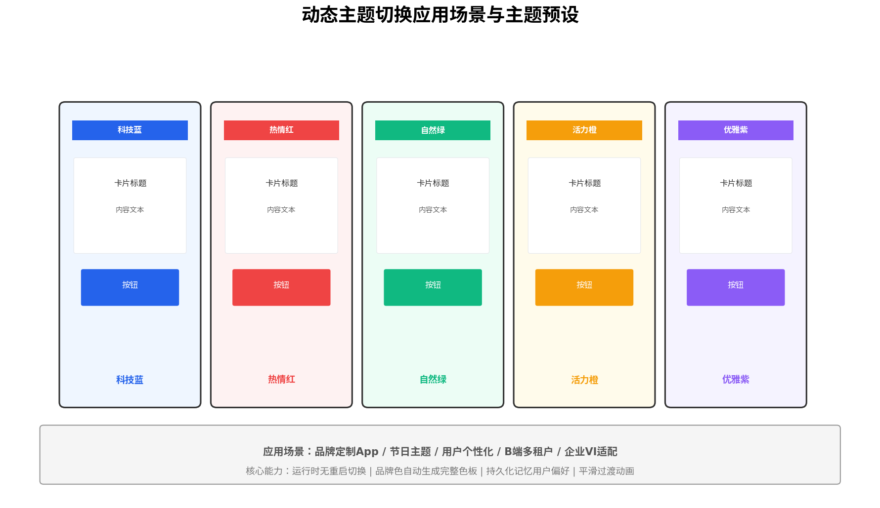
- B端多租户平台:不同企业客户拥有独立品牌色,登录后自动加载对应企业VI主题。
- 电商节日营销:春节红、中秋金、双11橙等节日限定主题,提升活动氛围与转化率。
- 用户个性化皮肤:允许用户自定义品牌色,增强产品归属感与使用粘性。
- 企业VI适配:同一套应用框架服务于多个品牌,通过主题配置实现"千企千面"。
三、技术架构与数据流
动态主题切换的核心挑战在于如何在运行时高效地将新的颜色值推送到整个组件树,同时保证状态持久化与视觉平滑过渡。我们采用三层架构解决这个问题:
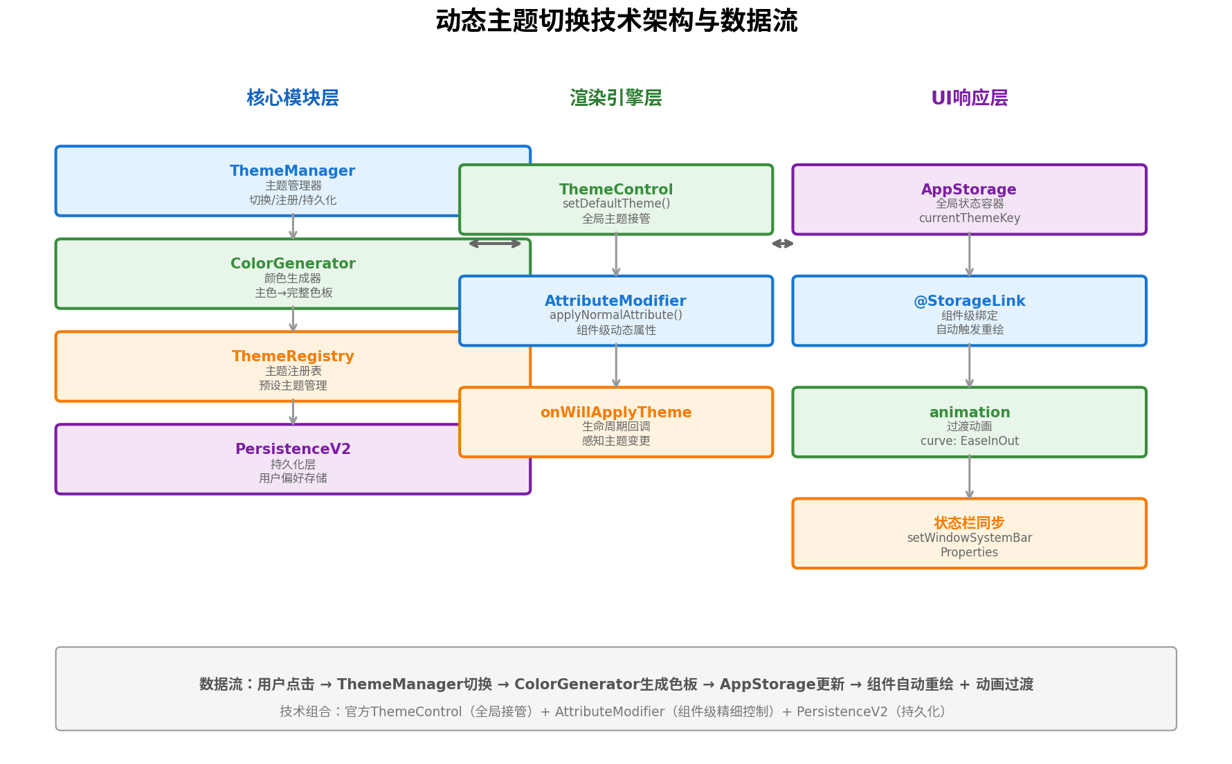
核心模块层:
ThemeManager:主题管理器,负责主题切换、注册、持久化。ColorGenerator:颜色生成器,基于HSL算法从单一品牌主色生成完整色板。ThemeRegistry:主题注册表,管理预设主题集合。PersistenceV2:持久化层,确保用户主题偏好跨会话保持。
渲染引擎层:
ThemeControl.setDefaultTheme():官方API全局接管组件默认配色。AttributeModifier<T>:组件级动态属性,实现精细化的样式控制。onWillApplyTheme():生命周期回调,让自定义组件感知主题变更。
UI响应层:
AppStorage:全局状态容器,存储当前主题标识。@StorageLink:组件级绑定,自动触发重绘。animation:过渡动画修饰器,实现颜色渐变效果。setWindowSystemBarProperties:状态栏同步适配。
四、品牌色自动生成完整色板
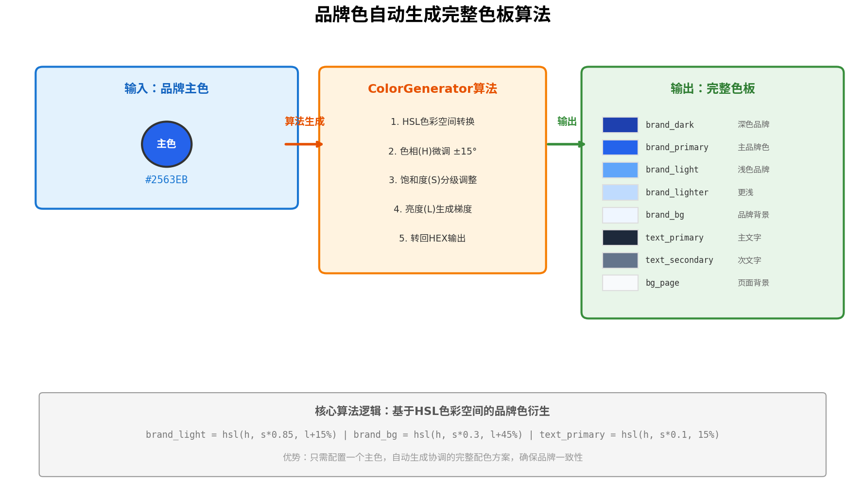
动态主题切换的精髓在于只需配置一个品牌主色,即可自动生成协调的完整配色方案。这避免了为每个主题手动维护数十个颜色值的繁琐工作。
4.1 HSL色彩空间转换算法
我们基于HSL(色相-饱和度-亮度)色彩空间进行颜色衍生,相比RGB空间,HSL更符合人类对颜色的直观感知:
// theme/ColorGenerator.ets

/**
 * HEX颜色转HSL
 * @param hex 如 '#2563EB'
 * @returns [h, s, l] 色相0-360,饱和度0-100,亮度0-100
 */
function hexToHsl(hex: string): [number, number, number] {
  let r = parseInt(hex.slice(1, 3), 16) / 255;
  let g = parseInt(hex.slice(3, 5), 16) / 255;
  let b = parseInt(hex.slice(5, 7), 16) / 255;

  const max = Math.max(r, g, b);
  const min = Math.min(r, g, b);
  let h = 0, s = 0, l = (max + min) / 2;

  if (max !== min) {
    const d = max - min;
    s = l > 0.5 ? d / (2 - max - min) : d / (max + min);
    switch (max) {
      case r: h = (g - b) / d + (g < b ? 6 : 0); break;
      case g: h = (b - r) / d + 2; break;
      case b: h = (r - g) / d + 4; break;
    }
    h /= 6;
  }

  return [Math.round(h * 360), Math.round(s * 100), Math.round(l * 100)];
}

/**
 * HSL转HEX
 */
function hslToHex(h: number, s: number, l: number): string {
  s /= 100;
  l /= 100;
  const k = (n: number) => (n + h / 30) % 12;
  const a = s * Math.min(l, 1 - l);
  const f = (n: number) => {
    const color = l - a * Math.max(-1, Math.min(k(n) - 3, Math.min(9 - k(n), 1)));
    return Math.round(255 * color).toString(16).padStart(2, '0');
  };
  return `#${f(0)}${f(8)}${f(4)}`;
}

/**
 * 主题色板生成器
 * 输入单一品牌主色,输出完整语义化色板
 */
export class ColorGenerator {
  static generatePalette(primaryHex: string): ThemePalette {
    const [h, s, l] = hexToHsl(primaryHex);

    return {
      // 品牌色梯度
      brandDark: hslToHex(h, Math.min(s * 1.2, 100), Math.max(l - 20, 10)),
      brandPrimary: primaryHex,
      brandLight: hslToHex(h, Math.max(s * 0.85, 20), Math.min(l + 15, 95)),
      brandLighter: hslToHex(h, Math.max(s * 0.5, 10), Math.min(l + 35, 98)),
      brandBg: hslToHex(h, Math.max(s * 0.15, 5), Math.min(l + 48, 99)),

      // 功能色(基于主色微调色相)
      success: hslToHex((h + 120) % 360, 70, 45),
      warning: hslToHex((h + 60) % 360, 80, 55),
      error: hslToHex((h + 0) % 360, 75, 55),

      // 中性色(低饱和度,基于主色色相)
      textPrimary: hslToHex(h, Math.max(s * 0.08, 3), 12),
      textSecondary: hslToHex(h, Math.max(s * 0.06, 2), 45),
      textDisabled: hslToHex(h, Math.max(s * 0.04, 1), 65),
      bgPage: hslToHex(h, Math.max(s * 0.03, 1), 97),
      bgSurface: '#FFFFFF',
      bgElevated: hslToHex(h, Math.max(s * 0.02, 1), 99),
      borderDefault: hslToHex(h, Math.max(s * 0.05, 2), 88),
    };
  }
}

/** 完整色板接口 */
export interface ThemePalette {
  brandDark: string;
  brandPrimary: string;
  brandLight: string;
  brandLighter: string;
  brandBg: string;
  success: string;
  warning: string;
  error: string;
  textPrimary: string;
  textSecondary: string;
  textDisabled: string;
  bgPage: string;
  bgSurface: string;
  bgElevated: string;
  borderDefault: string;
}
4.2 算法设计原理
| 颜色角色 | 生成规则 | 设计意图 |
|---|---|---|
brandDark | 亮度-20%,饱和度+20% | 用于按下态、强调阴影 |
brandLight | 亮度+15%,饱和度×0.85 | 用于hover态、轻量强调 |
brandBg | 亮度+48%,饱和度×0.15 | 极浅品牌背景,用于标签、徽章 |
textPrimary | 亮度12%,极低饱和度 | 确保与任何品牌色背景都有足够对比度 |
success | 色相+120°(绿色区间) | 功能色与品牌色保持协调但不冲突 |
warning | 色相+60°(黄色区间) | 警告色在色轮上与品牌色形成对比 |
五、ThemeManager主题管理器
ThemeManager是动态主题切换的核心控制器,负责主题注册、切换、持久化与状态同步:
// theme/ThemeManager.ets
import { CustomColors, CustomTheme, ThemeControl } from '@kit.ArkUI';
import { PersistenceV2, type } from '@kit.ArkUI';
import { ColorGenerator, ThemePalette } from './ColorGenerator';

/** 预设主题定义 */
export interface PresetTheme {
  key: string;
  name: string;
  primaryColor: string;
}

/** 主题状态(持久化) */
@ObservedV2
export class ThemePreference {
  /** 当前主题key */
  @Trace currentThemeKey: string = 'blue';
  /** 自定义品牌色(当themeKey为'custom'时使用) */
  @Trace customPrimaryColor: string = '#2563EB';
  /** 是否启用过渡动画 */
  @Trace enableAnimation: boolean = true;

  static getInstance(): ThemePreference {
    return PersistenceV2.connect(ThemePreference, () => new ThemePreference())!;
  }
}

/** 自定义颜色实现 */
class DynamicColors implements CustomColors {
  brand: ResourceColor = '#2563EB';
  fontPrimary: ResourceColor = '#1A1A1A';
  fontSecondary: ResourceColor = '#666666';
  backgroundPrimary: ResourceColor = '#F8F9FA';
  backgroundSecondary: ResourceColor = '#FFFFFF';
  compBackgroundPrimary: ResourceColor = '#FFFFFF';
  compBackgroundSecondary: ResourceColor = '#F3F4F6';
  compEmphasizeSecondary: ResourceColor = '#332563EB';
  compDivider: ResourceColor = '#E5E7EB';
  warning: ResourceColor = '#F59E0B';
  alert: ResourceColor = '#EF4444';
  confirm: ResourceColor = '#10B981';

  constructor(palette: ThemePalette) {
    this.brand = palette.brandPrimary;
    this.fontPrimary = palette.textPrimary;
    this.fontSecondary = palette.textSecondary;
    this.backgroundPrimary = palette.bgPage;
    this.backgroundSecondary = palette.bgSurface;
    this.compBackgroundPrimary = palette.bgSurface;
    this.compBackgroundSecondary = palette.brandBg;
    this.compEmphasizeSecondary = palette.brandPrimary + '33'; // 20%透明度
    this.compDivider = palette.borderDefault;
    this.warning = palette.warning;
    this.alert = palette.error;
    this.confirm = palette.success;
  }
}

/** 动态主题实现 */
class DynamicTheme implements CustomTheme {
  colors: CustomColors;
  darkColors: CustomColors;

  constructor(palette: ThemePalette) {
    this.colors = new DynamicColors(palette);
    // 深色模式色板可基于浅色色板进一步生成
    this.darkColors = this.generateDarkColors(palette);
  }

  private generateDarkColors(palette: ThemePalette): CustomColors {
    // 简化处理:实际项目中应基于HSL反转亮度生成深色色板
    const darkPalette = ColorGenerator.generatePalette(palette.brandPrimary);
    // 深色模式调整...
    return new DynamicColors(darkPalette);
  }
}

/** 主题管理器 */
export class ThemeManager {
  private static presets: PresetTheme[] = [
    { key: 'blue', name: '科技蓝', primaryColor: '#2563EB' },
    { key: 'red', name: '热情红', primaryColor: '#EF4444' },
    { key: 'green', name: '自然绿', primaryColor: '#10B981' },
    { key: 'orange', name: '活力橙', primaryColor: '#F59E0B' },
    { key: 'purple', name: '优雅紫', primaryColor: '#8B5CF6' },
  ];

  private static preference: ThemePreference = ThemePreference.getInstance();

  /** 获取所有预设主题 */
  static getPresets(): PresetTheme[] {
    return this.presets;
  }

  /** 获取当前主题色板 */
  static getCurrentPalette(): ThemePalette {
    const pref = this.preference;
    let primary: string;
    if (pref.currentThemeKey === 'custom') {
      primary = pref.customPrimaryColor;
    } else {
      const preset = this.presets.find(p => p.key === pref.currentThemeKey);
      primary = preset?.primaryColor || '#2563EB';
    }
    return ColorGenerator.generatePalette(primary);
  }

  /** 切换到预设主题 */
  static switchToPreset(key: string): void {
    this.preference.currentThemeKey = key;
    this.applyTheme();
  }

  /** 切换到自定义品牌色 */
  static switchToCustom(primaryColor: string): void {
    this.preference.currentThemeKey = 'custom';
    this.preference.customPrimaryColor = primaryColor;
    this.applyTheme();
  }

  /** 应用当前主题到全局 */
  private static applyTheme(): void {
    const palette = this.getCurrentPalette();
    const theme = new DynamicTheme(palette);
    ThemeControl.setDefaultTheme(theme);
    // 同步更新AppStorage供非ThemeControl组件使用
    AppStorage.setOrCreate('currentPalette', palette);
    AppStorage.setOrCreate('themeKey', this.preference.currentThemeKey);
  }

  /** 初始化(应用启动时调用) */
  static initialize(): void {
    this.applyTheme();
  }
}
六、AttributeModifier动态属性方案
对于需要精细控制的自定义组件,官方ThemeControl可能无法覆盖所有场景。此时可结合AttributeModifier<T>实现组件级的动态属性绑定:
// theme/ThemeModifiers.ets
import { AttributeModifier, TextAttribute, ColumnAttribute, ButtonAttribute } from '@kit.ArkUI';
import { ThemeManager } from './ThemeManager';

/** 文本动态属性 */
export class ThemeTextModifier implements AttributeModifier<TextAttribute> {
  private fontSizeVal?: number;
  private isBold?: boolean;

  setFontSize(size: number): ThemeTextModifier {
    this.fontSizeVal = size;
    return this;
  }

  setBold(bold: boolean): ThemeTextModifier {
    this.isBold = bold;
    return this;
  }

  applyNormalAttribute(instance: TextAttribute): void {
    const palette = ThemeManager.getCurrentPalette();
    instance.fontColor(palette.textPrimary);
    if (this.fontSizeVal) instance.fontSize(this.fontSizeVal);
    if (this.isBold) instance.fontWeight(FontWeight.Bold);
  }
}

/** 容器动态属性 */
export class ThemeColumnModifier implements AttributeModifier<ColumnAttribute> {
  applyNormalAttribute(instance: ColumnAttribute): void {
    const palette = ThemeManager.getCurrentPalette();
    instance.backgroundColor(palette.bgPage);
  }
}

/** 按钮动态属性 */
export class ThemeButtonModifier implements AttributeModifier<ButtonAttribute> {
  private isPrimary: boolean = true;

  setPrimary(primary: boolean): ThemeButtonModifier {
    this.isPrimary = primary;
    return this;
  }

  applyNormalAttribute(instance: ButtonAttribute): void {
    const palette = ThemeManager.getCurrentPalette();
    if (this.isPrimary) {
      instance.backgroundColor(palette.brandPrimary);
      instance.fontColor(Color.White);
    } else {
      instance.backgroundColor(palette.brandBg);
      instance.fontColor(palette.brandPrimary);
    }
  }

  applyPressedAttribute(instance: ButtonAttribute): void {
    const palette = ThemeManager.getCurrentPalette();
    instance.backgroundColor(palette.brandDark);
  }
}
七、过渡动画实现
主题切换时的视觉平滑过渡是提升体验的关键。我们通过animation修饰器为受主题影响的属性添加过渡动画:
// 在组件build中使用动画修饰器
Column() {
  Text('动态主题文本')
    .fontColor(this.currentBrandColor)
    .fontSize(16)
}
.width('100%')
.height(100)
.backgroundColor(this.currentBgColor)
// 关键:为主题相关属性添加过渡动画
.animation({
  duration: 300,
  curve: Curve.EaseInOut,
  iterations: 1,
  playMode: PlayMode.Normal
})
对于全局主题切换,可以在根组件上统一配置动画,确保所有子组件的颜色变化都有过渡效果。
八、完整使用示例
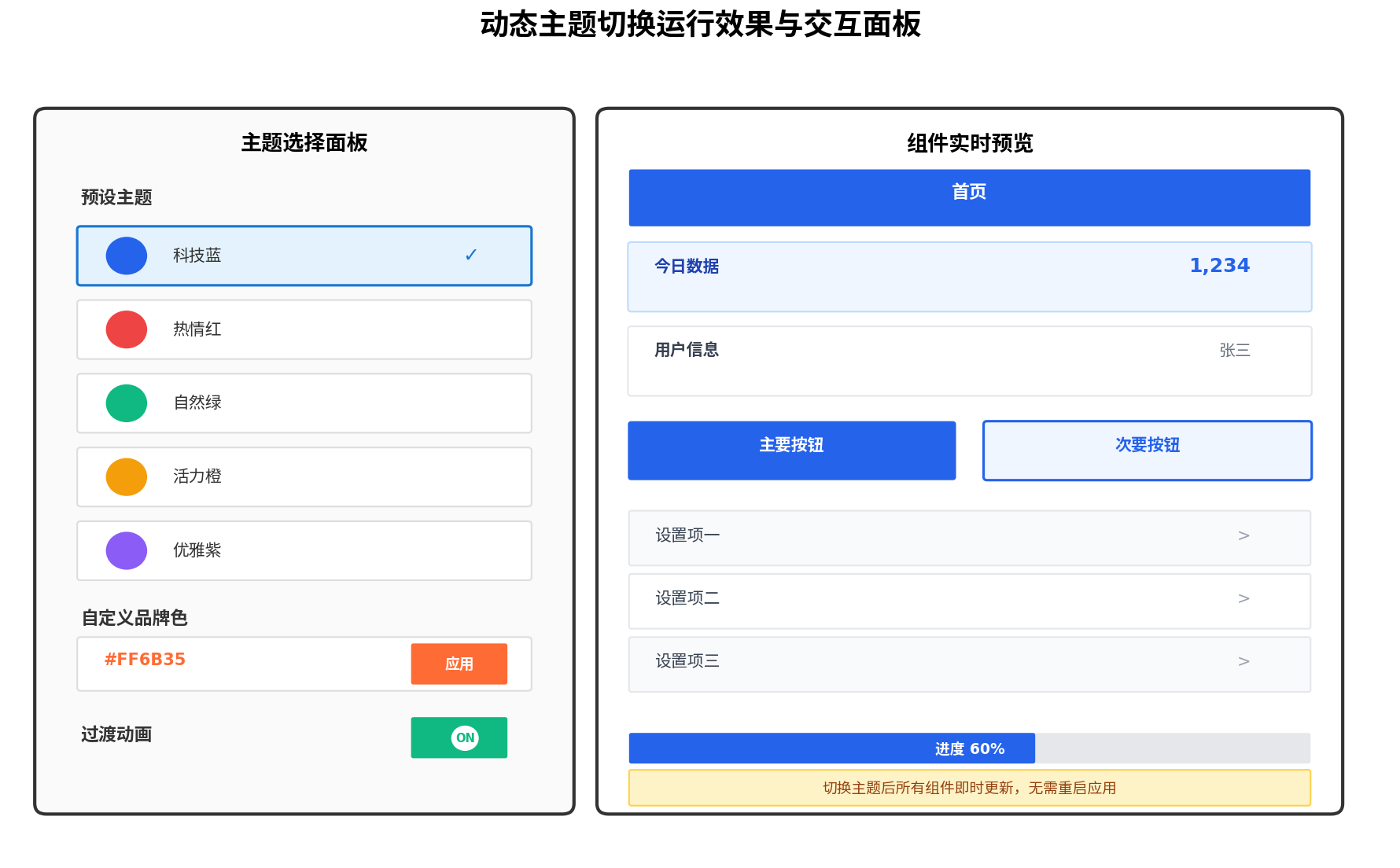
以下是一个完整的主题切换演示页面,集成预设主题选择、自定义品牌色输入与实时预览:
// pages/ThemeSwitchDemo.ets
import { Theme, ThemeControl } from '@kit.ArkUI';
import { ThemeManager, ThemePreference, PresetTheme } from '../theme/ThemeManager';
import { ColorGenerator, ThemePalette } from '../theme/ColorGenerator';
import { ThemeTextModifier, ThemeColumnModifier, ThemeButtonModifier } from '../theme/ThemeModifiers';

@Entry
@ComponentV2
struct ThemeSwitchDemoPage {
  @Local preference: ThemePreference = ThemePreference.getInstance();
  @Local palette: ThemePalette = ThemeManager.getCurrentPalette();
  @Local customColor: string = '#FF6B35';
  @Local presets: PresetTheme[] = ThemeManager.getPresets();

  onWillApplyTheme(theme: Theme) {
    // 当ThemeControl切换主题时刷新本地色板
    this.palette = ThemeManager.getCurrentPalette();
  }

  aboutToAppear(): void {
    ThemeManager.initialize();
    this.palette = ThemeManager.getCurrentPalette();
  }

  build() {
    Scroll() {
      Column({ space: 20 }) {
        Text('动态主题切换演示')
          .fontSize(22)
          .fontWeight(FontWeight.Bold)
          .fontColor(this.palette.brandPrimary)
          .margin({ top: 20 })

        // 预设主题选择区
        Column({ space: 12 }) {
          Text('预设主题')
            .fontSize(16)
            .fontWeight(FontWeight.Bold)
            .fontColor(this.palette.textPrimary)
            .width('90%')

          ForEach(this.presets, (preset: PresetTheme) => {
            Row() {
              Circle()
                .width(32)
                .height(32)
                .fill(preset.primaryColor)
                .margin({ right: 12 })
              Text(preset.name)
                .fontSize(15)
                .fontColor(this.palette.textPrimary)
                .layoutWeight(1)
              if (this.preference.currentThemeKey === preset.key) {
                Text('✓')
                  .fontSize(18)
                  .fontColor(this.palette.brandPrimary)
                  .fontWeight(FontWeight.Bold)
              }
            }
            .width('90%')
            .height(56)
            .padding({ left: 16, right: 16 })
            .backgroundColor(
              this.preference.currentThemeKey === preset.key
                ? this.palette.brandBg
                : this.palette.bgSurface
            )
            .borderRadius(12)
            .border({
              width: this.preference.currentThemeKey === preset.key ? 2 : 1,
              color: this.preference.currentThemeKey === preset.key
                ? this.palette.brandPrimary
                : this.palette.borderDefault
            })
            .onClick(() => {
              ThemeManager.switchToPreset(preset.key);
              this.palette = ThemeManager.getCurrentPalette();
            })
            .animation({ duration: 200, curve: Curve.EaseInOut })
          }, (preset: PresetTheme) => preset.key)
        }
        .width('100%')

        // 自定义品牌色
        Column({ space: 12 }) {
          Text('自定义品牌色')
            .fontSize(16)
            .fontWeight(FontWeight.Bold)
            .fontColor(this.palette.textPrimary)
            .width('90%')

          Row() {
            TextInput({ text: $$this.customColor })
              .width('60%')
              .height(44)
              .fontSize(14)
              .fontColor(this.palette.textPrimary)
              .backgroundColor(this.palette.bgSurface)
              .border({ width: 1, color: this.palette.borderDefault })
              .borderRadius(8)

            Button('应用')
              .width('30%')
              .height(44)
              .backgroundColor(this.palette.brandPrimary)
              .fontColor(Color.White)
              .borderRadius(8)
              .onClick(() => {
                ThemeManager.switchToCustom(this.customColor);
                this.palette = ThemeManager.getCurrentPalette();
              })
          }
          .width('90%')
          .justifyContent(FlexAlign.SpaceBetween)
        }
        .width('100%')

        // 实时预览区
        Column({ space: 16 }) {
          Text('实时预览')
            .fontSize(16)
            .fontWeight(FontWeight.Bold)
            .fontColor(this.palette.textPrimary)
            .width('90%')

          // 导航栏预览
          Row() {
            Text('预览页面')
              .fontSize(14)
              .fontColor(Color.White)
              .fontWeight(FontWeight.Bold)
          }
          .width('90%')
          .height(44)
          .backgroundColor(this.palette.brandPrimary)
          .borderRadius(8)
          .justifyContent(FlexAlign.Center)

          // 卡片预览
          Column({ space: 8 }) {
            Text('数据卡片')
              .fontSize(14)
              .fontColor(this.palette.textPrimary)
              .fontWeight(FontWeight.Medium)
            Text('1,234')
              .fontSize(20)
              .fontColor(this.palette.brandPrimary)
              .fontWeight(FontWeight.Bold)
          }
          .width('90%')
          .padding(16)
          .backgroundColor(this.palette.brandBg)
          .borderRadius(12)

          // 按钮组预览
          Row({ space: 12 }) {
            Button('主要按钮')
              .width('45%')
              .height(44)
              .backgroundColor(this.palette.brandPrimary)
              .fontColor(Color.White)
              .borderRadius(8)

            Button('次要按钮')
              .width('45%')
              .height(44)
              .backgroundColor(this.palette.brandBg)
              .fontColor(this.palette.brandPrimary)
              .borderRadius(8)
          }
          .width('90%')
          .justifyContent(FlexAlign.Center)

          // 列表项预览
          ForEach(['列表项一', '列表项二', '列表项三'], (item: string, index: number) => {
            Row() {
              Text(item)
                .fontSize(14)
                .fontColor(this.palette.textPrimary)
                .layoutWeight(1)
              Text('>')
                .fontSize(14)
                .fontColor(this.palette.textSecondary)
            }
            .width('90%')
            .height(48)
            .padding({ left: 12, right: 12 })
            .backgroundColor(index % 2 === 0 ? this.palette.bgSurface : this.palette.bgElevated)
            .borderRadius(8)
          }, (item: string) => item)

          // 进度条预览
          Stack({ alignContent: Alignment.Start }) {
            Row()
              .width('90%')
              .height(8)
              .backgroundColor(this.palette.borderDefault)
              .borderRadius(4)
            Row()
              .width('60%')
              .height(8)
              .backgroundColor(this.palette.brandPrimary)
              .borderRadius(4)
          }
          .width('90%')
        }
        .width('100%')
        .padding({ bottom: 40 })
      }
      .width('100%')
    }
    .width('100%')
    .height('100%')
    .backgroundColor(this.palette.bgPage)
    .scrollBar(BarState.Auto)
  }
}
运行效果
九、性能优化与最佳实践
| 优化策略 | 实现方式 | 效果 |
|---|---|---|
| 色板缓存 | ThemeManager缓存当前色板 | 避免重复计算HSL转换 |
| 按需生成 | 仅切换时生成新色板 | 减少不必要的计算开销 |
| 动画时长控制 | 300ms过渡 | 平衡视觉平滑与响应速度 |
| 持久化异步 | PersistenceV2后台写入 | 不阻塞UI线程 |
| 状态栏同步 | 切换后即时更新 | 避免状态栏与页面颜色不一致 |
最佳实践:
- 单一数据源:所有颜色值通过
ThemeManager.getCurrentPalette()获取,禁止组件内硬编码。 - 预设优先:提供5~8个精心调试的预设主题,满足90%用户需求,自定义作为补充。
- 对比度检测:自动生成色板后,使用WCAG对比度公式检测
textPrimary与bgPage的对比度,确保>=4.5:1。 - 深色模式联动:动态主题切换与系统深色模式独立管理,通过
darkColors同时支持两种模式的自动适配。
十、总结
本文深入讲解了HarmonyOS ArkUI框架下运行时动态主题切换的完整实现方案。通过ColorGenerator基于HSL色彩空间的算法,实现了从单一品牌主色自动生成完整语义化色板的能力;通过ThemeManager统一管理主题注册、切换与持久化;通过ThemeControl.setDefaultTheme()实现全局组件的即时响应;通过AttributeModifier<T>覆盖自定义组件的精细化样式控制;通过animation修饰器实现平滑的视觉过渡。
与系统深浅色模式适配相比,动态主题切换的核心差异在于无限扩展性与运行时即时性。开发者只需配置一个品牌主色,即可衍生出协调的完整配色方案,大大降低了多主题维护的成本。希望本文能为鸿蒙生态开发者在构建个性化、品牌化应用时提供坚实的技术支撑。
转载自:https://blog.csdn.net/u014727709/article/details/163450570
欢迎 👍点赞✍评论⭐收藏,欢迎指正

讨论HarmonyOS开发技术,专注于API与组件、DevEco Studio、测试、元服务和应用上架分发等。
更多推荐
 9
9 0
0- 0


 已为社区贡献861条内容

所有评论(0)