HarmonyOS7 DividerEssentials 教程:分割线这种小组件,为什么能明显提升页面秩序
文章目录
前言
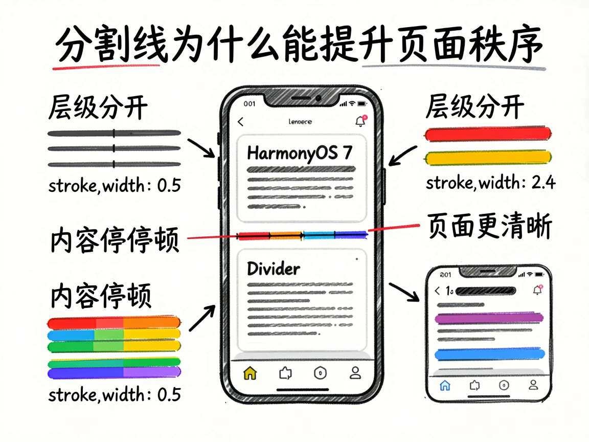
很多页面看起来“乱”,并不是因为颜色不对、字体不对,而是层级没分开。
信息和信息之间没有边界,内容块和内容块之间没有停顿,用户一眼看过去就会觉得挤、散、没重点。这时候,分割线往往是最轻量、最有效的秩序工具。
这份案例非常适合初学者,因为它没有一上来就讲复杂样式,而是先把 Divider 最基础、最常用的能力讲透:粗细、颜色,以及它在内容分区里的作用。
这份案例在演示什么
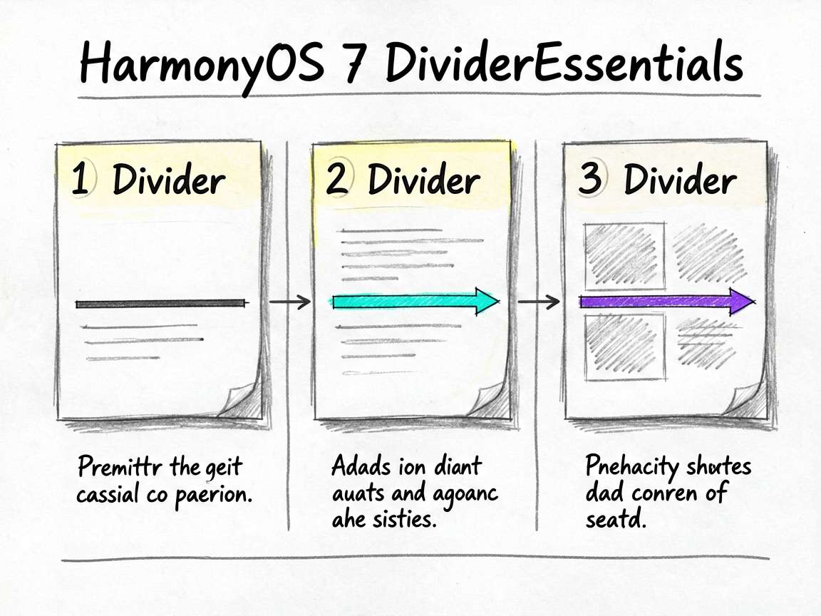
页面主要展示了三类内容:
- 不同粗细的分割线
- 不同颜色的分割线
- 分割线在内容区域中的实际应用
你可以把它理解成一份 Divider 基础能力说明书。
完整代码
/**
 * DividerEssentials - Divider 基础分割线
 * 演示 Divider 的基本用法和 strokeWidth 控制
 */
import { PRESET_COLORS, generateListItems, PAGE_BG_COLOR, PANEL_BG_COLOR, ACCENT_COLOR, MUTED_TEXT_COLOR } from './types'

@Entry
@Component
struct DividerEssentials {
  @State isShow: boolean = true

  build() {
    Column() {
      if (this.isShow) {
        Scroll() {
          Column({ space: 16 }) {
            Text('Divider 基础分割线').fontSize(16).fontColor(ACCENT_COLOR).fontWeight(FontWeight.Bold)

            Column() {
              Text('不同粗细的分割线').fontSize(13).fontColor('#4D96FF').margin({ bottom: 8 })
              Column({ space: 8 }) {
                Row() {
                  Text('strokeWidth: 0.5').fontSize(11).fontColor('#666666').layoutWeight(1)
                  Divider().strokeWidth(0.5).color('#E0E0E0')
                }.width('100%').height(20)
                Row() {
                  Text('strokeWidth: 1').fontSize(11).fontColor('#666666').layoutWeight(1)
                  Divider().strokeWidth(1).color('#A0A0A0')
                }.width('100%').height(20)
                Row() {
                  Text('strokeWidth: 2').fontSize(11).fontColor('#666666').layoutWeight(1)
                  Divider().strokeWidth(2).color('#666666')
                }.width('100%').height(24)
                Row() {
                  Text('strokeWidth: 4').fontSize(11).fontColor('#666666').layoutWeight(1)
                  Divider().strokeWidth(4).color('#4D96FF')
                }.width('100%').height(28)
              }
            }
            .backgroundColor(PANEL_BG_COLOR).padding(12).borderRadius(12)

            Column() {
              Text('不同颜色的分割线').fontSize(13).fontColor('#6BCB77').margin({ bottom: 8 })
              Column({ space: 8 }) {
                Divider().strokeWidth(1).color('#FF6B6B')
                Divider().strokeWidth(1).color('#FFA500')
                Divider().strokeWidth(1).color('#FFD93D')
                Divider().strokeWidth(1).color('#6BCB77')
                Divider().strokeWidth(1).color('#4D96FF')
                Divider().strokeWidth(1).color('#9B59B6')
              }
            }
            .backgroundColor('#F0FAF1').padding(12).borderRadius(12)

            Column() {
              Text('内容区域分割').fontSize(13).fontColor('#9B59B6').margin({ bottom: 8 })
              Column({ space: 0 }) {
                Text('区域一: 标题和内容').fontSize(13).padding(10)
                Divider().strokeWidth(0.5).color('#E0E0E0')
                Text('区域二: 更多信息').fontSize(13).padding(10)
                Divider().strokeWidth(0.5).color('#E0E0E0')
                Text('区域三: 底部操作').fontSize(13).padding(10)
              }
              .backgroundColor(PANEL_BG_COLOR).borderRadius(8)
            }
            .backgroundColor('#F5EEF8').padding(12).borderRadius(12)
          }.width('100%')
        }
      }
      Text('Divider 基础用法 - 用最轻的方式切开页面层次')
        .fontSize(12).fontColor(MUTED_TEXT_COLOR).margin({ top: 12 })
    }
    .width('100%').height('100%').backgroundColor(PAGE_BG_COLOR).padding(16)
  }
}
为什么分割线的重点不是“线”,而是“边界感”
很多人看到 Divider,会先关注颜色和粗细。但它更本质的作用,其实是帮页面建立信息边界。
比如:
- 哪一块内容属于一组
- 哪两行信息彼此独立
- 这一段和下一段之间有没有明显停顿
所以分割线不是装饰物,它是在帮页面说话。
strokeWidth 为什么是最基础也最重要的能力
先看第一组:
Divider().strokeWidth(0.5)
Divider().strokeWidth(1)
Divider().strokeWidth(2)
Divider().strokeWidth(4)
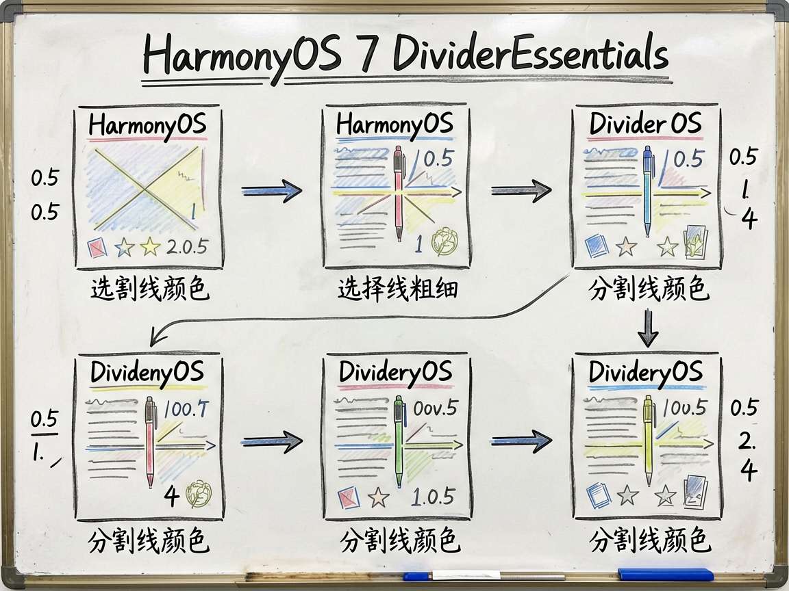
不同粗细其实对应不同的视觉语气:
| 粗细 | 更像什么 |
|---|---|
0.5 |
轻提示、弱边界 |
1 |
标准分隔 |
2 |
更明确的模块区分 |
4 |
强调型视觉分界 |
这意味着你不能把所有分割线都写成一样粗。页面层级不同,分割强度也应该不同。
颜色为什么不是越亮越好
第二组演示了多种颜色分割线,看起来很直观,但真实页面里更应该谨慎使用。
大多数情况下:
- 普通内容区适合浅灰线
- 强调模块可以用品牌色
- 警示或特殊状态才考虑高饱和色
分割线如果太跳,用户第一眼会被线吸走注意力,反而看不到真正的内容。
内容区域分割为什么最有实战价值
最后一块是整篇最实用的部分:
Text('区域一')
Divider()
Text('区域二')
Divider()
Text('区域三')
这就是最典型的内容分层做法。
它非常适合:
- 设置页条目
- 卡片内部多段信息
- 详情页分区
- 表单分组
你会发现,很多页面并不需要很重的边框,只要在关键位置补几条分割线,秩序就会清楚很多。
关键代码单独讲解
Divider().strokeWidth(0.5).color('#E0E0E0')
这是最常见也最稳妥的基础分隔样式,适合大部分普通内容区。
layoutWeight(1)
粗细演示区里左边说明文字用了弹性宽度,把右边分割线留出展示空间,这个布局思路很清晰。
Column({ space: 0 })
实际分区示例里把纵向间距设成 0,再完全依靠 Divider 来切层,这样边界感会更明确。
小白最容易踩的坑
1. 所有分割线都用同一种粗细
页面层次会显得很平,没有主次。
2. 分割线颜色过重
结果线条比内容更抢眼。
3. 什么地方都加线
分割线太多反而会让页面支离破碎。
这份代码能怎么改成真实业务
| 场景 | 改法 |
|---|---|
| 设置页 | 用浅灰线分隔不同设置项 |
| 资料卡片 | 在信息块之间增加轻量分割线 |
| 管理后台 | 用稍粗分割线切分大模块 |
| 品牌专题页 | 在重点区域使用品牌色分隔 |
动手改一改
- 把“内容区域分割”改成真实的设置页条目。
- 试着只保留
0.5和2两种线宽,观察层次差异。 - 给某一条分割线改成品牌色,看看会不会过于抢眼。
- 把一张卡片里的信息拆成 4 段,用
Divider重新组织。
写在最后
分割线是那种你平时不太会主动夸它,但一旦用对了,页面质感会立刻变稳的小组件。它不负责制造视觉高潮,负责的是把内容关系讲清楚。
如果你现在做的页面总觉得“哪里都对,但看起来还是乱”,这篇里的 Divider 思路值得试试。很多时候,问题不是内容太少,而是边界不够清楚。

讨论HarmonyOS开发技术,专注于API与组件、DevEco Studio、测试、元服务和应用上架分发等。
更多推荐
 8
8 0
0- 0


 已为社区贡献77条内容

所有评论(0)