@Provide 与 @Consume 跨组件通信——打破层级壁垒的状态共享之道
文章目录

每日一句正能量
对待生命你不妨大胆一点,因为你终将失去它。
我们常因害怕失去而不敢拥有。既然结局已定,过程为何不勇敢一些?把每一天当作借来的时间,把每一次尝试当作赚到的经历。大胆,不是因为不会受伤,而是因为看清了生命的本质,不愿在临终前因“没做过”而遗憾。
一、引言:当组件树越来越深,状态该往哪放?
在 ArkUI 的声明式开发范式中,状态驱动 UI 刷新是核心机制。随着业务复杂度提升,组件树往往从简单的「父→子」两层结构,演变为「根页面 → 布局容器 → 业务模块 → 原子组件」的多层嵌套。此时,如果继续使用 @Prop 或 @Link 逐层透传参数,中间层组件会沦为「传话筒」——它们本身不消费数据,却不得不接收并继续向下传递,导致代码冗余、耦合度飙升、维护成本剧增。
@Provide 与 @Consume 正是为解决这一痛点而生。这对装饰器允许祖先组件直接向后代组件广播状态,后代通过名称匹配即可消费,中间层完全透明。本文将从原理剖析、基础用法、高级特性、实战案例到踩坑指南,带你彻底掌握这套跨层级通信方案。
二、ArkUI 状态管理全景:为什么需要 @Provide/@Consume?
在深入之前,先建立整体认知。ArkUI 的状态管理装饰器按通信范围可分为三层:
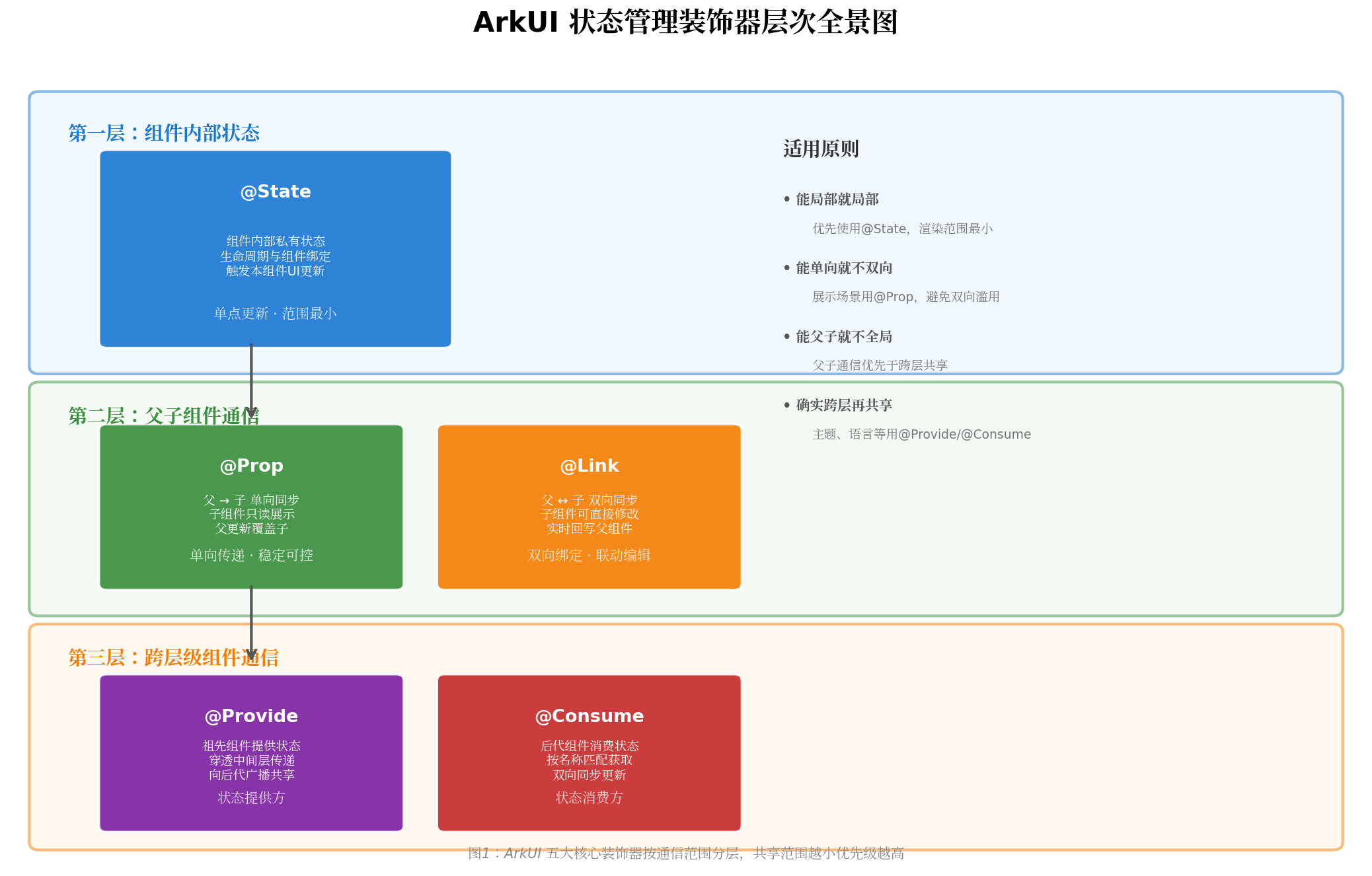
图1:ArkUI 五大核心装饰器按通信范围分层,共享范围越小优先级越高
- 第一层(组件内部):
@State管理组件私有状态,渲染范围最小,成本最低。 - 第二层(父子通信):
@Prop实现单向传递,@Link实现双向同步,但均需逐层透传。 - 第三层(跨层级共享):
@Provide/@Consume穿透中间层,实现祖先与任意后代的双向同步。
选型口诀:能局部就局部,能单向就不双向,能父子就不全局,确实跨层再共享。
三、核心原理:@Provide 如何「广播」,@Consume 如何「收听」
3.1 工作机制
@Provide 装饰的变量在祖先组件中初始化,框架会将其注册到当前组件子树的「状态上下文」中。后代组件通过 @Consume 按变量名或**别名(alias)**进行匹配,一旦匹配成功,双方建立双向引用同步关系。
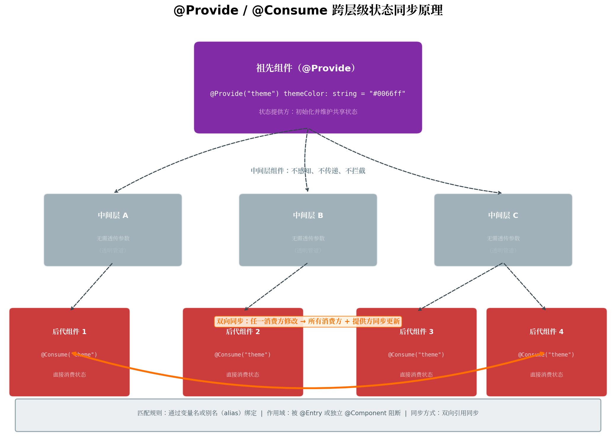
图2:祖先组件通过 @Provide 广播状态,后代通过 @Consume 直接消费,中间层透明无感知
核心要点:
- 匹配规则:默认通过变量名匹配;若使用别名,则通过字符串 key 匹配。
- 作用域边界:
@Entry或独立的@Component会阻断@Provide的作用域链。 - 同步方式:双向引用同步,任一消费方修改会立即回写提供方,并触发所有消费方刷新。
3.2 与 @Prop/@Link 的本质区别
| 特性 | @Prop | @Link | @Provide/@Consume |
|---|---|---|---|
| 数据流向 | 父 → 子(单向) | 父 ↔ 子(双向) | 祖先 ↔ 任意后代(双向) |
| 跨层级 | ❌ 需逐层传递 | ❌ 需逐层传递 | ✅ 直接穿透中间层 |
| 中间层职责 | 必须透传 | 必须透传 | 无需关心 |
| 适用场景 | 展示参数、配置项 | 输入框、开关等值编辑器 | 主题、字体、语言等全局上下文 |
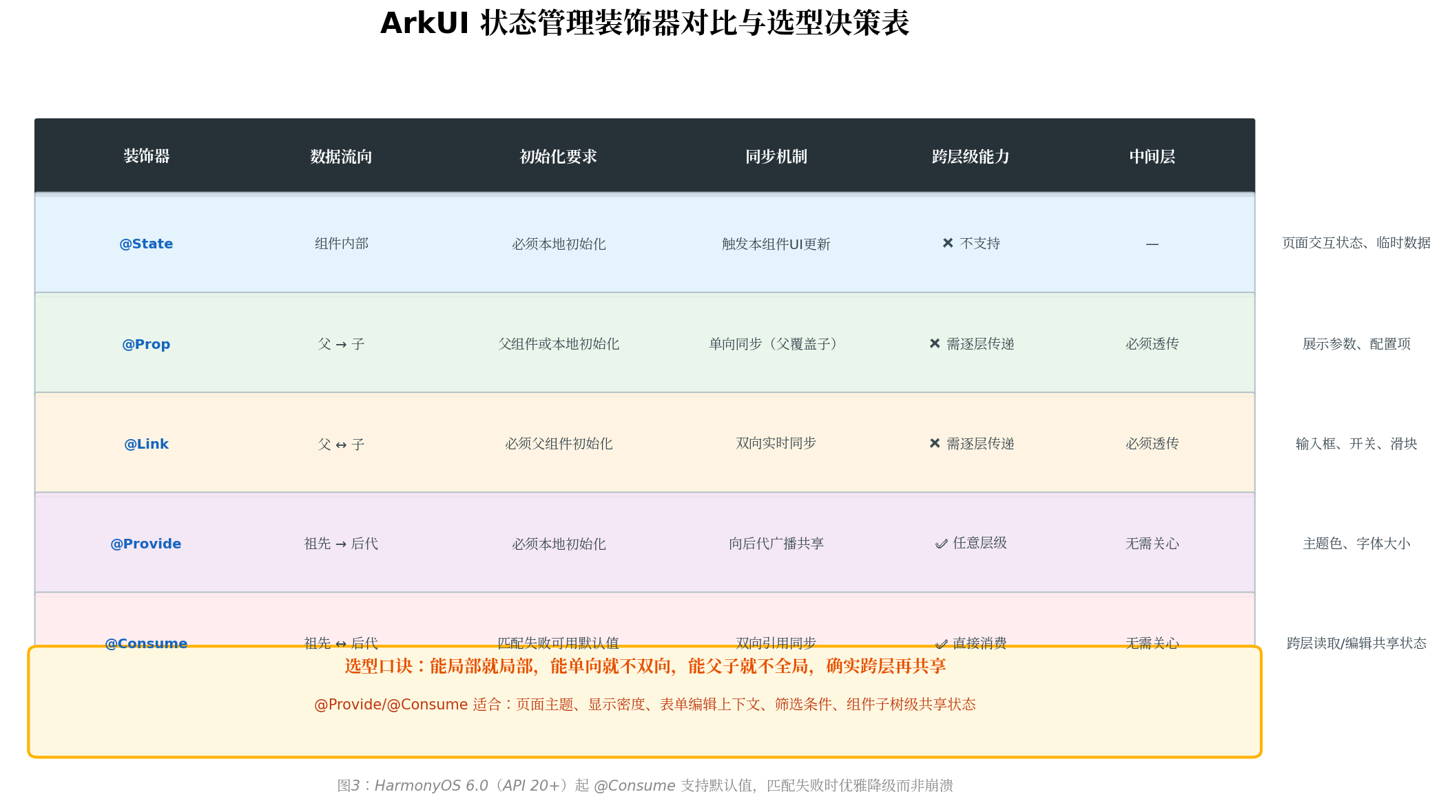
图3:五大装饰器横向对比,HarmonyOS 6.0(API 20+)起 @Consume 支持默认值
四、基础用法:从「层层传参」到「一步到位」
4.1 最小可运行示例
以下示例演示了一个三层组件树:根组件提供主题色,中间组件不做任何传递,叶子组件直接消费并修改。
// ThemeModel.ets —— 主题配置数据模型
export interface ThemeConfig {
  mode: 'light' | 'dark';
  primaryColor: string;
  backgroundColor: string;
  textColor: string;
}

export const lightTheme: ThemeConfig = {
  mode: 'light',
  primaryColor: '#0066ff',
  backgroundColor: '#ffffff',
  textColor: '#333333'
};

export const darkTheme: ThemeConfig = {
  mode: 'dark',
  primaryColor: '#07C160',
  backgroundColor: '#1a1a1a',
  textColor: '#e0e0e0'
};
// Index.ets —— 根页面(祖先组件)
import { ThemeConfig, lightTheme } from './ThemeModel';

@Entry
@Component
struct ThemeDemoPage {
  // 祖先组件通过 @Provide 提供共享状态
  @Provide('appTheme') theme: ThemeConfig = lightTheme;
  @Provide('fontScale') fontScale: number = 1.0;

  build() {
    Column({ space: 0 }) {
      // 中间层组件:完全不感知 theme 和 fontScale
      PageLayout()
    }
    .width('100%')
    .height('100%')
    .backgroundColor(this.theme.backgroundColor)
  }
}

// 中间层组件:无需接收任何参数,职责单一
@Component
struct PageLayout {
  build() {
    Column({ space: 16 }) {
      HeaderBar()      // 头部导航
      ContentArea()    // 内容区域
      ControlPanel()   // 底部控制面板
    }
    .width('100%')
    .height('100%')
    .padding(16)
  }
}

// 叶子组件 1:消费主题和字体缩放
@Component
struct HeaderBar {
  @Consume('appTheme') theme: ThemeConfig;
  @Consume('fontScale') fontScale: number;

  build() {
    Row() {
      Text('智能主题系统')
        .fontSize(22 * this.fontScale)
        .fontColor(this.theme.textColor)
        .fontWeight(FontWeight.Bold)
    }
    .width('100%')
    .height(56)
    .padding({ left: 16, right: 16 })
    .backgroundColor(this.theme.primaryColor)
    .justifyContent(FlexAlign.Start)
  }
}

// 叶子组件 2:消费主题配置
@Component
struct ContentArea {
  @Consume('appTheme') theme: ThemeConfig;
  @Consume('fontScale') fontScale: number;

  build() {
    Column({ space: 12 }) {
      Text('当前主题模式')
        .fontSize(18 * this.fontScale)
        .fontColor(this.theme.textColor)

      Text(this.theme.mode === 'light' ? '☀️ 浅色模式已启用' : '🌙 深色模式已启用')
        .fontSize(16 * this.fontScale)
        .fontColor(this.theme.primaryColor)
        .fontWeight(FontWeight.Medium)

      Text('这是一段示例内容,用于演示 @Provide/@Consume 的跨层级状态同步能力。')
        .fontSize(14 * this.fontScale)
        .fontColor(this.theme.textColor)
        .opacity(0.8)
        .maxLines(3)
        .textOverflow({ overflow: TextOverflow.Ellipsis })
    }
    .width('100%')
    .padding(20)
    .backgroundColor(this.theme.mode === 'light' ? '#f5f5f5' : '#2a2a2a')
    .borderRadius(12)
    .layoutWeight(1)
  }
}

// 叶子组件 3:修改共享状态(双向同步)
@Component
struct ControlPanel {
  @Consume('appTheme') theme: ThemeConfig;
  @Consume('fontScale') fontScale: number;

  private toggleTheme(): void {
    // 修改 @Consume 变量 → 自动同步回 @Provide → 所有消费方刷新
    this.theme = this.theme.mode === 'light' ? darkTheme : lightTheme;
  }

  private increaseFont(): void {
    if (this.fontScale < 1.5) {
      this.fontScale += 0.1;
    }
  }

  private decreaseFont(): void {
    if (this.fontScale > 0.8) {
      this.fontScale -= 0.1;
    }
  }

  build() {
    Row({ space: 16 }) {
      Button('切换主题')
        .backgroundColor(this.theme.primaryColor)
        .fontColor('#ffffff')
        .onClick(() => this.toggleTheme())

      Button('字体 +')
        .backgroundColor(this.theme.primaryColor)
        .fontColor('#ffffff')
        .onClick(() => this.increaseFont())

      Button('字体 -')
        .backgroundColor(this.theme.primaryColor)
        .fontColor('#ffffff')
        .onClick(() => this.decreaseFont())

      Text(`缩放: ${this.fontScale.toFixed(1)}x`)
        .fontSize(14)
        .fontColor(this.theme.textColor)
    }
    .width('100%')
    .height(64)
    .justifyContent(FlexAlign.Center)
  }
}
关键观察:
PageLayout作为中间层,没有接收任何参数,代码职责高度单一。ControlPanel修改this.theme后,HeaderBar和ContentArea会自动刷新,无需手动通知。- 所有消费方通过别名
'appTheme'和'fontScale'匹配,避免变量名冲突。
五、高级特性:别名机制与默认值
5.1 别名机制(Alias):解耦提供方与消费方
当祖先组件的变量名与后代组件的本地命名习惯不一致,或需要避免大型项目中同名冲突时,使用别名是最佳实践。
// 祖先组件:使用别名提供状态
@Component
struct SettingsRoot {
  @Provide('appTheme') themeMode: string = 'light';
  @Provide('primaryColor') mainColor: ResourceColor = '#0066ff';

  build() {
    SettingsContent()
  }
}

// 后代组件:用别名消费,本地变量名可自由定义
@Component
struct ThemeSection {
  @Consume('appTheme') currentTheme: string;   // 本地名:currentTheme
  @Consume('primaryColor') accentColor: ResourceColor;  // 本地名:accentColor

  build() {
    Column() {
      Text(`当前主题:${this.currentTheme}`)
        .fontColor(this.accentColor)
    }
  }
}
别名优势:
- 提供方与消费方解耦,重构变量名不影响通信。
- 一个祖先可提供多个不同语义的共享状态,避免命名污染。
- 便于构建可复用组件库,消费方无需关心提供方的内部命名。
5.2 @Consume 默认值(HarmonyOS 6.0 / API 20+)
在 API 20 之前,@Consume 必须严格匹配 @Provide,否则运行时抛出 JS ERROR。这在以下场景非常痛苦:
- 开发通用组件库时,无法确定上层是否一定提供了对应状态。
- 条件渲染分支中,
@Provide可能在@Consume初始化之后才出现。 BuilderNode动态创建节点时,生命周期不同步。
HarmonyOS 6.0 引入了 @Consume 默认值特性,实现了「先降级、后同步」的智能行为:
@Component
struct OptionalThemeConsumer {
  // 若祖先未提供 "appTheme",则使用默认值 'light'
  @Consume('appTheme') theme: string = 'light';

  // 若祖先后续动态提供了 "appTheme",自动建立双向同步
  build() {
    Text(`当前主题: ${this.theme}`)
      .fontColor(this.theme === 'dark' ? '#e0e0e0' : '#333')
  }
}
| 装饰器 | 支持默认值 | 默认值生效时机 | 同步方向 |
|---|---|---|---|
| @State | ✅ | 始终使用 | 组件内部 |
| @Prop | ✅ | 父组件未传值时 | 单向(父→子) |
| @Link | ❌ | 必须从父传入 | 双向 |
| @Provide | ✅ | 始终使用 | 向后代广播 |
| @Consume(API 20+) | ✅ | 匹配失败时使用 | 双向(可降级) |
六、综合实战:智能主题切换系统
基于上述知识,我们构建一个完整的主题切换系统,涵盖主题色、字体缩放、圆角风格三个维度的跨层级共享。
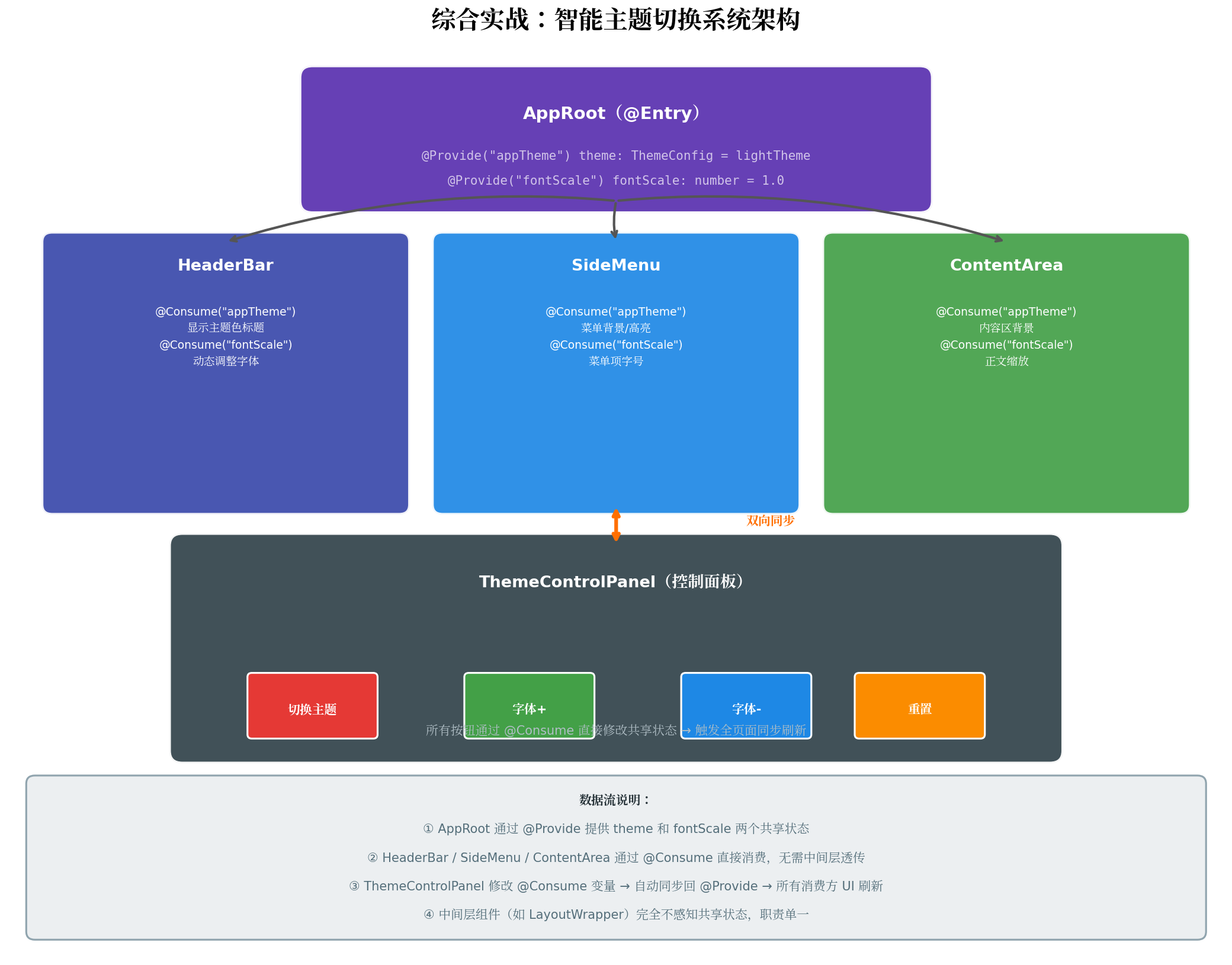
图4:AppRoot 通过 @Provide 提供 theme 和 fontScale,三大区域通过 @Consume 直接消费
6.1 完整数据模型
// model/ThemeConfig.ets
export interface ThemeConfig {
  mode: 'light' | 'dark' | 'auto';
  colors: {
    primary: ResourceColor;
    background: ResourceColor;
    surface: ResourceColor;
    textPrimary: ResourceColor;
    textSecondary: ResourceColor;
    border: ResourceColor;
  };
  radius: {
    small: number;
    medium: number;
    large: number;
  };
}

export const LightTheme: ThemeConfig = {
  mode: 'light',
  colors: {
    primary: '#0066ff',
    background: '#f5f7fa',
    surface: '#ffffff',
    textPrimary: '#1a1a1a',
    textSecondary: '#666666',
    border: '#e4e7ed'
  },
  radius: { small: 4, medium: 8, large: 16 }
};

export const DarkTheme: ThemeConfig = {
  mode: 'dark',
  colors: {
    primary: '#07C160',
    background: '#0f0f0f',
    surface: '#1e1e1e',
    textPrimary: '#e0e0e0',
    textSecondary: '#a0a0a0',
    border: '#333333'
  },
  radius: { small: 4, medium: 8, large: 16 }
};
6.2 根页面与中间层
// pages/ThemeSystemPage.ets
import { ThemeConfig, LightTheme, DarkTheme } from '../model/ThemeConfig';

@Entry
@Component
struct ThemeSystemPage {
  @Provide('appTheme') theme: ThemeConfig = LightTheme;
  @Provide('fontScale') fontScale: number = 1.0;
  @Provide('animDuration') animDuration: number = 300;

  build() {
    Column({ space: 0 }) {
      // 中间层:AppShell 不感知任何共享状态
      AppShell()
    }
    .width('100%')
    .height('100%')
    .backgroundColor(this.theme.colors.background)
    .animation({
      duration: this.animDuration,
      curve: Curve.EaseInOut
    })
  }
}

@Component
struct AppShell {
  build() {
    Column({ space: 0 }) {
      HeaderBar()
      SideMenu()
      ContentArea()
      ThemeControlPanel()
    }
    .width('100%')
    .height('100%')
  }
}
6.3 消费方组件示例
// components/HeaderBar.ets
@Component
export struct HeaderBar {
  @Consume('appTheme') theme: ThemeConfig;
  @Consume('fontScale') fontScale: number;

  build() {
    Row() {
      Image($r('app.media.ic_logo'))
        .width(32)
        .height(32)
        .borderRadius(this.theme.radius.small)

      Text('智审卫士')
        .fontSize(20 * this.fontScale)
        .fontColor(this.theme.colors.textPrimary)
        .fontWeight(FontWeight.Bold)
        .margin({ left: 12 })

      Blank()

      // 主题指示器
      Circle({ width: 12, height: 12 })
        .fill(this.theme.colors.primary)
        .margin({ right: 8 })

      Text(this.theme.mode.toUpperCase())
        .fontSize(12 * this.fontScale)
        .fontColor(this.theme.colors.textSecondary)
    }
    .width('100%')
    .height(60)
    .padding({ left: 20, right: 20 })
    .backgroundColor(this.theme.colors.surface)
    .border({
      width: { bottom: 1 },
      color: this.theme.colors.border
    })
  }
}
6.4 控制面板:修改共享状态
// components/ThemeControlPanel.ets
@Component
export struct ThemeControlPanel {
  @Consume('appTheme') theme: ThemeConfig;
  @Consume('fontScale') fontScale: number;
  @Consume('animDuration') animDuration: number;

  private switchTheme(mode: 'light' | 'dark'): void {
    this.theme = mode === 'light' ? LightTheme : DarkTheme;
  }

  private adjustFont(delta: number): void {
    const next = Math.max(0.8, Math.min(1.5, this.fontScale + delta));
    this.fontScale = Math.round(next * 10) / 10; // 保留一位小数
  }

  build() {
    Column({ space: 16 }) {
      Text('显示设置')
        .fontSize(16 * this.fontScale)
        .fontColor(this.theme.colors.textPrimary)
        .fontWeight(FontWeight.Medium)
        .alignSelf(ItemAlign.Start)

      Row({ space: 12 }) {
        ThemeButton({
          label: '☀️ 浅色',
          isActive: this.theme.mode === 'light',
          onClick: () => this.switchTheme('light')
        })

        ThemeButton({
          label: '🌙 深色',
          isActive: this.theme.mode === 'dark',
          onClick: () => this.switchTheme('dark')
        })
      }
      .width('100%')
      .justifyContent(FlexAlign.Start)

      Row({ space: 16 }) {
        Text('字体缩放')
          .fontSize(14 * this.fontScale)
          .fontColor(this.theme.colors.textSecondary)
          .layoutWeight(1)

        Button('-', { type: ButtonType.Circle })
          .width(36)
          .height(36)
          .backgroundColor(this.theme.colors.surface)
          .fontColor(this.theme.colors.textPrimary)
          .border({ width: 1, color: this.theme.colors.border })
          .onClick(() => this.adjustFont(-0.1))

        Text(`${(this.fontScale * 100).toFixed(0)}%`)
          .fontSize(14 * this.fontScale)
          .fontColor(this.theme.colors.textPrimary)
          .width(60)
          .textAlign(TextAlign.Center)

        Button('+', { type: ButtonType.Circle })
          .width(36)
          .height(36)
          .backgroundColor(this.theme.colors.surface)
          .fontColor(this.theme.colors.textPrimary)
          .border({ width: 1, color: this.theme.colors.border })
          .onClick(() => this.adjustFont(0.1))
      }
      .width('100%')
      .height(48)
    }
    .width('100%')
    .padding(20)
    .backgroundColor(this.theme.colors.surface)
    .borderRadius(this.theme.radius.large)
    .border({ width: 1, color: this.theme.colors.border })
  }
}

@Component
struct ThemeButton {
  @Consume('appTheme') theme: ThemeConfig;
  label: string = '';
  isActive: boolean = false;
  onClick: () => void = () => {};

  build() {
    Button(this.label)
      .backgroundColor(this.isActive ? this.theme.colors.primary : this.theme.colors.surface)
      .fontColor(this.isActive ? '#ffffff' : this.theme.colors.textPrimary)
      .border({
        width: this.isActive ? 0 : 1,
        color: this.theme.colors.border
      })
      .borderRadius(this.theme.radius.medium)
      .onClick(this.onClick)
  }
}
七、常见踩坑与排查指南
7.1 @Consume 找不到对应状态
现象:运行时日志提示 @Consume 未找到匹配的 @Provide,或变量始终为 undefined。
排查清单:
- 检查组件层级:
@Consume必须在@Provide的后代节点中,不能是兄弟或无关分支。 - 检查名称/别名:确保
@Provide('alias')与@Consume('alias')的字符串完全一致(区分大小写)。 - 检查作用域阻断:
@Entry会开启新的作用域。若@Provide在@EntryA 中,@EntryB 的后代无法消费。 - 检查初始化:
@Provide变量必须在声明时初始化,不能为undefined。
// ❌ 错误:@Entry 阻断作用域
@Entry
@Component
struct PageA {
  @Provide('data') data: string = 'A';
  build() { PageB() }  // PageB 是 PageA 的后代,可以消费
}

@Entry  // ❌ 新的 @Entry 阻断了 Provide 作用域!
@Component
struct PageB {
  @Consume('data') data: string;  // ❌ 找不到匹配
  build() { Text(this.data) }
}
7.2 修改对象属性后界面不刷新
现象:@Consume 的对象类型状态,修改其内部属性后 UI 未更新。
原因:@Provide/@Consume 对对象引用进行同步,而非深层属性监听。
解决方案:采用对象整体重新赋值,或配合 @Observed + @ObjectLink 使用。
// ❌ 错误:修改属性不会触发刷新
this.theme.colors.primary = '#ff0000';

// ✅ 正确:整体重新赋值触发刷新
this.theme = {
  ...this.theme,
  colors: { ...this.theme.colors, primary: '#ff0000' }
};
7.3 滥用 @Provide/@Consume 导致数据流混乱
反模式警示:
- 将业务数据(如订单列表、用户信息)全部提升为
@Provide,导致变更来源难以追踪。 - 在可复用组件中隐式依赖
@Consume,使组件脱离上下文后无法独立运行。
正确做法:
@Provide/@Consume仅用于显示上下文(主题、字体、语言、密度)。- 业务数据仍通过
@Prop/@Link或事件回调显式传递。 - 可复用组件的核心输入优先使用
@Prop,将@Consume作为可选的「增强能力」。
八、最佳实践总结
-
控制共享范围:仅在真正需要跨多层共享的上下文(主题、字体、语言、权限)中使用
@Provide/@Consume,避免过度共享。 -
优先使用别名:为
@Provide指定语义化别名(如'appTheme'、'userLocale'),降低耦合,便于重构。 -
利用默认值提升健壮性:HarmonyOS 6.0+ 为
@Consume设置合理默认值,让通用组件具备「自包含」能力。 -
避免对象属性级修改:对象类型状态修改时采用整体赋值,或结合
@Observed实现属性级观察。 -
与 Navigation 解耦:页面级状态用
@Provide/@Consume,页面栈管理交给Navigation,各司其职。 -
分层管理状态:
- 组件内部交互 →
@State - 父子单向展示 →
@Prop - 父子双向编辑 →
@Link - 跨层共享上下文 →
@Provide/@Consume - 全局应用状态 →
AppStorage/ 自定义 Store
- 组件内部交互 →
九、结语
@Provide 与 @Consume 是 ArkUI 状态管理工具箱中解决「跨层级通信」的利器。它们通过「广播-收听」模型,彻底消除了中间层的「传话筒」代码,让组件树保持扁平、职责清晰。但正如所有强大的工具一样,滥用会带来混乱——唯有在正确的场景、以正确的方式使用,才能发挥其最大价值。
在 HarmonyOS 6.0 引入 @Consume 默认值特性后,这对装饰器的灵活性和健壮性再上一个台阶。无论是构建企业级主题系统,还是开发可复用的组件库,掌握 @Provide/@Consume 都是每一位鸿蒙开发者的必修课。
转载自:https://blog.csdn.net/u014727709/article/details/163508491
欢迎 👍点赞✍评论⭐收藏,欢迎指正

讨论HarmonyOS开发技术,专注于API与组件、DevEco Studio、测试、元服务和应用上架分发等。
更多推荐

 2
2 0
0- 0


 已为社区贡献665条内容

所有评论(0)