基于 HarmonyOS NEXT 的学习计时器应用开发全解析
一、引言
HarmonyOS NEXT 是华为推出的全新一代操作系统,标志着鸿蒙生态从"兼容 Android"走向"纯血鸿蒙"的时代。它完全摒弃了 AOSP(Android Open Source Project)代码,采用自研的 ArkTS 语言和 ArkUI 声明式 UI 框架,为开发者提供了更加纯粹、高效的开发体验。本文将以一个"学习计时器"应用为案例,从零开始,详细讲解如何基于 HarmonyOS NEXT 6.1.1(API 24)开发一款功能完整、界面精美的移动端应用。
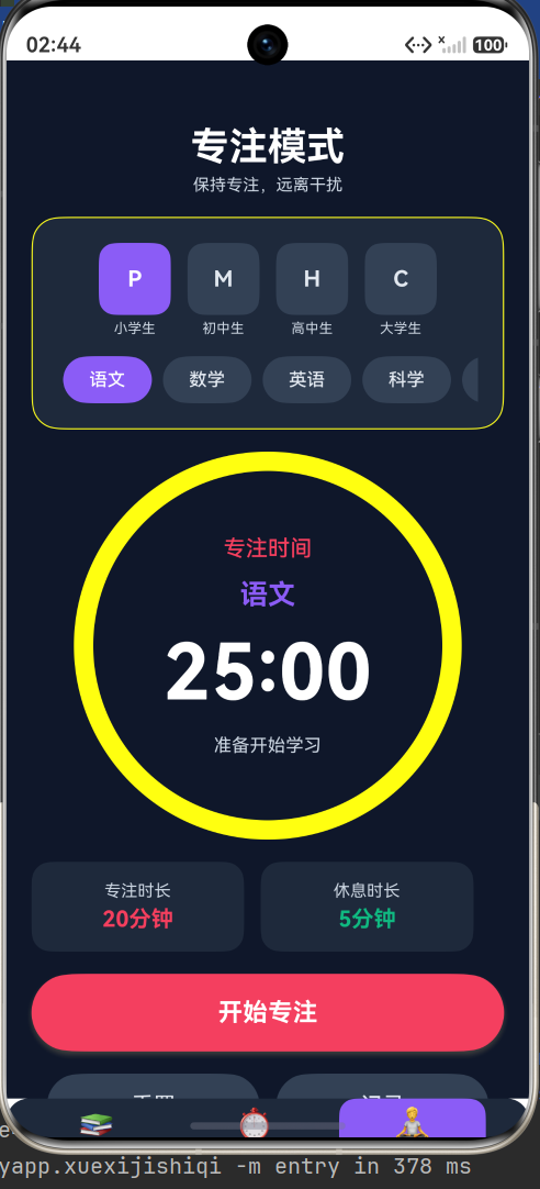
学习计时器是一款面向学生群体的效率工具应用,旨在帮助学生更好地管理学习时间、提高学习效率。应用支持正计时、倒计时和番茄钟三种计时模式,覆盖小学、初中、高中和大学四个学段,每个学段下又细分了对应的学科科目。此外,应用还集成了任务清单管理、学习记录追踪、每日学习统计和励志名言等功能,力求为学生提供一个全方位的学习辅助平台。
二、开发环境与项目配置
2.1 开发环境
本项目基于以下环境进行开发:
- 操作系统:Windows
- IDE:DevEco Studio
- SDK:HarmonyOS NEXT 6.1.1(API 24)
- 开发语言:ArkTS
- UI 框架:ArkUI 声明式 UI
2.2 项目配置文件
项目的全局构建配置位于根目录的 build-profile.json5 文件中,其中定义了签名配置、产品信息和 SDK 版本等关键信息:
{
  "app": {
    "signingConfigs": [
      {
        "name": "default",
        "type": "HarmonyOS",
        "material": {
          "storeFile": "E:/xuexijishiqi2/xuexijishiqi.p12",
          "signAlg": "SHA256withECDSA",
          "profile": "E:/xuexijishiqi2/xuexijishqiRelease.p7b",
          "certpath": "E:/xuexijishiqi2/xuexijishiqi.cer"
        }
      }
    ],
    "products": [
      {
        "name": "default",
        "signingConfig": "default",
        "targetSdkVersion": "6.1.0(23)",
        "compatibleSdkVersion": "6.1.0(23)",
        "runtimeOS": "HarmonyOS",
        "buildOption": {
          "strictMode": {
            "caseSensitiveCheck": true,
            "useNormalizedOHMUrl": true
          }
        }
      }
    ],
    "buildModeSet": [
      { "name": "debug" },
      { "name": "release" }
    ]
  },
  "modules": [
    {
      "name": "entry",
      "srcPath": "./entry",
      "targets": [
        {
          "name": "default",
          "applyToProducts": ["default"]
        }
      ]
    }
  ]
}
其中,targetSdkVersion 和 compatibleSdkVersion 指定了应用的目标 SDK 版本和兼容 SDK 版本。strictMode 中的 useNormalizedOHMUrl 选项确保使用标准化的 OHM(OpenHarmony Module)URL,这是 HarmonyOS NEXT 推荐的做法。
2.3 模块配置
模块配置文件 module.json5 定义了应用的能力(Ability)和扩展能力(ExtensionAbility):
{
  "module": {
    "name": "entry",
    "type": "entry",
    "description": "$string:module_desc",
    "mainElement": "EntryAbility",
    "deviceTypes": ["phone"],
    "deliveryWithInstall": true,
    "installationFree": false,
    "pages": "$profile:main_pages",
    "abilities": [
      {
        "name": "EntryAbility",
        "srcEntry": "./ets/entryability/EntryAbility.ets",
        "description": "$string:EntryAbility_desc",
        "icon": "$media:layered_image",
        "label": "$string:EntryAbility_label",
        "startWindowIcon": "$media:startIcon",
        "startWindowBackground": "$color:start_window_background",
        "exported": true,
        "skills": [
          {
            "entities": ["entity.system.home"],
            "actions": ["ohos.want.action.home"]
          }
        ]
      }
    ],
    "extensionAbilities": [
      {
        "name": "EntryBackupAbility",
        "srcEntry": "./ets/entrybackupability/EntryBackupAbility.ets",
        "type": "backup",
        "exported": false,
        "metadata": [
          {
            "name": "ohos.extension.backup",
            "resource": "$profile:backup_config"
          }
        ]
      }
    ]
  }
}
这里有几个关键配置项值得注意:
mainElement指定了应用的入口 Ability 为EntryAbility。deviceTypes限定应用运行在手机设备上。icon使用了$media:layered_image,这是一个分层图标资源,由前景图和背景图组合而成。startWindowIcon和startWindowBackground定义了应用启动时的窗口图标和背景色。skills配置了entity.system.home和ohos.want.action.home,使该 Ability 能够作为应用的主入口出现在桌面图标列表中。
三、颜色主题系统设计
一个优秀的应用离不开精心设计的视觉体系。本项目采用深色主题风格,通过资源文件统一管理所有颜色值,确保视觉一致性。
3.1 颜色资源定义
颜色资源位于 entry/src/main/resources/base/element/color.json:
{
  "color": [
    { "name": "start_window_background", "value": "#0f172a" },
    { "name": "primary_color", "value": "#8b5cf6" },
    { "name": "primary_light", "value": "#a78bfa" },
    { "name": "primary_dark", "value": "#7c3aed" },
    { "name": "secondary_color", "value": "#ec4899" },
    { "name": "accent_color", "value": "#06b6d4" },
    { "name": "background_color", "value": "#0f172a" },
    { "name": "surface_color", "value": "#1e293b" },
    { "name": "surface_light", "value": "#334155" },
    { "name": "text_primary", "value": "#ffffff" },
    { "name": "text_secondary", "value": "#e2e8f0" },
    { "name": "text_hint", "value": "#cbd5e1" },
    { "name": "border_color", "value": "#ffffff1f" },
    { "name": "success_color", "value": "#22c55e" },
    { "name": "warning_color", "value": "#f59e0b" },
    { "name": "error_color", "value": "#ef4444" },
    { "name": "pomodoro_work", "value": "#f43f5e" },
    { "name": "pomodoro_break", "value": "#10b981" },
    { "name": "shadow_color", "value": "#00000030" },
    { "name": "gradient_start", "value": "#0f172a" },
    { "name": "gradient_end", "value": "#1e1b4b" }
  ]
}
3.2 颜色体系解析
这套颜色体系遵循了现代 Material Design 3 的设计理念,同时融入了深色主题的暗色基调:
主色调:采用紫色系(#8b5cf6),紫色在心理学上代表着智慧、创造力和专注,非常契合"学习"这一主题。主色调还派生出浅色(#a78bfa)和深色(#7c3aed)两个变体,用于不同场景下的视觉层次。
背景与表面色:背景色采用深邃的午夜蓝(#0f172a),表面色使用稍浅的深石板灰(#1e293b),浅表面色为(#334155)。这种深色背景配合半透明表面的设计,营造出沉浸式的学习氛围。
文字层次:主文字为纯白(#ffffff),次级文字为浅灰白(#e2e8f0),提示文字为中浅灰(#cbd5e1),三级文字层次确保了信息的主次分明。
功能色:成功色(#22c55e)、警告色(#f59e0b)、错误色(#ef4444)分别用于不同的交互反馈场景。番茄钟的专注色(#f43f5e,玫红色)和休息色(#10b981,翠绿色)则形成了强烈的视觉对比,帮助用户快速区分当前所处的工作或休息状态。
在代码中,通过 $r('app.color.xxx') 语法引用这些颜色资源,例如:
.backgroundColor($r('app.color.surface_color'))
.fontColor($r('app.color.text_primary'))
这种方式的好处是实现了颜色与代码的解耦,修改主题只需更改资源文件,无需修改业务代码。同时,HarmonyOS 会自动根据系统主题(亮色/暗色)加载对应的资源,只需在 dark 目录下提供对应的 color.json 即可实现主题适配。
四、数据模型与常量定义
4.1 常量定义
项目首先定义了一系列常量,用于标识不同的模式、标签页和年级:
const MODE_COUNT_UP: number = 0       // 正计时模式
const MODE_COUNT_DOWN: number = 1     // 倒计时模式
const MODE_POMODORO: number = 2       // 番茄钟模式

const TAB_STUDY: number = 0           // 学习页标签
const TAB_TIMER: number = 1           // 计时页标签
const TAB_FOCUS: number = 2           // 专注页标签

const GRADE_PRIMARY: number = 0       // 小学
const GRADE_MIDDLE: number = 1        // 初中
const GRADE_HIGH: number = 2          // 高中
const GRADE_COLLEGE: number = 3       // 大学
使用常量而非魔法数字(Magic Number)是良好的编程实践,它提高了代码的可读性和可维护性。当需要修改某个标识值时,只需修改常量定义处即可。
4.2 年级配置接口与数据
应用为每个年级定义了详细的配置信息,包括标签、缩写、默认时长、番茄钟工作和休息时长以及科目列表:
interface GradeConfig {
  label: string              // 年级名称
  level: string              // 缩写标识
  defaultDuration: number    // 默认计时时长(秒)
  pomodoroWork: number       // 番茄钟工作时长(秒)
  pomodoroBreak: number      // 番茄钟休息时长(秒)
  subjects: Array<string>    // 科目列表
}

const GRADE_CONFIGS: Array<GradeConfig> = [
  {
    label: '小学生',
    level: 'P',
    defaultDuration: 20 * 60,
    pomodoroWork: 20 * 60,
    pomodoroBreak: 5 * 60,
    subjects: ['语文', '数学', '英语', '科学', '美术', '音乐', '体育']
  },
  {
    label: '初中生',
    level: 'M',
    defaultDuration: 25 * 60,
    pomodoroWork: 25 * 60,
    pomodoroBreak: 5 * 60,
    subjects: ['语文', '数学', '英语', '物理', '化学', '生物', '地理', '政治', '历史']
  },
  {
    label: '高中生',
    level: 'H',
    defaultDuration: 30 * 60,
    pomodoroWork: 30 * 60,
    pomodoroBreak: 5 * 60,
    subjects: ['语文', '数学', '英语', '物理', '化学', '生物', '地理', '政治', '历史']
  },
  {
    label: '大学生',
    level: 'C',
    defaultDuration: 45 * 60,
    pomodoroWork: 45 * 60,
    pomodoroBreak: 10 * 60,
    subjects: ['专业课', '公共课', '英语', '数学', '计算机', '论文', '复习']
  }
]
这个配置设计体现了教育心理学中"循序渐进"的原则:小学生的注意力集中时间较短,因此默认时长设为 20 分钟;初中生 25 分钟;高中生 30 分钟;大学生则可长达 45 分钟。番茄钟的休息时间也相应调整,小学生和初中生休息 5 分钟,高中生休息 5 分钟,大学生休息 10 分钟。
科目列表根据各学段的实际课程设置进行了差异化配置。小学阶段包含 7 个基础科目,初高中阶段包含 9 个中考/高考科目,大学阶段则涵盖了专业课、公共课、论文等更灵活的分类。
4.3 励志名言
应用内置了 10 条励志名言,在计时完成时随机展示一条,为用户提供正向激励:
const MOTIVATIONAL_QUOTES: Array<string> = [
  '学习不是为了应付考试,而是为了遇见更好的自己',
  '每一分钟的努力,都是未来的铺垫',
  '今天的汗水,是明天的荣耀',
  '坚持就是胜利,加油!',
  '学习使人充实,思考使人深邃',
  '成功属于永不放弃的人',
  '知识是人生的灯塔',
  '天道酬勤,厚积薄发',
  '现在的努力,是为了将来的自由',
  '时间是最公平的,每个人每天都有24小时'
]
4.4 数据模型类
项目定义了两个核心数据模型类:StudyRecord 和 Task。
class StudyRecord {
  date: string = ''
  duration: number = 0
  mode: string = ''
  grade: string = ''
  subject: string = ''
  timestamp: number = 0
}

class Task {
  id: number = 0
  text: string = ''
  completed: boolean = false
  grade: string = ''
  subject: string = ''
}
ArkTS 语法注意:在 ArkTS 中,类的属性必须提供初始值或使用 ! 确定性赋值断言。本项目选择为所有属性提供初始值,这样更安全且不会产生运行时警告。StudyRecord 记录了学习日期、时长、模式、年级、科目和时间戳等信息;Task 则包含了任务 ID、文本内容、完成状态以及关联的年级和科目。
五、自定义对话框组件
5.1 学习记录对话框
HarmonyOS 提供了 @CustomDialog 装饰器用于创建自定义对话框。学习记录对话框 HistoryDialog 用于展示用户的历史学习数据:
@CustomDialog
struct HistoryDialog {
  controller: CustomDialogController
  studyRecords: Array<StudyRecord> = []
  totalStudySeconds: number = 0
  onClose: () => void = () => {}

  build(): void {
    Column() {
      Row() {
        Text('学习记录')
          .fontSize(22)
          .fontWeight(FontWeight.Bold)
          .fontColor($r('app.color.text_primary'))
        Blank()
        Button('✕')
          .width(36)
          .height(36)
          .fontSize(20)
          .backgroundColor(Color.Transparent)
          .fontColor($r('app.color.text_secondary'))
          .onClick(() => this.onClose())
      }
      .width('100%')
      .padding(20)

      Text('累计学习时间: ' + this.formatTime(this.totalStudySeconds))
        .fontSize(16)
        .fontWeight(FontWeight.Medium)
        .fontColor($r('app.color.primary_color'))
        .padding({ left: 20, right: 20, bottom: 10 })

      List({ space: 12 }) {
        if (this.studyRecords.length === 0) {
          ListItem() {
            Column({ space: 8 }) {
              Text('📚')
                .fontSize(48)
              Text('暂无学习记录')
                .fontSize(14)
                .fontColor($r('app.color.text_hint'))
            }
            .padding(40)
            .width('100%')
            .alignItems(HorizontalAlign.Center)
          }
        } else {
          ForEach(this.studyRecords, (record: StudyRecord) => {
            ListItem() {
              Row() {
                Column({ space: 4 }) {
                  Text(record.date)
                    .fontSize(14)
                    .fontWeight(FontWeight.Medium)
                    .fontColor($r('app.color.text_primary'))
                  Text(record.grade + ' · ' + record.subject + ' · ' + record.mode)
                    .fontSize(12)
                    .fontColor($r('app.color.text_hint'))
                }
                Blank()
                Text(this.formatTime(record.duration))
                  .fontSize(16)
                  .fontWeight(FontWeight.Bold)
                  .fontColor($r('app.color.primary_color'))
              }
              .width('100%')
              .padding(14)
              .backgroundColor($r('app.color.surface_color'))
              .borderRadius(14)
            }
          })
        }
      }
      .width('100%')
      .height(320)
      .padding({ left: 20, right: 20 })
    }
    .width(340)
    .height(480)
    .backgroundColor($r('app.color.background_color'))
    .borderRadius(24)
    .shadow({ radius: 20, color: '#00000040', offsetY: 10 })
  }

  formatTime(seconds: number): string {
    const h: number = Math.floor(seconds / 3600)
    const m: number = Math.floor((seconds % 3600) / 60)
    const s: number = seconds % 60
    if (h > 0) {
      return `${h}小时${m}分`
    }
    return `${m}分${s}秒`
  }
}
关键设计点解析:
-
关闭按钮处理:对话框使用
onClose回调而非直接调用controller.close()。这是因为在实际开发中发现,如果controller未正确传递,直接调用this.controller.close()会导致应用崩溃退出。通过回调方式,由父组件负责关闭对话框,更加安全可靠。 -
空状态处理:当学习记录为空时,显示一个友好的空状态提示(📚 图标 + 文字),而非空白的列表。这是用户体验设计中的最佳实践。
-
列表渲染:使用
ForEach遍历studyRecords数组渲染每条记录。每条记录显示日期、年级、科目、模式和学习时长,信息层次清晰。 -
视觉设计:对话框采用圆角(
borderRadius(24))和阴影(shadow)效果,与整体深色主题保持一致。
5.2 任务清单对话框
任务清单对话框 TaskDialog 是应用的核心交互组件之一,支持添加、完成和删除任务:
@CustomDialog
struct TaskDialog {
  controller: CustomDialogController
  tasks: Array<Task> = []
  currentGrade: string = ''
  currentSubject: string = ''
  onTaskChange: (task: Task) => void = () => {}
  onClose: () => void = () => {}

  @State newTaskText: string = ''
  @State taskList: Array<Task> = []

  aboutToAppear(): void {
    this.taskList = this.tasks.slice()
  }

  build(): void {
    Column() {
      Row() {
        Text('任务清单')
          .fontSize(22)
          .fontWeight(FontWeight.Bold)
          .fontColor($r('app.color.text_primary'))
        Blank()
        Button('✕')
          .width(36)
          .height(36)
          .fontSize(20)
          .backgroundColor(Color.Transparent)
          .fontColor($r('app.color.text_secondary'))
          .onClick(() => this.onClose())
      }
      .width('100%')
      .padding(20)

      Row({ space: 8 }) {
        TextInput({ placeholder: '添加新任务...' })
          .width('70%')
          .height(44)
          .fontSize(14)
          .fontColor('#1a1a2e')
          .placeholderColor('#666666')
          .backgroundColor($r('app.color.surface_light'))
          .borderRadius(12)
          .onChange((text: string) => {
            this.newTaskText = text
          })
        Button('添加')
          .width(60)
          .height(44)
          .fontSize(14)
          .backgroundColor($r('app.color.primary_color'))
          .fontColor(Color.White)
          .borderRadius(12)
          .onClick(() => {
            if (this.newTaskText.trim()) {
              let task: Task = new Task()
              task.id = Date.now()
              task.text = this.newTaskText.trim()
              task.completed = false
              task.grade = this.currentGrade
              task.subject = this.currentSubject
              this.taskList.push(task)
              this.onTaskChange(task)
              this.newTaskText = ''
            }
          })
      }
      .width('100%')
      .padding({ left: 20, right: 20, bottom: 10 })

      List({ space: 8 }) {
        if (this.taskList.length === 0) {
          ListItem() {
            Column({ space: 8 }) {
              Text('📝')
                .fontSize(36)
              Text('暂无任务,添加一个吧')
                .fontSize(14)
                .fontColor($r('app.color.text_hint'))
            }
            .padding(30)
            .width('100%')
            .alignItems(HorizontalAlign.Center)
          }
        } else {
          ForEach(this.taskList, (task: Task) => {
            ListItem() {
              Row() {
                Checkbox()
                  .select(task.completed)
                  .selectedColor($r('app.color.primary_color'))
                  .onChange((value: boolean) => {
                    task.completed = value
                  })
                Text(task.text)
                  .fontSize(14)
                  .fontColor(task.completed ? $r('app.color.text_hint') : $r('app.color.text_primary'))
                  .decoration({ type: task.completed ? TextDecorationType.LineThrough : TextDecorationType.None })
                  .margin({ left: 10 })
                Blank()
                Button('删除')
                  .width(50)
                  .height(32)
                  .fontSize(12)
                  .backgroundColor($r('app.color.error_color'))
                  .fontColor(Color.White)
                  .borderRadius(8)
                  .onClick(() => {
                    const index: number = this.taskList.indexOf(task)
                    if (index > -1) {
                      this.taskList.splice(index, 1)
                    }
                  })
              }
              .width('100%')
              .padding(12)
              .backgroundColor($r('app.color.surface_color'))
              .borderRadius(12)
            }
          })
        }
      }
      .width('100%')
      .height(350)
      .padding({ left: 20, right: 20 })
    }
    .width(340)
    .height(520)
    .backgroundColor($r('app.color.background_color'))
    .borderRadius(24)
    .shadow({ radius: 20, color: '#00000040', offsetY: 10 })
  }
}
关键设计点解析:
-
响应式状态管理:对话框内部维护了
@State taskList: Array<Task>状态变量。这是因为在开发过程中发现,直接修改从父组件传入的tasks数组不会触发对话框内部的 UI 刷新。通过在aboutToAppear生命周期中将传入数据复制到taskList,并使用@State装饰器,确保添加和删除任务时 UI 能够实时更新。 -
任务添加逻辑:点击"添加"按钮时,先创建
Task对象并设置属性,然后同时更新对话框内部的taskList和通过onTaskChange回调通知父组件。这种"双写"策略确保了对话框和主页面数据的同步。 -
文本装饰效果:已完成的任务文字使用删除线效果。在 ArkTS 中,
decoration属性需要传入对象格式{ type: TextDecorationType.LineThrough },而非直接传入枚举值。 -
输入框颜色:输入框的文字颜色特意设置为深色
#1a1a2e,占位符颜色为#666666,这是因为在深色背景的输入框中,白色文字可能不够清晰。
六、主页面架构与底部导航
6.1 状态变量定义
主页面 Index 组件管理着应用的所有状态:
@Entry
@Component
struct Index {
  @State currentTab: number = TAB_STUDY
  @State currentGrade: number = GRADE_PRIMARY
  @State currentSubjectIndex: number = 0
  @State currentMode: number = MODE_COUNT_UP
  @State isRunning: boolean = false
  @State elapsedSeconds: number = 0
  @State targetSeconds: number = 25 * 60
  @State pomodoroIsWork: boolean = true
  @State todayStudySeconds: number = 0
  @State dailyGoal: number = 45 * 60
  @State tasks: Array<Task> = []
  @State studyRecords: Array<StudyRecord> = []
  @State quote: string = MOTIVATIONAL_QUOTES[0]

  private timer: number | null = null
}
每个 @State 装饰的变量都是响应式的,当其值发生变化时,引用该变量的 UI 部分会自动重新渲染。timer 变量用于存储 setInterval 的返回值,类型为 number | null,在计时器停止时设为 null。
6.2 整体布局结构
应用的主体布局采用 Column 容器,分为内容区域和底部导航栏两部分:
build(): void {
  Column() {
    Scroll() {
      Column() {
        if (this.currentTab === TAB_STUDY) {
          this.buildStudyPage()
        } else if (this.currentTab === TAB_TIMER) {
          this.buildTimerPage()
        } else if (this.currentTab === TAB_FOCUS) {
          this.buildFocusPage()
        }
      }
      .width('100%')
      .padding({ bottom: 80 })
    }
    .width('100%')
    .flexGrow(1)

    Row({ space: 8 }) {
      this.navButtonBuilder('📚', '学习', TAB_STUDY)
      this.navButtonBuilder('⏱️', '计时', TAB_TIMER)
      this.navButtonBuilder('🧘', '专注', TAB_FOCUS)
    }
    .width('100%')
    .height(75)
    .backgroundColor($r('app.color.surface_color'))
    .borderRadius({ topLeft: 16, topRight: 16 })
    .padding({ left: 12, right: 12, bottom: 20 })
  }
  .width('100%')
  .height('100%')
  .backgroundColor($r('app.color.background_color'))
}
布局策略:
- 最外层
Column占满全屏,背景色为深色背景。 - 内容区域使用
Scroll包裹,并设置flexGrow(1)占据除导航栏以外的所有空间。内部根据currentTab的值条件渲染对应的页面。 - 底部导航栏是一个
Row,固定在页面底部,高度为 75vp。导航栏设置了顶部圆角,与内容区域形成视觉分隔。 - 内容区域底部添加了 80vp 的内边距,确保内容不会被导航栏遮挡。
这种布局方式确保了底部导航栏始终固定在屏幕底部,而内容区域可以自由滚动。
6.3 底部导航按钮构建器
导航栏的每个按钮通过 @Builder 方法构建:
@Builder
navButtonBuilder(icon: string, label: string, tab: number): void {
  Column({ space: 4 }) {
    Text(icon)
      .fontSize(22)
      .fontColor(this.currentTab === tab ? Color.White : $r('app.color.text_secondary'))
    Text(label)
      .fontSize(12)
      .fontWeight(FontWeight.Medium)
      .fontColor(this.currentTab === tab ? Color.White : $r('app.color.text_secondary'))
  }
  .width('30%')
  .height('100%')
  .justifyContent(FlexAlign.Center)
  .alignItems(HorizontalAlign.Center)
  .borderRadius(12)
  .backgroundColor(this.currentTab === tab ? $r('app.color.primary_color') : Color.Transparent)
  .onClick(() => this.switchTab(tab))
}
选中的标签页图标和文字变为白色,背景变为紫色;未选中的标签页使用次要文字颜色,背景透明。按钮宽度设为 30%,三个按钮加上间距恰好填满导航栏。
@Builder 是 ArkUI 提供的方法装饰器,用于将 UI 构建逻辑封装为可复用的方法。与普通方法不同,@Builder 方法内部只能包含 UI 组件语法,不能包含逻辑语句。
七、学习页面实现
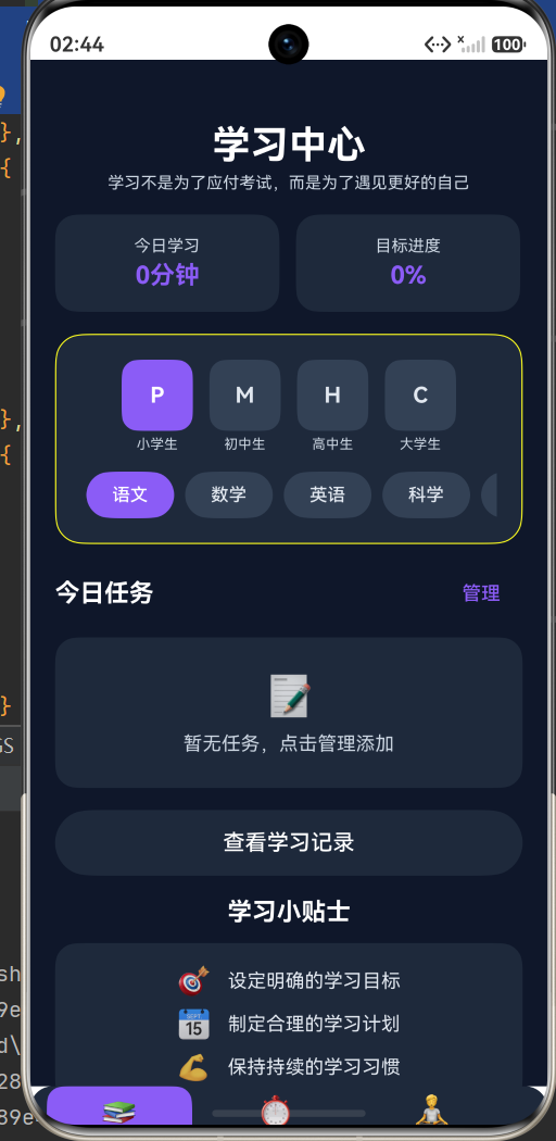
学习页面是应用的默认首页,集成了学习统计、年级科目选择、任务管理和学习记录等功能。
7.1 页面标题与励志名言
@Builder
buildStudyPage(): void {
  Column({ space: 16 }) {
    Column({ space: 4 }) {
      Text('学习中心')
        .fontSize(28)
        .fontWeight(FontWeight.Bold)
        .fontColor($r('app.color.text_primary'))
      Text(this.quote)
        .fontSize(12)
        .fontColor($r('app.color.text_hint'))
        .width('80%')
        .textAlign(TextAlign.Center)
    }
    .width('100%')
    .margin({ top: 28 })
    .alignItems(HorizontalAlign.Center)
页面顶部展示"学习中心"标题和一条励志名言。名言文字使用提示色,宽度限制为 80%,居中对齐,视觉上作为标题的辅助说明。
7.2 学习统计卡片
    Row({ space: 12 }) {
      this.statCardBuilder('今日学习', this.formatTimeShort(this.todayStudySeconds))
      this.statCardBuilder('目标进度', Math.round((this.todayStudySeconds / this.dailyGoal) * 100) + '%')
    }
    .width('100%')
统计卡片构建器:
@Builder
statCardBuilder(title: string, value: string): void {
  Column({ space: 4 }) {
    Text(title)
      .fontSize(12)
      .fontColor($r('app.color.text_hint'))
    Text(value)
      .fontSize(18)
      .fontWeight(FontWeight.Bold)
      .fontColor($r('app.color.primary_color'))
  }
  .width('48%')
  .padding(16)
  .backgroundColor($r('app.color.surface_color'))
  .borderRadius(16)
  .alignItems(HorizontalAlign.Center)
}
两张统计卡片并排显示:左侧展示今日学习时长,右侧展示目标完成进度百分比。每张卡片宽度为 48%,留出 12vp 的间距。卡片内使用上下布局:上方为标题(小字号、提示色),下方为数值(大字号、粗体、主色调)。
7.3 年级与科目选择
年级和科目选择区域是学习页面的核心交互组件:
    Column({ space: 14 }) {
      Scroll() {
        Row({ space: 12 }) {
          this.gradeButtonBuilder(GRADE_PRIMARY)
          this.gradeButtonBuilder(GRADE_MIDDLE)
          this.gradeButtonBuilder(GRADE_HIGH)
          this.gradeButtonBuilder(GRADE_COLLEGE)
        }
        .padding({ left: 4, right: 4 })
      }
      .width('100%')
      .scrollable(ScrollDirection.Horizontal)
      .scrollBar(BarState.Off)

      Scroll() {
        Row({ space: 8 }) {
          ForEach(GRADE_CONFIGS[this.currentGrade].subjects, (subject: string, index: number) => {
            this.subjectChipBuilder(subject, index)
          })
        }
        .padding({ left: 4, right: 4 })
      }
      .width('100%')
      .scrollable(ScrollDirection.Horizontal)
      .scrollBar(BarState.Off)
    }
    .width('100%')
    .padding(18)
    .backgroundColor($r('app.color.surface_color'))
    .borderRadius(20)
    .borderWidth(1)
    .borderColor($r('app.color.border_color'))
水平滚动设计:年级按钮和科目标签都包裹在水平 Scroll 容器中,隐藏滚动条(scrollBar(BarState.Off))。这是因为初中和高中的科目多达 9 个,在手机屏幕上无法全部显示。水平滚动让用户可以滑动查看所有选项,解决了早期版本中"后面的按钮点不到"的问题。
年级按钮构建器:
@Builder
gradeButtonBuilder(grade: number): void {
  Column({ space: 4 }) {
    Button(GRADE_CONFIGS[grade].level)
      .width(52)
      .height(52)
      .fontSize(16)
      .fontWeight(FontWeight.Bold)
      .backgroundColor(this.currentGrade === grade ? $r('app.color.primary_color') : $r('app.color.surface_light'))
      .fontColor(this.currentGrade === grade ? Color.White : $r('app.color.text_secondary'))
      .borderRadius(12)
      .onClick(() => this.switchGrade(grade))

    Text(GRADE_CONFIGS[grade].label)
      .fontSize(10)
      .fontColor($r('app.color.text_hint'))
  }
  .alignItems(HorizontalAlign.Center)
}
每个年级按钮采用上下布局:上方为圆形按钮(显示年级缩写 P/M/H/C),下方为年级全称。选中的年级按钮背景为紫色,未选中为浅表面色。
科目标签构建器:
@Builder
subjectChipBuilder(subject: string, index: number): void {
  Button(subject)
    .width(64)
    .height(34)
    .fontSize(13)
    .fontWeight(FontWeight.Medium)
    .backgroundColor(this.currentSubjectIndex === index ? $r('app.color.primary_color') : $r('app.color.surface_light'))
    .fontColor(this.currentSubjectIndex === index ? Color.White : $r('app.color.text_secondary'))
    .borderRadius(17)
    .onClick(() => this.currentSubjectIndex = index)
}
科目标签采用药丸形状(borderRadius(17),高度 34 的一半),选中的科目背景为紫色。
7.4 任务列表
学习页面还展示了一个精简的任务列表,用户可以通过"管理"按钮打开完整的任务对话框:
    Column({ space: 12 }) {
      Row() {
        Text('今日任务')
          .fontSize(18)
          .fontWeight(FontWeight.Bold)
          .fontColor($r('app.color.text_primary'))
        Blank()
        Button('管理')
          .fontSize(14)
          .fontColor($r('app.color.primary_color'))
          .backgroundColor(Color.Transparent)
          .onClick(() => this.openTaskDialog())
      }
      .width('100%')

      if (this.tasks.length === 0) {
        Column({ space: 8 }) {
          Text('📝')
            .fontSize(32)
          Text('暂无任务,点击管理添加')
            .fontSize(14)
            .fontColor($r('app.color.text_hint'))
        }
        .padding(24)
        .width('100%')
        .backgroundColor($r('app.color.surface_color'))
        .borderRadius(16)
        .alignItems(HorizontalAlign.Center)
      } else {
        List({ space: 8 }) {
          ForEach(this.tasks, (task: Task) => {
            ListItem() {
              Row() {
                Checkbox()
                  .select(task.completed)
                  .selectedColor($r('app.color.primary_color'))
                  .onChange((value: boolean) => {
                    task.completed = value
                  })
                Text(task.text)
                  .fontSize(14)
                  .fontColor(task.completed ? $r('app.color.text_hint') : $r('app.color.text_primary'))
                  .decoration({ type: task.completed ? TextDecorationType.LineThrough : TextDecorationType.None })
                  .margin({ left: 10 })
                Blank()
                Button('删除')
                  .width(48)
                  .height(30)
                  .fontSize(12)
                  .backgroundColor($r('app.color.error_color'))
                  .fontColor(Color.White)
                  .borderRadius(8)
                  .onClick(() => {
                    const index: number = this.tasks.indexOf(task)
                    if (index > -1) {
                      this.tasks.splice(index, 1)
                    }
                  })
              }
              .width('100%')
              .padding(14)
              .backgroundColor($r('app.color.surface_color'))
              .borderRadius(14)
            }
          })
        }
        .width('100%')
        .height(Math.min(this.tasks.length * 60, 240))
      }
    }
    .width('100%')
任务列表的高度根据任务数量动态计算,但最大不超过 240vp(约 4 个任务的高度),超出部分可滚动查看。每个任务项包含复选框、任务文本和删除按钮。已完成任务的文字显示为提示色并添加删除线效果。
7.5 学习小贴士
页面底部展示了三条学习小贴士,为用户提供学习方法指导:
    Column({ space: 12 }) {
      Text('学习小贴士')
        .fontSize(18)
        .fontWeight(FontWeight.Bold)
        .fontColor($r('app.color.text_primary'))

      Column({ space: 8 }) {
        Row({ space: 12 }) {
          Text('🎯').fontSize(20)
          Text('设定明确的学习目标')
            .fontSize(14)
            .fontColor($r('app.color.text_secondary'))
        }
        Row({ space: 12 }) {
          Text('📅').fontSize(20)
          Text('制定合理的学习计划')
            .fontSize(14)
            .fontColor($r('app.color.text_secondary'))
        }
        Row({ space: 12 }) {
          Text('💪').fontSize(20)
          Text('保持持续的学习习惯')
            .fontSize(14)
            .fontColor($r('app.color.text_secondary'))
        }
      }
      .width('100%')
      .padding(16)
      .backgroundColor($r('app.color.surface_color'))
      .borderRadius(16)
    }
    .width('100%')
    .margin({ bottom: 16 })
八、计时页面实现
计时页面是应用的核心功能页面,支持正计时和倒计时两种模式,以圆形进度环直观展示计时进度。
8.1 页面结构与进度环
@Builder
buildTimerPage(): void {
  Column({ space: 16 }) {
    Column({ space: 4 }) {
      Text('计时器')
        .fontSize(28)
        .fontWeight(FontWeight.Bold)
        .fontColor($r('app.color.text_primary'))
      Text(this.getStatusText())
        .fontSize(12)
        .fontColor($r('app.color.text_hint'))
    }
    .width('100%')
    .margin({ top: 28 })
    .alignItems(HorizontalAlign.Center)

    Stack() {
      Progress({ value: this.getProgressValue(), total: 100, type: ProgressType.Ring })
        .width(260)
        .height(260)
        .color(this.getProgressColor())
        .backgroundColor('#ffffff10')
        .style({ strokeWidth: 12 })

      Column({ space: 8 }) {
        Text(GRADE_CONFIGS[this.currentGrade].label)
          .fontSize(14)
          .fontWeight(FontWeight.Medium)
          .fontColor($r('app.color.text_secondary'))

        Text(GRADE_CONFIGS[this.currentGrade].subjects[this.currentSubjectIndex])
          .fontSize(18)
          .fontWeight(FontWeight.Bold)
          .fontColor($r('app.color.primary_color'))

        Text(this.formatTime(this.getDisplaySeconds()))
          .fontSize(52)
          .fontWeight(FontWeight.Bold)
          .fontColor($r('app.color.text_primary'))

        Text(this.getModeText())
          .fontSize(13)
          .fontColor($r('app.color.text_hint'))
      }
      .width('100%')
      .alignItems(HorizontalAlign.Center)
    }
Stack 叠层布局:计时页面的核心是 Stack 容器,它将圆形进度环和中心文字信息叠放在一起。Progress 组件作为底层,显示环形进度条;Column 作为上层,居中显示年级、科目、时间和模式信息。
进度环配置:使用 ProgressType.Ring 类型的环形进度条,宽度 260vp,进度条粗细 12vp。进度条背景设为半透明白色(#ffffff10),让未完成的部分也有微弱的视觉提示。进度值通过 getProgressValue() 方法动态计算。
8.2 模式切换与时间输入
    Row({ space: 8 }) {
      this.modeButtonBuilder(MODE_COUNT_UP, '正计时')
      this.modeButtonBuilder(MODE_COUNT_DOWN, '倒计时')
    }
    .width('100%')
    .justifyContent(FlexAlign.Center)

    if (this.currentMode === MODE_COUNT_DOWN && !this.isRunning) {
      Row({ space: 12 }) {
        this.timeInputBuilder('时', Math.floor(this.targetSeconds / 3600))
        Text(':')
          .fontSize(28)
          .fontWeight(FontWeight.Bold)
          .fontColor($r('app.color.text_primary'))
        this.timeInputBuilder('分', Math.floor((this.targetSeconds % 3600) / 60))
        Text(':')
          .fontSize(28)
          .fontWeight(FontWeight.Bold)
          .fontColor($r('app.color.text_primary'))
        this.timeInputBuilder('秒', this.targetSeconds % 60)
      }
      .width('100%')
      .justifyContent(FlexAlign.Center)
    }
时间输入构建器允许用户在倒计时模式下设置目标时间:
@Builder
timeInputBuilder(unit: string, value: number): void {
  Column({ space: 4 }) {
    TextInput({ text: this.formatNumber(value) })
      .width(56)
      .height(56)
      .fontSize(24)
      .fontWeight(FontWeight.Bold)
      .fontColor($r('app.color.primary_color'))
      .backgroundColor($r('app.color.surface_light'))
      .borderRadius(12)
      .borderWidth(0)
      .type(InputType.Number)
      .onChange((text: string) => {
        const num: number = parseInt(text) || 0
        this.updateTargetSeconds(unit, num)
      })
    Text(unit)
      .fontSize(12)
      .fontColor($r('app.color.text_hint'))
  }
  .alignItems(HorizontalAlign.Center)
}
时间输入区域仅在倒计时模式且计时器未运行时显示。三个输入框分别对应时、分、秒,使用数字键盘(InputType.Number),文字颜色为主色调以突出显示。用户输入时通过 updateTargetSeconds 方法更新目标时长。
8.3 控制按钮
    Button(this.isRunning ? '暂停' : '开始')
      .width('100%')
      .height(56)
      .fontSize(18)
      .fontWeight(FontWeight.Bold)
      .backgroundColor(this.isRunning ? $r('app.color.warning_color') : $r('app.color.primary_color'))
      .fontColor(Color.White)
      .borderRadius(28)
      .shadow({ radius: 16, color: this.isRunning ? '#f59e0b40' : '#8b5cf640', offsetY: 8 })
      .onClick(() => this.toggleTimer())

    Row({ space: 12 }) {
      Button('重置')
        .width('45%')
        .height(46)
        .fontSize(16)
        .fontWeight(FontWeight.Medium)
        .backgroundColor($r('app.color.surface_light'))
        .fontColor($r('app.color.text_secondary'))
        .borderRadius(23)
        .onClick(() => this.resetTimer())

      Button('记录')
        .width('45%')
        .height(46)
        .fontSize(16)
        .fontWeight(FontWeight.Medium)
        .backgroundColor($r('app.color.surface_light'))
        .fontColor($r('app.color.text_secondary'))
        .borderRadius(23)
        .onClick(() => this.openHistory())
    }
    .width('100%')
    .justifyContent(FlexAlign.Center)
    .margin({ bottom: 16 })
主控制按钮的文案和颜色根据计时状态动态变化:运行中显示"暂停"和警告色,停止时显示"开始"和主色调。按钮还添加了带颜色的阴影效果(shadow),阴影颜色与按钮背景色一致但透明度降低,营造出"悬浮"的视觉效果。
九、专注模式(番茄钟)实现
专注模式基于番茄工作法(Pomodoro Technique),自动在专注时间和休息时间之间切换。
9.1 番茄钟界面
@Builder
buildFocusPage(): void {
  Column({ space: 16 }) {
    Column({ space: 4 }) {
      Text('专注模式')
        .fontSize(28)
        .fontWeight(FontWeight.Bold)
        .fontColor($r('app.color.text_primary'))
      Text(this.pomodoroIsWork ? '保持专注,远离干扰' : '休息一下,放松身心')
        .fontSize(12)
        .fontColor($r('app.color.text_hint'))
    }
    .width('100%')
    .margin({ top: 28 })
    .alignItems(HorizontalAlign.Center)
专注模式的标题下方会根据当前是工作阶段还是休息阶段显示不同的提示文字,帮助用户快速了解当前状态。
9.2 番茄钟进度环
    Stack() {
      Progress({ value: this.getPomodoroProgress(), total: 100, type: ProgressType.Ring })
        .width(280)
        .height(280)
        .color(this.pomodoroIsWork ? $r('app.color.pomodoro_work') : $r('app.color.pomodoro_break'))
        .backgroundColor('#ffffff10')
        .style({ strokeWidth: 14 })

      Column({ space: 12 }) {
        Text(this.pomodoroIsWork ? '专注时间' : '休息时间')
          .fontSize(16)
          .fontWeight(FontWeight.Medium)
          .fontColor(this.pomodoroIsWork ? $r('app.color.pomodoro_work') : $r('app.color.pomodoro_break'))

        Text(GRADE_CONFIGS[this.currentGrade].subjects[this.currentSubjectIndex])
          .fontSize(20)
          .fontWeight(FontWeight.Bold)
          .fontColor($r('app.color.primary_color'))

        Text(this.formatTime(this.getDisplaySeconds()))
          .fontSize(56)
          .fontWeight(FontWeight.Bold)
          .fontColor($r('app.color.text_primary'))

        Text(this.getStatusText())
          .fontSize(13)
          .fontColor($r('app.color.text_hint'))
      }
      .width('100%')
      .alignItems(HorizontalAlign.Center)
    }
番茄钟的进度环比普通计时器的进度环更大(280vp vs 260vp),粗细也更宽(14vp vs 12vp),视觉上更加突出。进度环颜色根据当前阶段动态切换:工作阶段使用玫红色(pomodoro_work),休息阶段使用翠绿色(pomodoro_break)。中心文字也会相应变化,工作阶段显示"专注时间",休息阶段显示"休息时间"。
9.3 专注与休息时长展示
    Row({ space: 12 }) {
      Column({ space: 4 }) {
        Text('专注时长')
          .fontSize(12)
          .fontColor($r('app.color.text_hint'))
        Text(this.formatTimeShort(GRADE_CONFIGS[this.currentGrade].pomodoroWork))
          .fontSize(16)
          .fontWeight(FontWeight.Bold)
          .fontColor($r('app.color.pomodoro_work'))
      }
      .width('45%')
      .padding(14)
      .backgroundColor($r('app.color.surface_color'))
      .borderRadius(14)
      .alignItems(HorizontalAlign.Center)

      Column({ space: 4 }) {
        Text('休息时长')
          .fontSize(12)
          .fontColor($r('app.color.text_hint'))
        Text(this.formatTimeShort(GRADE_CONFIGS[this.currentGrade].pomodoroBreak))
          .fontSize(16)
          .fontWeight(FontWeight.Bold)
          .fontColor($r('app.color.pomodoro_break'))
      }
      .width('45%')
      .padding(14)
      .backgroundColor($r('app.color.surface_color'))
      .borderRadius(14)
      .alignItems(HorizontalAlign.Center)
    }
    .width('100%')
两张卡片分别展示当前年级的专注时长和休息时长,颜色与进度环保持一致,形成视觉呼应。
十、计时器核心逻辑
10.1 计时器启动与停止
startTimer(): void {
  this.isRunning = true
  let timerId: number = setInterval(() => {
    if (this.currentMode === MODE_COUNT_DOWN) {
      if (this.elapsedSeconds >= this.targetSeconds) {
        this.completeTimer()
        return
      }
    }
    this.elapsedSeconds++
  }, 1000)
  this.timer = timerId
}

pauseTimer(): void {
  this.isRunning = false
  if (this.timer !== null) {
    clearInterval(this.timer)
    this.timer = null
  }
}
计时器使用 setInterval 每秒递增 elapsedSeconds。在倒计时模式下,当已计时秒数达到目标秒数时,自动调用 completeTimer 完成计时。
ArkTS 语法注意:setInterval 的返回值在 ArkTS 中需要显式声明为 number 类型。不能使用 as unknown as number 类型转换,应直接赋值给已声明类型的变量。
10.2 计时器完成处理
completeTimer(): void {
  this.pauseTimer()
  this.saveStudyRecord()
  this.updateTodayStudyTime()
  this.refreshQuote()

  if (this.currentMode === MODE_POMODORO) {
    this.pomodoroIsWork = !this.pomodoroIsWork
    this.elapsedSeconds = 0
    this.targetSeconds = this.pomodoroIsWork
      ? GRADE_CONFIGS[this.currentGrade].pomodoroWork
      : GRADE_CONFIGS[this.currentGrade].pomodoroBreak
  }
}
计时完成时依次执行四个操作:暂停计时器、保存学习记录、更新今日学习时间、刷新励志名言。如果是番茄钟模式,还会自动切换工作/休息状态,并重置计时器以开始下一个周期。
10.3 学习记录保存
saveStudyRecord(): void {
  let record: StudyRecord = new StudyRecord()
  const now: Date = new Date()
  record.date = `${now.getMonth() + 1}月${now.getDate()}日 ${now.getHours()}:${this.formatNumber(now.getMinutes())}`
  record.duration = this.elapsedSeconds
  record.mode = this.getModeText()
  record.grade = GRADE_CONFIGS[this.currentGrade].label
  record.subject = GRADE_CONFIGS[this.currentGrade].subjects[this.currentSubjectIndex]
  record.timestamp = Date.now()
  this.studyRecords.unshift(record)
}
每次计时完成都会创建一条学习记录,包含日期、时长、模式、年级和科目等信息。使用 unshift 将新记录插入到数组开头,确保最新的记录显示在列表顶部。
10.4 进度与显示计算
getDisplaySeconds(): number {
  if (this.currentMode === MODE_COUNT_UP) {
    return this.elapsedSeconds
  } else {
    return this.targetSeconds - this.elapsedSeconds
  }
}

getProgressValue(): number {
  if (this.currentMode === MODE_COUNT_UP) {
    return Math.min(100, (this.elapsedSeconds / (60 * 60)) * 100)
  } else {
    return (this.elapsedSeconds / this.targetSeconds) * 100
  }
}

getPomodoroProgress(): number {
  const total: number = this.pomodoroIsWork
    ? GRADE_CONFIGS[this.currentGrade].pomodoroWork
    : GRADE_CONFIGS[this.currentGrade].pomodoroBreak
  return (this.elapsedSeconds / total) * 100
}
- 正计时模式:显示已计时秒数,进度以 1 小时为满刻度。
- 倒计时模式:显示剩余秒数(目标时间减去已计时时间),进度为已计时占目标的百分比。
- 番茄钟模式:根据当前是工作还是休息阶段,使用对应的总时长计算进度。
10.5 时间格式化
formatTime(seconds: number): string {
  const h: number = Math.floor(seconds / 3600)
  const m: number = Math.floor((seconds % 3600) / 60)
  const s: number = seconds % 60
  if (h > 0) {
    return `${h}:${this.formatNumber(m)}:${this.formatNumber(s)}`
  }
  return `${this.formatNumber(m)}:${this.formatNumber(s)}`
}

formatTimeShort(seconds: number): string {
  const h: number = Math.floor(seconds / 3600)
  const m: number = Math.floor((seconds % 3600) / 60)
  if (h > 0) {
    return `${h}小时${m}分`
  }
  return `${m}分钟`
}

formatNumber(num: number): string {
  return num < 10 ? `0${num}` : `${num}`
}
应用提供了两种时间格式:formatTime 输出 HH:MM:SS 或 MM:SS 格式,用于计时器显示;formatTimeShort 输出中文格式如"25分钟"或"1小时30分",用于统计卡片和番茄钟时长展示。formatNumber 确保个位数前面补零。
十一、动画效果
11.1 年级切换动画
switchGrade(grade: number): void {
  animateTo({ duration: 200 }, () => {
    this.currentGrade = grade
    this.currentSubjectIndex = 0
    this.targetSeconds = GRADE_CONFIGS[grade].defaultDuration
  })
}
使用 animateTo 在 200 毫秒内平滑过渡年级切换。当用户切换年级时,当前科目索引重置为 0,目标时长更新为新年级的默认时长。animateTo 会自动对状态变量变化触发的 UI 更新添加动画效果。
11.2 模式切换动画
switchMode(mode: number): void {
  animateTo({ duration: 200 }, () => {
    this.currentMode = mode
    this.resetTimer()
  })
}
模式切换同样使用 200 毫秒的动画过渡,切换后自动重置计时器。
ArkUI 动画规范:在 HarmonyOS 中,推荐使用 @State 驱动动画,通过改变状态变量触发动画效果。animateTo 是 ArkUI 提供的显式动画 API,接受动画配置(如持续时间、曲线等)和回调函数,回调函数中的状态变量变化会以动画形式呈现。需要注意的是,不可以在动画过程中频繁改变组件的 width、height、padding、margin 等布局属性,否则会严重影响性能。
十二、对话框管理
12.1 打开学习记录
openHistory(): void {
  let dialog: CustomDialogController = new CustomDialogController({
    builder: HistoryDialog({
      studyRecords: this.studyRecords,
      totalStudySeconds: this.todayStudySeconds,
      onClose: () => {
        dialog.close()
      }
    }),
    alignment: DialogAlignment.Center,
    autoCancel: false
  })
  dialog.open()
}
12.2 打开任务清单
openTaskDialog(): void {
  let dialog: CustomDialogController = new CustomDialogController({
    builder: TaskDialog({
      tasks: this.tasks,
      currentGrade: GRADE_CONFIGS[this.currentGrade].label,
      currentSubject: GRADE_CONFIGS[this.currentGrade].subjects[this.currentSubjectIndex],
      onTaskChange: (task: Task) => {
        this.tasks.push(task)
      },
      onClose: () => {
        dialog.close()
      }
    }),
    alignment: DialogAlignment.Center,
    autoCancel: false
  })
  dialog.open()
}
对话框管理策略:
alignment: DialogAlignment.Center使对话框居中显示。autoCancel: false禁止点击对话框外部区域自动关闭,防止用户误触丢失数据。onClose回调中通过闭包引用dialog变量调用dialog.close(),实现安全关闭。onTaskChange回调在添加任务时被调用,将新任务同步到主页面的tasks数组。
十三、开发中遇到的问题与解决方案
13.1 对话框关闭导致应用退出
问题:点击对话框的关闭按钮(✕)时,应用直接崩溃退出。
原因:@CustomDialog 组件的 controller 属性在某些情况下未正确传递,导致 this.controller.close() 调用 undefined.close() 引发崩溃。
解决方案:不直接使用 controller.close(),改为通过 onClose 回调由父组件负责关闭对话框。父组件在创建 CustomDialogController 时,在 onClose 闭包中持有 dialog 引用并调用 dialog.close()。
13.2 年级按钮和科目标签被截断
问题:初中和高中有 9 个科目,在手机屏幕上后面的科目标签无法显示也无法点击。
解决方案:将年级按钮区域和科目标签区域分别包裹在水平 Scroll 容器中,支持左右滑动查看所有选项。同时隐藏滚动条(scrollBar(BarState.Off))保持界面整洁。
13.3 任务列表添加任务后不刷新
问题:在任务对话框中添加任务后,列表没有显示新任务。
原因:对话框中直接修改从父组件传入的 tasks 数组不会触发对话框内部的 UI 刷新,因为 tasks 不是 @State 装饰的变量。
解决方案:在对话框中新增 @State taskList: Array<Task> 状态变量,在 aboutToAppear 生命周期中将传入的 tasks 复制到 taskList。添加和删除任务都操作 taskList,确保 UI 实时刷新。同时通过 onTaskChange 回调将新任务同步给父组件。
13.4 底部导航栏遮挡内容
问题:底部导航栏固定在页面底部,遮挡了页面内容中靠下的按钮,导致无法点击。
解决方案:采用 Column 布局将内容区域和导航栏分为两个独立部分。内容区域使用 Scroll 包裹并设置 flexGrow(1),底部添加内边距;导航栏作为 Column 的第二个子元素自然排列在底部。
13.5 文字装饰类型错误
问题:.decoration(TextDecorationType.LineThrough) 报编译错误,提示类型不匹配。
原因:在 ArkTS 中,decoration 属性接受 DecorationStyleInterface 类型对象,而非直接接受 TextDecorationType 枚举值。
解决方案:改为对象格式 .decoration({ type: TextDecorationType.LineThrough })。
13.6 setInterval 返回值类型问题
问题:setInterval 返回值使用 as unknown as number 类型转换,不符合 ArkTS 规范。
解决方案:将返回值直接赋值给显式声明为 number 类型的变量,再赋值给 this.timer。
13.7 FontWeight 枚举值不存在
问题:使用 FontWeight.SemiBold 报编译错误。
原因:ArkTS 的 FontWeight 枚举不包含 SemiBold 值。
解决方案:使用 FontWeight.Bold 替代 FontWeight.SemiBold。
十四、ArkTS 开发注意事项总结
在 HarmonyOS NEXT 的 ArkTS 开发中,有一些与标准 TypeScript 不同的语法约束需要特别注意:
-
不支持
any和unknown类型:所有变量和参数都必须显式指定类型。catch子句中的异常变量也不能使用类型标注。 -
不支持解构赋值:不能使用
const { a, b } = obj语法,需要逐字段赋值。 -
不支持对象字面量直接用作类型:必须使用
interface或class显式声明类型。对象字面量可以用于初始化已声明的接口或类。 -
不支持
var关键字:只能使用let和const。 -
类属性必须有初始值:不能声明未初始化的类属性,或使用
!确定性赋值断言(不推荐)。 -
不支持
Function.apply、Function.call和Function.bind:this只能在实例方法中使用,遵循传统 OOP 风格。 -
不支持
in运算符:检查对象属性是否存在应使用instanceof。 -
不支持索引签名:不能使用
obj["field"]访问对象属性,应使用obj.field。标准库中的类型化数组(如Int32Array)是例外。 -
@Builder方法内只能包含 UI 组件语法:不能在@Builder方法中编写逻辑语句,需要使用三元表达式等替代方案。 -
所有
import语句必须在文件开头:不能在其他语句之后导入模块。
十五、项目总结与展望
15.1 项目成果
本项目基于 HarmonyOS NEXT 6.1.1(API 24)成功开发了一款功能完整的学习计时器应用,实现了以下核心功能:
- 三页式架构:学习、计时、专注三个页面通过底部导航栏切换,职责分明。
- 三种计时模式:正计时、倒计时和番茄钟模式,满足不同学习场景的需求。
- 四学段七至九科目:覆盖小学到大学的完整学段,每个学段配置了对应的科目列表。
- 任务清单管理:支持添加、完成和删除任务,帮助用户规划学习内容。
- 学习记录追踪:自动保存每次学习记录,支持查看历史数据。
- 每日学习统计:实时展示今日学习时长和目标完成进度。
- 励志名言激励:计时完成后随机展示励志名言,提供正向反馈。
- 深色主题设计:紫色主色调配合深色背景,营造沉浸式学习氛围。
15.2 技术亮点
- 响应式状态管理:全面使用
@State装饰器管理 UI 状态,实现数据驱动的界面更新。 - 组件化开发:通过
@Builder方法封装可复用的 UI 组件,如导航按钮、统计卡片、年级按钮等。 - 自定义对话框:使用
@CustomDialog创建任务清单和学习记录对话框,通过回调机制实现安全的组件通信。 - 动画效果:使用
animateTo实现年级和模式切换的平滑过渡动画。 - 资源管理:通过
color.json统一管理颜色资源,实现主题与代码的解耦。 - 水平滚动:使用
Scroll容器解决科目标签在小屏幕设备上的显示问题。
15.3 未来展望
虽然应用已经具备了较完善的功能,但仍有进一步优化的空间:
-
数据持久化:目前学习记录和任务列表仅存储在内存中,应用重启后数据会丢失。未来可使用
@ohos.data.preferences或@ohos.data.relationalStore实现数据持久化存储。 -
图表统计:可以引入图表组件,以日历热力图或柱状图的形式展示学习数据,让用户更直观地了解学习习惯。
-
通知提醒:利用
@ohos.notificationManager在计时完成或番茄钟阶段切换时发送系统通知,即使用户不在应用内也能收到提醒。 -
云端同步:接入华为云服务,实现学习数据的云端备份和多设备同步。
-
社交功能:添加学习排行榜或学习小组功能,增加学习的趣味性和社交性。
-
个性化设置:支持自定义番茄钟时长、每日目标、主题颜色等个性化配置。
-
数据导出:支持将学习记录导出为 Excel 或 PDF 文件,方便用户进行数据分析。
15.4 结语
HarmonyOS NEXT 作为华为全新一代操作系统,其 ArkTS 语言和 ArkUI 框架为开发者提供了高效、简洁的开发体验。声明式 UI 范式让界面构建更加直观,响应式状态管理让数据与视图的同步变得自然。虽然在 ArkTS 的语法约束上与标准 TypeScript 有所不同,但这些约束实际上是在引导开发者编写更加类型安全、结构清晰的代码。
通过这个学习计时器项目的开发,我们不仅实践了 HarmonyOS NEXT 的各种核心 API 和 UI 组件,也深入理解了声明式 UI 的设计理念。随着鸿蒙生态的不断发展和完善,相信会有越来越多的优秀应用涌现,为用户带来更好的体验。希望本文能够为正在学习 HarmonyOS NEXT 开发的开发者提供一些参考和启发。

讨论HarmonyOS开发技术,专注于API与组件、DevEco Studio、测试、元服务和应用上架分发等。
更多推荐

 9
9 0
0- 0


 已为社区贡献57条内容

所有评论(0)