HarmonyOS NEXT AI 智能生活助手:主题切换与玻璃拟态
·
HarmonyOS NEXT AI 智能生活助手:主题切换与玻璃拟态
前言
在 [第 01 篇] 中规划了主题设计——融合 OpenAI、Claude、Apple 的视觉风格。本文将实现完整的 主题切换 和 玻璃拟态 效果,支持 Light/Dark/Auto 三种模式。
主题设计 是用户体验的重要组成部分。HarmonyAI 支持 Light/Dark/Auto 三种模式,并采用玻璃拟态(Glassmorphism)设计语言,营造通透、现代的视觉效果。所有页面通过 AppStorage 获取
statusBarHeight和navBarHeight做安全区适配。
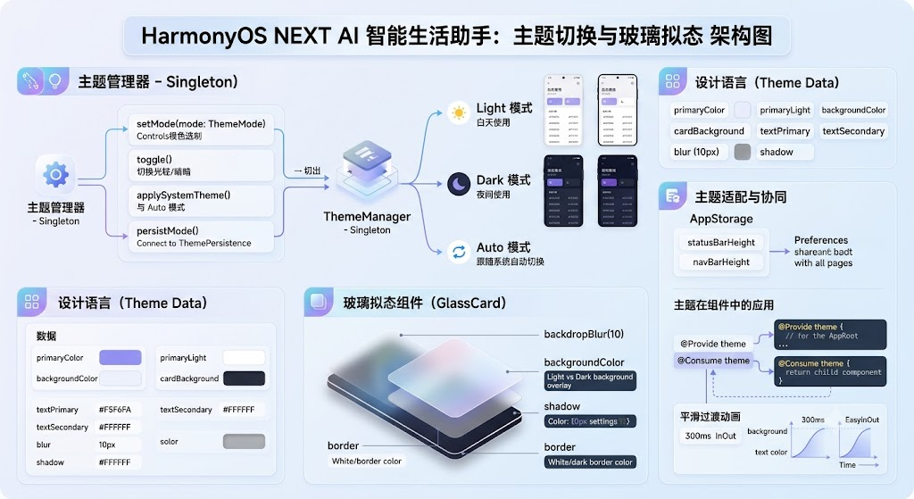
一、主题系统架构
1.1 设计语言
| 设计元素 | Light 模式 | Dark 模式 | 实现方式 |
|---|---|---|---|
| 背景色 | #F5F6FA | #1A1A2E | ThemeManager |
| 卡片色 | #FFFFFF | #16213E | ThemeManager |
| 主色调 | #6C5CE7 | #A29BFE | 渐变 |
| 文字色 | #2D3436 | #FFFFFF | ThemeManager |
| 圆角 | 12-20px | 12-20px | border-radius |
| 玻璃拟态 | 白色+10px模糊 | 深色+10px模糊 | backdropBlur |
1.2 三种主题模式说明
HarmonyAI 支持以下三种主题模式:
- Light 模式:浅色主题,适合白天使用,背景为灰白色系
- Dark 模式:深色主题,适合夜间使用,背景为深蓝黑色系
- Auto 模式:跟随系统自动切换,根据系统主题动态适配
二、ThemeManager 实现
2.1 主题管理器核心代码
// theme/ThemeManager.ts
import configuration from '@ohos.app.ability.configuration';

export class ThemeManager {
  private static instance: ThemeManager;
  @State currentTheme: AppTheme = LightTheme;
  @State mode: ThemeMode = 'light';

  static getInstance(): ThemeManager {
    if (!ThemeManager.instance) {
      ThemeManager.instance = new ThemeManager();
    }
    return ThemeManager.instance;
  }

  setMode(mode: ThemeMode): void {
    this.mode = mode;
    switch (mode) {
      case 'light': this.currentTheme = LightTheme; break;
      case 'dark': this.currentTheme = DarkTheme; break;
      case 'auto': this.applySystemTheme(); break;
    }
    this.persistMode(mode);
  }

  toggle(): void {
    const next = this.mode === 'light' ? 'dark' : 'light';
    this.setMode(next);
  }

  private async applySystemTheme(): Promise<void> {
    const config = await getContext().abilityInfo?.configuration;
    const isDark = config?.colorMode === configuration.ColorMode.COLOR_MODE_DARK;
    this.currentTheme = isDark ? DarkTheme : LightTheme;
  }

  private persistMode(mode: ThemeMode): void {
    PreferenceUtil.set('theme_mode', mode);
  }
}

export type ThemeMode = 'light' | 'dark' | 'auto';

export interface AppTheme {
  mode: string;
  primaryColor: ResourceColor;
  primaryLight: ResourceColor;
  backgroundColor: ResourceColor;
  cardBackground: ResourceColor;
  textPrimary: ResourceColor;
  textSecondary: ResourceColor;
  textTertiary: ResourceColor;
  borderColor: ResourceColor;
  blur: number;
  shadow: string;
}

export const LightTheme: AppTheme = {
  mode: 'light',
  primaryColor: '#6C5CE7',
  primaryLight: '#A29BFE',
  backgroundColor: '#F5F6FA',
  cardBackground: '#FFFFFF',
  textPrimary: '#2D3436',
  textSecondary: '#636E72',
  textTertiary: '#B2BEC3',
  borderColor: '#E8E8E8',
  blur: 10,
  shadow: 'rgba(0,0,0,0.06)'
};

export const DarkTheme: AppTheme = {
  mode: 'dark',
  primaryColor: '#A29BFE',
  primaryLight: '#6C5CE7',
  backgroundColor: '#1A1A2E',
  cardBackground: '#16213E',
  textPrimary: '#FFFFFF',
  textSecondary: '#B2BEC3',
  textTertiary: '#636E72',
  borderColor: '#2D3436',
  blur: 10,
  shadow: 'rgba(0,0,0,0.2)'
};
2.2 玻璃拟态组件
// components/GlassCard.ets
@Component
export struct GlassCard {
  @Prop blur: number = 10;
  @Prop opacity: number = 0.15;
  @Prop width: string | number = '100%';
  @Prop height: string | number = 'auto';
  @Prop theme: AppTheme = LightTheme;

  build() {
    Column() {
      // 内容插槽通过 @BuilderParam 传入
    }
    .width(this.width)
    .height(this.height)
    .backgroundColor(this.theme.mode === 'dark'
      ? `rgba(22,33,62,${this.opacity})`
      : `rgba(255,255,255,${this.opacity + 0.55})`)
    .borderRadius(20)
    .shadow({ radius: 10, color: this.theme.shadow })
    .backdropBlur(this.blur)
    .border({ width: 1, color: this.theme.borderColor });
  }
}
2.3 主题持久化
// theme/ThemePersistence.ts
export class ThemePersistence {
  private static readonly KEY = 'theme_mode';

  static async save(mode: ThemeMode): Promise<void> {
    const pref = await getPreferences(getContext(), 'theme_config');
    await pref.put(this.KEY, mode);
    await pref.flush();
  }

  static async load(): Promise<ThemeMode> {
    const pref = await getPreferences(getContext(), 'theme_config');
    return await pref.get(this.KEY, 'light') as ThemeMode;
  }
}
三、主题切换页面
3.1 ThemePage 实现
// pages/ThemePage.ets
import { display } from '@kit.ArkUI';

@Entry
@Component
struct ThemePage {
  @State currentMode: ThemeMode = 'light';
  private themeManager = ThemeManager.getInstance();

  // 安全区适配
  @StorageLink('statusBarHeight') statusBarHeight: number = 0;
  @StorageLink('navBarHeight') navBarHeight: number = 0;

  aboutToAppear() {
    this.currentMode = this.themeManager.mode;
    this.initSafeArea();
  }

  private initSafeArea(): void {
    const displayInfo = display.getDefaultDisplaySync();
    const densityPixels = displayInfo.densityPixels;
    this.statusBarHeight = px2vp(displayInfo.statusBarHeight) / densityPixels;
    this.navBarHeight = px2vp(displayInfo.navigationIndicatorHeight) / densityPixels;
  }

  build() {
    Column() {
      Row() {
        Image($r('app.media.ic_back')).width(24).height(24).fillColor('#2D3436')
          .onClick(() => RouterUtil.back());
        Text('主题设置')
          .fontSize(18)
          .fontWeight(FontWeight.Bold)
          .margin({ left: 12 });
      }
      .width('100%')
      .height(56)
      .padding({ left: 16, right: 16 })
      .margin({ top: this.statusBarHeight });

      // 预览区域
      Column() {
        Text('预览').fontSize(14).fontColor('#636E72').margin({ bottom: 12 });
        GlassCard({ theme: this.themeManager.currentTheme }) {
          Column() {
            Text('HarmonyAI').fontSize(20).fontWeight(FontWeight.Bold)
              .fontColor(this.themeManager.currentTheme.textPrimary);
            Text('AI 智能生活助手').fontSize(14).margin({ top: 4 })
              .fontColor(this.themeManager.currentTheme.textSecondary);
            Row() {
              Button('聊天').backgroundColor('#6C5CE7').fontColor(Color.White).borderRadius(16).height(32);
              Button('翻译').backgroundColor('#00B894').fontColor(Color.White).borderRadius(16).height(32).margin({ left: 8 });
            }
            .margin({ top: 12 });
          }
          .padding(24).alignItems(HorizontalAlign.Start);
        }
        .width('90%');
      }
      .padding(16)
      .backgroundColor(this.themeManager.currentTheme.backgroundColor)
      .borderRadius(16)
      .margin(16);

      // 模式选择
      Column() {
        Text('主题模式').fontSize(16).fontWeight(FontWeight.Bold).width('100%').margin({ bottom: 16 });
        ForEach([
          { value: 'light', label: '浅色模式', icon: $r('app.media.ic_sun'), desc: '适合白天使用' },
          { value: 'dark', label: '深色模式', icon: $r('app.media.ic_moon'), desc: '适合夜间使用' },
          { value: 'auto', label: '跟随系统', icon: $r('app.media.ic_sync'), desc: '自动切换' }
        ], (item) => {
          Row() {
            Image(item.icon).width(22).height(22).fillColor('#6C5CE7');
            Column() {
              Text(item.label).fontSize(15).fontWeight(FontWeight.Medium);
              Text(item.desc).fontSize(12).fontColor('#636E72').margin({ top: 2 });
            }
            .layoutWeight(1)
            .margin({ left: 12 });
            if (this.currentMode === item.value) {
              Image($r('app.media.ic_check')).width(22).height(22).fillColor('#6C5CE7');
            }
          }
          .padding(16)
          .backgroundColor(Color.White)
          .borderRadius(12)
          .margin({ bottom: 8 })
          .onClick(() => {
            this.currentMode = item.value as ThemeMode;
            this.themeManager.setMode(this.currentMode);
          });
        }, (item) => item.value);
      }
      .padding(16);
    }
    .width('100%')
    .height('100%')
    .backgroundColor('#F5F6FA');
  }
}
3.2 主题切换动画
// 平滑过渡动画
@Entry
@Component
struct ThemeTransition {
  @State theme = ThemeManager.getInstance().currentTheme;

  // 监听主题变化,触发平滑动画
  @Watch('onThemeChanged')
  onThemeChanged(): void {
    animateTo({ duration: 300, curve: Curve.EaseInOut }, () => {
      // ArkUI 自动插值颜色过渡
    });
  }

  build() {
    Column() {
      Text('切换主题时颜色平滑过渡')
        .fontSize(16)
        .fontColor(this.theme.textPrimary);
    }
    .backgroundColor(this.theme.backgroundColor)
    .padding(24)
    .borderRadius(16);
  }
}
四、主题在组件中的应用
4.1 主题感知组件模式
// 使用 @Consume 实现主题感知
@Component
struct ThemedPage {
  @Consume theme: AppTheme;

  build() {
    Column() {
      Text('主题感知组件')
        .fontColor(this.theme.textPrimary)
        .backgroundColor(this.theme.cardBackground);
    }
    .backgroundColor(this.theme.backgroundColor);
  }
}

// 在父组件中提供主题
@Component
struct AppRoot {
  @Provide theme: AppTheme = ThemeManager.getInstance().currentTheme;

  build() {
    Column() {
      ThemedPage();
    }
    .width('100%').height('100%');
  }
}
4.2 主题动画过渡
export class ThemeTransitionAnimation {
  // 背景色过渡
  static animateBackground(targetColor: ResourceColor): void {
    animateTo({ duration: 300, curve: Curve.Smooth }, () => {
      // 通过 @State 驱动 ArkUI 自动插值
    });
  }

  // 卡片入场动画
  static animateCardAppear(): void {
    animateTo({ duration: 400, curve: Curve.FastOutSlowIn }, () => {
      // 缩放 + 透明度动画
    });
  }
}
4.3 动画参数配置表
| 动画类型 | 属性 | 时长 | 曲线 |
|---|---|---|---|
| 背景色 | backgroundColor | 300ms | EaseInOut |
| 文字色 | fontColor | 300ms | EaseInOut |
| 卡片缩放 | scale | 400ms | FastOutSlowIn |
| 阴影 | shadow | 300ms | EaseInOut |
五、安全区与主题协同
5.1 全局安全区初始化
// utils/SafeAreaHelper.ts
import { display } from '@kit.ArkUI';

export class SafeAreaHelper {
  static init(): void {
    const displayInfo = display.getDefaultDisplaySync();
    const densityPixels = displayInfo.densityPixels;

    const statusBarHeight = px2vp(displayInfo.statusBarHeight) / densityPixels;
    const navBarHeight = px2vp(displayInfo.navigationIndicatorHeight) / densityPixels;

    AppStorage.setOrCreate('statusBarHeight', statusBarHeight);
    AppStorage.setOrCreate('navBarHeight', navBarHeight);

    hilog.info(0x0000, 'SafeArea',
      'statusBarHeight: %{public}f, navBarHeight: %{public}f',
      statusBarHeight, navBarHeight);
  }
}
5.2 主题适配最佳实践
在实际开发中,建议遵循以下主题适配策略:
- 统一使用 ThemeManager:避免硬编码颜色值
- 组件级主题感知:通过
@Consume/@Provide传递主题 - 动画平滑过渡:主题切换时添加 300ms 过渡动画
- 持久化用户偏好:使用 Preferences 保存用户选择的主题模式
- 安全区同步适配:主题切换时同步调整安全区 padding
六、主题最佳实践
6.1 开发注意事项
在实际开发主题系统时,需要注意以下要点:
- 避免硬编码颜色:所有颜色必须通过 ThemeManager 获取
- 动画性能:主题切换动画避免同时修改过多属性
- 测试覆盖:必须在 Light 和 Dark 两种模式下进行 UI 测试
- 系统同步:Auto 模式下监听系统主题变化事件
// 错误示例:硬编码颜色
Text('Hello').fontColor('#2D3436'); // ❌ 深色模式下不可见

// 正确示例:使用主题
Text('Hello').fontColor(this.theme.textPrimary); // ✅ 自动适配
6.2 常见问题排查
| 问题 | 原因 | 解决方案 |
|---|---|---|
| 切换闪烁 | 无过渡动画 | 添加 animateTo({ duration: 300 }) |
| 颜色不统一 | 多处硬编码 | 统一使用 ThemeManager |
| 深色模式文字看不清 | 对比度不足 | 检查 textPrimary vs backgroundColor |
| SafeArea 未适配 | 未获取状态栏高度 | 使用 display.getDefaultDisplaySync() |
七、Git 提交
git add .
git commit -m "feat(theme): 主题切换与玻璃拟态

- ThemeManager 主题管理(Light/Dark/Auto)
- GlassCard 玻璃拟态组件
- @Consume/@Provide 主题感知
- 300ms 平滑过渡动画
- 主题配置持久化
- SVG 矢量图标(太阳/月亮/同步)
- 安全区适配(statusBarHeight + navBarHeight)
- 主题最佳实践与常见问题排查

Co-Authored-By: AtomCode (deepseek-v4-flash) <noreply@atomgit.com>"
git tag v0.2.2
总结
本文实现了 主题切换与玻璃拟态 效果。核心要点如下:
- 三模式切换:浅色/深色/跟随系统,满足不同使用场景
- ThemeManager:全局状态管理,统一控制主题变更
- 玻璃拟态:backdropBlur 毛玻璃效果,营造通透视觉
- 主题适配:@Consume/@Provide 实现组件级主题感知
- 平滑过渡:300ms 动画效果,切换自然流畅
- 配置持久化:Preferences 保存用户偏好,下次启动恢复
- 安全区协同:所有页面通过 AppStorage 获取安全区高度
- SVG 图标:太阳、月亮、同步等图标采用矢量图实现
如果这篇文章对你有帮助,欢迎点赞👍、收藏⭐、关注🔔,你的支持是我持续创作的动力!
相关资源
- HarmonyOS 主题开发官方指南
- HarmonyOS Animation 动画指南
- Glassmorphism 设计趋势
- HarmonyOS configuration API
- HarmonyOS @Consume 装饰器
- HarmonyOS 安全区适配指南
- Material Design 主题规范
- Apple HIG 深色模式
下一篇预告: [25-性能优化] —— 系统性优化 HarmonyAI 的性能瓶颈,包括虚拟列表、图片压缩、缓存策略、启动优化等关键手段。

讨论HarmonyOS开发技术,专注于API与组件、DevEco Studio、测试、元服务和应用上架分发等。
更多推荐

 6
6 0
0- 0


 已为社区贡献64条内容

所有评论(0)