HarmonyOS 组件API设计规范:从接口定义到生产级组件的系统性方法论
文章目录

每日一句正能量
“把‘我没办法’改成‘我暂时还没找到方法’,不要在自我对话中贬低自己的价值。”
日常的自我对话,是你和自己的关系。如果总用“没办法”“我不行”来沟通,关系就会僵化;换成“暂时”“还没”“可以试试”,关系就活过来了。换个说法,就换了一种与自己的相处方式。
一、引言:为什么需要组件API设计规范
在 HarmonyOS 应用开发中,自定义组件是构建复杂界面的基本单元。然而,随着项目规模扩大和团队人员增加,组件API设计不规范所带来的问题日益凸显:命名风格混乱导致代码可读性下降、状态管理滥用引发性能瓶颈、事件回调设计不当造成内存泄漏、缺乏可访问性支持导致应用无法通过无障碍检测。
组件API设计规范并非简单的"代码风格指南",而是一套系统性的方法论,它涵盖了命名约定、状态管理策略、事件设计模式、生命周期约束、性能优化原则以及可访问性要求等多个维度。遵循规范设计的组件,不仅能够提升代码的可维护性和可复用性,更能确保组件在多设备、多场景下的行为一致性。
本文基于 HarmonyOS API 12+ 的 ArkUI 框架,结合企业级项目实战经验,系统阐述组件API设计的核心规范与最佳实践。
二、组件API设计原则金字塔
组件API设计应遵循以下六项核心原则,它们构成了一个从基础到高层的金字塔结构:
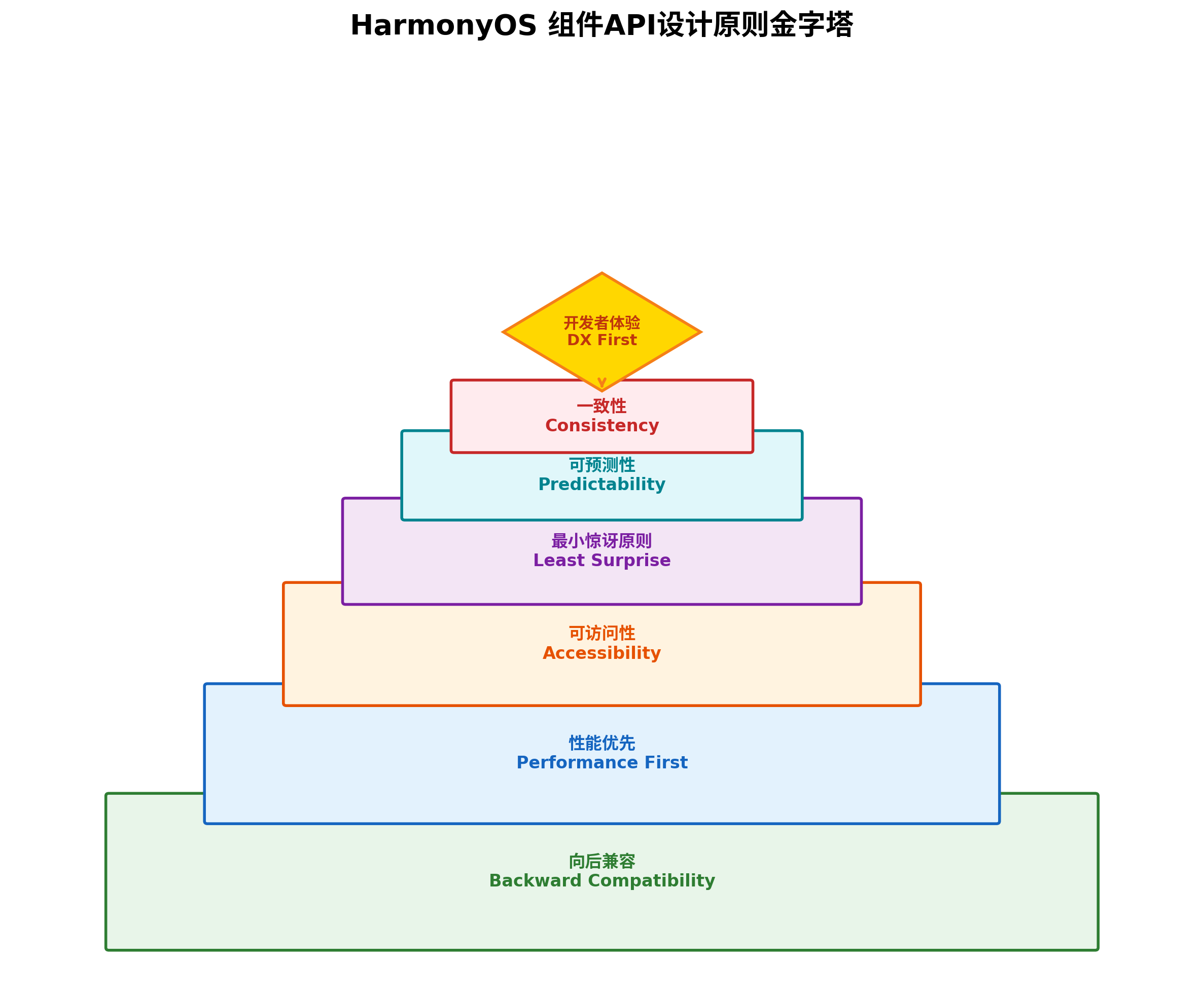
2.1 向后兼容(Backward Compatibility)——基石层
向后兼容是组件API设计的底线要求。一旦组件发布,其公共接口的变更必须谨慎处理:
- 属性新增:仅允许新增可选属性,禁止删除或重命名已有属性
- 默认值保持:已有属性的默认值不得随意变更
- 废弃策略:对需要移除的属性,先标记
@deprecated并保留至少两个版本周期 - 类型扩展:允许将属性类型从具体类型扩展为联合类型,但不可反向收缩
// 正确:新增可选属性,保持向后兼容
interface CardProps {
  title: string;
  subtitle?: string;        // 新增可选属性
  // @deprecated 请使用 subtitle 替代
  desc?: string;
}

// 错误:删除已有属性,破坏兼容性
interface CardPropsBad {
  // title 被删除,导致所有调用方报错
  subtitle: string;
}
2.2 性能优先(Performance First)
组件API的设计直接影响运行时性能:
- 状态最小化:仅将真正驱动UI变更的变量标记为
@State,其余使用普通变量 - 避免深层监听:对象嵌套层级超过3层时,
@Observed的监听开销显著增加 - 延迟初始化:非首屏必需的数据通过异步加载,避免阻塞主线程
- 组件复用:为列表场景设计可复用组件,配合
@Reusable装饰器
2.3 可访问性(Accessibility)
HarmonyOS 对应用可访问性有明确要求,组件API设计阶段就应纳入考量:
- 所有交互组件必须支持
ariaLabel和ariaDescription属性 - 焦点管理遵循"可见即可达"原则,确保键盘和遥控器导航正常
- 颜色对比度满足 WCAG 2.1 AA 标准(至少 4.5:1)
- 支持屏幕阅读器的朗读顺序控制
2.4 最小惊讶原则(Least Surprise)
组件的行为应符合开发者的直觉预期:
- 属性命名与行为一致:
isVisible为true时组件必须可见 - 事件触发时机明确:
onChange应在值确定变更后触发,而非输入过程中 - 默认值合理:布尔属性默认应为
false,避免隐式启用功能
2.5 可预测性(Predictability)
相同输入必须产生相同输出,组件状态变更路径清晰可追踪:
- 避免在
build()方法中修改状态变量,这是 ArkUI 的硬性约束 - 异步操作的结果应通过状态变量反映,而非直接操作DOM
- 组件内部状态与外部传入属性边界清晰
2.6 一致性(Consistency)
同一项目乃至同一生态内的组件应遵循统一的命名和行为规范:
- 属性命名统一使用小驼峰(camelCase)
- 事件回调统一以
on开头 - 尺寸单位统一使用 vp(虚拟像素),避免硬编码 px
- 颜色值统一通过主题令牌引用,禁止硬编码色值
三、命名规范
3.1 属性命名
| 类型 | 规范 | 示例 |
|---|---|---|
| 字符串属性 | 名词或形容词 | title, placeholder, backgroundColor |
| 布尔属性 | is / has / can 前缀 | isVisible, hasDivider, canScroll |
| 数值属性 | 明确计量单位 | fontSize, borderRadius, itemSpacing |
| 枚举属性 | 类型后缀 | buttonType: ButtonType, layoutMode: LayoutMode |
| 回调属性 | on + 动词 + 名词 | onClick, onValueChange, onScrollEnd |
反模式警示:
// ❌ 避免缩写,降低可读性
@Prop bg: string = '';           // 应使用 backgroundColor
@Prop fs: number = 14;         // 应使用 fontSize
@Prop show: boolean = false;    // 应使用 isVisible

// ❌ 避免反向语义
@Prop hideTitle: boolean = false;  // 应使用 isTitleVisible,默认 true

// ✅ 正确示例
@Prop backgroundColor: ResourceColor = '#FFFFFF';
@Prop fontSize: number = 14;
@Prop isTitleVisible: boolean = true;
3.2 事件回调命名
事件回调应遵循 on + [触发时机] + [事件对象] 的命名模式:
// 点击事件
onClick?: () => void;
onItemClick?: (index: number, item: ItemType) => void;

// 值变更事件
onValueChange?: (value: string) => void;
onSelectionChange?: (selected: boolean) => void;

// 状态事件
onFocus?: () => void;
onBlur?: () => void;
onError?: (error: ErrorInfo) => void;

// 生命周期事件(自定义组件)
onBeforeOpen?: () => void;
onAfterClose?: () => void;
3.3 方法命名(Controller 模式)
对于需要通过 Controller 暴露方法的组件:
class SearchBarController {
  // 动词开头,明确行为
  focusInput: () => void = () => {};
  clearText: () => void = () => {};
  setText: (value: string) => void = () => {};
  getText: () => string = () => '';

  // 避免使用 get/set 作为普通方法前缀(与属性混淆)
  // 查询状态使用 is/has/can 前缀
  isFocused: () => boolean = () => false;
}
四、状态管理装饰器决策树
ArkUI 提供了丰富的状态管理装饰器,正确使用它们是组件API设计的关键环节。
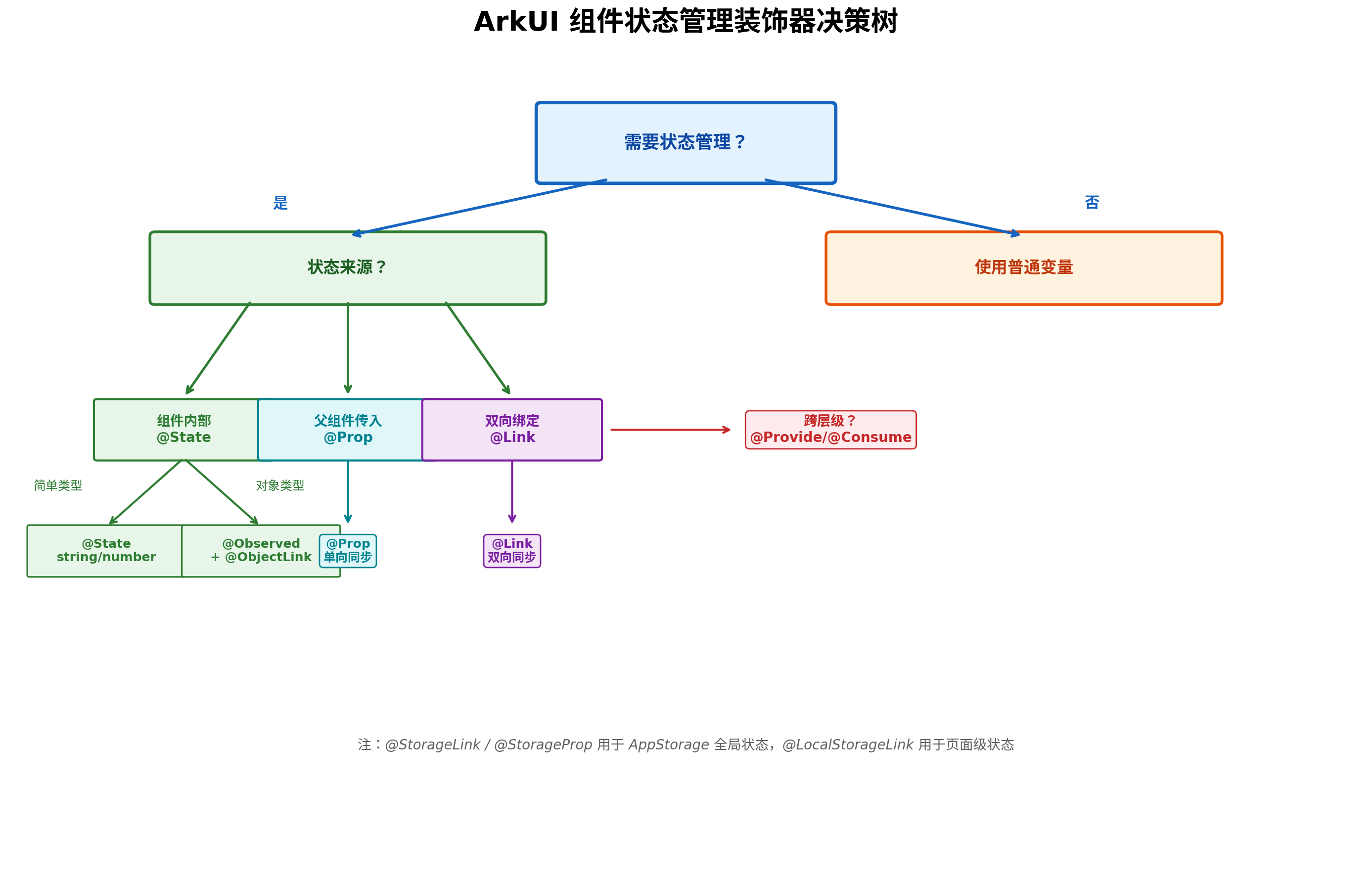
4.1 装饰器选择指南
| 装饰器 | 数据流向 | 适用场景 | 注意事项 |
|---|---|---|---|
@State | 组件内部 | 私有状态,如开关状态、输入值 | 仅标记驱动UI的变量 |
@Prop | 父→子单向 | 父组件传入的只读配置 | 子组件不可修改 |
@Link | 父子双向 | 需要双向同步的表单值 | 父组件需传递引用 $value |
@ObjectLink | 嵌套对象观察 | 对象内部属性变更监听 | 需配合 @Observed 使用 |
@Provide/@Consume | 跨层级 | 主题、语言等全局上下文 | 避免过度使用导致耦合 |
4.2 实战示例:表单组件的状态设计
// 定义表单数据模型
@Observed
class FormData {
  username: string = '';
  password: string = '';
  agreeProtocol: boolean = false;
}

// 表单组件API设计
@Component
export struct LoginForm {
  // 外部传入:表单数据(双向同步)
  @Link formData: FormData;

  // 外部传入:提交回调(必需)
  onSubmit?: (data: FormData) => void;

  // 外部传入:验证失败回调(可选)
  onValidationError?: (field: string, message: string) => void;

  // 内部状态:当前聚焦的输入框
  @State private focusedField: string = '';

  // 内部状态:是否正在提交(控制 loading)
  @State private isSubmitting: boolean = false;

  // 内部状态:验证错误信息(不暴露给外部)
  @State private errors: Map<string, string> = new Map();

  private validate(): boolean {
    this.errors.clear();
    if (this.formData.username.length < 3) {
      this.errors.set('username', '用户名至少3个字符');
    }
    if (this.formData.password.length < 6) {
      this.errors.set('password', '密码至少6个字符');
    }
    if (!this.formData.agreeProtocol) {
      this.errors.set('agreeProtocol', '请先同意用户协议');
    }
    return this.errors.size === 0;
  }

  private handleSubmit() {
    if (!this.validate()) {
      const firstError = this.errors.entries().next().value;
      this.onValidationError?.(firstError[0], firstError[1]);
      return;
    }
    this.isSubmitting = true;
    this.onSubmit?.(this.formData);
    this.isSubmitting = false;
  }

  build() {
    Column({ space: 16 }) {
      TextInput({ placeholder: '请输入用户名', text: this.formData.username })
        .onChange((value) => { this.formData.username = value; })
        .onFocus(() => { this.focusedField = 'username'; })
        .borderColor(this.errors.has('username') ? '#F5222D' : '#E5E5E5')

      if (this.errors.has('username')) {
        Text(this.errors.get('username'))
          .fontSize(12)
          .fontColor('#F5222D')
      }

      TextInput({ placeholder: '请输入密码', text: this.formData.password })
        .type(InputType.Password)
        .onChange((value) => { this.formData.password = value; })
        .borderColor(this.errors.has('password') ? '#F5222D' : '#E5E5E5')

      Row() {
        Checkbox()
          .select(this.formData.agreeProtocol)
          .onChange((value) => { this.formData.agreeProtocol = value; })
        Text('我已阅读并同意《用户协议》')
          .fontSize(14)
          .fontColor('#666666')
      }

      Button(this.isSubmitting ? '提交中...' : '登录')
        .enabled(!this.isSubmitting && this.formData.agreeProtocol)
        .onClick(() => this.handleSubmit())
    }
    .padding(24)
    .width('100%')
  }
}
4.3 状态设计黄金法则
- 单一数据源:同一数据不要在多个组件中各自维护
@State副本 - 状态提升:当多个兄弟组件需要共享状态时,将状态提升到最近的公共父组件
- 只读派生:通过
get方法从现有状态计算派生值,避免冗余状态 - 不可变更新:对象状态更新时创建新对象而非修改原对象,确保变更检测生效
五、事件设计规范
5.1 回调函数设计模式
// 定义事件参数接口(提升类型安全性)
interface TabChangeEvent {
  index: number;
  previousIndex: number;
  tabTitle: string;
}

interface ScrollEvent {
  offsetX: number;
  offsetY: number;
  direction: 'up' | 'down' | 'left' | 'right';
}

// 组件事件API声明
@Component
export struct TabsContainer {
  @Prop tabs: string[] = [];
  @State activeIndex: number = 0;

  // 提供默认空实现,降低使用门槛
  onTabChange?: (event: TabChangeEvent) => void = () => {};
  onTabScroll?: (event: ScrollEvent) => void = () => {};
  onTabLongPress?: (index: number) => void = () => {};

  private switchTab(index: number) {
    if (index === this.activeIndex) return;

    const event: TabChangeEvent = {
      index: index,
      previousIndex: this.activeIndex,
      tabTitle: this.tabs[index]
    };

    this.activeIndex = index;
    this.onTabChange(event);
  }

  build() {
    Row() {
      ForEach(this.tabs, (tab: string, index: number) => {
        Text(tab)
          .fontColor(index === this.activeIndex ? '#007DFF' : '#666666')
          .onClick(() => this.switchTab(index))
          .gesture(
            LongPressGesture({ duration: 500 })
              .onAction(() => this.onTabLongPress?.(index))
          )
      })
    }
  }
}
5.2 手势冲突处理
当组件同时绑定多个手势时,必须明确优先级和互斥关系:
@Component
struct GestureCard {
  @State scale: number = 1.0;
  @State rotation: number = 0;

  build() {
    Column() {
      Image($r('app.media.photo'))
        .width(300)
        .height(300)
        .scale({ x: this.scale, y: this.scale })
        .rotate({ angle: this.rotation })
        .gesture(
          GestureGroup(GestureMode.Sequence,
            // 优先级1:双击缩放
            TapGesture({ count: 2 })
              .onAction(() => {
                this.scale = this.scale === 1.0 ? 2.0 : 1.0;
              }),
            // 优先级2:捏合缩放
            PinchGesture()
              .onActionStart((event: GestureEvent) => {
                this.scale = event.scale;
              }),
            // 优先级3:旋转
            RotationGesture()
              .onActionStart((event: GestureEvent) => {
                this.rotation = event.angle;
              })
          )
        )
    }
  }
}
六、生命周期与API调用时序
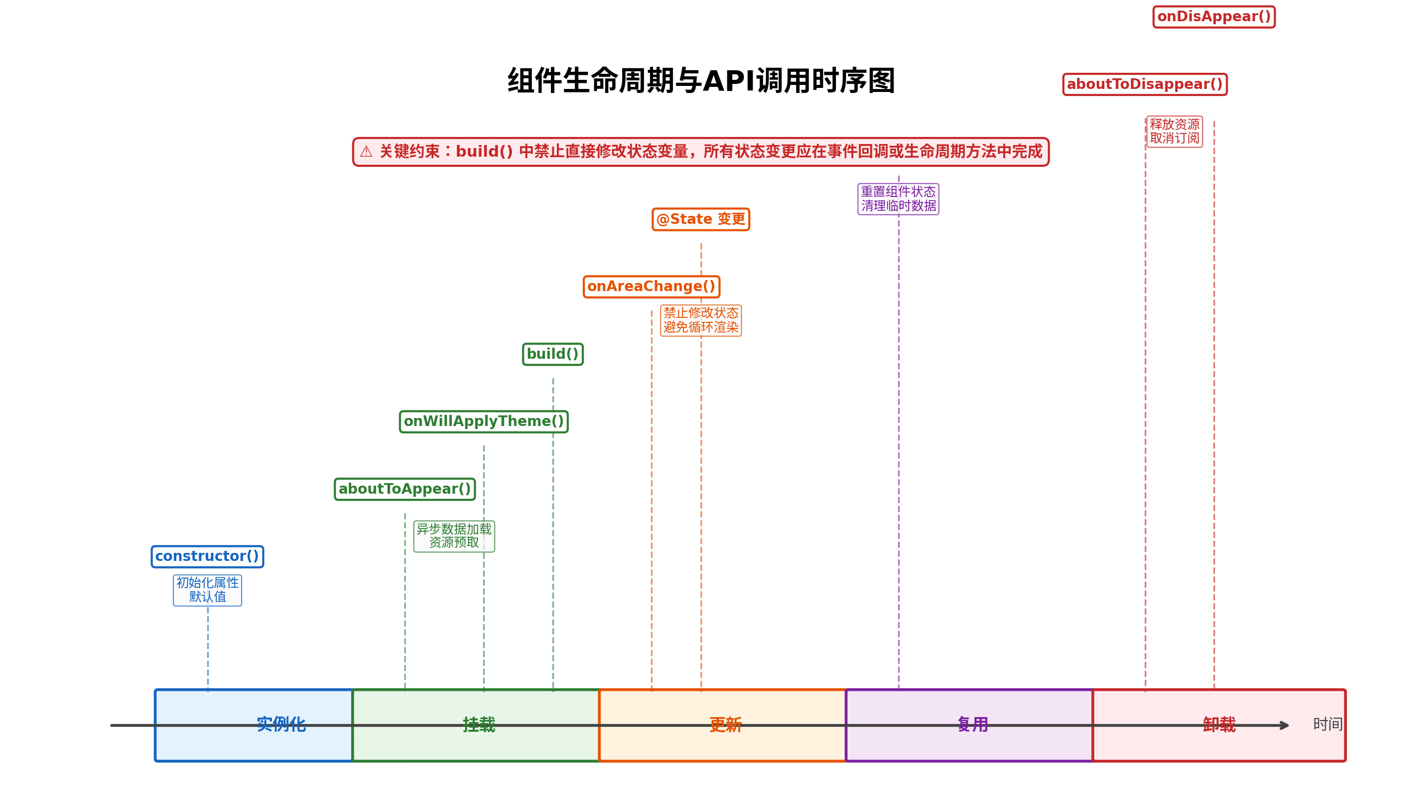
理解组件生命周期是设计可靠API的前提。ArkUI 组件的生命周期可分为五个阶段:
6.1 生命周期方法规范
| 生命周期 | 调用时机 | API设计约束 |
|---|---|---|
constructor() | 组件实例化时 | 仅初始化属性默认值,禁止访问UI上下文 |
aboutToAppear() | 组件即将挂载 | 可发起异步数据请求,设置监听器 |
onWillApplyTheme() | 主题应用前 | 获取主题对象,准备主题相关资源 |
build() | 渲染UI树 | 禁止修改任何状态变量,仅做纯渲染 |
onAreaChange() | 组件区域变化 | 可响应布局变化,但避免触发重渲染 |
aboutToReuse() | 组件即将复用 | 重置组件状态,清理临时数据 |
aboutToDisappear() | 组件即将卸载 | 取消订阅,释放资源,停止定时器 |
6.2 反模式警示
@Component
struct BadExample {
  @State count: number = 0;

  build() {
    Column() {
      // ❌ 严重错误:build() 中修改状态会导致无限循环渲染
      Text(`${this.count++}`)
        .onClick(() => {
          this.count++;  // ✅ 正确:在事件回调中修改状态
        })
    }
  }
}
七、可访问性(Accessibility)设计
7.1 无障碍属性规范
@Component
struct AccessibleButton {
  @Prop text: string = '';
  @Prop ariaLabel?: string;
  @Prop ariaDescription?: string;
  @Prop isEnabled: boolean = true;

  onClick?: () => void = () => {};

  build() {
    Button(this.text)
      .enabled(this.isEnabled)
      .accessibilityText(this.ariaLabel ?? this.text)
      .accessibilityDescription(this.ariaDescription ?? '')
      .accessibilityLevel(this.isEnabled ? 'auto' : 'no')
      .onClick(() => this.onClick())
  }
}
7.2 焦点管理
@Component
struct FocusableList {
  @State items: string[] = [];
  @State focusedIndex: number = -1;

  build() {
    List() {
      ForEach(this.items, (item: string, index: number) => {
        ListItem() {
          Text(item)
            .focusable(true)
            .tabIndex(index)
            .onFocus(() => { this.focusedIndex = index; })
            .backgroundColor(this.focusedIndex === index ? '#E3F2FD' : '#FFFFFF')
        }
      })
    }
    .defaultFocus(this.items.length > 0)  // 列表默认获取焦点
  }
}
八、性能设计规范
8.1 避免过度渲染
@Component
struct OptimizedList {
  @State items: ItemType[] = [];

  // ✅ 使用 @Memo 缓存计算结果(API 12+)
  @Memo
  private getVisibleItems(): ItemType[] {
    return this.items.filter(item => item.isVisible);
  }

  build() {
    List() {
      // ✅ 使用键值函数确保 ForEach 高效 diff
      ForEach(this.getVisibleItems(),
        (item: ItemType) => {
          ListItem() {
            ItemCard({ data: item })
          }
        },
        (item: ItemType) => item.id  // 键值函数
      )
    }
    .cachedCount(5)  // 预缓存5个列表项,提升滑动流畅度
  }
}

@Component
struct ItemCard {
  @Prop data: ItemType;

  // ✅ 使用 @Reusable 支持组件复用
  aboutToReuse(params: Record<string, Object>): void {
    this.data = params['data'] as ItemType;
  }

  build() {
    Column() {
      Text(this.data.title)
      Image(this.data.imageUrl)
        .width('100%')
        .height(120)
        .objectFit(ImageFit.Cover)
    }
  }
}
8.2 大数据量处理
// 虚拟列表实现规范
@Component
struct VirtualList {
  @State dataSource: DataSource = new DataSource();
  private listScroller: ListScroller = new ListScroller();

  aboutToAppear() {
    // 分页加载,避免一次性渲染全部数据
    this.loadMoreData();
  }

  private loadMoreData() {
    const newItems = fetchPage(this.dataSource.totalCount(), 20);
    this.dataSource.pushData(newItems);
  }

  build() {
    List({ scroller: this.listScroller }) {
      LazyForEach(this.dataSource, (item: ItemType) => {
        ListItem() {
          ItemCard({ data: item })
        }
      }, (item: ItemType) => item.id)
    }
    .onReachEnd(() => {
      // 触底加载更多
      this.loadMoreData();
    })
    .scrollBar(BarState.Auto)
  }
}
九、组件API设计评审清单
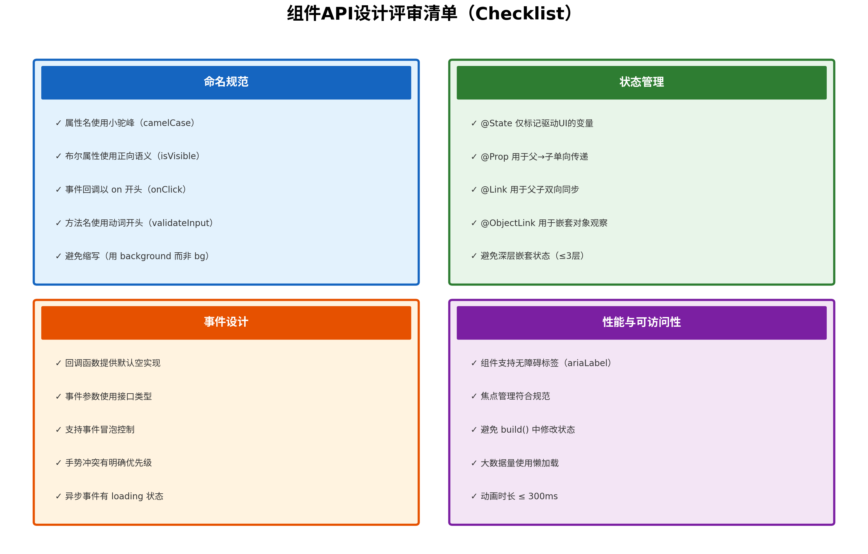
在组件发布前,应通过以下评审清单进行自查:
9.1 命名规范检查项
- 所有属性使用小驼峰命名(camelCase)
- 布尔属性使用正向语义(
isVisible而非hide) - 事件回调以
on开头,方法名以动词开头 - 避免无意义缩写(使用
backgroundColor而非bgColor) - 类型命名使用 PascalCase(
ButtonType而非button_type)
9.2 状态管理检查项
-
@State仅标记真正驱动UI的变量 -
@Prop用于父→子单向传递,子组件不修改 -
@Link用于需要双向同步的场景 -
@ObjectLink配合@Observed用于嵌套对象 - 状态嵌套层级不超过3层
9.3 事件设计检查项
- 所有回调函数提供默认空实现
- 事件参数使用接口类型而非匿名对象
- 支持事件冒泡控制(
stopPropagation) - 手势冲突有明确的优先级定义
- 异步事件有 loading 状态和错误处理
9.4 性能与可访问性检查项
- 组件支持
ariaLabel和ariaDescription - 焦点管理符合无障碍规范
-
build()中不修改任何状态变量 - 大数据量场景使用
LazyForEach懒加载 - 动画时长控制在 300ms 以内
十、实战案例:设计一个符合规范的通用弹窗组件
以下是一个生产级通用弹窗组件的完整实现,涵盖了本文所述的全部规范要点。
// Dialog.types.ets —— 类型定义文件

// 弹窗按钮配置
export interface DialogButton {
  text: string;
  type?: 'primary' | 'secondary' | 'danger';
  isEnabled?: boolean;
  onClick?: () => void | Promise<void>;
}

// 弹窗属性接口
export interface DialogProps {
  isVisible: boolean;
  title: string;
  message?: string;
  buttons?: DialogButton[];
  isClosable?: boolean;
  isMaskClosable?: boolean;
  ariaLabel?: string;
  onClose?: () => void;
  onMaskClick?: () => void;
}

// Dialog.component.ets —— 组件实现
import { DialogProps, DialogButton } from './Dialog.types';

@Component
export struct Dialog {
  // === 外部属性 ===
  @Prop isVisible: boolean = false;
  @Prop title: string = '';
  @Prop message?: string;
  @Prop buttons?: DialogButton[] = [];
  @Prop isClosable: boolean = true;
  @Prop isMaskClosable: boolean = true;
  @Prop ariaLabel?: string;

  // === 事件回调 ===
  onClose?: () => void = () => {};
  onMaskClick?: () => void = () => {};

  // === 内部状态 ===
  @State private isAnimating: boolean = false;
  @State private buttonLoading: Map<number, boolean> = new Map();

  // === 生命周期 ===
  aboutToAppear() {
    if (this.isVisible) {
      this.isAnimating = true;
    }
  }

  aboutToDisappear() {
    this.buttonLoading.clear();
  }

  // === 私有方法 ===
  private handleMaskClick() {
    if (!this.isMaskClosable) return;
    this.closeDialog();
  }

  private closeDialog() {
    if (this.isAnimating) return;
    this.isAnimating = true;
    // 动画结束后关闭
    setTimeout(() => {
      this.isAnimating = false;
      this.onClose();
    }, 200);
  }

  private async handleButtonClick(button: DialogButton, index: number) {
    if (!button.isEnabled || this.buttonLoading.get(index)) return;

    const result = button.onClick?.();

    // 如果返回 Promise,显示 loading
    if (result instanceof Promise) {
      this.buttonLoading.set(index, true);
      try {
        await result;
        this.closeDialog();
      } finally {
        this.buttonLoading.set(index, false);
      }
    } else {
      this.closeDialog();
    }
  }

  private getButtonColor(type?: string): ResourceColor {
    switch (type) {
      case 'primary': return '#007DFF';
      case 'danger': return '#F5222D';
      case 'secondary': return '#666666';
      default: return '#007DFF';
    }
  }

  // === 渲染 ===
  build() {
    Stack() {
      // 遮罩层
      if (this.isVisible) {
        Column()
          .width('100%')
          .height('100%')
          .backgroundColor('rgba(0, 0, 0, 0.5)')
          .onClick(() => this.handleMaskClick())
          .animation({
            duration: 200,
            curve: Curve.EaseInOut
          })
      }

      // 弹窗内容
      if (this.isVisible) {
        Column({ space: 16 }) {
          // 标题
          Row() {
            Text(this.title)
              .fontSize(18)
              .fontWeight(FontWeight.Bold)
              .fontColor('#1A1A1A')
              .layoutWeight(1)

            if (this.isClosable) {
              Button({ type: ButtonType.Circle }) {
                Image($r('app.media.ic_close'))
                  .width(16)
                  .height(16)
              }
              .width(32)
              .height(32)
              .backgroundColor('transparent')
              .onClick(() => this.closeDialog())
            }
          }
          .width('100%')

          // 消息内容
          if (this.message) {
            Text(this.message)
              .fontSize(14)
              .fontColor('#666666')
              .width('100%')
          }

          // 按钮组
          if (this.buttons && this.buttons.length > 0) {
            Row({ space: 12 }) {
              ForEach(this.buttons, (button: DialogButton, index: number) => {
                Button(button.text)
                  .width(button.type === 'primary' ? 120 : 100)
                  .height(40)
                  .fontSize(14)
                  .fontColor(button.type === 'primary' ? '#FFFFFF' : this.getButtonColor(button.type))
                  .backgroundColor(button.type === 'primary' ? this.getButtonColor(button.type) : '#F5F5F5')
                  .enabled(button.isEnabled !== false && !this.buttonLoading.get(index))
                  .onClick(() => this.handleButtonClick(button, index))
              })
            }
            .width('100%')
            .justifyContent(FlexAlign.End)
          }
        }
        .width('80%')
        .padding(24)
        .backgroundColor('#FFFFFF')
        .borderRadius(12)
        .shadow({ radius: 16, color: 'rgba(0,0,0,0.12)' })
        .accessibilityText(this.ariaLabel ?? this.title)
        .accessibilityDescription(this.message ?? '')
        .animation({
          duration: 200,
          curve: Curve.Spring,
          delay: 50
        })
      }
    }
    .width('100%')
    .height('100%')
    .align(Alignment.Center)
  }
}

// 使用示例
@Entry
@Component
struct DialogDemo {
  @State showDialog: boolean = false;

  build() {
    Column() {
      Button('显示弹窗')
        .onClick(() => { this.showDialog = true; })

      Dialog({
        isVisible: this.showDialog,
        title: '确认删除',
        message: '删除后数据将无法恢复,是否继续?',
        isClosable: true,
        isMaskClosable: false,
        ariaLabel: '删除确认弹窗',
        buttons: [
          { text: '取消', type: 'secondary', onClick: () => {} },
          {
            text: '删除',
            type: 'danger',
            onClick: async () => {
              // 模拟异步删除操作
              await new Promise(resolve => setTimeout(resolve, 1000));
              console.info('删除成功');
            }
          }
        ],
        onClose: () => { this.showDialog = false; }
      })
    }
  }
}
十一、常见问题与解决方案
Q1:组件属性过多(超过10个)如何优化?
解决方案:将相关属性分组为配置对象:
// ❌ 属性过多
interface BadProps {
  title: string;
  titleColor: string;
  titleSize: number;
  subtitle: string;
  subtitleColor: string;
  subtitleSize: number;
  // ... 更多属性
}

// ✅ 分组为配置对象
interface TextStyle {
  text: string;
  color?: string;
  size?: number;
  weight?: FontWeight;
}

interface GoodProps {
  title: TextStyle;
  subtitle?: TextStyle;
}
Q2:如何处理组件的版本升级与API变更?
解决方案:采用渐进式废弃策略:
interface CardPropsV1 {
  title: string;
  /** @deprecated 将在 v3.0 移除,请使用 description 替代 */
  desc?: string;
  description?: string;
}

@Component
struct Card {
  @Prop props: CardPropsV1;

  private getDescription(): string {
    // 兼容旧属性
    return this.props.description ?? this.props.desc ?? '';
  }
}
Q3:第三方组件库如何暴露扩展能力?
解决方案:使用 @BuilderParam 实现插槽机制:
@Component
struct ExtensibleCard {
  @Prop title: string;

  @BuilderParam headerBuilder: () => void = this.defaultHeader;
  @BuilderParam contentBuilder: () => void = this.defaultContent;
  @BuilderParam footerBuilder: () => void = this.defaultFooter;

  @Builder
  defaultHeader() {
    Text(this.title).fontSize(18).fontWeight(FontWeight.Bold);
  }

  @Builder
  defaultContent() {
    // 空内容
  }

  @Builder
  defaultFooter() {
    // 空内容
  }

  build() {
    Column() {
      this.headerBuilder();
      this.contentBuilder();
      this.footerBuilder();
    }
  }
}
十二、总结
HarmonyOS 组件API设计规范是一套覆盖命名、状态、事件、生命周期、性能和可访问性的系统性工程方法论。在实际项目中,建议团队建立以下机制:
- 组件评审制度:每个自定义组件在合入代码库前,必须通过API设计评审,重点检查命名规范、状态管理和事件设计
- 自动化检测:在 CI 流程中集成 ArkUI 规范检测工具,自动拦截不符合规范的代码
- 文档即代码:为每个公共组件编写 JSDoc 文档,说明属性用途、类型、默认值和示例
- 渐进式增强:基础版本提供最小可用集,复杂功能通过可选参数和插槽机制扩展
- 持续迭代:收集开发者反馈,每季度回顾并更新组件API规范
良好的组件API设计如同建筑的地基——在初期投入更多思考,后期将节省数倍的维护成本。希望本文的规范体系和实战案例,能够帮助 HarmonyOS 开发者构建出更加健壮、易用、可维护的组件生态。
转载自:https://blog.csdn.net/u014727709/article/details/163572641
欢迎 👍点赞✍评论⭐收藏,欢迎指正

讨论HarmonyOS开发技术,专注于API与组件、DevEco Studio、测试、元服务和应用上架分发等。
更多推荐
 1
1 0
0- 0


 已为社区贡献861条内容

所有评论(0)