HarmonyOS应用<奇妙科学乐园>开发第94篇:知识详情页开发——文章内容/动画/冷知识/收藏
引言
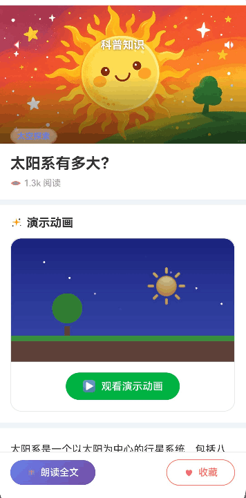
在《奇妙科学乐园》的页面体系中,知识详情页(TopicDetail)是用户深度阅读科普内容的核心场景。当用户从首页文章列表点击某张 TopicCard 进入后,便来到这个沉浸式的阅读界面。该页面承担了四大核心职责:Hero 图片展示与视觉氛围营造、文章正文渲染与阅读体验呈现、冷知识 FunFact 卡片的信息拓展、以及底部操作栏的朗读与收藏交互。
从技术角度看,TopicDetail 页面是一个典型的复合型详情页——它需要协调多层 Stack 布局实现沉浸式头部、使用 Scroll + Column 的经典滚动组合呈现长文本内容、通过 ForEach 动态渲染数组类型的文章段落与冷知识数据、并与后端持久化层(UserPreferences)进行收藏与阅读记录的双向交互。对于面向6-12岁儿童的科普教育应用而言,详情页还需要考虑视觉层次分明、操作反馈即时、加载状态友好等用户体验要素。
本文将以 TopicDetail.ets 的完整源码为主线,逐一拆解 Hero 图片与渐变遮罩、透明导航栏设计、文章标题区与阅读量显示、AnimationDemo 动画演示区、文章正文 ForEach 渲染、FunFactCard 冷知识卡片集成、底部操作栏(朗读全文/收藏)以及阅读进度记录等全部模块的实现细节。
学习目标
完成本文后,你将能够:
- ✅ 掌握 TopicDetail 页面的整体架构:Stack + Scroll + Column 多层嵌套布局
- ✅ 理解 Hero 图片区两层 Stack 嵌套:图片层 + 渐变遮罩层 + 分类 Badge 层
- ✅ 实现 linearGradient 底部渐变遮罩的透明到半黑过渡效果
- ✅ 掌握透明导航栏的 textShadow 文字阴影与毛玻璃视觉设计
- ✅ 使用 ForEach 渲染文章段落数组与冷知识数组
- ✅ 集成 AnimationDemo 动画演示组件与 FunFactCard 冷知识卡片
- ✅ 实现底部操作栏:渐变按钮(朗读全文)与描边按钮(收藏)
- ✅ 掌握收藏切换逻辑:UserPreferences.toggleFavorite 的异步调用链
- ✅ 理解阅读记录写入与成就系统联动的完整数据流
需求分析
页面功能架构
TopicDetail 页面的功能模块结构如下:
TopicDetail 页面
├── Hero 图片区(Stack 双层嵌套)
│   ├── 背景图片(16:9 aspectRatio)
│   ├── 底部渐变遮罩(透明→半黑)
│   └── 左上角分类 Badge(毛玻璃 + borderRadius 9999)
├── 透明导航栏(返回 + 标题 + 朗读)
│   ├── textShadow 文字阴影
│   └── 悬浮于图片区域上方
├── Scroll 滚动区域
│   ├── 文章标题区(标题 + 阅读量图标 + 格式化数字)
│   ├── 动画演示区(AnimationDemo 组件)
│   ├── 文章正文内容(ForEach content[])
│   ├── 你知道吗?冷知识区(ForEach funFacts[] → FunFactCard)
│   └── 底部留白(80vp 给操作栏腾空间)
├── 底部操作栏(固定底部)
│   ├── 朗读全文按钮(线性渐变背景)
│   └── 收藏按钮(描边样式 + 动态图标颜色)
└── 异常兜底视图(文章不存在 → 空状态 + 返回首页按钮)
数据流向分析
RouterUtil.getParams() → topicId
        ↓
scienceData.getTopicById(topicId) → Topic | null
        ↓
├─ userPrefs.isFavoriteSync(topicId) → isFavorite(收藏状态初始化)
├─ userPrefs.addReadRecord(topic.id) → 阅读历史持久化
└─ achievementManager.recordReadArticle(topic.category) → 成就进度更新

用户点击收藏按钮
        ↓
userPrefs.toggleFavorite(topic.id) → Promise<boolean>
        ↓
├─ 更新 isFavorite @State 状态
└─ promptAction.showToast("已收藏" / "已取消收藏")
依赖关系
| 模块 | 作用 | 引入方式 |
|---|---|---|
| promptAction | Toast 提示反馈 | @kit.ArkUI |
| FunFactCard | 冷知识卡片展示组件 | 组件导入 |
| AnimationDemo | 科普动画演示组件 | 组件导入 |
| scienceData | 数据服务单例 | 服务导入 |
| Topic / FunFact | 数据模型 | 模型导入 |
| userPrefs | 用户偏好持久化 | 服务导入 |
| achievementManager | 成就管理器 | 服务导入 |
| Logger / FormatUtil / RouterUtil | 工具类 | 工具导入 |
| RouteUrls / ThemeColors / AppConstants | 常量配置 | 常量导入 |
核心实现
步骤1:页面初始化与路由参数获取
功能说明
TopicDetail 作为 @Entry 页面,需要在 aboutToAppear 生命周期中完成三件核心任务:从路由参数获取 topicId、通过 scienceData 查询文章数据、初始化收藏状态并记录阅读历史。这是整个页面的数据入口。
源码实现
// 文件路径:entry/src/main/ets/pages/TopicDetail.ets

import { promptAction } from '@kit.ArkUI';
import { FunFactCard } from '../components/common/FunFactCard';
import { AnimationDemo } from '../components/topic/AnimationDemo';
import { scienceData } from '../viewmodel/ScienceData';
import { Topic } from '../model/Topic';
import { FunFact } from '../model/Topic';
import { userPrefs } from '../viewmodel/UserPreferences';
import { achievementManager } from '../viewmodel/AchievementManager';
import { Logger } from '../utils/Logger';
import { FormatUtil } from '../utils/FormatUtil';
import { RouterUtil } from '../utils/RouterUtil';
import { RouteUrls } from '../constants/RouteUrls';
import { ThemeColors } from '../constants/AppConstants';

const TAG = 'TopicDetail';

@Entry
@Component
struct TopicDetail {
    // 文章数据(可空,加载失败时为 null)
    @State topic: Topic | null = null;
    // 当前文章是否已收藏
    @State isFavorite: boolean = false;

    aboutToAppear() {
        // ① 从路由参数获取 topicId
        const params = RouterUtil.getParams() as Record<string, Object>;
        if (params && params.topicId) {
            const topicId = params.topicId as number;
            // ② 通过 scienceData 查询文章数据
            const foundTopic = scienceData.getTopicById(topicId);
            if (foundTopic) {
                this.topic = foundTopic;
                // ③ 同步初始化收藏状态
                this.isFavorite = userPrefs.isFavoriteSync(topicId);
                // ④ 记录阅读历史 + 触发成就进度
                this.recordRead(foundTopic);
            }
        }
    }
}
关键设计要点
路由参数安全获取:
// ✅ 正确:类型断言 + 存在性校验,防御空参数
const params = RouterUtil.getParams() as Record<string, Object>;
if (params && params.topicId) {
    const topicId = params.topicId as number;
}

// ❌ 错误:直接取值不校验,Previewer 或空参数时崩溃
const params = RouterUtil.getParams();
const topicId = params.topicId as number; // undefined as number → NaN
收藏状态同步初始化:
使用 isFavoriteSync 而非异步 isFavorite,确保页面首次渲染时收藏状态已经正确,避免先显示未收藏再闪烁为已收藏的视觉跳动。
// ✅ 同步读取缓存,首帧即正确
this.isFavorite = userPrefs.isFavoriteSync(topicId);

// ❌ 异步读取,首帧状态错误后修正,产生视觉闪烁
userPrefs.isFavorite(topicId).then((isFav: boolean) => {
    this.isFavorite = isFav;
});
步骤2:阅读记录与成就联动
功能说明
当用户进入文章详情页时,系统自动记录一次阅读行为。阅读记录写入 UserPreferences 的 readHistory 数组(去重 + 最新置顶),同时触发 AchievementManager 的分类阅读计数,用于解锁"阅读达人"等成就。
源码实现
// 文件路径:entry/src/main/ets/pages/TopicDetail.ets

/**
 * 记录阅读行为
 * 包含两个并行动作:持久化阅读历史 + 更新成就进度
 */
private recordRead(topic: Topic): void {
    // 异步写入阅读历史(不阻塞 UI 渲染)
    userPrefs.addReadRecord(topic.id).catch((err: Error) => {
        Logger.error(TAG, '记录阅读历史失败', err);
    });
    // 同步触发成就进度(分类阅读计数)
    achievementManager.recordReadArticle(topic.category);
}
阅读记录去重逻辑
UserPreferences 的 addReadRecord 内部实现了去重+置顶逻辑:
// 文件路径:entry/src/main/ets/viewmodel/UserPreferences.ets

async addReadRecord(topicId: number): Promise<void> {
    // 去重:先移除相同 topicId 的旧记录
    this.cache.readHistory = this.cache.readHistory.filter(
        (r: ReadRecord) => r.topicId !== topicId
    );
    // 置顶:将新记录插入数组头部
    this.cache.readHistory.unshift({ topicId, readTime: Date.now() });
    // 限流:超过 MAX_HISTORY_SIZE 时截断
    if (this.cache.readHistory.length > AppConstants.MAX_HISTORY_SIZE) {
        this.cache.readHistory = this.cache.readHistory.slice(
            0, AppConstants.MAX_HISTORY_SIZE
        );
    }
    // 延迟写入持久化(500ms 防抖)
    this.scheduleSave();
}
错误处理对比
// ✅ 正确:阅读记录失败不阻塞用户浏览
userPrefs.addReadRecord(topic.id).catch((err: Error) => {
    Logger.error(TAG, '记录阅读历史失败', err);
});

// ❌ 错误:阅读记录失败阻塞页面渲染
await userPrefs.addReadRecord(topic.id); // 阻塞 aboutToAppear
步骤3:Hero 图片区——双层 Stack 嵌套布局
功能说明
Hero 图片区是整个详情页的视觉门面,采用双层 Stack 嵌套实现三层视觉效果:底层全宽背景图片(16:9)、中层底部渐变遮罩(透明到半黑)、上层左上角分类 Badge(毛玻璃 + 圆角)。外层 Stack 再叠加透明导航栏(返回按钮 + 标题 + 朗读按钮),形成完整的沉浸式头部区域。
源码实现
// 文件路径:entry/src/main/ets/pages/TopicDetail.ets

build() {
    Column() {
        if (this.topic) {
            // ===== 外层 Stack:Hero图片 + 透明导航栏 =====
            Stack({ alignContent: Alignment.Top }) {
                // ===== 内层 Stack:图片 + 遮罩 + Badge =====
                Stack({ alignContent: Alignment.BottomStart }) {
                    // 第一层:全宽 Hero 图片(16:9 比例)
                    Image(this.getHeroImage())
                        .width('100%')
                        .aspectRatio(16 / 9)
                        .objectFit(ImageFit.Cover);

                    // 第二层:底部渐变遮罩
                    Column()
                        .width('100%')
                        .height(100)
                        .linearGradient({
                            direction: GradientDirection.Bottom,
                            colors: [
                                ['rgba(0, 0, 0, 0)', 0],       // 顶部完全透明
                                ['rgba(0, 0, 0, 0.6)', 1]      // 底部60%不透明度
                            ]
                        });

                    // 第三层:左上角分类 Badge
                    Row() {
                        Text(this.topic.categoryName)
                            .fontSize(12)
                            .fontWeight(FontWeight.Bold)
                            .fontColor(this.getCategoryGradient()[0]);
                    }
                    .padding({ left: 10, right: 10, top: 4, bottom: 4 })
                    .backgroundColor('rgba(255, 255, 255, 0.35)')  // 半透明白色背景
                    .backdropBlur(10)                               // 毛玻璃效果
                    .borderRadius(9999)                             // 胶囊形状
                    .margin({ top: 60, left: 16 });
                }
                .width('100%');
Hero 图片资源获取策略
/**
 * 获取 Hero 图片资源
 * 优先使用分类封面图,兜底使用默认太阳图片
 */
private getHeroImage(): Resource {
    if (!this.topic) {
        return $r('app.media.topic_sun');
    }
    const category = scienceData.getCategoryById(this.topic.category);
    return category
        ? category.topicCoverImage
        : $r('app.media.topic_sun');
}
渐变遮罩原理
图片区域高度 = width * 9 / 16

┌──────────────────────────────┐
│         Hero 图片            │  ← Image + objectFit.Cover
│                              │
│         图片内容              │
│                              │
├──────────────────────────────┤ ← 渐变开始(rgba(0,0,0,0))
│     透明度逐渐增加            │
│     rgba(0,0,0,0.3)         │
│     rgba(0,0,0,0.6)         │
└──────────────────────────────┘ ← 渐变结束(rgba(0,0,0,0.6))
分类 Badge 毛玻璃效果
// 毛玻璃三要素
Row() { /* ... */ }
    .backgroundColor('rgba(255, 255, 255, 0.35)')  // ① 半透明背景
    .backdropBlur(10)                                // ② 背景模糊
    .borderRadius(9999)                              // ③ 胶囊形状

// ✅ 正确:使用 rgba 半透明 + backdropBlur 毛玻璃
.backgroundColor('rgba(255, 255, 255, 0.35)')
.backdropBlur(10)

// ❌ 错误:纯色背景遮挡图片,失去毛玻璃效果
.backgroundColor('#ffffff')
// 缺少 backdropBlur,完全遮挡背景
步骤4:透明导航栏——textShadow 文字阴影
功能说明
导航栏悬浮于 Hero 图片区域上方,采用透明背景设计,仅通过 textShadow 文字阴影确保白色文字在图片上的可读性。导航栏包含三个元素:左侧返回按钮、中间标题文字、右侧朗读按钮,使用 SpaceBetween 两端对齐布局。
源码实现
// 文件路径:entry/src/main/ets/pages/TopicDetail.ets

                // ===== 透明导航栏(悬浮于 Hero 图片上方) =====
                Row() {
                    // 左侧:返回按钮
                    Image($r('app.media.icon_back'))
                        .width(20)
                        .height(20)
                        .fillColor(ThemeColors.TEXT_WHITE)
                        .onClick(() => {
                            this.goBack();
                        });

                    // 中间:标题文字(带文字阴影)
                    Text('科普知识')
                        .fontSize(16)
                        .fontWeight(FontWeight.Bold)
                        .fontColor(ThemeColors.TEXT_WHITE)
                        .textShadow({
                            radius: 4,                           // 模糊半径
                            color: 'rgba(0, 0, 0, 0.5)',          // 阴影颜色
                            offsetX: 0,                           // 水平偏移
                            offsetY: 1                             // 垂直偏移(向下1vp)
                        });

                    // 右侧:朗读按钮
                    Image($r('app.media.icon_speak'))
                        .width(20)
                        .height(20)
                        .fillColor(ThemeColors.TEXT_WHITE)
                        .onClick(() => {
                            this.handleReadAloud();
                        });
                }
                .width('100%')
                .padding({ left: 16, right: 16, top: 48 })
                .alignItems(VerticalAlign.Center)
                .justifyContent(FlexAlign.SpaceBetween);
            }
            .width('100%');
textShadow 参数解析
textShadow({
    radius: 4,                      // 阴影模糊扩散半径(越大越柔和)
    color: 'rgba(0, 0, 0, 0.5)',    // 50% 透明度黑色阴影
    offsetX: 0,                     // 不水平偏移
    offsetY: 1                      // 向下偏移 1vp,模拟"浮雕"效果
});
视觉效果:白色文字下方带有柔和的灰色阴影,即使在浅色图片区域也能保持清晰可读。
// ✅ 正确:textShadow 增强文字在图片上的可读性
.textShadow({ radius: 4, color: 'rgba(0, 0, 0, 0.5)', offsetX: 0, offsetY: 1 })

// ❌ 错误:无阴影处理,白色文字在浅色背景上不可读
.fontColor('#ffffff')
// 没有 textShadow,浅色图片上文字几乎不可见
步骤5:文章标题区——阅读量格式化
功能说明
紧接 Hero 图片区之后是文章标题区,展示文章标题与阅读量。阅读量使用 FormatUtil 进行智能格式化(超过万显示"X.X万",超过千显示"X.Xk"),配合阅读图标提供清晰的数据展示。
源码实现
// 文件路径:entry/src/main/ets/pages/TopicDetail.ets

            Scroll() {
                Column() {
                    // ===== 文章标题区 =====
                    Column() {
                        Text(this.topic.title)
                            .fontSize(22)
                            .fontWeight(FontWeight.Bold)
                            .fontColor('#333')
                            .width('100%')
                            .margin({ bottom: 8 });

                        // 阅读量:图标 + 格式化数字 + "阅读"后缀
                        Row() {
                            Image($r('app.media.icon_read'))
                                .width(16)
                                .height(16)
                                .fillColor('#999')
                                .margin({ right: 4 });
                            Text(
                                FormatUtil.formatReadCount(this.topic.readCount) + ' 阅读'
                            )
                                .fontSize(13)
                                .fontColor('#999');
                        }
                        .width('100%');
                    }
                    .width('100%')
                    .padding(16)
                    .backgroundColor(ThemeColors.BG_PRIMARY);
FormatUtil 智能格式化
// 文件路径:entry/src/main/ets/utils/FormatUtil.ets

export class FormatUtil {
    /**
     * 格式化数字:大数缩写
     * @param num - 原始数字
     * @returns 格式化后的字符串
     */
    static formatNumber(num: number): string {
        if (num >= 10000) {
            return (num / 10000).toFixed(1) + '万';
        } else if (num >= 1000) {
            return (num / 1000).toFixed(1) + 'k';
        }
        return num.toString();
    }

    static formatReadCount(count: number): string {
        return FormatUtil.formatNumber(count);
    }
}
格式化示例:
| 原始值 | 格式化结果 |
|---|---|
| 256 | "256" |
| 1500 | "1.5k" |
| 12800 | "1.3万" |
| 100000 | "10.0万" |
步骤6:动画演示区——AnimationDemo 集成
功能说明
动画演示区使用区域标题 + AnimationDemo 组件的组合模式。标题行包含闪光图标和"演示动画"文字,AnimationDemo 组件根据文章的 animationType 字段(sun/leaf/whale/rain/dream/robot)动态渲染对应的 Canvas 动画,并提供播放/暂停按钮。
源码实现
// 文件路径:entry/src/main/ets/pages/TopicDetail.ets

            // ===== 动画演示区 =====
            Column() {
                // 区域标题:闪光图标 + "演示动画"
                Row() {
                    Image($r('app.media.icon_sparkle'))
                        .width(18)
                        .height(18)
                        .fillColor(ThemeColors.TEXT_PRIMARY)
                        .margin({ right: 6 });
                    Text('演示动画')
                        .fontSize(17)
                        .fontWeight(FontWeight.Bold)
                        .fontColor(ThemeColors.TEXT_PRIMARY);
                }
                .width('100%')
                .margin({ bottom: 12 });

                // AnimationDemo 组件:根据 animationType 渲染对应动画
                AnimationDemo({ topic: this.topic });
            }
            .width('100%')
            .padding(16)
            .backgroundColor(ThemeColors.BG_PRIMARY)
            .margin({ top: 8 });
AnimationDemo 组件核心结构
// 文件路径:entry/src/main/ets/components/topic/AnimationDemo.ets

@Component
export struct AnimationDemo {
    @Prop topic: Topic = getDefaultTopicForAnim();
    @State isPlaying: boolean = false;
    @State animValue: number = 0;      // 动画驱动值 0-99 循环
    private timerId: number = -1;      // 定时器 ID

    /**
     * 根据动画类型分发渲染
     * animationType: 'sun' | 'leaf' | 'whale' | 'rain' | 'dream' | 'robot'
     */
    @Builder
    AnimationContent() {
        if (this.topic.animationType === 'sun') {
            this.SunAnimation();
        } else if (this.topic.animationType === 'leaf') {
            this.LeafAnimation();
        } else if (this.topic.animationType === 'whale') {
            this.WhaleAnimation();
        } else if (this.topic.animationType === 'rain') {
            this.RainAnimation();
        } else if (this.topic.animationType === 'dream') {
            this.DreamAnimation();
        } else if (this.topic.animationType === 'robot') {
            this.RobotAnimation();
        } else {
            this.SunAnimation();       // 默认太阳动画兜底
        }
    }

    build() {
        Column() {
            this.AnimationContent();
            // 播放/暂停控制按钮
            Row() {
                Button() {
                    Row({ space: 8 }) {
                        Text(this.isPlaying ? '⏸' : '▶')
                            .fontSize(16)
                            .fontColor(ThemeColors.TEXT_WHITE);
                        Text(this.isPlaying ? '暂停动画' : '观看演示动画')
                            .fontSize(15)
                            .fontWeight(FontWeight.Medium)
                            .fontColor(ThemeColors.TEXT_WHITE);
                    }
                }
                .type(ButtonType.Capsule)
                .height(40)
                .backgroundColor(ThemeColors.SUCCESS)
                .onClick(() => { this.toggleAnimation(); });
            }
            .width('100%')
            .justifyContent(FlexAlign.Center);
        }
        .backgroundColor(ThemeColors.BG_PRIMARY)
        .borderRadius(16)
        .border({ width: 1, color: ThemeColors.BORDER_COLOR })
        .clip(true);    // 裁切溢出内容
    }
}
动画驱动机制
/**
 * 启动动画:setInterval 驱动 animValue 从 0 到 99 循环
 * 每 50ms 更新一次 → 约 20fps
 */
startAnimation() {
    if (this.timerId !== -1) {
        clearInterval(this.timerId);       // 清理旧定时器
    }
    this.animValue = 0;
    this.isPlaying = true;
    this.timerId = setInterval(() => {
        this.animValue = (this.animValue + 1) % 100;
    }, 50);
}

/**
 * 组件销毁时必须清理定时器,防止内存泄漏
 */
aboutToDisappear() {
    if (this.timerId !== -1) {
        clearInterval(this.timerId);
        this.timerId = -1;
    }
}
步骤7:文章正文——ForEach 渲染段落
功能说明
文章正文存储在 Topic 模型的 content: string[] 数组中,每个元素代表一个段落。使用 ForEach 遍历渲染,每个段落为一个独立的 Text 组件,段间距 12vp。最后一项不需要底部间距,通过条件判断控制。
源码实现
// 文件路径:entry/src/main/ets/pages/TopicDetail.ets

            // ===== 文章正文内容 =====
            Column() {
                ForEach(
                    this.topic.content,
                    (paragraph: string, index: number) => {
                        Text(paragraph)
                            .fontSize(15)
                            .fontColor(ThemeColors.TEXT_PRIMARY)
                            .lineHeight(26)                            // 行高 26vp,阅读舒适
                            .width('100%')
                            // 最后一段不加底部间距
                            .margin({
                                bottom: index < this.topic!.content.length - 1 ? 12 : 0
                            });
                    },
                    // Key 生成函数:使用索引保证唯一性
                    (_: string, index: number) => 'para-' + index.toString()
                );
            }
            .width('100%')
            .padding({ top: 16, left: 16, right: 16, bottom: 16 })
            .backgroundColor(ThemeColors.BG_PRIMARY)
            .margin({ top: 8 });
ForEach 段间距控制技巧
// ✅ 正确:最后一项不加底部间距,避免多余空白
.margin({
    bottom: index < this.topic!.content.length - 1 ? 12 : 0
});

// ❌ 错误1:所有段落统一间距,最后一段底部多出 12vp 空白
.margin({ bottom: 12 });
// 父容器已有 bottom padding 16,最后一段再加 12vp = 28vp 底部空白

// ❌ 错误2:使用非空断言 this.topic! 可能导致空指针
.margin({
    bottom: index < this.topic!.content.length - 1 ? 12 : 0
});
// 虽然 ForEach 外已有 if (this.topic) 保护,但推荐使用安全访问
排版参数选择
| 参数 | 值 | 说明 |
|---|---|---|
| fontSize | 15 | 适合儿童阅读,不过大也不过小 |
| lineHeight | 26 | 行高 1.73 倍字号,阅读舒适 |
| fontColor | TEXT_PRIMARY (#333) | 深灰色比纯黑更柔和 |
| 段间距 | 12vp | 段落间呼吸感 |
步骤8:冷知识区——FunFactCard 集成
功能说明
冷知识区展示"你知道吗?"板块,使用 ForEach 遍历 Topic 的 funFacts: FunFact[] 数组,每个冷知识渲染为一个 FunFactCard 组件。FunFactCard 的视觉设计为左侧橙色竖条 + 浅橙色背景 + 标题 + 内容的四层结构。
源码实现
// 文件路径:entry/src/main/ets/pages/TopicDetail.ets

            // ===== 你知道吗?冷知识区 =====
            Column() {
                // 区域标题
                Row() {
                    Image($r('app.media.icon_lightbulb'))
                        .width(18)
                        .height(18)
                        .fillColor(ThemeColors.TEXT_PRIMARY)
                        .margin({ right: 6 });
                    Text('你知道吗?')
                        .fontSize(17)
                        .fontWeight(FontWeight.Bold)
                        .fontColor(ThemeColors.TEXT_PRIMARY);
                }
                .width('100%')
                .margin({ bottom: 12 });

                // 动态渲染冷知识卡片列表
                ForEach(
                    this.topic.funFacts,
                    (fact: FunFact) => {
                        FunFactCard({ funFact: fact })
                            .margin({ bottom: 10 });
                    },
                    (fact: FunFact, index: number) => 'fact-' + index.toString()
                );
            }
            .width('100%')
            .padding(16)
            .backgroundColor(ThemeColors.BG_PRIMARY)
            .margin({ top: 8, bottom: 24 });
FunFactCard 组件结构
// 文件路径:entry/src/main/ets/components/common/FunFactCard.ets

@Component
export struct FunFactCard {
    @Prop funFact: FunFact = getDefaultFunFact();

    build() {
        Row() {
            // 左侧橙色竖条(带圆角)
            Column()
                .width(4)
                .backgroundColor(ThemeColors.WARNING)
                .borderRadius({ topLeft: 12, bottomLeft: 12 });

            // 右侧内容区
            Column() {
                // 标题行:emoji + 标题文字
                Row() {
                    Text('💡 ' + this.funFact.title)
                        .fontSize(15)
                        .fontWeight(FontWeight.Bold)
                        .fontColor(ThemeColors.WARNING);
                }
                .margin({ bottom: 10 });

                // 内容正文
                Text(this.funFact.content)
                    .fontSize(14)
                    .fontColor(ThemeColors.TEXT_SECONDARY)
                    .lineHeight(24);
            }
            .layoutWeight(1)
            .padding({ left: 14, right: 14, top: 16, bottom: 16 })
            .backgroundColor(ThemeColors.WARNING_LIGHT)
            .borderRadius({ topRight: 12, bottomRight: 12 });
        }
        .width('100%')
        .backgroundColor(ThemeColors.WARNING_LIGHT)
        .borderRadius(12);
    }
}
FunFact 数据模型
// 文件路径:entry/src/main/ets/model/Topic.ets

/**
 * 冷知识数据模型
 * 与科普文章关联的趣味知识条目
 */
export interface FunFact {
    title: string;     // 冷知识标题
    content: string;   // 冷知识内容
}
Topic 模型中的冷知识字段
// 文件路径:entry/src/main/ets/model/Topic.ets

export interface Topic {
    id: number;
    title: string;
    category: string;
    categoryName: string;
    categoryColor: string;
    icon: string;
    gradientStart: string;
    gradientEnd: string;
    content: string[];           // 文章段落数组
    funFacts: FunFact[];         // 冷知识数组 ← 本文关注点
    animationType: string;       // 动画类型
    has3DModel: boolean;
    readTime: number;
    readCount: number;
    difficulty: 'easy' | 'medium' | 'hard';
}
步骤9:底部操作栏——朗读与收藏
功能说明
底部操作栏固定在页面底部,包含两个按钮:左侧"朗读全文"按钮(线性渐变背景)和右侧"收藏"按钮(描边样式)。朗读按钮当前显示"开发中"提示,收藏按钮支持切换收藏状态并即时更新图标颜色与 Toast 反馈。
源码实现
// 文件路径:entry/src/main/ets/pages/TopicDetail.ets

        // ===== 底部操作栏(固定底部) =====
        Row() {
            // 朗读全文按钮:线性渐变紫色背景
            Row({ space: 6 }) {
                Image($r('app.media.icon_book'))
                    .width(14)
                    .height(14)
                    .fillColor(ThemeColors.TEXT_WHITE);
                Text('朗读全文')
                    .fontSize(14)
                    .fontWeight(FontWeight.Medium)
                    .fontColor(ThemeColors.TEXT_WHITE);
            }
            .padding({ left: 24, right: 24, top: 10, bottom: 10 })
            .linearGradient({
                angle: 135,
                colors: [
                    ['#667eea', 0],     // 蓝紫色起始
                    ['#764ba2', 1]      // 紫色结束
                ]
            })
            .borderRadius(9999)         // 胶囊形状
            .onClick(() => {
                this.handleReadAloud();
            });

            // 中间弹性间距
            Blank();

            // 收藏按钮:描边样式 + 动态颜色
            Row({ space: 6 }) {
                Image($r('app.media.icon_collect'))
                    .width(16)
                    .height(16)
                    // 收藏状态决定图标颜色
                    .fillColor(this.isFavorite ? ThemeColors.PRIMARY : '#cccccc');
                Text('收藏')
                    .fontSize(14)
                    .fontWeight(FontWeight.Medium)
                    .fontColor(ThemeColors.PRIMARY);
            }
            .padding({ left: 24, right: 24, top: 10, bottom: 10 })
            .backgroundColor(ThemeColors.BG_PRIMARY)
            .border({ width: 1, color: ThemeColors.PRIMARY })
            .borderRadius(9999)
            .onClick(() => {
                this.toggleFavorite();
            });
        }
        .width('100%')
        .height(60)
        .padding({ left: 16, right: 16 })
        .backgroundColor(ThemeColors.BG_PRIMARY)
        .border({ width: { top: 1 }, color: '#e8e8e8' })
        .alignItems(VerticalAlign.Center)
        .justifyContent(FlexAlign.SpaceBetween);
收藏切换完整逻辑
/**
 * 切换收藏状态
 * 调用 UserPreferences 异步切换,成功后更新 @State 状态 + Toast 反馈
 */
toggleFavorite() {
    if (!this.topic) return;     // 空文章防护
    userPrefs.toggleFavorite(this.topic.id).then((isFav: boolean) => {
        this.isFavorite = isFav;  // 更新响应式状态,触发 UI 刷新
        promptAction.showToast({
            message: isFav ? '已收藏' : '已取消收藏',
            duration: 1500
        });
    }).catch((err: Error) => {
        Logger.error(TAG, '切换收藏失败', err);
        promptAction.showToast({
            message: '操作失败,请重试',
            duration: 1500
        });
    });
}
朗读功能占位实现
/**
 * 朗读全文(当前为占位实现,待接入 TTS 引擎)
 */
handleReadAloud() {
    promptAction.showToast({
        message: '朗读功能开发中...',
        duration: 1500
    });
}
按钮样式对比
// ✅ 朗读按钮:线性渐变 + 胶囊形状
.linearGradient({
    angle: 135,
    colors: [['#667eea', 0], ['#764ba2', 1]]
})
.borderRadius(9999)

// ✅ 收藏按钮:描边 + 白色背景
.backgroundColor(ThemeColors.BG_PRIMARY)
.border({ width: 1, color: ThemeColors.PRIMARY })
.borderRadius(9999)

// ❌ 错误:两个按钮样式完全一致,用户无法快速区分主次操作
.backgroundColor(ThemeColors.PRIMARY)
.borderRadius(9999)
// 朗读和收藏都用实心按钮,视觉层级混乱
步骤10:Scroll 滚动区与底部留白
功能说明
Scroll 组件包裹所有可滚动内容,设置 layoutWeight(1) 占据底部操作栏之外的全部空间。滚动区域末尾有一个 80vp 高度的空白 Column,为底部操作栏预留可视空间,防止最后一条冷知识卡片被操作栏遮挡。
源码实现
// 文件路径:entry/src/main/ets/pages/TopicDetail.ets

            Scroll() {
                Column() {
                    // ... 文章标题区 ...
                    // ... 动画演示区 ...
                    // ... 文章正文 ...
                    // ... 冷知识区 ...

                    // ===== 底部留白 =====
                    Column()
                        .width('100%')
                        .height(80);     // 为固定底部操作栏预留空间
                }
                .width('100%');
            }
            .width('100%')
            .layoutWeight(1)                    // 占据剩余空间
            .scrollBar(BarState.Off)             // 隐藏滚动条
            .edgeEffect(EdgeEffect.Spring)      // 边缘回弹效果
            .backgroundColor(ThemeColors.BG_SECONDARY);
底部留白设计原理
┌──────────────────────────────┐
│         Scroll 区域          │
│                              │
│   文章标题区                  │
│   动画演示区                  │
│   文章正文(多段落)          │
│   你知道吗?冷知识区          │
│   ┌────────────────────────┐│
│   │   底部留白 80vp         ││ ← 最后一条冷知识下方 80vp 空白
│   └────────────────────────┘│
├──────────────────────────────┤
│   底部操作栏(固定 60vp)     │ ← 不遮挡内容
└──────────────────────────────┘

如果留白 < 60vp → 最后一条冷知识被操作栏遮挡
如果留白 > 80vp → 不必要的空白浪费
80vp = 60vp 操作栏 + 20vp 额外间距,体验最佳
// ✅ 正确:预留 80vp 留白防止遮挡
Column()
    .width('100%')
    .height(80);

// ❌ 错误:无留白,最后一条冷知识被操作栏遮挡
// 内容直接到 Scroll 底部,固定操作栏覆盖最后的内容
步骤11:异常兜底——文章不存在视图
功能说明
当 topicId 无效或 scienceData 中未找到对应文章时,topic 为 null,此时渲染空状态视图。空状态包含空图标、"文章不存在"提示文字和"返回首页"按钮,引导用户回到主页面。
源码实现
// 文件路径:entry/src/main/ets/pages/TopicDetail.ets

        } else {
            // ===== 文章不存在兜底视图 =====
            Column() {
                Image($r('app.media.icon_empty'))
                    .width(48)
                    .height(48)
                    .fillColor(ThemeColors.TEXT_SECONDARY)
                    .margin({ bottom: 12 });
                Text('文章不存在')
                    .fontSize(15)
                    .fontColor(ThemeColors.TEXT_SECONDARY)
                    .margin({ bottom: 16 });
                Button('返回首页')
                    .type(ButtonType.Capsule)
                    .height(36)
                    .backgroundColor(ThemeColors.PRIMARY)
                    .onClick(() => {
                        RouterUtil.replaceUrl(
                            { url: RouteUrls.MAIN_TABS },
                            'TopicDetail'
                        );
                    });
            }
            .width('100%')
            .height('100%')
            .justifyContent(FlexAlign.Center)
            .backgroundColor(ThemeColors.BG_SECONDARY);
        }
    }
    .width('100%')
    .height('100%');
}
路由操作选择
// ✅ 返回首页使用 replaceUrl:清空页面栈中的 TopicDetail
RouterUtil.replaceUrl({ url: RouteUrls.MAIN_TABS }, 'TopicDetail');

// ❌ 使用 pushUrl:首页上再叠一层 TopicDetail,页面栈混乱
// RouterUtil.pushUrl({ url: RouteUrls.MAIN_TABS }); // 栈:首页 → 详情 → 首页
步骤12:分类渐变色获取
功能说明
Hero 图片区左上角的分类 Badge 文字颜色需要与分类主题色一致,通过 getCategoryGradient 方法从 Category 数据中获取渐变起始色。
源码实现
/**
 * 获取分类渐变色
 * 优先使用分类数据中的渐变色,兜底使用 PRIMARY + WARNING
 */
private getCategoryGradient(): [string, string] {
    if (!this.topic) {
        return [ThemeColors.PRIMARY, ThemeColors.WARNING];
    }
    const category = scienceData.getCategoryById(this.topic.category);
    return category
        ? [category.gradientStart, category.gradientEnd]
        : [ThemeColors.PRIMARY, ThemeColors.WARNING];
}
返回值类型为元组 [string, string],[0] 为渐变起始色(用于 Badge 文字颜色),[1] 为渐变结束色。
最佳实践
1. 页面布局分层设计
// ✅ 推荐:明确区分固定区域和滚动区域
Column() {
    // 固定区域1:Hero 图片 + 导航栏(不随滚动)
    Stack() { /* Hero 图片 + 导航栏 */ }

    // 可滚动区域:文章内容
    Scroll() {
        Column() { /* 标题 + 动画 + 正文 + 冷知识 + 留白 */ }
    }
    .layoutWeight(1)    // 关键:占据剩余空间

    // 固定区域2:底部操作栏(不随滚动)
    Row() { /* 朗读 + 收藏 */ }
}

// ❌ 错误:将底部操作栏放在 Scroll 内部
Scroll() {
    Column() {
        // ... 内容 ...
        Row() { /* 操作栏 */ }  // 随内容滚动,不可见时无法操作
    }
}
2. ForEach Key 生成策略
// ✅ 推荐:语义化 Key,利于 Diff 算法精准更新
(_: string, index: number) => 'para-' + index.toString()
(fact: FunFact, index: number) => 'fact-' + index.toString()

// ❌ 错误:使用默认 Key(数组索引),可能导致渲染异常
// ForEach(this.topic.content, (paragraph: string) => { ... })
// 不指定第三个参数,ArkUI 使用默认索引 Key
3. 异步操作不阻塞 UI
// ✅ 正确:阅读记录异步写入,失败仅打日志
userPrefs.addReadRecord(topic.id).catch((err: Error) => {
    Logger.error(TAG, '记录阅读历史失败', err);
});

// ❌ 错误:使用 await 阻塞 aboutToAppear
aboutToAppear() {
    await userPrefs.addReadRecord(topic.id);  // 阻塞生命周期
    // 用户看到白屏时间变长
}
4. 收藏状态初始化用同步方法
// ✅ 同步初始化,首帧即正确
this.isFavorite = userPrefs.isFavoriteSync(topicId);

// ❌ 异步初始化,首帧闪烁
userPrefs.isFavorite(topicId).then((isFav: boolean) => {
    this.isFavorite = isFav;
});
5. 定时器生命周期管理
// ✅ 正确:aboutToDisappear 中清理定时器
aboutToDisappear() {
    if (this.timerId !== -1) {
        clearInterval(this.timerId);
        this.timerId = -1;
    }
}

// ❌ 错误:不清理定时器,组件销毁后定时器继续运行 → 内存泄漏
startAnimation() {
    this.timerId = setInterval(() => { /* ... */ }, 50);
    // 没有 aboutToDisappear 清理
}
常见问题与排查
Q1:Hero 图片变形,不显示 16:9 比例
原因:缺少 aspectRatio 属性或 objectFit 设置不当。
// ✅ 正确:aspectRatio 锁定比例 + Cover 填充
Image(this.getHeroImage())
    .width('100%')
    .aspectRatio(16 / 9)
    .objectFit(ImageFit.Cover);

// ❌ 错误:仅设 width 和 height,不同屏幕比例不同
Image(this.getHeroImage())
    .width('100%')
    .height(200);    // 硬编码高度,不同屏幕宽度下比例不一致
Q2:分类 Badge 文字颜色不对
原因:getCategoryGradient 返回的数组索引使用错误。
// ✅ 正确:取 [0] 为渐变起始色(分类主题色)
.fontColor(this.getCategoryGradient()[0]);

// ❌ 错误:取 [1] 为渐变结束色(可能是暗色,Badge 上不可见)
.fontColor(this.getCategoryGradient()[1]);
Q3:收藏后返回列表页,收藏状态未更新
原因:列表页 TopicCard 没有监听收藏状态变化。
解决方案:TopicCard 应使用 AppStorage 或从 userPrefs 同步读取最新收藏状态:
// TopicCard 中监听收藏变化
aboutToAppear() {
    this.isFavorite = userPrefs.isFavoriteSync(this.topicId);
}
onPageShow() {
    // 每次页面显示时刷新收藏状态
    this.isFavorite = userPrefs.isFavoriteSync(this.topicId);
}
Q4:滚动到底部时内容被操作栏遮挡
原因:Scroll 内容末尾缺少足够的底部留白。
// ✅ 预留 80vp 留白(操作栏 60vp + 额外间距 20vp)
Column()
    .width('100%')
    .height(80);

// ❌ 留白不足,最后一条内容被遮挡
Column()
    .height(40);  // 只留 40vp,不够 60vp 的操作栏高度
总结
TopicDetail 知识详情页是《奇妙科学乐园》中信息密度最高、组件协作最复杂的页面之一。通过本文的完整拆解,我们梳理了以下核心技术要点:
-
双层 Stack 嵌套:外层 Stack 叠加 Hero 图片与透明导航栏,内层 Stack 叠加图片、渐变遮罩和分类 Badge,实现沉浸式头部效果。
-
渐变遮罩 + 毛玻璃 Badge:
linearGradient实现从透明到半黑的底部渐变,backdropBlur+ 半透明白色背景实现毛玻璃分类标签。 -
textShadow 文字阴影:透明导航栏中白色文字通过
textShadow确保在各种图片背景上的可读性。 -
ForEach 段落渲染:文章正文通过 ForEach 遍历
content[]数组,条件判断控制最后一段的段间距。 -
FunFactCard 冷知识集成:For Each 遍历
funFacts[]数组,每个冷知识渲染为 FunFactCard 组件。 -
底部操作栏固定布局:Scroll 使用
layoutWeight(1)占据剩余空间,底部操作栏固定在页面底部,80vp 留白防止内容遮挡。 -
收藏异步状态管理:同步初始化收藏状态避免闪烁,异步切换收藏并即时反馈 Toast。
-
阅读记录 + 成就联动:进入详情页自动记录阅读历史(去重置顶),同时触发成就进度更新。
源码仓库:https://atomgit.com/2301_79280419/WonderSciencePark
上一篇:第93篇 - 阅读历史页History开发
下一篇:第95篇 - 趣味问答页Quiz开发

讨论HarmonyOS开发技术,专注于API与组件、DevEco Studio、测试、元服务和应用上架分发等。
更多推荐

 0
0 0
0- 0


 已为社区贡献196条内容

所有评论(0)