HarmonyOS应用<奇妙科学乐园>开发第97篇:个人中心页开发——成就预览/菜单列表/打卡
📖 引言
在上一篇文章中,我们完成了每日挑战页面 DailyChallenge.ets 的开发,实现了5题限时答题、120秒倒计时、三星评级和成绩持久化。每日挑战给了孩子"每天回来做什么"的理由,而个人中心页(Profile)则是整个应用的信息枢纽——它整合了用户统计、成就系统、功能入口和系统设置四大模块。
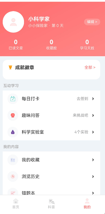
《奇妙科学乐园》的个人中心页 Profile.ets 是一个典型的"信息聚合+功能导航"页面。顶部渐变头部展示用户头像、昵称、学习天数和三项统计数据;成就徽章模块预览已解锁成就的前3枚徽章;下方按分组(互动学习/我的内容/设置)排列菜单列表。页面虽然不像答题页那样有复杂的交互状态机,但在布局设计、组件复用和数据流转方面有不少值得深入拆解的技术点——特别是"成就徽章模块 margin 遮挡"和"菜单箭头从 Text 改为 SVG 图标"两个真实踩坑经验。
本文将完整拆解 Profile.ets 的实现,从渐变头部布局到成就预览算法,从菜单列表分组到打卡弹窗联动,逐一解析每个模块的技术细节和优化决策。
🎯 学习目标
完成本文后,你将能够:
- ✅ 掌握渐变头部布局的实现:
linearGradient+ 头像圆形裁剪 + 统计栏三列均分 - ✅ 实现成就徽章预览模块:从
AchievementManager取前3个已解锁 + "更多等你"占位 - ✅ 设计分组菜单列表:
section字段分组 +getSectionItems()过滤 +MenuSectionBuilder - ✅ 复用
ListItemComponent基础组件构建一致的菜单行 - ✅ 理解
CustomDialogController与打卡弹窗CheckInDialog的联动机制 - ✅ 掌握
margin({top:-16})导致组件被遮挡的问题和解决方案 - ✅ 了解菜单箭头从
Text('>')改为 SVG 图标的优化原因
💡 需求分析
功能模块设计
| 模块 | 功能描述 | 技术要点 |
|---|---|---|
| 渐变头部 | 用户头像、昵称、学习天数、编辑按钮、三项统计 | linearGradient渐变、Row三列均分、layoutWeight |
| 成就徽章预览 | 前3枚已解锁徽章 + "更多等你"占位,点击进入成就页 | achievementManager.getAllAchievements、filter+slice |
| 互动学习菜单 | 每日打卡/趣味问答/科学实验室 | action回调/pageUrl路由跳转 |
| 我的内容菜单 | 我的收藏/浏览历史/错题本 | RouterUtil.pushUrl导航 |
| 设置菜单 | 应用设置/家长控制/主题设置/帮助反馈 | 菜单分组渲染 |
| 打卡弹窗联动 | 点击"每日打卡"菜单弹出CheckInDialog | CustomDialogController |
页面结构分析
Profile 页面结构
  │
  ├─ 渐变头部(linearGradient: PRIMARY → PRIMARY_LIGHT)
  │    ├─ 用户信息行
  │    │    ├─ 头像(圆形 72x72,白色边框3px)
  │    │    ├─ 昵称 + "小小探险家 · 第X天"
  │    │    └─ "编辑 >" 按钮
  │    └─ 统计栏
  │         ├─ 已读文章数
  │         ├─ 收藏数
  │         └─ 学习天数
  │
  ├─ Scroll 可滚动区域
  │    ├─ 成就徽章卡片
  │    │    ├─ 标题行:"成就徽章" + "全部 >"
  │    │    └─ 徽章Row:前3枚已解锁 + "更多等你"
  │    │
  │    ├─ 互动学习分组
  │    │    ├─ 每日打卡 → action(打开CheckInDialog)
  │    │    ├─ 趣味问答 → pageUrl(跳转Quiz页)
  │    │    └─ 科学实验室 → pageUrl(跳转Lab页)
  │    │
  │    ├─ 我的内容分组
  │    │    ├─ 我的收藏 → pageUrl
  │    │    ├─ 浏览历史 → pageUrl
  │    │    └─ 错题本 → pageUrl
  │    │
  │    ├─ 成长体系分组(空数据占位)
  │    │
  │    ├─ 设置分组
  │    │    ├─ 应用设置 → pageUrl
  │    │    ├─ 家长控制 → pageUrl
  │    │    ├─ 主题设置 → 右侧显示"跟随系统"
  │    │    └─ 帮助与反馈 → pageUrl
  │    │
  │    └─ 版本号:"奇妙科学乐园 v1.0.0"
  │
  └─ 底部留白(margin bottom 76,为底部TabBar预留空间)
数据流设计
Profile.aboutToAppear()
    ↓ userPrefs.getUserNameSync()      → userName
    ↓ userPrefs.getReadCount()         → readCount
    ↓ userPrefs.getFavoriteCount()     → favoriteCount
    ↓ userPrefs.getLearnDaysSync()     → daysCount
    ↓ achievementManager.getAllAchievements()
    ↓ filter(a => a.unlocked).slice(0, 3) → previewAchievements
页面渲染完成
    ↓ 用户点击"每日打卡"
showCheckInDialog()
    ↓ checkInDialogController.open()
CheckInDialog 弹出
    ↓ 用户点击"立即打卡"
CheckInDialog.onCheckIn()
    ↓ userPrefs.checkInAndUpdateDays()
    ↓ controller.close()
打卡完成
🛠️ 核心实现
步骤1: 接口定义与组件状态声明
功能说明
个人中心页定义了两个接口:MenuItem(菜单项数据结构)和 AchievementItem(成就预览数据结构)。组件状态包括用户名、已读数、收藏数、学习天数和成就预览列表。打卡弹窗通过 CustomDialogController 管理。
完整代码
// 文件路径:entry/src/main/ets/pages/Profile.ets

import { ListItemComponent } from '../components/base/ListItem';
import { RouteUrls } from '../constants/RouteUrls';
import { ThemeColors } from '../constants/AppConstants';
import { RouterUtil, RouterOptions, RouterParams } from '../utils/RouterUtil';
import { userPrefs } from '../viewmodel/UserPreferences';
import { achievementManager } from '../viewmodel/AchievementManager';
import { Achievement } from '../model/Achievement';
import { CheckInDialog } from '../components/common/CheckInDialog';

// 菜单项数据结构
interface MenuItem {
  icon: ResourceStr;       // 图标资源
  label: string;           // 菜单标题
  value?: string;          // 右侧辅助文字(可选)
  pageUrl?: string;        // 跳转页面路径(可选)
  section: string;         // 所属分组
  action?: () => void;     // 自定义点击回调(可选,优先于pageUrl)
}

// 成就预览数据结构(简化版,仅用于展示)
interface AchievementItem {
  icon: ResourceStr;       // 徽章图标
  name: string;            // 成就名称
  unlocked: boolean;        // 是否已解锁
}

@Component
export struct Profile {
  @State userName: string = '小科学家';
  @State readCount: number = 0;
  @State favoriteCount: number = 0;
  @State daysCount: number = 0;
  @State previewAchievements: AchievementItem[] = [];

  // 打卡弹窗控制器
  private checkInDialogController: CustomDialogController = new CustomDialogController({
    builder: CheckInDialog(),
    alignment: DialogAlignment.Center,
    customStyle: true,
    autoCancel: true
  });
代码解析
1. MenuItem 接口的双路径设计
interface MenuItem {
  pageUrl?: string;      // 路径1:跳转到指定页面
  action?: () => void;    // 路径2:执行自定义回调
  section: string;        // 分组标识:用于getSectionItems过滤
}
原理/说明:
pageUrl和action是互斥的两种点击行为——action优先(因为打卡弹窗不需要路由跳转)section字段将菜单项按功能分组,getSectionItems('互动学习')只返回该组的菜单项value可选字段用于显示右侧辅助信息(如"去签到"、"4个实验"、"跟随系统")
2. AchievementItem 与 Achievement 的关系
// AchievementItem(Profile页面专用,简化版)
interface AchievementItem {
  icon: ResourceStr;      // Resource类型,直接用于Image
  name: string;
  unlocked: boolean;
}

// Achievement(全局完整模型)
export interface Achievement {
  id: string;
  name: string;
  description: string;
  icon: string;
  badgeImage: Resource;
  category: 'learning' | 'quiz' | 'explore' | 'social';
  rarity: 'common' | 'rare' | 'epic' | 'legendary';
  unlocked: boolean;
  progress: number;
  total: number;
  unlockedAt?: number;
  colorStart: string;
  colorEnd: string;
}
原理/说明:
AchievementItem是Achievement的子集,仅包含Profile预览所需的三个字段- 从完整的
Achievement对象映射到简化的AchievementItem,减少不必要的数据传递 - 这种"视图模型(ViewModel)简化"模式在列表预览场景中很常见
步骤2: 数据初始化与成就预览加载
功能说明
aboutToAppear 中从 UserPreferences 同步读取用户统计数据,从 AchievementManager 加载已解锁成就并取前3个作为预览。如果已解锁成就超过3个,追加一个"更多等你"占位项。
完整代码
  aboutToAppear() {
    // 同步读取用户数据(UserPreferences内部有缓存,无需异步)
    this.userName = userPrefs.getUserNameSync();
    this.readCount = userPrefs.getReadCount();
    this.favoriteCount = userPrefs.getFavoriteCount();
    this.daysCount = userPrefs.getLearnDaysSync();
    // 加载成就预览
    this.loadPreviewAchievements();
  }

  /**
   * 加载成就徽章预览数据
   * 取前3个已解锁成就 + 1个"更多等你"占位
   */
  loadPreviewAchievements(): void {
    const all = achievementManager.getAllAchievements();
    // 过滤出已解锁的成就
    const unlocked = all.filter(a => a.unlocked);
    // 取前3个,映射为简化的AchievementItem
    const preview = unlocked.slice(0, 3).map(a => ({
      icon: a.badgeImage,    // 使用badgeImage(Resource类型)
      name: a.name,
      unlocked: true
    } as AchievementItem));
    // 如果总成就数超过3个,追加"更多等你"占位
    if (all.length > 3) {
      preview.push({
        icon: $r('app.media.icon_lock'),
        name: '更多等你',
        unlocked: false
      });
    }
    this.previewAchievements = preview;
  }
代码解析
1. Sync方法的选择依据
// ✅ 正确:Profile页面初始化使用Sync方法
this.userName = userPrefs.getUserNameSync();
this.readCount = userPrefs.getReadCount();

// ❌ 错误:在aboutToAppear中不必要地使用异步方法
async aboutToAppear() {
  this.userName = await userPrefs.getUserName();
  // 异步方法在aboutToAppear中可能返回undefined(数据尚未加载)
}
原理/说明:
UserPreferences在EntryAbility.onCreate中通过init()预加载了全部数据到内存缓存- 所有
Sync方法直接从缓存读取,无需异步等待 - 在
aboutToAppear中使用Sync方法确保首帧渲染时就有数据,避免"先白屏后闪现"
2. "更多等你"占位的设计考量
// 已解锁成就超过3个时才显示"更多等你"
if (all.length > 3) {
  preview.push({
    icon: $r('app.media.icon_lock'),   // 锁定图标
    name: '更多等你',
    unlocked: false                      // 控制透明度
  });
}
原理/说明:
- 判断条件是
all.length > 3(总成就数),而非unlocked.length > 3(已解锁数) - 这确保了即使当前只解锁了1个成就,只要系统中还有更多成就可解锁,就会显示"更多等你"
unlocked: false控制该占位项的样式——透明度降低到0.5,视觉上与已解锁成就形成对比
步骤3: 菜单数据定义与分组逻辑
功能说明
菜单项通过 menuItems 数组定义,每个菜单项包含 icon、label、value、pageUrl、section、action 六个字段。getSectionItems() 方法按 section 字段过滤菜单项,handleMenuClick() 统一处理点击事件。
完整代码
  // 菜单数据定义(按section分组)
  private menuItems: MenuItem[] = [
    // 互动学习分组
    { icon: $r('app.media.icon_checkin'), label: '每日打卡', value: '去签到',
      section: '互动学习', action: () => this.showCheckInDialog() },
    { icon: $r('app.media.icon_quiz'), label: '趣味问答', value: '来挑战吧',
      pageUrl: 'pages/Quiz', section: '互动学习' },
    { icon: $r('app.media.icon_lab'), label: '科学实验室', value: '4个实验',
      pageUrl: 'pages/Lab', section: '互动学习' },
    // 我的内容分组
    { icon: $r('app.media.icon_favorite'), label: '我的收藏', value: '',
      pageUrl: 'pages/Favorites', section: '我的内容' },
    { icon: $r('app.media.icon_history'), label: '浏览历史', value: '',
      pageUrl: 'pages/History', section: '我的内容' },
    { icon: $r('app.media.icon_wrong'), label: '错题本', value: '',
      pageUrl: 'pages/WrongQuiz', section: '我的内容' },
    // 设置分组
    { icon: $r('app.media.icon_settings'), label: '应用设置', value: '',
      pageUrl: 'pages/Settings', section: '设置' },
    { icon: $r('app.media.icon_parent'), label: '家长控制', value: '',
      pageUrl: 'pages/ParentControl', section: '设置' },
    { icon: $r('app.media.icon_theme'), label: '主题设置', value: '跟随系统',
      section: '设置' },
    { icon: $r('app.media.icon_help'), label: '帮助与反馈', value: '',
      section: '设置' }
  ] as Array<MenuItem>;

  /**
   * 按分组名称过滤菜单项
   * @param section - 分组名称
   * @returns 该分组的菜单项数组
   */
  getSectionItems(section: string): MenuItem[] {
    return this.menuItems.filter(item => item.section === section);
  }

  /**
   * 统一处理菜单点击事件
   * @param item - 被点击的菜单项
   */
  handleMenuClick(item: MenuItem): void {
    // 优先执行自定义回调(如打卡弹窗)
    if (item.action) {
      item.action();
      return;
    }
    // 其次执行路由跳转
    if (item.pageUrl) {
      const options: RouterOptions = { url: item.pageUrl };
      RouterUtil.pushUrl(options, 'Profile');
    }
  }
代码解析
1. action 优先于 pageUrl 的设计
// ✅ 正确:action优先判断
handleMenuClick(item: MenuItem): void {
  if (item.action) {
    item.action();    // 打卡弹窗等自定义行为
    return;           // 不再执行路由跳转
  }
  if (item.pageUrl) {
    RouterUtil.pushUrl({ url: item.pageUrl }, 'Profile');
  }
}

// ❌ 错误:不判断优先级,同时执行两种行为
handleMenuClick(item: MenuItem): void {
  if (item.action) item.action();
  if (item.pageUrl) RouterUtil.pushUrl({ url: item.pageUrl }, 'Profile');
  // 打卡时会同时打开弹窗和跳转页面!
}
原理/说明:
action和pageUrl代表两种不同的交互模式:弹窗交互 vs 页面跳转- "每日打卡"使用
action(因为打卡是弹窗操作,不需要路由跳转) - "趣味问答"等使用
pageUrl(因为需要跳转到独立页面) action优先 +return确保两者互斥执行
2. "成长体系"空数据占位
// 在build()中调用了"成长体系"分组,但menuItems中没有该section的菜单项
this.MenuSectionBuilder('成长体系', this.getSectionItems('成长体系'));
// getSectionItems('成长体系') 返回空数组 → 渲染空的Column
原理/说明:
- 预留"成长体系"分组,为后续功能扩展做准备
- 空数据时
ForEach不渲染任何项,但分组标题和白色背景卡片仍然显示 - 这种"预留分组"设计避免了未来新增功能时需要修改
build()方法
步骤4: 渐变头部与统计栏布局
功能说明
页面顶部是一个渐变背景的头部区域,包含用户信息行和统计栏。用户信息行左侧是圆形头像,中间是昵称和学习天数,右侧是编辑按钮。统计栏三列均分展示"已读文章"、"收藏数"、"学习天数"。
完整代码
  build() {
    Column() {
      // ===== 渐变头部 =====
      Column() {
        // 用户信息行
        Row() {
          // 圆形头像容器
          Column() {
            Image($r('app.media.icon_profile'))
              .width(36)
              .height(36)
              .objectFit(ImageFit.Contain);
          }
          .width(72)
          .height(72)
          .borderRadius(36)
          .backgroundColor(ThemeColors.BG_PRIMARY)
          .justifyContent(FlexAlign.Center)
          .border({ width: 3, color: 'rgba(255, 255, 255, 0.5)' })
          .margin({ right: 14 });

          // 昵称 + 学习天数
          Column() {
            Text(this.userName)
              .fontSize(18)
              .fontWeight(FontWeight.Bold)
              .fontColor(ThemeColors.TEXT_WHITE)
              .margin({ bottom: 4 });
            Text('小小探险家 · 第 ' + this.daysCount + ' 天')
              .fontSize(13)
              .fontColor('rgba(255, 255, 255, 0.8)');
          }
          .alignItems(HorizontalAlign.Start)
          .layoutWeight(1);

          // 编辑按钮(半透明白色背景)
          Text('编辑 >')
            .fontSize(12)
            .fontColor(ThemeColors.TEXT_WHITE)
            .backgroundColor('rgba(255, 255, 255, 0.2)')
            .padding({ left: 10, right: 10, top: 4, bottom: 4 })
            .borderRadius(9999);
        }
        .width('100%')
        .padding({ top: 32, left: 16, right: 16, bottom: 20 });

        // 统计栏(三列均分)
        Row() {
          Column() {
            Text(this.readCount.toString())
              .fontSize(20)
              .fontWeight(FontWeight.Bold)
              .fontColor(ThemeColors.TEXT_WHITE)
              .margin({ bottom: 2 });
            Text('已读文章')
              .fontSize(12)
              .fontColor('rgba(255, 255, 255, 0.8)');
          }
          .layoutWeight(1)
          .alignItems(HorizontalAlign.Center);

          Column() {
            Text(this.favoriteCount.toString())
              .fontSize(20)
              .fontWeight(FontWeight.Bold)
              .fontColor(ThemeColors.TEXT_WHITE)
              .margin({ bottom: 2 });
            Text('收藏数')
              .fontSize(12)
              .fontColor('rgba(255, 255, 255, 0.8)');
          }
          .layoutWeight(1)
          .alignItems(HorizontalAlign.Center);

          Column() {
            Text(this.daysCount.toString())
              .fontSize(20)
              .fontWeight(FontWeight.Bold)
              .fontColor(ThemeColors.TEXT_WHITE)
              .margin({ bottom: 2 });
            Text('学习天数')
              .fontSize(12)
              .fontColor('rgba(255, 255, 255, 0.8)');
          }
          .layoutWeight(1)
          .alignItems(HorizontalAlign.Center);
        }
        .width('100%')
        .padding({ bottom: 20 });
      }
      .width('100%')
      .linearGradient({
        direction: GradientDirection.RightBottom,
        colors: [[ThemeColors.PRIMARY, 0], [ThemeColors.PRIMARY_LIGHT, 1]]
      });
代码解析
1. linearGradient 渐变方向的选择
// ✅ 正确:使用GradientDirection枚举
.linearGradient({
  direction: GradientDirection.RightBottom,  // 从左上到右下
  colors: [[ThemeColors.PRIMARY, 0], [ThemeColors.PRIMARY_LIGHT, 1]]
});

// ❌ 错误:使用旧的angle属性(API deprecated)
.linearGradient({
  angle: 135,   // 旧版API,部分模拟器不兼容
  colors: [[ThemeColors.PRIMARY, 0], [ThemeColors.PRIMARY_LIGHT, 1]]
});
原理/说明:
GradientDirection.RightBottom表示渐变从左上角到右下角,视觉上自然柔和colors数组的第二个元素是[[color, offset], ...]格式,offset 范围 0~1- 头部渐变使用主题色 PRIMARY 到 PRIMARY_LIGHT,与全局视觉风格统一
2. 头像圆形裁剪的 borderRadius 技巧
// ✅ 正确:borderRadius 为宽高的一半实现完美圆形
Column()
  .width(72)
  .height(72)
  .borderRadius(36)  // 72 / 2 = 36
  .border({ width: 3, color: 'rgba(255, 255, 255, 0.5)' })
原理/说明:
borderRadius设置为容器宽高的一半(72/2=36)实现完美圆形- 白色半透明边框
rgba(255, 255, 255, 0.5)在渐变背景上形成柔和的分隔效果 - 头像图标使用
icon_profile,36x36 尺寸在72x72容器中居中显示
步骤5: 成就徽章预览模块
功能说明
成就徽章模块是一个白色圆角卡片,标题行包含"成就徽章"标题和"全部 >"链接,下方横向排列前3枚已解锁徽章图标和名称。如果成就总数超过3个,末尾追加一个锁定图标占位。
完整代码
      Scroll() {
        Column() {
          // ===== 成就徽章预览卡片 =====
          Column() {
            // 标题行
            Row() {
              Row({ space: 6 }) {
                Image($r('app.media.icon_trophy'))
                  .width(20)
                  .height(20)
                  .objectFit(ImageFit.Contain);
                Text('成就徽章')
                  .fontSize(16)
                  .fontWeight(FontWeight.Bold)
                  .fontColor(ThemeColors.TEXT_PRIMARY);
              }
              .layoutWeight(1);
              Text('全部 >')
                .fontSize(13)
                .fontColor(ThemeColors.PRIMARY)
                .onClick(() => {
                  this.goToAchievement();
                });
            }
            .width('100%')
            .margin({ bottom: 14 });

            // 徽章横向排列
            Row() {
              ForEach(this.previewAchievements, (item: AchievementItem) => {
                Column() {
                  // 徽章图标容器
                  Column() {
                    Image(item.icon)
                      .width(28)
                      .height(28)
                      .objectFit(ImageFit.Contain);
                  }
                  .width(48)
                  .height(48)
                  .borderRadius(24)
                  .backgroundColor(item.unlocked ? '#fff3e0' : ThemeColors.BG_TERTIARY)
                  .justifyContent(FlexAlign.Center)
                  .margin({ bottom: 6 })
                  .opacity(item.unlocked ? 1 : 0.5);  // 未解锁降低透明度
                  // 成就名称
                  Text(item.name)
                    .fontSize(10)
                    .fontColor(ThemeColors.TEXT_SECONDARY);
                }
                .layoutWeight(1)
                .alignItems(HorizontalAlign.Center);
              }, (item: AchievementItem) => item.name);
            }
            .width('100%');
          }
          .width('100%')
          .padding(16)
          .backgroundColor(ThemeColors.BG_PRIMARY)
          .borderRadius(16)
          .margin({ top: 12, bottom: 14 });  // ✅ 正确:使用正值top margin

          // 菜单分组渲染
          this.MenuSectionBuilder('互动学习', this.getSectionItems('互动学习'));
          this.MenuSectionBuilder('我的内容', this.getSectionItems('我的内容'));
          this.MenuSectionBuilder('成长体系', this.getSectionItems('成长体系'));
          this.MenuSectionBuilder('设置', this.getSectionItems('设置'));

          // 版本号
          Text('奇妙科学乐园 v1.0.0')
            .fontSize(12)
            .fontColor(ThemeColors.TEXT_HINT)
            .margin({ top: 16, bottom: 76 });
        }
        .width('100%')
        .padding({ left: 16, right: 16 });
      }
      .width('100%')
      .layoutWeight(1)
      .scrollBar(BarState.Off)
      .backgroundColor(ThemeColors.BG_SECONDARY);
代码解析
1. 徽章容器的圆形裁剪与背景色
// 已解锁:橙色浅底 + 完全不透明
.backgroundColor(item.unlocked ? '#fff3e0' : ThemeColors.BG_TERTIARY)
.opacity(item.unlocked ? 1 : 0.5);
原理/说明:
- 已解锁徽章使用
#fff3e0(暖橙色浅底),与成就系统的"奖赏感"一致 - 未解锁徽章("更多等你"占位)使用灰色底 + 0.5 透明度,视觉上弱化
borderRadius: 24(48/2=24)实现完美的圆形徽章容器- 这种"有/无"的视觉对比让用户一眼看出哪些成就已获得、哪些还在路上
步骤6: 菜单分组渲染 MenuSectionBuilder
功能说明
MenuSectionBuilder 是一个 @Builder 方法,接收分组标题和菜单项数组,渲染分组标题 + 白色圆角卡片内的菜单列表。每个菜单项复用 ListItemComponent 基础组件,自动处理图标、标题、右侧文字、箭头和点击事件。
完整代码
  @Builder
  MenuSectionBuilder(title: string, items: MenuItem[]) {
    Column() {
      // 分组标题
      Text(title)
        .fontSize(13)
        .fontColor(ThemeColors.TEXT_TERTIARY)
        .width('100%')
        .margin({ left: 4, bottom: 8 });

      // 菜单列表容器
      Column() {
        ForEach(items, (item: MenuItem, index: number) => {
          ListItemComponent({
            itemIcon: item.icon,
            itemTitle: item.label,
            itemRightText: item.value,
            itemBorderBottom: index < items.length - 1,  // 最后一项无底部分割线
            onItemClick: () => {
              this.handleMenuClick(item);  // 统一处理点击
            }
          })
        }, (item: MenuItem) => item.label);
      }
      .width('100%')
      .backgroundColor(ThemeColors.BG_PRIMARY)
      .borderRadius(16)
      .margin({ bottom: 14 });
    }
  }

  /**
   * 显示每日打卡弹窗
   */
  showCheckInDialog(): void {
    this.checkInDialogController.open();
  }

  /**
   * 跳转到成就页面
   */
  goToAchievement(): void {
    const options: RouterOptions = { url: RouteUrls.ACHIEVEMENT };
    RouterUtil.pushUrl(options, 'Profile');
  }
代码解析
1. ListItemComponent 的复用与配置
// ✅ 正确:通过props配置 ListItemComponent 的外观和行为
ListItemComponent({
  itemIcon: item.icon,          // 左侧图标
  itemTitle: item.label,        // 菜单标题
  itemRightText: item.value,    // 右侧文字(可选)
  itemBorderBottom: index < items.length - 1,  // 分割线控制
  onItemClick: () => {
    this.handleMenuClick(item);  // 点击回调
  }
})
原理/说明:
ListItemComponent是项目的基础组件(详见第49篇文章),封装了图标圆角背景、标题文字、右侧辅助文字、右侧箭头图标itemBorderBottom控制菜单项之间的分割线——最后一项不需要底部分割线handleMenuClick统一处理所有菜单项的点击逻辑,避免在ForEach中直接写跳转代码
2. ListItemComponent 的箭头图标实现
// 文件路径:entry/src/main/ets/components/base/ListItem.ets

// ✅ 正确:使用SVG图标作为箭头
if (this.itemShowArrow) {
  Image($r('app.media.icon_arrow_right'))
    .width(16)
    .height(16)
    .fillColor(ThemeColors.TEXT_TERTIARY);  // 动态着色
}

// ❌ 错误:使用Text字符作为箭头(早期版本的做法)
Text('→')
  .fontSize(16)
  .fontColor(ThemeColors.TEXT_TERTIARY);  // 字体渲染不统一
原理/说明:
- 早期版本使用
Text('→')字符作为菜单箭头,但在不同设备上字体渲染不一致 - 改为
Image($r('app.media.icon_arrow_right'))SVG图标后,配合fillColor可以精确控制颜色 - SVG 矢量图标在任何分辨率下都清晰锐利,不会出现像素化
- 这是"组件一致性优化"的典型案例——所有图标统一使用 SVG 资源
⚠️ 常见问题与解决方案
问题1: 成就徽章模块 margin({top:-16}) 导致被遮挡
现象:
成就徽章卡片的 margin({top: -16}) 意图实现"向上嵌入渐变头部"的视觉效果,但实际渲染时卡片上半部分被渐变头部遮挡,徽章图标不可见。
原因:
负 margin 让卡片向上偏移到渐变头部区域内,但渐变头部的 z-index 更高(后渲染的层级更高),导致成就卡片被完全覆盖。HarmonyOS ArkTS 中没有显式的 z-index 属性,层叠顺序由声明顺序决定。
错误代码:
// ❌ 错误:使用负margin实现嵌入效果,导致被遮挡
Column()
  .width('100%')
  .padding(16)
  .backgroundColor(ThemeColors.BG_PRIMARY)
  .borderRadius(16)
  .margin({ top: -16, bottom: 14 });  // -16 让卡片向上偏移
// 结果:卡片上半部分被渐变头部遮挡
正确代码:
// ✅ 正确:使用正值margin保持独立间距
Column()
  .width('100%')
  .padding(16)
  .backgroundColor(ThemeColors.BG_PRIMARY)
  .borderRadius(16)
  .margin({ top: 12, bottom: 14 });  // 正值12,与头部保持清晰间距
// 结果:卡片完整显示,不被遮挡
规则/建议:
- 在 ArkTS 中谨慎使用负 margin——层叠顺序不可控时容易导致遮挡问题
- 如果需要"嵌入"效果,考虑使用
Stack组件的层叠布局代替负 margin - 正值 margin(如
top: 12)更安全、更可预测,适合大多数场景
问题2: 菜单箭头从 Text('>') 改为 SVG 图标
现象:
早期版本使用 Text('>') 或 Text('→') 作为菜单箭头,但在不同设备上显示效果不一致——有的设备箭头偏大、有的偏小、有的颜色与预期不符。
原因:Text 组件渲染 Unicode 字符时依赖系统字体,不同设备的字体库对 > 和 → 的渲染样式不同。且 Text 组件的 fontColor 无法精确匹配设计稿中的箭头颜色。
错误代码:
// ❌ 错误:使用Text字符作为菜单箭头
// 在Profile.ets中直接内联箭头(早期版本)
Row() {
  // ... 菜单图标和标题 ...
  Text('>')
    .fontSize(16)
    .fontColor(ThemeColors.TEXT_TERTIARY);
}
正确代码:
// ✅ 正确:ListItemComponent中使用SVG图标
// 文件路径:entry/src/main/ets/components/base/ListItem.ets
if (this.itemShowArrow) {
  Image($r('app.media.icon_arrow_right'))
    .width(16)
    .height(16)
    .fillColor(ThemeColors.TEXT_TERTIARY);
}
规则/建议:
- UI 中的功能性图标(箭头、返回、关闭等)统一使用 SVG 资源,而非 Text 字符
- SVG 图标通过
fillColor动态着色,确保在任何主题下颜色一致 - SVG 矢量资源在任何分辨率下清晰锐利,不会出现像素化
- 如果项目中已有统一的
ListItemComponent,新页面应复用而非重新实现
问题3: ForEach key 重复导致渲染错乱
现象:
当菜单列表渲染后,点击某个菜单项时,其他菜单项的内容也跟着变化。
原因:ForEach 的 key 生成函数使用了 item.label,如果两个菜单项的 label 相同(虽然当前数据不会出现,但扩展时可能),会导致 key 重复,ArkTS 的 diff 算法错误复用组件。
错误代码:
// ❌ 有风险:仅用label作为key
ForEach(items, (item: MenuItem, index: number) => {
  ListItemComponent({ ... });
}, (item: MenuItem) => item.label);  // 如果label重复,key冲突
正确代码:
// ✅ 正确:使用section+label组合确保key唯一
ForEach(items, (item: MenuItem, index: number) => {
  ListItemComponent({ ... });
}, (item: MenuItem) => item.section + '-' + item.label);
// key 示例:互动学习-每日打卡、我的内容-我的收藏
原理/说明:
- 虽然
label在当前数据中不会重复,但使用section + '-' + label组合更加安全 - 如果未来有跨分组相同名称的菜单项,纯
labelkey 会导致渲染异常 - 防御性编程:为 ForEach 设计 key 时,始终考虑数据扩展的可能性
问题4: 空分组显示空白卡片
现象:
"成长体系"分组在当前版本没有菜单项,但仍然渲染了一个白色圆角卡片,视觉上显得多余。
原因:MenuSectionBuilder 不论 items 数组是否为空,都会渲染分组标题和白色背景容器。
错误代码:
// ❌ 不处理空数组,始终渲染分组UI
this.MenuSectionBuilder('成长体系', this.getSectionItems('成长体系'));
// 结果:显示一个空白的白色卡片
正确代码:
// ✅ 方案1:条件渲染,空分组不显示
const growthItems = this.getSectionItems('成长体系');
if (growthItems.length > 0) {
  this.MenuSectionBuilder('成长体系', growthItems);
}

// ✅ 方案2:如果确定是预留功能,保留空分组但隐藏背景卡片
// 在 MenuSectionBuilder 中判断 items 长度
@Builder
MenuSectionBuilder(title: string, items: MenuItem[]) {
  if (items.length === 0) return;  // 空分组不渲染
  Column() {
    // ... 正常渲染逻辑
  }
}
规则/建议:
- 预留分组可以保留(为未来扩展做准备),但空分组不应渲染可见的 UI 元素
- 条件渲染
if (items.length === 0) return是最简单的空数据处理方式 - 如果使用
LazyForEach,空数据不会触发渲染,天然避免了这个问题
问题5: CustomDialogController 在页面退出时未关闭
现象:
打开打卡弹窗后,直接通过底部 TabBar 切换到其他页面,弹窗仍然悬浮在页面上方。
原因:CustomDialogController 的生命周期不跟随 Profile 组件。当 Profile 页面因 Tab 切换而不可见时(但未被销毁),弹窗仍然保持显示状态。
错误代码:
// ❌ 错误:没有在页面不可见时关闭弹窗
// CheckInDialog 打开后,用户切换 Tab,弹窗不消失
正确代码:
// ✅ 正确:利用autoCancel属性 + 在onPageHide中关闭
// 方案1:autoCancel: true(点击遮罩自动关闭)
private checkInDialogController: CustomDialogController = new CustomDialogController({
  builder: CheckInDialog(),
  alignment: DialogAlignment.Center,
  customStyle: true,
  autoCancel: true  // 点击弹窗外区域自动关闭
});

// 方案2:在页面隐藏时主动关闭弹窗
onPageHide() {
  if (this.checkInDialogController) {
    this.checkInDialogController.close();
  }
}
规则/建议:
- 设置
autoCancel: true让用户可以通过点击遮罩区域关闭弹窗 - 如果弹窗需要在页面切换时自动关闭,在
onPageHide中调用controller.close() - 注意
Profile作为 Tab 页面不会被销毁(aboutToDisappear不会触发),应使用onPageHide代替
📝 本章小结
核心知识点
本文详细讲解了个人中心页 Profile.ets 的完整实现,主要包括:
1. 渐变头部布局设计
linearGradient实现渐变背景,GradientDirection.RightBottom从左上到右下borderRadius为宽高一半实现圆形头像- 三列统计栏使用
layoutWeight(1)均分宽度
2. 成就预览算法
filter(a => a.unlocked).slice(0, 3)取前3个已解锁成就- 追加"更多等你"占位项,使用
unlocked: false控制透明度 - 从完整
Achievement映射到简化AchievementItem,减少数据冗余
3. 分组菜单列表
section字段分组 +getSectionItems()过滤 +MenuSectionBuilder统一渲染action优先于pageUrl的双路径点击处理- 复用
ListItemComponent实现一致的菜单行样式
最佳实践总结
✅ 渐变头部布局
.linearGradient({
  direction: GradientDirection.RightBottom,
  colors: [[ThemeColors.PRIMARY, 0], [ThemeColors.PRIMARY_LIGHT, 1]]
});
✅ 成就预览数据加载
const unlocked = all.filter(a => a.unlocked);
const preview = unlocked.slice(0, 3).map(a => ({
  icon: a.badgeImage,
  name: a.name,
  unlocked: true
} as AchievementItem));
✅ 菜单点击统一处理
handleMenuClick(item: MenuItem): void {
  if (item.action) { item.action(); return; }
  if (item.pageUrl) { RouterUtil.pushUrl({ url: item.pageUrl }, 'Profile'); }
}
下一步预告
在下一篇文章中,我们将:
- 🎨 拆解成就详情页
Achievement.ets的完整实现 - 📚 讲解成就分类筛选、进度条展示、解锁动画
- 🏷️ 分析 AchievementManager 的进度管理与持久化策略
🔗 相关链接
- 项目源码: Atomgit仓库
💡 提示: 建议结合项目源码中的 Profile.ets、ListItem.ets、CheckInDialog.ets 三个文件对照阅读,理解个人中心页从数据加载到组件渲染到交互联动的完整链路。

讨论HarmonyOS开发技术,专注于API与组件、DevEco Studio、测试、元服务和应用上架分发等。
更多推荐


 0
0 0
0- 0


 已为社区贡献196条内容

所有评论(0)