HarmonyOS7 自定义轻提示样式:CustomToastSimulation
文章目录
前言
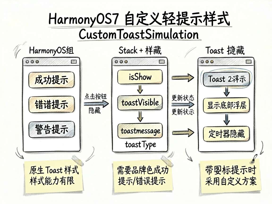
系统原生 Toast 很方便,但它的样式能力有限。如果你想做品牌色成功提示、错误提示、带图标提示,或者需要更贴近业务视觉体系的反馈样式,单靠原生 Toast 往往不够。这时就需要自己模拟一个“Toast 式浮层”。
这个案例的价值正在这里:它不是教你替代原生能力,而是教你在必要时用 Stack + 状态控制 + 定时隐藏 的方式,做出更自由的轻提示展示。
页面效果
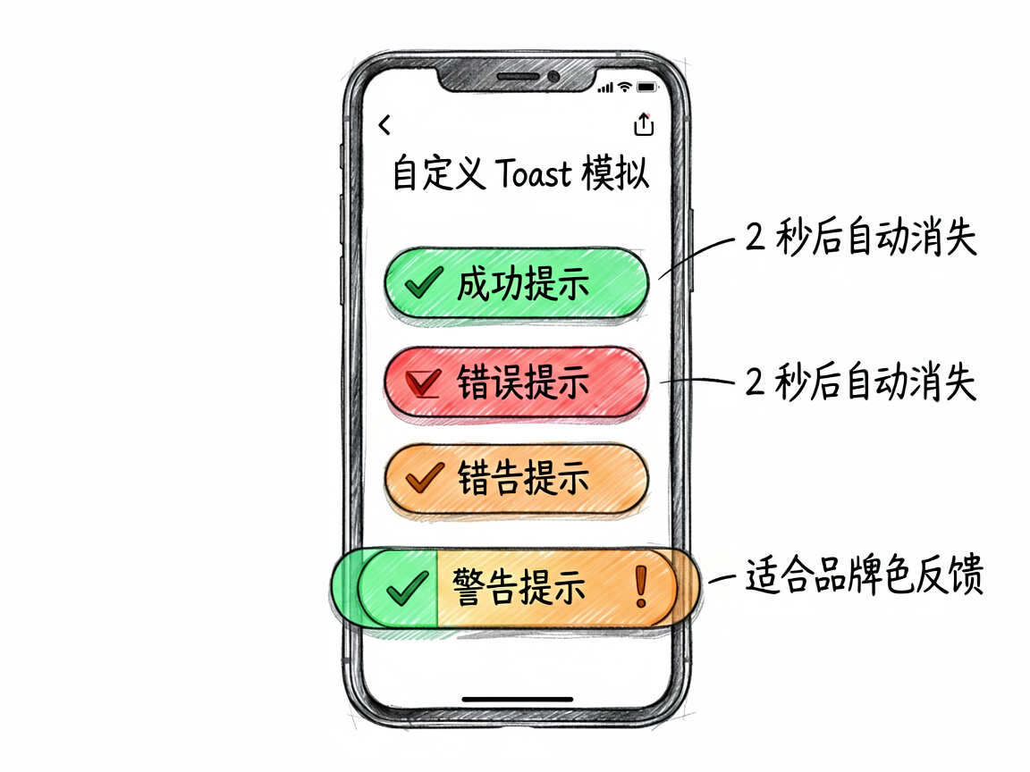
页面提供三种提示入口:
- 成功提示
- 错误提示
- 警告提示
点击按钮后,会在页面底部上方出现一条带颜色和图标区分的自定义提示条,2 秒后自动消失。
完整代码
import { DEMO_BG_COLOR, DEMO_CARD_COLOR } from './types'

@Entry
@Component
struct CustomToastSimulation {
  @State isShow: boolean = true
  @State toastVisible: boolean = false
  @State toastMessage: string = ''
  @State toastType: string = ''
  private timerId: number = 0

  build() {
    Stack() {
      Column() {
        if (this.isShow) {
          Column() {
            Text('自定义 Toast 模拟')
              .fontSize(16)
              .fontWeight(FontWeight.Bold)
              .margin({ bottom: 20 })

            Button('成功提示')
              .width('100%')
              .height(48)
              .backgroundColor('#6BCB77')
              .borderRadius(12)
              .fontColor('#FFFFFF')
              .fontSize(15)
              .margin({ bottom: 10 })
              .onClick(() => {
                this.showToast('success', '操作成功!')
              })

            Button('错误提示')
              .width('100%')
              .height(48)
              .backgroundColor('#FF6B6B')
              .borderRadius(12)
              .fontColor('#FFFFFF')
              .fontSize(15)
              .margin({ bottom: 10 })
              .onClick(() => {
                this.showToast('error', '操作失败,请重试')
              })

            Button('警告提示')
              .width('100%')
              .height(48)
              .backgroundColor('#FFA500')
              .borderRadius(12)
              .fontColor('#FFFFFF')
              .fontSize(15)
              .onClick(() => {
                this.showToast('warning', '请注意检查输入内容')
              })
          }
          .width('100%')
          .padding(24)
          .backgroundColor(DEMO_CARD_COLOR)
          .borderRadius(12)
        }

        if (this.toastVisible) {
          Row() {
            if (this.toastType === 'success') {
              Text('✓')
                .fontSize(16)
                .fontColor('#FFFFFF')
                .margin({ right: 8 })
            } else if (this.toastType === 'error') {
              Text('✗')
                .fontSize(16)
                .fontColor('#FFFFFF')
                .margin({ right: 8 })
            } else {
              Text('!')
                .fontSize(16)
                .fontColor('#FFFFFF')
                .margin({ right: 8 })
                .fontWeight(FontWeight.Bold)
            }

            Text(this.toastMessage)
              .fontSize(14)
              .fontColor('#FFFFFF')
          }
          .padding({ left: 20, right: 20, top: 12, bottom: 12 })
          .backgroundColor(this.toastType === 'success' ? '#6BCB77' :
            this.toastType === 'error' ? '#FF6B6B' : '#FFA500')
          .borderRadius(24)
          .shadow({ radius: 12, color: '#00000020' })
          .position({ bottom: 100 })
          .animation({ duration: 300, curve: Curve.EaseOut })
        }
      }
      .width('100%')
      .height('100%')
      .backgroundColor(DEMO_BG_COLOR)
      .padding(16)
    }
    .width('100%')
    .height('100%')
  }

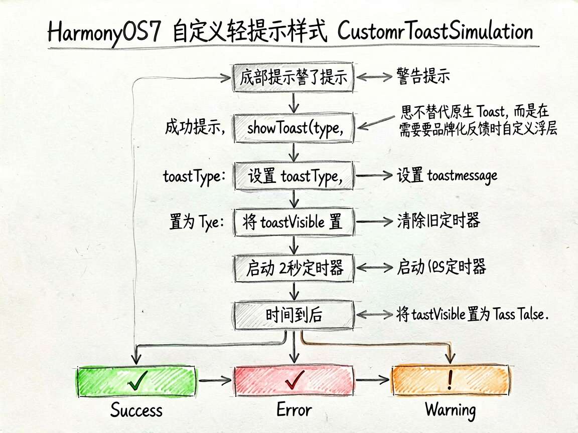
  showToast(type: string, message: string) {
    this.toastType = type
    this.toastMessage = message
    this.toastVisible = true

    if (this.timerId !== 0) {
      clearTimeout(this.timerId)
    }

    this.timerId = setTimeout(() => {
      this.toastVisible = false
      this.timerId = 0
    }, 2000) as number
  }
}
关键代码讲解
1. Stack 是实现浮层效果的基础
因为提示条需要悬浮在页面内容之上,所以根布局使用了 Stack。这让普通页面内容和提示层可以同时存在,互不覆盖结构层级。
如果不用 Stack,你很难自然地把这条提示“浮”在页面上方。
2. 用状态驱动显示与隐藏
核心状态有三个:
toastVisible:是否显示toastMessage:当前文案toastType:当前提示类型
这意味着每次调用 showToast(),都不是直接操作 UI,而是先改状态,再由声明式界面自动刷新。这样的写法更符合 ArkUI 的习惯,也更容易扩展。
3. setTimeout 用来模拟自动消失
原生 Toast 会自动消失,这里我们自己补上同样的机制:
this.timerId = setTimeout(() => {
  this.toastVisible = false
  this.timerId = 0
}, 2000) as number
同时在重新触发提示前,先调用 clearTimeout() 清理旧计时器。这一步很关键,否则用户连续点击不同按钮时,多个隐藏定时器可能互相打架,导致提示闪烁或提前消失。
4. 类型决定视觉风格
toastType 不只是一个字符串,它负责把业务状态映射到不同颜色和图标:
success对应绿色和勾号error对应红色和叉号warning对应橙色和感叹号
这种做法在业务项目里非常常见,因为用户能通过颜色和符号快速理解反馈性质。
什么时候该用这种方案
推荐在以下场景使用自定义轻提示:
- 需要品牌化视觉风格
- 需要区分成功、失败、警告等多种状态
- 需要更复杂的布局,比如图标、标题、副文案
- 原生 Toast 样式无法满足设计规范
但如果你只是做一条普通成功提示,优先还是用原生 Toast,因为成本更低,也更稳定。
总结
这个案例展示的是一种很实用的思路:当系统轻提示不够用时,如何自己搭一个轻量浮层反馈组件。掌握这个模式后,你可以继续延伸出可复用的全局消息条、顶部提示条,甚至统一的反馈组件体系。

讨论HarmonyOS开发技术,专注于API与组件、DevEco Studio、测试、元服务和应用上架分发等。
更多推荐


 5
5 0
0- 0


 已为社区贡献100条内容

所有评论(0)