HarmonyOS7 条件浮层提示:ConditionalPopupHints
·
前言
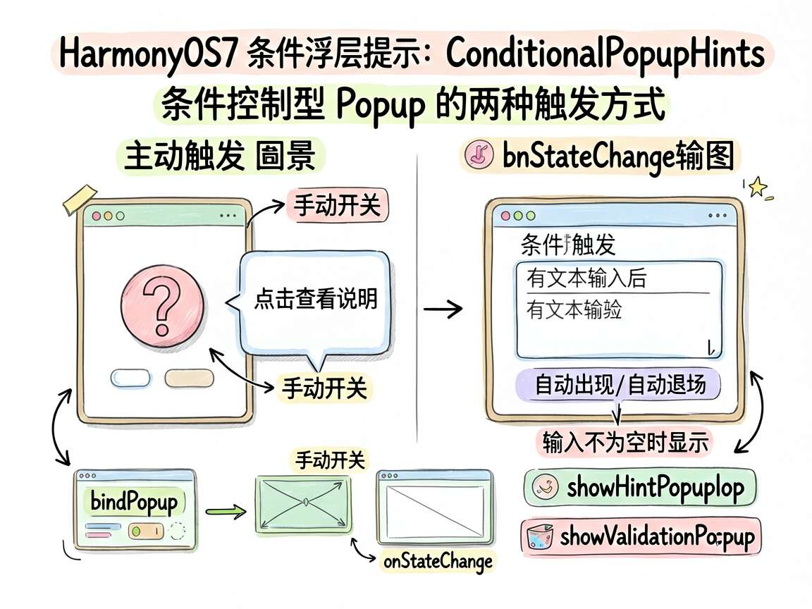
好的提示不是“永远都在”,而是该出现的时候出现,不该出现的时候立刻退场。这正是条件控制型 Popup 的价值。它特别适合做输入提示、校验反馈、功能说明和上下文引导。
这个案例把两类常见需求放在一起:一类是点击问号查看说明,另一类是输入内容后自动出现校验提示。前者是主动触发,后者是条件触发,正好能把 Popup 的两种典型打开方式讲透。
页面目标
页面包含两个部分:
- 左侧问号按钮,用于主动查看使用说明
- 输入框,用于在输入不为空时自动显示验证提示
这种设计在表单页、设置页和复杂功能页里都很常见。
完整代码
import { DEMO_CARD_COLOR } from './types'

@Entry
@Component
struct ConditionalPopupHints {
  @State isShow: boolean = true
  @State showHintPopup: boolean = false
  @State inputValue: string = ''
  @State showValidationPopup: boolean = false

  build() {
    Column() {
      if (this.isShow) {
        Column() {
          Text('Popup 条件显示')
            .fontSize(16)
            .fontWeight(FontWeight.Bold)
            .margin({ bottom: 20 })

          Row() {
            Button('?')
              .width(36)
              .height(36)
              .backgroundColor('#E0E0E0')
              .borderRadius(18)
              .fontColor('#999999')
              .fontSize(16)
              .bindPopup(this.showHintPopup, {
                builder: this.hintPopupBuilder,
                placement: Placement.Right,
                enableArrow: true,
                onStateChange: (e) => {
                  if (!e.isVisible) {
                    this.showHintPopup = false
                  }
                }
              })
              .onClick(() => {
                this.showHintPopup = !this.showHintPopup
              })

            Text('  点击 ? 查看提示说明')
              .fontSize(14)
              .fontColor('#666666')
              .bindPopup(this.showHintPopup, {
                builder: this.hintPopupBuilder,
                placement: Placement.Right,
                enableArrow: true,
                onStateChange: (e) => {
                  if (!e.isVisible) {
                    this.showHintPopup = false
                  }
                }
              })
          }
          .width('100%')
          .margin({ bottom: 20 })

          TextInput({ placeholder: '输入不为空时显示 Popup' })
            .width('100%')
            .height(42)
            .onChange((value: string) => {
              this.inputValue = value
              this.showValidationPopup = value.length > 0
            })
            .bindPopup(this.showValidationPopup, {
              builder: this.validationPopupBuilder,
              placement: Placement.Bottom,
              enableArrow: true,
              onStateChange: (e) => {
                if (!e.isVisible) {
                  this.showValidationPopup = false
                }
              }
            })

          Text('当前输入:' + this.inputValue)
            .fontSize(13)
            .fontColor('#999999')
            .margin({ top: 12 })
        }
        .width('100%')
        .padding(24)
        .backgroundColor(DEMO_CARD_COLOR)
        .borderRadius(12)
      }
    }
    .width('100%')
    .height('100%')
    .backgroundColor('#F5F6FA')
    .padding(16)
  }

  @Builder
  hintPopupBuilder() {
    Column() {
      Text('使用说明')
        .fontSize(14)
        .fontWeight(FontWeight.Bold)
        .margin({ bottom: 8 })
      Text('在输入框中输入任意内容,下方即会显示验证提示 Popup。')
        .fontSize(12)
        .fontColor('#666666')
    }
    .width(200)
    .padding(12)
    .backgroundColor('#FFFFFF')
    .borderRadius(8)
    .shadow({ radius: 8, color: '#00000010' })
  }

  @Builder
  validationPopupBuilder() {
    Row() {
      Text('✓')
        .fontSize(14)
        .fontColor('#6BCB77')
        .fontWeight(FontWeight.Bold)
      Text(' 输入有效')
        .fontSize(13)
        .fontColor('#6BCB77')
    }
    .padding({ left: 12, right: 12, top: 8, bottom: 8 })
    .backgroundColor('#F0FFF0')
    .borderRadius(8)
  }
}
关键代码讲解
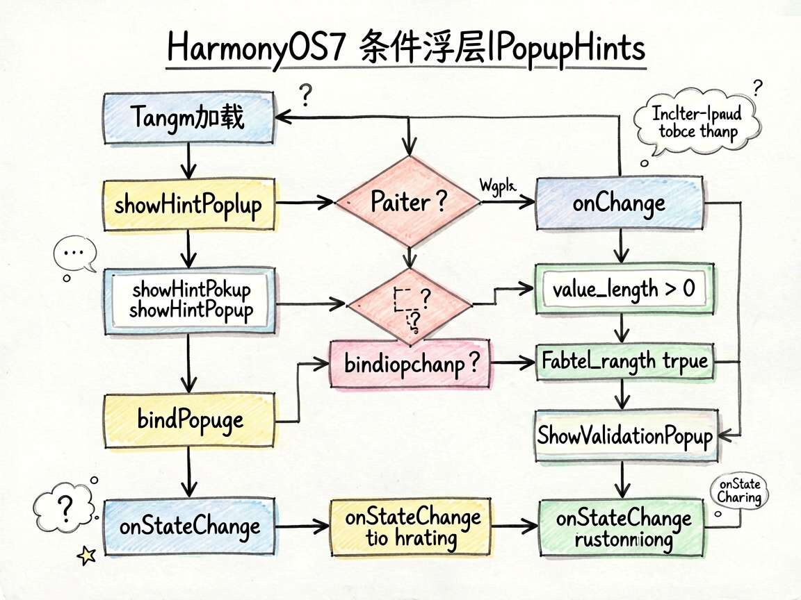
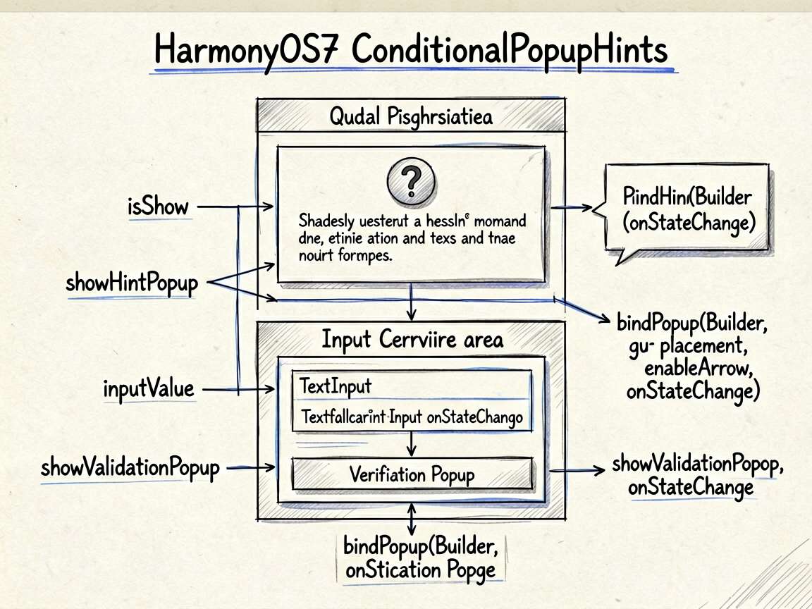
1. 主动触发和条件触发可以并存
页面中第一类 Popup 是按钮点击触发:
this.showHintPopup = !this.showHintPopup
第二类 Popup 则由输入变化决定:
this.showValidationPopup = value.length > 0
这说明 Popup 的显示条件并不局限于点击动作。任何可计算状态,只要能映射成布尔值,都可以拿来控制浮层开关。
2. 表单提示特别适合用条件 Popup
输入不为空就提示“输入有效”,这是一个很典型的表单即时反馈场景。它的好处在于:
- 提示离输入框很近
- 不需要打断用户
- 状态变化可以实时响应
比起单独在页面里塞一段说明文字,这种方式更轻,也更聚焦。
3. 说明型 Popup 适合承载上下文帮助
问号按钮这一部分也很常见。很多复杂设置项、配置项、权限说明,没必要一直把解释写在页面上。用一个小问号加 Popup,既能节省空间,也能在需要时立刻给出解释。
设计建议
如果你准备在项目里大量使用条件 Popup,建议注意几点:
- 提示内容要短,避免遮挡主要操作
- 出现条件要稳定,不要一闪一闪
- 表单型提示优先贴近输入框
- 说明型提示优先绑定帮助图标或标题文本
总结
这个案例把 Popup 从“点击后显示”进一步推进到了“根据状态动态显示”。真正重要的收获是:浮层不是单纯的视觉层,它可以成为状态反馈的一部分。当你把它用在说明、校验和引导场景里,会非常顺手。

讨论HarmonyOS开发技术,专注于API与组件、DevEco Studio、测试、元服务和应用上架分发等。
更多推荐


 7
7 0
0- 0


 已为社区贡献100条内容

所有评论(0)