HarmonyOS7 可交互浮层选择器:PopupInteractiveSelector
·
前言
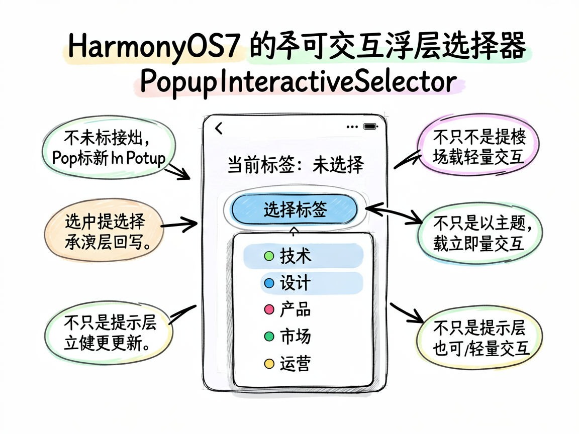
很多人刚接触 Popup 时,会默认把它理解成“只能看、不能点”的提示层。其实并不是。只要内容规模合适,Popup 完全可以承载简单交互,比如菜单选择、标签切换、快速筛选、局部操作等。
这个案例就展示了一个非常实用的形态:点击按钮后弹出标签菜单,用户在浮层内完成选择,结果立刻回写到主界面。
交互效果
页面会先显示“当前标签”,初始值为“未选择”。点击“选择标签”按钮后,底部弹出一个带颜色标识的标签列表。用户点选其中任意一项后:
- 主页面的标签文字立即更新
- Popup 自动关闭
这就是一个完整的“轻量交互浮层”闭环。
完整代码
import { DEMO_CARD_COLOR, DEMO_THEME_COLOR } from './types'

@Entry
@Component
struct PopupInteractiveSelector {
  @State isShow: boolean = true
  @State showMenuPopup: boolean = false
  @State selectedTag: string = '未选择'

  build() {
    Column() {
      if (this.isShow) {
        Column() {
          Text('Popup 交互')
            .fontSize(16)
            .fontWeight(FontWeight.Bold)
            .margin({ bottom: 16 })

          Row() {
            Text('当前标签:')
              .fontSize(14)
              .fontColor('#666666')
            Text(this.selectedTag)
              .fontSize(14)
              .fontColor(DEMO_THEME_COLOR)
              .fontWeight(FontWeight.Bold)
          }
          .margin({ bottom: 20 })

          Button('选择标签')
            .width('100%')
            .height(48)
            .backgroundColor('#4ECDC4')
            .borderRadius(12)
            .fontColor('#FFFFFF')
            .fontSize(16)
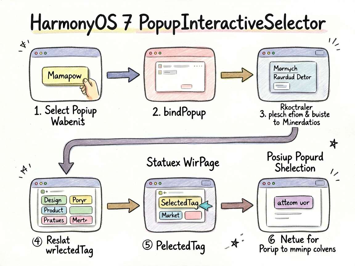
            .bindPopup(this.showMenuPopup, {
              builder: this.menuPopupBuilder,
              placement: Placement.Bottom,
              enableArrow: true,
              onStateChange: (e) => {
                if (!e.isVisible) {
                  this.showMenuPopup = false
                }
              }
            })
            .onClick(() => {
              this.showMenuPopup = !this.showMenuPopup
            })
        }
        .width('100%')
        .padding(24)
        .backgroundColor(DEMO_CARD_COLOR)
        .borderRadius(12)
      }
    }
    .width('100%')
    .height('100%')
    .backgroundColor('#F5F6FA')
    .padding(16)
  }

  @Builder
  menuPopupBuilder() {
    Column() {
      this.tagItem('技术', '#4D96FF')
      this.tagItem('设计', '#9B59B6')
      this.tagItem('产品', '#FF6B6B')
      this.tagItem('市场', '#6BCB77')
      this.tagItem('运营', '#FFA500')
    }
    .padding(8)
    .backgroundColor('#FFFFFF')
    .borderRadius(12)
    .shadow({ radius: 12, color: '#00000015' })
  }

  @Builder
  tagItem(label: string, color: string) {
    Row() {
      Row() {
        Circle({ width: 8, height: 8 }).fill(color)
        Text(label)
          .fontSize(14)
          .fontColor('#333333')
          .margin({ left: 8 })
      }
      Text('').layoutWeight(1)
    }
    .width('100%')
    .padding({ left: 12, right: 12, top: 10, bottom: 10 })
    .borderRadius(6)
    .onClick(() => {
      this.selectedTag = label
      this.showMenuPopup = false
    })
  }
}
关键代码讲解
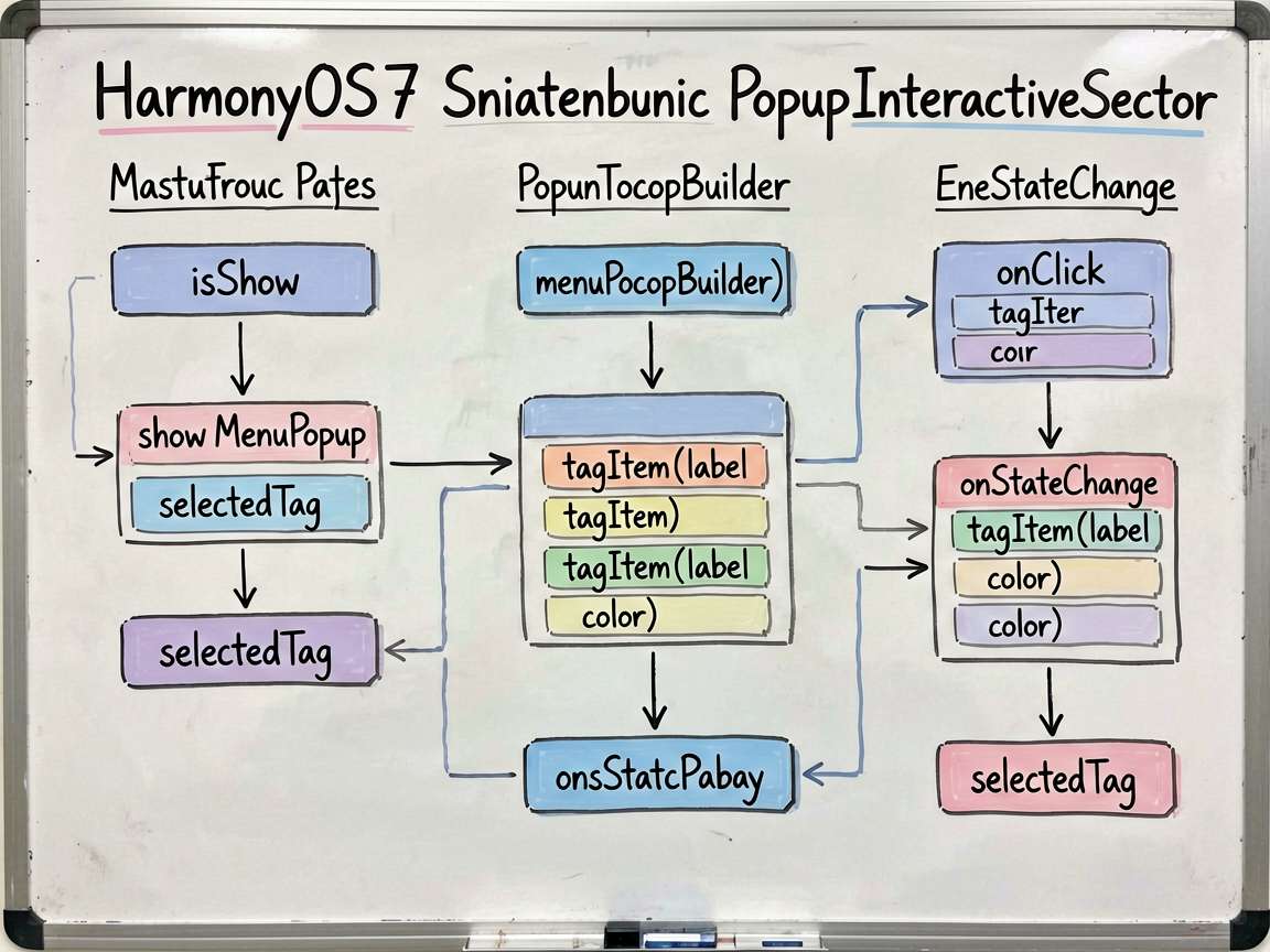
1. 结果状态回写到主页面
案例里最关键的状态是:
@State selectedTag: string = '未选择'
Popup 中的每一项被点击后,都会把标签写回这个状态:
this.selectedTag = label
this.showMenuPopup = false
这就让浮层不再只是展示层,而是变成了一个真正参与业务状态更新的交互部件。
2. tagItem() 把重复菜单项封装了起来
每个标签项结构几乎一致:
- 一个颜色圆点
- 一个标签名
- 一个点击事件
把它抽成 tagItem() 能让主 Builder 更清爽,也方便后续扩展选中态、悬停态或图标样式。
3. Popup 很适合这种“点完即走”的交互
为什么这个案例适合用 Popup,而不是 Dialog?因为它的交互非常短:
- 打开
- 选择
- 关闭
整个过程不需要额外确认,也不需要复杂表单。像这种轻量级选择器,用 Popup 会比弹窗更顺手,也更贴近组件上下文。
使用建议
Popup 交互适合以下类型任务:
- 标签选择
- 轻量筛选项切换
- 附近菜单操作
- 局部状态变更
如果交互过程需要多步确认、输入内容或复杂校验,就别继续使用 Popup,应切换到对话框或独立面板。
总结
这个案例很好地说明了:Popup 不只是展示说明,也可以承载简单而高频的局部交互。只要你控制好内容规模和操作链路,它会成为非常高效的一种界面组织方式。

讨论HarmonyOS开发技术,专注于API与组件、DevEco Studio、测试、元服务和应用上架分发等。
更多推荐


 7
7 0
0- 0


 已为社区贡献100条内容

所有评论(0)