HarmonyOS 沉浸光感系列终章:首眼光感、智感握姿联动与多设备全场景适配
HarmonyOS 沉浸光感系列终章:首眼光感、智感握姿联动与多设备全场景适配
前言
在前两篇文章中,我们分别讲解了沉浸光感的基础概念与双轨适配架构,以及标题栏、底部导航、MiniBar 和内容区组件的实战适配。然而,沉浸光感的真正价值在于全场景落地——从用户打开应用的第一眼印象(首眼沉浸光感),到菜单栏的精细光感适配,再到与智感握姿的智能联动,最终覆盖多设备形态的差异化体验。
本文作为沉浸光感系列的终章,将聚焦三大场景:应用首眼沉浸光感、自适应悬浮导航和智感握姿智能交互,并深入探讨多设备适配策略。
一、场景一:应用首眼沉浸光感
1.1 首眼光感的重要性
应用首眼是用户打开应用的第一印象,沉浸光感能让首眼效果焕然一新。基于 HDS 提供的 HdsNavigation 与 HdsTabs 组件,通过配置沉浸光感材质,即可打造精致的首眼视觉效果。
首眼沉浸光感根据档位分为三个级别:
| 首眼沉浸效果 | 材质等级 | 视觉特征 | 适用场景 |
|---|---|---|---|
| 强 | EXQUISITE | 完整光效,光影交织,纵深立体 | 旗舰设备,视觉优先 |
| 均衡 | GENTLE | 通透轻盈,光感克制 | 大多数设备,日常使用 |
| 弱 | SMOOTH | 高对比度,锐利清晰 | 低端设备,性能优先 |
1.2 列表标题栏适配光感
首眼场景中,列表页的标题栏适配是核心。通过 titleBar.style.systemMaterialEffect 启用材质,配合 scrollEffectOpts 配置滚动渐变模糊:
import {
  hdsMaterial,
  HdsNavigation,
  HdsNavigationMenuContentOptions,
  HdsNavigationTitleMode,
  HideMode,
  ScrollEffectType,
  TextStyleMode,
} from '@kit.UIDesignKit';
import { NavPathStack, Scroller } from '@kit.ArkUI';

@Entry
@ComponentV2
struct WaterFlowDetailPage {
  @Local pathStack: NavPathStack = new NavPathStack();
  @Local scroller: Scroller = new Scroller();
  @Local customMaterialLevel: hdsMaterial.MaterialLevel = hdsMaterial.MaterialLevel.ADAPTIVE;
  @Local isMenuVisible: boolean = false;

  build() {
    HdsNavigation(this.pathStack) {
      HdsNavDestination() {
        // 瀑布流内容区
        WaterFlow({ scroller: this.scroller }) {
          FlowItem() {
            this.buildFlowItem('首眼沉浸光感', '瀑布流内容项 1')
          }
          FlowItem() {
            this.buildFlowItem('渐变模糊标题栏', '瀑布流内容项 2')
          }
          FlowItem() {
            this.buildFlowItem('悬浮底部导航', '瀑布流内容项 3')
          }
          // ... 更多瀑布流项目
        }
        .columnsTemplate('1fr 1fr')
        .columnsGap(8)
        .rowsGap(8)
        .width('100%')
        .height('100%')
        .padding({ left: 16, right: 16 })
      }
      .hideBackButton(false)
      .titleMode(HdsNavigationTitleMode.MINI)
      .titleBar({
        style: {
          scrollEffectOpts: {
            enableScrollEffect: true,
            scrollEffectType: ScrollEffectType.GRADIENT_BLUR,
          },
          systemMaterialEffect: {
            materialType: hdsMaterial.MaterialType.ADAPTIVE,
            materialLevel: this.customMaterialLevel,
          },
        },
      })
      .dynamicHideTitleBar({
        hideTitleArea: true,
        hideStatusBar: true,
        mode: HideMode.SCROLL_UP_TO,
      })
      .bindToScrollable([this.scroller])
    }
  }

  @Builder
  buildFlowItem(title: string, subtitle: string) {
    Column() {
      // 图片占位
      Column()
        .width('100%')
        .height(120)
        .borderRadius(12)
        .backgroundColor('#E8E8ED')

      Text(title)
        .fontSize(16)
        .fontWeight(FontWeight.Medium)
        .fontColor('#333')
        .margin({ top: 8, left: 8, right: 8 })

      Text(subtitle)
        .fontSize(12)
        .fontColor('#999')
        .margin({ left: 8, right: 8, bottom: 8 })
    }
    .width('100%')
    .borderRadius(12)
    .backgroundColor('#FFF')
    .shadow({ radius: 4, color: 'rgba(0,0,0,0.06)', offsetY: 2 })
  }
}
1.3 首页底部导航适配
首页底部导航通过 HdsTabs 悬浮模式实现,配置 barFloatingStyle 属性自定义悬浮栏样式,适配多设备布局需求:
import {
  hdsMaterial,
  HdsTabs,
  HdsTabsController,
} from '@kit.UIDesignKit';
import { BottomTabBarStyle } from '@kit.ArkUI';

@Entry
@ComponentV2
struct HomePageWithImmersive {
  private controller: HdsTabsController = new HdsTabsController();
  @Local customMaterialLevel: hdsMaterial.MaterialLevel = hdsMaterial.MaterialLevel.ADAPTIVE;
  @Local naviIndicatorHeight: number = 0;

  aboutToAppear(): void {
    try {
      this.controller.preloadItems([0, 1, 2, 3, 4]);
    } catch (error) {
      console.error(`预加载失败: ${JSON.stringify(error)}`);
    }
  }

  /**
   * 计算底部导航间距
   * 有导航指示器时使用指示器高度,否则使用默认间距
   */
  private getBottomMargin(): number {
    return this.naviIndicatorHeight > 0
      ? this.naviIndicatorHeight
      : 32; // 默认间距
  }

  build() {
    HdsTabs({ controller: this.controller }) {
      TabContent() {
        HomeContent()
      }.tabBar(new BottomTabBarStyle($r('sys.media.ohos_app_icon'), '首页'))

      TabContent() {
        DiscoverContent()
      }.tabBar(new BottomTabBarStyle($r('sys.media.ohos_app_icon'), '发现'))

      TabContent() {
        MessageContent()
      }.tabBar(new BottomTabBarStyle($r('sys.media.ohos_app_icon'), '消息'))

      TabContent() {
        CartContent()
      }.tabBar(new BottomTabBarStyle($r('sys.media.ohos_app_icon'), '购物车'))

      TabContent() {
        ProfileContent()
      }.tabBar(new BottomTabBarStyle($r('sys.media.ohos_app_icon'), '我的'))
    }
    .scrollable(false)
    .barOverlap(true)
    .vertical(false)
    .barPosition(BarPosition.End)
    .barFloatingStyle({
      barBottomMargin: this.getBottomMargin(),
      adaptToHandedness: true,
      systemMaterialEffect: {
        materialType: hdsMaterial.MaterialType.ADAPTIVE,
        materialLevel: this.customMaterialLevel,
      },
    })
  }
}
1.4 菜单栏适配沉浸光感
菜单栏是用户高频交互的组件,适配沉浸光感后可呈现通透的玻璃质感,提升空间层次:
import { uiMaterial } from '@kit.ArkUI';

@Component
export struct ImmersiveMenuBar {
  @State private isMenuVisible: boolean = false;

  private readonly menuMaterial: uiMaterial.Material =
    new uiMaterial.ImmersiveMaterial({
      style: uiMaterial.ImmersiveStyle.ULTRA_THICK,
      interactive: true,
      lightEffect: { color: Color.White }
    });

  private readonly menuItemMaterial: uiMaterial.Material =
    new uiMaterial.ImmersiveMaterial({
      style: uiMaterial.ImmersiveStyle.THIN,
      interactive: true,
      lightEffect: { color: Color.White }
    });

  @Builder
  buildMenuItem(icon: Resource, label: string, onClick: () => void) {
    Row() {
      SymbolGlyph(icon)
        .fontSize(20)
        .fontColor([Color.White])

      Text(label)
        .fontSize(16)
        .fontColor('#FFF')
        .margin({ left: 12 })
    }
    .width('100%')
    .padding({ left: 16, right: 16, top: 12, bottom: 12 })
    .borderRadius(12)
    .systemMaterial(this.menuItemMaterial)
    .onClick(onClick)
  }

  build() {
    if (!this.isMenuVisible) {
      return;
    }

    Column({ space: 8 }) {
      this.buildMenuItem($r('sys.symbol.house'), '首页', () => {
        console.info('首页');
        this.isMenuVisible = false;
      })

      this.buildMenuItem($r('sys.symbol.magnifyingglass'), '搜索', () => {
        console.info('搜索');
        this.isMenuVisible = false;
      })

      this.buildMenuItem($r('sys.symbol.gearshape'), '设置', () => {
        console.info('设置');
        this.isMenuVisible = false;
      })

      Divider()
        .strokeWidth(0.5)
        .color('rgba(255,255,255,0.3)')
        .margin({ top: 4, bottom: 4 })

      this.buildMenuItem($r('sys.symbol.info'), '关于', () => {
        console.info('关于');
        this.isMenuVisible = false;
      })
    }
    .width(200)
    .padding(12)
    .borderRadius(20)
    .systemMaterial(this.menuMaterial)
    .shadow({
      radius: 24,
      color: 'rgba(0,0,0,0.2)',
      offsetY: 8
    })
    .position({ x: '100%', y: 60 })
    .translate({ x: '-100%-16', y: 0 })
    .transition(
      TransitionEffect.OPACITY
        .animation({ duration: 250 })
        .combine(TransitionEffect.scale({ x: 0.9, y: 0.9 }))
    )
  }
}
二、场景二:自适应悬浮导航
2.1 沉浸式 MiniBar 全场景
沉浸式 MiniBar 是悬浮导航的高级形态,在底部导航栏中嵌入可折叠的迷你控制栏,适用于音乐播放、视频控制等场景。
2.2 多设备左右栏适配
沉浸式 MiniBar 在多设备场景下需要适配不同的屏幕尺寸和布局方向。以下是多设备左右栏适配方案:
import { HdsTabs, HdsTabsController } from '@kit.UIDesignKit';
import { hdsMaterial, BreakpointType } from '@kit.UIDesignKit';

@Entry
@ComponentV2
struct MultiDeviceMiniBarPage {
  private controller: HdsTabsController = new HdsTabsController();
  @Local isMiniBarExpanded: boolean = false;
  @Local currentBreakpoint: string = 'sm';
  @Local isPlaying: boolean = false;
  @Local currentTrack: string = '未在播放';

  /**
   * 获取当前断点下的 MiniBar 布局参数
   */
  private getMiniBarLayoutParams(): MiniBarLayoutParams {
    switch (this.currentBreakpoint) {
      case 'lg':
        // 大屏(平板/折叠屏展开):左右分栏布局
        return {
          showLeftPanel: true,
          miniBarWidth: '320',
          miniBarPosition: 'right',
          expandedHeight: 160,
        };
      case 'md':
        // 中屏(折叠屏折叠态):居中布局
        return {
          showLeftPanel: false,
          miniBarWidth: '100%',
          miniBarPosition: 'center',
          expandedHeight: 140,
        };
      default:
        // 小屏(手机):全宽布局
        return {
          showLeftPanel: false,
          miniBarWidth: '100%',
          miniBarPosition: 'center',
          expandedHeight: 120,
        };
    }
  }

  @Builder
  buildMiniBarContent() {
    const layout = this.getMiniBarLayoutParams();

    Column() {
      if (this.isMiniBarExpanded) {
        // 展开状态
        Row() {
          // 左侧面板(仅大屏显示)
          if (layout.showLeftPanel) {
            Column() {
              Text('播放列表')
                .fontSize(14)
                .fontWeight(FontWeight.Medium)
                .fontColor('#333')
              List() {
                ForEach(['歌曲 1', '歌曲 2', '歌曲 3'], (song: string) => {
                  ListItem() {
                    Text(song)
                      .fontSize(13)
                      .fontColor('#666')
                      .padding(8)
                  }
                })
              }
              .width('100%')
              .height(80)
            }
            .width('40%')
            .padding(12)
          }

          // 右侧播放控制
          Column() {
            Row() {
              Text(this.currentTrack)
                .fontSize(16)
                .fontWeight(FontWeight.Medium)
                .fontColor('#333')
                .maxLines(1)
                .textOverflow({ overflow: TextOverflow.Ellipsis })
                .layoutWeight(1)
            }

            // 进度条
            Slider({ value: 30, min: 0, max: 100 })
              .width('100%')
              .trackColor('#E5E5E5')
              .selectedColor('#007AFF')
              .margin({ top: 8 })

            // 播放控制按钮
            Row({ space: 20 }) {
              Button({ type: ButtonType.Circle }) {
                SymbolGlyph($r('sys.symbol.shuffle'))
                  .fontSize(18)
                  .fontColor([Color.White])
              }
              .width(36).height(36).backgroundColor('#333')

              Button({ type: ButtonType.Circle }) {
                SymbolGlyph($r('sys.symbol.backward'))
                  .fontSize(20)
                  .fontColor([Color.White])
              }
              .width(40).height(40).backgroundColor('#333')

              Button({ type: ButtonType.Circle }) {
                SymbolGlyph(this.isPlaying
                  ? $r('sys.symbol.pause')
                  : $r('sys.symbol.play'))
                  .fontSize(28)
                  .fontColor([Color.White])
              }
              .width(52).height(52).backgroundColor('#007AFF')
              .onClick(() => { this.isPlaying = !this.isPlaying; })

              Button({ type: ButtonType.Circle }) {
                SymbolGlyph($r('sys.symbol.forward'))
                  .fontSize(20)
                  .fontColor([Color.White])
              }
              .width(40).height(40).backgroundColor('#333')

              Button({ type: ButtonType.Circle }) {
                SymbolGlyph($r('sys.symbol.repeat'))
                  .fontSize(18)
                  .fontColor([Color.White])
              }
              .width(36).height(36).backgroundColor('#333')
            }
            .margin({ top: 8 })
          }
          .layoutWeight(1)
          .padding(12)
        }
        .width('100%')
        .height(layout.expandedHeight)
      } else {
        // 收起状态
        Row() {
          Text(this.currentTrack)
            .fontSize(14)
            .fontColor('#333')
            .maxLines(1)
            .textOverflow({ overflow: TextOverflow.Ellipsis })
            .layoutWeight(1)

          Button({ type: ButtonType.Circle }) {
            SymbolGlyph(this.isPlaying
              ? $r('sys.symbol.pause')
              : $r('sys.symbol.play'))
              .fontSize(20)
              .fontColor([Color.White])
          }
          .width(36).height(36).backgroundColor('#007AFF')
          .onClick(() => { this.isPlaying = !this.isPlaying; })
        }
        .width('100%')
        .padding({ left: 16, right: 16, top: 8, bottom: 8 })
      }
    }
    .width('100%')
    .borderRadius(16)
    .systemMaterial(
      new uiMaterial.ImmersiveMaterial({
        style: uiMaterial.ImmersiveStyle.THICK,
        interactive: true,
        lightEffect: { color: Color.White }
      })
    )
    .onClick(() => {
      this.isMiniBarExpanded = !this.isMiniBarExpanded;
    })
    .animation({ duration: 350, curve: Curve.EaseInOut })
  }

  build() {
    HdsTabs({ controller: this.controller }) {
      TabContent() {
        Text('音乐内容')
      }.tabBar(new BottomTabBarStyle($r('sys.media.ohos_app_icon'), '音乐'))

      TabContent() {
        Text('播客内容')
      }.tabBar(new BottomTabBarStyle($r('sys.media.ohos_app_icon'), '播客'))
    }
    .barOverlap(true)
    .barPosition(BarPosition.End)
    .barFloatingStyle({
      barBottomMargin: 28,
      miniBar: {
        miniBarBuilder: () => this.buildMiniBarContent(),
      },
      systemMaterialEffect: {
        materialType: hdsMaterial.MaterialType.ADAPTIVE,
        materialLevel: hdsMaterial.MaterialLevel.ADAPTIVE,
      },
      adaptToHandedness: true,
    })
  }
}

interface MiniBarLayoutParams {
  showLeftPanel: boolean;
  miniBarWidth: string;
  miniBarPosition: string;
  expandedHeight: number;
}
三、场景三:智感握姿智能交互联动
3.1 沉浸光感 + 智感握姿协同
沉浸光感与智感握姿的结合,是空间化交互的终极形态。沉浸光感提供通透的视觉质感,智感握姿驱动组件根据握持手自动切换位置,两者叠加产生"1+1 > 2"的效果。
3.2 底部导航智感握姿跟随
在底部悬浮导航中,通过 adaptToHandedness: true 启用智感握姿跟随:
HdsTabs({ controller: this.controller }) {
  // TabContent...
}
.barFloatingStyle({
  barBottomMargin: 36,
  adaptToHandedness: true,     // 核心:启用智感握姿跟随
  systemMaterialEffect: {      // 同时启用沉浸光感
    materialType: hdsMaterial.MaterialType.ADAPTIVE,
    materialLevel: hdsMaterial.MaterialLevel.ADAPTIVE,
  },
})
3.3 悬浮面板 + 沉浸光感 + 智感握姿联合实现
以下是一个完整的悬浮面板,同时集成沉浸光感材质和智感握姿自适应:
import { motion } from '@kit.MultimodalAwarenessKit';
import { uiMaterial } from '@kit.ArkUI';
import { BusinessError } from '@kit.BasicServicesKit';

@Component
export struct SmartReachImmersivePanel {
  @State private holdingHandStatus: motion.HoldingHandStatus =
    motion.HoldingHandStatus.RIGHT_HAND_HELD;
  @State private isExpanded: boolean = false;

  // 沉浸光感材质
  private readonly panelMaterial: uiMaterial.Material =
    new uiMaterial.ImmersiveMaterial({
      style: uiMaterial.ImmersiveStyle.THICK,
      interactive: true,
      lightEffect: { color: Color.White }
    });

  private readonly buttonMaterial: uiMaterial.Material =
    new uiMaterial.ImmersiveMaterial({
      style: uiMaterial.ImmersiveStyle.THIN,
      interactive: true,
      lightEffect: { color: Color.White }
    });

  aboutToAppear(): void {
    try {
      motion.on('holdingHandChanged', (data: motion.HoldingHandStatus) => {
        this.holdingHandStatus = data;
      });
    } catch (err) {
      const error = err as BusinessError;
      console.error(`智感握姿监听失败: ${error.code}`);
    }
  }

  aboutToDisappear(): void {
    try {
      motion.off('holdingHandChanged');
    } catch (err) {
      console.error(`停止监听失败: ${JSON.stringify(err)}`);
    }
  }

  private isLeftHanded(): boolean {
    return this.holdingHandStatus === motion.HoldingHandStatus.LEFT_HAND_HELD;
  }

  @Builder
  buildActionButton(icon: Resource, label: string, onClick: () => void) {
    Column() {
      Button({ type: ButtonType.Circle }) {
        SymbolGlyph(icon)
          .fontSize(22)
          .fontColor([Color.White])
      }
      .width(48)
      .height(48)
      .backgroundColor('rgba(0, 122, 255, 0.3)')
      .systemMaterial(this.buttonMaterial)

      Text(label)
        .fontSize(11)
        .fontColor('#666')
        .margin({ top: 4 })
    }
    .alignItems(HorizontalAlign.Center)
    .onClick(onClick)
  }

  @Builder
  buildPanel() {
    Column({ space: 0 }) {
      // 展开指示器
      Row()
        .width(32)
        .height(4)
        .borderRadius(2)
        .backgroundColor('rgba(0,0,0,0.2)')
        .margin({ top: 8, bottom: 8 })

      if (this.isExpanded) {
        // 操作按钮组
        Row({ space: 16 }) {
          this.buildActionButton($r('sys.symbol.plus'), '新建', () => {
            console.info('新建');
          })
          this.buildActionButton($r('sys.symbol.magnifyingglass'), '搜索', () => {
            console.info('搜索');
          })
          this.buildActionButton($r('sys.symbol.share'), '分享', () => {
            console.info('分享');
          })
          this.buildActionButton($r('sys.symbol.gearshape'), '设置', () => {
            console.info('设置');
          })
        }
        .padding({ left: 12, right: 12, bottom: 12 })
      }
    }
    .borderRadius(24)
    .systemMaterial(this.panelMaterial)
    .shadow({
      radius: 16,
      color: 'rgba(0,0,0,0.12)',
      offsetY: 4
    })
    .onClick(() => {
      this.isExpanded = !this.isExpanded;
    })
  }

  build() {
    Stack({ alignContent: this.isLeftHanded()
      ? Alignment.BottomStart
      : Alignment.BottomEnd
    }) {
      this.buildPanel()
    }
    .width('100%')
    .height('100%')
    .hitTestBehavior(HitTestMode.Transparent)
    .padding({
      left: this.isLeftHanded() ? 16 : 0,
      right: this.isLeftHanded() ? 0 : 16,
      bottom: 100
    })
    .animation({
      duration: 350,
      curve: curves.interpolatingSpring(0, 1, 200, 17)
    })
  }
}
3.4 沉浸光感 + 智感握姿 + 折叠屏三重联动
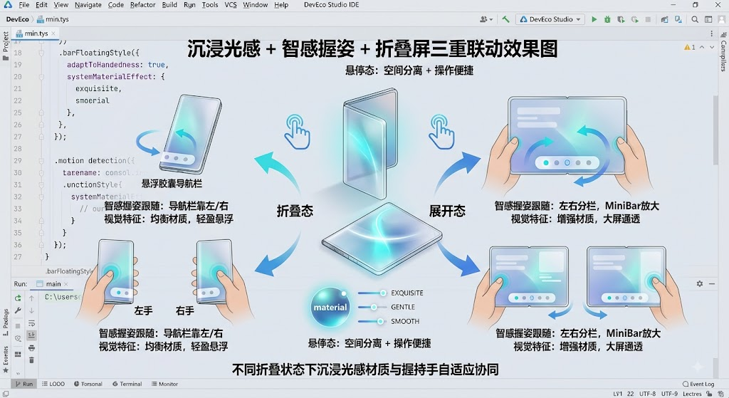
图:沉浸光感材质 + 智感握姿跟随 + 折叠屏状态感知三重联动,实现顶级空间化体验
当沉浸光感与智感握姿、折叠屏状态感知三者结合时,可以实现最顶级的空间化体验:
| 设备状态 | 沉浸光感策略 | 智感握姿策略 | 视觉效果 |
|---|---|---|---|
| 折叠态 + 左手 | 均衡材质,悬浮胶囊 | 导航栏靠左 | 通透 + 左手舒适区 |
| 折叠态 + 右手 | 均衡材质,悬浮胶囊 | 导航栏靠右 | 通透 + 右手舒适区 |
| 展开态 + 左手 | 增强材质,悬浮胶囊放大 | 位移幅度增大 | 大屏通透 + 左手舒适区 |
| 展开态 + 右手 | 增强材质,悬浮胶囊放大 | 位移幅度增大 | 大屏通透 + 右手舒适区 |
| 悬停态 | 上半屏正常,下半屏增强 | 仅下半屏跟手 | 空间分离 + 操作便捷 |
四、多设备适配策略
4.1 断点系统与沉浸光感
HarmonyOS 的断点系统(Breakpoint System)可帮助开发者根据屏幕尺寸动态调整沉浸光感参数:
| 断点 | 屏幕宽度 | 推荐材质样式 | 悬浮导航策略 |
|---|---|---|---|
sm(小屏) | < 600vp | THIN 标题栏,THICK 底部导航 | 全宽悬浮胶囊 |
md(中屏) | 600-840vp | REGULAR 标题栏,THICK 底部导航 | 居中悬浮胶囊,带 MiniBar |
lg(大屏) | > 840vp | REGULAR 标题栏,ULTRA_THICK 底部导航 | 左右分栏,MiniBar 常驻 |
4.2 断点自适应材质配置
import { BreakpointType } from '@kit.UIDesignKit';

/**
 * 根据断点获取推荐的沉浸光感材质样式
 */
export function getAdaptiveMaterialStyle(
  breakpoint: string,
  componentType: 'titlebar' | 'navbar' | 'card'
): uiMaterial.ImmersiveStyle {
  switch (componentType) {
    case 'titlebar':
      return breakpoint === 'sm'
        ? uiMaterial.ImmersiveStyle.THIN
        : uiMaterial.ImmersiveStyle.REGULAR;
    case 'navbar':
      return breakpoint === 'lg'
        ? uiMaterial.ImmersiveStyle.ULTRA_THICK
        : uiMaterial.ImmersiveStyle.THICK;
    case 'card':
      return uiMaterial.ImmersiveStyle.REGULAR;
    default:
      return uiMaterial.ImmersiveStyle.REGULAR;
  }
}

/**
 * 根据断点获取悬浮导航栏底部间距
 */
export function getAdaptiveBottomMargin(breakpoint: string): number {
  switch (breakpoint) {
    case 'sm':
      return 28;
    case 'md':
      return 36;
    case 'lg':
      return 48;
    default:
      return 36;
  }
}
4.3 多设备完整适配示例
import { BreakpointType, hdsMaterial, HdsTabs, HdsTabsController } from '@kit.UIDesignKit';
import { uiMaterial } from '@kit.ArkUI';

@Entry
@ComponentV2
struct MultiDeviceImmersivePage {
  @Local currentBreakpoint: string = 'sm';
  @StorageLink('currentBreakpoint') globalBreakpoint: string = 'sm';
  private controller: HdsTabsController = new HdsTabsController();

  aboutToAppear(): void {
    this.currentBreakpoint = this.globalBreakpoint;
  }

  /**
   * 获取当前断点下的材质等级
   */
  private getAdaptiveMaterialLevel(): hdsMaterial.MaterialLevel {
    // 大屏设备使用自适应模式,系统会自动选择更高级别
    if (this.currentBreakpoint === 'lg') {
      return hdsMaterial.MaterialLevel.ADAPTIVE;
    }
    // 中小屏设备也用自适应,让系统根据实际算力决定
    return hdsMaterial.MaterialLevel.ADAPTIVE;
  }

  /**
   * 获取底部导航悬浮间距
   */
  private getBottomMargin(): number {
    return getAdaptiveBottomMargin(this.currentBreakpoint);
  }

  build() {
    HdsTabs({ controller: this.controller }) {
      TabContent() {
        this.buildContentForBreakpoint()
      }.tabBar(new BottomTabBarStyle($r('sys.media.ohos_app_icon'), '首页'))

      TabContent() {
        DiscoverContent()
      }.tabBar(new BottomTabBarStyle($r('sys.media.ohos_app_icon'), '发现'))

      TabContent() {
        ProfileContent()
      }.tabBar(new BottomTabBarStyle($r('sys.media.ohos_app_icon'), '我的'))
    }
    .barOverlap(true)
    .barPosition(BarPosition.End)
    .barFloatingStyle({
      barBottomMargin: this.getBottomMargin(),
      adaptToHandedness: true,
      systemMaterialEffect: {
        materialType: hdsMaterial.MaterialType.ADAPTIVE,
        materialLevel: this.getAdaptiveMaterialLevel(),
      },
    })
  }

  @Builder
  buildContentForBreakpoint() {
    if (this.currentBreakpoint === 'lg') {
      // 大屏:左右分栏布局
      Row() {
        Column() {
          Text('左侧面板')
        }
        .width('40%')
        .height('100%')
        .backgroundColor('#F8F8F8')

        Column() {
          Text('右侧内容')
        }
        .width('60%')
        .height('100%')
      }
    } else {
      // 中小屏:单列布局
      Column() {
        Text('内容区域')
          .fontSize(18)
          .fontColor('#999')
      }
      .width('100%')
      .height('100%')
      .justifyContent(FlexAlign.Center)
    }
  }
}
五、沉浸光感与空间化完整体系
5.1 空间化三大支柱
| 支柱 | 能力 | 视觉表现 | 交互表现 |
|---|---|---|---|
| 沉浸光感材质 | 毛玻璃、渐变模糊、流光 | 通透、层次、精致 | 按压弹性、光随指动 |
| 悬浮组件 | 悬浮胶囊、MiniBar | 轻盈、悬浮、空间感 | 折叠展开、圆角胶囊 |
| 智感握姿 | 握持手感知、UI 跟随 | 自适应位移 | 左右自动切换 |
5.2 接入优先级建议
| 优先级 | 适配内容 | 开发成本 | 体验收益 |
|---|---|---|---|
| P0 | 底部导航悬浮 + 沉浸光感 | 低(属性配置) | 极高 |
| P1 | 标题栏材质 + 渐变模糊 | 低(属性配置) | 高 |
| P2 | 内容区卡片材质 | 中(需逐个组件配置) | 中 |
| P3 | 菜单栏 / 弹窗材质 | 中(需逐个弹窗配置) | 中 |
| P4 | MiniBar + 智感握姿联动 | 高(需自定义 Builder) | 高 |
| P5 | 多设备断点自适应 | 高(需多套布局) | 极高 |
六、总结
本文作为沉浸光感系列的终章,聚焦三大核心场景:
- 首眼沉浸光感:通过标题栏
scrollEffectOpts+ 底部导航barFloatingStyle+ 菜单栏systemMaterial,打造精致的第一印象 - 自适应悬浮导航:MiniBar 折叠展开 + 多设备断点适配,实现从手机到平板的全场景覆盖
- 智感握姿联动:沉浸光感材质 + 智感握姿跟随 + 折叠屏状态感知,三重联动实现顶级空间化体验
沉浸光感代表了 HarmonyOS 在空间化视觉设计上的新思考——它不仅仅是"让界面更好看",而是从底层重构了 UI 的视觉表达方式。合理运用沉浸光感,你的应用将具备:
- 通透的视觉层次:毛玻璃材质让内容与交互自然交融
- 灵动的交互反馈:按压弹性、光随指动、渐变模糊
- 智能的空间适配:档位自适应、断点适配、智感握姿联动
随着 HarmonyOS 生态的持续完善,沉浸光感将成为应用体验的标配能力。现在接入,就是为你的用户提供最前沿的空间化体验。
如果这篇文章对你有帮助,欢迎点赞👍、收藏⭐、关注🔔,你的支持是我持续创作的动力!
相关资源:

讨论HarmonyOS开发技术,专注于API与组件、DevEco Studio、测试、元服务和应用上架分发等。
更多推荐
 3
3 0
0- 0


 已为社区贡献87条内容

所有评论(0)