【HarmonyOS】时间管理类APP:底部 Tab 还是侧边栏?
这是本系列的第三篇。上一篇讲了断点系统如何处理连续的尺寸变化,这一篇换个角度,讲一个适配决策:导航栏到底该放底部还是侧边? 答案并不是取决于哪种更好看,而是取决于交互范式:手机是拇指优先,2in1 是键鼠+宽屏优先。同一个 App、在两种设备上展现出了完全不同的导航形态。
问题的出现
本APP有五个主页面:热力图、时间轴、分析、洞察、我的。在手机上,它们用底部 Tab 承载,这是最经典的移动端导航模式。拇指能够到,切换快,不遮挡内容。
但把这个布局原封不动搬到 2in1设备(电脑)上,问题立刻出现:
第一,电脑屏幕是横向的,高度比手机富余得多,底部 Tab 在手机上是合理的位置,在电脑上却变成了一条窄窄的、和上方大片内容区不协调的横条。
第二,电脑是键鼠交互,用户的视线和操作焦点集中在屏幕中上部,底部 Tab 反而需要"低头去找"。这和手机拇指自然悬在底部的逻辑正好相反。
第三,"分析"这个 Tab 下其实藏着若干个子项。手机上可以用进入页面后再切换的方式来解决,但电脑宽屏有足够的横向空间,完全可以在导航栏里直接展开子菜单,省一次跳转。
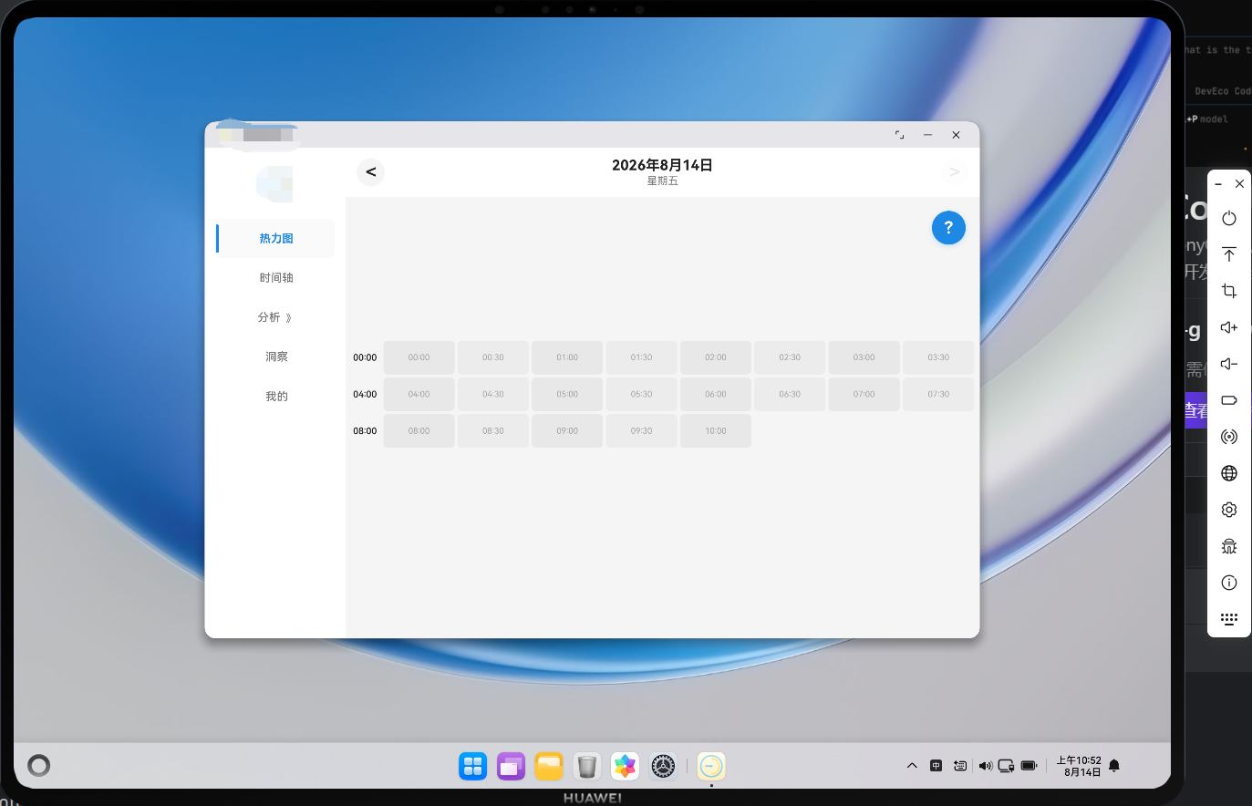
所以我们的方案很清楚:手机和平板共用底部 Tab,2in1 改用左侧边栏。
分流入口
整个导航分流发生在 MainPage 的 build() 里。先看组件的状态声明和初始化:
@Entry
@Component
struct MainPage {
  @State currentTabIndex: number = 0
  @State isInitialized: boolean = false
  @State initError: string = ''
  @State is2In1: boolean = false
  @State analysisExpanded: boolean = false // 分析菜单是否展开
  @State analysisSubTab: number = 0 // 分析子菜单选中索引
  @State fontScale: number = 1.0 // 字体缩放系数
  @State currentBreakpoint: BreakpointType = BreakpointType.SM // 当前断点
  ...
}
is2In1 是一个布尔状态量,analysisExpanded 和 analysisSubTab 是为侧边栏的分析子菜单准备的。它们在 aboutToAppear 里被初始化:
  async aboutToAppear(): Promise<void> {
    try {
      this.context = getContext(this) as common.UIAbilityContext
      this.is2In1 = is2In1Device()
      this.fontScale = getFontScale()
      ...
    } catch (error) {
      const err = error as Error
      this.initError = `初始化错误: ${err.message}`
    }
  }
is2In1 = is2In1Device() 这一行是分流的源头。它读取的是 deviceInfo.deviceType,返回当前设备是不是 2in1。注意这里用的是设备类型而不是断点,因为导航栏位置的决定与设备类型有关:键鼠设备需要侧边栏,触摸设备需要底部 Tab,这和屏幕宽度无关(电脑设备即使把窗口缩窄,它仍然是键鼠交互,侧边栏依然合理)。
分支
初始化完成后,build() 根据三个状态渲染三种界面:加载中、2in1 侧边栏布局、手机/平板底部 Tab 布局。核心是这两段分支:
  build() {
    Column() {
      if (!this.isInitialized) {
        // 加载中或错误状态
        ...
      } else if (this.is2In1) {
        // 2in1 设备 - 侧边导航布局
        Row() {
          // 左侧导航栏
          Column() {
            Row() {
              Image($r('app.media.foreground'))
                .height(56)
                .objectFit(ImageFit.Contain)
            }
            .width('100%')
            .height(70)
            .justifyContent(FlexAlign.Center)
            .margin({ bottom: 16 })

            this.SideNavBuilder('热力图', '', 0)
            this.SideNavBuilder('时间轴', '', 1)
            this.SideNavBuilder('分析', '', 2)
            this.SideNavBuilder('洞察', '', 3)
            this.SideNavBuilder('我的', '', 4)

            Blank()
          }
          .width(200)
          .height('100%')
          .backgroundColor($r('app.color.card_background'))
          .padding({ left: 16, right: 16, top: 16, bottom: 16 })
          .alignItems(HorizontalAlign.Center)
          .shadow({
            radius: 8,
            color: $r('app.color.shadow_color'),
            offsetX: 2,
            offsetY: 0
          })

          // 右侧内容区域
          Column() {
            this.CurrentPageContent()
          }
          .layoutWeight(1)
          .height('100%')
          .backgroundColor($r('app.color.background_color'))
          .justifyContent(FlexAlign.Start)
          .alignItems(HorizontalAlign.Start)
        }
        .width('100%')
        .height('100%')
      } else {
        // 手机/平板 - 底部导航布局
        Tabs({ index: this.currentTabIndex }) {
          TabContent() {
            HeatmapPage()
          }
          .tabBar(this.TabBarBuilder('热力图', '', 0))

          TabContent() {
            TimelinePage()
          }
          .tabBar(this.TabBarBuilder('时间轴', '', 1))

          TabContent() {
            AnalysisPage()
          }
          .tabBar(this.TabBarBuilder('分析', '', 2))

          TabContent() {
            InsightsPage()
          }
          .tabBar(this.TabBarBuilder('洞察', '', 3))

          TabContent() {
            ProfilePage()
          }
          .tabBar(this.TabBarBuilder('我的', '', 4))
        }
        .barPosition(BarPosition.End)
        .barMode(BarMode.Fixed)
        .barHeight(56)
        .animationDuration(300)
        .onChange((index: number) => {
          this.currentTabIndex = index
          // 切换标签时触发对应页面刷新
          if (index === 0 || index === 1) {
            // 热力图或时间轴页面,触发时间线刷新
            AppStorage.setOrCreate('needRefreshTimeline', Date.now())
          } else if (index === 2) {
            // 分析页面
            AppStorage.setOrCreate('needRefreshAnalysis', Date.now())
          } else if (index === 3) {
            // 洞察页面
            AppStorage.setOrCreate('needRefreshInsights', Date.now())
          } else if (index === 4) {
            // 我的页面
            AppStorage.setOrCreate('needRefreshProfile', Date.now())
          }
        })
        .backgroundColor($r('app.color.background_color'))
      }
    }
    .width('100%')
    .height('100%')
  }
}
else if (this.is2In1) 和 else 把两种布局完全隔开。
底部 Tab
先看手机/平板用的 TabBarBuilder,它非常简洁:
  // 底部导航栏(手机/平板)
  @Builder
  TabBarBuilder(title: string, icon: string, index: number) {
    Column() {
      Text(title)
        .fontSize(15)
        .fontWeight(this.currentTabIndex === index ? FontWeight.Bold : FontWeight.Normal)
        .fontColor(this.currentTabIndex === index ?
          $r('app.color.primary_color') :
          $r('app.color.text_secondary'))

      // 底部指示条
      if (this.currentTabIndex === index) {
        Column()
          .width(20)
          .height(3)
          .backgroundColor($r('app.color.primary_color'))
          .borderRadius(2)
          .margin({ top: 6 })
      }
    }
    .width('100%')
    .height('100%')
    .justifyContent(FlexAlign.Center)
    .onClick(() => {
      this.currentTabIndex = index
      this.triggerPageRefresh(index)
    })
  }
我们这边只是做了一个简易的导航栏,针对手机端的导航栏,如果是API23以上,建议直接使用HdsTabs。
侧边栏
再看 2in1 用的 SideNavBuilder:
  // 侧边导航栏(2in1)
  @Builder
  SideNavBuilder(title: string, icon: string, index: number) {
    Column({ space: 0 }) {
      Row() {
        // 左侧指示条
        if (this.currentTabIndex === index && index !== 2) {
          Column()
            .width(4)
            .height(40)
            .backgroundColor($r('app.color.primary_color'))
            .borderRadius({ topRight: 2, bottomRight: 2 })
        } else if (index === 2 && this.analysisExpanded) {
          Column()
            .width(4)
            .height(40)
            .backgroundColor($r('app.color.primary_color'))
            .borderRadius({ topRight: 2, bottomRight: 2 })
        } else {
          Column()
            .width(4)
            .height(40)
        }

        // 主菜单内容区域
        Row() {
          Text(title)
            .fontSize(16)
            .fontWeight((this.currentTabIndex === index && index !== 2) || (index === 2 && this.analysisExpanded) ? FontWeight.Bold : FontWeight.Medium)
            .fontColor((this.currentTabIndex === index && index !== 2) || (index === 2 && this.analysisExpanded) ?
              $r('app.color.primary_color') :
              $r('app.color.text_secondary'))

          // 分析菜单显示展开/收起箭头(使用旋转的三角形)
          if (index === 2) {
            Text('︾')
              .fontSize(14)
              .fontColor($r('app.color.text_secondary'))
              .margin({ left: 8 })
              .rotate({ angle: this.analysisExpanded ? 0 : -90 })
              .animation({
                duration: 200,
                curve: Curve.EaseInOut
              })
          }
        }
        .layoutWeight(1)
        .justifyContent(FlexAlign.Center)
      }
      .width('100%')
      .height(56)
      .backgroundColor((this.currentTabIndex === index && index !== 2) || (index === 2 && this.analysisExpanded) ?
        $r('app.color.secondary_background') :
        Color.Transparent)
      .borderRadius(8)
      .onClick(() => {
        if (index === 2) {
          // 点击分析菜单,切换展开/收起
          this.analysisExpanded = !this.analysisExpanded
          if (this.analysisExpanded) {
            // 展开时默认选中日分析
            this.currentTabIndex = 2
            this.analysisSubTab = 0
            AppStorage.setOrCreate('analysisSubTab', 0)
            this.triggerPageRefresh(2)
          }
        } else {
          this.currentTabIndex = index
          this.analysisExpanded = false // 切换到其他页面时收起分析菜单
          this.triggerPageRefresh(index)
        }
      })

      // 分析子菜单
      if (index === 2 && this.analysisExpanded) {
        Column({ space: 4 }) {
          this.AnalysisSubMenuItem('日分析', 0)
          this.AnalysisSubMenuItem('周分析', 1)
          this.AnalysisSubMenuItem('月分析', 2)
          this.AnalysisSubMenuItem('年分析', 3)
          this.AnalysisSubMenuItem('重塑', 4)
        }
        .width('100%')
        .padding({ left: 20, right: 16, top: 4, bottom: 4 })
      }
    }
    .width('100%')
  }
和 TabBarBuilder 对比,差异立刻可见:
手机底部导航栏: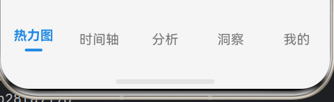
2in1侧边栏: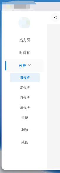
指示条方向反了。底部 Tab 的指示条在文字下方(横向),侧边栏的指示条在文字左侧。
选中态多了背景色。底部 Tab 只靠字重和颜色区分选中,侧边栏多了一层 backgroundColor(选中时 secondary_background,未选中透明)。
分析项特殊处理。这是因为分析项在侧边栏里是一个可展开的父菜单。它的选中态逻辑分两种:菜单收起时,点击它展开;菜单展开时,它本身保持高亮,同时下方列出几个子项。而其他几个项点击直接切换。
展开箭头动画。分析项右侧有一个 ︾ 字符,通过 rotate({ angle: this.analysisExpanded ? 0 : -90 }) 控制旋转——展开时朝下(0°),收起时朝右(-90°)。animation 让旋转有 200ms 的缓入缓出过渡,不是生硬跳变。
分析子菜单
分析菜单展开后,五个子项由 AnalysisSubMenuItem 渲染:
  // 分析子菜单项
  @Builder
  AnalysisSubMenuItem(title: string, subIndex: number) {
    Row() {
      Text(title)
        .fontSize(14)
        .fontColor(this.analysisSubTab === subIndex ?
          $r('app.color.primary_color') :
          $r('app.color.text_secondary'))
        .fontWeight(this.analysisSubTab === subIndex ? FontWeight.Medium : FontWeight.Normal)
    }
    .width('100%')
    .height(40)
    .justifyContent(FlexAlign.Center)
    .backgroundColor(this.analysisSubTab === subIndex ?
      'rgba(25, 118, 210, 0.1)' :
      Color.Transparent)
    .borderRadius(6)
    .onClick(() => {
      this.analysisSubTab = subIndex
      AppStorage.setOrCreate('analysisSubTab', subIndex)
      this.currentTabIndex = 2
      if (subIndex === 4) {
        // 切换到时光重塑时,触发加载
        AppStorage.setOrCreate('needRefreshAnalysis', Date.now())
      }
    })
  }
这套子菜单逻辑是侧边栏独有的。手机上"分析"只是一个普通 Tab,进去之后在页面内部切换日/周/月/年/重塑;电脑上这些子项被提到了导航层级,因为宽屏有足够的纵向空间来显示。
小结
导航是用户接触 App 的一个很重要的部分,它的多端适配不只是考虑换个位置,而是需要重新思考交互方式。

讨论HarmonyOS开发技术,专注于API与组件、DevEco Studio、测试、元服务和应用上架分发等。
更多推荐
 5
5 0
0- 0


 已为社区贡献11条内容

所有评论(0)