鸿蒙SideBarContainer 侧边栏完全指南:抽屉导航、菜单切换与交互优化
SideBarContainer 侧边栏完全指南:抽屉导航、菜单切换与交互优化
本文基于 HarmonyOS(ArkTS 声明式开发范式,API 12 / 5.0.0)写作,所有示例均可在 DevEco Studio 模拟器中验证。配套演示工程位于本文同级目录
ohos/,包含完整可运行的EntryAbility.ets与Index.ets。
一、引言
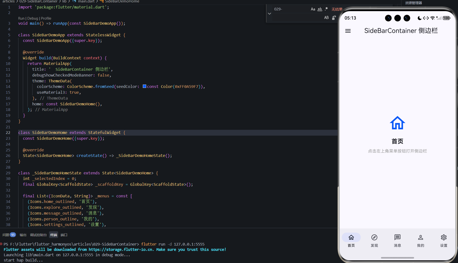
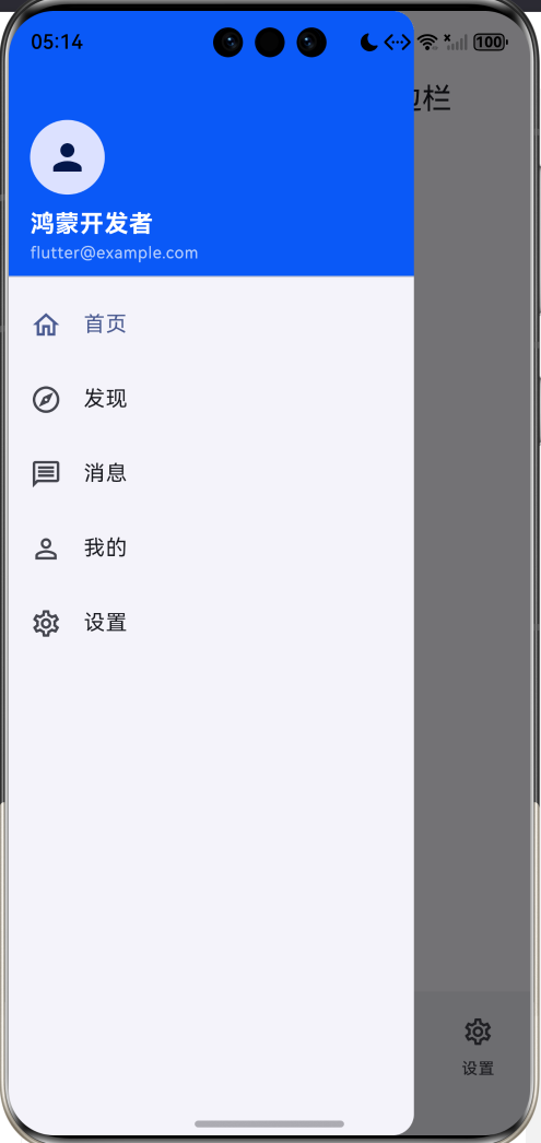
手机屏幕的左上角总藏着三条横线,点开它,一块面板从左侧滑出:头像、菜单、设置入口,再点一下某个菜单,面板收回,内容区切换。这就是侧边栏(抽屉导航)——移动端承载"次级导航"的最经典形态,主界面空间不足时,把低频菜单收纳进一个可展开/收起的抽屉。
SideBarContainer 是 ArkUI 为此提供的容器组件。它把界面天然切成两块:侧边栏(导航/功能入口)与内容区(主视图),二者由一根可拖拽、可折叠的分界线组织。与 TabBar 的"平级并列"不同,侧边栏解决的是层级收纳问题:Tab 适合 2~5 个高频平级入口,侧边栏适合更多、更低频的菜单项,以及需要"留出整块内容区"的界面(如邮箱、云盘、管理后台)。它在平板上的形态更是如此——侧边栏常驻,内容区自适应。
组件自身承担了导航容器最麻烦的部分:展开/收起动画、边缘拖拽调宽、折叠控制按钮,以及 4.1 要重点讨论的手势冲突仲裁。开发者要做的只有三件事:往两个子槽里填内容、用 showSideBar 受控显示、监听 onChange 同步状态。但"组件省事"不代表"设计省事"——菜单选中态、宽度阈值、手势与内容区滚动的配合,仍是一份需要认真对待的设计。
本文的路线:先讲透构造参数与受控显示,用公式说明宽度体系与内容区的关系,用流程图说明菜单切换与手势冲突的判定逻辑,再给出完整演示工程,覆盖导航主界面(头像+菜单+内容切换)、位置与宽度(Start/End/拖拽)、手势与状态三个场景,最后谈验证、常见问题与侧边栏导航设计模式。
二、环境准备
SideBarContainer 自 API 9 起提供,API 12 上 sideBarWidth/minSideBarWidth/maxSideBarWidth、controlButton、divider 等能力全部稳定。
| 项目 | 推荐配置 | 说明 |
|---|---|---|
| DevEco Studio | 5.0 及以上 | 需支持 API 12 的 SDK |
| HarmonyOS SDK | 5.0.0(12) | compatibleSdkVersion 与之对应 |
| 设备 | Phone 模拟器或真机 | 本文以模拟器验证为主 |
| 工程类型 | Stage 模型 + ArkTS | EntryAbility 继承 UIAbility |
工程落地路径与之前几篇一致:
- 方式一:DevEco Studio 新建 Empty Ability 工程,直接写 ArkTS 原生页面(本文演示工程即采用此方式)。
- 方式二:在 Flutter·鸿蒙壳工程里把
ohos/entry/src/main/ets/下的页面与组件放入原生工程(EntryAbility通常继承FlutterAbility),组件代码不受影响。
若用方式二,只需关注
pages/Index.ets、model/SideBarModel.ets与components/下的组件代码。
三、核心 API 与原理解析
3.1 构造参数与双子槽
SideBarContainer 是少数需要"两个子组件"的容器——第一个子组件渲染侧边栏,第二个子组件渲染内容区:
SideBarContainer({
  sideBarWidth: 220,
  minSideBarWidth: 120,
  maxSideBarWidth: 300,
  sideBarPosition: SideBarPosition.Start
}) {
  Column() { /* ① 侧边栏内容 */ }
  Column() { /* ② 内容区内容 */ }
}
| 参数 | 类型 | 说明 |
|---|---|---|
sideBarWidth |
Length | 侧边栏宽度,默认 200vp |
minSideBarWidth |
Length | 拖拽最小宽度,默认 100vp |
maxSideBarWidth |
Length | 拖拽最大宽度,默认 260vp |
sideBarPosition |
SideBarPosition | Start(默认,左侧)/ End(右侧) |
注意两点:其一,侧边栏子槽的宽度要按 sideBarWidth 设计——内容太宽会被裁切,太窄则留白;其二,min/maxSideBarWidth 是拖拽的硬边界,超出范围后组件自动拒绝继续拖动,无需业务校验。
3.2 受控显示:showSideBar、onChange 与 controlButton
侧边栏的展开/收起由 showSideBar 受控:
SideBarContainer({ sideBarWidth: 220 }) {
  Column() { /* 侧边栏 */ }
  Column() { /* 内容区 */ }
}
.showSideBar(this.showSideBar)
.controlButton({ width: 32, height: 32, left: 4, top: 80 })
.onChange((show: boolean) => {
  this.showSideBar = show;   // 双写:状态回灌
})
.divider({ strokeWidth: 1, color: '#E8E8E8' })
| 属性 | 说明 |
|---|---|
showSideBar |
显示/隐藏,受控绑定;默认 false |
controlButton |
悬浮折叠按钮(位置/尺寸/图标可配),展开时自动出现在侧边栏与内容区交界 |
onChange |
展开状态变化回调,参数为 boolean |
divider |
侧边栏与内容区之间的分割线(strokeWidth/color/startMargin/endMargin) |
三个细节:onChange 必须回灌——用户点折叠按钮、拖拽边缘、程序改值都会触发它,不写双写,状态与视图会脱节;controlButton 出现时机——仅 showSideBar = true 时显示,收起后消失,业务侧在内容区自己补一个"☰"入口;分割线可开关——视觉上是"一体还是两栏"的设计选择,divider 的 strokeWidth: 0 即可隐藏。
3.3 宽度体系:公式与内容区关系
侧边栏宽度的合法区间:
[
w_{min} \le w_{side} \le w_{max}
]
当侧边栏展开时,内容区宽度被挤压:
[
W_{content} = W_{total} - w_{side} \cdot I(show),\quad
I(show)=\begin{cases}1 & show\0 & 否则\end{cases}
]
这条公式解释了常见布局问题的根源:内容区必须自适应(用 layoutWeight(1) 或 width('100%')),而不是写死宽度;showSideBar 切换时内容区宽度随公式联动,组件内置动画让这个过程平滑。菜单多、文案长的应用(如云盘)应给较大的 sideBarWidth(220~280vp),纯图标导航可以压到 80vp 以下——宽度本身也是导航密度的一部分。
3.4 菜单切换与展开/收起状态流
两条链互不干扰:菜单切换链(点击 → 高亮 → 收起 → 换内容)与显示控制链(入口 → showSideBar → onChange 回灌)。把这两条链分开建模,是侧边栏状态管理最省心的做法——currentMenu 只回答"选了什么",showSideBar 只回答"开没开"。
3.5 手势冲突:三条手势的仲裁
侧边栏是手势冲突的高发区,典型场景(Start 位):
- 内容区纵向滚动(List/Scroll 内部)——方向正交,不冲突;
- 侧边栏收起时,从屏幕左缘向右滑——唤出抽屉(系统级手势仲裁,抽屉优先);
- 手指落在侧边栏宽度范围内左右拖动——调整侧边栏宽度(拖拽调宽,受 min/max 限制)。
冲突只发生在横向维度:左缘右滑唤抽屉 vs 内容区内部横向滚动控件(如横向 Swiper)。框架的仲裁规则是"边缘优先"——从屏幕边缘发起的滑动倾向抽屉,内容区内部的横向手势倾向控件自己。End 位则镜像为右缘左滑。设计上的建议:抽屉处于 Start 位时,内容区首屏避免放横向滚动的容器,或为内容区横向手势预留足够的非边缘起始区。
3.6 导航方案对比
| 方案 | 形态 | 适用场景 |
|---|---|---|
SideBarContainer |
抽屉/常驻侧栏 | 多菜单、层级收纳、平板自适应 |
Tabs |
底部/顶部标签 | 2~5 个高频平级入口 |
| 自定义抽屉(overlay) | 全屏遮罩 + 面板 | 需要遮罩层级与复杂动画 |
Navigation |
栈式导航 | 页面跳转与返回 |
选型一句话:高频平级用 Tabs,低频多菜单用侧边栏,页面跳转用 Navigation。侧边栏与 Tabs 甚至可以共存——侧边栏管"大模块",Tabs 管"模块内页面"。
四、完整代码实现
工程以 Tabs 组织三个模块:导航主界面(核心场景)、位置与宽度、手势与状态。数据模型 SideBarModel.ets 提供菜单。
4.1 入口:EntryAbility.ets
import { UIAbility } from '@kit.AbilityKit';
import { hilog } from '@kit.PerformanceAnalysisKit';
import { window } from '@kit.ArkUI';

export default class EntryAbility extends UIAbility {
  private readonly TAG: string = 'SideBarContainerGuideAbility';

  onWindowStageCreate(windowStage: window.WindowStage): void {
    windowStage.loadContent('pages/Index', (err) => {
      if (err.code) {
        hilog.error(0x0000, this.TAG, 'Failed to load the content. Cause: %{public}s', JSON.stringify(err));
        return;
      }
      hilog.info(0x0000, this.TAG, '%{public}s', 'Succeeded in loading the content.');
    });
  }

  // onCreate / onDestroy / onForeground / onBackground / onWindowStageDestroy
  // 生命周期回调仅打 hilog 日志,完整版见演示工程源码
}
4.2 数据模型:SideBarModel.ets
export class MenuItem {
  key: string;
  label: string;
  icon: string;
  desc: string;

  constructor(key: string, label: string, icon: string, desc: string) {
    this.key = key;
    this.label = label;
    this.icon = icon;
    this.desc = desc;
  }
}

// NAV_MENUS:首页/消息/收藏/设置/关于 五项导航菜单
4.3 主页面:Index.ets
import { NavDemo } from '../components/NavDemo';
import { PositionDemo } from '../components/PositionDemo';
import { GestureDemo } from '../components/GestureDemo';

@Entry
@Component
struct Index {
  @State currentIndex: number = 0;

  build() {
    Column() {
      Tabs({ barPosition: BarPosition.Start, index: this.currentIndex }) {
        TabContent() { NavDemo() }.tabBar('导航主界面')
        TabContent() { PositionDemo() }.tabBar('位置与宽度')
        TabContent() { GestureDemo() }.tabBar('手势与状态')
      }
      .vertical(false)
      .scrollable(true)
      .barMode(BarMode.Scrollable)
      .width('100%')
      .height('100%')
    }
    .width('100%')
    .height('100%')
  }
}
4.4 核心场景一:导航主界面(NavDemo.ets)
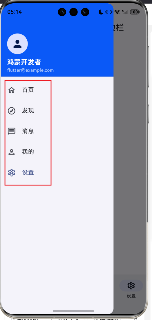
核心场景演示侧边栏的完整闭环:双子槽布局、菜单选中高亮、点击切换内容并自动收起、☰ 与折叠按钮双向展开:
import { promptAction } from '@kit.ArkUI';
import { MenuItem, NAV_MENUS } from '../model/SideBarModel';
@Component
export struct NavDemo {
@State currentMenu: string = 'home';
@State showSideBar: boolean = true;
build() {
SideBarContainer({
sideBarWidth: 220,
minSideBarWidth: 120,
maxSideBarWidth: 300,
sideBarPosition: SideBarPosition.Start
}) {
// ① 侧边栏:头像 + 菜单列表
Column() {
Column({ space: 10 }) {
Text('🧑💻')
.fontSize(44).width(72).height(72)
.textAlign(TextAlign.Center).borderRadius(36)
.backgroundColor('#EAF2FF')
Text('Harmony 开发者')
.fontSize(16).fontWeight(FontWeight.Bold).fontColor('#333333')
Text('v1.0.0').fontSize(12).fontColor('#999999')
}
.width('100%').padding({ top: 28, bottom: 20 })
Column({ space: 4 }) {
ForEach(NAV_MENUS, (item: MenuItem) => {
Row({ space: 12 }) {
Text(item.icon).fontSize(18)
Text(item.label).fontSize(15)
.fontColor(this.currentMenu === item.key ? '#0A59F7' : '#333333')
.fontWeight(this.currentMenu === item.key ? FontWeight.Bold : FontWeight.Normal)
Blank()
}
.width('100%').height(46).padding({ left: 18, right: 18 })
.borderRadius(10)
.backgroundColor(this.currentMenu === item.key ? '#EAF2FF' : Color.Transparent)
.onClick(() => {
this.currentMenu = item.key;
this.showSideBar = false;
promptAction.showToast({ message: `切换到:${item.label}`, duration: 1000 });
})
}, (item: MenuItem) => item.key)
}
.width('100%')
Blank()
Button('收起侧边栏')
.width('88%').height(40).fontSize(14)
.backgroundColor('#F0F0F0').fontColor('#333333')
.onClick(() => {
this.showSideBar = false;
})
}
.width('100%').height('100%').backgroundColor('#FFFFFF').padding({ top: 20 })
// ② 内容区:标题栏 + 当前菜单内容
Column() {
Row({ space: 12 }) {
Button('☰')
.width(40).height(40).fontSize(20)
.backgroundColor('#F0F0F0').fontColor('#333333')
.onClick(() => {
this.showSideBar = true;
})
Text(this.currentTitle()).fontSize(18).fontWeight(FontWeight.Bold)
Blank()
Text('📌').fontSize(20)
}
.width('92%').padding({ top: 14 })
Column({ space: 12 }) {
Text(this.currentIcon()).fontSize(56)
Text(this.currentTitle()).fontSize(22).fontWeight(FontWeight.Bold)
Text(this.currentDesc())
.fontSize(14).fontColor('#666666')
.textAlign(TextAlign.Center).lineHeight(22)
}
.width('92%').layoutWeight(1).justifyContent(FlexAlign.Center)
Text('点击侧边栏菜单切换内容,点 ☰ 或折叠箭头重新展开')
.fontSize(12).fontColor('#999999').padding({ bottom: 16 })
}
.width('100%').height('100%').backgroundColor('#F7F9FF')
}
.showSideBar(this.showSideBar)
.controlButton({ width: 32, height: 32, left: 4, top: 80 })
.onChange((show: boolean) => {
this.showSideBar = show;
})
.divider({ strokeWidth: 1, color: '#E8E8E8' })
.width('100%')
.height('100%')
}
currentTitle(): string { return this.currentItem().label; }
currentIcon(): string { return this.currentItem().icon; }
currentDesc(): string { return this.currentItem().desc; }
currentItem(): MenuItem {
for (let i = 0; i < NAV_MENUS.length; i++) {
if (NAV_MENUS[i].key === this.currentMenu) {
return NAV_MENUS[i];
}
}
return NAV_MENUS[0];
}
}
值得注意的设计细节:选中高亮是纯函数——currentMenu === item.key 直接决定文字颜色、加粗与背景,没有独立的"选中态"状态;点击菜单 = 高亮 + 收起——收起让用户立刻看到内容区变化,符合"抽屉选完即走"的交互惯例;currentItem() 兜底返回第一项——currentMenu 永远有合法值。### 4.5 场景二:位置与宽度(PositionDemo.ets)
Start/End 切换、Slider 实时调宽与 min/max 拖拽边界,直接体现 3.3 的宽度体系:
@Component
export struct PositionDemo {
  @State position: SideBarPosition = SideBarPosition.Start;
  @State sideBarWidth: number = 200;
  @State showSideBar: boolean = true;
  @State showDivider: boolean = true;

  build() {
    Column({ space: 12 }) {
      SideBarContainer({
        sideBarWidth: this.sideBarWidth,
        minSideBarWidth: 120,
        maxSideBarWidth: 300,
        sideBarPosition: this.position
      }) {
        Column({ space: 8 }) {
          Text('侧边栏').fontSize(16).fontWeight(FontWeight.Bold).margin({ top: 24 })
          Text(`宽 ${this.sideBarWidth}vp`).fontSize(13).fontColor('#999999')
          Text('🅰️ 菜单一').fontSize(14).margin({ top: 20 })
          Text('🅱️ 菜单二').fontSize(14).margin({ top: 10 })
          Text('ℹ️ 菜单三').fontSize(14).margin({ top: 10 })
          Blank()
          Text('拖拽边缘可改变宽度').fontSize(11).fontColor('#BBBBBB').padding({ bottom: 16 })
        }
        .width('100%').height('100%').backgroundColor('#FFFFFF')

        Column({ space: 10 }) {
          Blank()
          Text('内容区域').fontSize(20).fontWeight(FontWeight.Bold)
          Text('侧边栏在' + (this.position === SideBarPosition.Start ? '左侧(Start)' : '右侧(End)'))
            .fontSize(14).fontColor('#666666')
          Blank()
        }
        .width('100%').height('100%').backgroundColor('#F7F9FF')
      }
      .showSideBar(this.showSideBar)
      .controlButton({ width: 28, height: 28, top: 40 })
      .divider({ strokeWidth: this.showDivider ? 1 : 0, color: '#D8D8D8' })
      .onChange((show: boolean) => {
        this.showSideBar = show;
      })
      .width('100%')
      .layoutWeight(1)

      Column({ space: 10 }) {
        Row({ space: 10 }) {
          Button('侧边栏在左 Start')
            .layoutWeight(1).height(38).fontSize(13)
            .backgroundColor(this.position === SideBarPosition.Start ? '#0A59F7' : '#F0F0F0')
            .fontColor(this.position === SideBarPosition.Start ? Color.White : '#333333')
            .onClick(() => { this.position = SideBarPosition.Start; this.showSideBar = true; })
          Button('侧边栏在右 End')
            .layoutWeight(1).height(38).fontSize(13)
            .backgroundColor(this.position === SideBarPosition.End ? '#0A59F7' : '#F0F0F0')
            .fontColor(this.position === SideBarPosition.End ? Color.White : '#333333')
            .onClick(() => { this.position = SideBarPosition.End; this.showSideBar = true; })
        }
        .width('100%')

        Row({ space: 12 }) {
          Text(`宽度 ${this.sideBarWidth}`).fontSize(13).fontColor('#666666')
          Slider({ value: this.sideBarWidth, min: 120, max: 300, step: 5 })
            .layoutWeight(1)
            .onChange((value: number) => { this.sideBarWidth = value; })
        }
        .width('100%')

        Row({ space: 10 }) {
          Button(this.showDivider ? '隐藏分割线' : '显示分割线')
            .layoutWeight(1).height(36).fontSize(13).backgroundColor('#07C160')
            .onClick(() => { this.showDivider = !this.showDivider; })
          Button('展开/收起')
            .layoutWeight(1).height(36).fontSize(13).backgroundColor('#FA8C16')
            .onClick(() => { this.showSideBar = !this.showSideBar; })
        }
        .width('100%')

        Text('说明:sideBarWidth 在 minSideBarWidth 与 maxSideBarWidth 之间;'
          + '拖动侧边栏边缘可连续调整宽度,min/max 是拖拽的硬边界。')
          .fontSize(12).fontColor('#999999').width('100%').textAlign(TextAlign.Start)
      }
      .width('92%').padding(12).borderRadius(12).backgroundColor(Color.White)
    }
    .width('100%').height('100%').padding({ top: 8 })
  }
}
要点:sideBarWidth 走状态——Slider 改动后侧边栏即时重排,内容区按 3.3 公式联动;sideBarPosition 运行时切换——组件内部自动完成侧栏迁移与手势方向翻转;End 位下 controlButton 自动移到右侧,无需业务适配。
4.6 场景三:手势与状态(GestureDemo.ets)
内容区放一个可滚动 List,对照三条手势的仲裁结果,onChange 实时反映展开状态:
import { promptAction } from '@kit.ArkUI';
import { MenuItem, NAV_MENUS } from '../model/SideBarModel';

@Component
export struct GestureDemo {
  @State showSideBar: boolean = true;
  @State currentMenu: string = 'home';

  build() {
    Column({ space: 10 }) {
      SideBarContainer({ sideBarWidth: 200, sideBarPosition: SideBarPosition.Start }) {
        Column() {
          ForEach(NAV_MENUS, (item: MenuItem) => {
            Row({ space: 10 }) {
              Text(item.icon).fontSize(16)
              Text(item.label).fontSize(14)
                .fontColor(this.currentMenu === item.key ? '#0A59F7' : '#333333')
              Blank()
            }
            .width('100%').height(42).padding({ left: 16, right: 16 })
            .borderRadius(8)
            .backgroundColor(this.currentMenu === item.key ? '#EAF2FF' : Color.Transparent)
            .onClick(() => {
              this.currentMenu = item.key;
              this.showSideBar = false;
            })
          }, (item: MenuItem) => item.key)
        }
        .width('100%').height('100%').padding({ top: 20 }).backgroundColor('#FFFFFF')

        Column() {
          Row({ space: 10 }) {
            Text(`当前页:${this.currentMenu}`).fontSize(14).fontColor('#666666')
            Blank()
            Text(this.showSideBar ? '🔄 展开中' : '➡️ 已收起')
              .fontSize(12)
              .fontColor(this.showSideBar ? '#0A59F7' : '#FA8C16')
          }
          .width('94%').padding({ top: 12 })

          List({ space: 8 }) {
            ForEach([1, 2, 3, 4, 5, 6, 7, 8, 9, 10], (i: number) => {
              ListItem() {
                Row({ space: 10 }) {
                  Text('📄').fontSize(16)
                  Column({ space: 4 }) {
                    Text(`文章标题 ${i}`).fontSize(15).fontColor('#333333')
                    Text(`这是内容区第 ${i} 条——可纵向滚动,不参与抽屉手势`)
                      .fontSize(12).fontColor('#999999')
                  }
                  .alignItems(HorizontalAlign.Start)
                  Blank()
                }
                .width('100%').padding(12).borderRadius(10).backgroundColor(Color.White)
              }
            }, (i: number) => i.toString())
          }
          .width('94%').layoutWeight(1).scrollBar(BarState.Off)
        }
        .width('100%').height('100%').backgroundColor('#F7F9FF')
      }
      .showSideBar(this.showSideBar)
      .controlButton({ width: 30, height: 30 })
      .onChange((show: boolean) => {
        this.showSideBar = show;
      })
      .width('100%')
      .layoutWeight(1)

      Text('手势冲突对照:① 内容区纵向滚动 → 交给 List,抽屉不抢;'
        + '② 侧边栏收起时,从屏幕左缘向右快速滑出 → 唤出抽屉(Start 位);'
        + '③ 手指在侧边栏宽度范围内滑动 → 拖动抽屉调整宽度。'
        + '三条手势由框架仲裁,互不干扰;End 位时唤出手势在右缘。')
        .fontSize(12).fontColor('#999999').lineHeight(20)
        .width('94%').padding(10).borderRadius(10).backgroundColor('#F0F4FF')
        .margin({ bottom: 10 })
    }
    .width('100%').height('100%')
  }
}
对照 3.5 的手势模型逐条验证:List 纵向滚动全程无感(方向正交);收起状态下从左缘右滑,抽屉优先于内容区;在侧边栏宽度范围内拖动,宽度受 min/max 硬约束。顶部的"展开中/已收起"徽标由 onChange 回灌驱动——它是受控闭环的可见证据。
五、模拟器运行与效果展示
启动模拟器,点击 Run 部署演示工程,依次切换三个 Tab 验证:
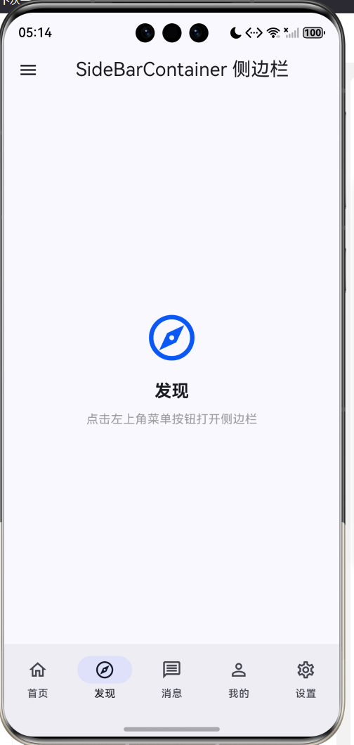
- 导航主界面 Tab:侧边栏默认展开,点击菜单项后高亮、收起并切换内容区;点 ☰ 重新展开;折叠按钮在展开态自动出现。
- 位置与宽度 Tab:Start/End 切换后侧边栏迁移;Slider 拖动宽度实时生效;拖动侧边栏边缘调宽并受 min/max 限制;分割线开关即时显隐。
- 手势与状态 Tab:内容区 List 纵向滚动无冲突;收起后从左缘右滑唤出抽屉;展开/收起徽标随 onChange 实时切换。
截图占位(模拟器实机拍摄后替换):
| 占位图 | 场景 |
|---|---|
screenshot_01_closed.png |
侧边栏关闭:内容区全宽,☰ 入口可见 |
screenshot_02_open.png |
侧边栏展开:头像+菜单+折叠按钮 |
screenshot_03_selected.png |
菜单项选中高亮:背景与文字颜色变化 |
screenshot_04_switched.png |
内容区切换:点击菜单后新内容呈现 |
六、调试与常见问题
| 现象 | 原因 | 解决 |
|---|---|---|
| 点折叠按钮状态不更新 | 忘了 onChange 回灌 |
回调里双写 this.showSideBar = show |
| 侧边栏内容被裁切 | 子槽宽度没按 sideBarWidth 设计 | 侧栏内部用 width('100%') + 紧凑布局 |
| 拖拽宽度无上限 | 没配 maxSideBarWidth | 显式设置 min/max,组件自动限位 |
| 内容区被挤变形 | 内容宽度写死 | 用 layoutWeight(1) 自适应 |
| End 位时唤不出抽屉 | 手势方向随位置翻转 | 在右缘向左滑,手势源在 End 一侧 |
| 收起后找不到入口 | controlButton 只在展开态显示 | 内容区自备 ☰ 按钮 |
| 内容区横向控件抢手势 | 边缘手势优先抽屉 | 首屏避免横向容器,或预留非边缘起始区 |
| 菜单高亮与内容不符 | 高亮状态独立维护 | 高亮由 currentMenu 推导,不另存状态 |
调试技巧:展开/收起状态异常时,先在 onChange 里 hilog 打印 show,对照 3.4 的两条链路定位是"菜单链"还是"显示链"出了问题;侧边栏宽度问题先确认 sideBarWidth 单位(vp)与 Slider 的 min/max 是否一致。
七、总结与扩展
-
两个状态两件事
- currentMenu 只回答"选了什么",showSideBar 只回答"开没开"——两条链分开建模。 选中态是投影
- 高亮由 currentMenu 推导,不另存"选中态"状态,数据永远只有一份。 受控必须回灌
- onChange 双写 showSideBar,用户手势与程序控制走同一条状态通道。 手势交给仲裁
- 纵向滚动给内容、边缘滑出给抽屉、栏内拖动调宽度,框架仲裁天然分好。
扩展方向:① 菜单分组:侧栏内用 Section 分组 + 折叠子菜单;② 平板常驻模式:宽屏下侧边栏不收起,窄屏退回抽屉(响应式宽度断点);③ 头像区接入用户信息与登录态;④ 与 Tabs 组合的"大模块 + 小页面"两级导航;⑤ 深色模式下侧栏与内容区的配色体系。

讨论HarmonyOS开发技术,专注于API与组件、DevEco Studio、测试、元服务和应用上架分发等。
更多推荐
 1
1 0
0- 0


 已为社区贡献26条内容

所有评论(0)